From golden hour to pumpkin spice and Taylor Swift's new era, is orange going to be the new red in interior design?
The unexpected red trend had its moment – fall is orange’s turn to shine

Design expertise in your inbox – from inspiring decorating ideas and beautiful celebrity homes to practical gardening advice and shopping round-ups.
You are now subscribed
Your newsletter sign-up was successful
Want to add more newsletters?
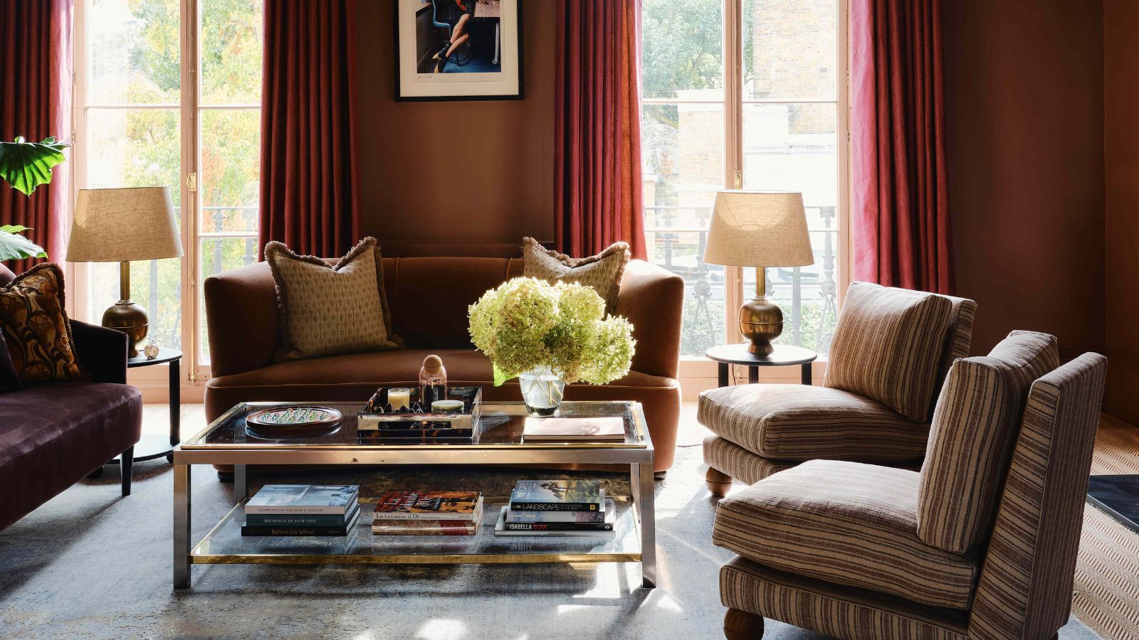
Red has ruled interiors for the past year, but as we step into fall, I can’t help noticing a new shade on everybody's lips. Orange, in all its warming, glowing iterations, has stepped up to take red's place as the most talked-about color.
Of course, as we start to welcome fall color schemes into our homes, orange's warmth feels particularly relevant now. And where red can sometimes feel dominating, decorating with orange softens the effect without losing impact – it has that same punch as red gives, but it feels softer and more approachable.
'Orange is absolutely stepping into the spotlight as the new red,' says House of Hive's Kailee Blalock. 'It’s a surprisingly versatile color, much more adaptable than people realize.' And as I’ve started spotting orange everywhere – from new-in fall trends to Taylor Swift’s upcoming album – it’s hard to ignore the feeling that this fiery shade is really about to have its moment.
Article continues belowIs orange the new red for fall 2025?
One of the biggest color trends in design over the past year has been the rise of unexpected red theory – a trend coined on TikTok that took over our homes and wardrobes and proved just how powerful a single, bold hit of color can be.
Red accents popped up everywhere, from glossy side tables to lacquered accessories, and the message was clear: red had claimed its place as the most daring, exciting color in interiors. But as we move into fall, I’m noticing a new hue that feels better suited to the season ahead.
What makes orange so exciting is the way it takes everything red offers – energy, vibrancy, drama – and makes it softer.
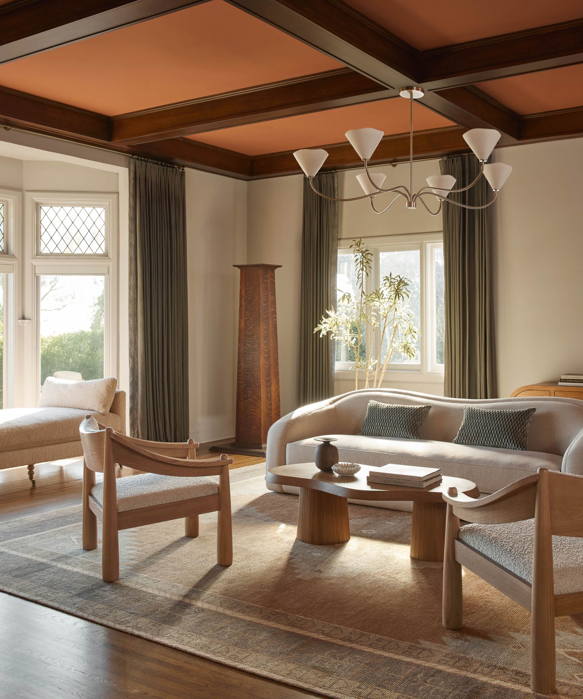
'I definitely think we’re seeing a bit of a comeback for orange in interiors after it fell by the wayside with its avocado green pair of the 70s or full Tuscan treatment from the 90s,' says Courtnay Tartt Elias of Creative Tonic Design. 'I love the rich quality of a terracotta hue (still often paired with green!) paired with crisp white linens in a bedroom and linear accents to keep the space from reading too retro or Tuscan!'
Design expertise in your inbox – from inspiring decorating ideas and beautiful celebrity homes to practical gardening advice and shopping round-ups.
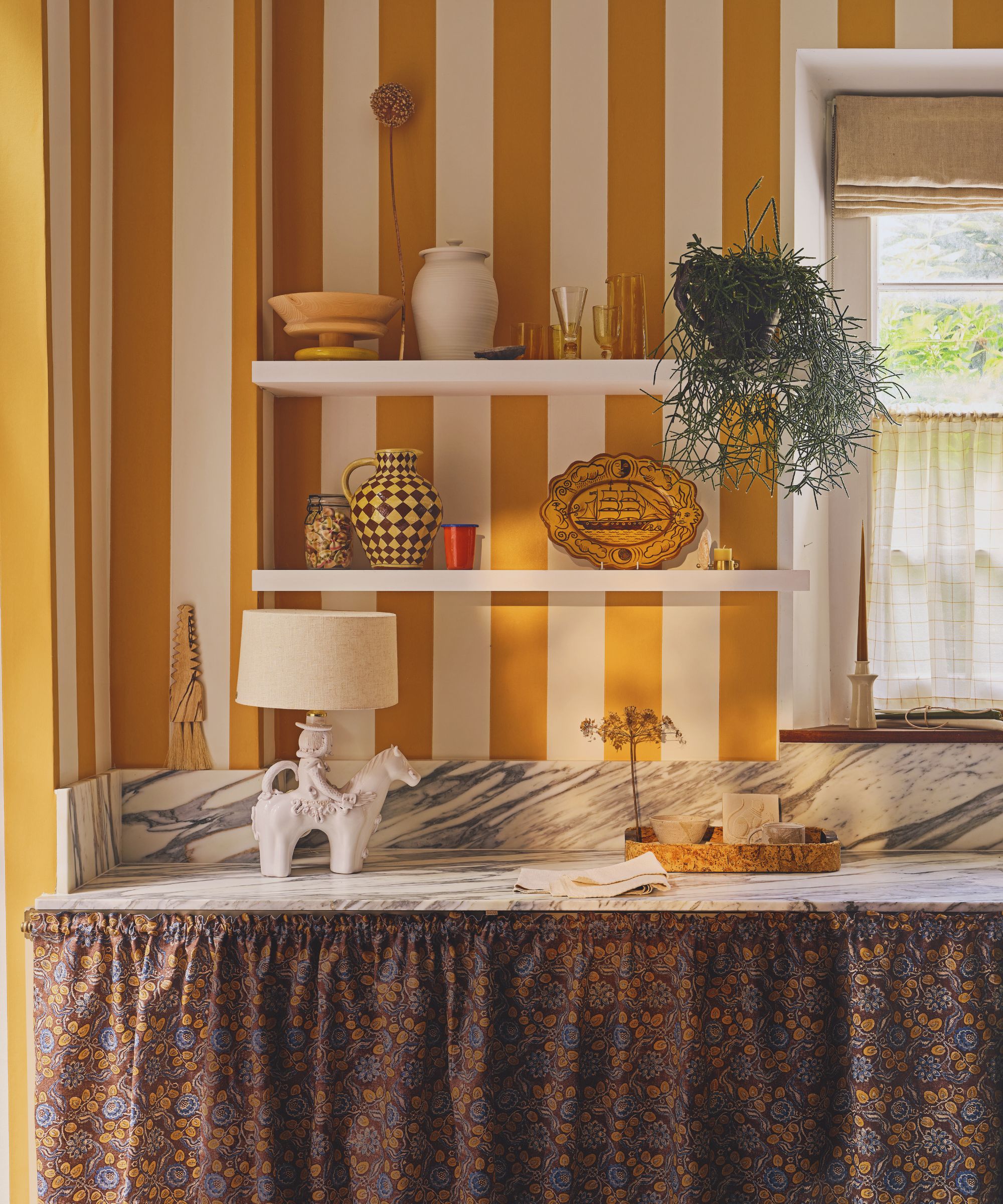
'Orange is emerging as a warmer, less intense alternative to red, yet no less impactful. It brings a sense of optimism and introduces a more playful, approachable tone,' says Caroline Milns, head of interior design at Zulufish. 'Where red can feel formal or dramatic, orange comes across as fresh, energizing, and unexpectedly sophisticated when used with intent.'
Of course, the rise of orange always comes at this time of year. From late summer sunsets to pumpkin spice, fall decor is synonymous with rusty shades that mimic the falling leaves outside.
'Orange feels especially relevant at the moment, particularly as we look towards autumn,' agrees designer Lauren Gilberthorpe. 'Where red can sometimes dominate a scheme, orange brings a softer warmth and a natural connection to the landscape.'
But there's also another culprit behind the trend: Taylor Swift's 'orange era'. After announcing her 12th studio album, The Life of a Showgirl, is on its way, Taylor also dropped hints that this record was going to be her era of orange. And the internet has been obsessed with pops of orange ever since.
And while Taylor chose a palette of vibrant orange tones, there are plenty of shades that have their own personality and effect on a room – from glowing amber and playful tangerine to rich terracotta and deep chestnut.
Michael Rolland, paint expert at The Paint Shed, pointed out just how much interest there is in these warmer tones right now. 'Chestnut paint colors were searched for over 10,000 times in July 2025 alone, showing a clear appetite for warm, toasty tones that bring the richness of autumn’s roasted nuts to the home,' he explains, suggesting Little Greene's Muscovado as a great shade to try. 'Whether through chestnut-toned paint or chestnut wood features, this rich, indulgent colour brings warmth and richness to a room, while subtly recalling one of autumn’s favourite sweet treats.'
Designer Molly Torres Portnof of DATE Interiors also leans toward the deeper end of the spectrum: 'I love incorporating orange hues since they often make a space feel warm, cozy, and inviting. While there’s definitely a place for bright orange, I typically favor amber and brown orangey tones, since they pair so well with neutrals and blues.'
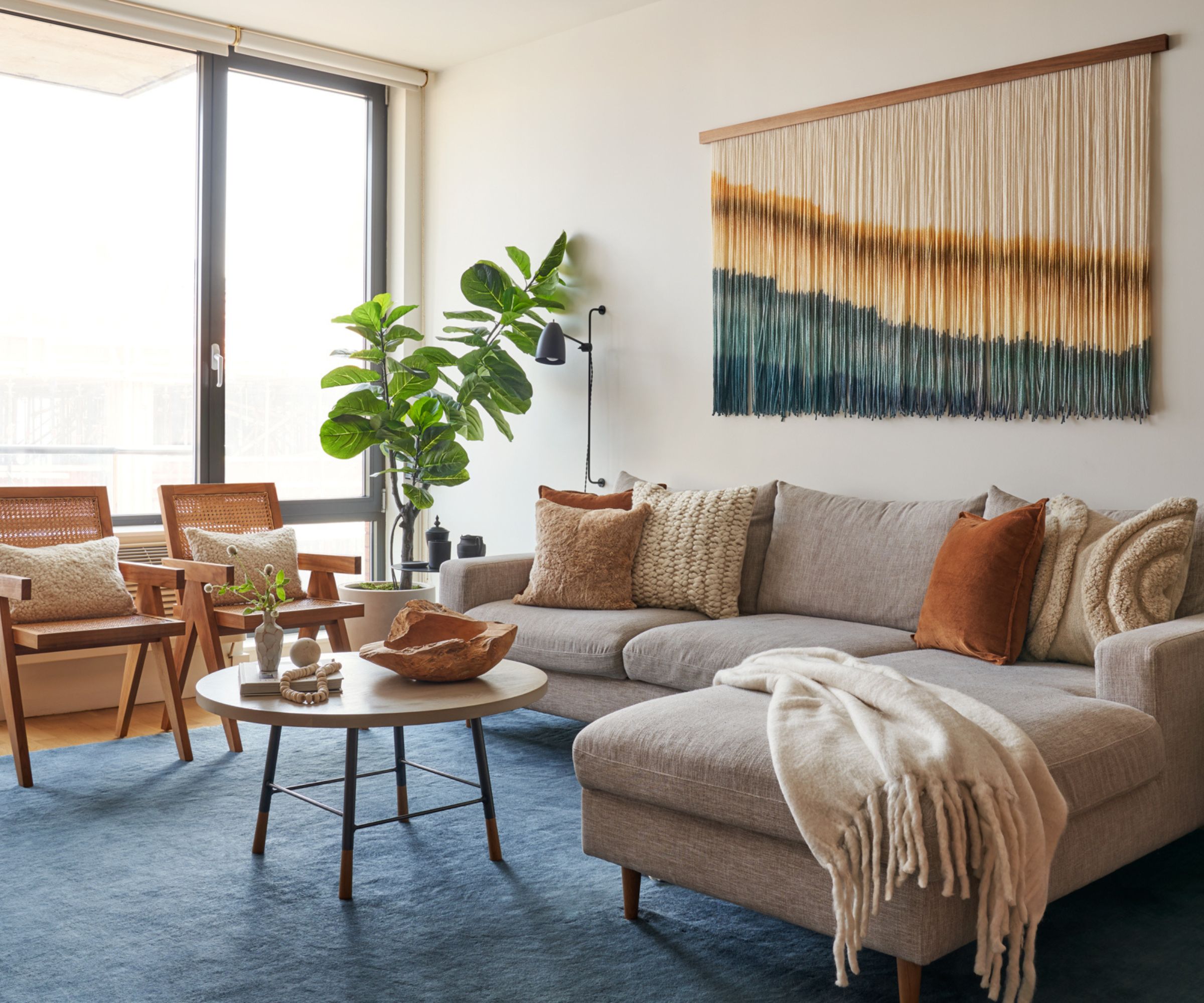
'I love pairing burnt or terracotta shades with deep navy or soft neutrals, they instantly lift a space while maintaining balance and elegance,' adds Caroline Milns. 'It’s a color that beautifully bridges the classic and contemporary.'
Orange doesn’t have to stand alone; it’s a surprisingly versatile team player, and there are plenty of colors that go with orange. Pair it with deep blues, greens, or charcoals for a bold contrast, or with creams, taupes, and natural timbers for a softer, grounded color combination.
'If you’re hesitant, start with a muted or burnt orange, which feels warm but not overwhelming,' suggests Kailee. 'Orange can even function like a neutral; it’s softer and more approachable than red.'
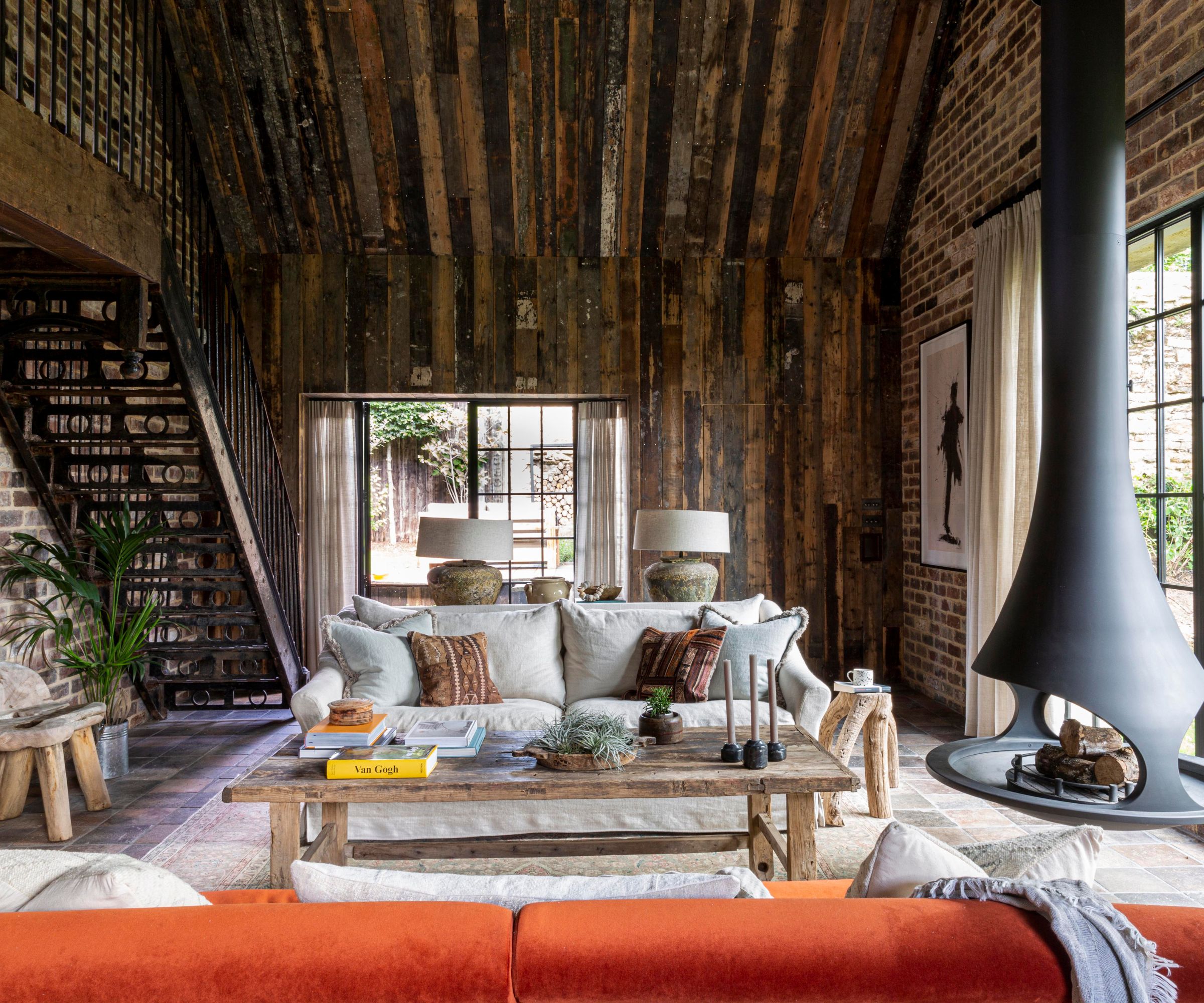
Texture in interiors is often what makes orange feel at home. 'What makes orange so versatile is how well it responds to texture,' adds Lauren Gilberthorpe. 'A rust-toned velvet cushion against natural oak, or a terracotta wall offset by a sheer linen curtain, creates a space that feels layered and inviting.'
'Burnt orange and terracotta tones such as Farrow & Ball’s Red Earth or Marmelo work beautifully with natural timbers and stone. For something fresher, Edward Bulmer's Malahide has a brightness that pairs surprisingly well with warm neutrals and off-whites,' she suggests.
Nina Lichtenstein adds: 'Texture plays a key role in making orange feel intentional rather than overwhelming. Matte plaster walls, velvet upholstery, leather accents, and woven rugs add depth and balance, allowing the color to pop without dominating the room.'
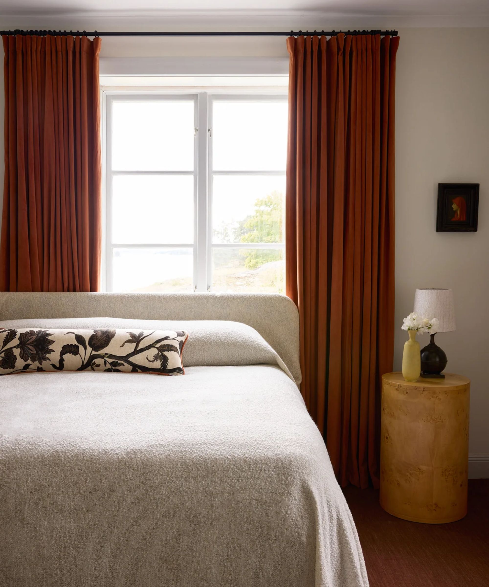
The key to using orange is finding the right balance. It’s a powerful shade, but with thoughtful styling, it can transform a room without overwhelming it. For me, orange shines brightest when it’s layered through textiles, furniture, or accessories to add hints of warmth, rather than splashed across walls.
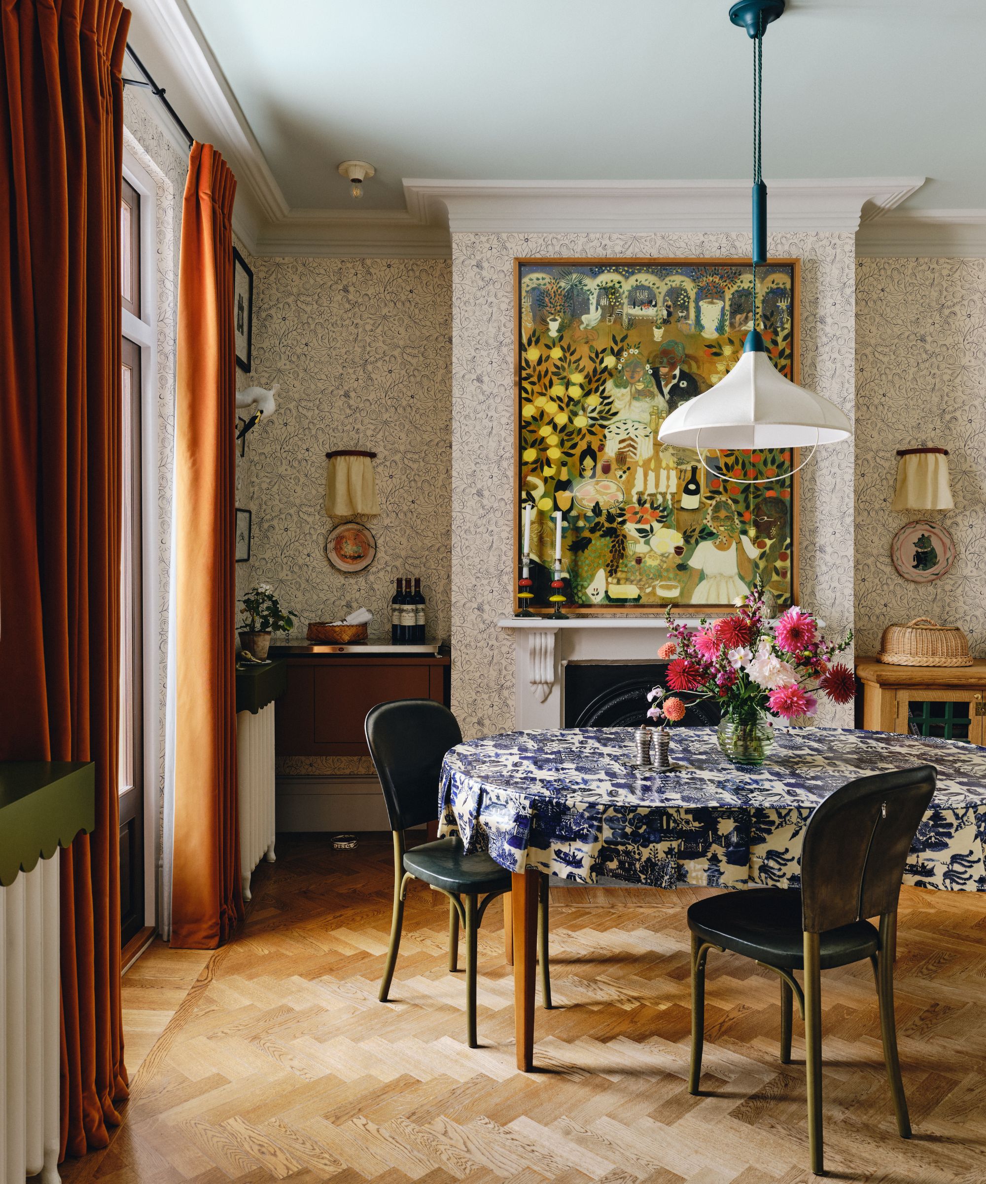
Designer Jeanne Barber of Camden Grace Interiors agrees, telling me: 'The warm undertone in orange lends itself to cozy dining rooms or other spaces where people gather and eat; in fact, I love orange so much I incorporated squash-colored chairs around my own dining table.'
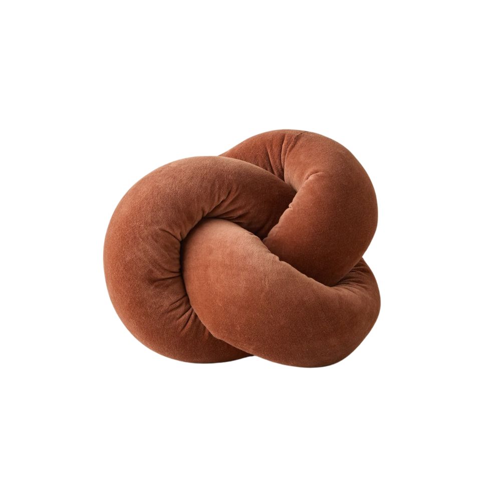
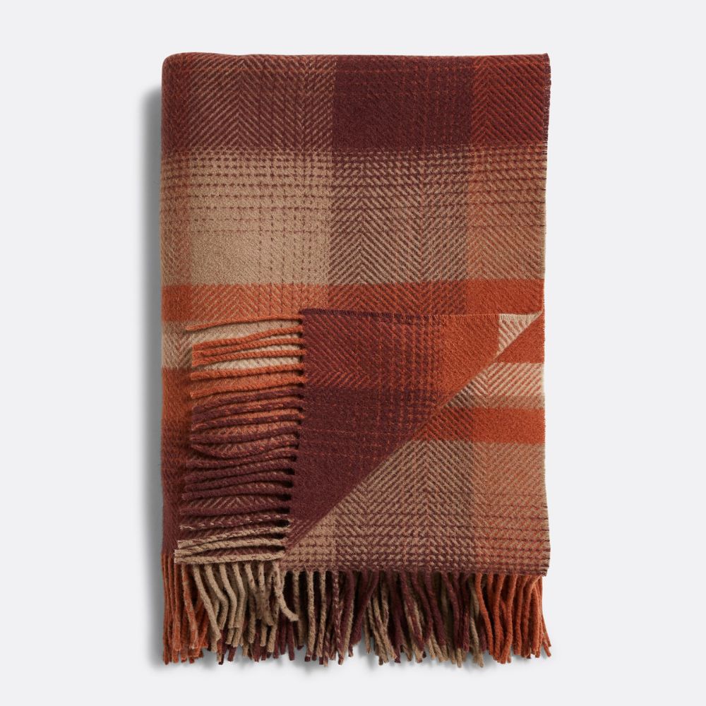
'When layered through textiles, artwork, or accents, orange adds a dynamic vibrancy that feels both current and enduring,' adds Caroline. A burnt-orange throw, a velvet cushion here or there, or even ceramics in rustic clay tones can bring just the right amount of richness to a room to make it super cozy for fall.
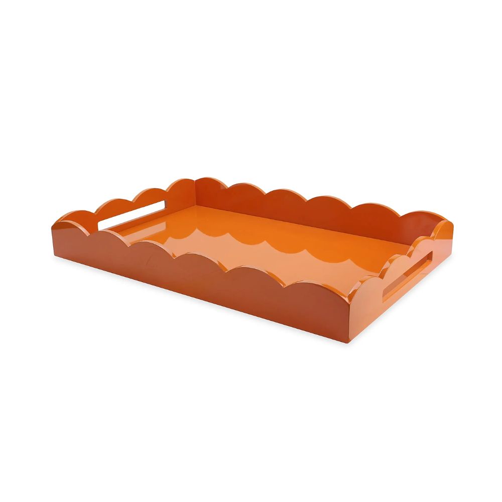
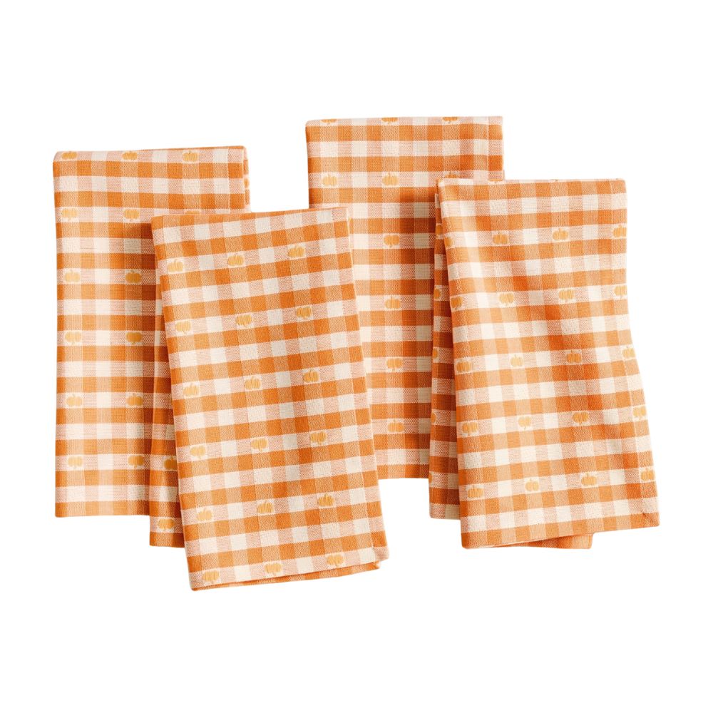
Shop home orange decor
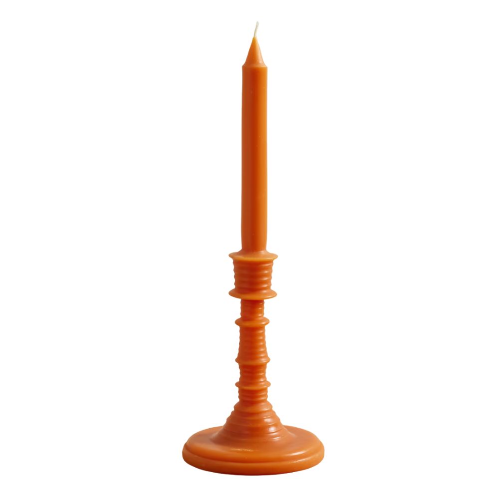
Made by the famous fashion label Loewe, this refreshing taper candle is scented with the fragrance of orange blossom and fashioned in the shape of a candlestick and holder. Playful enough to elevate any table or fall mantel.
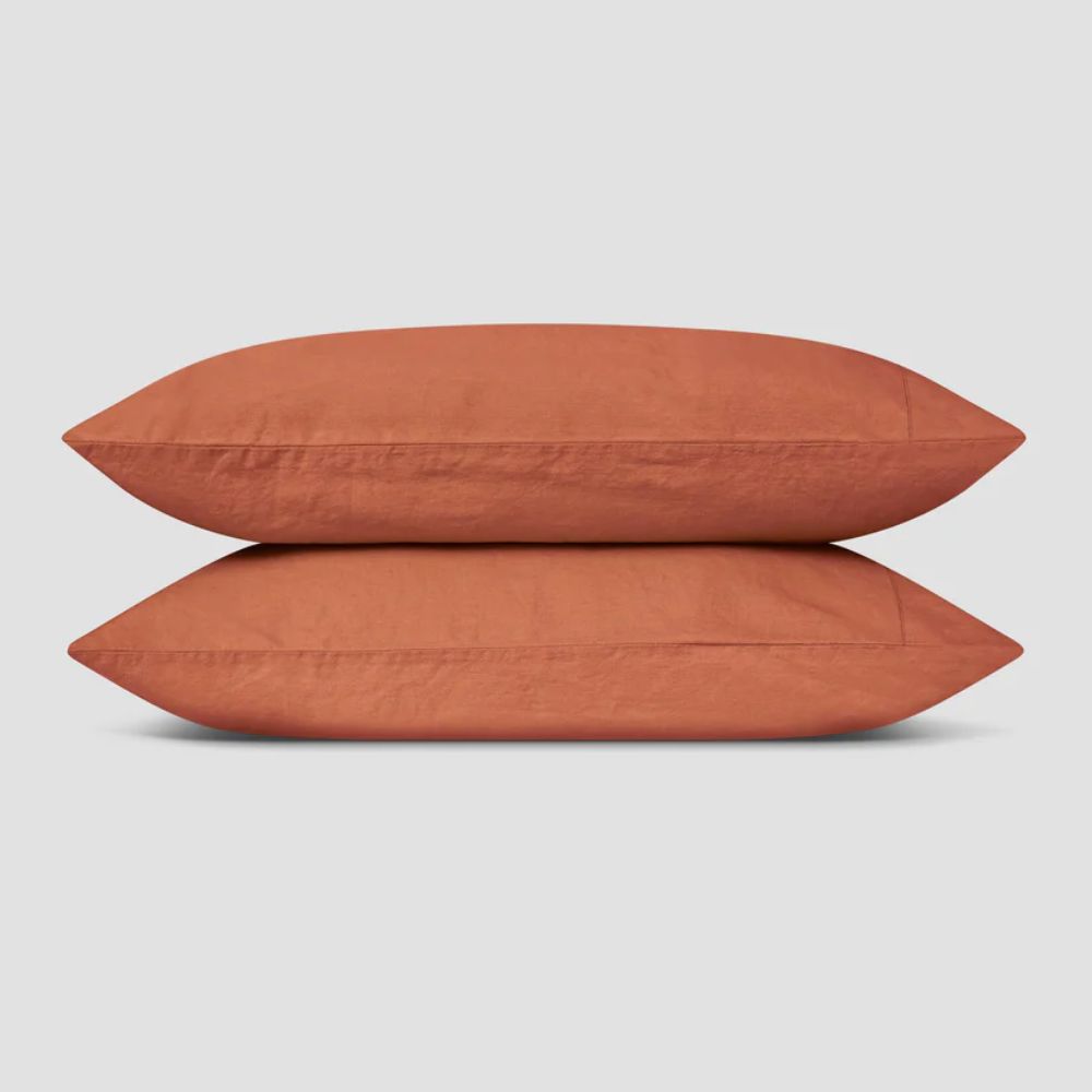
For those looking to decorate every room for fall, the burnt orange set from Piglet in Bed is perfect for adding warmth and comfort to your bedroom. Made from 55% linen and 45% cotton, these sheets are breathable, hard-wearing, and prewashed for softness.
As someone who fell hook, line, and sinker for unexpected red, I never thought I’d be drawn to orange. But it actually feels optimistic, versatile, and expressive, while still being surprisingly easy to live with. And while it doesn't signal the end of red, designers are certainly leaning into orange with added gusto this year. 'Orange is not necessarily replacing red, but it offers an earthier, more grounded way of bringing energy and color into the home,' adds Lauren.

Charlotte is the style and trends editor at Homes and Gardens and has been with the team since Christmas 2023. Following a 5 year career in Fashion, she has worked at many women's glossy magazines including Grazia, Stylist, and Hello!, and as Interiors Editor for British heritage department store Liberty. Her role at H&G fuses her love of style with her passion for interior design, and she is currently undergoing her second home renovation - you can follow her journey over on @olbyhome
