5 unexpected colors guaranteed to bring lasting joy and happiness to your living room – 'the perfect pick-me-up for fall and winter'
Expert-approved colors to give your living room a mood-boosting feel


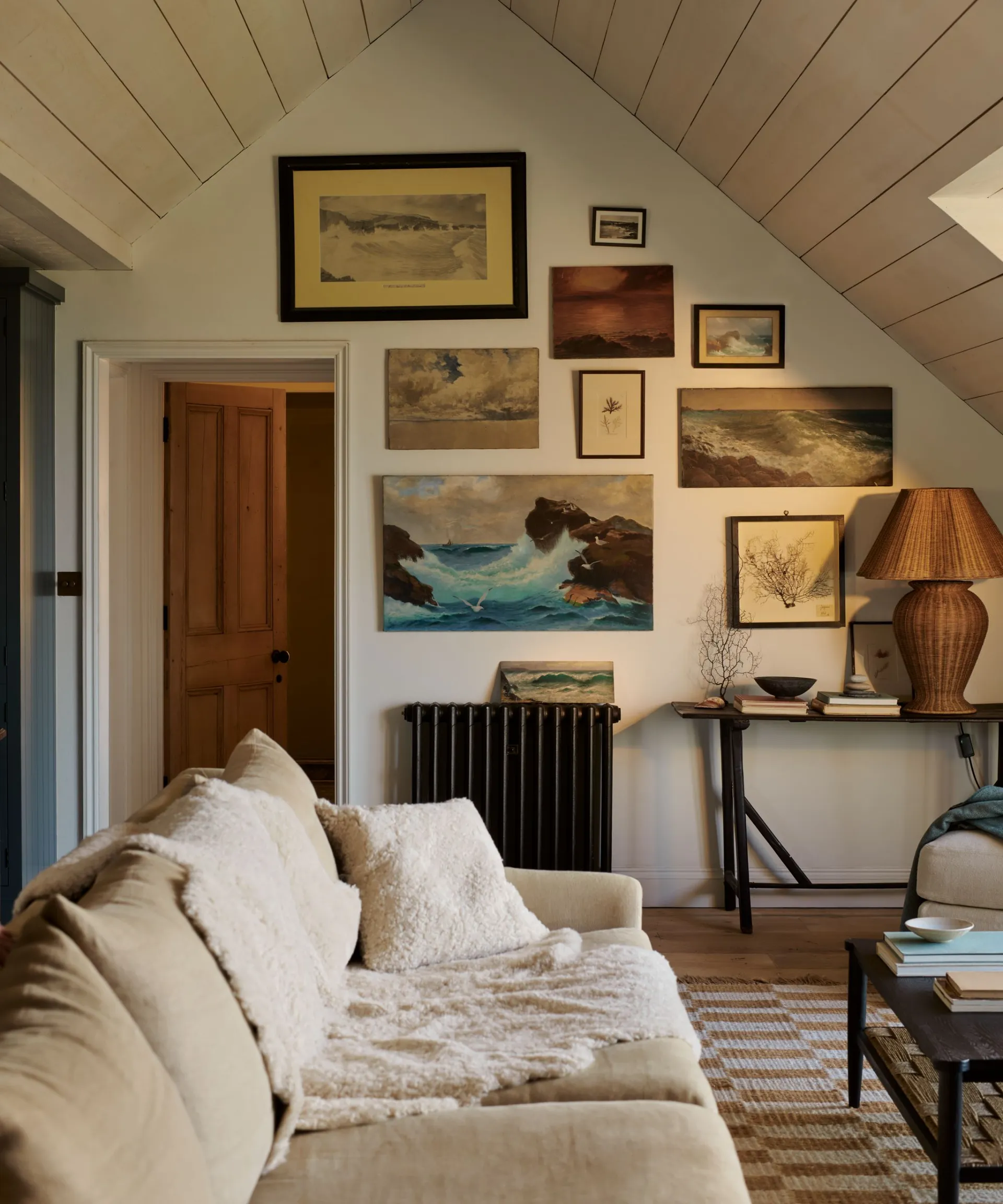
The living room is the emotional heart of the home – a space where we unwind, entertain, and connect. It’s where comfort meets style, and where the right design choices can shape how we feel every day. Choosing the perfect living room color scheme isn’t just about aesthetics; it’s about creating a space that nurtures well-being and reflects your personality.
Mood-boosting color schemes, guided by the principles of color therapy, can transform your living room into a sanctuary of calm or a lively hub of energy. And the good news? Achieving a happy, uplifting palette doesn’t require bright or jarring hues. Design and color experts are increasingly pointing to sophisticated, unexpected shades that lift the mood while remaining timeless.
Happy living room colors
In this article, we’ve gathered insights from leading color specialists to present five foundational color families. These colors combine style, emotional impact, and the latest living room color trends – creating interiors that feel both modern and enduring, and are set to define sophisticated spaces through 2026.

1. Warm earthy reds and corals

Red room ideas may not be the first color that comes to mind, but it brings warmth, passion, and a bold sense of drama to any space. Warm, earthy tones are strongly emerging as the anti-trend color for joy. Shades like muted terracotta and coral are complex, drawing on the energy of red without the commitment of a primary color.
Benjamin Moore's Helen Shaw says that ‘Adding a dash of color to the living room doesn’t need to be daunting. Warm and earthy tones such as terracotta and coral will naturally bring a zest and sense of energy to a room.’
This sentiment is shared by Erika Woelfel, color expert at Behr, who agrees that ‘If you’re looking for a mood-boosting color, brighter shades can feel dynamic and bring more energy into a space.’
Rather than painting all four walls, use these tones as high-impact accents – think a velvet coral armchair, a painted fireplace, or a color-drenched library nook.
2. Soothing blush and earthy pinks

For a space dedicated to switching off and finding comfort, soft, earth-based pinks are the perfect choice. Moving far beyond the fleeting 'Barbiecore' trend, these muted tones are complex neutrals that feel restorative and warmly feminine without being overly sweet.
Farrow & Ball's color consultant Patrick O'Donnell suggests looking to these shades for sanctuary: ‘For somewhere to switch off, read a book on your squishy sofa, or catch up on your favorite drama, look to an earthy pink for your walls. Farrow & Ball’s Setting Plaster is just the ticket with its delicate brown notes and utterly soothing feel.’
This palette sets the tone for a cozy living room, combining comfort, style, and a sense of homely elegance.
3. Uplifting golden yellows

Yellow room ideas are universally known as the color of optimism, warmth, and joy. While its boldness can be intimidating, incorporating it thoughtfully guarantees a mood lift.
Helen Shaw confirms that ‘Decorating with yellow is known to lift a mood and evoke a feeling of warmth and joy.’ For those hesitant to commit to all-over color, she suggests using this vivid hue as a strategic accent: ‘Alternatively, use this happy color as an accent or highlight architectural features for a more subtle approach.’
A pale butter yellow on a ceiling, or gold-toned yellow velvet cushions on a sofa, brings the warmth of sunshine into your home, working particularly well in rooms lacking natural light.
4. Restorative earthy greens

Decorating with green is fundamentally linked to biophilic wellness, promoting a deep sense of calm and happiness by connecting us to the living world. The trend for 2026 favors these nature-inspired hues, such as deep forest greens and soft, muted pistachio shades.
To achieve balance, Patrick O’Donnell suggests pairing green with a soft white: ‘To give the room a nice counterbalance, try Card Room Green on all your woodwork – doors, skirting, and windows – and then choose a nuanced white for your ceiling, nothing too sharp. Shadow White would be a perfect balance for the main colors.’
For smaller spaces, Ashley McCollum, color expert at Glidden, advises using lighter variations, suggesting muted pistachio hues that ‘work very well in rooms that are lacking in natural light, such as Glidden’s Whispering Pine.’
5. Timeless foundational neutrals
For those who prefer a minimalist living room or serene base, neutral living room ideas are crucial for happiness by providing a relaxed, uncluttered atmosphere that reduces visual stress. However, a successful neutral room relies heavily on layering.
Ashley McCollum is an advocate for choosing sophisticated neutrals, explaining that a lighter hue like ‘Limitless provides a fresh and energizing take on a neutral color. Decorating with neutrals adds brightness to the deep, warm, and cool tones of the season.’
To ensure these foundational colors are not flat, designers emphasize texture (wool, boucle, linen) and metallic layering. McCollum advises that ‘gold or bronze finishes pair beautifully with neutral shades,’ using reflective accents to add necessary light and luxury to the calm, pared-back base.
There is no doubt that color profoundly affects our mood. When designing your living room, the goal is to choose shades that not only reflect your personal taste but also help you feel happier at home. By selecting these sophisticated, emotionally resonant colors, you create a positive, uplifting foundation that endures.
