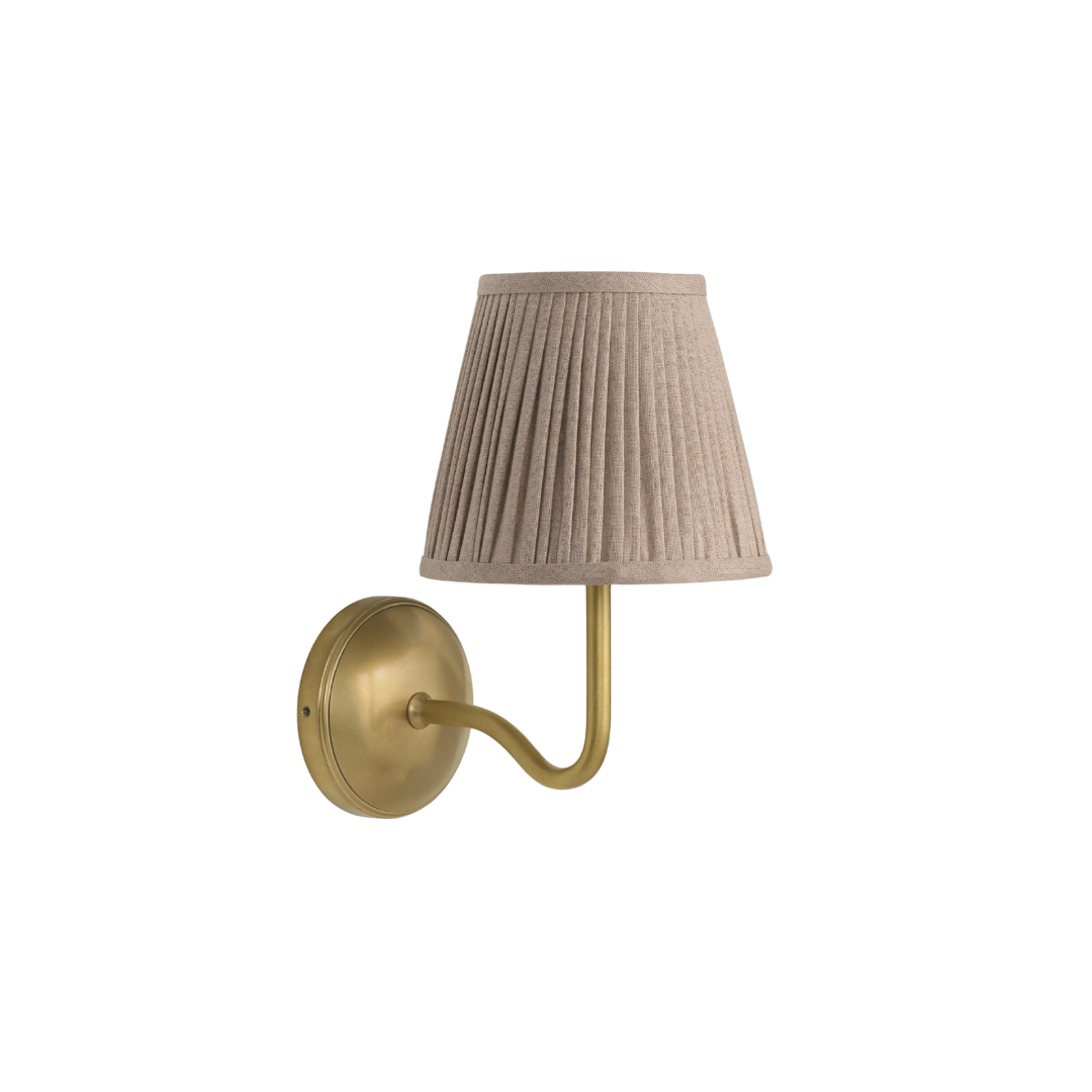
Design DNA: Inside a neutrally nuanced Mayfair duplex where work and wardrobe meet modern ritual
Most of us work, and all of us get dressed. Designer Claire Sá redefines laid-back luxury with a multipurpose space curated for how people actually live

Design expertise in your inbox – from inspiring decorating ideas and beautiful celebrity homes to practical gardening advice and shopping round-ups.
You are now subscribed
Your newsletter sign-up was successful
Want to add more newsletters?
The notion of a ‘home office’ is increasingly antiquated. Papers are digitized, laptops replace hulking screens, and few of us work in silos anymore – so why design a space like one?
For Claire Sá, founder of De Rosee Sa, a London duplex called for a more relevant ritual: getting dressed. Work and wardrobe both shape how we present ourselves, demanding spaces that inspire so it makes sense that a dressing room should sit in an office.
Situated in the iconic 60 Curzon in Mayfair, once home to Mirabelle – the restaurant of royals and rock stars – reinvention has long run through the veins of this address. Now, Claire decodes its Design DNA, revealing how a storied space can be retooled for modern work life, with takeaways to elevate yours.
A room-anchoring desk
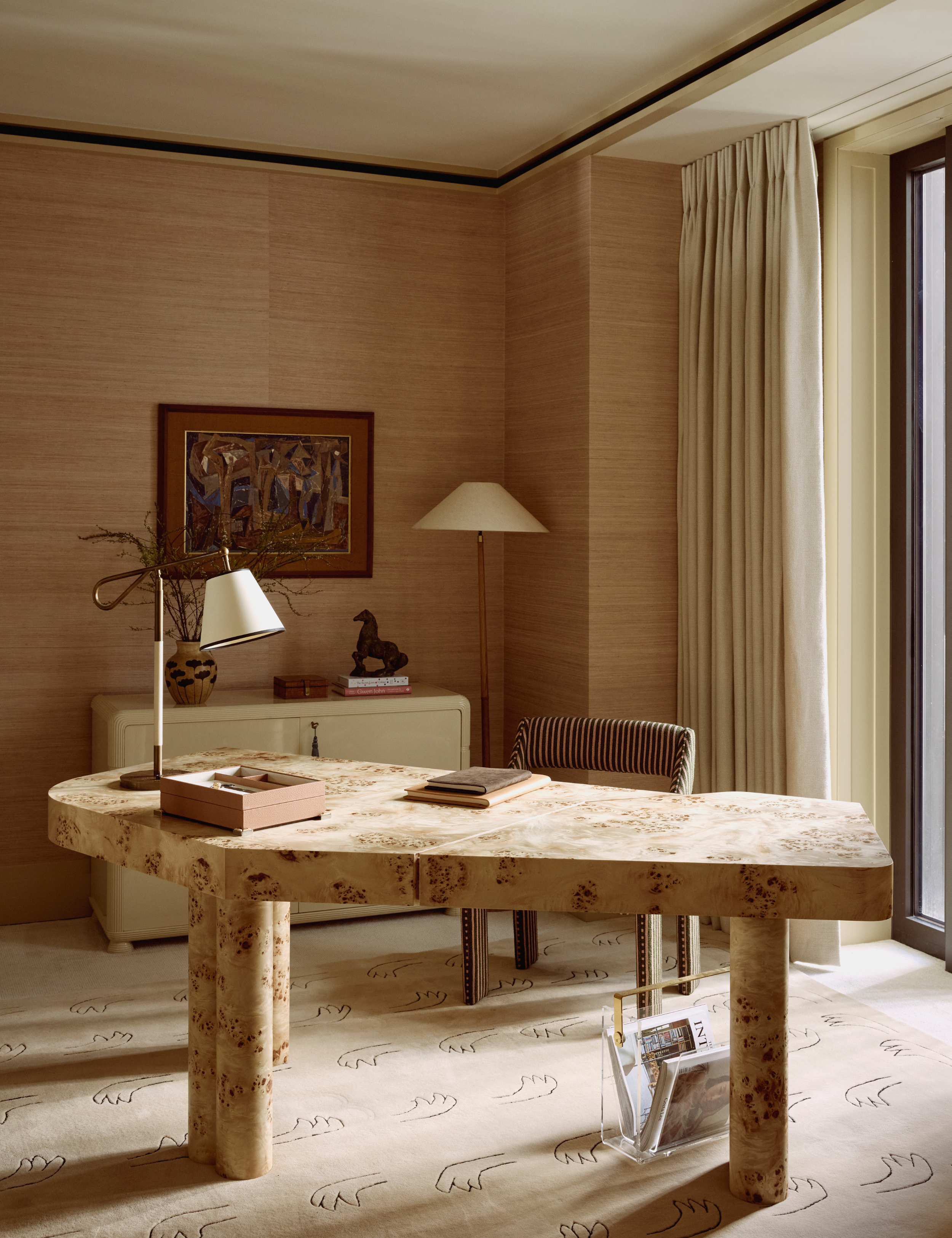
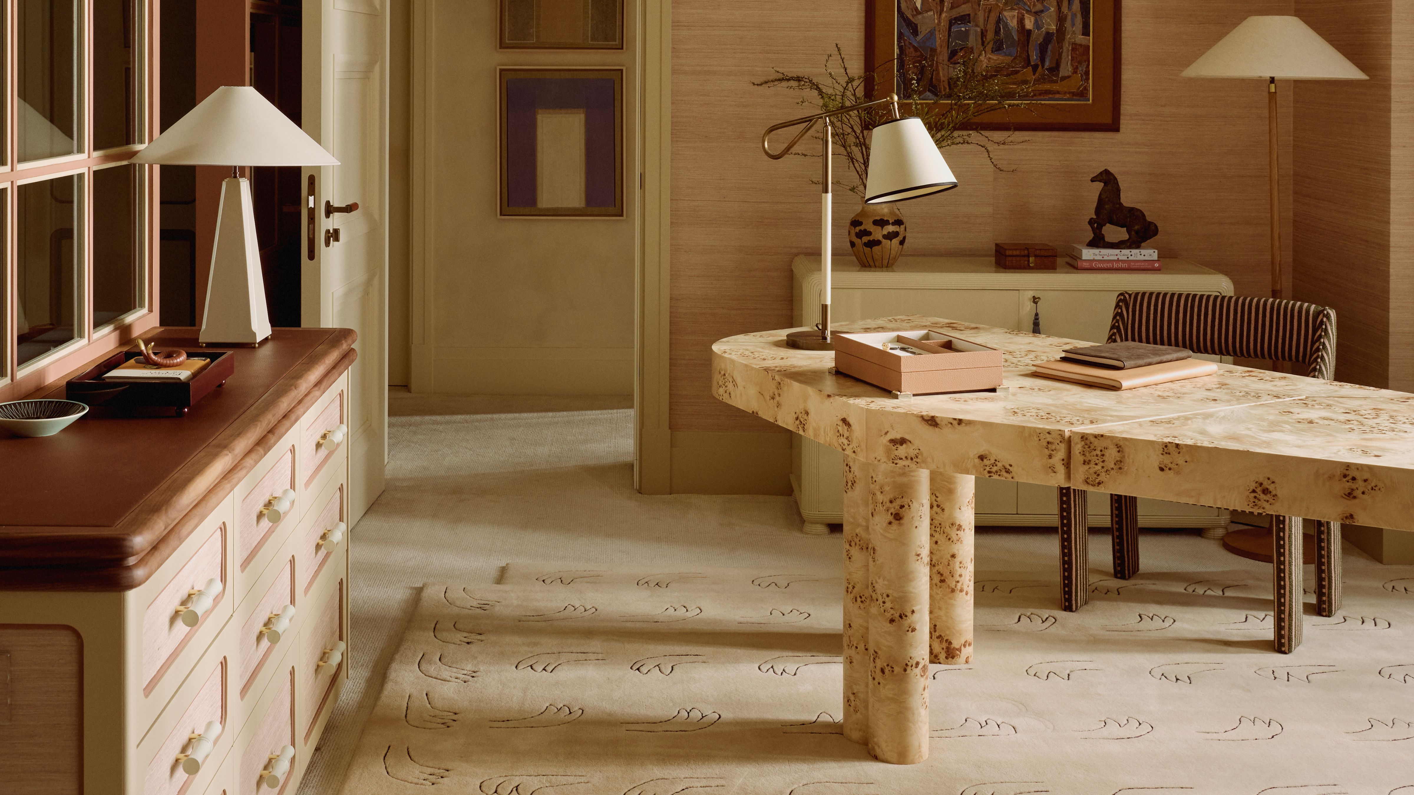
All eyes feast on the asymmetrical elm burl desk by Danielle Siggerud, its twin tabletops balanced on tree-trunk legs. ‘It has a sculptural, commanding presence that anchors the office, pairing beautifully with the tactile walls and sheers. It introduces warmth and gravitas, setting the tone for a workspace that feels both serious and inspiring,’ Claire says.
For her, a desk is never just a work surface. 'It can double as a place to put on makeup, to write a note, or to sit with a laptop for a short burst of work. A bespoke or carefully chosen desk sets the tone for the whole space and can help the office feel part of the home rather than separate from it.’
Don’t be afraid to splurge or go bold – the right desk anchors a room and supports more daily practices than you might presume.
See-through threshold
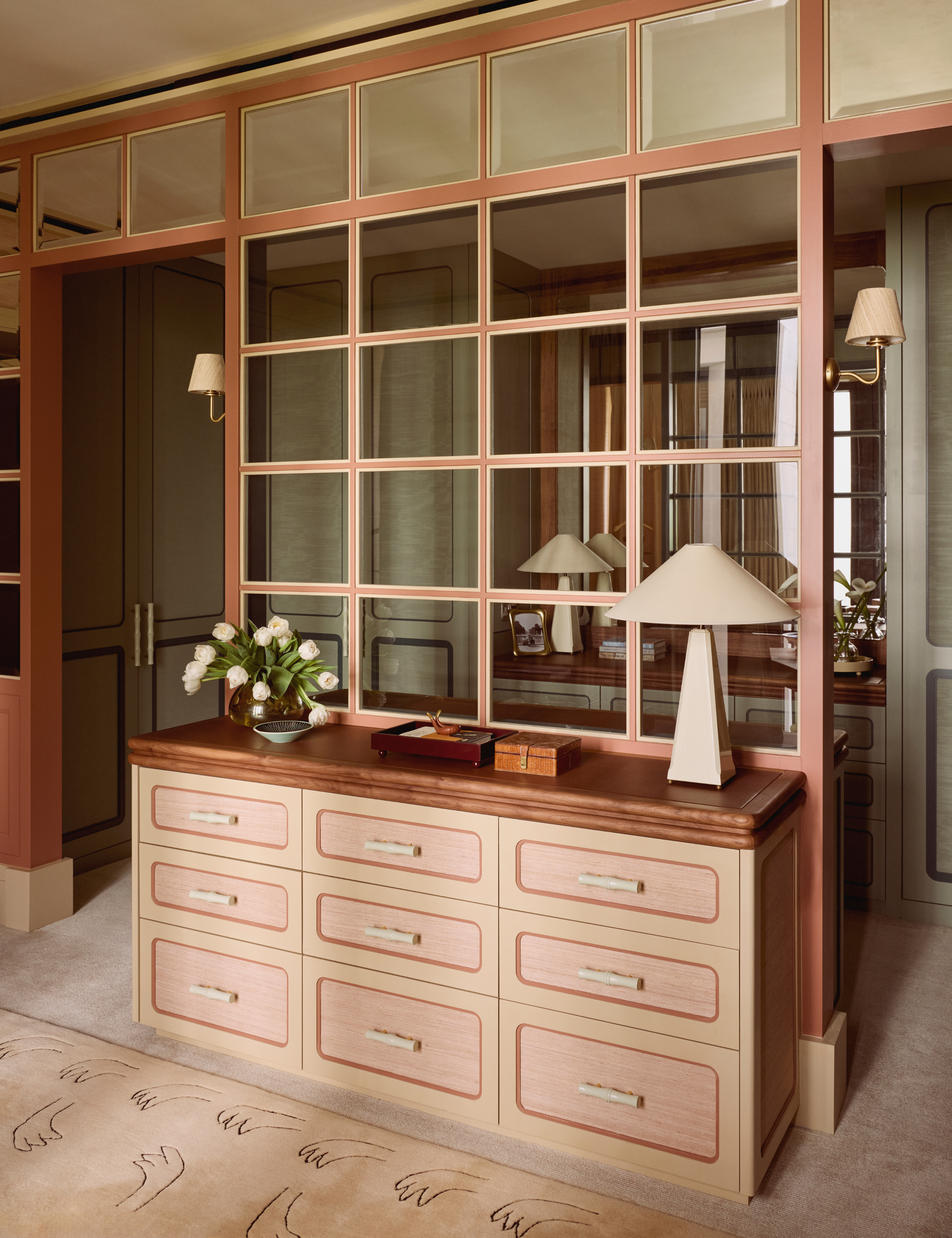
There’s a difference between a room that’s open concept and one that’s truly multipurpose. The first risks feeling directionless; the latter creates distinctions, carving out zones within a larger whole. The line between the two is what Claire calls a threshold – not a hard break, but a mediary that lets spaces flow together and apart.
‘We kept the spaces distinct but connected with subtle thresholds: a windowpane screen that lets in light but breaks it up with mullions, mirrors to bounce light deeper in,’ she says of linking the office and dressing room, a choice that helps ‘shift the mood without fully dividing the room.’
Shared lighting helps too. Objects like the Susie Atkinson Plato lamp, perched on the bespoke leather-top dresser that bridges both rooms, set the ambience on either side.
Since this project's 'threshold' is bespoke, try a silken screen divider. Albeit more opaque, it offers the same pause between spaces and while doubling as a design canvas.
'A bespoke or carefully chosen desk sets the tone for the whole space and can help the office feel part of the home rather than separate from it.’
Claire Sá, co-founder of Architecture and Design studio De Rosee Sa
Neutral, textured backdrops
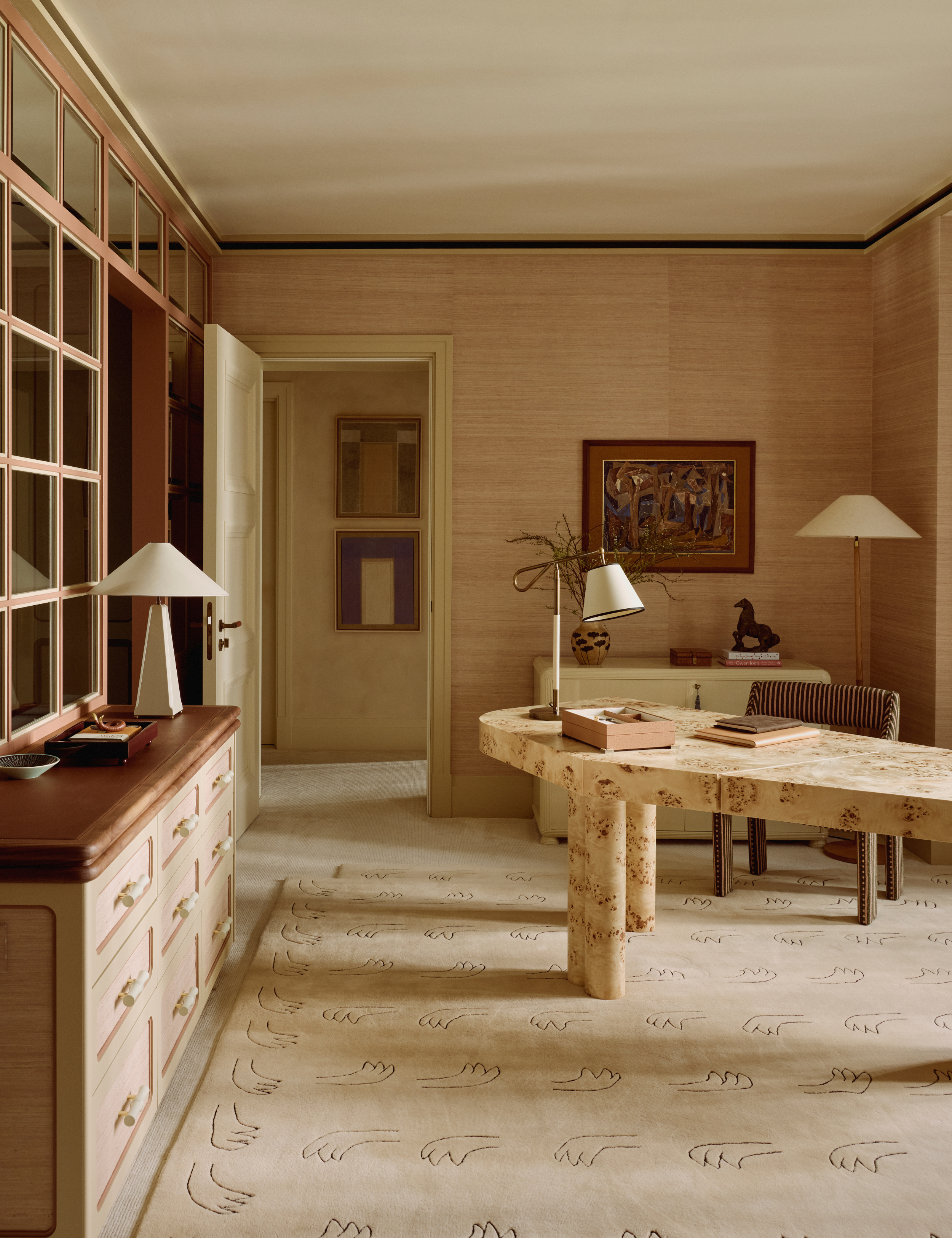
Neutral palettes are notoriously tricky. One wrong move and they mope into monotony. In this Mayfair office–dressing room, texture keeps the scheme layered from floor to ceiling.
‘Texture is key,’ says Claire. ‘From Weitzner’s silk wallcovering to the Dedar-clad wardrobe doors, every surface has tactility.’ Even the larger gestures serve the same purpose. The handloomed Nordic Knots rug, made from New Zealand wool, softens the space against grass-cloth flooring and textured walls, adding dimension through contrast.
If you’re attempting a similar palette at home, keep Claire’s advice in mind: layer texture wherever possible, whether through wallcoverings, upholstery, or even a single tactile pillow. And don’t assume ‘neutral’ means beige. Inside the wardrobe nook, Claire paired blush pink and green – ‘These are not colors you would naturally put together, but testing that tension gives the room personality,’ she says.
Storytelling objects
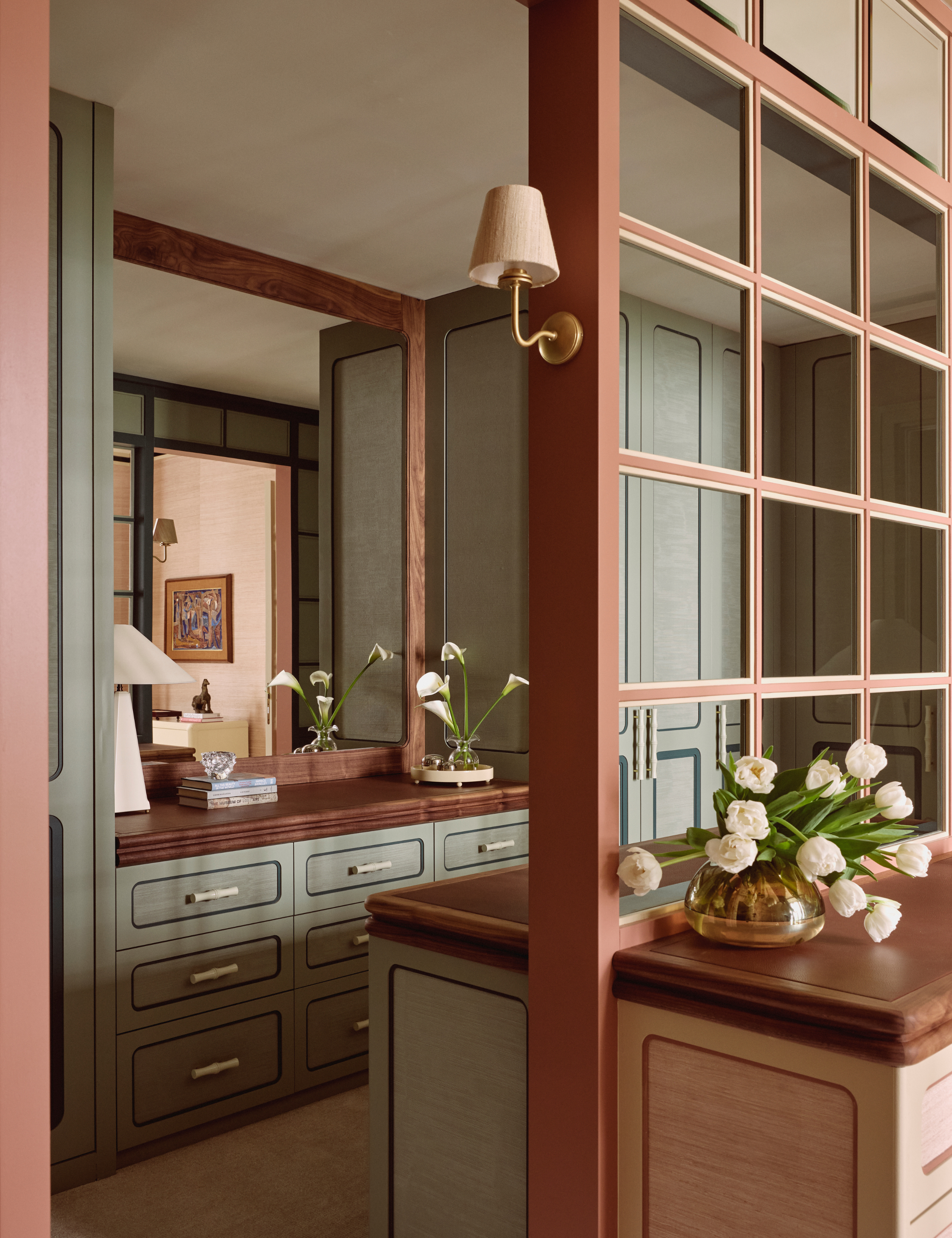
Another way to prevent neutrals from slipping into sameness is also the most obvious: objects with character. ‘The layering of fabric, art, and objects ensures the neutrals feel alive rather than flat,’ says Claire, who treats every surface – from tabletops to the dresser divider – as a stage for interest.
‘The art is a mix of commissions, dealer pieces, and vintage finds, chosen to feel collected over time rather than staged,’ she adds. Even a paperweight isn’t just a paperweight here – it’s a brass-and-leather cigar holder by Austrian painter Carl Auböck, circa 1950.
Not every piece needs a pedigree, but the best ones tell a story. Prioritize finds that feel lived-in or storied – think antique sales, Etsy, or 1stDibs – and your neutrals will always read as layered.
‘If you put an armchair in a bathroom, inevitably you will sit there on your phone and behave differently. If there is nowhere to sit, you just brush your teeth and leave.'
Claire Sá, co-founder of Architecture and Design studio De Rosee Sa
Unorthodox placements
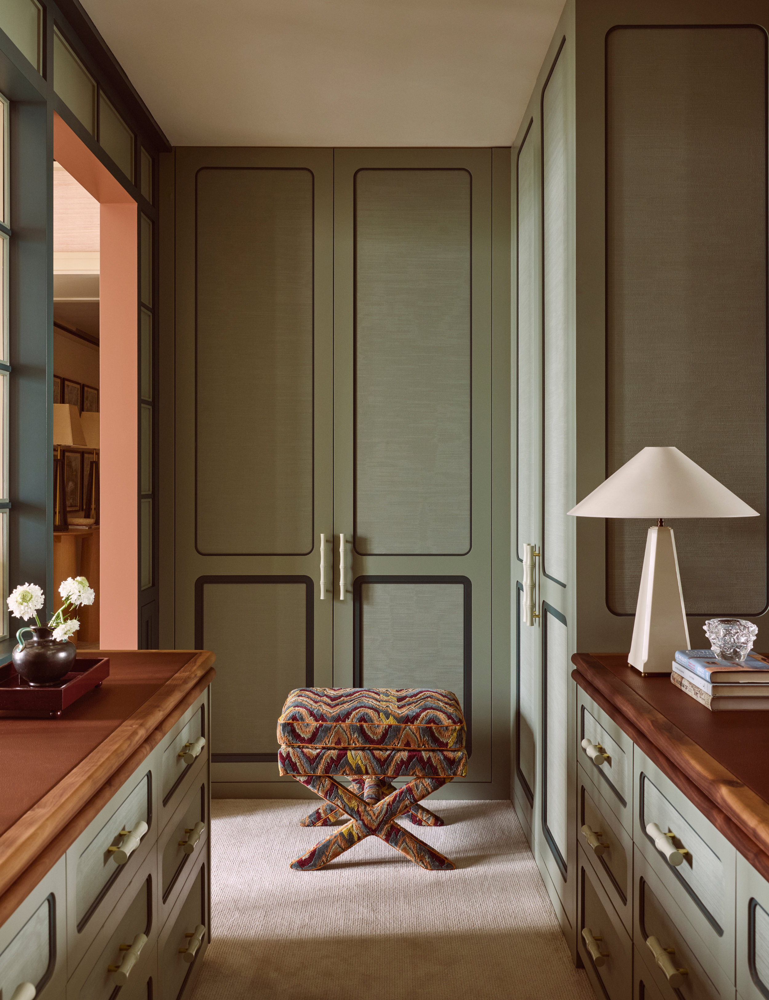
For Claire, multifunctionality is born from breaking the rules of placement. ‘Allow there to be an armchair in the kitchen, a desk in the dressing room, or cozy lamps around a dining table,’ she says. ‘Even in a bathroom, if it has a beautiful view, why not put in a chair or a desk? Sometimes it is just about putting a piece of furniture where you would not normally expect it and seeing what happens.’
These tweaks subtly shift how a space is used. ‘If you put an armchair in a bathroom, inevitably you will sit there on your phone and behave differently. If there is nowhere to sit, you just brush your teeth and leave,’ she quips.
Here, a Watts Hesketh upholstered stool could have been omitted. Instead, it anchors the dressing area with an invitation to linger, turning storage into a space for pause.
The edit
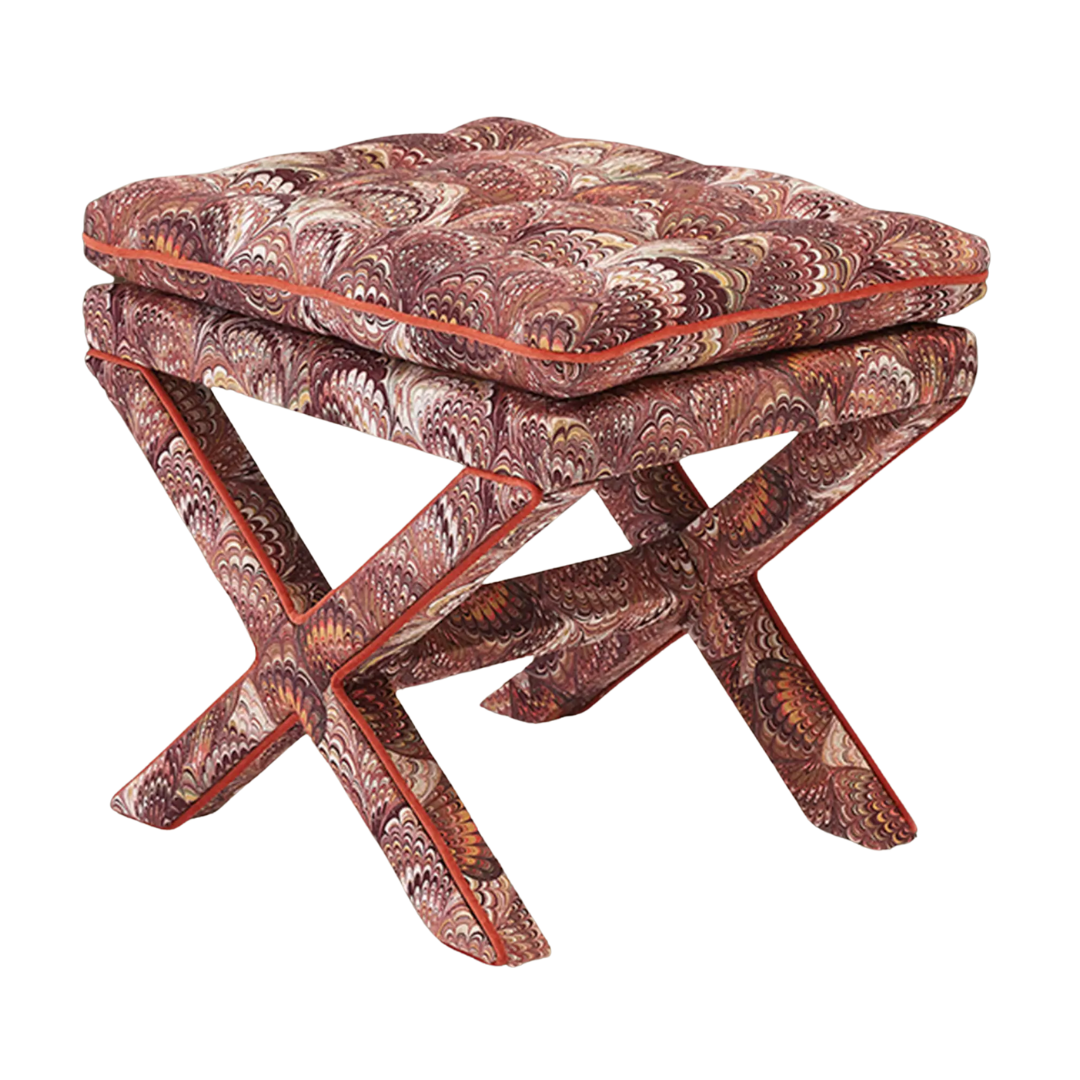
The stool in the dressing room is a standout, though sadly not one you can shop off the floor. ‘It’s a stool from Manhattan Designs which we reupholstered in Watts Hesketh fabric,’ Claire explains. In theory, you could do the same, though this Massoud version makes a convincing substitute with its similarly upholstered jewel-toned swirls.

Peer past the desk into the far-right corner of the office, and you’ll spot an antique-style horse rearing atop a stack of coffee table books, a detail Claire added for character. This particular piece is a Chairish score – not actually antique (it dates to the 2010s), but with all the equestrian flair of the real thing, and just as coveted right now.
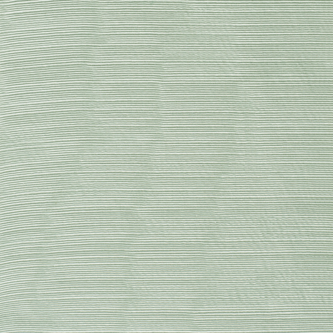
Claire layered the wardrobe fronts with this exact wall fabric by Atelier Vime – a cotton ottoman moiré that brings a ribbed, tactile texture to the surface. Easy on the eye, it introduces an unexpected sense of depth in a space that might otherwise read as flat.
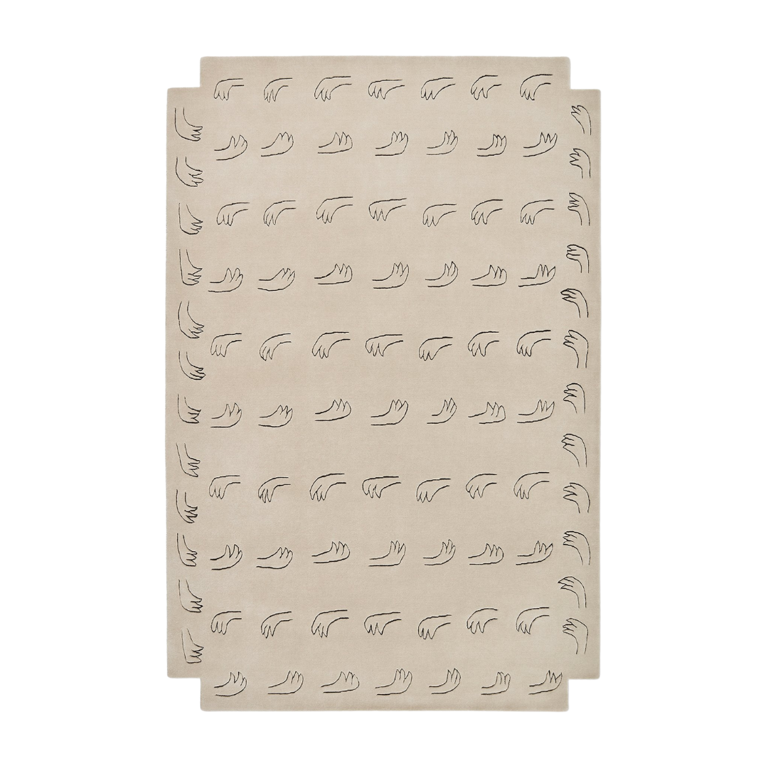
Rugs over carpets? For Claire, doubling down is a yes. ‘Here we layered a Nordic Knots rug over a natural grass-cloth style carpet,’ she tells Homes & Gardens of her 60 Curzon project. ‘It adds softness and defines the zone, while the textures play off each other to avoid flatness.’ You can shop the same rug here, but if you’re branching out, her advice is to ‘choose a rug with weight and a contrasting weave so it feels anchored.’
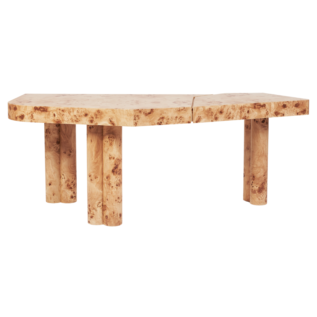
As the desk of dreams, Danielle Siggerud’s sculptural design comes with an equally enchanting backstory. The tabletop, split into two parts, was first created as a wedding gift for her husband – a metaphor for individuality and unity, separate yet unable to stand alone. Today, the now-iconic style can be customized in finishes ranging from mahogany veneer to black high gloss.
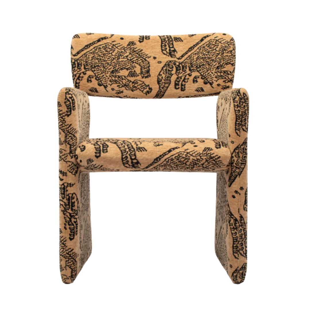
‘The chair was selected to balance comfort with elegance, complementing the Mattina desk without overwhelming it,’ notes Claire. Not an office chair at all but a dining chair: the Laurie from Soho Home. ‘As with the rest of the scheme, it sits quietly but with presence,’ she adds. Though the Laurie has since sold out, this Interior Icons alternative carries the same mid-century air with a slim frame and warmly tailored upholstery.

Every object in the project was chosen with intention. Carl Auböck paperweights are still produced today (he popularized that sculptural link design that went viral a few years back), but the vintage iterations carry far more intrigue. Here, Claire sourced a circa-1950 leather-wrapped pipe holder by the Austrian painter and designer, repurposed as a paperweight atop a book. These collectibles often sell north of $1,000, though we’ve found one for a song.
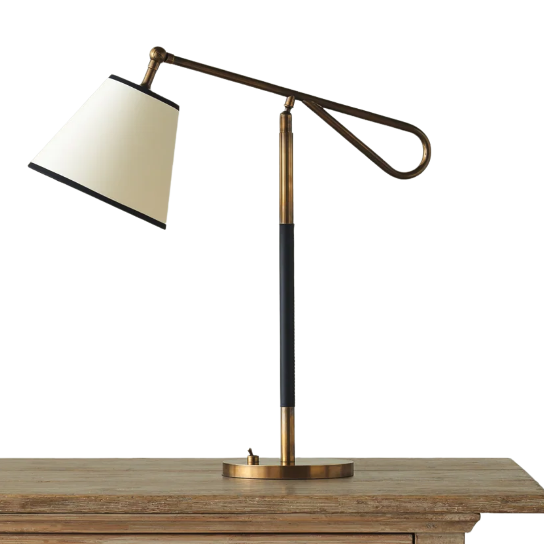
Lighting is treated with equal reverence. With a distinguished name like Parsons, this desk lamp spares no detail: hand-crafted antique brass finished in the UK, wrapped in hand-stitched leather, and available in ivory, black, or oxblood. The shade is sold separately, a detail that allocates room for customization, tailoring the glow to the unique way you work.
What are the key elements of a well-designed multipurpose space?
We move through many roles in a single day, especially in an age of hybrid schedules. One minute you’re finishing a deck, the next you’re ‘Zoom top ready,’ and five minutes later you’re back in pyjamas. For Claire Sá, the solution is fluidity. ‘The idea was to avoid a dark, cupboard-like dressing room and instead create a space to wait, relax, or even send a few emails,’ she says.
‘An office today isn’t always a formal room,’ she adds. ‘It’s often just where you pop up a laptop, so combining the two made sense,’ offering space for work, yes, but also for trying on clothes, pausing between activities, ‘or making getting ready feel like an event.’
A multipurpose space should meet you where you are. In London, that meant a dressing room–office hybrid. For an LA yogi, it might mean swapping in a meditation corner instead.
How do you create a balanced home office?
A balanced home office shouldn’t feel like an office at all – it should read as an extension of your home. That means reflecting your own taste, not defaulting to the bulk-purchased ‘office accessory’ bundles in plastic and chrome. If it wouldn’t make the cut in your living room, it has no business living in your workspace.
Claire proves the point with her own substitution: a now sold-out Soho Home dining chair in lieu of a traditional desk chair. Upholstered, comfortable, and elegant, it sidesteps the clunky ‘office’ label altogether.
The lesson here is to defy expectations. Choose pieces that inspire you, even if they weren’t designed for an office. And most importantly: don’t fall for the big-box office propaganda – it’s creativity, not convention, that keeps your space balanced.
What design choices make this room timeless?
60 Curzon has carried weight since 1936, when it first opened as Mirabelle, one of Mayfair’s most storied restaurants. Now reinvented as 32 boutique residences, the address arrives with built-in history. Despite that legacy, Claire knew it couldn't behave like a nepo baby: the space had to honor its past while forging a path of its own, speaking to a modern, cosmopolitan buyer – not rest on its laurels.
‘Our aim was to create a home that feels both sophisticated and welcoming, a balance of classic Mayfair elegance and mid-century modern warmth,’ she says. ‘We wanted it to resonate with today’s lifestyle – practical, adaptable, and layered with personality.’
Her method was to cross centuries. ‘For me, it’s all about composition, mixing textures, finishes, and eras so the space feels curated rather than fixed in one style,’ Claire explains.
Timelessness is not about looking back; it’s about making history live comfortably in the present.
What should every dressing room include?
Glass-front wardrobes have become trendy for a certain set of department store connoisseur, but they’re not always the most inspiring. Sometimes, a closed door is the better choice. Concealing clutter creates calm – and, counterintuitively, can spark more creativity when putting outfits together.
‘A flat wall of cabinets can feel heavy, so we added depth with details that make the frontage feel more polished, like inset silk wallpaper panels and a bead of contrasting color,’ Claire says. ‘Doors were essential to conceal the messier side of storage, but we treated those fronts as an opportunity to decorate and refine.’
Inside, practicality rules. ‘The layout was calculated, with enough space for long dresses and shoe storage. A mix of drawers, chests, and his-and-hers sections keep it practical but also a little more open.’
Think as carefully about what’s outside as what’s within. Closet doors are as much design opportunity as the clothes inside.
Do what’s necessary, not what’s expected. A desk can be a vanity, a dressing room an office – who cares what you call it? Build for your rituals, not theirs. Infuse the space with your DNA, and suddenly the room starts being yours.
Design DNA is the Homes & Gardens series that breaks down beautiful rooms into their essential elements. Each installment dissects one interior and shows readers exactly what makes it work, from the anchor furniture and layout choices to color, lighting, and styling details.

Julia Demer is a New York–based Style Editor at Homes & Gardens with a sharp eye for where fashion meets interiors. Having cut her teeth at L’Officiel USA and The Row before pivoting into homes, she believes great style is universal – whether it’s a perfect outfit, a stunning room, or the ultimate set of sheets. Passionate about art, travel, and pop culture, Julia brings a global, insider perspective to every story.
