It's time to look beyond pumpkin spice – 10 fall colors designers swear by for a cozy, seasonal, and timeless look
From rich, harvest hues to on-trend tones, these stylish colors will help bring the season’s warmth and character indoors

Design expertise in your inbox – from inspiring decorating ideas and beautiful celebrity homes to practical gardening advice and shopping round-ups.
You are now subscribed
Your newsletter sign-up was successful
Want to add more newsletters?
Waving goodbye to summer doesn't mean our homes have to retreat into darkness and drabness – in fact, far from it. Fall is the perfect time to refresh your home with a color palette that feels warm, inviting, and timeless.
When considering a fall color scheme, think of all the shades you might see on a September walk – russet leaves, earthy browns, golden light – and bring them indoors with fall decor ideas that celebrate cozy season in all its glory.
Whether you’re planning a whole-room makeover or just want to update with accessories, the best fall palettes are versatile enough to suit every interior design style. From rich room color ideas inspired by the changing landscape outside to deep and moody shades of the harvest, these 10 color ideas will help you to decorate every room for fall in a totally transformative or softly subtle way.
Article continues below10 fall color schemes to get you ready for a seasonal refresh
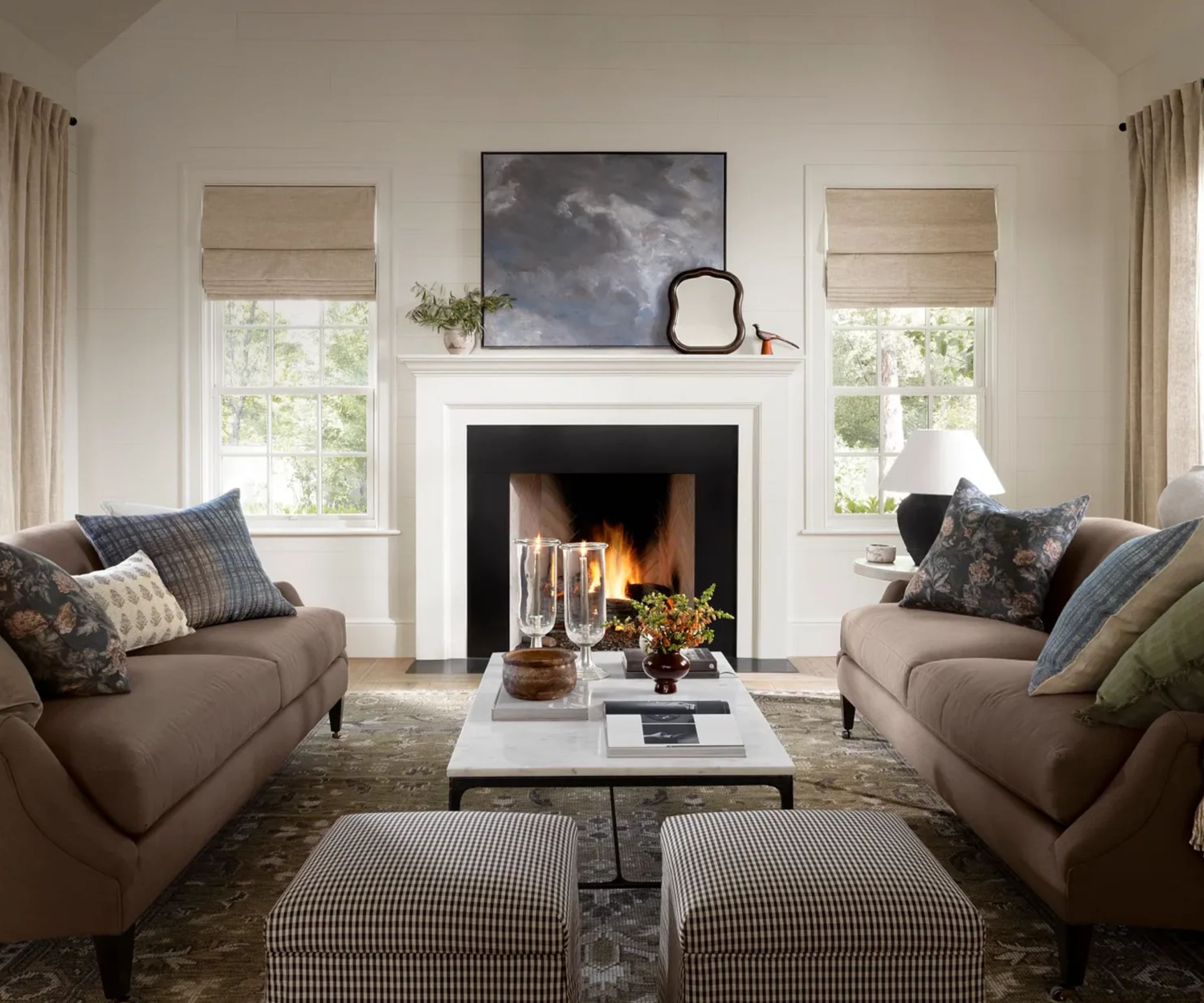
While a glance at your outdoor fall decor ideas and the natural surroundings that inspired them will likely serve you with ample chromatic inspiration, we’ve gathered 10 stunning ideas on how to integrate color trends into your home for the season, and asked the experts to highlight their favorite hues and combinations to help you get it right.
1. Rich burgundy
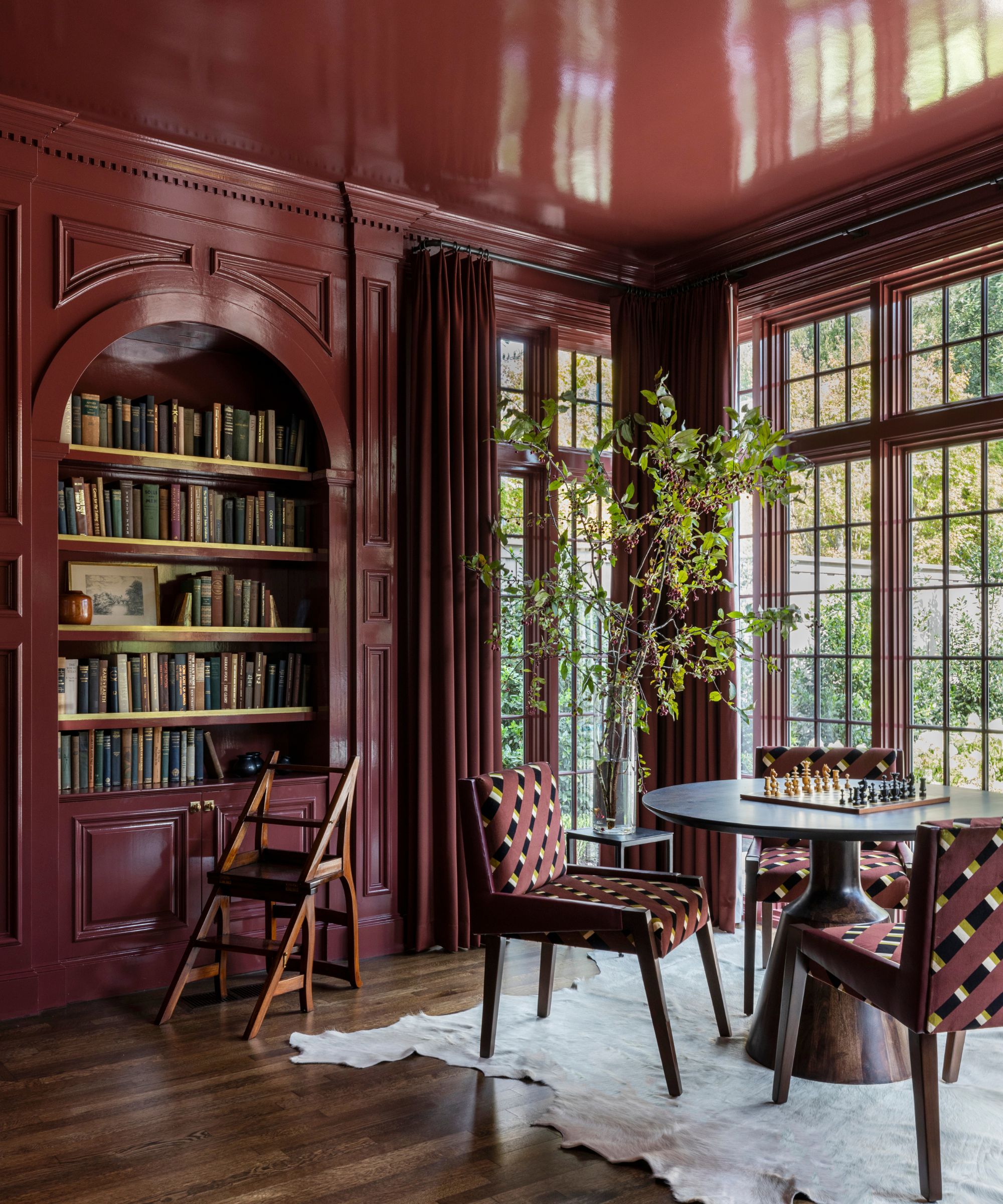
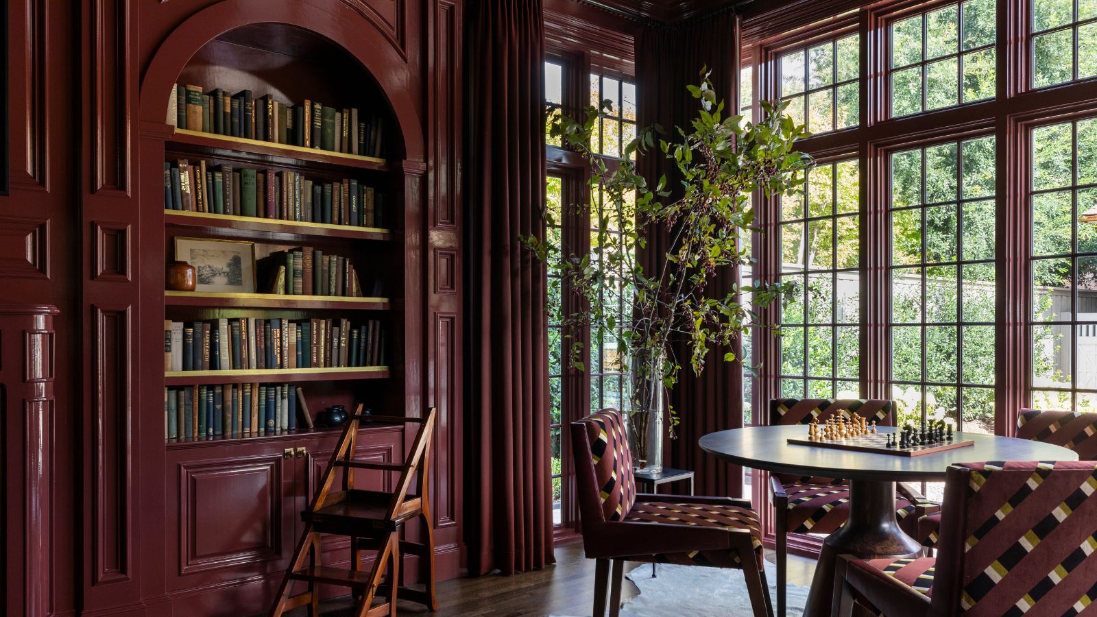
Perhaps the ultimate interior indulgence, sumptuous red room ideas are a daring choice, but inarguably enveloping when done right. Rich, bold, and deeply sophisticated, decorating with burgundy is one of the most enduring trends of the past year.
Its wine red undertones create instant warmth, making it the perfect choice for spaces where you want a sense of drama and coziness. 'I love the continued presence of oxblood and deep reds; they offer a grounding warmth that feels both timeless and modern,' says interior designer Marie Flanigan. 'When paired with natural textures like wood, plaster, or stone, these shades create rooms that feel soulful and inviting, while still carrying an elegance that lasts well beyond the season.'
‘Deep maple reds from Farrow & Ball’s Blazer to Preference Red make for the perfect fall living room palette,’ adds Patrick O’Donnell, brand ambassador for the brand. ‘Brick reds and rich mustard yellows look beautiful together,’ adds O’Donnell. ‘Use empathetic whites to balance the tones and avoid the room looking too cloying.’
Design expertise in your inbox – from inspiring decorating ideas and beautiful celebrity homes to practical gardening advice and shopping round-ups.
For those hesitant to commit to painting walls, try weaving it into your room with pops of unexpected red in cushions, rugs, or drapes. Although a burgundy kitchen would look moody and chic year round.
2. Burnt orange
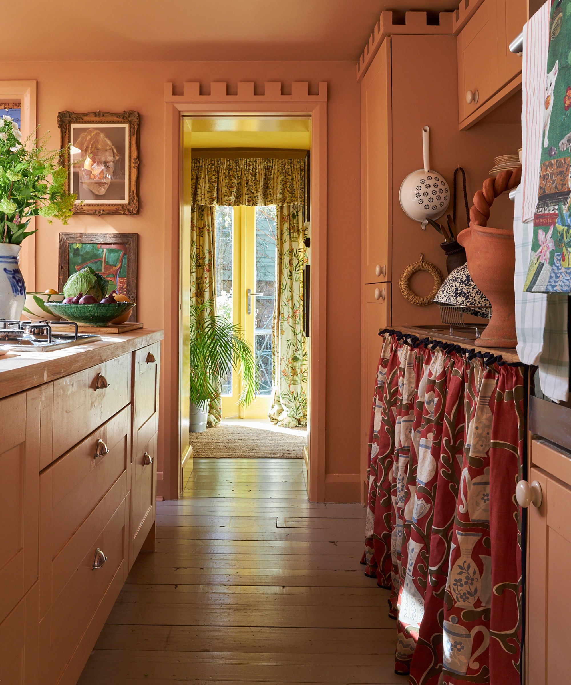
Few colors capture the spirit of fall as effortlessly as burnt orange. If you’ve started scouring the sidewalk for the most vibrant leaves to inspire your fall wreath, don’t let the inspiration stop there.
Decorating with orange will wrap a cozy layer around any room. ‘Where we put on coats, scarves, and gloves, your home needs extra rugs, throws, and patterns,’ adds Martin Waller, founder of Andrew Martin. ‘Think burnt oranges and deep red tones in rugs and cushions just like the scattering of autumnal leaves.’
'Burnt orange is the color of the season, but pairing it with something unexpected makes it feel fresh,' suggests Kailee Blalock of House of Hive Design Co. 'We love seeing it alongside lavender or deep eggplant purple. That balance between a warm, autumnal shade and a moody or playful contrast feels elevated, while still very much tied to fall.'
Helen Shaw from Benjamin Moore however, suggests a more earthy color combination: 'Earthy oranges, deep terracotta, and soft amber hues are mood-lifting and enveloping, especially when paired with grounded shades like olive green, bark brown and deep red for tonal depth.'
3. Chocolate brown
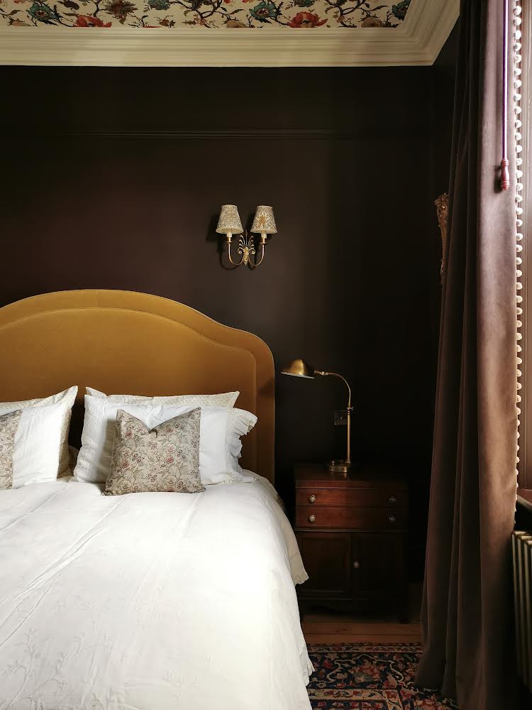
Deep and comforting, brown room ideas are emerging as one of the most stylish colors to embrace this season. And while it might seem a little outdated, decorating with brown is far from boring – as the nights draw in, it’s time to embrace the dark side.
‘As summer rolls into fall, the natural palette gently shifts to colors of spice and amber that inspire our interior choices,’ says Patrick O’Donnell from Farrow & Ball. ‘Mix together earth browns, rich chocolate tones, and the softest, most nuanced of whites. Rich browns such as Farrow & Ball’s earthy Broccoli Brown are an elegant yet practical choice for a fall color scheme.’
Designer Chantelle Hartman Malarkey is also a proponent of dark hues this time of year. ‘Deep browns add a beautiful element to the bedroom,’ she says. ‘It is a neutral color so it looks great and has a calming feel which you are looking for in a principal bedroom, but it is also a rich color so it’s warm and cozy.’
Because of its versatility, chocolate brown works beautifully across a range of styles. It can read traditional when paired with mahogany furniture and brass accents, but feels sleek and modern when contrasted with crisp white or warm neutrals.
4. Jewel tones
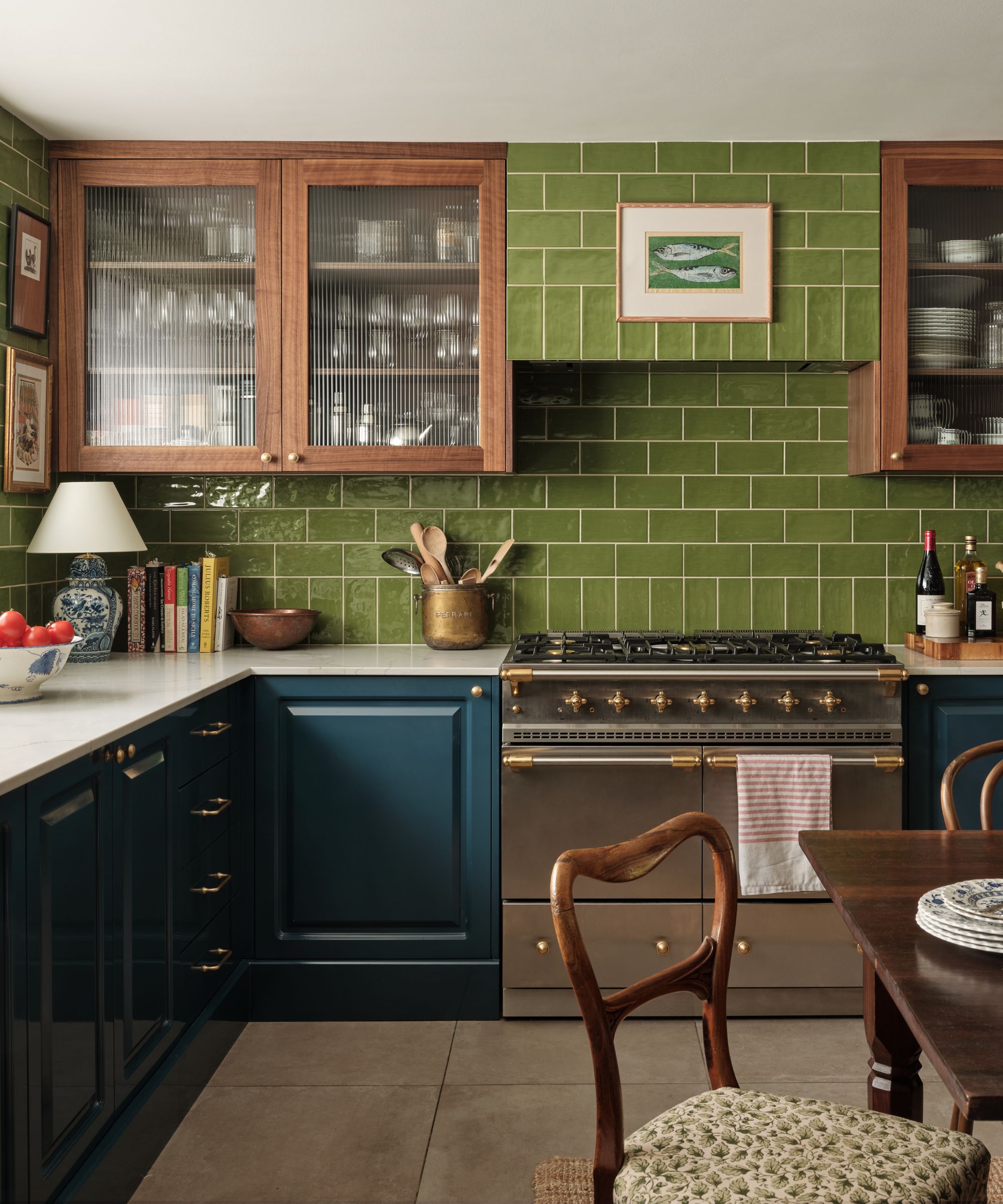
When it comes to fall decorating, jewel tones are a perennial favorite for their depth and drama. Shades like emerald, sapphire, amethyst, and ruby offer a richness that feels instantly luxurious while still being cozy enough for the cooler months.
‘You want to look for rich colors and tones such as deep forest greens and burnt oranges,’ suggests Chantelle Hartman Malarkey. ‘Jewel tones are great for fall colors. You can incorporate these colors in blankets, rugs, and throw pillows and rotate them with the seasons.’
While typically vibrant and verdant, the experts this year advise sticking to a more muted iteration. 'Jewel tones are present this year, but not in their usual opulence,' adds Helen Shaw. 'This season, they appear chalky, muted or matte – think dusky garnets, stormy sapphires and mossy emeralds. These hues have a softness that feels quietly luxurious.'
'When I think of fall color schemes, I’m drawn to palettes that feel layered and collected rather than seasonal in a fleeting way. Muted gem tones, think mossy greens, smoky sapphires, and soft amber, bring a richness to a space without overwhelming it,' agrees Marie Flanigan.
5. Biophilic shades
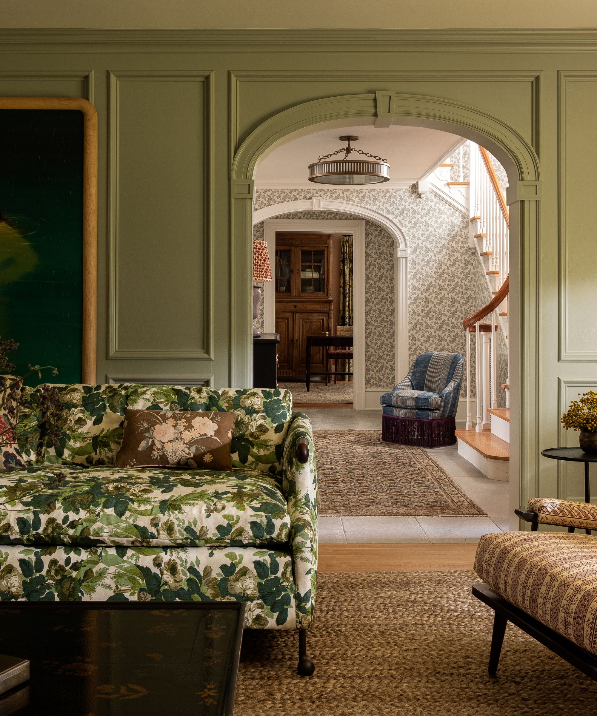
Drawing inspiration from the natural world, biophilic design – think moss green, olive, sage, and even earthy clay – are an essential part of fall decorating. These hues bring the outside in, grounding interiors in a way that feels both restorative and timeless.
‘Biophilic colors like your sage greens and terracotta like have a cocoon-like feel that can be soothing in your space,’ says Dan Mazzarini, principal and creative director of BHDM Design. ‘Layer in these tones with pillows and throws, or drapery which can easily be swapped as seasons change.’
‘Autumn colors aren’t just about warmth,’ says Artem Kropovinsky of Arsight. ‘Consider decorating with green with hints of pale teal or fresh green, reminiscent of a brisk fall daybreak. It’s a gentle change from the typical fiery shades.’
For those wanting to keep things fresh, biophilic shades also pair beautifully with some of fall’s more dramatic colors. A deep forest green sofa can be softened with burgundy cushions, or sage walls can provide the perfect backdrop for warm ochres and rusts. And the beauty of these shades is that they’re timeless and trend-proof – they don’t just belong to fall
6. Golden ochre
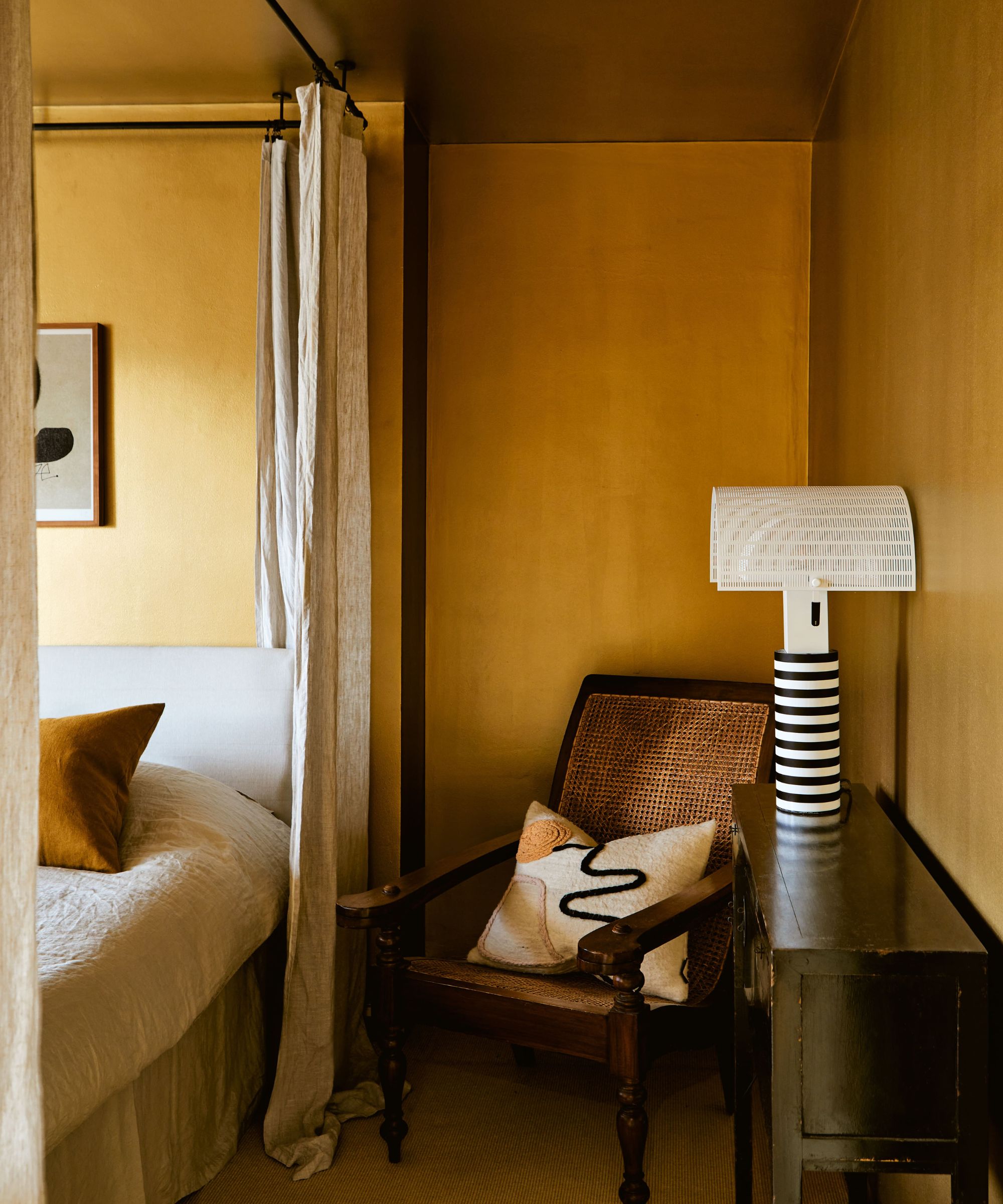
While butter yellow was the breakout shade of summer, fall calls for a deeper, more grounded take on the hue. Ochre and golden tones are replacing butter yellow are offer the same warmth with added depth that feels right for fall.
Where butter yellow brought a breezy freshness, ochre steps in as its richer, earthier counterpart, creating a palette that transitions seamlessly into the cozier months. If you’re missing the sun already, welcome it back into your home by sprinkling shades of yellow throughout your space.
‘Our wonderfully rich ochre India Yellow is a perfect choice for an interior that echoes the season outside. With its rich, rounded ochre notes, is a beautiful backdrop to an awkwardly lit room or will positively glow in a south-facing room drenched in autumnal light,’ adds Patrick O’Donnell. ‘Layer it with strong contrasts for all-year relevance such as darker tones like Down Pipe for a bold counterpoint!’
Instead of embracing paint for your yellow room ideas, why not enrich a room with accents of yellow through furniture, accessories, or even artwork?
7. Deep eggplant
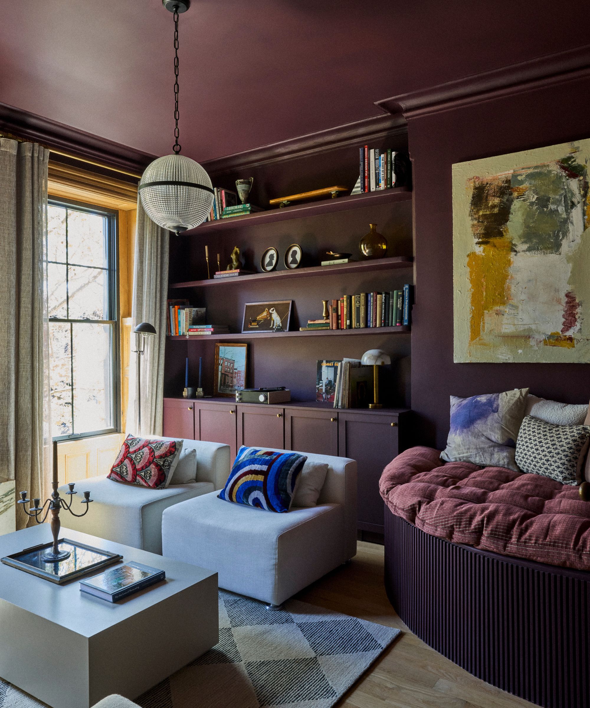
It might surprise you that purple has made a comeback, and decorating with deep shades of eggplant is one of the boldest ways to nod to the harvest season.
Sitting somewhere between purple and brown, eggplant is one of those shades that immediately elevates a space. It has a regal quality, but when styled right, it also feels cozy and approachable.
'So many of us have become more color confident over the last few years, that this fall is the time to take the plunge and redecorate at least one room in a rich color,' says Helen Shaw. 'My favorite way to achieve this is to go bold. For the ultimate statement, create an ultra-luxe, all-encompassing, floor-to-ceiling finish in one color, such as a lustrous, deep shade of purple.'
For those less keen on purple as a wall color, eggplant-colored textiles such as velvet curtains, cushions, or a plush rug can add just the right touch of richness.
8. Smokey blues
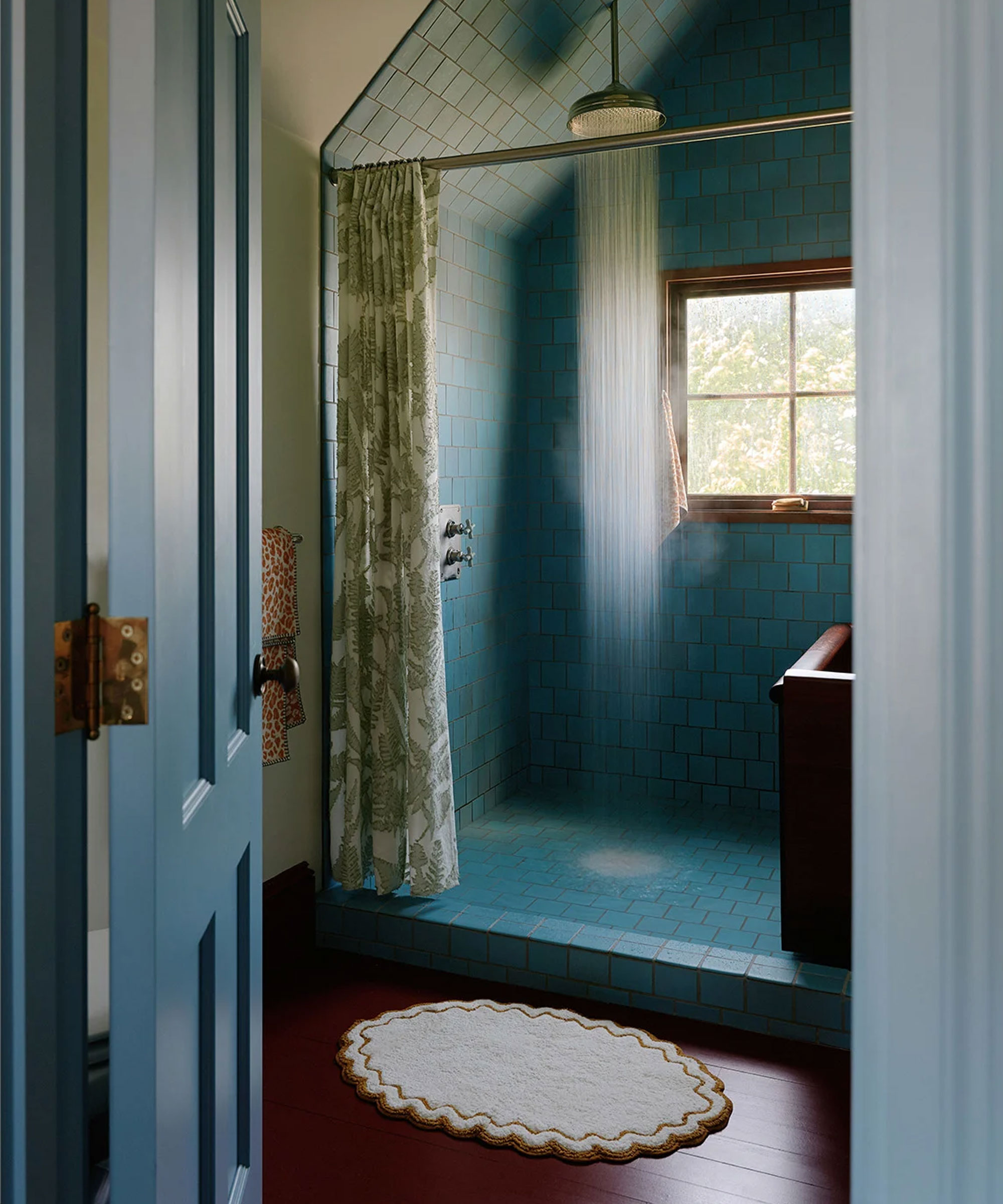
Though blue is often associated with summer, the right blues can bring a moody, cocooning quality that makes them ideal for fall. Decorating with blue is definitely possible for cozy color schemes, it's all about balancing the cool tones with warming accents and layering the space with plenty of cozy, inviting texture.
'This autumn and winter is all about considered depth and understated confidence. Rooted in rich, evocative tones, the season leans into grown-up palettes that are sophisticated rather than shout for attention,' adds Helen.
'At the heart of the trend are shadowy teals, complex blues and softened mauves. These shades have an almost moody quality about them, creating a sense of atmosphere and depth that feels both timeless and forward-looking.'
Smokey blues work beautifully in living rooms and bedrooms, where their restful nature can create a serene atmosphere. Muted blues feel timeless in a bathroom or kitchen because they pair so well with both warm and cool tones – and you can soften them with creams and warm woods for a cozy effect, or sharpen the look with charcoal and brass accents.
9. Warming neutrals
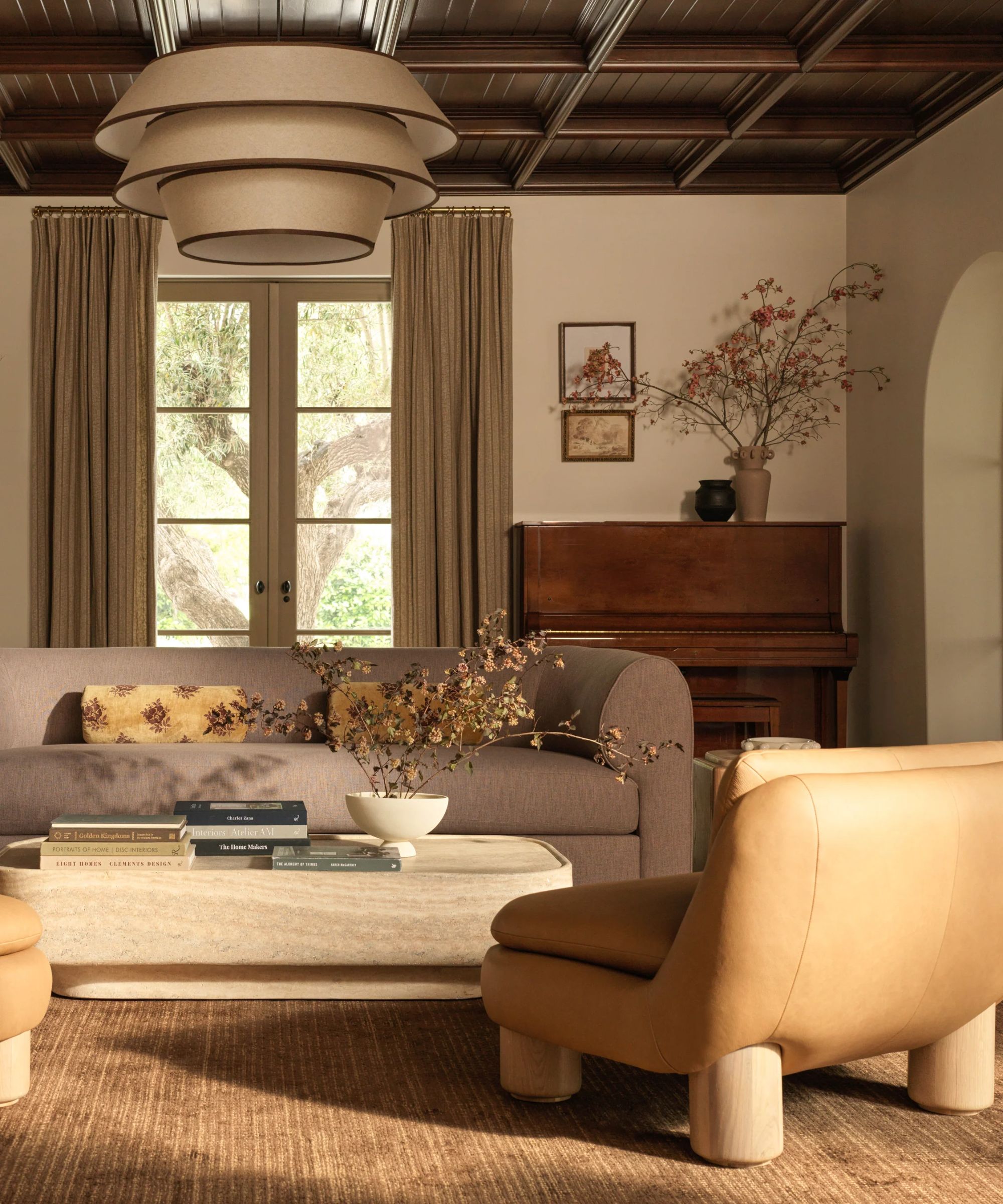
While bold shades often steal the spotlight in fall, minimalists will be pleased to hear that it’s the warm neutrals that tie a seasonal scheme together. Think decorating with neutrals like creamy beiges, warm grays, and sandy tones to create a versatile and warm color scheme.
‘For the fall, I like to use muted versions of the traditional fall colors instead of overwhelming bright colors and patterns,’ says Jennifer Verruto, founder and CEO of Blythe Interiors. ‘By ridding your home decor of bright, garish colors, you’ll create a more calming and inviting space, which is the perfect vibe for fall.'
‘I recommend incorporating a more neutral color palette through cream, beige, and sage green decor. Then, layer pops of color and texture to create a welcoming atmosphere reminiscent of the harvest season. I like to incorporate natural accents like wooden decor, woven seagrass baskets, or dried fountain grass in a vase to create an inviting atmosphere.’
'For me, autumn is about embracing richness and warmth,' adds designer Lauren Gilberthorpe. 'Earthy shades such as ochre, russet, and moss green work beautifully alongside grounding neutrals. Texture is essential, with natural timbers, linens, and wool bringing depth. Seasonal scents also play a role - adding notes of spice, wood, or smoke can subtly transform the atmosphere of a room and make the shift into fall feel all the more present.'
10. Earthy tones
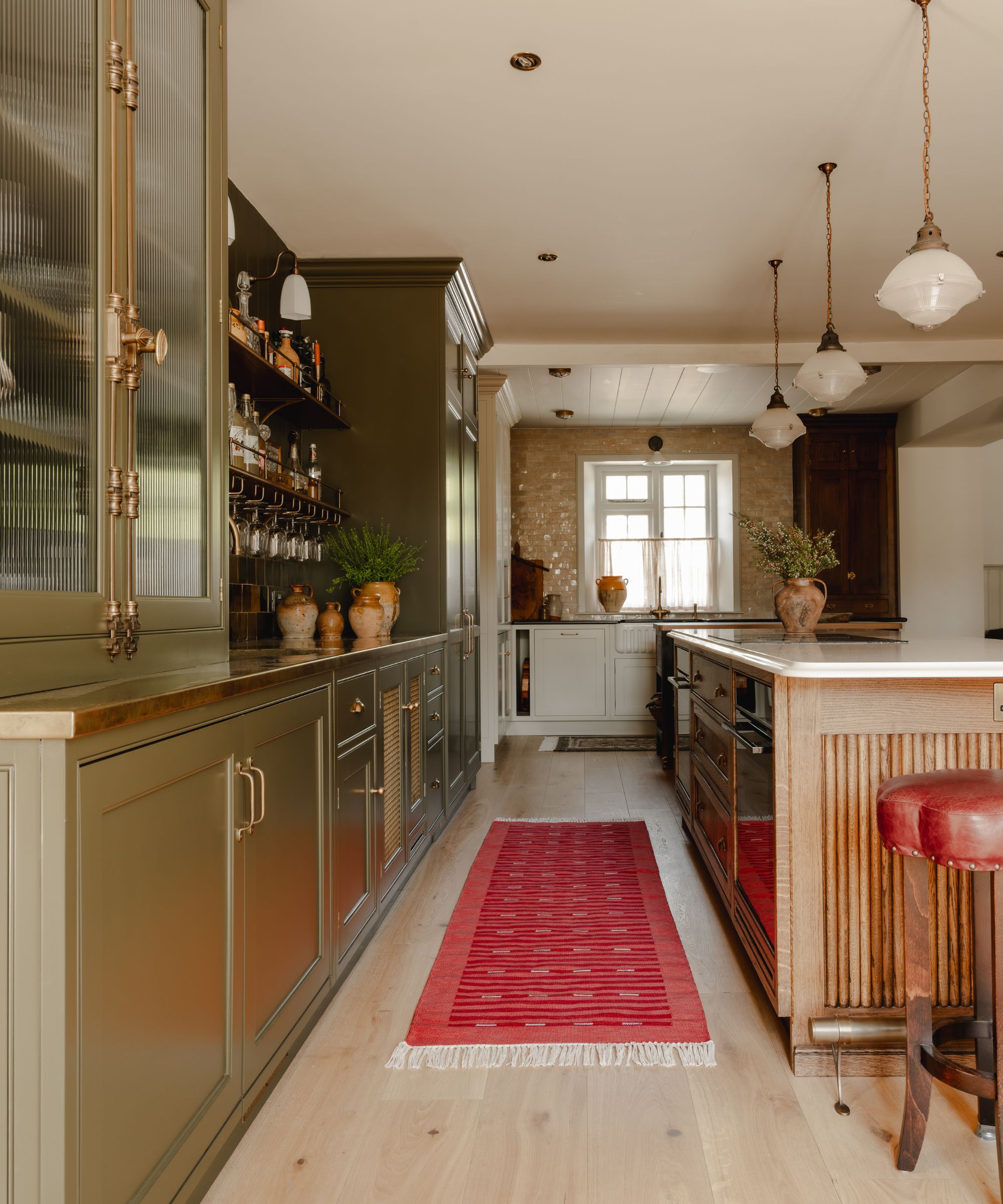
At the heart of every transitional fall scheme is earthy colors. From olive green to mushroom and warm sand, these shades have an inherently calming effect and are timeless year round.
‘A palette of muted tones is the perfect way to bring a cozy feel in cooler months, and rich earthly shades offer an instant connection to nature, creating an ambiance that is calming and tranquil,' says Stefan Ormenisan, creative director of MindTheGap.
'Opting for a more refined palette such as this is also an excellent way to easily introduce a mix of patterns, where the muted colors act as a unifier for a mix of differing scales and motifs. It is also an easy palette to update, simply by adding a pop of color with a brightly colored cushion or throw.'
Whether used on walls, floors, or through smaller decor pieces like vases and textiles, earthy tones offer a grounding element that never goes out of style.
Shop on-trend, colorful fall decor
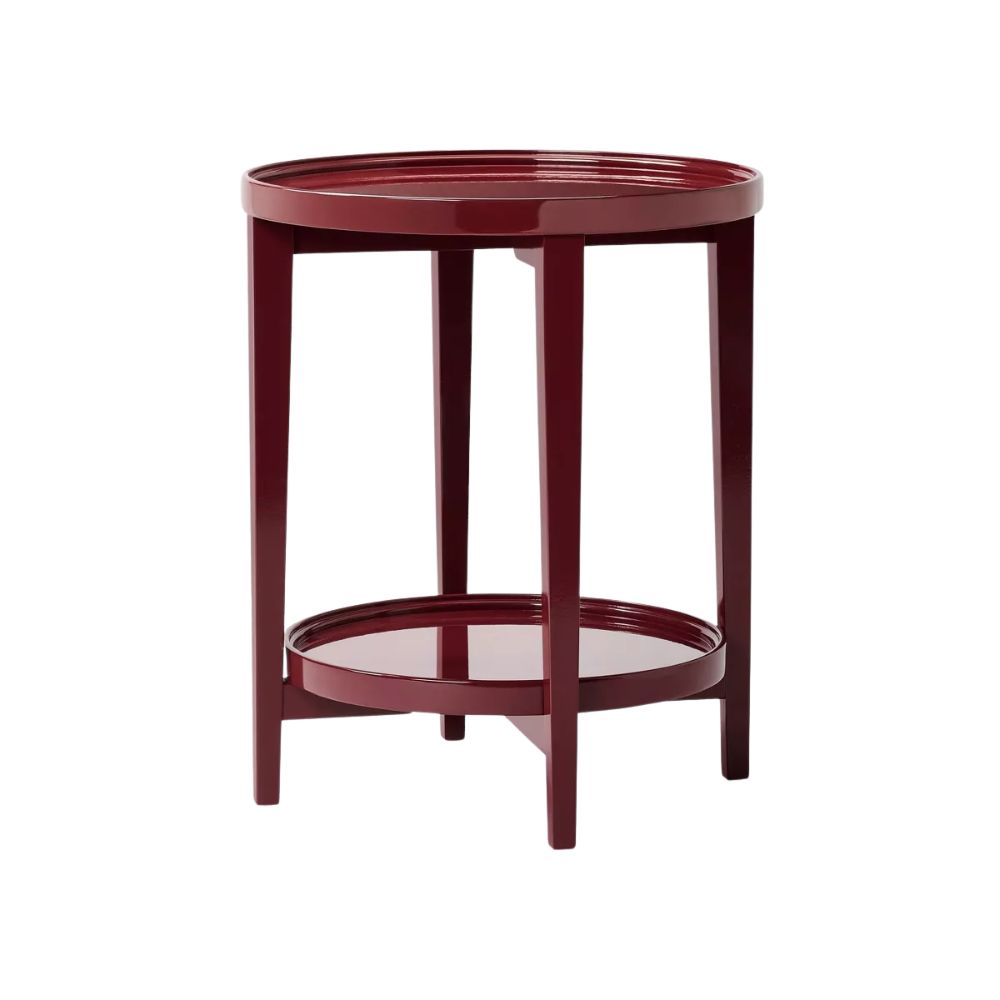
Shea McGee is fully on board with the burgundy fall trend, releasing a range of cherry red lacquered pieces like this statement side table, for her range at Target. Crafted from solid wood and boasting a shelf for storage, this is sure to sell out.
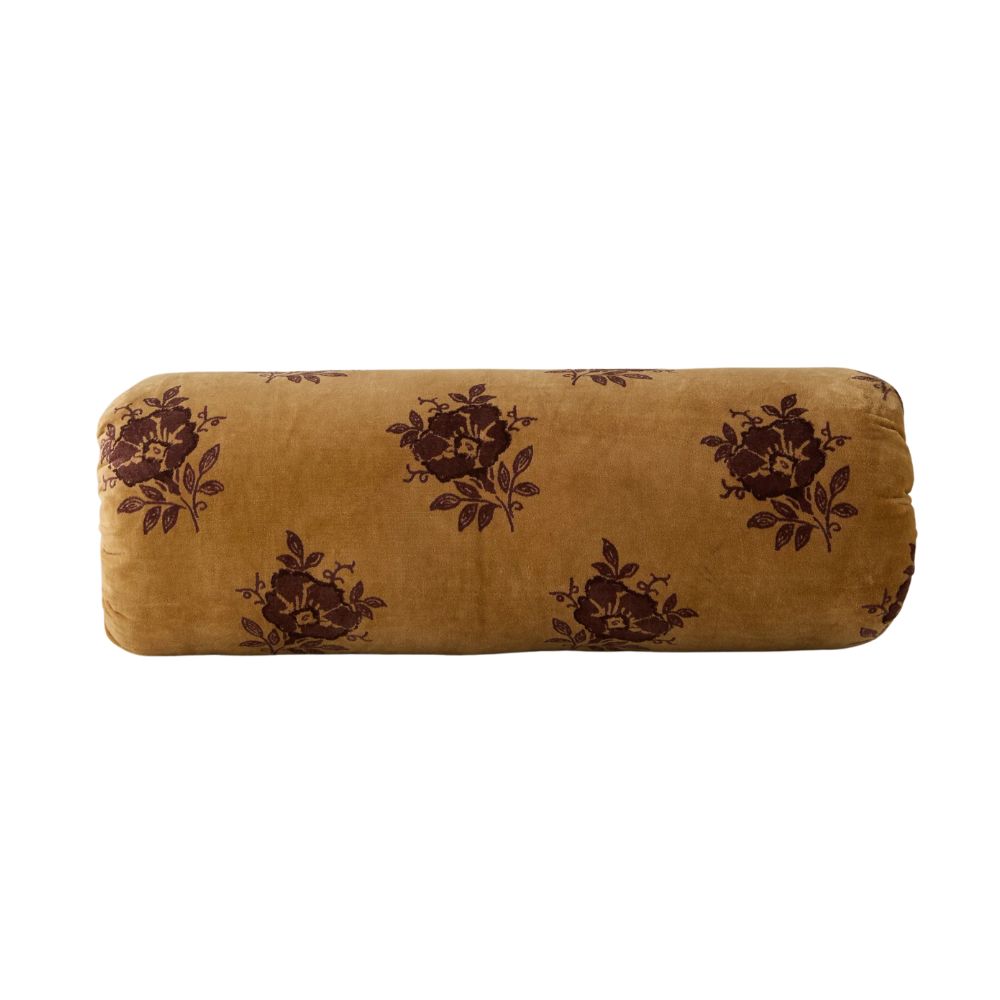
A stand-out from the Lulu and Georgia fall collection, this sweet bolster pillow is covered in a rich oche velvet and adorned with block print florals that lend a depth to the palette.
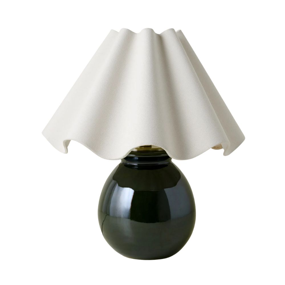
Joanna Gaines' Magnolia fall collection is full of beautiful lighting and this sculptural table lamp is just one of the pieces we have our eye on for fall. Finished with a whimsical linen scalloped shade, it's bold table lamp brings in some fall tones too.
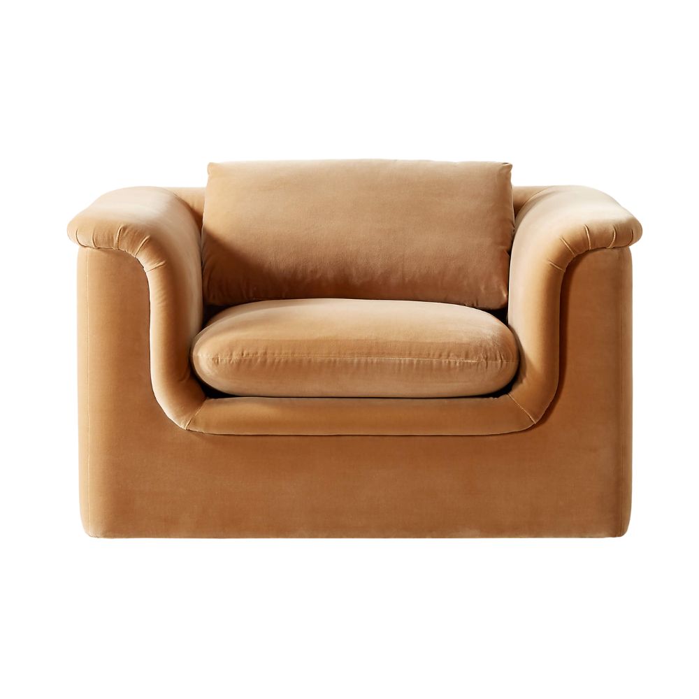
If we could picture the perfect reading nook chair, it would be this. Designed by Melbourne-based creatives VUUE, it has been made with a low-slung profile that invites you to curl up into its caramel upholstery.
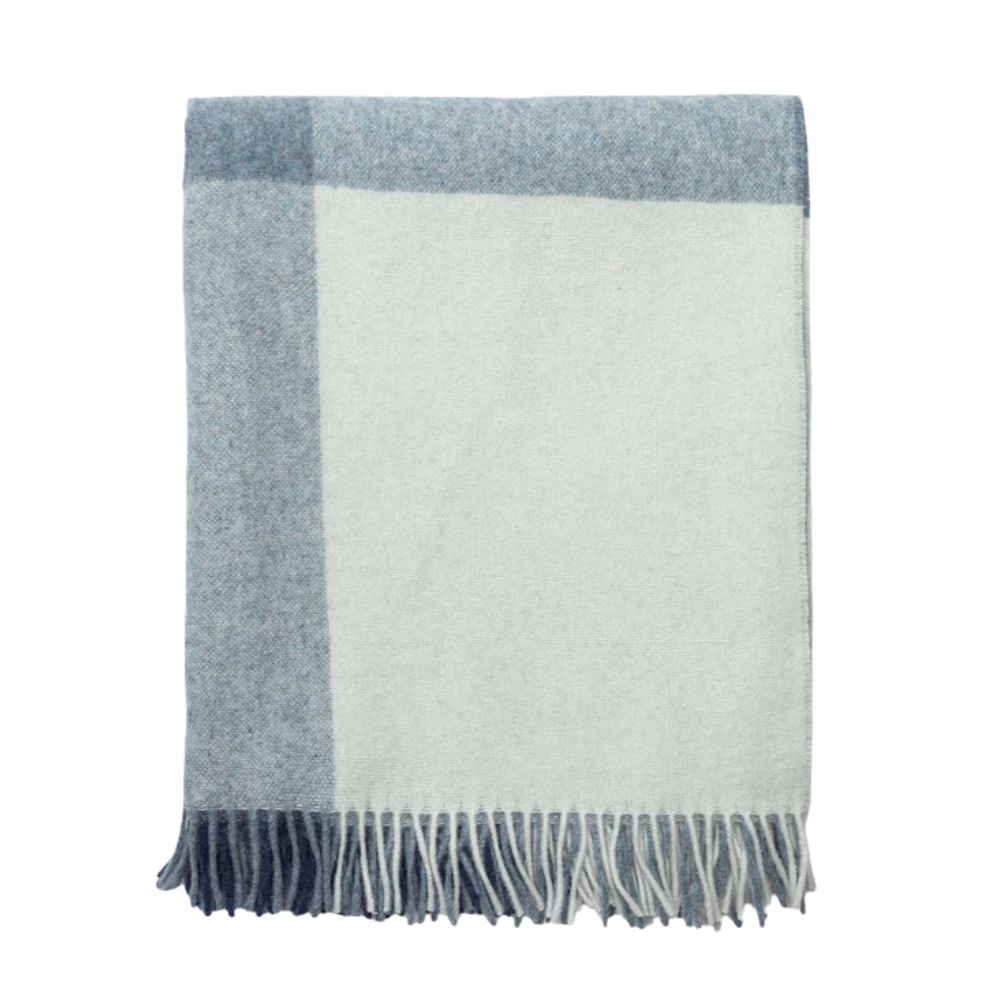
Just dropped in the McGee & Co. fall collection, this cozy throw is more than just a plaid blanket. It's recycled alpaca and sheep wool composition boast an eco-friendly design, while adding to its tactile warmth.
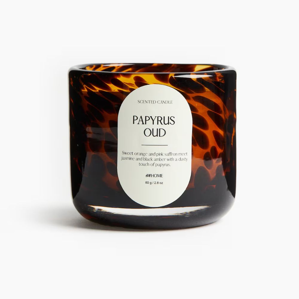
While the Living team are raving about H&M's dark honey candle, the Papyrus Oud has caught the style teams eye thanks to its smoky take on sweet citrus scents that remain uplifting all year round.
FAQs
What are good fall colors?
The best fall colors are the ones that remind you of the natural world during these unique months. This can range from the season’s idyllic aspects to its less bucolic but equally atmospheric characteristics.
The color of falling leaves and plump pumpkins, orange will always be at the center of a fall palette. For a contemporary take, look to burnt oranges, coppers, and terracottas. For a wider view of warm colors, head to its complementary hues, red and yellow. To keep both feeling autumnal rather than aggressive, add a little brown and explore ochre shades. Brown itself is a fall staple, and pretty much anything on its tonal spectrum is valid.
Green has been having a big year with everyone craving sometime in the great outdoors, so also look for shades of this hue with brown undertones, like olive and sage. Cool colors can also feel autumnal and kept muted, so consider inky blues and aubergine.
'There’s also a notable shift in how colors typical reserved for spring-summer are being reinterpreted for cooler seasons,' adds Benjamin Moore's Helen Shaw. 'Soft pinks and pale blues reappear with greater saturation and contrast, lending a fresh energy to autumnal pairings. When teamed with deep rusts, merlot reds and burnished metallics, these lighter tones are delicate yet grounded, playful yet poised.'
How to decorate tastefully for fall
You may be wondering how to decorate tastefully for fall to herald the special season without overtly, or even worse, tackily plastering fall-themed merchandise around your home.
To avoid seasonal decorating cliches, one of the easiest ways to decorate tastefully for fall is to introduce some of these color ideas above in subtle ways that gently ease your existing schemes into fall.
'Color this season isn’t about following a formula but about layering in ways that feel lived-in and personal,' says designer Nina Lichtenstein. 'Chalky whites and misty grays continue to anchor spaces, but they’re joined by russet reds, golden ochres, and deep fig purples. These tones don’t scream seasonal. They hint at it, bringing warmth and sophistication without cliche.'
'Olive green has emerged as a surprise neutral, pairing beautifully with earthy terracottas and even soft blush,' she adds. 'For those drawn to moodier interiors, inky blues and charcoal balance the warmth of these hues with grounding depth.'
Refreshing your throws and cushions in the colors of fall is a simple and easy way to switch up your decor for the season, as interior designer, Brooke Spreckman says, 'one way to incorporate fall into your home is through re-doing your throw pillow covers with a new color palette. If you have lighter tones, try swapping all of them out with a richer palette of fabrics.'
Combining textures is also a great way to add visual as well as tactile interest during holiday seasons to avoid using stereotypical patterns such as leaves, pumpkins, and mushrooms as so frequently adorns festive throws this time of year. While there is nothing wrong with traditional motifs, they can quickly overwhelm a space when extensively used.
How to make a home cozy for fall
How to make your home cozier is a question so many of us are asking right now as we transition out of summer and into autumn. The good news is, it really needn't mean an entire overhaul, simple and affordable switches are all it can take to bring your home out of summer and make it cozier for fall and winter.
There are several ways you can make your house cozy for fall including swapping your textiles for thick throw blankets and cushions, especially in natural materials such as wool that instantly make any space feel cozy and inviting.
'As the crisp air of fall arrives, it’s the perfect time to embrace a cozier ambiance in your home. Consider swapping out your light summer accents for a richer, moodier palette. Think deep jewel-toned velvet pillows and plush throws that invite warmth,' suggests Marie Flanigan.
'Incorporate textures like velvet and wool, replacing linen with these heavier fabrics to create a space that feels both luxurious and inviting. Layering these elements will not only add depth to your decor but will also make your home a welcoming retreat as the temperatures drop.'
Layering in interior design is important no matter the time of year, but it really plays a role when making a house cozy in the fall. 'You can never have too many autumnal throw pillows and fuzzy cashmere blankets!' adds designer Kathy Kuo. 'These easy additions to any living room really go a long way in creating a sense of coziness. I also love adding a couple seasonal scented candles or oil diffusers in really beautiful vessels.'
Of course, the lighting changes outside as we move into fall, getting softer and darker. Inside your home, lighting can change too to match those shorter days and longer nights. You want to go soft and layered, pools of warm light throughout rooms to invite you with lamps and your best candles.
‘One can't really feel the full extent of fall approaching without the gorgeous smells of fresh pine, sweet cinnamon, spiced pumpkin, bergamot, or the notes of amber and leather,’ adds Mehreen Baldoni. ‘My personal favorite is Diptyque’s Maquis, available at Amazon, which has just the perfect amount of amber and leather with subtle notes of sun-dried earth which makes you feel so close to nature.’
When making a house look cozy for Fall, it helps to declutter before Fall to make the space feel intentional, and not cramped. This process should include getting rid of any summer decor you didn't resonate with this year and clearing out any Fall decor you don’t like when pulling pieces out of seasonal storage. This not only makes your home feel less overwhelming, but makes space for you to find some new seasonal pieces too.

Charlotte is the style and trends editor at Homes and Gardens and has been with the team since Christmas 2023. Following a 5 year career in Fashion, she has worked at many women's glossy magazines including Grazia, Stylist, and Hello!, and as Interiors Editor for British heritage department store Liberty. Her role at H&G fuses her love of style with her passion for interior design, and she is currently undergoing her second home renovation - you can follow her journey over on @olbyhome
- Emily MoormanContributing Writer
- Zara StaceyManaging Editor