Which neutral colors are on trend for 2024? Designers' top choices for the year ahead
Decorating with neutrals in 2024 is all about warm tones

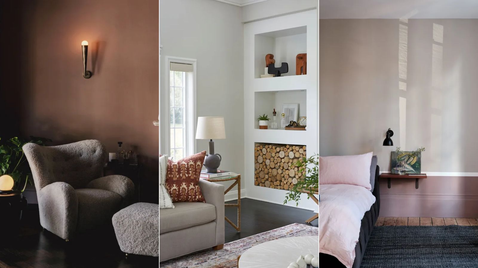
When color trends are predicted for the year ahead, we often focus on the daring, saturated, and stand-out shades. But neutral colors shouldn't be overlooked – these tranquil shades play a significant role in almost every home.
Within the neutral category, the range is expansive. From warm-toned to cool; light to dark, there are so many neutral colors that create equally calming and pared-back interior schemes. While neutrals don't tend to date so quickly as bolder colors and can feel more timeless, it's still worth knowing which are the most preferred amongst designers for 2024.
Below, we've rounded up the color trends that interior designers will be reaching for the most when it comes to decorating with neutrals this year. As we expected, this year it's about embracing warm tones – seeing popular browns replace once-loved cool grays.
1. Chocolate brown
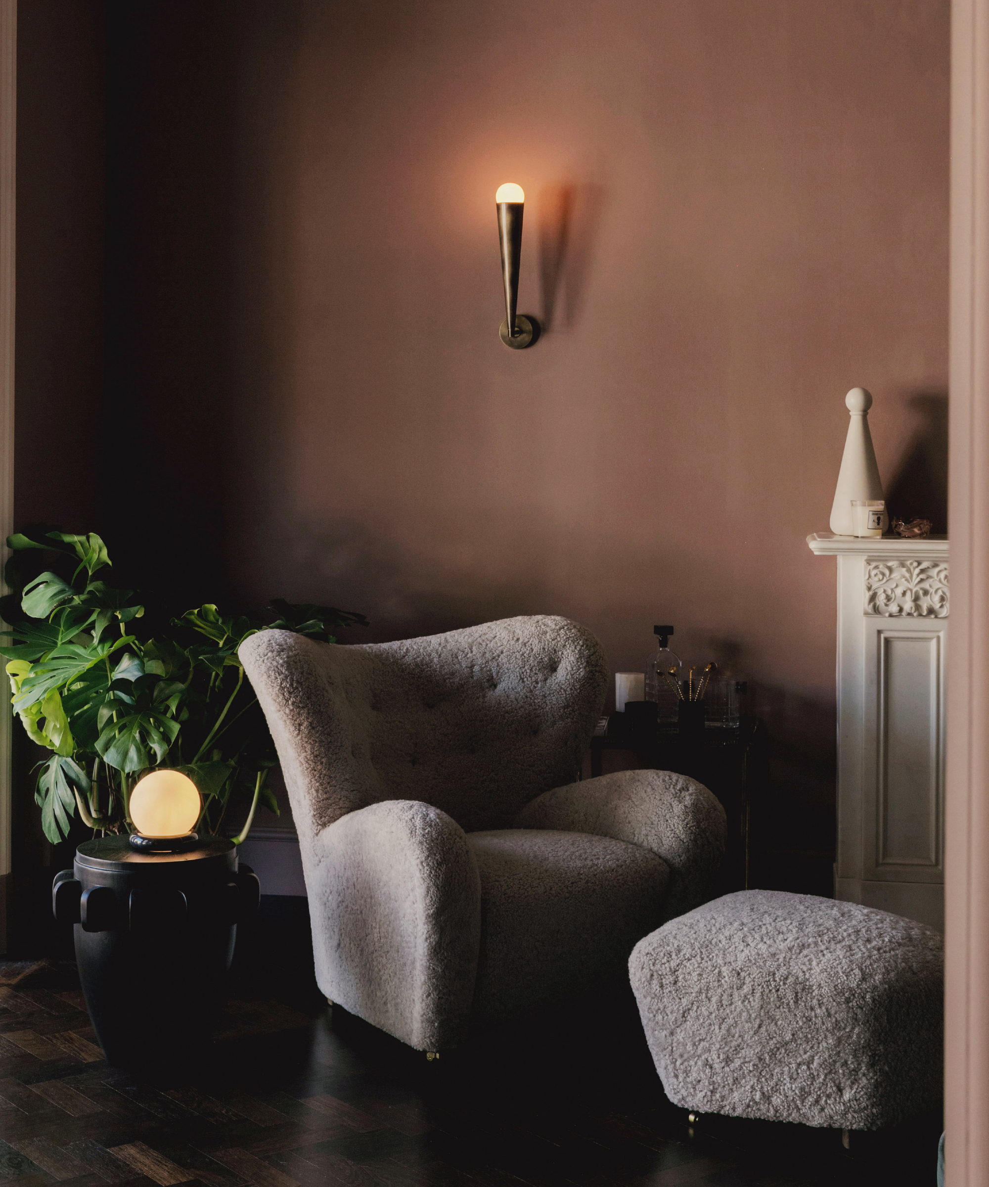
It comes as no surprise to see chocolate brown predicted to be a standout neutral color for 2024. The trend for decorating with brown began to emerge last year and we're increasingly seeing designers and homeowners embrace these tones to create deeply cozy and inviting spaces.
'Brown is a color we will see more in 2024,' predicts interior designer Soledad Alzaga. 'It's considered a neutral and versatile color that can be a backdrop for different design styles. Brown tones, such as beige, taupe, or chocolate are warm and earthy, creating a cozy feeling and bringing a touch of nature inside. These neutral colors add depth and sophistication without overpowering the overall aesthetic.'
San Francisco-based Interior designer Soledad Alzaga has worked on designs projects in San Francisco, Sonoma, Atherton, New York, Martha's Vineyard, Los Angeles, Mexico and Argentina.
2. Warm white
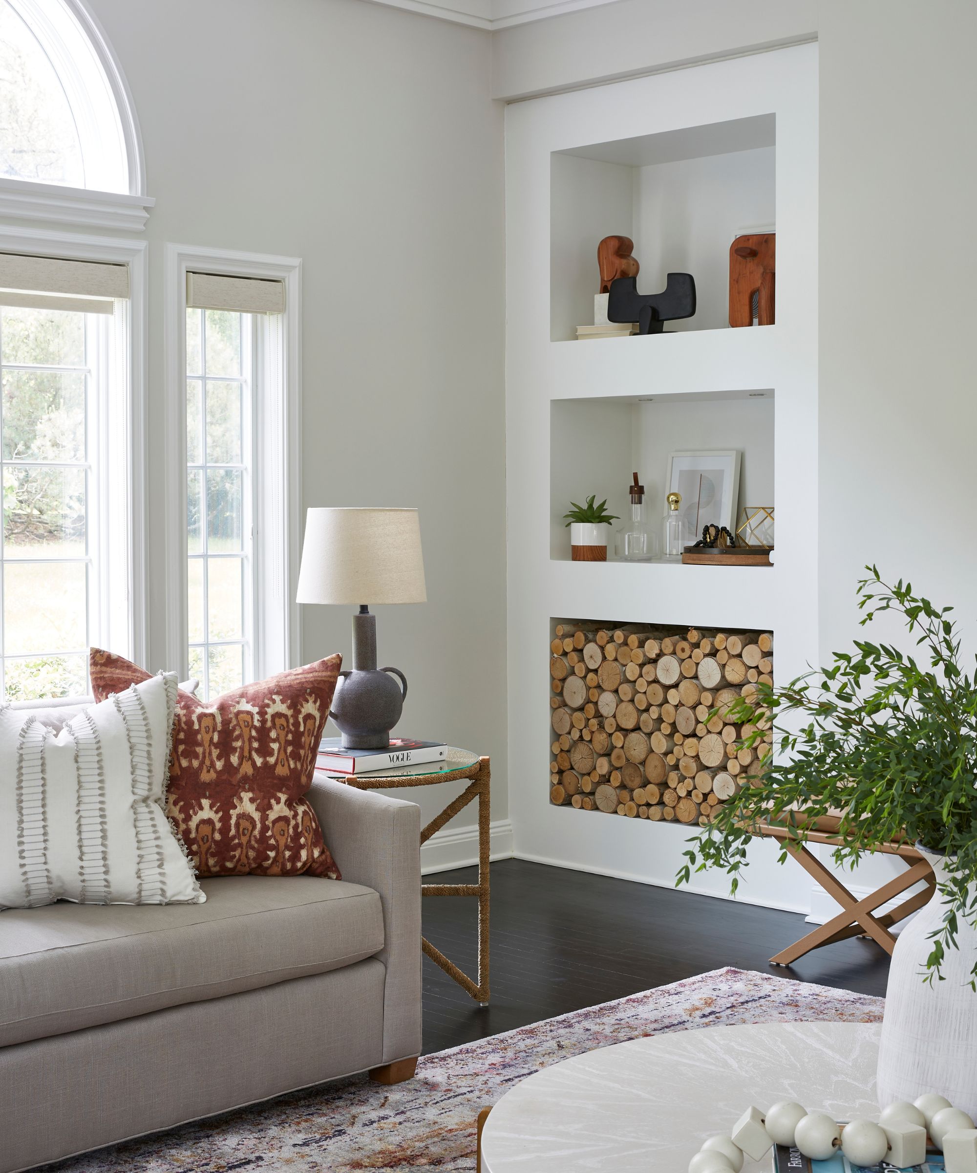
In 2024, decorating with white is all about warm whites. Gone are the days of interiors looking cold and sterile from cool-toned whites – designers are increasingly favoring warm white paints that create that same minimalist and serene look without feeling stark.
'As we enter into 2024, the use of bright neutrals is going to be popular,' comments interior designer Luis Carmona. 'Colors like Alabaster from Sherwin-Williams and Harvest Moon from Backdrop allow the palette of the space to still be neutral, but with some added brightness. Paints like Alabaster help brighten up the space without appearing stark white. The beauty of brighter neutral paints is that they are great at reflecting light helping a space appear larger. The lighter neutrals, like Alabaster, are also neutral enough to play with furniture and art with warmer tones, like taupe and birch wood, as well as cooler tones, like blues.'
Design expertise in your inbox – from inspiring decorating ideas and beautiful celebrity homes to practical gardening advice and shopping round-ups.

Luis Carmona is the owner and lead designer at VERDE Interior Design. With almost two decades of experience in the creative space (interior design, advertising, and marketing), Carmona gets to blend his many passions into one design studio, offering services to commercial and residential clients in both Houston and Dallas.
3. Nature-inspired shades
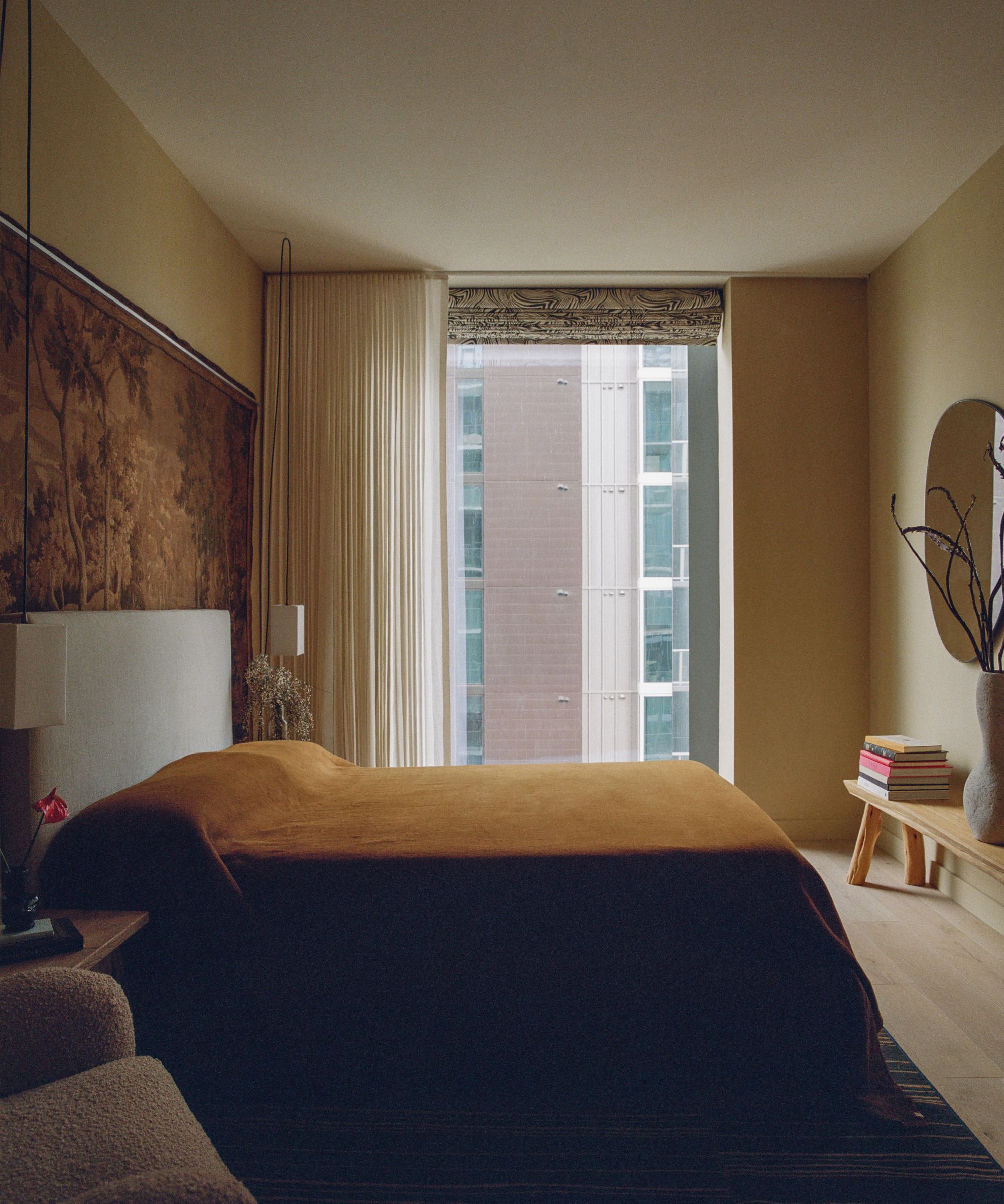
Netuals inspired by nature are also expected to be a standout trend this year. From sand tones to soft blues, there are lots of variations of this trend that will bring a relaxed feel to your space: 'In 2024, the trendiest neutral colors will continue to be rooted in earthy, soothing tones that evoke a sense of calm and connection with nature,' observes interior designer Jennifer Davis.
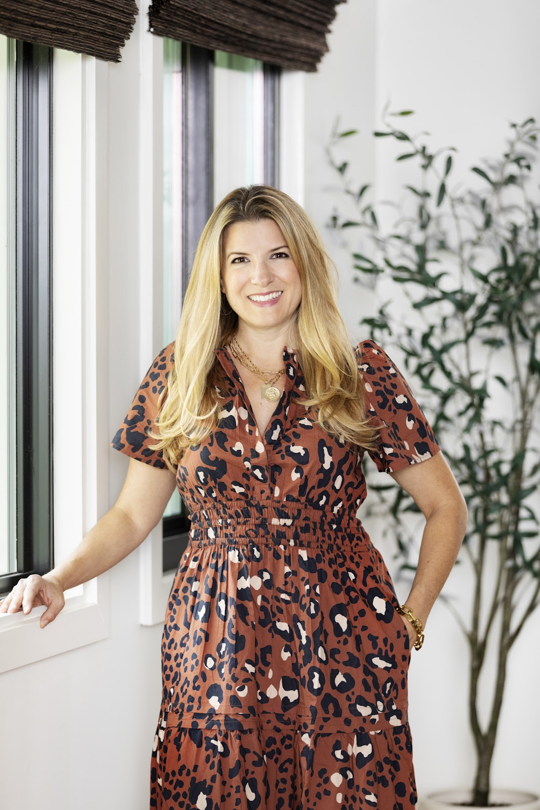
Jennifer fell in love with design at a young age and has been working in the industry for over 25 years. She has developed an eye for detail and a talent for creating timeless designs. Jennifer offers a balance of creativity and forward-thinking with a structured, organized, and detailed mentality. Jennifer is driven by her deep passion for design while curating an exceptional client journey, ensuring pure delight from the very beginning to the end.
'Shades like warm sandy beiges, soft terracotta, and muted olive greens are dominating interior design palettes, reflecting a desire for tranquility and sustainability. Variations of soft blues, such as airy cerulean and dusty slate, are gaining popularity for their ability to add a serene touch to spaces while maintaining neutrality. These colors not only create a harmonious backdrop for various decor styles but also embody a growing inclination towards natural elements and a balanced, serene living environment.'
4. Clay
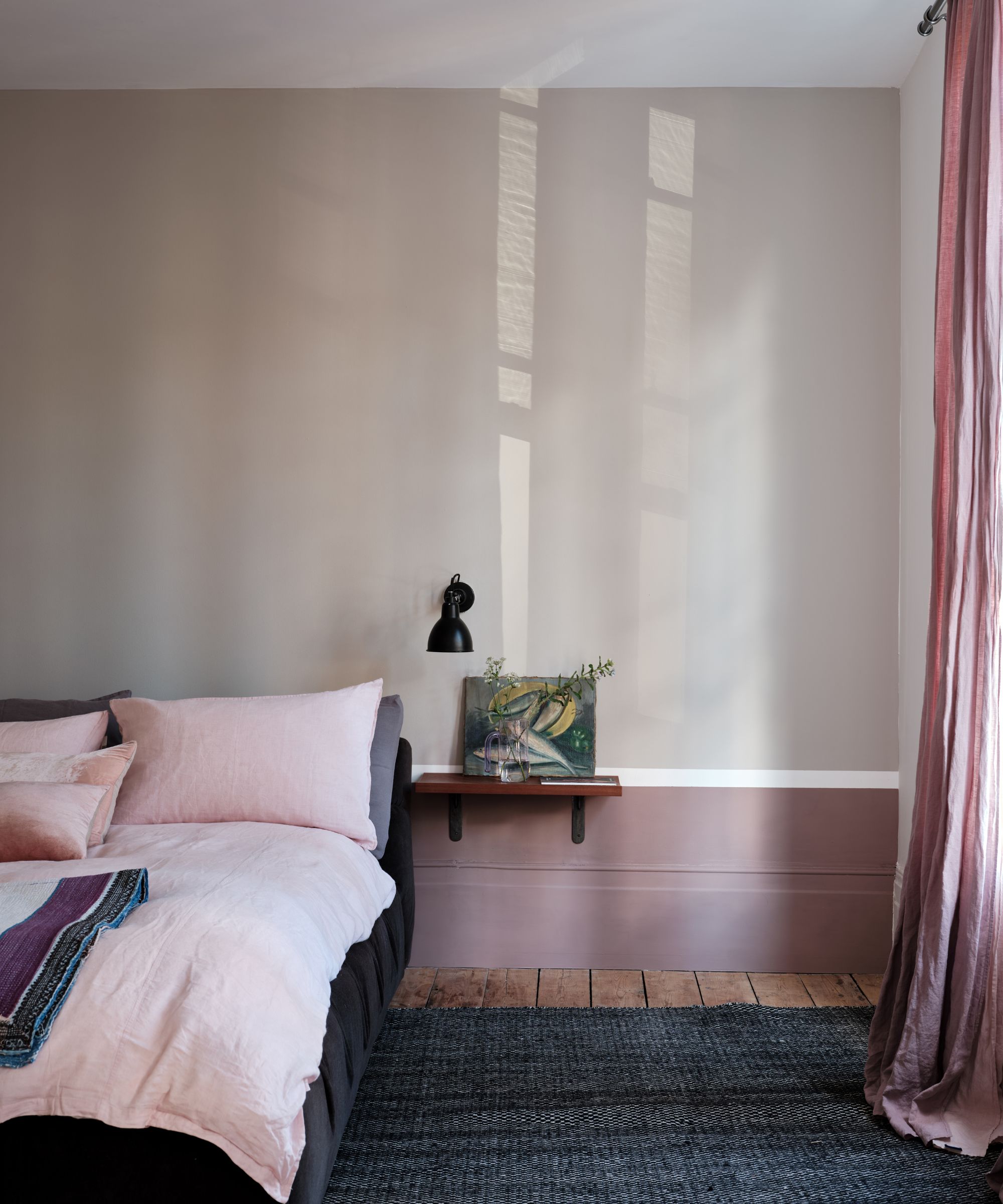
Continuing the theme of earth tones, Farrow & Ball Color Curator Joa Studholme expects to see clay tones embraced in home decor ideas this year. Clay tones are all about mimicking the organic look of this natural material – a good choice if you're looking for something less warm-toned than beige. 'Rich clay tones continue to nurture us in times of uncertainty,' says Joa.
As Farrow & Ball's Color Curator and author of titles including Recipes for Decorating and How to Decorate, it’s no surprise that Joa Studholme knows Farrow & Ball's palette and finishes inside and out. Joa has been with the brand or over 25 years – in that time, she’s developed color ranges and consulted on design projects all over the world, as well as helping countless color consultancy customers to transform their homes.
'The warm tones of Jitney and Stirabout create an earthy, reassuring atmosphere. When used together, they create a harmonious space that’s easy on the eyes. The subtle balance of Jitney on the walls and lighter Stirabout on the panels, ceiling, and trim, result in a beguiling room with an ethereal quality – a wonderful, warm scheme for those who prefer neutral spaces.'
If you're looking to embrace these on-trend clay tones but want to ensure your space remains bright and feels spacious, Joa recommends the following pairings: 'Using a lighter tone like Oxford Stone on the walls and the much stronger Tanners Brown on the trim instantly makes the walls feel lighter and the room feel bigger.'
5. Gray-green
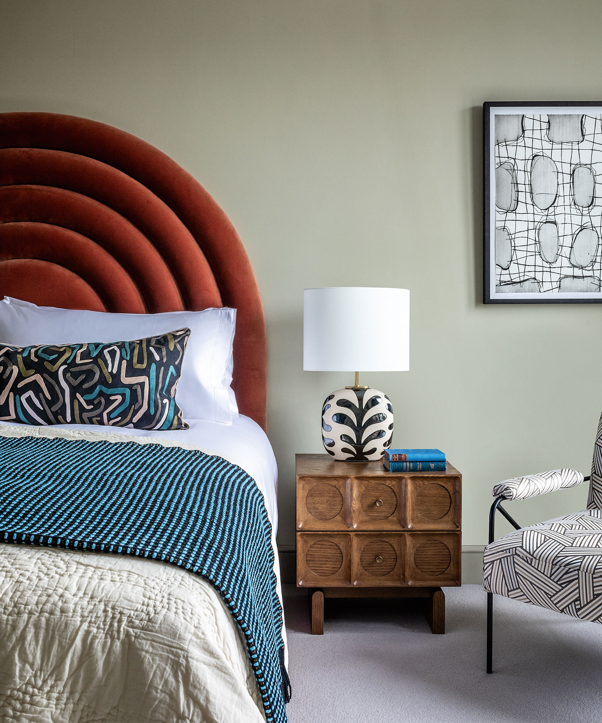
Gray-green is another already-established color trend that's showing no sign of stopping in 2024. Combining the cool tones of gray with green's links to nature, gray-green captures the best of both color trends.
'Forget beige and greige and choose a new neutral instead such as Hazy Skies,' suggests Helen Shaw, Director of Color Marketing at Benjamin Moore. 'This moody gray-green will add a mysterious depth to your space. For a truly luxurious look pair with dark woods, tactile bouclé textiles, and sleek stone surfaces such as marble and quartz.'

Helen Shaw is part of Benjamin Moore's UK division. Color expert and international marketing director, Helen and her husband Craig are founders of Shaw Paints, acquired by Benjamin Moore in 2020.
Or, if you want to lean more towards the green side of this color trend, embrace a more saturated paint idea, as Helen suggests: 'If you’re looking for a subtle but fresh aesthetic opt for an inviting green-gray such as Crystalline. This effervescent, silvery jade will reflect plenty of light while providing a softer look than some of the brighter whites which can feel cold in the wrong space.'
Decorating with neutrals will always be timeless. Whether you're more drawn to rich brown shades or pared-back warm whites, you can be sure that these understated colors will help achieve a sophisticated and calming scheme.

Emily is a freelance interior design writer based in Scotland. Prior to going freelance in the spring of 2025, Emily was Homes & Gardens’ Paint & Color Editor, covering all things color across interiors and home decor for the Homes & Gardens website. Having gained specific expertise in this area, Emily is well-versed in writing about the latest color trends and is passionate about helping homeowners understand the importance of color psychology in home design. Her own interior design style reflects the simplicity of mid-century design and she loves sourcing vintage furniture finds for her tenement flat.


