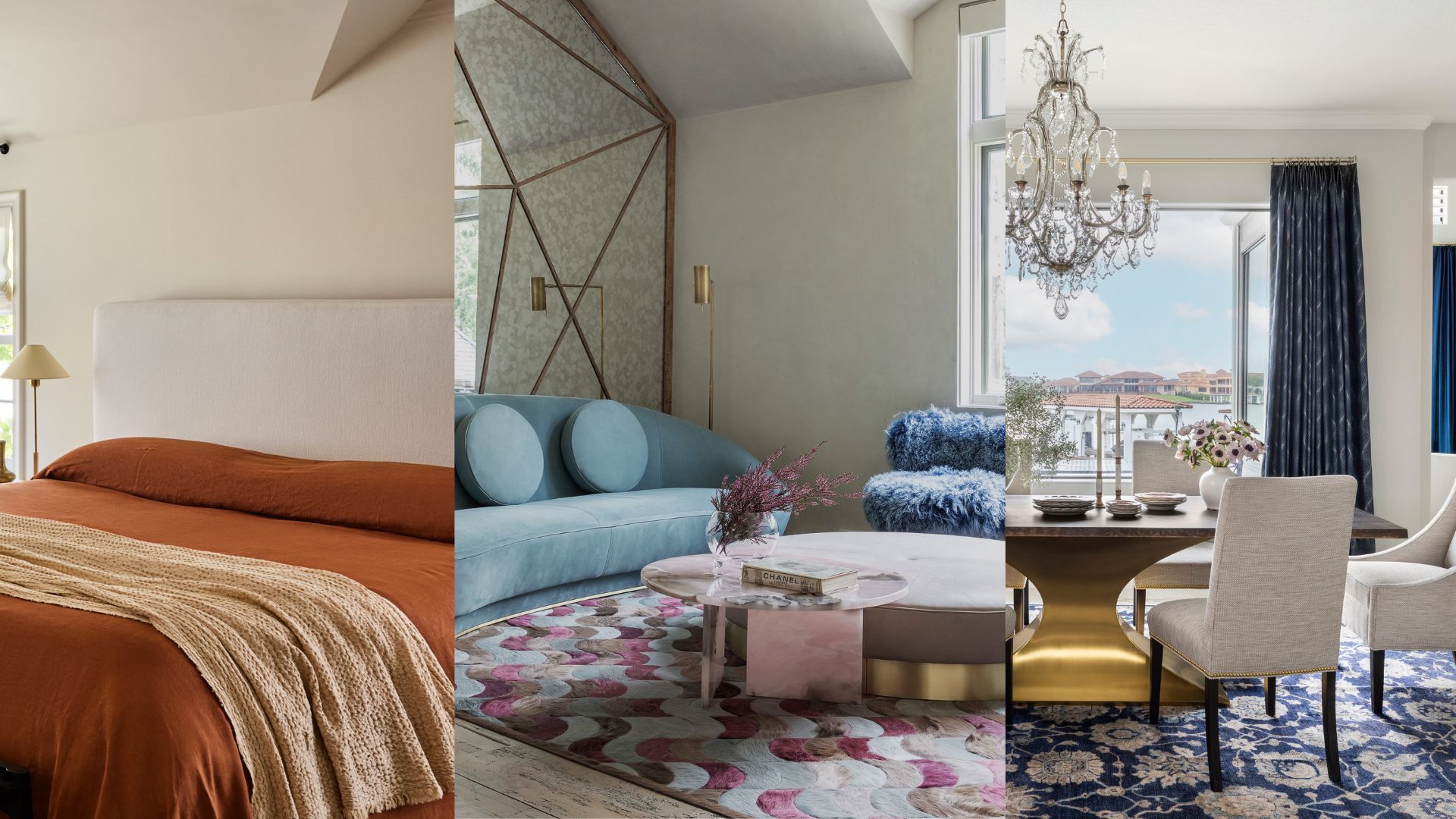
Choosing colors to go together in a room is a fine art, so it's sometimes worth starting from a point of what definitely won't work. Designers have made careers out of knowing which color combinations to avoid, and sometimes it's a very subtle nuance that can tip a whole scheme out of balance.
'Rather than compliment each other, I find they tend to fight,' says the interior designer Alexandra Kaehler, of when room color ideas go wrong. She suggests looking for shades that have the same undertone as that will create a natural sense of harmony, and allow you to play with colors a little more bravely.
But there are six color combinations to avoid that you might currently be considering, and so the designers below have suggested alternatives that will work so much better. Their secrets to perfecting your home's palette.
Article continues below1. Warm colors and gray
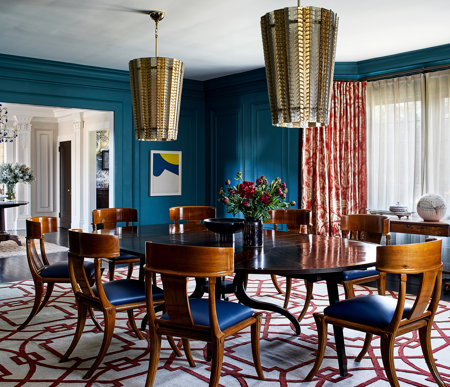
Gray walls are perfect for a bleached out, Scandi-style aesthetic, or for giving statement pieces a backdrop to pop out against. But if you're planning a warming palette that creates a rich and inviting space, then gray walls are best avoided in favor of another neutral instead: blue.
'The dining room is a combination of blues, burnt orange, and magenta,' says the Wisconsin-based designer Teresa Manns of Teresa Manns Design. 'The colors combine for an assertive yet not aggressive feel. The room has so much color energy when you are in it, and the one color I would never add here is gray as it would feel out of step and downbeat.'
2. Dark blue and bright white
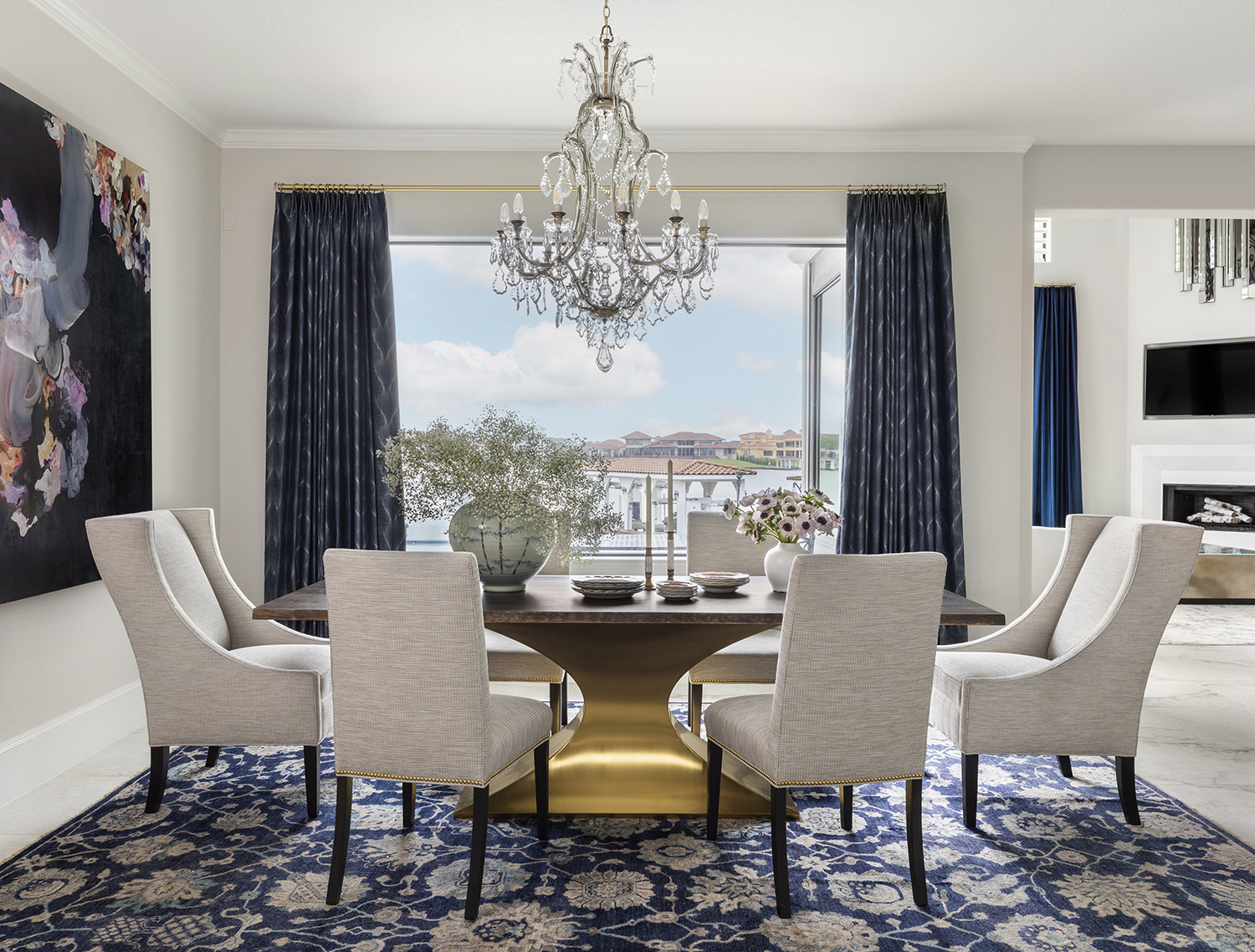
Where decorating with gray does come into its own, though is with cooler dark colors like blues and blacks. It tones them down in a way that a bright white never could – the contrast between them is just too glaring.
'The combination of blue and gray is a sophisticated choice that exudes elegance and depth,' says the Houston-based interior designer Missy Stewart, who is behind the scheme above. 'While blue brings in a sense of drama and richness, gray acts as a calming and grounding force. Unlike a brilliant white, which might create a stark contrast and amplify the intensity of the blue, gray softens the hue, allowing it to make a statement without overwhelming the space. This subtle interplay between the two colors creates a harmonious and balanced, stylish and serene environment.'
Design expertise in your inbox – from inspiring decorating ideas and beautiful celebrity homes to practical gardening advice and shopping round-ups.
3. Warm colors in a creative space
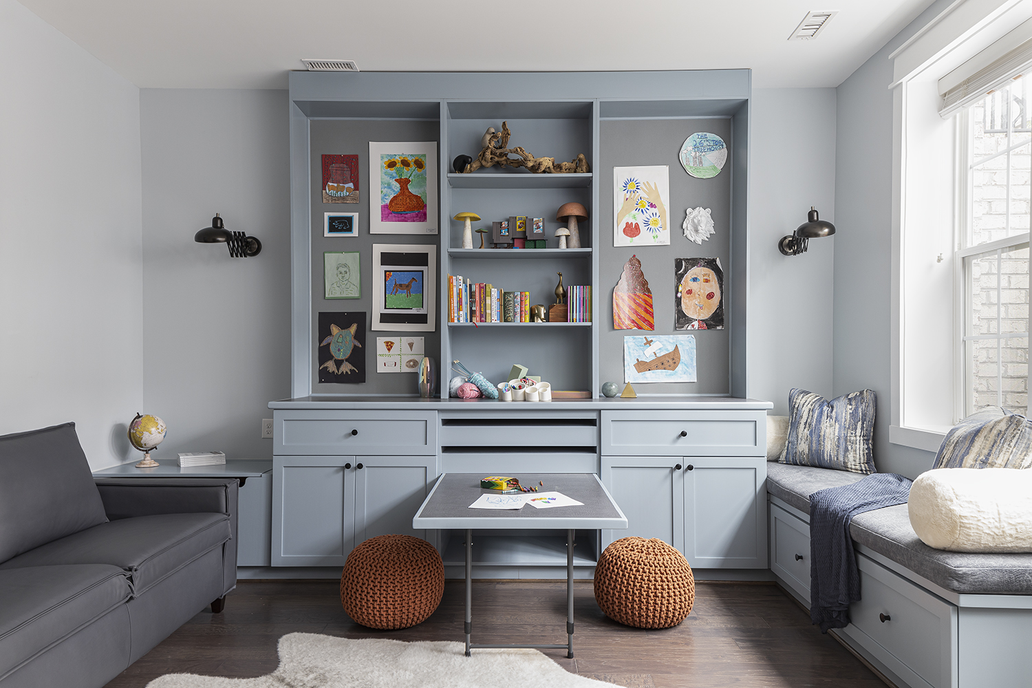
If you're looking to decorate a home office or a kids' workroom or even a kitchen in which you think you'll end up using the island as a desk, then steer clear of warm color combinations. While they may uplift your spirits, many designers believe that don't invite the sort of headspace you need to be in to truly be most creative.
'Color selection is crucial when it comes to designing a creative space,' says the Virginia-based interior designer Kathy Corbet. 'There is a book called “My Creative Space, How to Design Your Home to Stimulate Ideas and Spark Innovation” by Donald M Rattner, and one of his tactics is to look at something blue. I designed this room [above] for a mother’s crafts and for the children to play and learn. The only other color I would have entertained using would have been green, which would have brought an earthy element. A space like this would not be suitable for any other colors; all of the other colors have more influence over us emotionally than blue or green.'
4. Red and tan
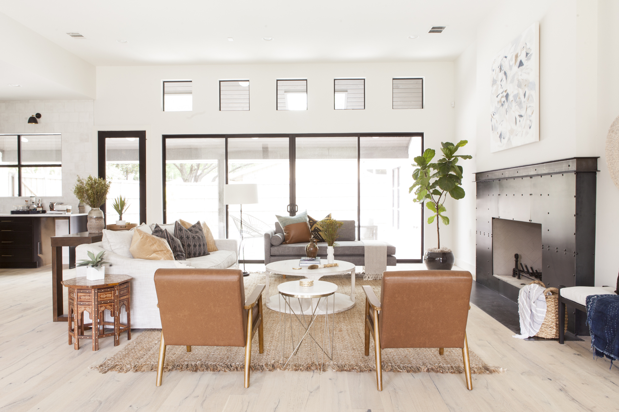
Both tan and red are growing color trends. Red is going viral thanks to Tiktok's love of the 'unexpected red theory', which believes that a pop of crimson will help make any room look expensive. Meanwhile tan, and its buttery softness, is the version of brown that's easy to live with while being warming, too. But red and tan together? Forget it.
'On paper, various shades of red and tan look great together, but red is a strong emotional color that is not right in every room,' says the Dallas-based interior designer Angeline Guido Hall, who left red out of this scheme she created above. 'Tan gives a sense of ease and comfort, and injecting a robust and vibrant color will pull the focus of the eye directly to however that color is used. We have always found it best to keep things simple and warm when using tan.'
5. Too many bold tones
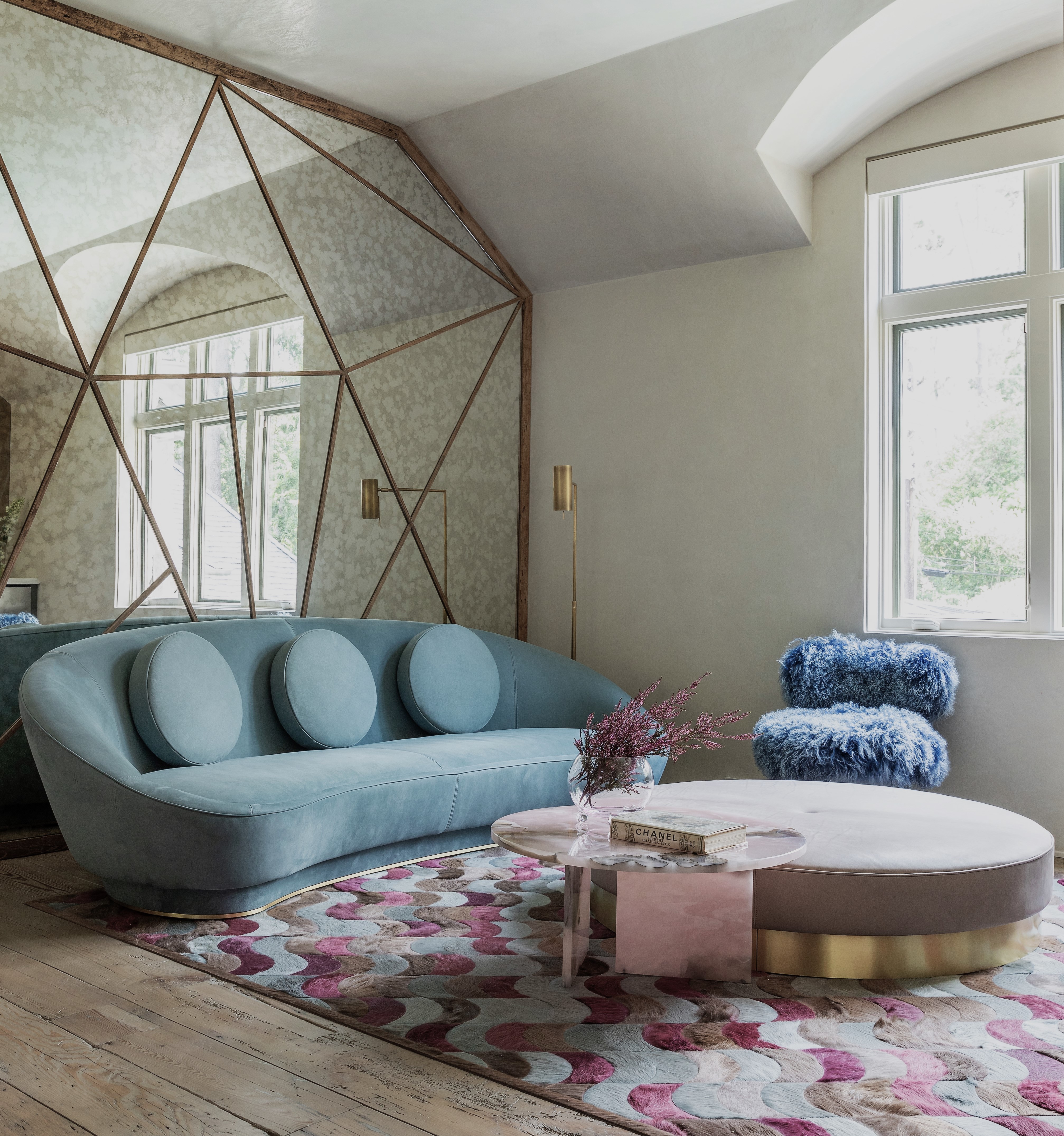
Even when designers are creating maximalist schemes, it's rare that every single piece of furniture used, or every color choice is bold. There will always be something softer or more peaceful in the mix that helps ground the whole look, stopping it from being a visual assault.
'This effect is achieved through a combination of factors, such as selecting softer shades of bold colors, incorporating muted tones, and ensuring they harmonize with each other and the overall aesthetic of the space,' says the Houston-based interior designer Nina Magon, who put together the room above. 'Additionally, strategic use of texture, lighting, and accent pieces further enhances the calming effect while adding depth and interest to the design. By skillfully balancing bold hues with muted tones and incorporating other design elements thoughtfully, [you'll] create a serene scheme that captivates the senses and invites relaxation.'
6. Bright orange and white
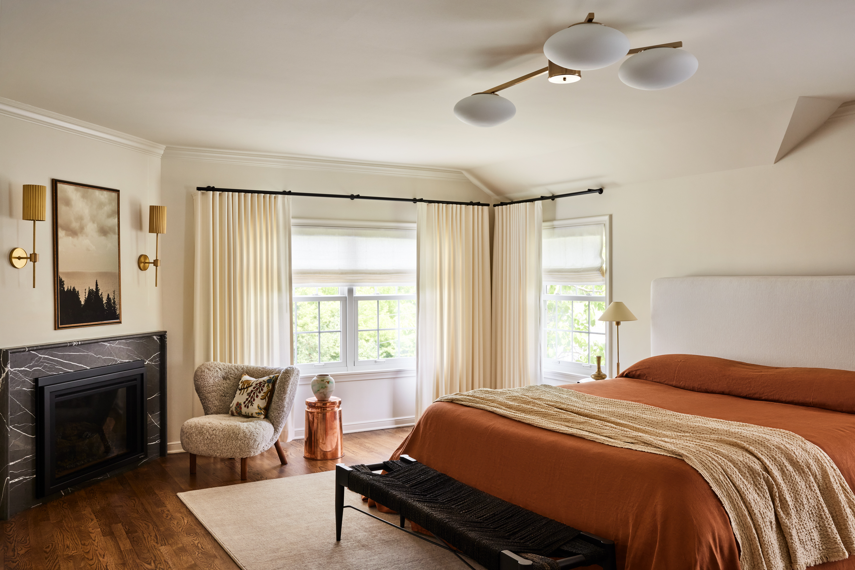
Evoking the sunbaked joy of terracotta urns and Mediterranean sunsets, orange has been having a design moment of late. But look closely and you'll see it's a tone of orange that is less that of the fruit and more that of a piece of aged pottery. There is a subtle pigment that brings it down notch, a brown undertone that provides a calmer note. Victoria from Prospect Refugre
'The coppery tones we worked into this bedroom space warm up the mix of whites throughout the neutral based bedroom,' says Victoria Sass, founder of the Minneapolis-based Prospect Refuge Studio. 'It’s a nice mid-tone to bridge the contrast between dark accents and the white envelope. A rust that is ‘just this side of orange’ helped to add a bit of zip to this ‘milk and cookies’ palette, while keeping things earthy and natural.'
Pip Rich is an interiors journalist and editor with 20 years' experience, having written for all of the UK's biggest titles. Most recently, he was the Global Editor in Chief of our sister brand, Livingetc, where he now continues in a consulting role as Executive Editor. Before that, he was acting editor of Homes & Gardens, and has held staff positions at Sunday Times Style, ELLE Decoration, Red and Grazia. He has written three books – his most recent, A New Leaf, looked at the homes of architects who had decorated with house plants. Over his career, he has interviewed pretty much every interior designer working today, soaking up their knowledge and wisdom so as to become an expert himself.

