Color decorating rules to ignore – designers say these 5 old mantras could be dating your decor
You've heard them all before, but here's why you should throw this outdated color rulebook out of the window

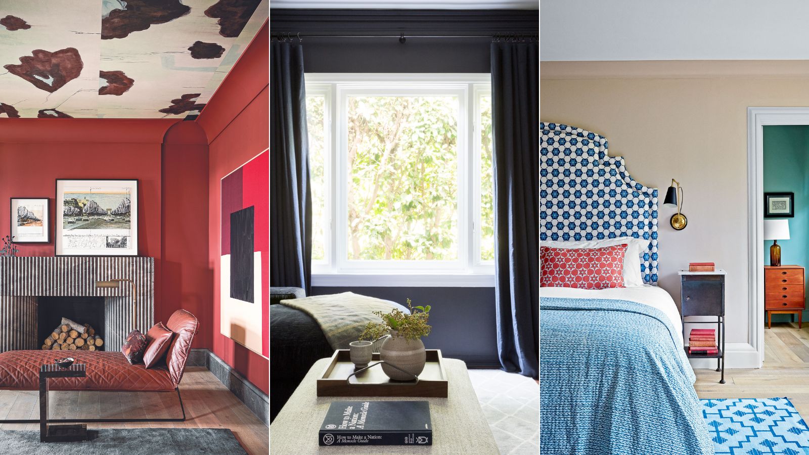
Choosing the right shade for a space can present endless choices and subtle nuances to understand and overcome, but if you've been following certain color rules religiously you could be doing more harm than good.
'Choosing your room colors is one of the hardest parts of decorating because we only actually know the true color of something because it’s sitting next to another color,' says Rachel Chudley, an interior designer renowned for her use of strong color. So it is understandable why many people played it safe for so many years, but we know and understand color theory better now.
The following five schemes break every color decorating rule you've been told about what to do when choosing a color in the home. Each room proves that some rules are simply made to be broken.
Color decorating rules to ignore
Any project can be clearly defined by having solid rules in place. These basic interior design rules and standards exist to help you accomplish harmonious interiors that convey character, but many rules were created by the risk-averse, long before we truly understand the power that color can have not just on our homes, but also on our minds.
So, to help you comprehend what color rules you should ignore, we delve into each of these old color decorating rules in detail below.
1. Do not use dark colors in small rooms
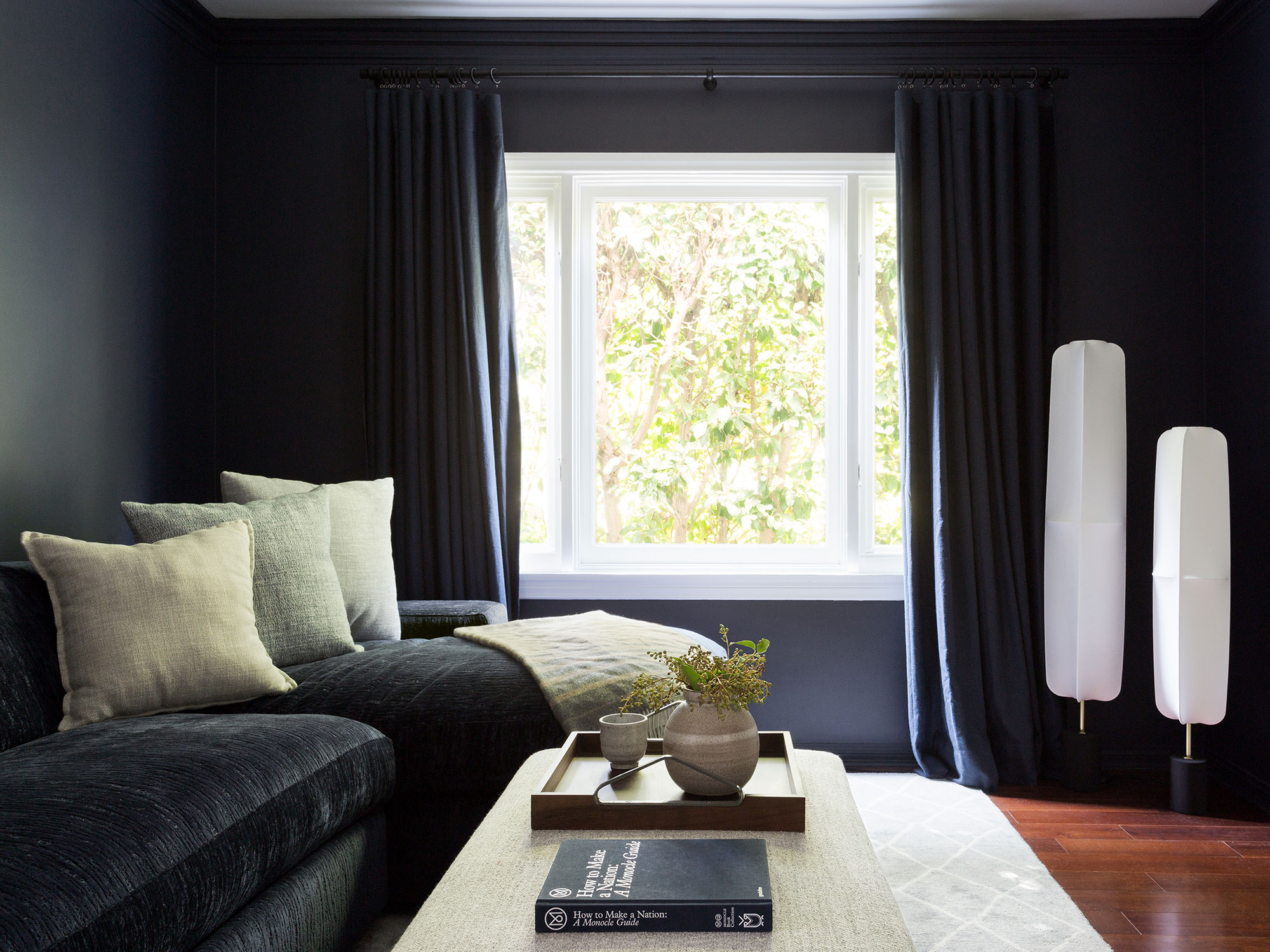
If you think you can't go dark or bold in a diminutive room, you've probably heard that you should only ever paint a small room in white or pale hues. These days, that advice couldn't be further from the truth. In fact, small rooms are often the most exciting spaces to decorate.
‘When dealing with a small or dark hall it’s best to embrace what you have rather than fight it,' says Joa Studholme, color curator, Farrow & Ball. 'Paint it a strong color that will thrill you and your guests when you arrive at the house and make the rooms off it feel bigger and lighter.’
Design expertise in your inbox – from inspiring decorating ideas and beautiful celebrity homes to practical gardening advice and shopping round-ups.
'Dark colors are not only bold and dramatic, but they have so many different nuances, tones, and tactilities that give them character and charm like no other color,' says interior designer Genna Margolis, founder, of Shapeside. 'Use black, or deeper hues of brown or navy in small rooms and snug rooms for a surprising element of comfort and warmth.'
2. Never mix metals
I was first told not to mix metals when I once, as a teenager, wanted to wear gold and silver jewelry on the same hand. The shock and horror that I would even contemplate such a thing have stuck with me to this day, and it comforts me to know that I am not the only one. But it wasn't until recently that I realized this mantra has since infiltrated the interior design and decoration of our homes.
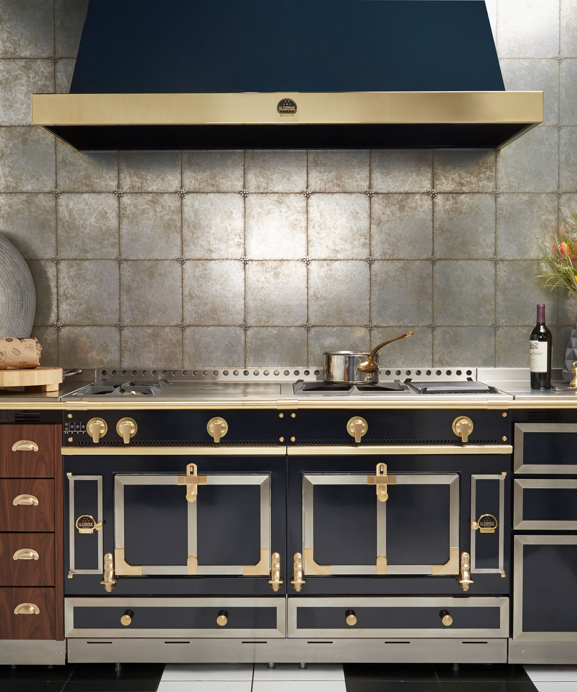
While metallic finishes are hard to get right – it's too easy to tip into over-the-top Eighties-style glossiness or frou-frou fussiness – pairing metallics, such as copper or gold, with crisp steel and chrome, is proving popular. Well-chosen, elegant mixed metal hardware can produce a look that is, in fact, all grown up.
'In this chef's kitchen, the metallic elements are the star of the show,' says Camille Syren, chef de projets, La Cornue. 'This kitchen proves that not only mixing metals and high shine finishes are beautiful, but they are also a must if you want to curate a standout space.' Done right, it can make a kitchen look expensive, too. You see, it can be done.
3. The ceiling should be painted white
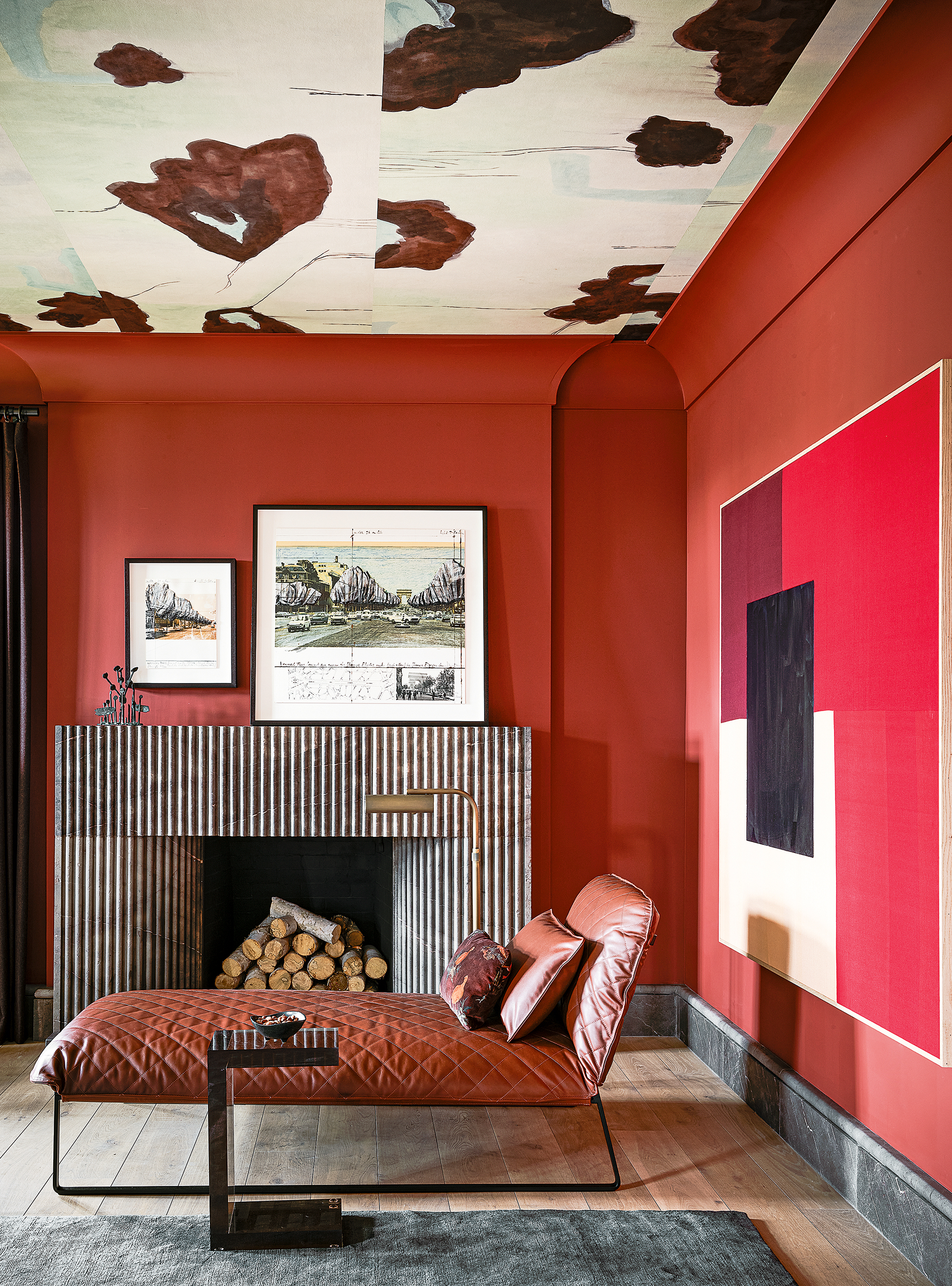
Ceiling ideas offer scope to expand your creativity beyond your four walls, therefore painting a ceiling white is certainly not the only color option you should consider.
The ceiling holds endless possibilities for creativity and should be treated with the same consideration as any other wall in your home. You certainly don't have to stick with just paint either. There is a multitude of ways to elevate your ceiling with materials, color, texture, and even wallpaper.
In this daring and bold space, designed by Chad Dorsey, founder, of Chad Dorsey Design, the goal was to create a room that is enticing and enveloping. 'Many people think red is harsh but used in a monochromatic way I find it to be very soothing,' he says. 'We also used it for the ceiling in this room, designed in collaboration with Porter Teleo wallcoverings.’
‘Ceilings have been overlooked in recent times,’ says interior designer Rachel Chudley, ‘but when you visit historic houses, the ceiling is often treated as a masterpiece.’ It is about time we, once again, start thinking about the color, texture, reflection, and finish of our ceilings in the same breath as every other wall in our homes.
4. Everything must match or coordinate
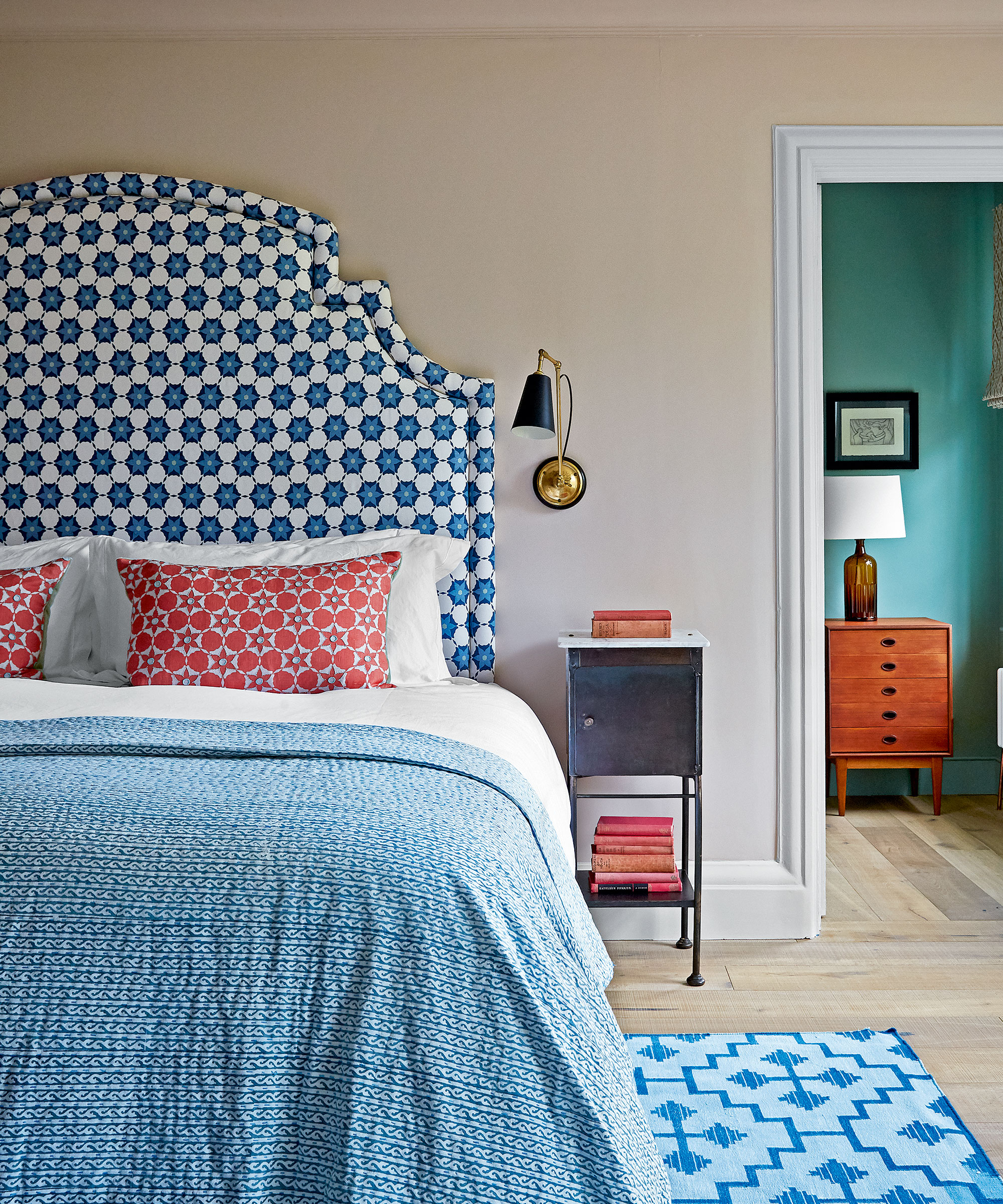
The idea that you should only ever have one color throughout your entire home is a decorating myth that still exists, but that's not to say you shouldn't. Whether you should paint your entire home one color is an endless debate, and despite the pros and cons, there is no definitive answer to this color conundrum.
Decorators and designers will often say they don’t follow rules when it comes to decorating but something that is helpful to bear in mind is that colors never need to match, they just need to work together.
To achieve that balance, it’s helpful to bear in mind that one color can also be stronger than the other. Using a more unusual color pairing in a room will alter the atmosphere in the space, explains interior decorator Nicola Harding, founder of Nicola Harding & Co.
‘The greater the degree of contrast there is, the more drama there is in the room and when there is less contrast, the space is calmer.’ As a general rule of thumb, you want to include high contrast when you want a dynamic, high-energy feeling but this should be done in a space that you don’t spend lots of time in such as a guest bedroom, powder room, and transient rooms at home that aren’t in frequent use.
5. Blue and green must never been seen together
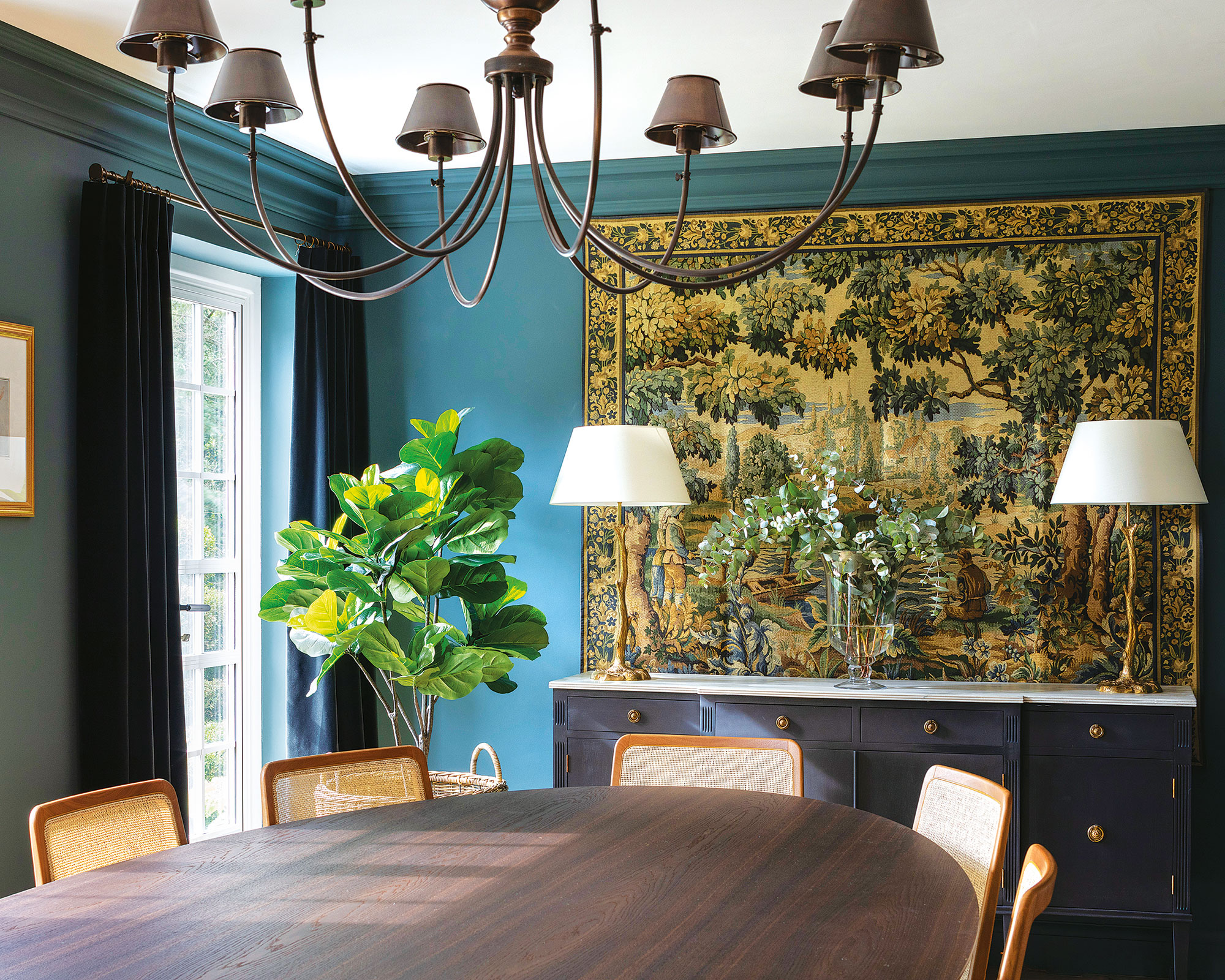
Contrary to popular belief, green and blue look marvelous together. The source of the adage of never mixing blue and green has murky roots. Scratch beneath the surface and its origins are hard to fathom. One of the most likely theories, given that so much idiom in the English language derives from maritime vernacular and superstitions, is that sailors were warned not to paint the hulls of their boats green lest they become invisible when capsized. But it’s tenuous.
‘People feel nervous about teaming blue and green, but I believe it’s a quintessential pairing,' says Tricia Guild, founder and creative director, of Designers Guild. 'Just imagine the landscape – the endless blue optimism of a summer sky against a green and pleasant land. It’s a classic combination that evokes familiarity and comfort.'
FAQs
What is the rule of color?
Choosing complementary color combinations is an art form, so it is worth paying attention to certain rules when choosing ratios. Of the most used, the 60-30-10 rule is a favorite.
Simply put, the 60-30-10 rule is an interior design technique for getting color schemes to balance perfectly.
60 represents 60% and is the main color you are using in the room, and is usually seen on the largest space: the walls. This shade will anchor the room and be the backdrop for your 30 color, which you should use half as much as the 60 hue. This is likely to be seen on accent chairs, curtains, or even an accent wall. The 10 is your accent color, which will be represented in about 10% of your furnishings, perhaps showcased on cushions, decorative objects, lamps, or artwork.
When choosing color for your home, do away with these old color rules, and instead look to tried-and-tested formulas and color theory for inspiration.
'It just doesn't occur to me to work with a rule book with it comes to color – it's about what feels right for the room, its light and the environment around it,' says decorator and designer, Susan Deliss.

Jennifer is the Digital Editor at Homes & Gardens, bringing years of interiors experience across the US and UK. She has worked with leading publications, blending expertise in PR, marketing, social media, commercial strategy, and e-commerce. Jennifer has covered every corner of the home – curating projects from top interior designers, sourcing celebrity properties, reviewing appliances, and delivering timely news. Now, she channels her digital skills into shaping the world’s leading interiors website.