'The biggest mistake is to eschew color altogether' – 5 family room paint colors going out of style in 2024
Choosing the right shade for a family room can present endless choices to understand and overcome – we spoke to a few of our favorite interiors people to find out what colors they love and loathe


Finding the right paint color for a family room is a design conundrum many of us wish to overcome. Get it right and you create a space that is a joy for the whole household, but get it wrong and your family room can turn into a space that overwhelms, visually shrinks, and brings sadness.
Creative family room paint ideas can bring unique beauty to a home – and the more inventive they are, the better.
If you’re not confident in choosing room color ideas, go with a pre-selected paint palette already picked out by the paint brand you’re using, or follow our advice later on working with tonal, harmonizing and contrasting colors.
Family room paint colors going out of style
Much like with any outdated decorating trend, one of the biggest mistakes is to eschew color altogether for fear that your space will age badly.
Here interior designers, decorators, and color psychologists reveal what family room paint colors are going out of style, and how to approach choosing paint ideas for rooms that truly sing, from using the color wheel to help you avoid making disastrous color mistakes to finding paint colors that will make you feel happier at home.
1. Swap color drenching for a two-tone color scheme

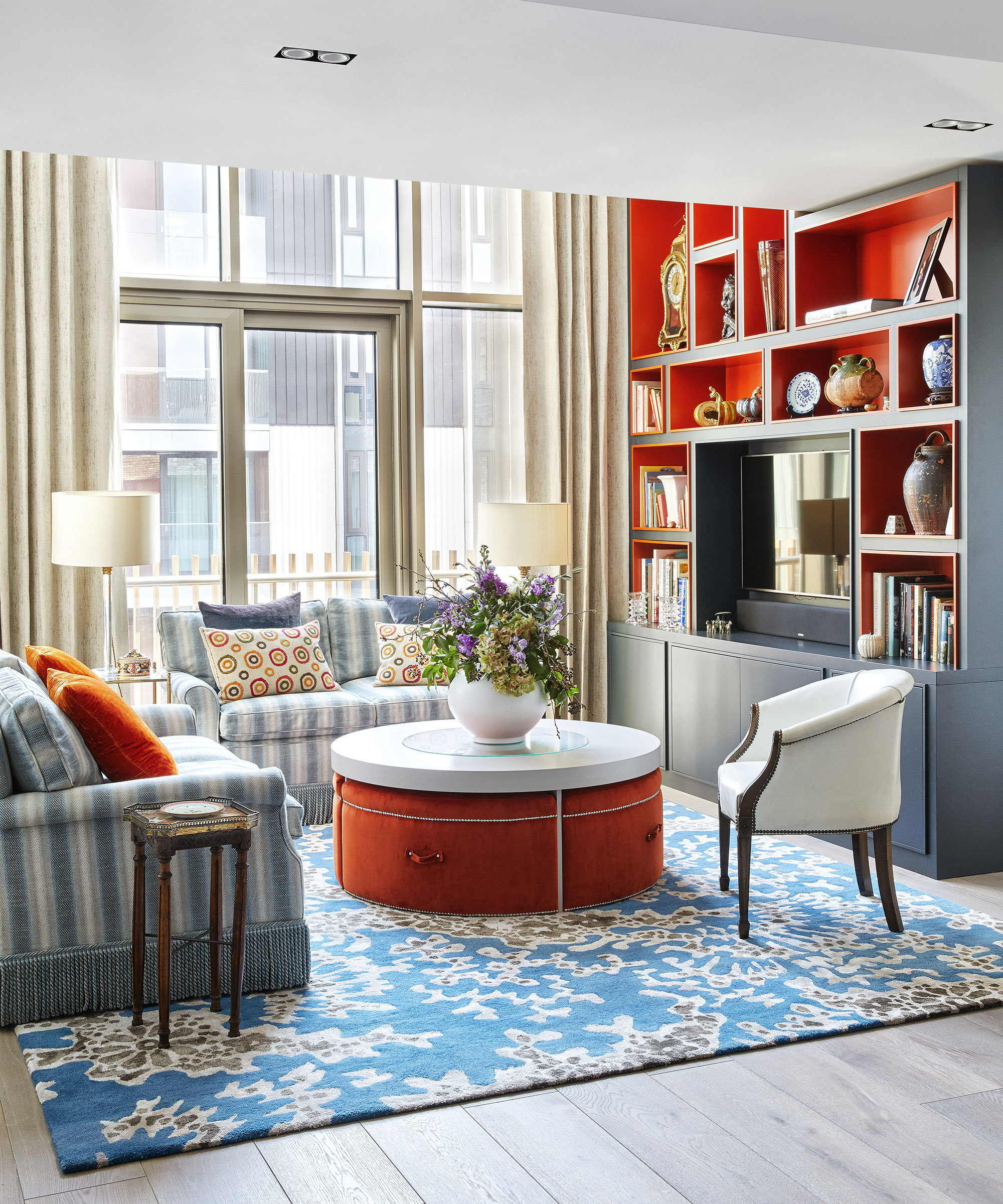
Using an interesting paint color pairing, such and blue and orange, in a family room will alter the atmosphere in the space, explains interior decorator Nicola Harding, founder of Nicola Harding & Co.
Many people shy away from decorating with orange, but when paired with blue – the color diametrically opposite on the color wheel – it can create a vibrant yet welcoming scheme. Also referred to as complementary colors, this combination is guaranteed to add drama to any room.
Design expertise in your inbox – from inspiring decorating ideas and beautiful celebrity homes to practical gardening advice and shopping round-ups.
‘The greater the degree of contrast there is, the more drama there is in the room and when there is less contrast, the space is calmer.’ As a general rule of thumb, you want to include high contrast when you want a dynamic, high-energy feeling. ‘That of course includes kids’ bedrooms and family rooms which are naturally more energetic anyway as they are filled with their toys, books, artwork, and a family room TV,’ says Nicola.
2. Replace pure white with warming neutrals

In times of uncertainly and social-economic instability, embracing colors rooted in nature can be both comforting and grounding.
‘Not to be confused with cold and bland palettes, new neutrals are warm by nature,’ says Charu Gandhi, founder and director of Elicyon. ‘Typically matt in finish, they have the ability to flex, and so it’s possible for them to suit any type of home, be it traditional or contemporary – in fact, their elasticity is the reason we’re calling them “new”.’
One vital aspect to consider when decorating with neutrals is bringing in as much texture as possible, as it creates interest and layers – important factors when strong paint colors are out of the picture. In this space, designed by Becca Galbraith of Becca Interiors, neutrals in different variations, give this space plenty of depth and dimension.

Charu Gandhi is the founder & director of Elicyon. Charu Gandhi is a qualified Architect, registered with RIBA and ARB, who studied and taught at the Architectural Association.

Owner and principal designer Becca Casey grew up in the English countryside, before eventually moving to the other side of the Atlantic and launching her design career in New York City. Currently based in Connecticut where she leads her interior design firm, Becca brings her style – rooted here in the UK – to homes across the US.
3. Switch overwhelming yellow for a cozy terracotta color

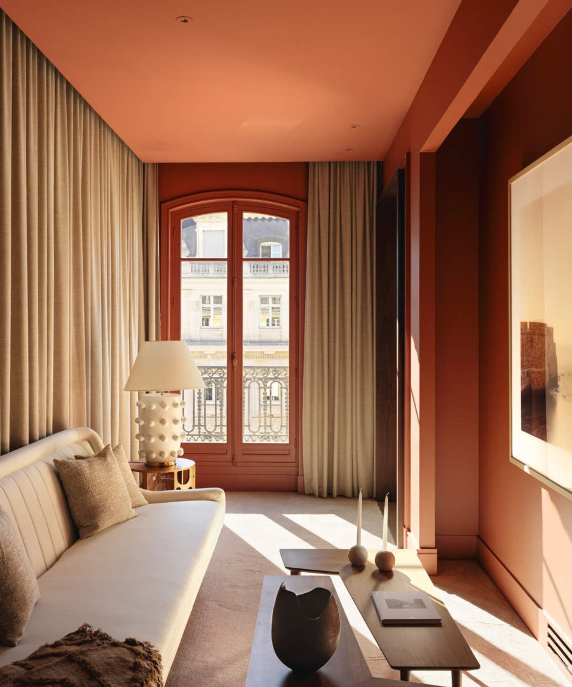
Rich and nuanced, an earthy terracotta has a depth that lends sophistication to a scheme. A versatile hue, it can veer into a warming burnt orange or brighten into a deep coral.
‘This tone works perfectly in a family room that is rather dark, or which suffers from a lack of natural light,' says Elizabeth Hay, founder, of Elizabeth Hay Design. 'Not only does it inject a space with brightness and cheer, but it will also bring out and highlight any accent colors in the room.’
‘We love to use terracotta in more formal family rooms, like drawing rooms, as it can actually add quite a masculine feel, especially when paired with olive greens or earthy browns,' adds Nicole Salvesen & Mary Graham, co-founders, Salvesen Graham. 'Simple classic shapes on upholstery also stop terracotta from feeling too fussy and overpowering.’
4. Do away with cold blue for an earthy green

Inspired by the natural world, olive, and forest green will provide a restful touch of heritage to a family room. Strong yet soothing, it brings an enveloping feel but can also sit quietly and allow bold furniture to shine.
‘This is a wonderful paint color that works well all through the year and is ideal if you are trying to bring an element of nature or a heritage feel into a more contemporary city home,' says Emma Sims-Hilditch, founder and creative director, Sims Hilditch. 'It’s a restful and calming shade which not only works well on cabinetry but also looks great on walls in a family room.’
Here, the warm tones in the deep olive on the walls give this family room by Albion Nord a cosseting feel, while the absence of accent colors keeps it calm.
5. Opt for a delicate pink instead of a stressful red

Rethink everything you think you know about decorating a pink room. This divisive color has had a grown-up renaissance.
Pink is the new decorating neutral – it has a natural ability to deliver warmth and interest without overwhelming a space. But choosing the right pink shade can be a thorny task when you’re faced with everything from soft rose pinks to peachy tones.
The key is to pick a serene hue from your family room paint choices. Muted pink walls are a perfect backdrop for a rich palette – introduce crisp whites for breathing space, or pair with black for a modern touch.

Jennifer is the Digital Editor at Homes & Gardens, bringing years of interiors experience across the US and UK. She has worked with leading publications, blending expertise in PR, marketing, social media, commercial strategy, and e-commerce. Jennifer has covered every corner of the home – curating projects from top interior designers, sourcing celebrity properties, reviewing appliances, and delivering timely news. Now, she channels her digital skills into shaping the world’s leading interiors website.