Pastels for spring? Interior designers are focusing on these moodier, earthier tones for 2024 instead
If you're over pastel hues for spring, you're not alone. As the seasons change, interior designers are turning to these shades instead

Design expertise in your inbox – from inspiring decorating ideas and beautiful celebrity homes to practical gardening advice and shopping round-ups.
You are now subscribed
Your newsletter sign-up was successful
Want to add more newsletters?
Spring is nearly here, and it's the perfect season for a home refresh, whether you're due for a new coat of paint or a decor shopping spree. Warmer weather pushes us naturally toward bright, revitalizing color schemes, especially in our living spaces. And while pastel hues have become a hallmark of spring, from budding flowers to Easter celebrations, designers say it's time to branch out.
Earthy, organic hues are all the rage this year, and spring is a lovely time to try them out. Luckily, we spoke with interior designers, who shared some of their favorite non-pastel spring colors – and while some are earthy and understated, others prove bold and daring. Here are the top five spring colors you should know about before embarking on spring redecorating.
5 organic, earthy colors that designers recommend for spring
From warm blushes and mauves to bright pops of red, the experts say there's something for everyone in spring – even if you're opposed to pastel room ideas. These are the five colors you should keep your eyes on this season
Article continues below1. Warm, rustic hues
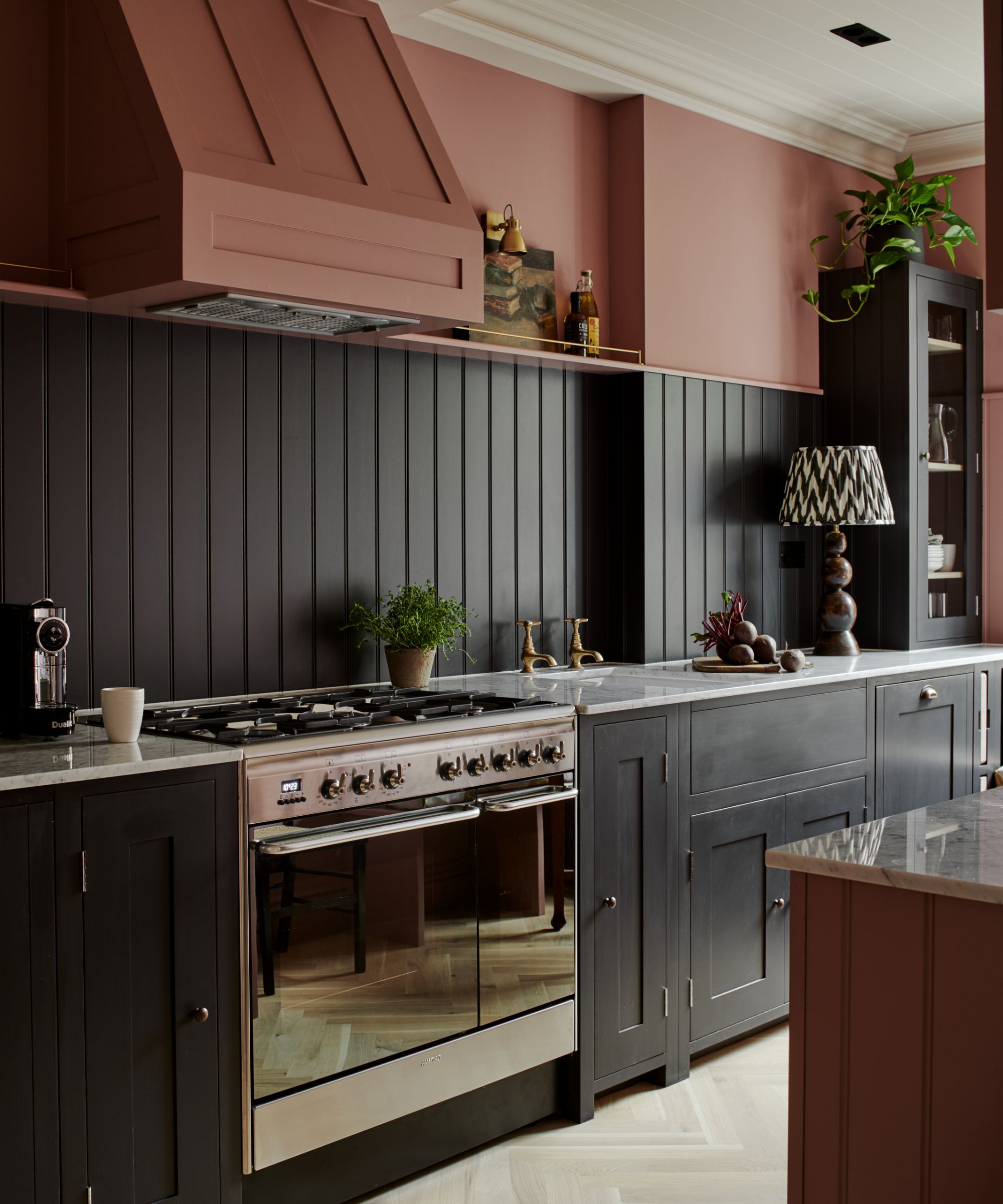
'When decorating for the short term, like a fleeting season or a holiday, it is always best to keep your home's original design intent and materiality in mind and add decorative elements that complement what is already present,' says Dani Crawford, lead interior designer and senior associate of Kimmel Studio Architects.
Unless your home already features 'traditional pastel pinks, blues and yellows,' Dani says these spring additions won't stand the test of time. Instead, she suggests 'richer, more pigmented options.'
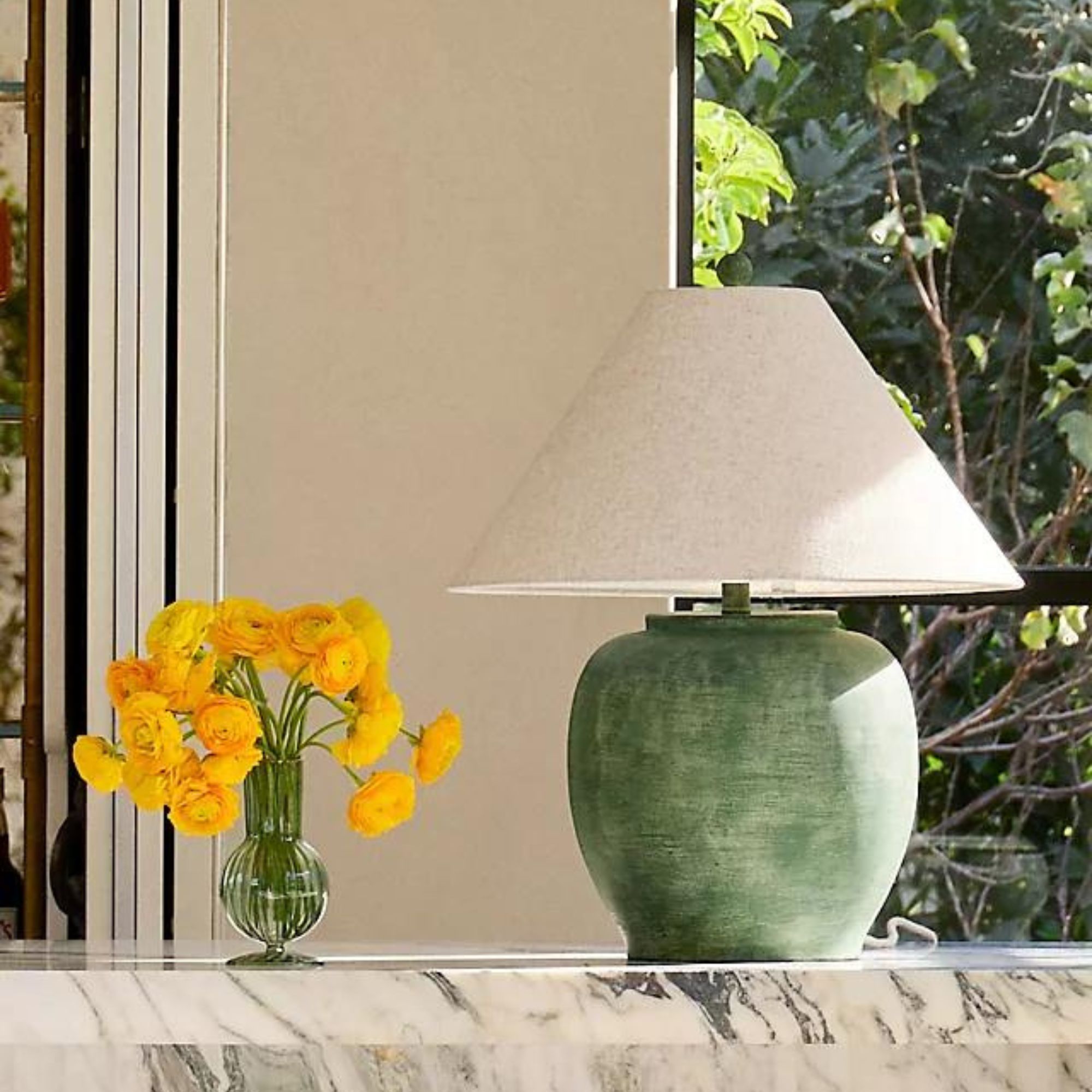
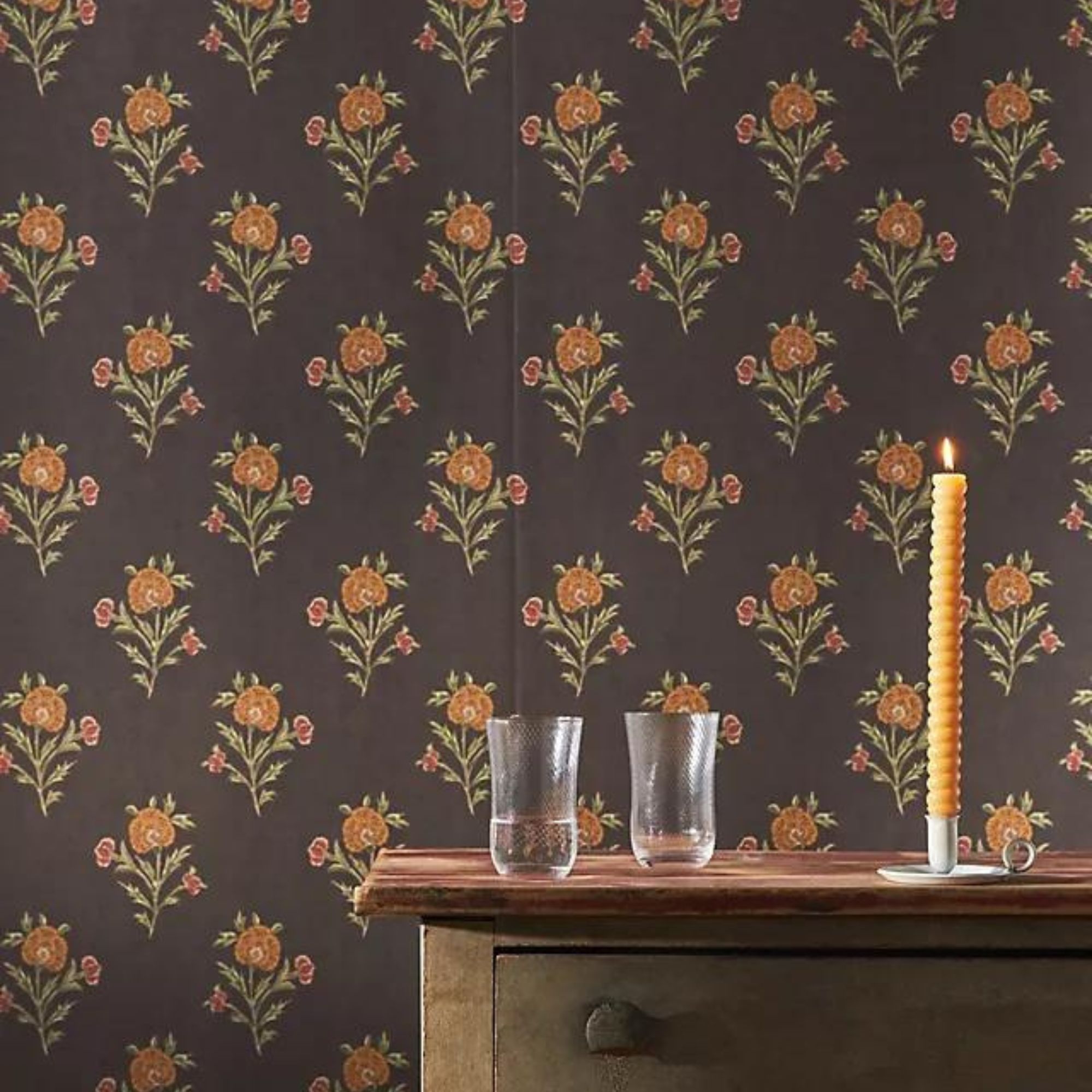
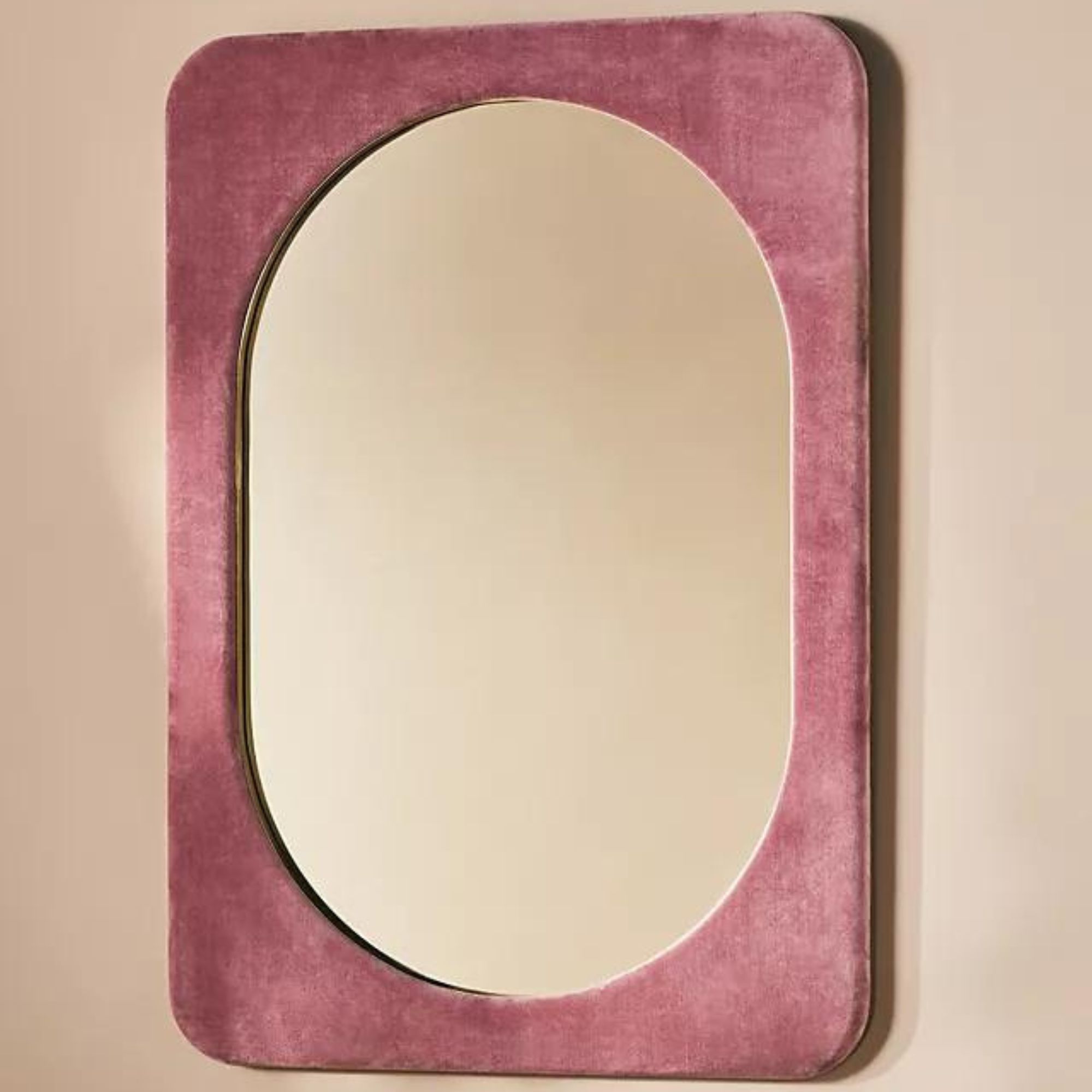
Whether you prefer deep, warm color schemes including mauves and blush pinks, or like a bit of mustard yellow or 'rust-toned orange,' going all-in with the pigment is the way to go. These rustic, warm-toned hues will make your home more welcoming, for the spring season and beyond.
'Adding more pigment provides a powerful dose of color requiring less in quantity, whether it is freshening up painted walls or adding seasonal decorative elements. Pairing these with rich tans and warm white paints as a neutral base provides a bright and cheerful design palette to welcome the turn of the season and warmer weather,' Dani adds.
Design expertise in your inbox – from inspiring decorating ideas and beautiful celebrity homes to practical gardening advice and shopping round-ups.
2. Olive greens
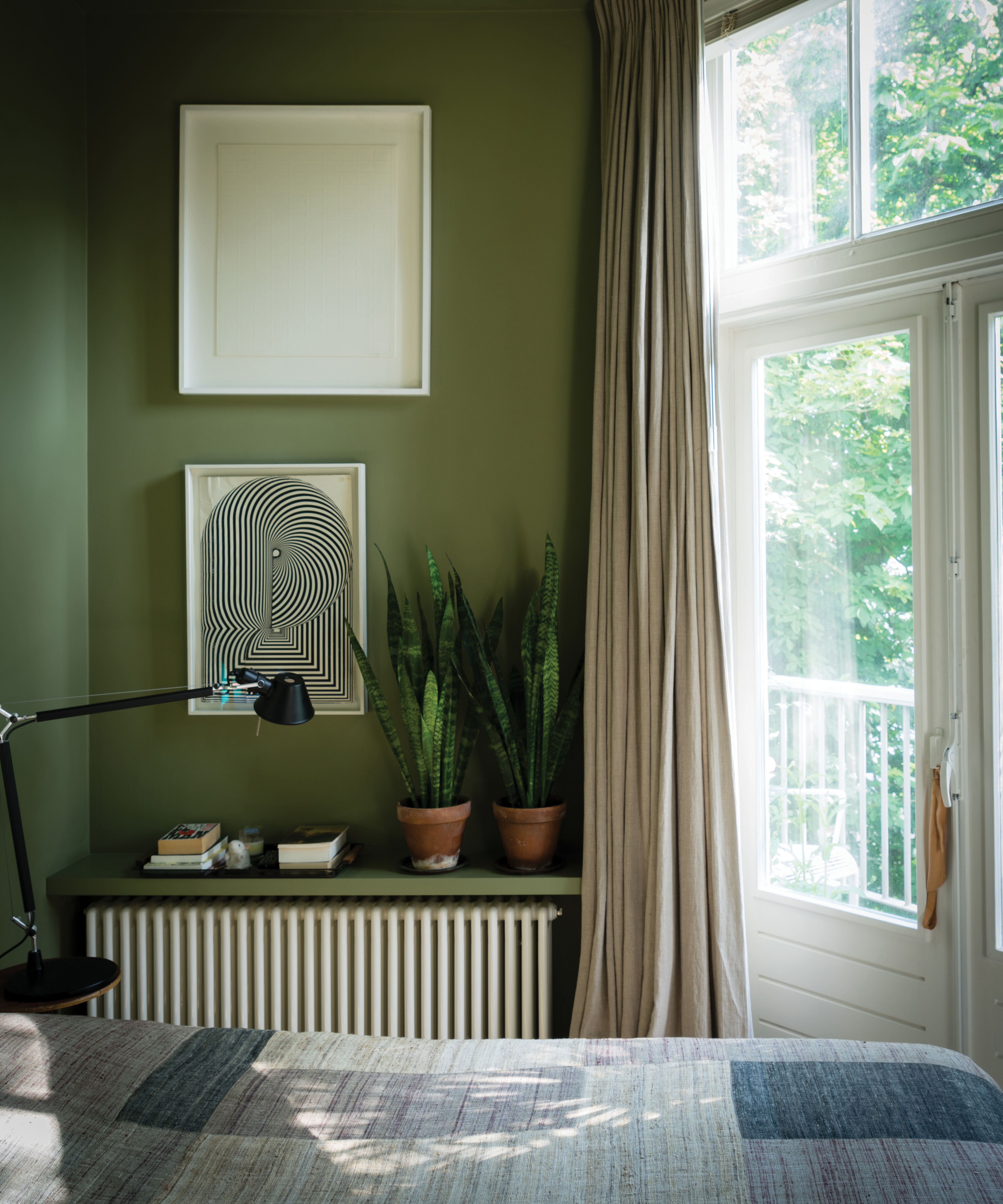
Olive green is trending this season, and the hue is perfect for longer days and warmer weather. Its organic look and wide range of natural pairings makes olive green easy to decorate with and welcoming to all.
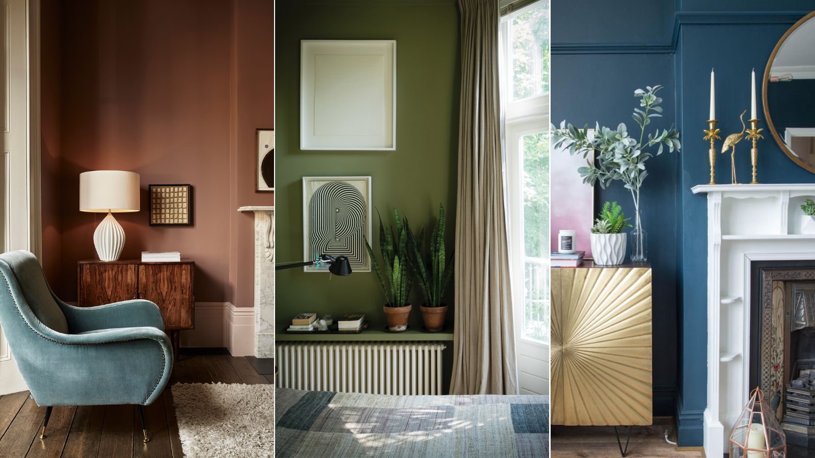
Browse the best olive green paint colors to find a complementary shade for your home – the options span from dark and moody to light and bright. In this bedroom, olive green walls bright a burst of life to the space, pairing with natural light, bright white paint and house plants for a vibrant yet subdued aesthetic.
'Add it to pinks or blue-green aquas to make an interesting pair of colors. Olive green keeps pink from looking too saccharine sweet,' says Elizabeth Drake, principal designer of Elizabeth Drake.
3. Inviting brown tones
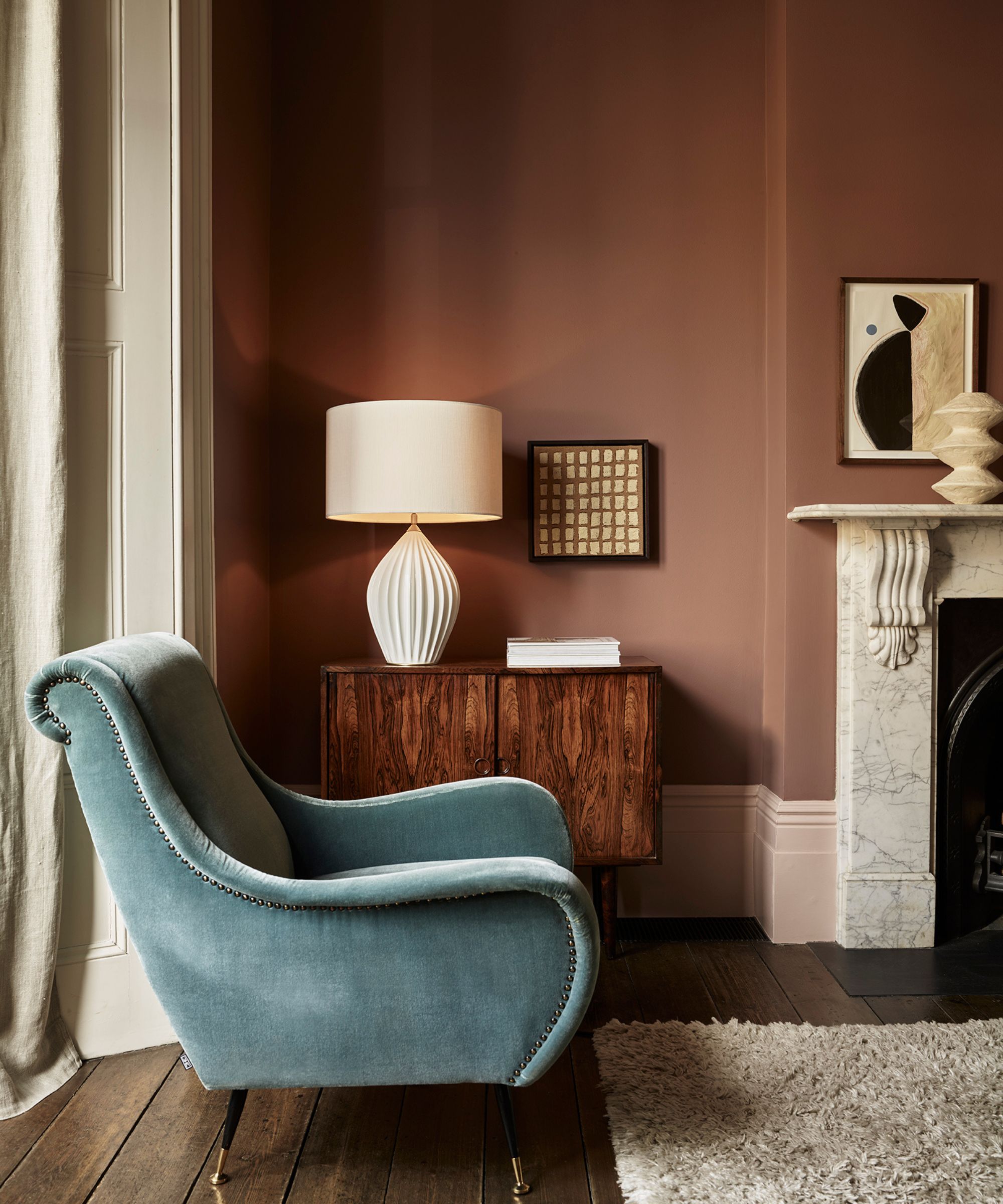
Brown paints don't exactly evoke spring on first glance, but their warm, pared-back renditions bring just the right levels of coziness and warmth to a spring-ready space. Plus, brown is one of 2024's dominant interior color trends.
Along with other welcoming hues 'like terracotta, olive green and burnt sienna,' Taylor Troia – co-founder of San Diego-based House of Hive – recommends 'deep browns' over pastels. She says these hues 'evoke a grounded and organic feel.'
'When used throughout a space, these colors can convey a similar feel to pastels, injecting vibrancy and character,' Taylor adds.
4. Bold pops of color
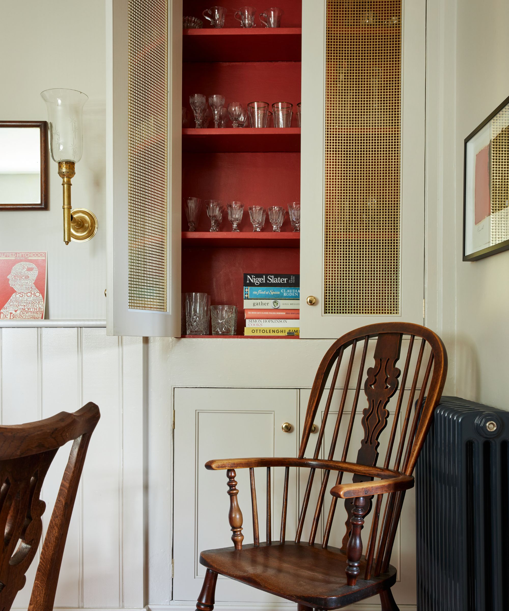
Just because this spring is trending more organic doesn't mean you have to steer clear of bright, bold pops of color. In fact, these statement hues are encouraged. Amber Shay, National VP of Design Studios at Meritage Homes, says that bold pops of color are part of a welcome change across the interior design world this year.
'Bright, happy, and uplifting colors are replacing the all-neutral palette that has been trending over the past few years. Pops of color, especially shades of green and blue, have been on the rise,' says Amber.
The unexpected red theory is just one of the statement-driven, fun-forward interior design trends that have surfaced this year, and we're loving the stunning results in homes everywhere. Experiment with a pop of red, pops of other primary colors, or bolder versions of your favorite pastel for a vibrant spring interior that won't date.
5. Sea-inspired blues
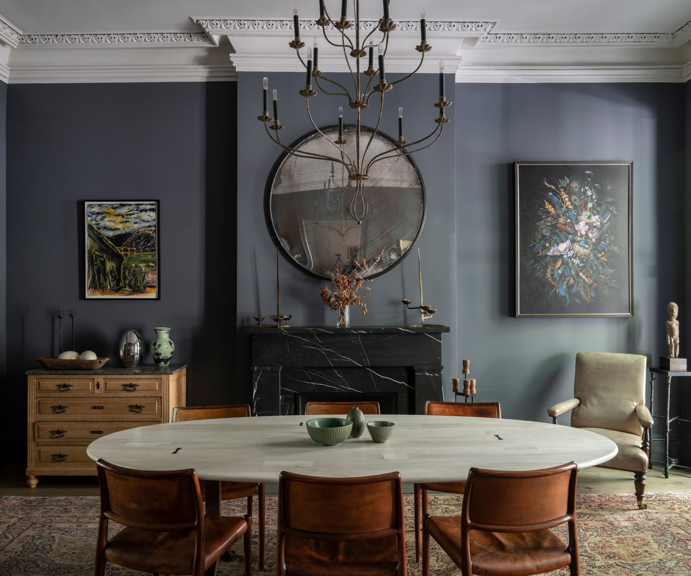
Although designers seem to love warm, welcoming shades for spring, cooler colors are welcome as well. Amber adds that 'sea blue' is a current favorite for seasonal refreshes. Working beautifully with coastal decor, she says this is 'such a pretty color' when paired with 'marble and other natural stones.'
'Its muted tone can read as a rich color, or a fun accent. I recommend using sea blue as an accent with pillows, artwork and decorative accessories, yet it's versatile enough to use on larger pieces or as a paint color for an entire room,' says Amber.
With these pastel alternatives, your home will be set for spring in no time – and these hues are likely to last far into summer and fall, too. Look to earthy, organic color schemes for an inviting home that stays warm all year round.

Abby was the Interior Design News Editor at Homes & Gardens and is now studying for her Master's degree in Journalism at City University, London. Prior to joining our team, she worked with Better Homes & Gardens, where she wrote and edited content about home decor, gardening tips, food news, and more. She studied Journalism and English Literature at New York University and moved to London to pursue her love of writing in 2023.
