Seasonal color analysis in interior design – should your ideal palette influence the shades you choose for your home?
What if we chose our home decor to match our own ideal palette? Experts discuss seasonal color analysis in interiors

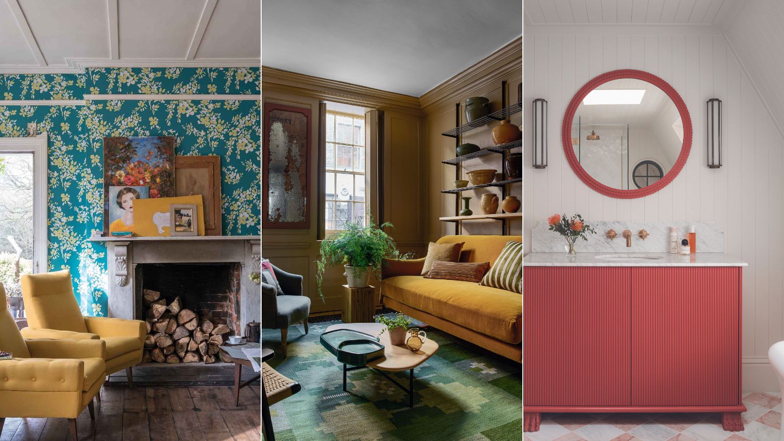
Are you a summer person or a winter person? Or would you class yourself as a spring or autumn type? We're not talking about the weather or times of the year, here, but about seasonal color analysis.
For the uninitiated, and for those who haven't ever had their 'colors done', this is about analyzing a person's hair, skin tones, and eye coloring to determine the ideal colors for their clothing to help them select items that make them look and feel their best.
What we're interested to know is whether a person's seasonal type for clothes should be considered when choosing room colors in their home. To help us decide, we've spoken to color experts in interiors, and in the fashion and beauty industry. What they told us makes for interesting reading.
What is seasonal color analysis?
A post shared by Color Guru 🌈 Seasonal Color Analysis (@yourcolorguru)
A photo posted by on
The concept of seasonal color analysis for clothing first burst onto our horizons like an unexpected rainbow in the early 1980s. You can pin the origins back to when professional color consultant Carole Jackson brought the idea of seasonal colors into the spotlight with her bestselling book Color Me Beautiful.
Seasonal color analysis back then was a practical technique rather than a scientific process. It can be done digitally now, working from a person's photographs, but back in the 1980s, it involved numerous fabric swatches or samples of colors which the coloree (if you can call them that) held up to their face to determine the effect of each color. If the color is wrong the person's skin tone appears to drain, dull or take on an unhealthy hue. Get it right and they'll appear visibly healthier, happier and all of a glow.
The colors are grouped according to the seasons so spring colors include, among many others, bright coral and periwinkle; summer colors include raspberry and gray blue; autumn, rust and terracotta; and winter, true blue and emerald green. It's worth knowing that the seasonal color analysis technique has developed since the early days, and many color consultants now include additional more nuanced seasonal categories, light summer, warm spring etc. but for the purposes of this feature we'll focus on the original four seasons or you'll be here until fall.
When the seasonal color analysis is complete the coloree is told which season category they are, and given a card with the 30 or so colors in that category. The idea is that they stick to those shades for everything they wear.
Design expertise in your inbox – from inspiring decorating ideas and beautiful celebrity homes to practical gardening advice and shopping round-ups.
Would the same apply to our home interiors, we wondered. Should we be choosing our home decor, color and paint ideas to match our seasonal color analysis?
Can it apply for interiors?
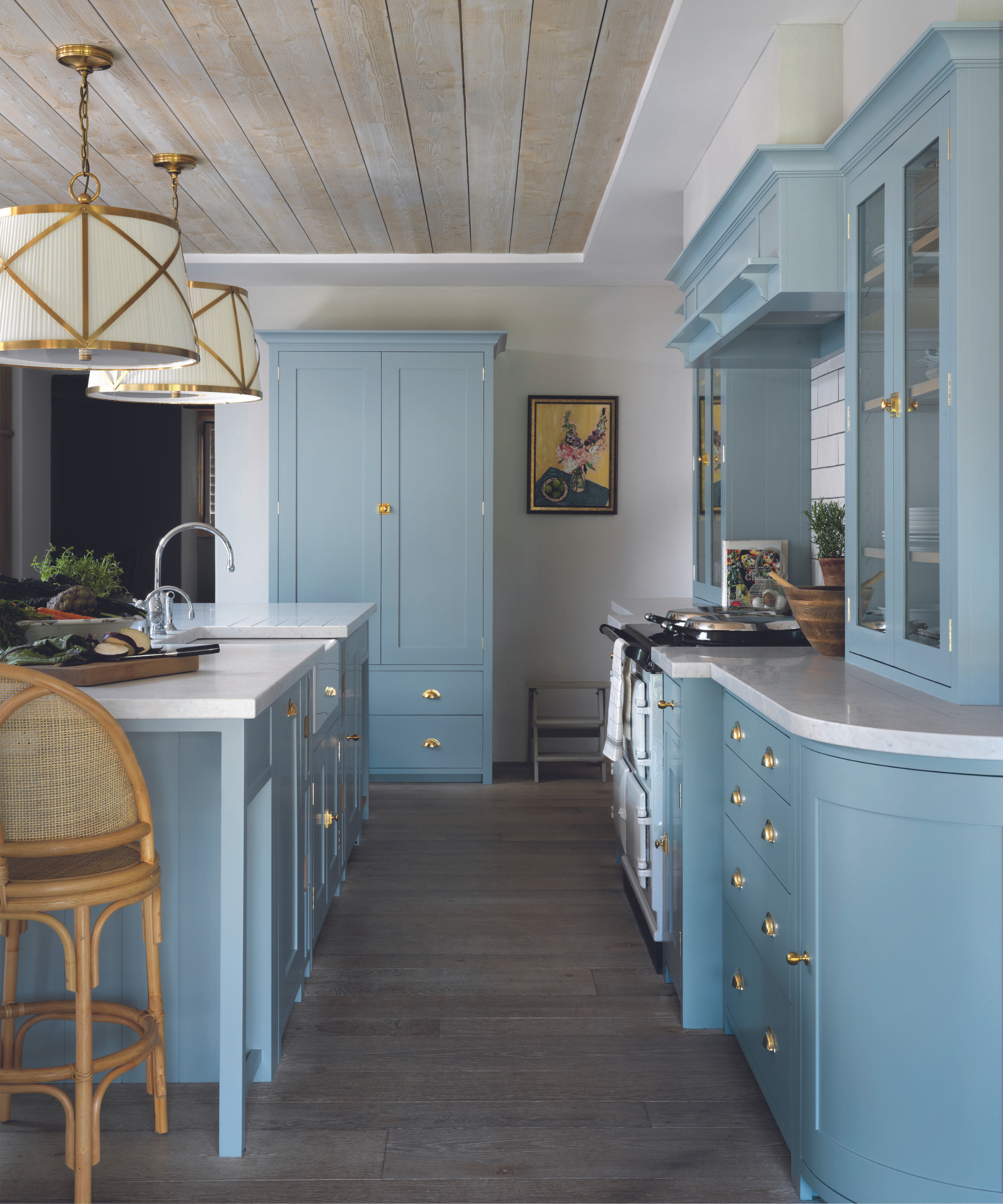
We spoke to Jeannie Stith, the founder and CEO of Color Guru, a business devoted to matching people to their optimum colors for clothing, based on their individual seasonal color analysis.
'Should people consider their own seasonal color as they think about their decorating ideas and how to choose a color scheme for a whole home?' We asked Jeannie.
'Yes,' she says. 'It's fascinating that when we introduce people to their ideal color palette for clothes, they often say they've decorated their home in their palette colors but haven't been wearing them! I think people are intuitively drawn to the colors that suit their own coloring. Often people say they feel like they've "come home" when they see their color palette for the first time.'
Jeannie created four simplified seasonal color palettes for interiors as a guide to choosing paint colors and furnishings for the home in line with those for clothing. 'Taking your color palette into consideration when you're designing your home is a great idea if you absolutely love the palette. It can be a great base to start from since the best colors for you can highlight your natural beauty and make you glow while the worst colors for you can wash you out, drag you down, make you look tired and even ill.'

Jeannie Stith is the founder and CEO of Color Guru. Color Guru analyzes your hair, skin, and eye color to match you with your ideal color palette for clothes so that you can feel confident in your clothes, shop more simply, and create a coordinated wardrobe. Color Guru has been featured in The Spark Joy Podcast.
What about our color experts from the world of interior design, do they agree that a person's season should shape their color choices around the home?
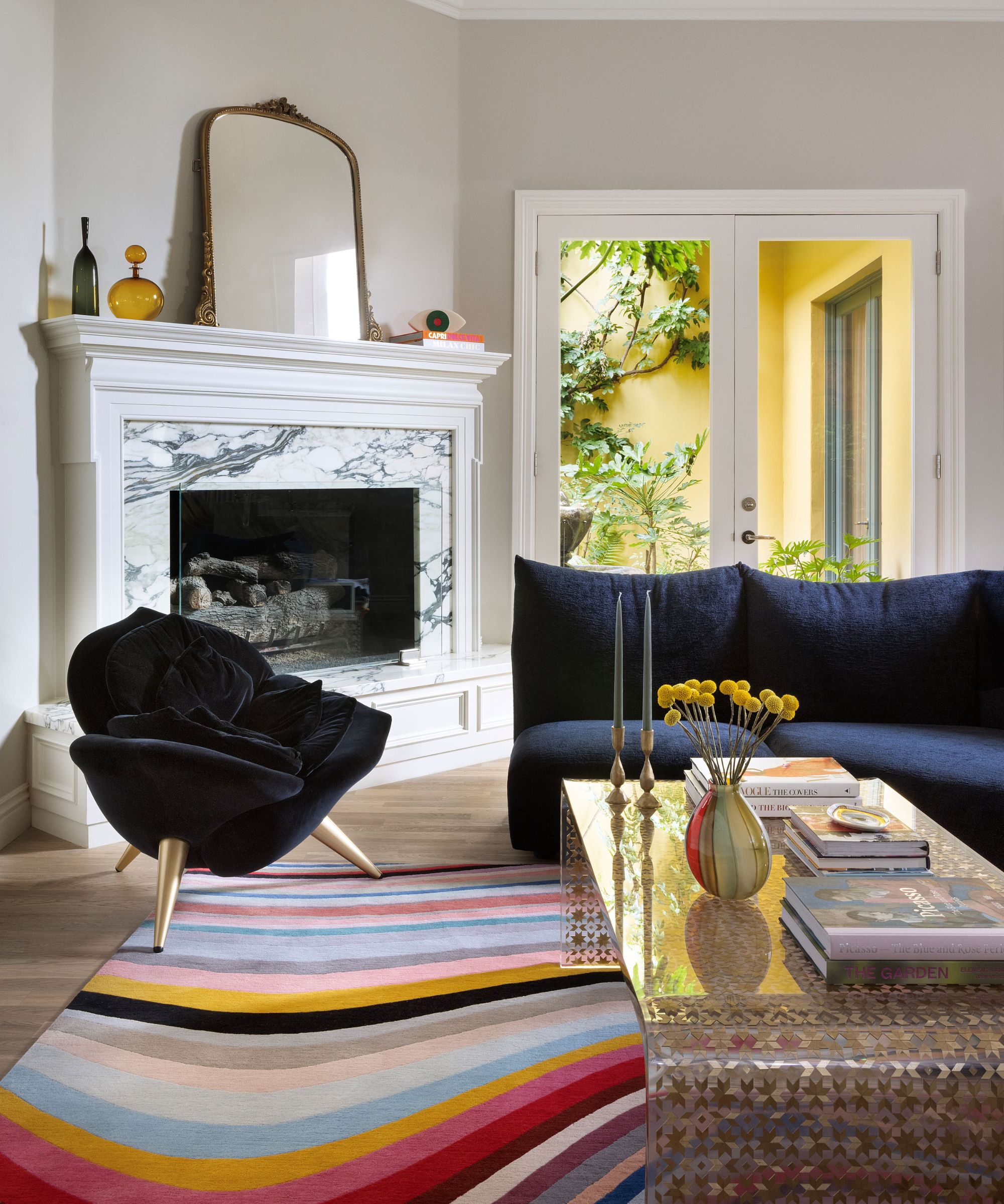
For Tancred Vilucchi of Maison Vilucchi, it's a no-brainer. 'Definitely yes, I believe that colors should reflect and be in harmony with what defines or appeals to a person within his environment, from the interior to the exterior of a home,' he says.
Tancred loves to create imaginative and colorful interior design for all of his clients, tailoring each bespoke space to the preferences and needs of the individuals. His family living room for a 1980s LA home, pictured above, includes a quirky rainbow rug to bring a splash of color to an otherwise pared-back space.
Is seasonal color analysis restrictive?
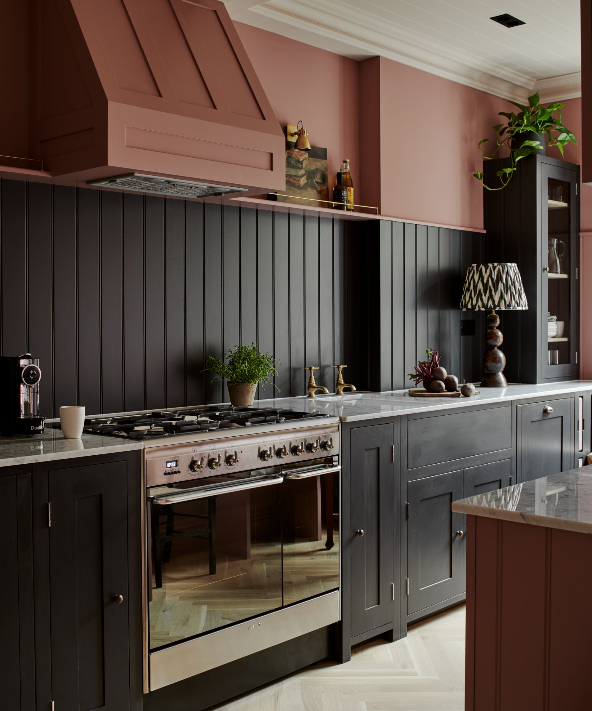
At this point, we were beginning to get a little concerned. It sounded rather restrictive. What if you're a summer person but don't want a house full of ice cream colors? Luckily, there's more to summer colors than that, as seasonal color analysis expert Jeannie Stith explains.
'If you're a summer seasonal type for clothing colors, choosing summer colors for both your clothing and home interior is ideal. There is a misconception that summer colors are all about decorating with pastels, and while it's true that the summer palette does have a lot of pastels in it, our summer palettes have richer colors as well, like cranberry, spruce, teal, steel blue, soft navy, charcoal gray and rosewood,' says Jeannie.
The Neptune kitchen pictured above, is a perfect example of the richer summer shades of charcoal gray and rosewood combined.
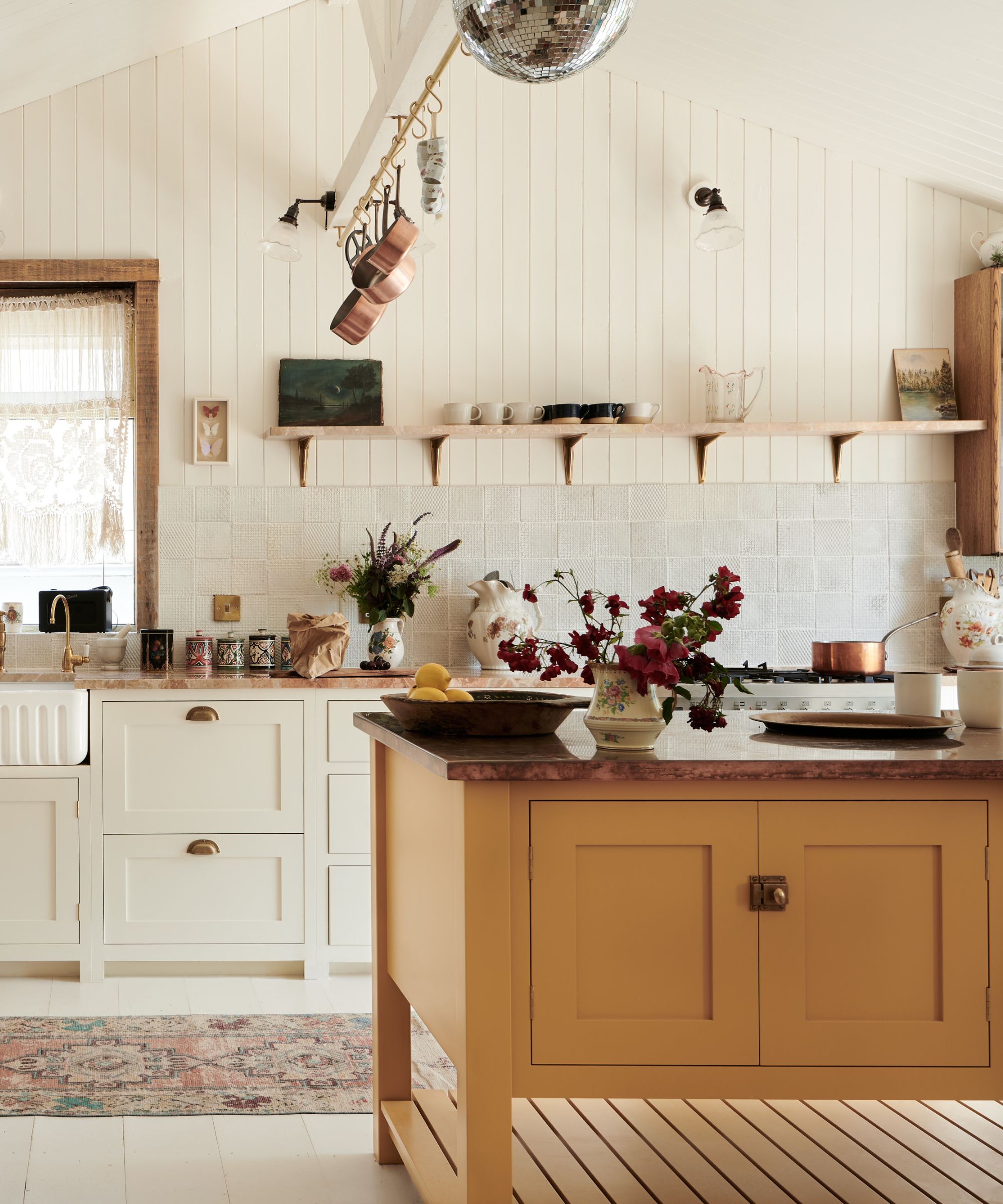
'So just because you're a summer type doesn't mean you can't wear or use deeper/richer colors in your closet or in your decor. It's all about getting the hue exactly right so that it's a perfect match for you,' adds Jeannie.
Interior designer Tancred Vilucchi agrees, 'Whatever the colors that define you, these are the colors you should surround yourself with in your own sanctuary, to bring you happiness and well-being,' he says.
So besides thinking about what colors make a room feel happy, we need to consider the shades that make us feel happy, too.
'Colors are powerful tools,' adds Tancred. 'they influence our emotions, feelings, thoughts, and energy throughout the day. That’s why, when we study residential home décor, regardless of following color trends, we analyze and use as guidance colors related to the person. It is essential, and that’s how we create “living” spaces, not generic but warm atmospheres in which the people who live there feel happy and fulfilled, and can gather and create memories.'
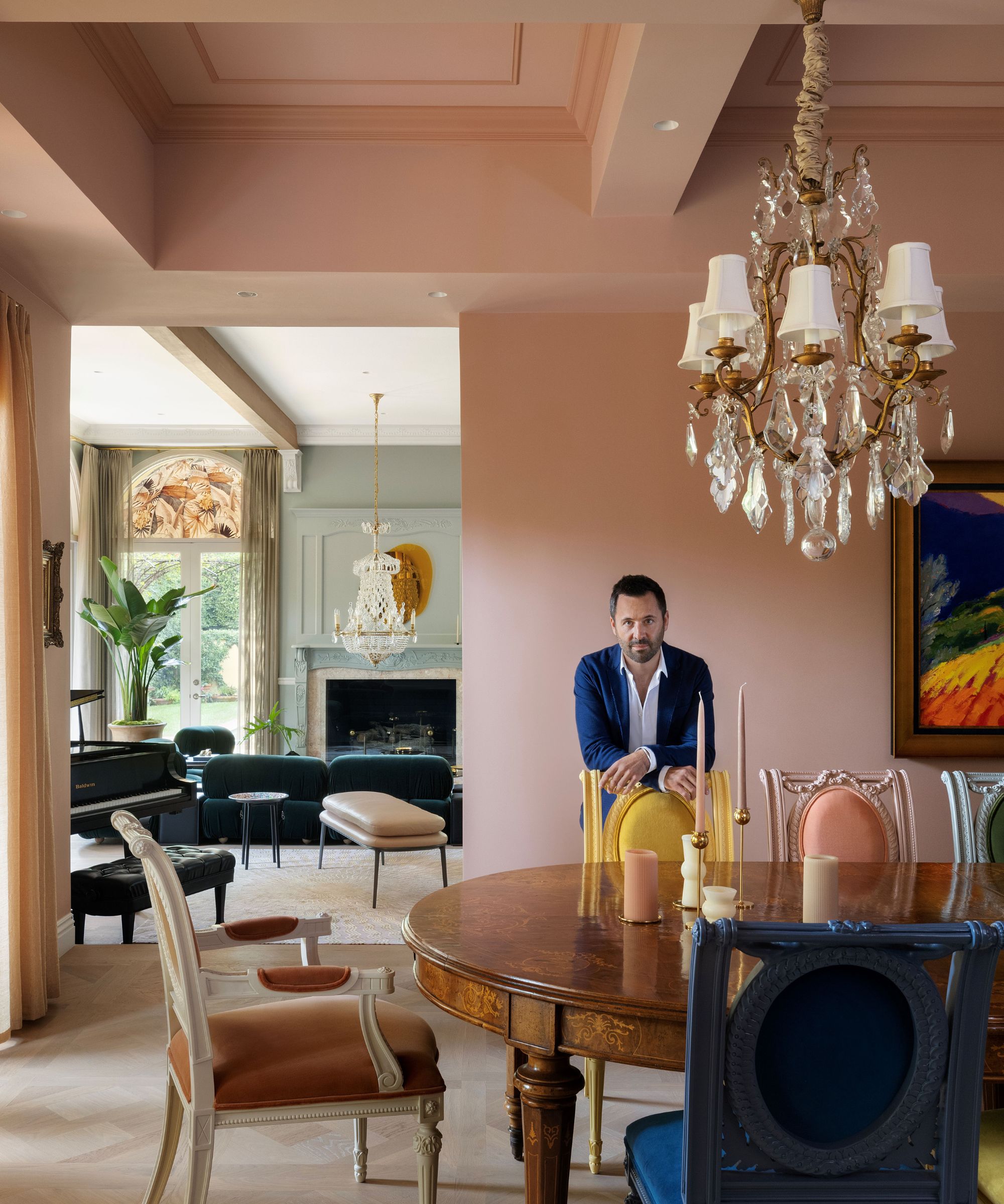
French-Italian designer and builder Tancred Vilucchi is based in Los Angeles and draws on his European heritage in all his work. Never afraid to embrace color, Maison Vilucchi is known for its luxurious and eclectic designs.
How can you style a room to match your season?
What are the effects of styling a room to suit your seasonal color analysis?
'Well, you look amazing in all of the photos you take in that room!' says Jeannie. 'It's true – if you're going to surround yourself in color, why not surround yourself in the colors that highlight your natural beauty? Also the color palette card is a family of colors that go together, so if you're choosing your colors from the card, it narrows down the color options in a very efficient way.'
'Our clients see the same benefits in their closets. When you stick to a family of colors, not only is shopping easier because you know exactly what to take into the dressing room, but you also easily create a coordinated wardrobe where everything goes together seamlessly.'
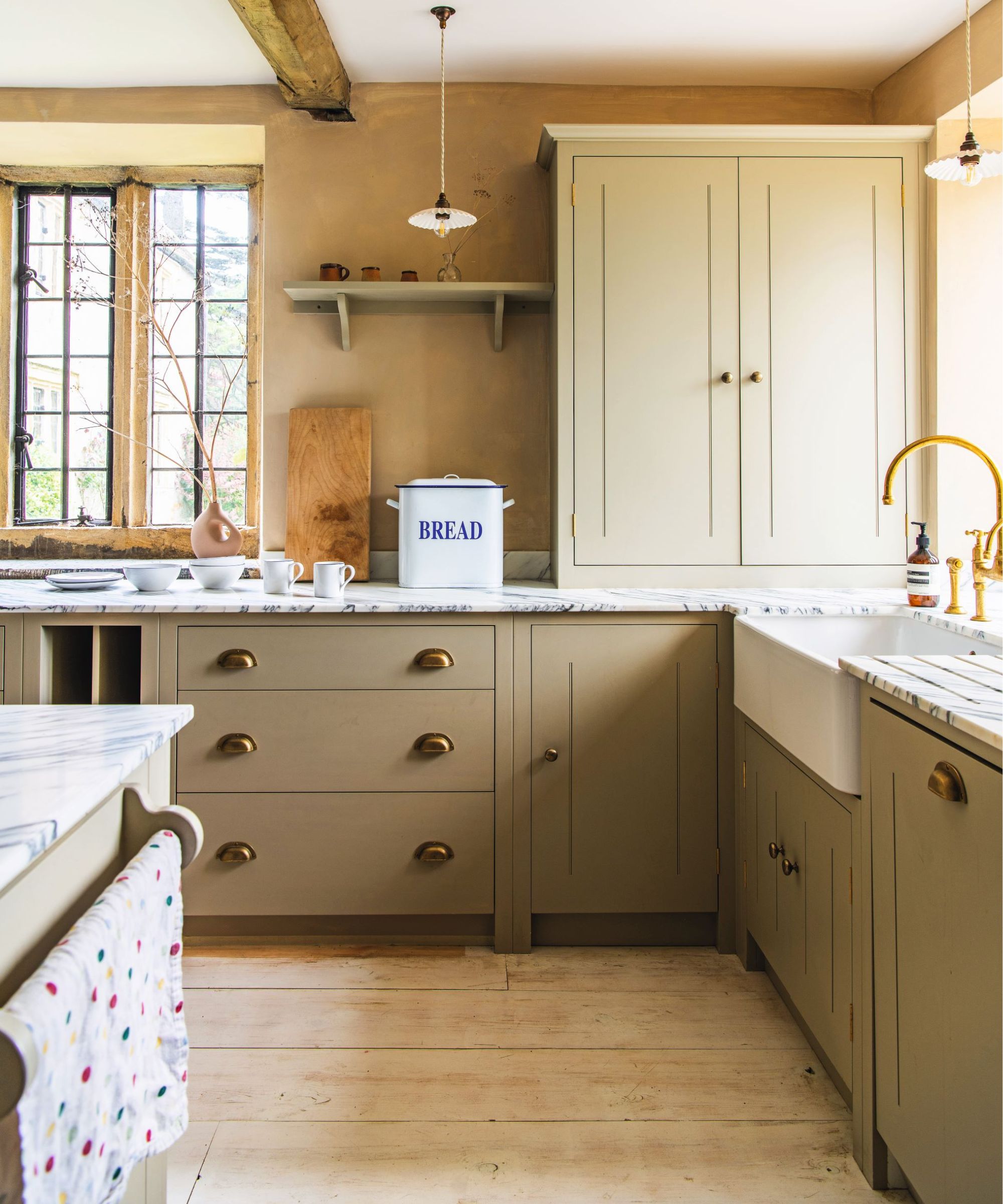
Jennifer Ebert, online editor of H&G, only recently found out she's an autumn person. 'It didn't really surprise me that I'm an autumn,' she says. 'I've always been drawn to warm, muted, earthy autumn colors for clothes and interiors. In fact, I painted my bedroom olive green a couple of years ago and have just updated the space again by decorating with beige, both shades very much drawing on the autumn palette.'
'Just like cuddling up in a blanket on a crisp autumn day, these colors instantly make a room feel cozy and warm,' explains Jeannie Stith. 'So they're a great choice for bedrooms, as Jennifer is finding out, but also for family rooms, reading rooms, and home theaters. Autumn colors are soothing, warm, and can even make larger rooms have a cozy feel.'
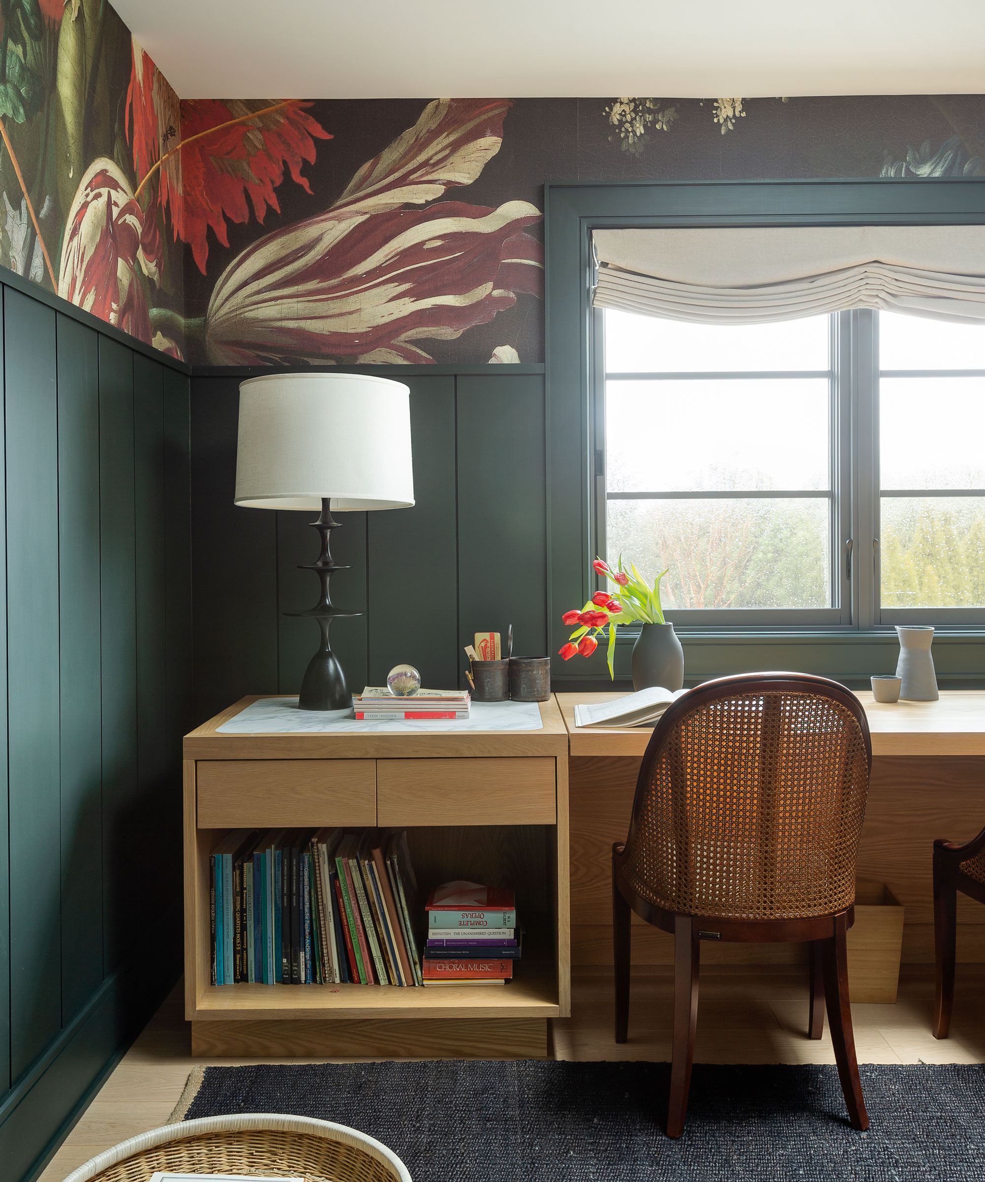
We also wondered if certain rooms used for specific purposes would call out for winter colors. Again, Jeannie was on hand to enlighten us.
'Winter colors are the highest contrast colors, which are also high energy colors,' explains Jeannie. 'Think crisp white, black, and jewel tones like ruby, sapphire, emerald, and amethyst. These colors and color combinations are better suited to rooms where you want the room to have a feeling of "let's go!!" instead of "let's relax and chill". So rooms that would benefit from the energy of these colors would be mudrooms, home offices, and home gyms.'
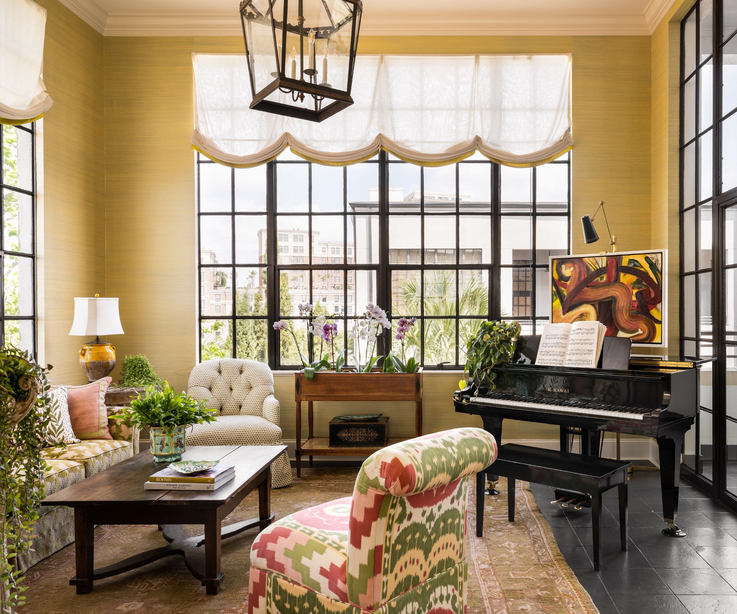
And the rooms that suit summer colors? Sunrooms, for starters, as this Charleston, SC, penthouse space designed by Moe Draz of Architrave Interior Design so beautifully demonstrates. 'I really love how all the dark elements of the room interact with the chartreuse green grasscloth (by Innovations in Wallcoverings) on the walls,' says Moe.
Jeannie Stith adds, 'Summer colors are cool, muted, and light. There are lots of pastels in the summer palette, and some deeper colors as well, but even the deep colors are muted and soft. Cool, muted, light colors are perfect for rooms we want to relax in and where we want the room to have a light and airy feel. The summer palette is ideal for living rooms, sunrooms, and nurseries.'

Moe Draz founded Architrave Interior Design in 2016. Since then, the studio has completed countless projects across multiple properties, transforming spaces with beautiful details and ambitious designs, from concept right through to installation.
Can you mix two color palettes?
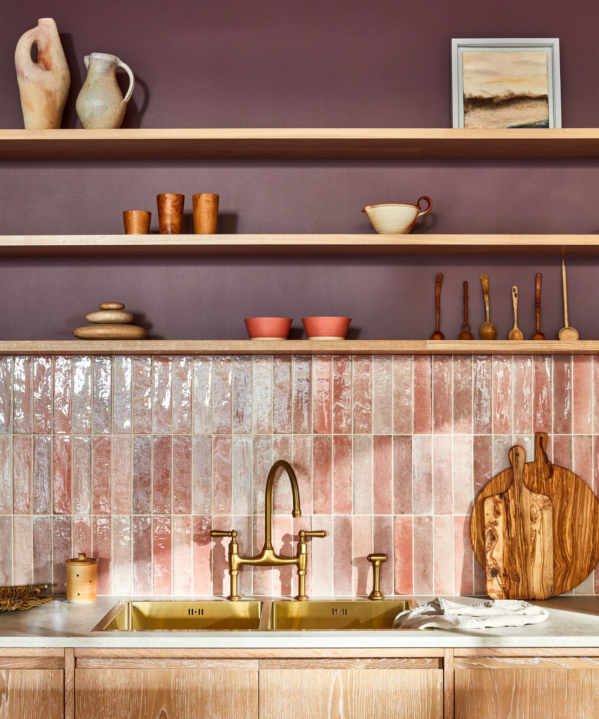
It's all very well matching home decor to your seasonal color analysis, but we've spotted a flaw. 'How does it work when people in the house have different seasons?' we asked Jeannie. It turns out, it's all about compromise, and the results can be very pleasing.
'A great place to start with is how you all want the house to feel,' says Jeannie. 'If there is a couple with one Autumn type (warm, earthy, muted colors) and one Winter type (cool, high energy, bold colors) for example, but they both want the house to feel warm, earthy, and calm, well that describes autumn colors, so the Autumn palette would make most sense for their home.'
'Other people take the approach of creating a color palette for their home that is a mix of two seasons and that result can be very interesting and beautiful! For example, the Autumn/Winter couple could use some of the warmer colors from the Autumn palette like smoky violet, bay leaf, and cream, and incorporate some cooler winter shades like evergreen, spiced pear, and charcoal to come up with a beautiful combination that honors both palettes.'
Any cons to using seasonal color analysis in interiors?
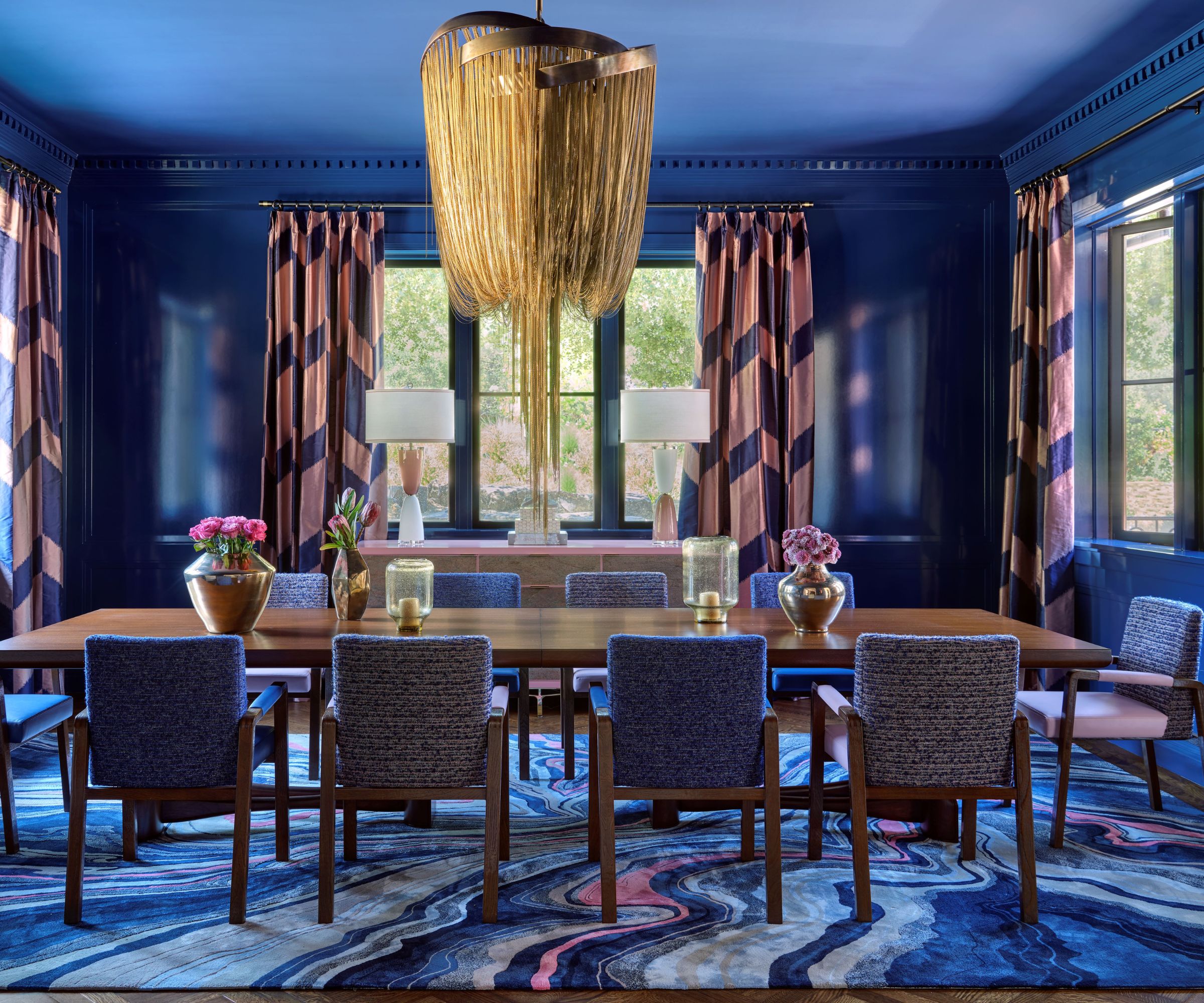
Kendall Wilkinson, the San Francisco-based interior designer of this blue dining room, was less enthusiastic about the role of seasonal color analysis in interior design, and says: 'We ask detailed questions to understand and build a picture of clients' color and aesthetic preferences. They often have very visceral responses to specific colors, an excellent baseline for cultivating initial design plans. However, what we do is deeply personal, so we don't rely on color theory, trend reports, or the individual seasons with our design process or color selection.'
Although many of Kendall Wilkinson's projects are international, the firm's key market is its California backyard and in that sunny location decorating with blue is a popular and stylish way to go.
'Because of the climate here, we always take inspiration from Mother Nature, and inherently, a lot of blue makes its way into our client's hearts and our design plans – reflections of the sky and sea,' says Kendall. 'A little fact I discovered recently is that all of human evolution has been under the blue skies of our planet, and in color studies, our minds respond most to the blue spectrum of color and light, so it's no coincidence that blues are most often favorite colors.
'We used more than 27 paint colors in this Silicon Valley home,' adds designer Kendall, 'and decided to wrap the dining room in a bold sapphire blue applied in a high gloss finish. The color is bold and deep, and the sheen of the finish adds a reflectivity that makes evening meals and dining parties sexy and alluring.'
With a dining room color so rich and delicious, we doubt anyone's worried about what season it belongs to.
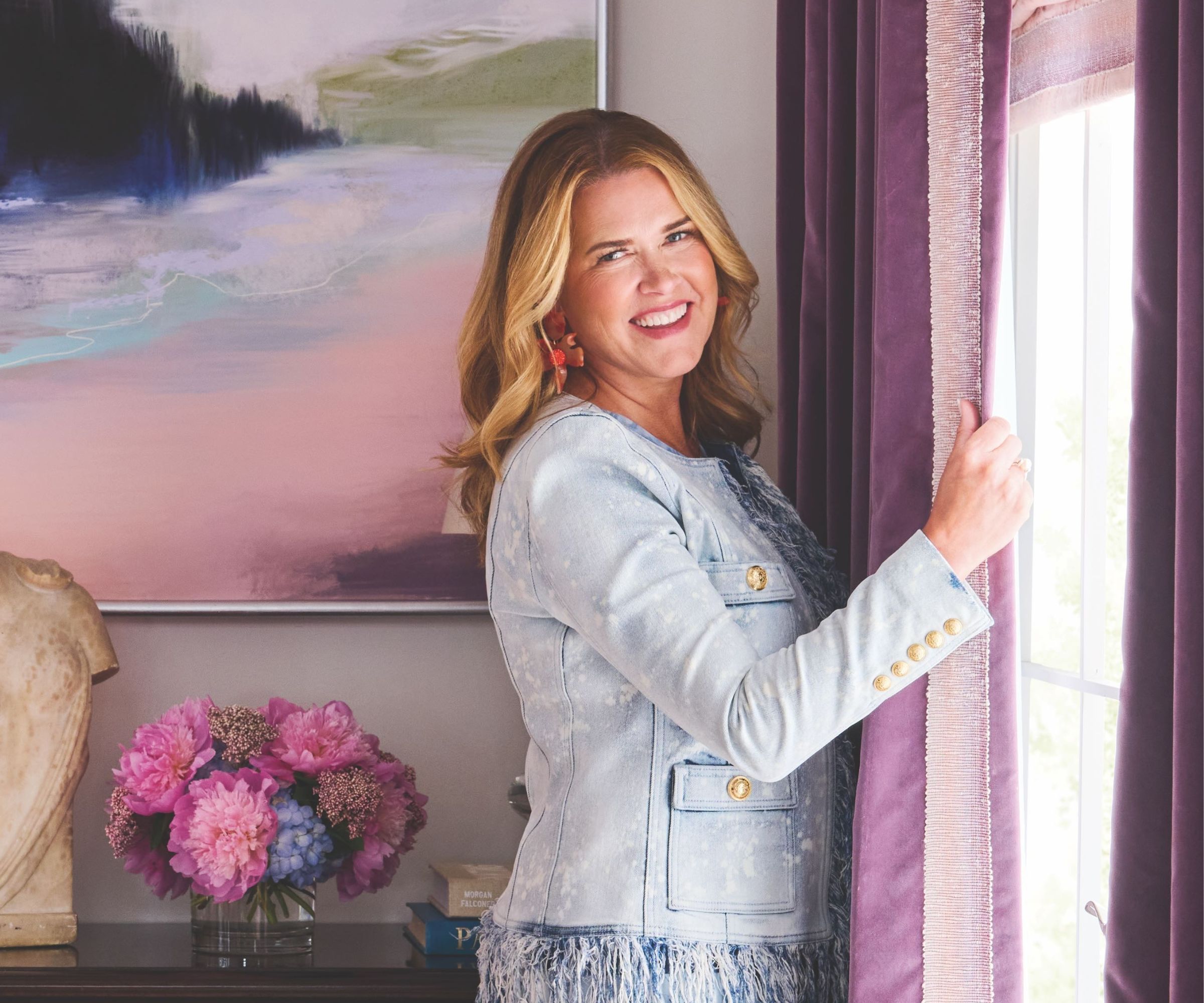
Kendall Wilkinson Design (KWD) creates bespoke residences with an emphasis on beauty and comfort. With a foundation of classic design sensibility, Kendall’s style continues to evolve with every project she engages.
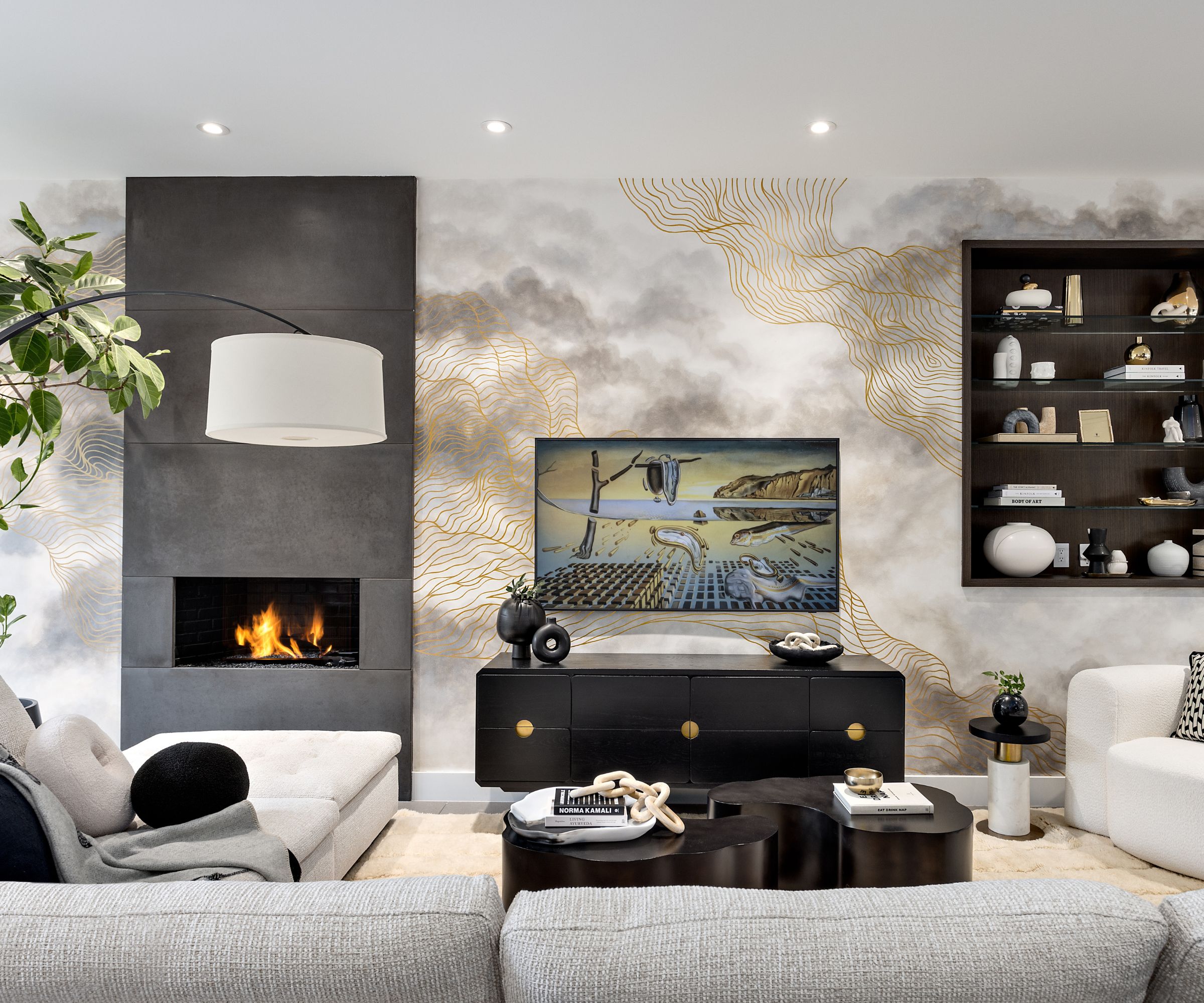
Phyllis Lui, partner and principal of Vancouver-based Kalu Interiors, designed the family room above. She says she prefers to lean on other factors when working with clients to choose color schemes for their homes.
'I don't fully agree that a person’s season should come into play when designing a space,' says 'Naturally people are attracted to certain colors but that does not necessarily mean they are the colors that are considered to be their season. It's important not to overlook people’s personalities and likes by designing in this way.
'For instance, somebody that is considered to be an autumn person is supposed to use deep greens and maroon but they may dislike the heavy dark colors in their space and prefer to keep it light and airy,' adds Phyllis. 'I feel that people’s homes should be more of an extension of who they are and not so much in tune with what color they look best in.'

Phyllis Lui of Kalu Interiors has become known in the industry for her classic and tasteful style. Her designs have captured the attention of many and have been nominated for awards nationwide.
Opinions are divided between the experts. There are some who back seasonal color analysis as a means of determining the optimum colors for interiors. While others prefer to choose a color scheme based on the home's location; the room's practical use; or simply by talking to the homeowner to establish their preferred choices for the space.
What's clear in this, however, is that we are instinctively drawn to the colors that suit us best, and that is true just as much for our interior design schemes, as it is for our clothing. We're all simply seeking to color our homes beautifully.
Karen sources beautiful homes to feature on the Homes & Gardens website. She loves visiting historic houses in particular and working with photographers to capture all shapes and sizes of properties. Karen began her career as a sub-editor at Hi-Fi News and Record Review magazine. Her move to women’s magazines came soon after, in the shape of Living magazine, which covered cookery, fashion, beauty, homes and gardening. From Living Karen moved to Ideal Home magazine, where as deputy chief sub, then chief sub, she started to really take an interest in properties, architecture, interior design and gardening.
