How to Design Your Bedroom for Sensational Sleep
These small design changes can make a big difference in how well you sleep – here’s what the experts recommend

Charlotte Olby
- 1. Create a sleep-first layout
- 2. Perfect the bedroom color scheme
- 3. Master light levels
- 4. Control temperature all year round
- 5. Reduce noise for deep sleep
- 6. Introduce soothing scents
- 7. Choose sleep-supportive furniture
- 8. Keep the space fresh and allergen free
- 9. Add plants that promote rest
- 10. Small extras that make a big difference
- Should you turn off Wi-Fi routers at night?
- What’s the best place to put a mirror in a sleep-focused bedroom?
- Is it better to keep windows open or closed?
- Should you turn off your AC at night?
- What is 'Cozymaxxing'?
Design expertise in your inbox – from inspiring decorating ideas and beautiful celebrity homes to practical gardening advice and shopping round-ups.
You are now subscribed
Your newsletter sign-up was successful
Want to add more newsletters?
Designing a sleep-supportive bedroom plays a major part in allowing you to get the best night’s rest you can. While 2025 lifestyles can impinge on the room’s qualities as a peaceful sanctuary, great bedroom design can be the remedy to a whole lot of issues.
Our guide draws on both the latest sleep science and the principles of interior design with bedroom ideas that deliver on style and hold the promise of peaceful slumber.
Research continues to reveal how to sleep better, and our advice offers practical strategies for taking advantage of the latest discoveries and creating an aesthetically pleasing bedroom.
Article continues below1. Create a sleep-first layout

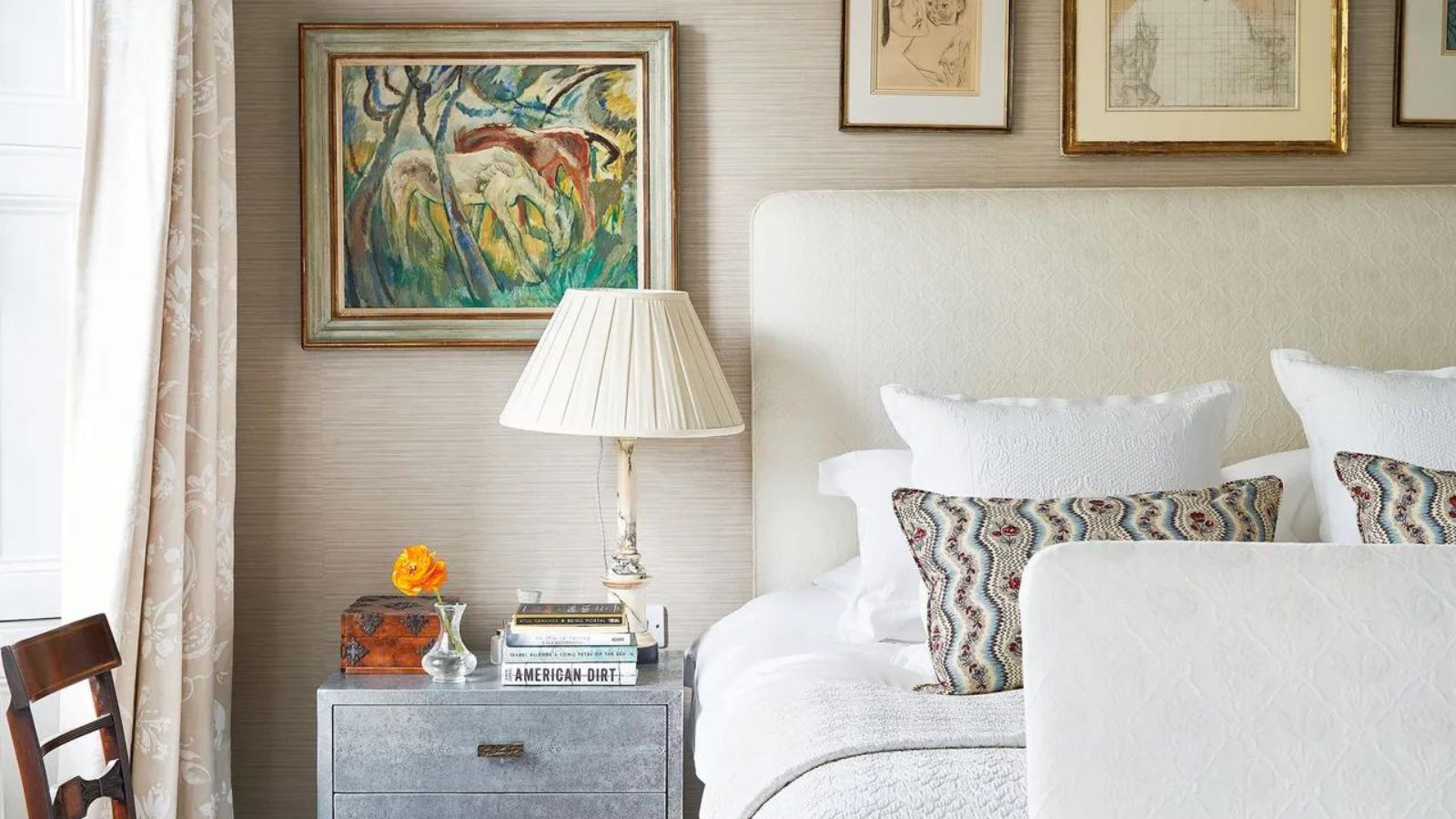
To create a sleep-first bedroom layout, begin by considering the position of the bed, which should promote comfort and calm. Placing the bed against a wall maximizes space in the room – especially valuable in a small bedroom. Avoid any party wall, though, as you don’t want to be disturbed by sound from a neighbor’s home. Putting the bed under a window might mean a sleep-disturbing draft, so avoid this and move your bed placement elsewhere to stay warm at night.
Bedroom feng shui principles require that the bed be in the commanding position so that you can see the door from the bed, no matter which sleep position you're in, without being directly in line with it, ensuring you are aware if the door opens. This is reassuring and can make it easier to sleep.
Putting the bed in a space-efficient place also helps avoid obstructing pathways through the room. Position the remaining bedroom furniture with this in mind, too. An overfilled room as a whole creates visual noise that detracts from calm, and the utility of every piece of furniture should be considered to avoid crowding.
Aside from putting the bed in the commanding position, adopting other feng shui principles can contribute to a restful atmosphere. You shouldn’t hang anything above the bed, nightstands should match (and provide storage space that avoids clutter), and you should avoid keeping items that aren’t connected to sleep in the room.
Design expertise in your inbox – from inspiring decorating ideas and beautiful celebrity homes to practical gardening advice and shopping round-ups.
2. Perfect the bedroom color scheme
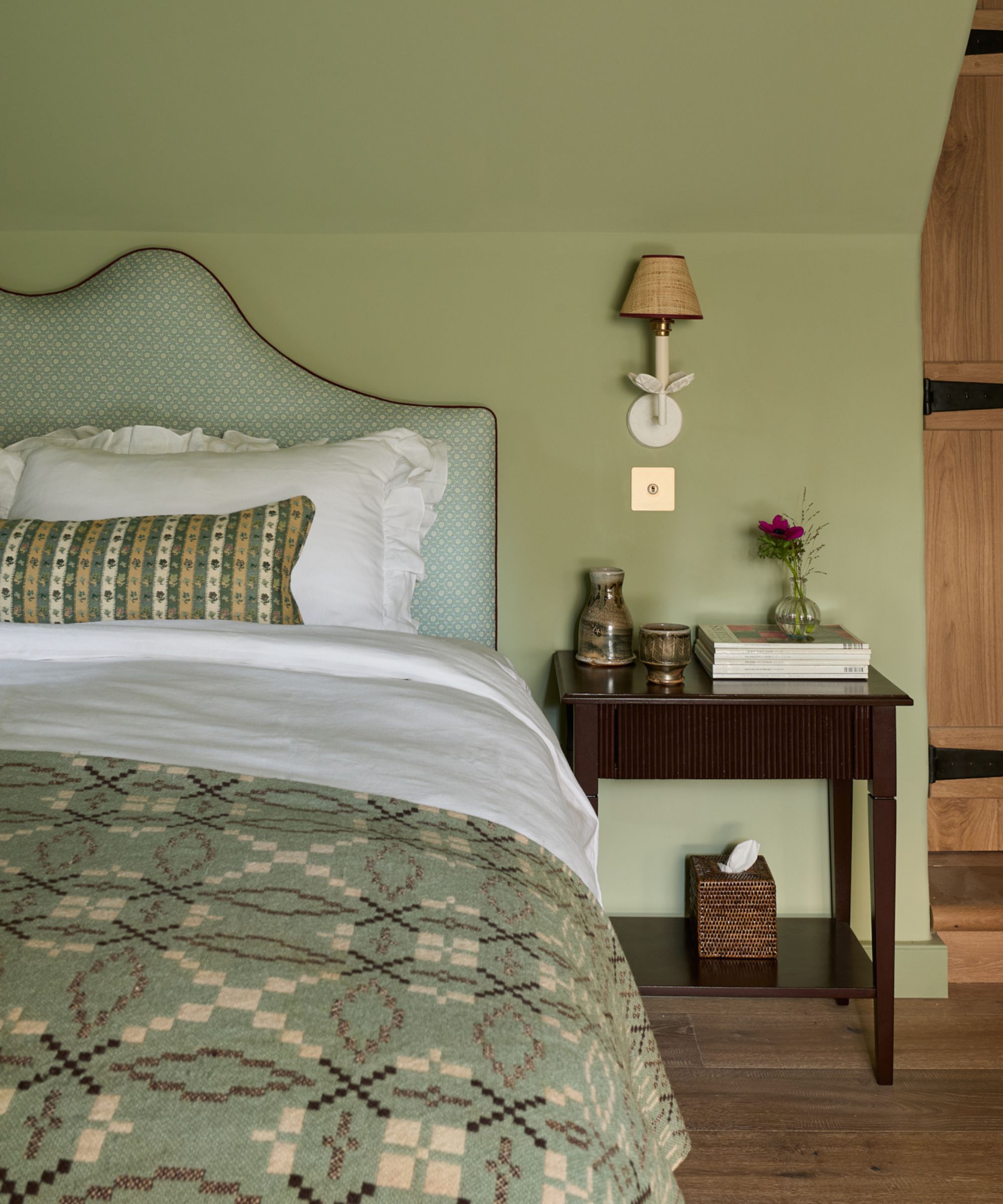
Draw on the color psychology that reveals that certain bedroom color ideas are calming while others stimulate in order to create a bedroom color scheme that’s soothing. Think earthy greens and warm neutrals to evoke a restful atmosphere. Pink can be another good choice, but keep it to a natural dusky take on the hue.
The bedroom colors to swerve for great sleep? ‘Avoid any color that's overly stimulating or highly saturated says Lick’s director of interior design and color psychologist, Tash Bradley. ‘If you’ve got one of those brains that simply won’t stop the chatter as soon as your head hits the pillow, then I advise swapping the electric blues, primary reds, and “brat” greens for their more muted, softer counterparts.'
Limewashing a bedroom has also been hailed as a relaxing bedroom paint option in a recent study by sleep psychologist Dr. Katherine Hall. Limewash mixes lime, water, and colored pigments to create a textured and breathable finish on walls that’s antiseptic, antifungal, and antibacterial, and has been shown to improve air quality in a bedroom in turn improving sleep.
Color drenching – painting one color in slightly different tones across multiple surfaces in one room – is a further alternative. ‘Using color drenching can bring a feeling of connectedness, can reduce stimulation and make us feel like we are surrounded by the harmony of difference, that is all the same at its root, creating an orchestra of one color that plays in tandem and in tune,’ says psychologist and wellbeing consultant Lee Chambers.
Blue, which sits alongside calming green on the color wheel, can be successfully paired with green with relaxing results, or used alone. Color experts single out Sherwin Williams' Atmospheric. and its Resolute Blue, Naval, and Vast Sky, along with Benjamin Moore's Van Deusen Blue as favorites for a calm bedroom.
Consider, too, selecting from the Color for Sleep collection, which is part of Valspar’s The Color Effect, curated palettes with wellbeing benefits. The brand suggests choosing their Kindness of Strangers, Gray Berry, Crushed Nutmeg, Indigo Dreams, Ethereal Dance, Sea Crest, Pink Alabaster, or Toasted Beige for an optimum sleep environment.
3. Master light levels
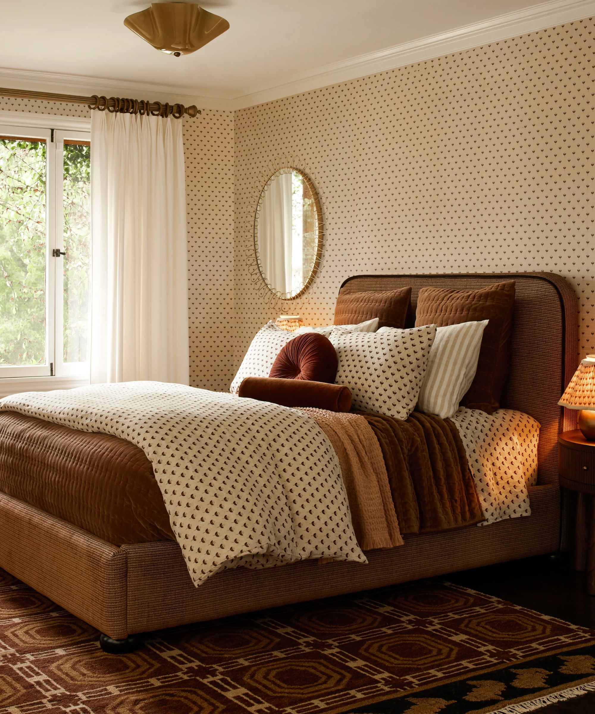
Think about the natural and artificial light that reaches a bedroom from the exterior as well as the lighting in the room when considering bedroom lighting ideas for great sleep.
For light sleepers and if there are intrusive street lights, blackout curtains or shades or heavy drapes are the way to go for your bedroom curtain ideas more uninterrupted rest. However, if for you the natural stimulation of the arrival of daylight makes for a better transition from sleep to wakefulness, solar shades and shadings or translucent fabrics can be used to filter daylight while maintaining privacy. They can be used on their own, but also layered with other window treatments.
Layered lighting within the room plays a crucial role in regulating your sleep cycle, too. An overhead light should be combined with other light sources, which might include wall sconces beside the bed, table lamps for nightstands and accent lighting, such as for a dressing table. And be sure to pick warm-toned bulbs of 2700K-3000K for a calming effect in the room.
There’s a best LED color for sleep as well. 'Switching to a natural red color light in your bedroom can help your body ease into its sleep cycle more naturally as it produces a wavelength similar to that of the setting sun,' says Matthew Shaw at Ultra LEDs. 'This forces your body to release more melatonin, the hormone that helps you sleep, making you feel drowsy and ready to go to sleep.'
But while red is desirable, blue light should be avoided. 'Blue light must be limited during the evening as it actually suppresses the production of melatonin and disrupts the natural circadian rhythm (needed for a good night's sleep),' says Dr. Pamela Miller, a medical reviewer for All About Vision.
A bedroom can be over-lit, stimulating rather than relaxing to prepare its occupant for sleep. Be sure that each of the lights in the layers can be controlled independently and go for dimmers so light levels can be gradually lowered. Keep fixtures with exposed bulbs for other rooms as intense light tells the body it’s daytime, and the same goes for reading lights that are very bright.
4. Control temperature all year round
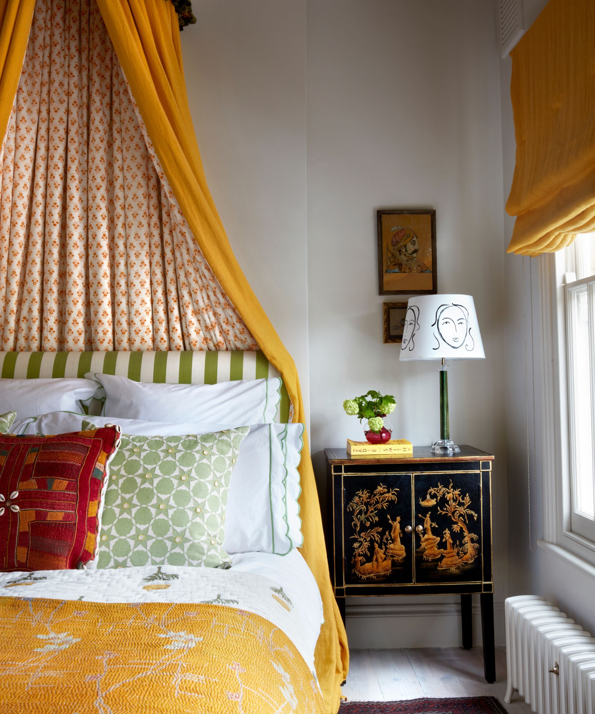
A bedroom should be relatively cool at night as a room that’s too hot affects the quality of sleep. So, when it comes to designing the room, ways to keep the temperature at the ideal level should be part of the plan.
Think seasonally with some of the choices for your room. In summer, swap to natural fibers for bedding if you’ve used synthetics in winter, together with lighter comforters or duvet inserts. We explore the best bed sheets you can buy in our dedicated round-up.
Consider changing window treatments to those in lighter colors and materials and options with cooling potential. ‘I normally choose drapes and blinds lined with metallic polymer fibers which reflect heat back out through the window instead of into the room,’ says Andrea Hundley, interior designer and editor-in-chief at Design Morsels.
You may also need to use products such as fans and portable air conditioning units.
Hot sleepers should pick from cooling mattresses, pillows, and cooling mattress toppers or pads. But there are strategies you should adopt, too, to complement the bedroom design. Turn off and unplug the tech that heats up a room; chill wrists and feet before bed using ice and cool water respectively; use a cold hot water bottle; and keep windows shut in the day to keep heat out then open them at night.
In winter, pick fleece and flannel bedding instead, and swap to a higher TOG comforter or duvet. Add a thick rug in a natural fiber like wool for comfort underfoot as well as extra insulation, and consider wall coverings such as canvases and tapestries for extra wall insulation. Go for heavier window treatments, too.
5. Reduce noise for deep sleep
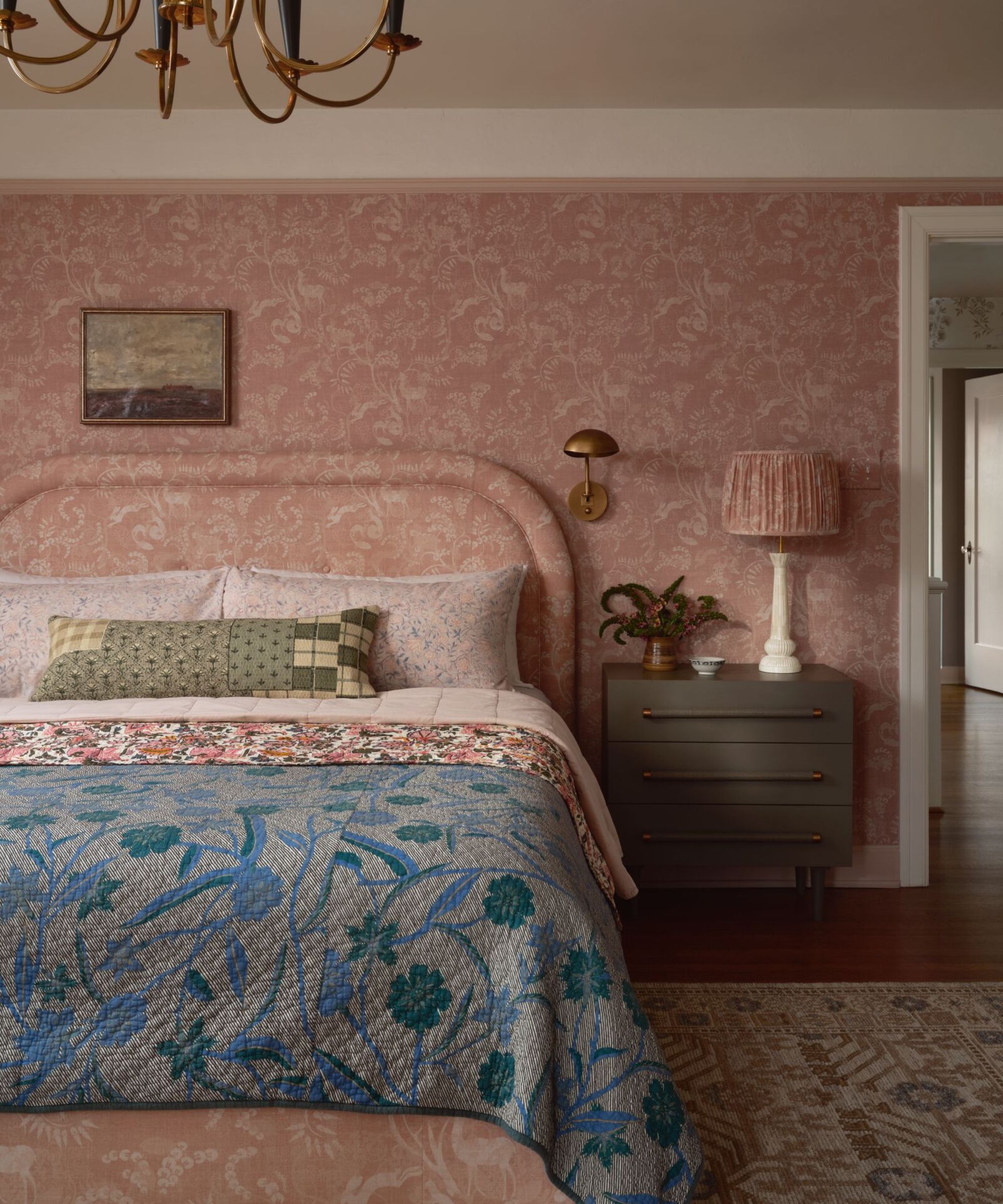
Noise from the street outside or even from others in your home on different schedules can be reduced with soundproofing techniques as part of a bedroom design.
A permanent way to lower sound transmission through walls is to use panels. ‘For existing rooms, the easiest thing to do would be to add a loaded vinyl noise barrier to the walls,’ says Tyler Hadley, of DDS Acoustical Specialties. ‘This 1/8 inch thick material can either be installed directly to wood or metal studs or directly over existing walls and finished over.’ Alternatively, try stick-on acoustic panels, which can reduce incoming noise and control sound within the room.
Look to the door, too. Sound travels more easily through a hollow core door, so choose a solid core door that is designed with more sound-dampening material.
Smaller fixes can also help such as sealing gaps around windows and doors using weatherstripping.
Focus on window treatments as well. These aren’t just useful for regulating light and heat but can provide noise insulation when you opt for heavy drapes. Size them up, too. In general, the more coverage is, the better,' says Devon Wegman, design director and founder of Devon Grace Interiors. 'We will often ceiling-mount drapes and install them from corner to corner, floor to ceiling in order to seal out as much noise (and light) as possible.’ Combining shades, blinds, or shutters, with drapes can also reduce noise.
Think heavy for other furnishings to contribute to a quieter room. Choose heavy weight carpet or dense area bedroom rugs, and heavy wall hangings. Throw blankets and pillows for the bed and seating can also absorb sound.
Some noise, on the other hand, can be worth introducing. Bedroom soundscaping introduces soothing sounds to a bedroom for great sleep. The pleasant noises – rain, waves, forest noises, or instrumental music – lower stress and promote relaxation.
Alternatively, you might prefer the constant background provided by a white noise machine or a white noise app. Either of these can block intrusive noise and can boost relaxation ready for a restful night.
6. Introduce soothing scents
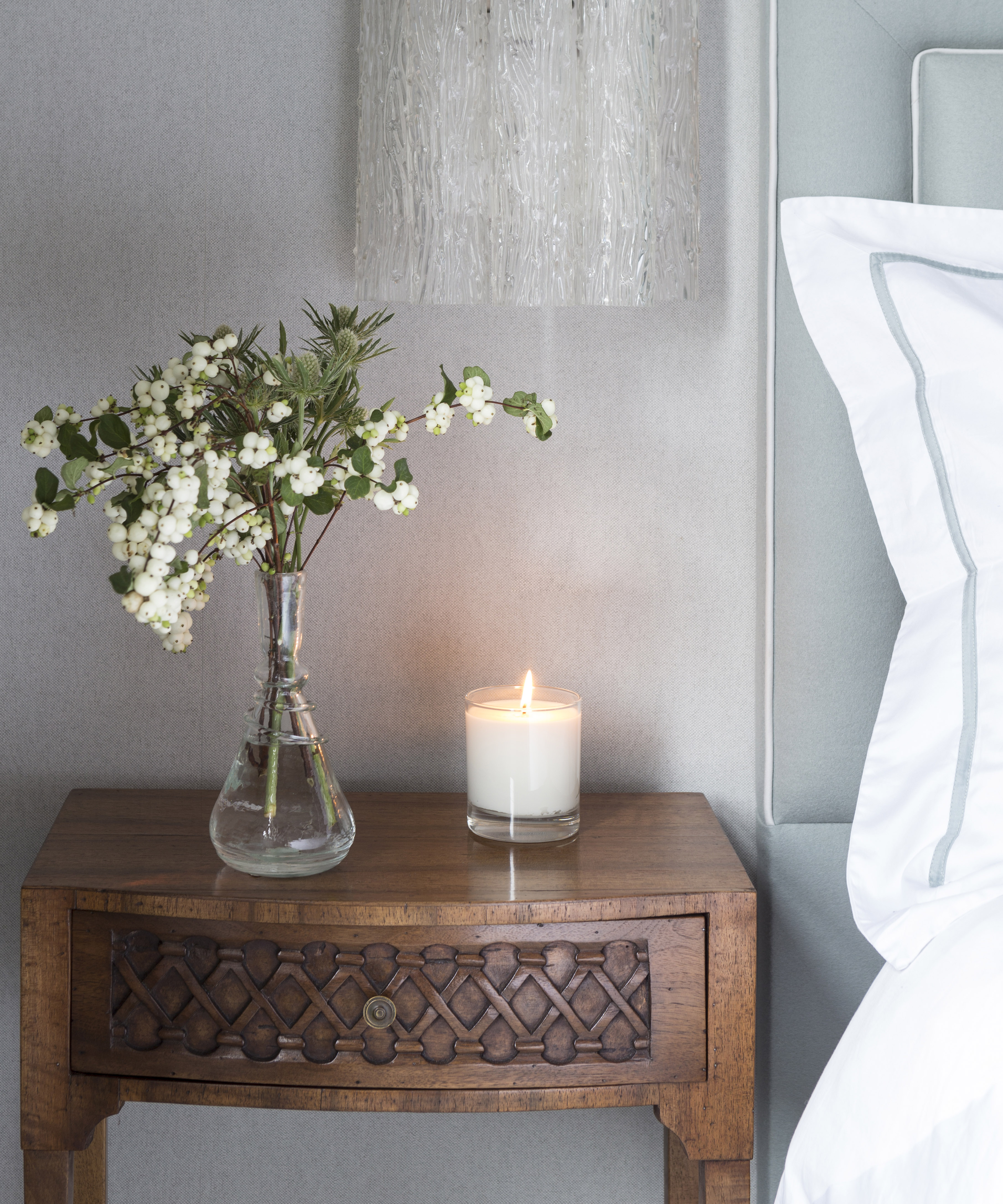
The best home fragrance can contribute to making a bedroom a calming environment that’s conducive to great sleep and the lore of aromatherapy can guide you to the best options.
Lavender
'Lavender is probably the most popular scent when it comes to encouraging a good night’s rest,' explains Nate Masterson, an aromatherapy expert for Maple Holistics. 'Compounds called linalool and linalyl acetate are found in lavender, and when inhaled, it can have relaxing and sedative effects on our central nervous system, making it an ideal scent for encouraging sleep.' Try it in a linen spray or use a dried lavender sachet.
Geranium
If you want a fresh, light scent to improve your sleep, but don’t fancy lavender, then geranium oil might be the next best thing, suggests Betsy Miller, MS, clinical herbalist and aromatherapist for Frontier Co-op and Aura Cacia.
To enjoy geranium essential oils, Betsy recommends investing in an oil diffuser and running it for no more than two to four hours at a time for adults and 30 minutes to one hour at a time for children, with an equivalent amount of time away from the diffusion. Choose a diffuser with auto shutoff to avoid fire risk.
Chamomile
Yes, you could try chamomile tea, but its scent can also help you wind down at night. ‘Chamomile contains apigenin, an antioxidant that binds to specific receptors in your brain to produce a calming effect,’ explains Dr. Leah Kaylor Ph.D. MSCP. ‘Apigenin acts on the same brain receptors targeted by certain anti-anxiety medications, promoting relaxation and reducing insomnia.’
Grapefruit
'Grapefruit – more specifically, ruby and dark pink grapefruit – contains lycopene, an antioxidant that helps promote drowsiness,' explains Nate. This makes it a fantastic scent for falling asleep with.
Jasmine
'This floral scent is sweet and a delight for anybody’s senses,’ advises Nate. ‘Not only does it relax you and help you sleep better, but it can effectively ease stress, and in many cases, it has been used as a way to alleviate the symptoms of depression. Benzyl acetate, linalool, and benzyl alcohol are the chemical compounds that give jasmine its therapeutic capabilities.'
Of course, is you are scent-sensitive, you’ll need to avoid the fragrances that trigger reactions such as tickling in the nose, sneezing, watery eyes, and headaches. Skip, too, aromas that, while pleasing, are stimulating, such as lemon, orange, and peppermint.
7. Choose sleep-supportive furniture
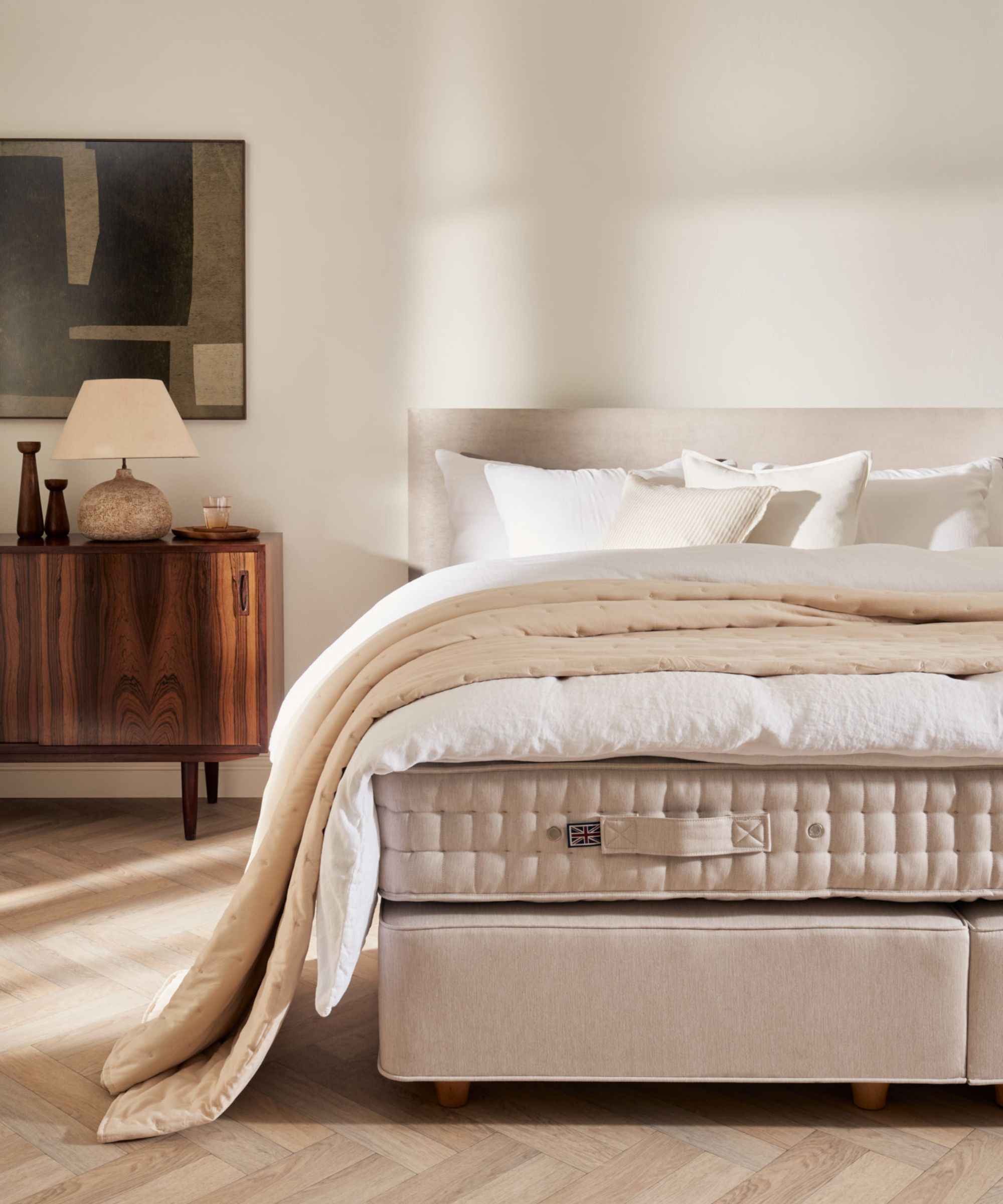
When you’re choosing furniture for a bedroom make sure that it’s sleep supporting as well as stylish.
A low bed can be a good idea in hotter climates and for hot sleepers as the mattress will be closer to the ground. (But don’t compromise accessibility if you need a higher bed.) However, consider airflow in the room as well. Opt for a box spring on legs or a slatted bed base to promote it – and don’t use the underbed space for storage. This way body heat will dissipate better.
Pick one of the best mattresses that allows the best airflow, too. Go for innerspring or hybrid, the springs of which permit airflow, or latex, which has an open-cell structure that does the same. Bear in mind that you should never use a mattress on the floor as this will restrict airflow around it.
Be mindful that mattress firmness also factors into designing a bedroom for great sleep since softer mattresses trap more heat. Go firmer for better airflow.
8. Keep the space fresh and allergen free

Focus on keeping the bedroom design free of clutter, fresh, and clean to aid great sleep.
Declutter
Decluttering a bedroom aids the relaxation necessary at nighttime. ‘Through decluttering, you create an aesthetically pleasing and visually soothing atmosphere. This has a direct impact on stress reduction, promoting a mental state conducive to restful sleep,' advises Marcus Smith, professional clinical counselor and executive director at Alpas Wellness.
Creating order in the room can also permit a relaxing transition from the day's activities to a peaceful night's rest. ‘Spend five minutes before bed clearing surfaces,’ says Ashish Agarwal, owner of Home In Depth. ‘It’s therapeutic and signals your brain that it’s time to wind down.’
A clutter-free bedroom is vital for another reason. 'A decluttered and organized bedroom is easier to keep clean, and fewer items will reduce the amount of dust that accumulates in the space overall,' says Lisa Munkvold, a professional organizer and the owner of Complete Clutter Control. 'A dust-free, clean space will improve the air quality in the bedroom, positively impacting your breathing and, therefore, your sleep.'
Clean
To clean a bedroom and reduce the room’s allergens be sure to dust and vacuum regularly. Periodically shampoo and deep clean your carpet or rug as well. For hardwood or laminate floors, vacuuming and mopping with wood floor cleaner can keep them looking and feeling fresh.
Pay attention to bedding, too. 'Wash your sheets, pillowcases, and duvet covers weekly in hot water and hypoallergenic detergents and dryer sheets to keep them clean and fresh,' says Angela Rubin from Hellamaid.

Angela Rubin is the owner of Hellamaid, an award-winning cleaning company in Canada.
Pollen-proof
Pollen-proofing a bedroom is a valuable strategy to reduce the presence of the allergen if you or a family member are affected by it.
Keep doors and windows closed as much as is possible when pollen levels are high to prevent its infiltration. However, this shouldn’t be at the expense of good ventilation, so use exhaust fans, open windows when pollen levels are lower according to pollen forecasts, and try an air purifier.
Keep up with decluttering and dusting, as above, to reduce the amount of pollen that can get trapped on crowded surfaces. Use a damp cloth when wiping them so pollen doesn’t become airborne again.
Choose easy-to-clean soft furnishings, and hypoallergenic materials such as leather or wood or synthetic materials.
Increase both vacuuming and bedding washing in peak pollen season. Vacuum the bedroom at least twice a week using a vacuum with a HEPA filter. Pay extra attention to areas where dust and pollen tend to accumulate, such as under the bed, in corners, and on window sills. Wash sheets biweekly and use a minimum temperature of 130°F if care labels allow.
9. Add plants that promote rest

Include the best bedroom plants in your bedroom design for sleep support. ‘Many studies have shown plants have sleep-inducing benefits,’ says sleep psychologist Dr. Katherine Hall. ‘They can help lower a person's cortisol levels (stress hormones) by emitting oxygen at night that clears the mind and relaxes the body.' They can also purify the air, releasing water vapor through their leaves and stems to maintain humidity levels.
These are the plants to consider:
Lavender
Known for its relaxing qualities. A plant’s a living alternative to sleep sprays and essential oils.
Jasmine
A sweet scent that helps to reduce stress and anxiety. It also looks pretty in a bedroom, with white flowers that bloom during summer months.
Peace lily
It’s one of the best indoor plants for improving air quality.
Spider plant
Low maintenance, great for absorbing toxins, including any odors, and increasing oxygen levels in the air.
Snake plant
Known for its ability to remove pollutants such as trichloroethylene, benzene, and formaldehyde from the air. A special type of photosynthesis (called crassulacean acid metabolism or CAM) means snake plants absorb carbon dioxide at night and, unlike most plants, release some oxygen at night, too.
Aloe vera
Another plant that can release some oxygen at night, and easy care to boot.
Rosemary
Loved for its strong aroma which has been found to be relaxing.
Chamomile
Acknowledged for its ability to promote relaxation, the plant is an alternative to the scent (see above).
Think about any plant’s shape and color so it complements a bedroom’s aesthetic and be sure to check its eventual size. Some varieties may grow too big for your space, especially if you have a small bedroom. Snake plants and spider plants are good options as they won't dominate your bedroom and can easily sit on the top of a set of drawers or a bedside table.
When it comes to their position, trailing houseplants are ideal for a bedroom shelf or bookcase, and cascading leaves will add interest to a blank bedroom wall.
10. Small extras that make a big difference
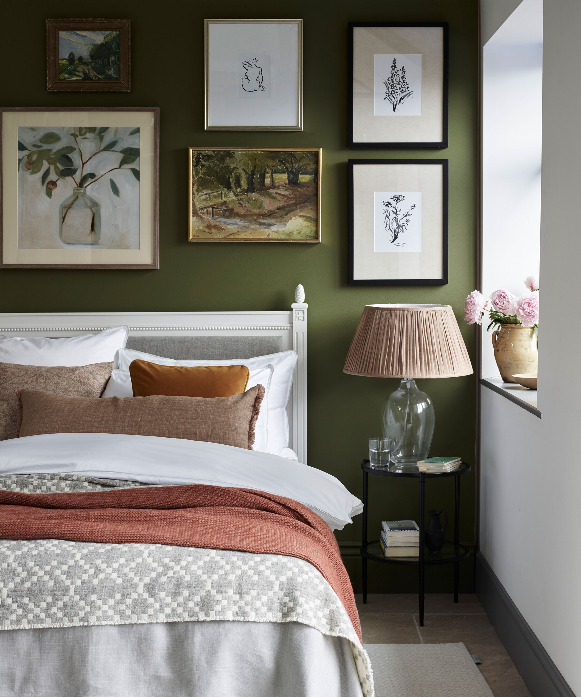
A bedroom design should include the finishing touches that maximize sleep support.
Worth adding are weighted blankets. The deep pressure stimulation provided by one of these decreases the level of cortisol and boosts the hormones that enhance mood with the resulting promise of a relaxing sleep.
Consider your bedroom art ideas, too. As with wall colors, selecting artwork that features calming shades as well as calming scenes – personal to you – can make a bedroom a soothing space.
Tactile accessories can contribute to calm as well. Opt for materials that are pleasing to touch for these: think wood and ceramics and mix matte and glazed finishes.
Add the essentials for winding down to your nightstand. Pillow spray in your favorite relaxing scent, or an oil diffuser or scented candle, and an eye mask if you need it in addition to window treatments to block out light.
FAQs
Should you turn off Wi-Fi routers at night?
Some sleep experts recommend turning off Wi-Fi at night on the grounds that it can interfere with the natural production of melatonin, preventing you from getting restorative sleep. However, there isn’t conclusive evidence that this is the case.
Of course, if it prevents excessive screen time, turning off the router could help you relax before bed but you should bear in mind that turning it off has other complications. Updates to firmware are typically sent overnight. Additionally, disruption to your smart tech could cause you anxiety and result in poorer sleep.
What’s the best place to put a mirror in a sleep-focused bedroom?
Positioning a mirror opposite carefully selected artwork or a bedroom plant can be the best choice in a sleep-focused bedroom since you‘ll get another view of the items you’ve used to make it a soothing space.
Bear in mind that some schools of feng shui recommend you don’t have a mirror in the bedroom at all because negative energy reflects off the mirror and remains in the room. If you’re sleep is poor, it’s certainly worth trialling going without.
Is it better to keep windows open or closed?
Keeping bedroom windows open at night is, for the most part, preferable in order to ventilate the room, improve airflow, and reduce overheating, which are all conducive to good sleep. Even having them open a crack can help if it’s not safe to open them wider.
The time to keep them closed? When opening windows will make the room cold enough to detract from good sleep, and when pollution and allergens will have a detrimental affect on sleepers.
Should you turn off your AC at night?
Turning the AC off at night can bring improved sleep. If it makes the temperature too low, AC can interfere with nighttime rest. Be mindful, too, that if the fan circulates allergens this will also negatively impact sleep. The cool of AC might also aggravate pain by making muscles tense, so it’s also worth switching off if that’s the case.
What is 'Cozymaxxing'?
Put simply, 'cozymaxxing' is all about characterful rooms filled with natural textures, earthy colors, and mood lighting, and making your space feel as comforting and relaxing as possible, both physically and psychologically. Here are six easy ways to try it in your own space:
- Incorporate natural materials: Think linen, brushed oak, hand-glazed ceramics, and biophilic elements to bring nature indoors, like leafy greens, earthy textures, and even the gentle sound of water to bring presence and peace, and help you drift off to sleep.
- Set the mood: The feeling of coziness is really about the experience you create in your home; it's not just how it looks, but how it feels. This might look like burning your best candle, playing music, and inviting layers of textures, such as throws, rugs, and pillows into each space, for a cozy vibe that welcomes relaxation.
- Add a comforting fragrance: Find your bedroom's signature scent, and invest in the best reed diffusers or best essential oil diffusers.
- Create a cozy color palette: Warm color schemes on the red, orange, and yellow spectrum can really help to bring comfort to your bedroom in the colder months, especially if you have some rooms that do not benefit from a lot of natural daylight. You don't have to fully redecorate, though – you can add visual interest and bring cozy paint colors into the scheme, such as more intense navy and warm golds, through upholstery or textiles.
- Dim the lights: Soft lighting and dimmable lights using warm-toned bulbs add instant coziness and intimacy. Opt for the best lightbulbs you can afford, such as filament bulbs, which lend a lovely glow. Candlelight isn't just for winter, either. It can really uplift a bedroom in the spring and summer months, especially as dusk starts to close in.
- Declutter: Clearing visual clutter in your bedroom is a sure-fire way to help you sleep better.
Design benefits
Contemporary lifestyles make designing a bedroom that supports sleep through its color palette, furniture, layout, material choices, lighting, and more the way to go.
The latest scientific findings have much to offer bedroom design, and picking just one of the recommendations from our selection can begin the changes conducive to restful sleep, bringing calm and comfort without compromising on style.

Sarah is a freelance journalist and editor. Previously executive editor of Ideal Home, she’s specialized in interiors, property and gardens for over 20 years, and covers interior design, house design, gardens, and cleaning and organizing a home for Homes & Gardens. She’s written for websites, including Houzz, Channel 4’s flagship website, 4Homes, and Future’s T3; national newspapers, including The Guardian; and magazines including Future’s Country Homes & Interiors, Homebuilding & Renovating, Period Living, and Style at Home, as well as House Beautiful, Good Homes, Grand Designs, Homes & Antiques, LandLove and The English Home among others. It’s no big surprise that she likes to put what she writes about into practice, and is a serial house renovator.
- Charlotte OlbyStyle & Trends Editor