Benjamin Moore's fresh and crisp 'winter skies' color palette is making a case for cooler shades – here's what designers make of the trend
It can be difficult to find design inspiration in the depths of winter, but Benjamin Moore's new 'winter skies' color palette is filled with new tones perfect for right now

Design expertise in your inbox – from inspiring decorating ideas and beautiful celebrity homes to practical gardening advice and shopping round-ups.
You are now subscribed
Your newsletter sign-up was successful
Want to add more newsletters?
Sometimes, giving your home a mid-winter refresh is all you need to maintain a cozy, comforting atmosphere all year round. And this year, Benjamin Moore has provided the perfect color collection for a frosty spruce-up. The brand's 'winter skies' palette, consisting of icy neutrals and bold accent hues, is full of refreshing design inspiration.
In a post announcing the shade range, Benjamin Moore says the colors 'pair effortlessly with fuzzy socks, flickering candles and plenty of cozy nights spent wrapped up in your favorite blanket.' And while the cold winter drags on, it's safe to say we're sold. These are the selected shades, plus how designers recommend bringing these paint ideas into your home, for winter and beyond.
A post shared by Benjamin Moore (@benjaminmoore)
A photo posted by on
What colors are included in the 'winter skies' palette?
The 'winter skies' palette strikes a beautiful balance between fresh and frosty, and warm and inviting – the perfect combination to stave away the winter blues. Here's an inside look into all the shades included in the collection, and what designers suggest for putting them to use.
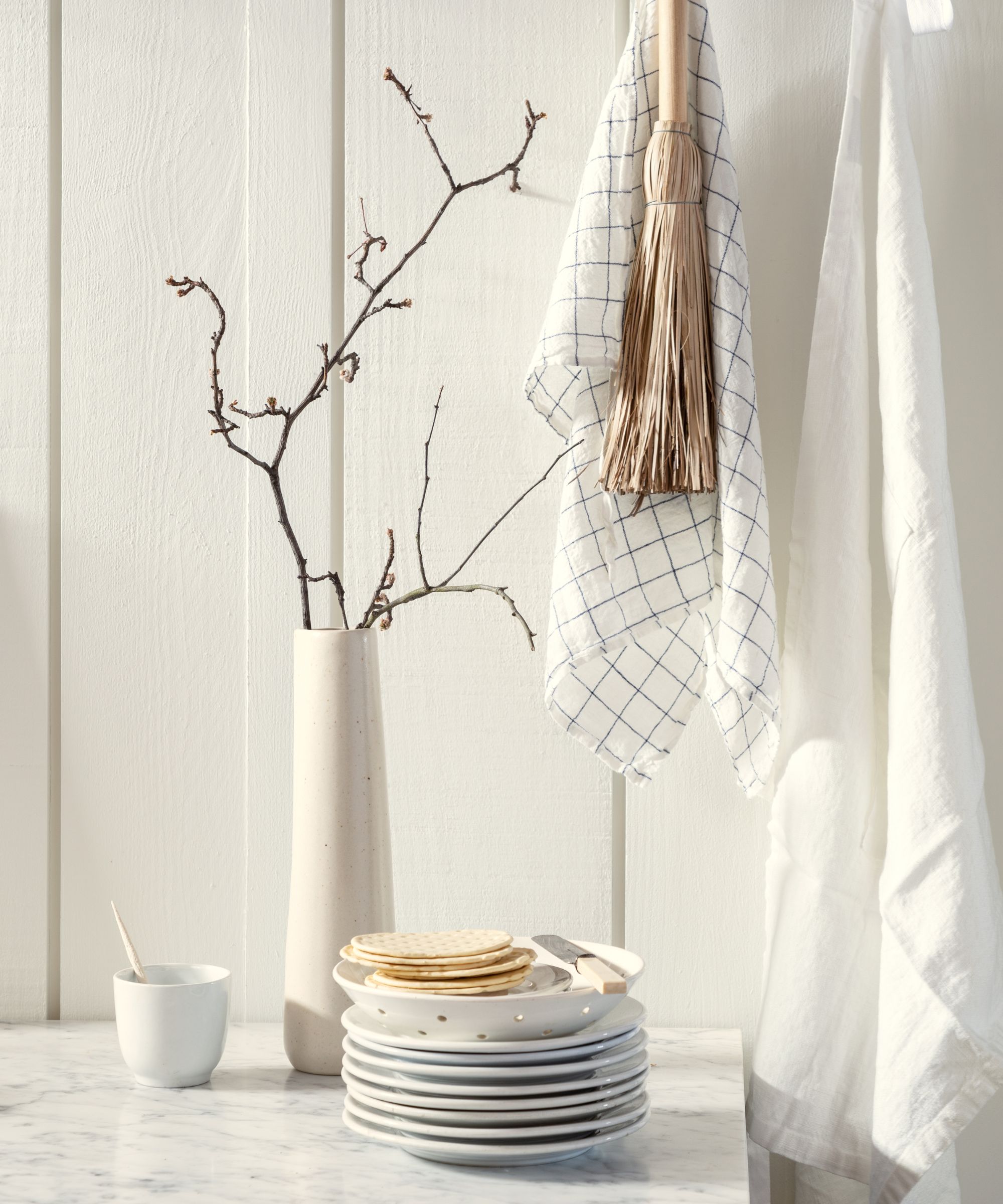
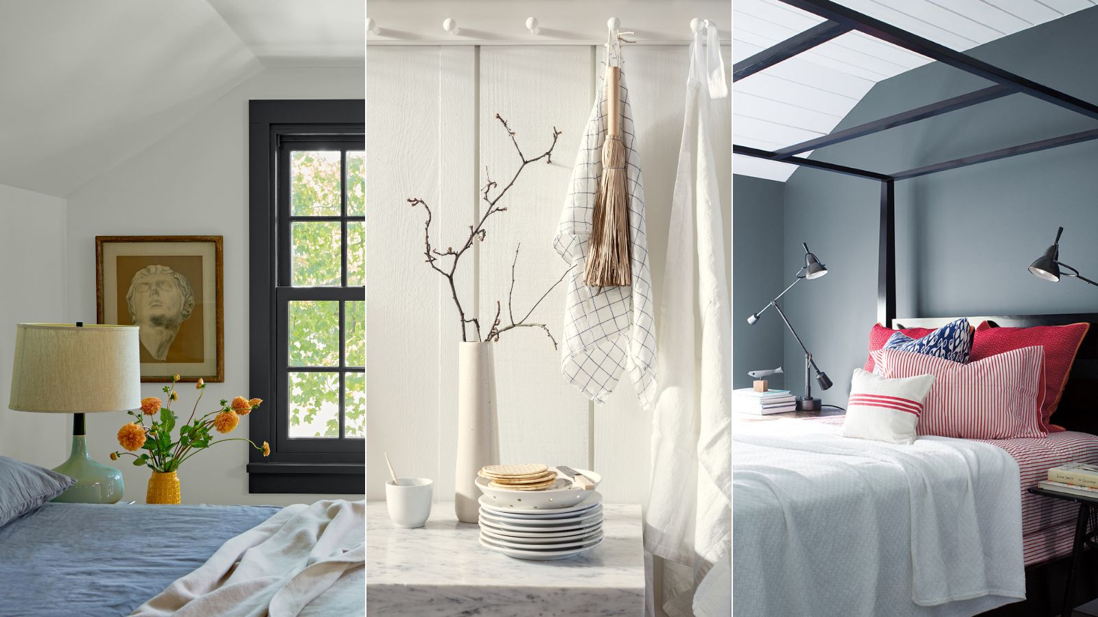
Benjamin Moore brought six shades together to form the winter skies palette, and they range from soft and light to bright and bold. Icicle OC-60, pictured above, is a 'soft off-white with a subtle gray-green undertone,' says Hannah Yeo, senior color manager at Benjamin Moore.
'Not too creamy nor too sterile, this shade creates a quiet and calming backdrop. Like many off-white colors, Icicle can be used as an all-around wall color or for the trim and ceiling throughout the entire home,' says Hannah.
She suggests pairing the neutral shade with Silver Gray 2131-60 'for an all-year-round color combination,' while Dry Sage 2142-40 or Trailing Vines 1505 'create an earthy monochromatic color scheme. First Snowfall 1618 is the next shade up in the winter skies collection, and Hannah describes the hue as 'a mix of icy white and pale blue that brings a gentle breeze into the space.'
'This delicate hue is great for south-facing rooms as the cool undertone balances strong natural sunlight. Get creative and bring in fun pops of colors or elevate the space by pairing with soft neutrals such as Pashmina AF-100,' she says.
Design expertise in your inbox – from inspiring decorating ideas and beautiful celebrity homes to practical gardening advice and shopping round-ups.
For a bit of a brighter pop of color, Polar Sky 1674 is a welcome addition to the palette. Also part of Benjamin Moore's Color Trends 2024 palette, this shade is 'a light, crisp blue that resembles a cool winter sky,' says Hannah. 'With a light reflectance value (LRV) of 69, it reflects decent amount of light making the space appear brighter and larger. A drop of gray undertone adds a touch of softness and sophistication,' she says.
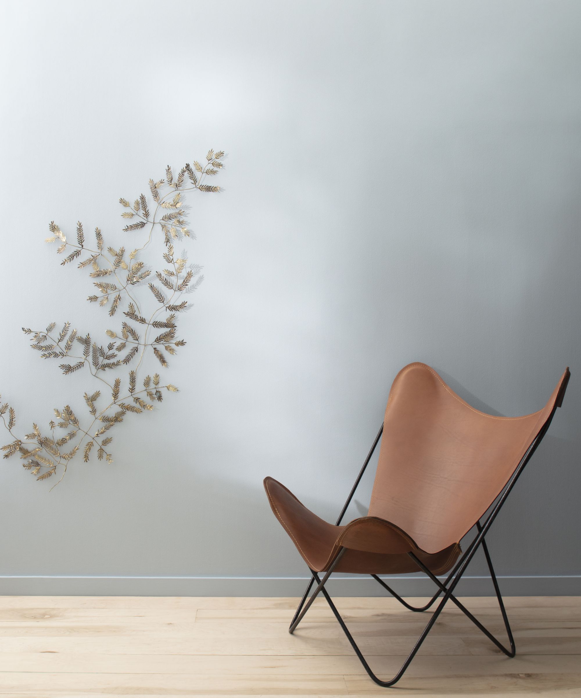
New Hope Gray 2130-50 is 'a tranquil blue with a healthy dose of a gray undertone,' says Hannah.
'New Hope Gray can look sleek, soothing or moody depending on how you dress it. This rich blue is best suited in larger rooms with lots of natural light, which also makes it a great exterior home choice. Pair it with a crisp white such as White Heron OC-57,' she says.
The last two shades deliver a bold and moody atmosphere fit for early sunsets and mellow nights in: Wolf Gray 2127-40 and Midnight Oil 1631. Hannah describes Wolf Gray, a gray with blue undertones, as 'fearless.'
'With an LRV of 21, this dark hue is great for accents such as cabinets, dressers and doors. It pairs beautifully with light gray stones and dark wood, which contributes to its popularity in the exterior of the home,' she says.
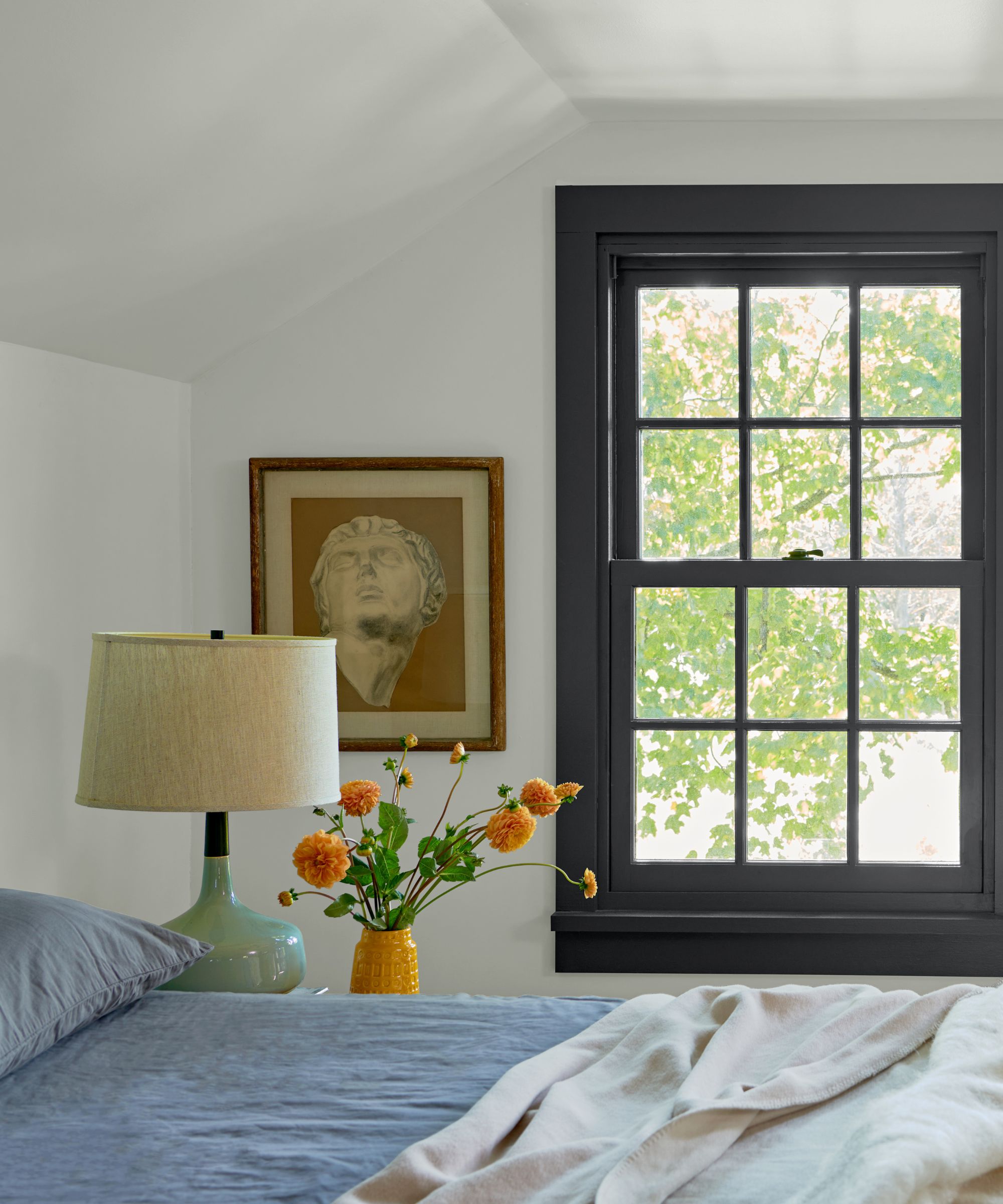
On the other hand, Midnight Oil – pictured below, on this bedroom's bold window frames – offers 'a great alternative to black,' she adds. 'This deep and mysterious hue anchors the room. The undertone leans blue making it easy to pair with blues, greens and grays,' says Hannah.
She suggests using the color to create focal points in a room, from a gallery wall to a fireplace. And, if you're looking for front door color refresh, this shade delivers 'a sleek, modern vibe.'
How to decorate with the palette
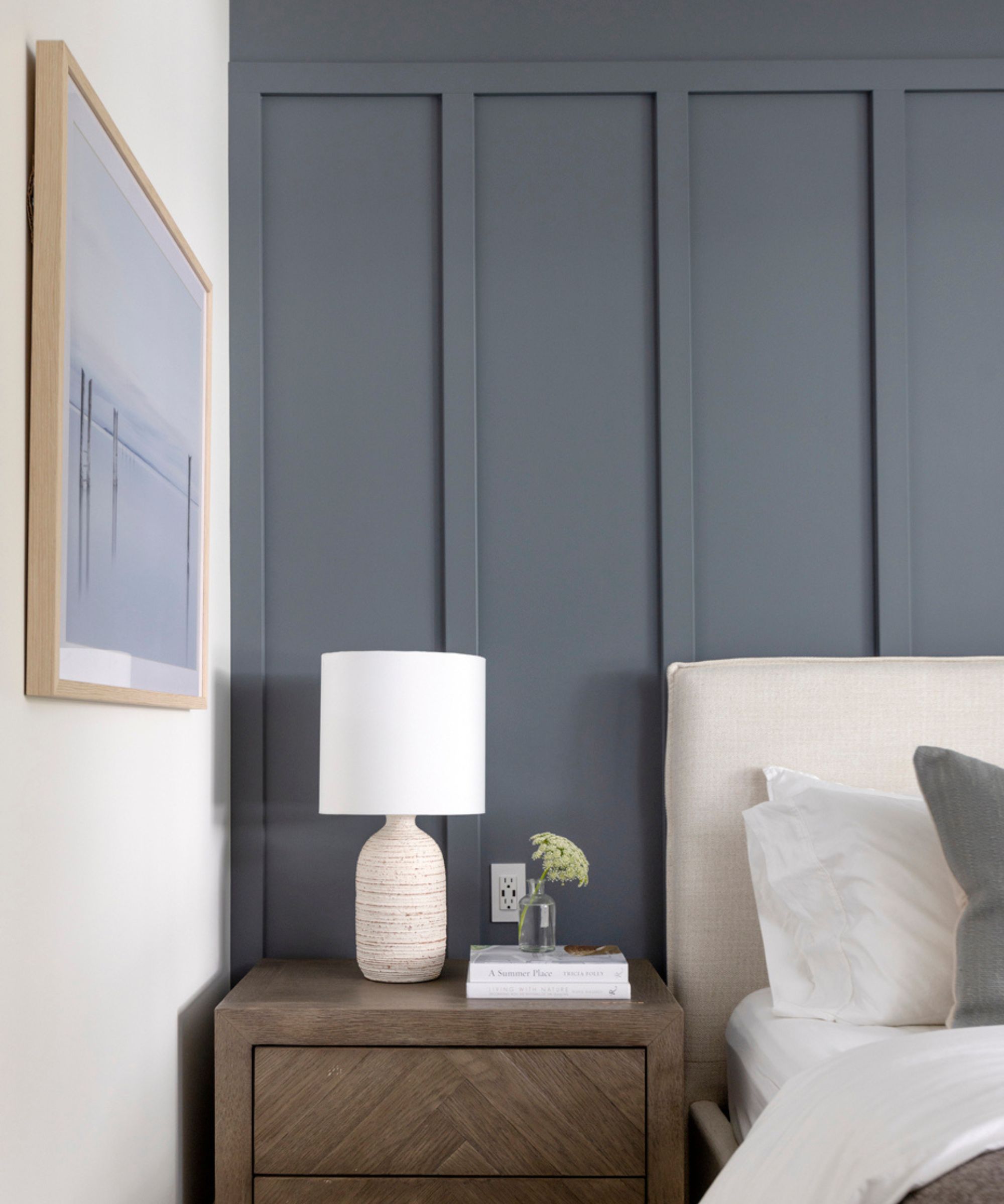
Shaunn Lipsey, principal designer and creative director of Shaunn Lipsey + Co., says the winter skies palette 'offers a serene and versatile range of colors that can be used to create a calming and sophisticated atmosphere in your home.' In particular, the shade Icicle calls out to Shaunn as a stunning base color for a cozy living room space.
'Consider using Icicle as the main wall color in the living room to provide a tranquil backdrop for relaxation and conversation with a ton of warmth. Pair it with warm neutrals like creamy whites or light greys for furniture upholstery and accent pieces to create a cozy and inviting space,' she says.
And if you're looking to use some of the palette's statement shades, Shaunn says that Wolf Grey or Midnight Oil work well in a home office or dining room for a 'rich and moody ambiance.'
'Fill these rooms with shades such as soft whites, warm greys, and black accents to create a cohesive and harmonious look throughout your home. Incorporate natural textures like wood, rattan, and linen to add warmth and depth to the space while maintaining the overall sense of tranquility and serenity inspired by the winter skies palette,' she adds.

Shaunn Lipsey is the Principal and Creative Director for Shaunn Lipsey + Co., a Toronto-based design and build team. Renowned for crafting bespoke interiors that enhance both value, style and function, Shaunn Lipsey + Co. services Ontario, Montreal, Florida and California.
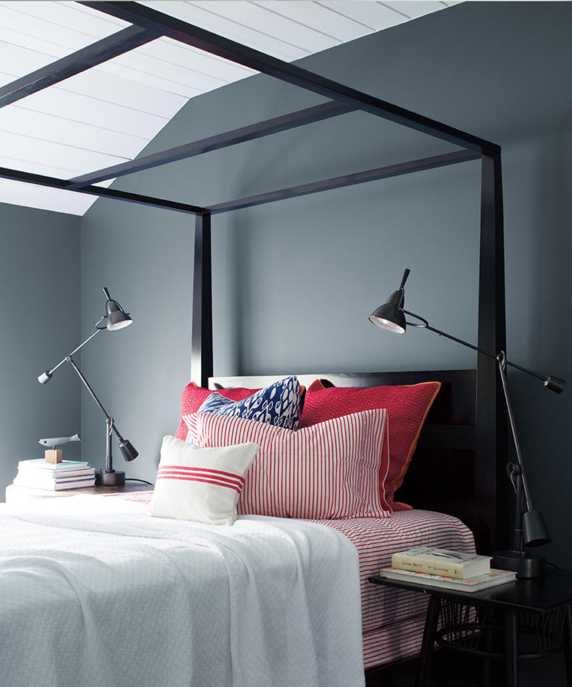
Trish Knight, interior designer and co-founder of Vancouver-based Knight Varga Interiors, says the color palette caters to a near-universal winter lifestyle. while Icicle and Polar Sky bring a frosty coolness reminiscent of the first snowfall, Wolf Gray and Midnight Oil represent the 'shortest, darkest days of the year,' she says.
'This newly released color palette perfectly evokes the feeling of shorter days, low light and cooler temperatures. The moodiness and tone-on-tone colors have a mid-century Scandinavian vibe and would feel right at home in northern climates across the globe,' says Trish.
Trish also suggests bringing in wood tones and using natural textures in the design scheme, along with 'hearty woven wools, heavy linens, faux furs and candlelight.'
'The lighter shades – Polar Sky and First Snowfall – would be fresh and welcoming in kids' rooms or kitchens; while the darker tones – Wolf Gray and Midnight Oil – would be perfectly cozy in primary bedrooms and dining rooms,' says Trish.
On the whole, she adds that each color individually has the potential to transform homes that are contemporary, traditional or transitional, while the palette as a whole creates a modern feel.

Designer Trish Knight is a co-founder of Knight Varga Interiors. Collectively with two decades of experience this Vancouver-based multi-award-winning design firm has become known and sought after for creating well-curated interiors. The firm provides complete bespoke residential design services throughout Vancouver, BC Canada and North America.
The winter skies color palette is sure to turn a dull and dated design scheme into a refreshing winter atmosphere in no time. By mixing and matching these timeless shades, the remaining dark and chilly evenings will have a much needed lift. And come spring, these shades will be just at home, providing a crisp, fresh backdrop to spring floral, soft pastels and the softer spring light.

Abby was the Interior Design News Editor at Homes & Gardens and is now studying for her Master's degree in Journalism at City University, London. Prior to joining our team, she worked with Better Homes & Gardens, where she wrote and edited content about home decor, gardening tips, food news, and more. She studied Journalism and English Literature at New York University and moved to London to pursue her love of writing in 2023.
