HGTV Home by Sherwin-Williams unveils its 2024 Color Collection – a celebration of earthy tones
The HGTV Home 2024 Color Collection has been expertly designed to bring comfort and tranquility to the home

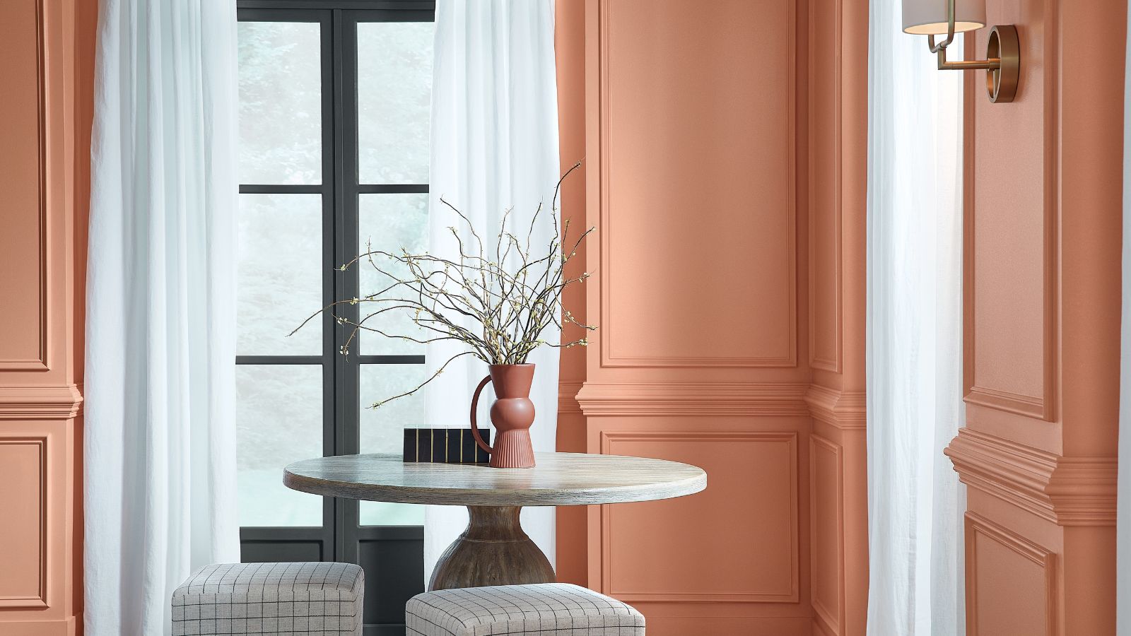
HGTV Home by Sherwin-Williams has unveiled its 2024 Color Collection, dubbed ‘Renewed Comfort’, as well as its standalone 2024 Color of the Year: Persimmon, pictured above.
Comprising a carefully curated selection of 10 different shades, the Renewed Comfort Color Collection promotes ‘tranquility, comfort, and rejuvenation,’ all of which are available to shop exclusively at Lowes. The selection for 2024 puts a new spin on traditional color combinations, combining soft neutral hues with rich and alluring shades to give us the ultimate color trend inspiration.
Ashley Banbury, Color Marketing Manager at Sherwin-Williams explains: ‘The Renewed Comfort Color Collection is restful and restorative with an expressive touch to showcase unique personal style – bringing a sense of comfort into the home with a new, refreshed outlook.’
‘The shades in our 2024 Color Collection of the Year feel familiar and dependable, yet versatile, with the ability to be reshuffled to create a custom look for your home.’
HGTV Home 2024 Collection – What you need to know
United by their earthy undertones, the 2024 Color Collection balances vibrant tones with more pared-back and subtle hues. Designed for homeowners and design professionals alike, the collection promotes a mix-and-match approach to create a personalized space that is united by its underlying refreshing and comfortable hues.
The standout from the collection, and crowned 2024’s Color of the Year, Persimmon, is an earthy terracotta shade with tangerine tones which has been designed to bring a sense of comfort to the home. Banbury explains: ‘Persimmon balances the energy of tangerine with grounded neutral undertones, making it perfect for spaces like living rooms and kitchens as it promotes positive relationships and conversation. The beautiful shade helps rejuvenate a space while bringing unique design visions to life.’

Ashley is Color Marketing Manager at Sherwin-Williams, with over 15 years of experience in the design world. Working with consumers across the color selection process, she is an expert in communicating lifestyle trends through the use of color.
How to use the 2024 Color Collection in your own home
Whether you lean towards the Renewed Comfort Color Collection's rich hues or prefer to keep things pared-back with the more neutral tones, the collection has been expertly designed to work interchangeably to elevate your home.
Design expertise in your inbox – from inspiring decorating ideas and beautiful celebrity homes to practical gardening advice and shopping round-ups.
Whilst all of the collection's 10 shades are equally inspiring for 2024 and beyond and are serving us with lots of decorating ideas, we've rounded up some of our favorite colors to show how you can incorporate them into your own home.
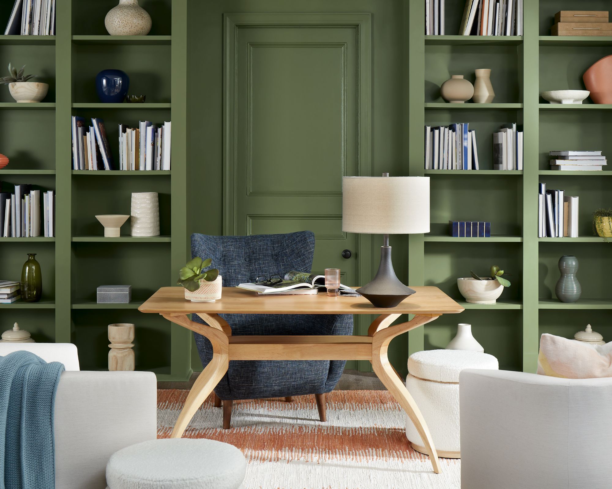
Described as a 'deep moss green with cool undertones' the shade Oakmoss is pictured above in an office room. Perfect for injecting color into a room whilst maintaining a refined and elegant look, we're loving this rich green color for 2024 and beyond.
Previously dubbed the color of 2023, green rooms are renowned for their tranquil and soothing qualities, making them an obvious choice for creating a calming home environment.
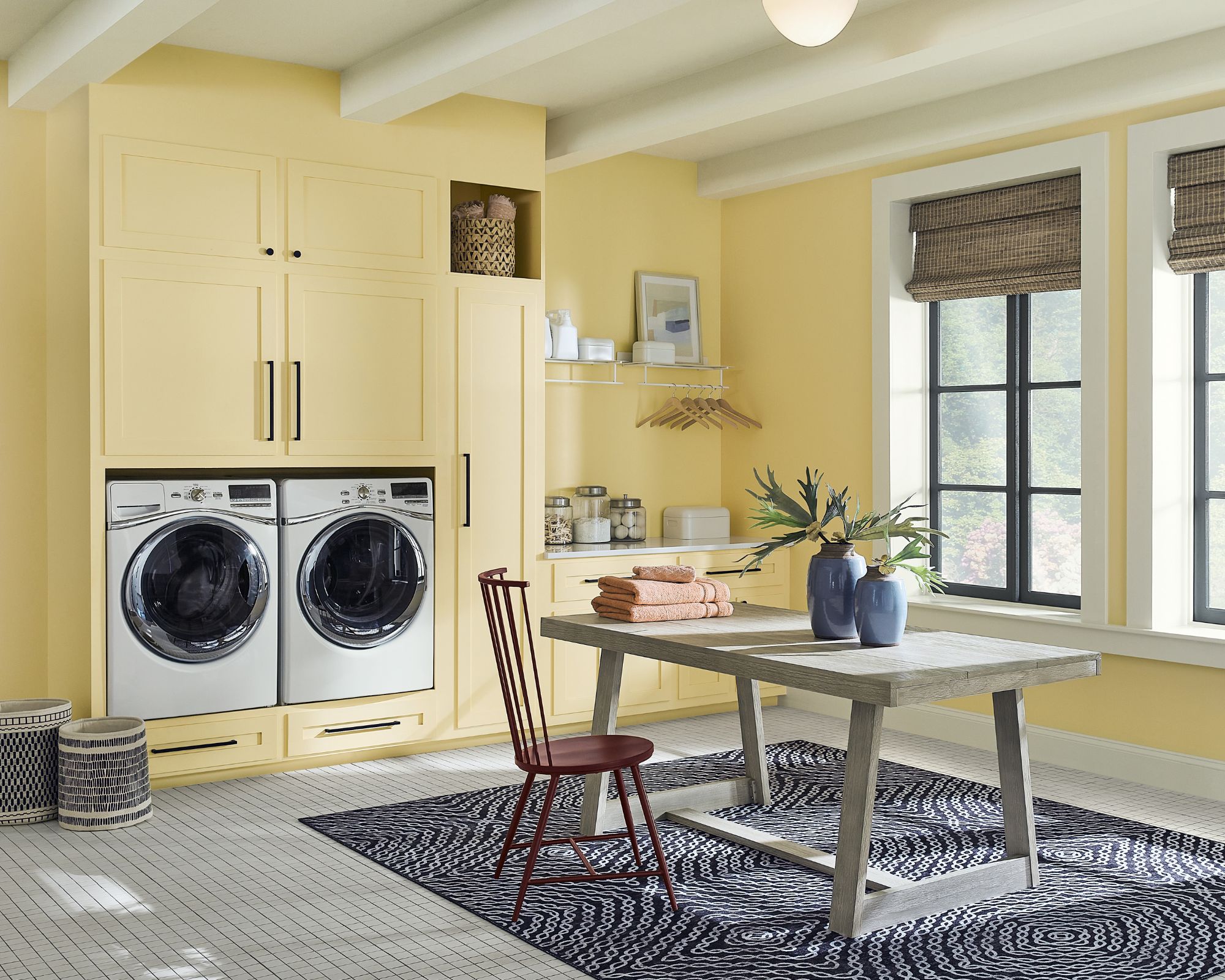
Friendly Yellow is the ultimate fresh take on lemon yellow. While a more retro bright yellow can be tiring on the eyes, the soft and mellow hues of this shade make it playful without being overpowering.
As pictured, a secondary room in the home, such as a laundry room is a great space to get experimental and decorate with yellow.
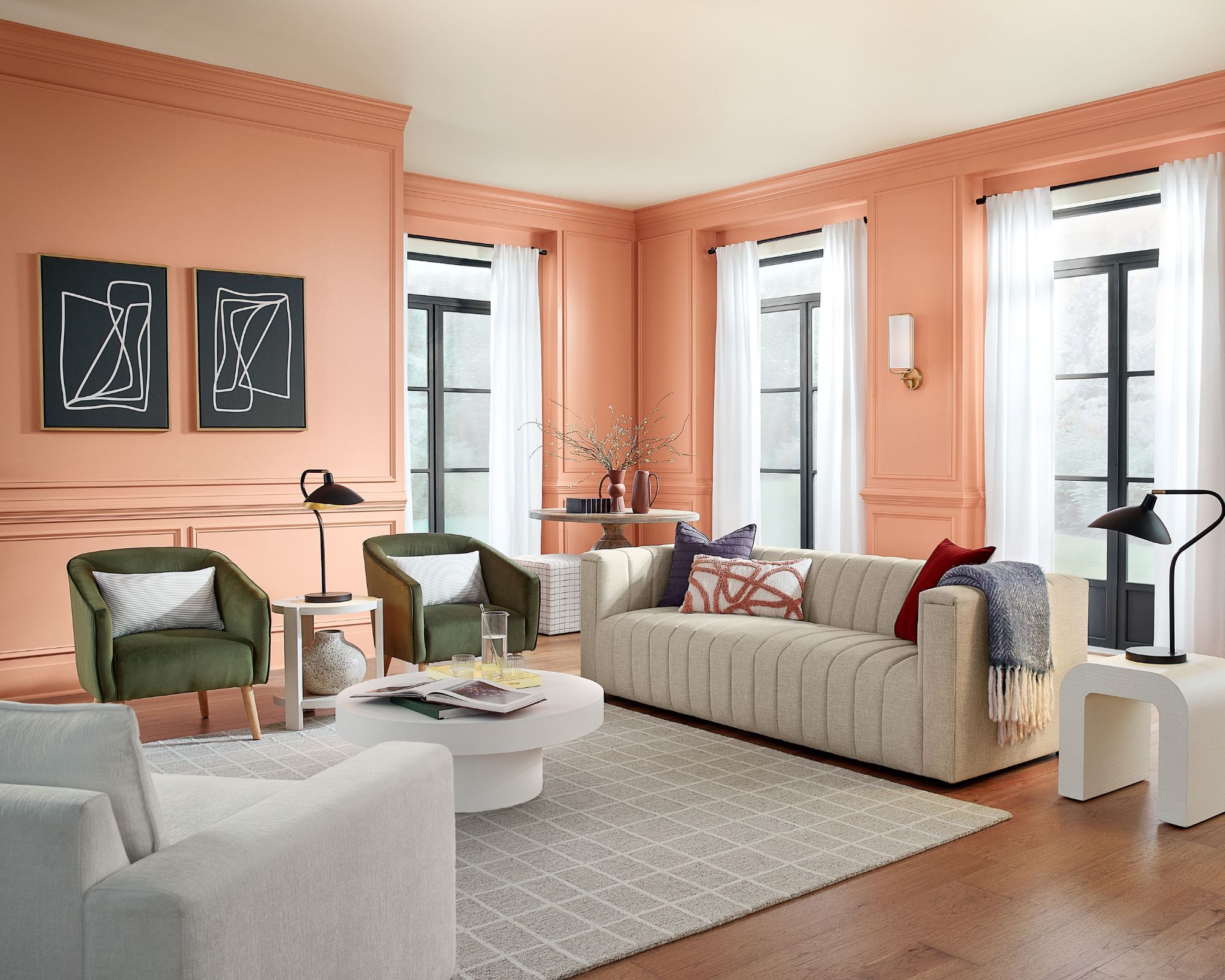
As shown in a living room, Persimmon is a bold yet elegant take on a classic terracotta shade. Bringing instant warmth, this color is best suited to uplift your modern living room. Make sure to keep the rest of the room understated, such as opting for neutral-toned furniture to ensure the space doesn't feel overwhelming.
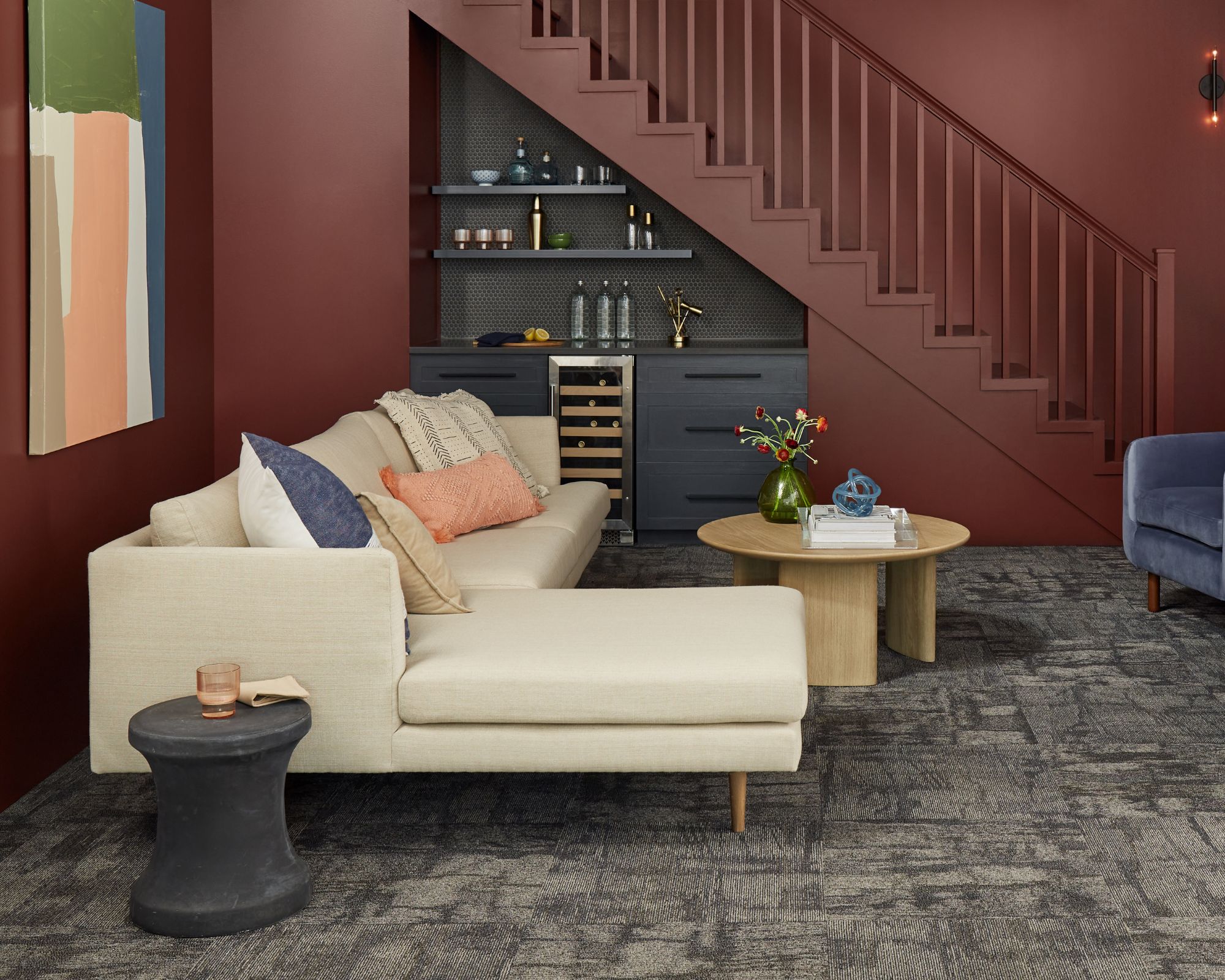
A deep and warm shade, Dark Auburn is the ultimate grown-up and sophisticated take on decorating with red. Ideal for creating a cocoon-like feel in a living room, Dark Auburn is best paired with wooden furniture to enhance the earthy undertones.
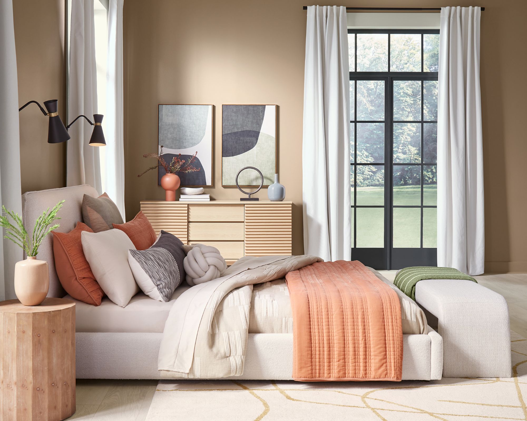
Central to the collection is a neutral tone, coming in the form of Utaupeia. Combining brown and warm tones, this shade is an elevated way of decorating with neutrals. Ideal for creating a calming bedroom space, as shown above, pair Utaupeia with soft and neutral-colored furniture to create the ultimate tranquil space.
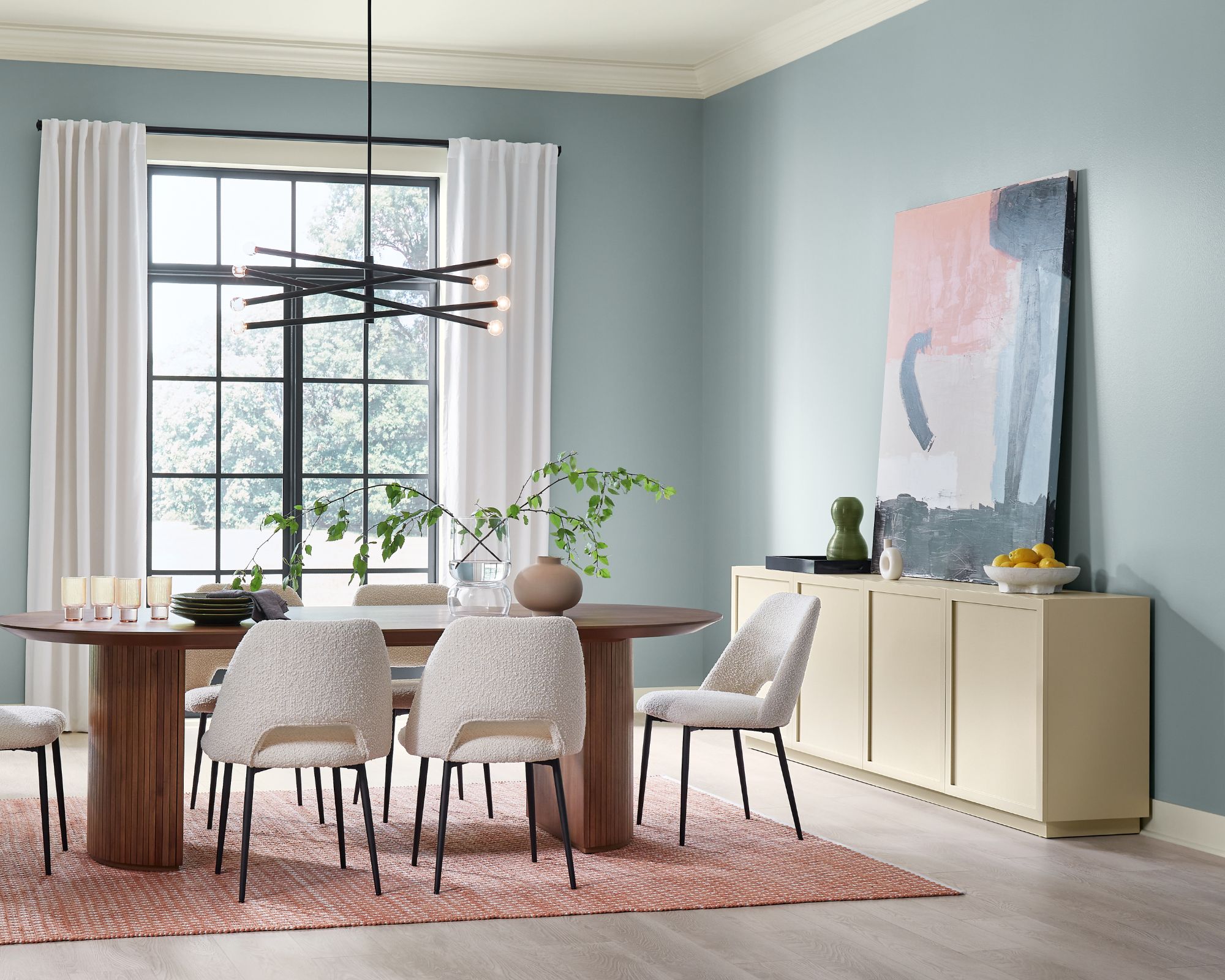
A revival of pastel blue, Stardew is an understated cool tone that feels soft and subtle. While decorating with blue can feel daring, this shade is ideal for incorporating the color which is known for its calming qualities, whilst remaining an understated feel.
FAQs
Where can I buy the Renewed Comfort Color Collection?
The Renewed Comfort Color Collection is available exclusively at Lowe’s stores nationwide and on Lowes.com. You can also find out more via HGTV Home by Sherwin-Williams.

Emily is a freelance interior design writer based in Scotland. Prior to going freelance in the spring of 2025, Emily was Homes & Gardens’ Paint & Color Editor, covering all things color across interiors and home decor for the Homes & Gardens website. Having gained specific expertise in this area, Emily is well-versed in writing about the latest color trends and is passionate about helping homeowners understand the importance of color psychology in home design. Her own interior design style reflects the simplicity of mid-century design and she loves sourcing vintage furniture finds for her tenement flat.
