Designer Sarah Ward's expert advice on adding color to a country interior
Interior designer Sarah Ward explains how to use bold colors alongside muted items to create a perfectly balanced scheme

Design expertise in your inbox – from inspiring decorating ideas and beautiful celebrity homes to practical gardening advice and shopping round-ups.
You are now subscribed
Your newsletter sign-up was successful
Want to add more newsletters?
Color is a vital component of any interior scheme, it has the power to make or break the space. Therefore, it is essential that you get it right the first time.
The country look is a precise one – typically based on natural materials and a neutral color palette. However, this does not mean that it needs to be bland and devoid of character.
Interior designer Sarah Ward from Ward & Co shares her top room color ideas, interior design tips, and decorating ideas for adding an accent color to a country interior.
Article continues below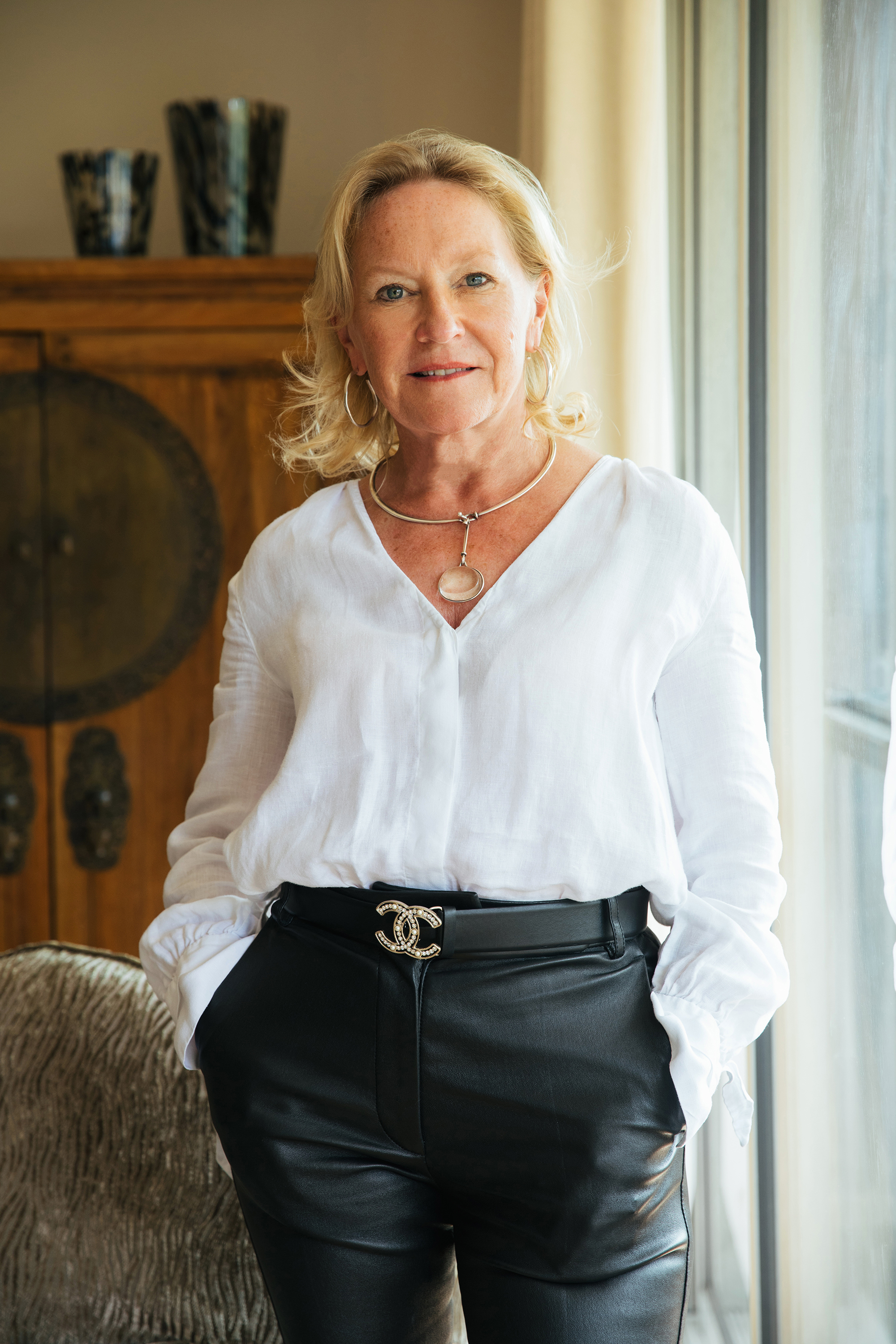
Sarah is the Founder and Creative Director of the interior design and architecture studio, Ward & Co. Sarah began her career in the commercial design sector before turning her hand to boutique hotels. Her passion for creating uniquely impressive, timeless spaces led her to establish Interiors by Sarah Ward in 1986. In early 2021, Sarah rebranded her eponymous design studio to Ward & Co, celebrating daughter Rosie’s eight-year contribution to the company. Sarah’s ability to blend threads of bold, culturally inspired designs with more classical, clean lines set her apart from her industry peers.
1. Start with the bare bones
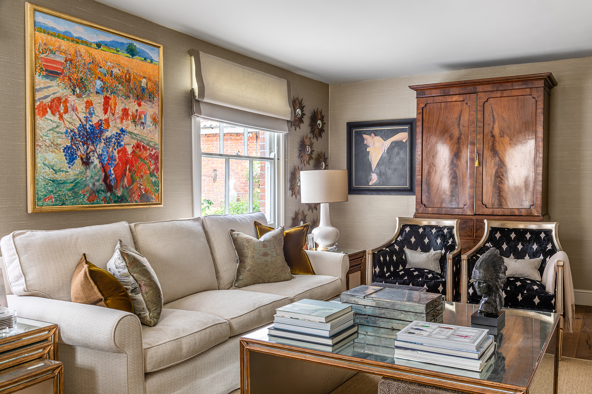
When it comes to country decorating ideas, first look at the natural light, ceiling height, room function, and access. Then decide on the best furniture layout options, ceiling arrangement – such as ceiling paneling ideas – and whether feature or discreet lighting should be used. After that, you can think about a scheme starting with floors, the main accent fabrics, decorating with art and accessories – then layer it up! After all, layering is an essential part of decorating with neutrals.
2. Be brave with your interiors
No matter the space you are decorating, always go with your gut and be brave with scale, pattern, and color. Decorating with mirrors will help to create a greater sense of space, while decorative lights and art add a fantastic dynamic.
When it comes to living room ideas, especially country living room ideas, adaptable and controllable lighting should always be considered to help set the scene. We also recommend hiding any large TVs within paneling or behind artwork – unless it is a dedicated movie room. Comfort is key so go for the best couch you can afford – opt for a design that invites you to sit, we believe that a couch should always look as though it wants to be sat on, rather than be purely decorative!
3. Choose the right accent color
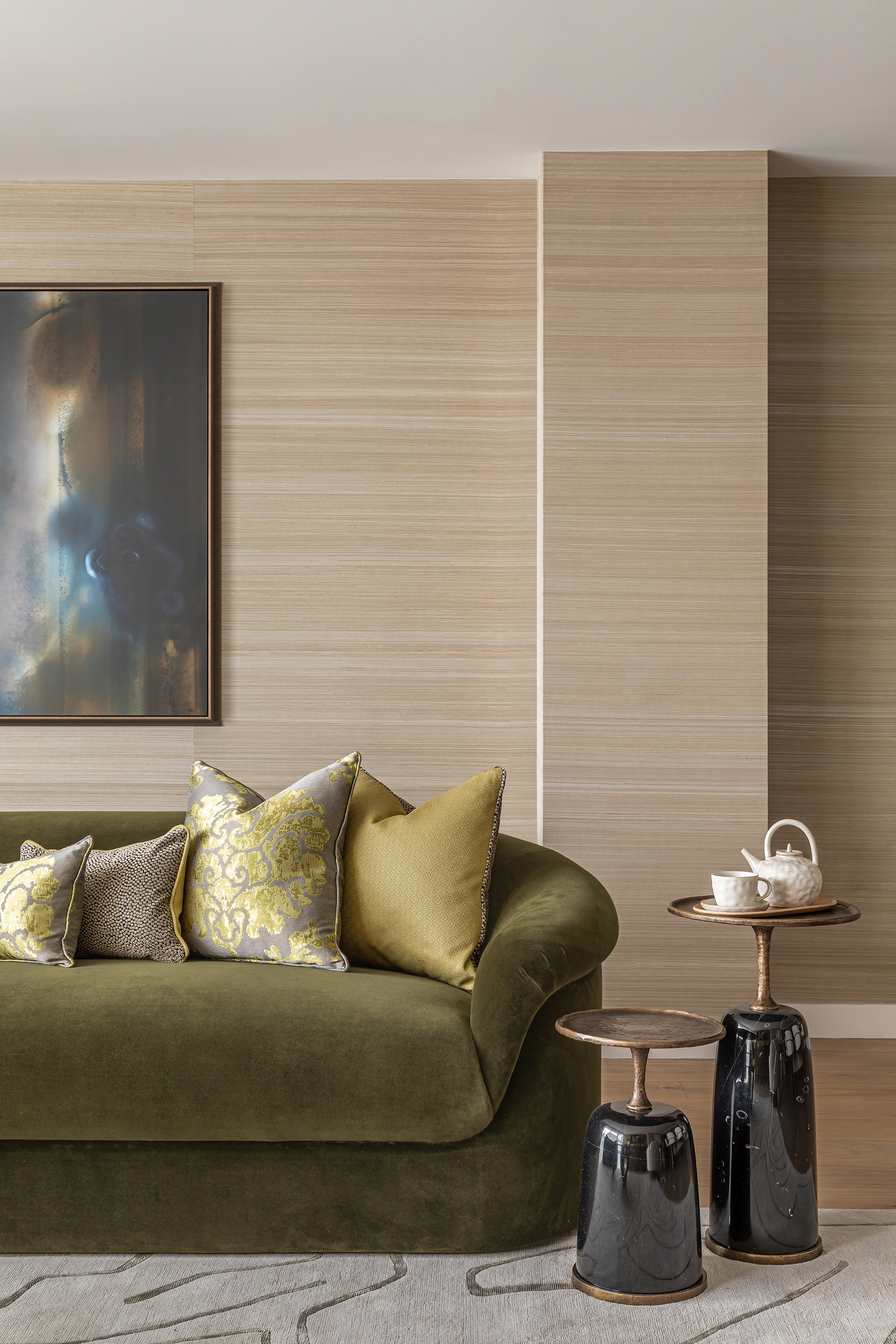
The choice of color will depend on your preference and intended use for the space, the wider local environment, the age of the property, and whether you need to increase natural light. For a recent project, we set deep olive green against warm woods to subtly reference a nearby river – bringing echoes of the natural world into the interior design. We then layered this by adding accents of more vibrant greens to add brightness and opulence to the space.
Design expertise in your inbox – from inspiring decorating ideas and beautiful celebrity homes to practical gardening advice and shopping round-ups.
Alternatively, fall color schemes such as orange or moss work well in country destinations; decorating with black can also be very stylish as can strong burgundy or a soft teal blue.
4. Design your interiors around the accent color
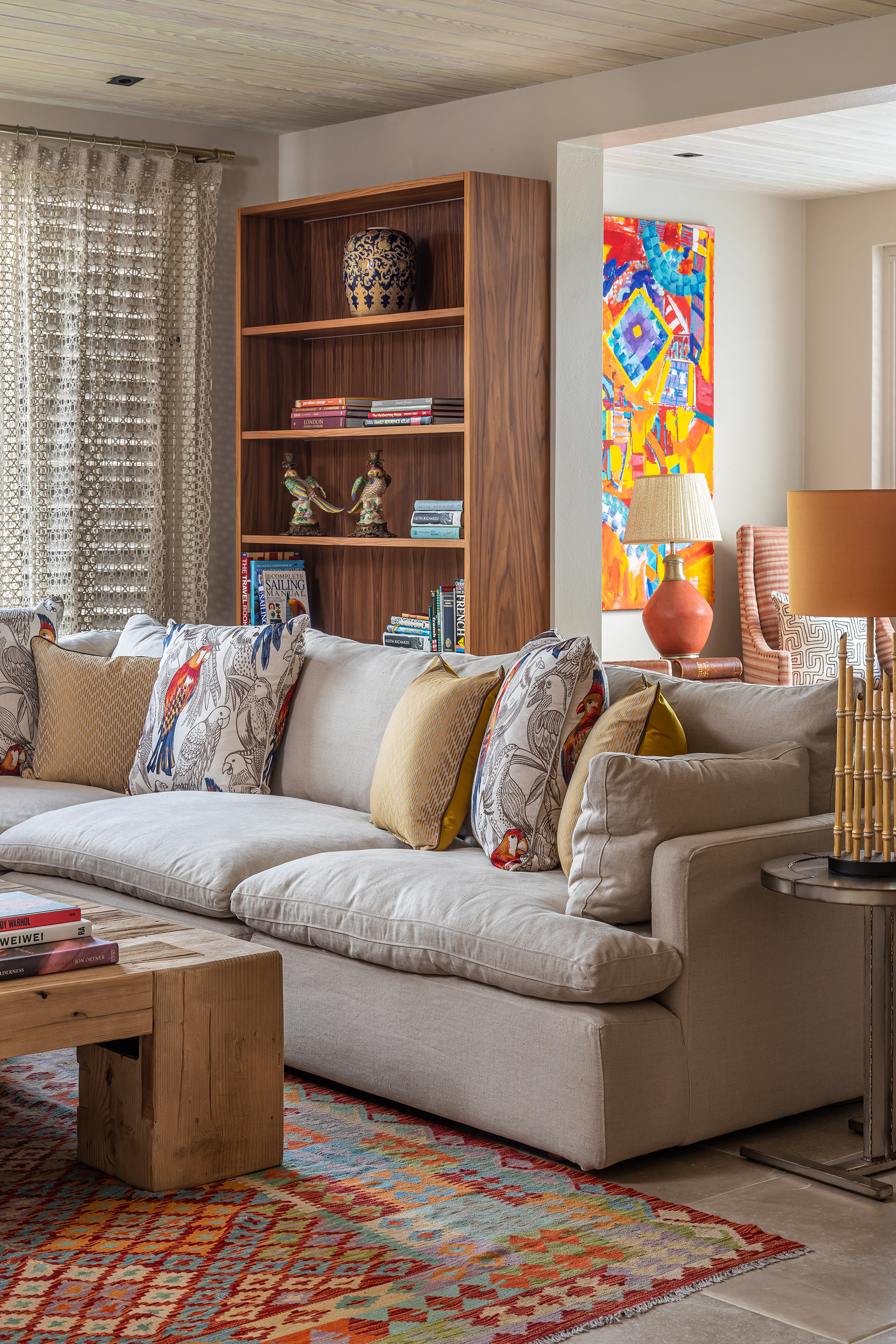
When bringing bold colors into a muted scheme, your approach will differ depending on whether the color is presented as a ‘pattern’ or as a ‘solid’.
If the accent colors are solid, then assess the spectrum and choose the neutrals accordingly. You can use the color wheel to help you define complementary colors.
If the color is being incorporated through a pattern – such as decorating with checks – then base your design around any muted background tones that are seen in the print, and run with that as a starting point.
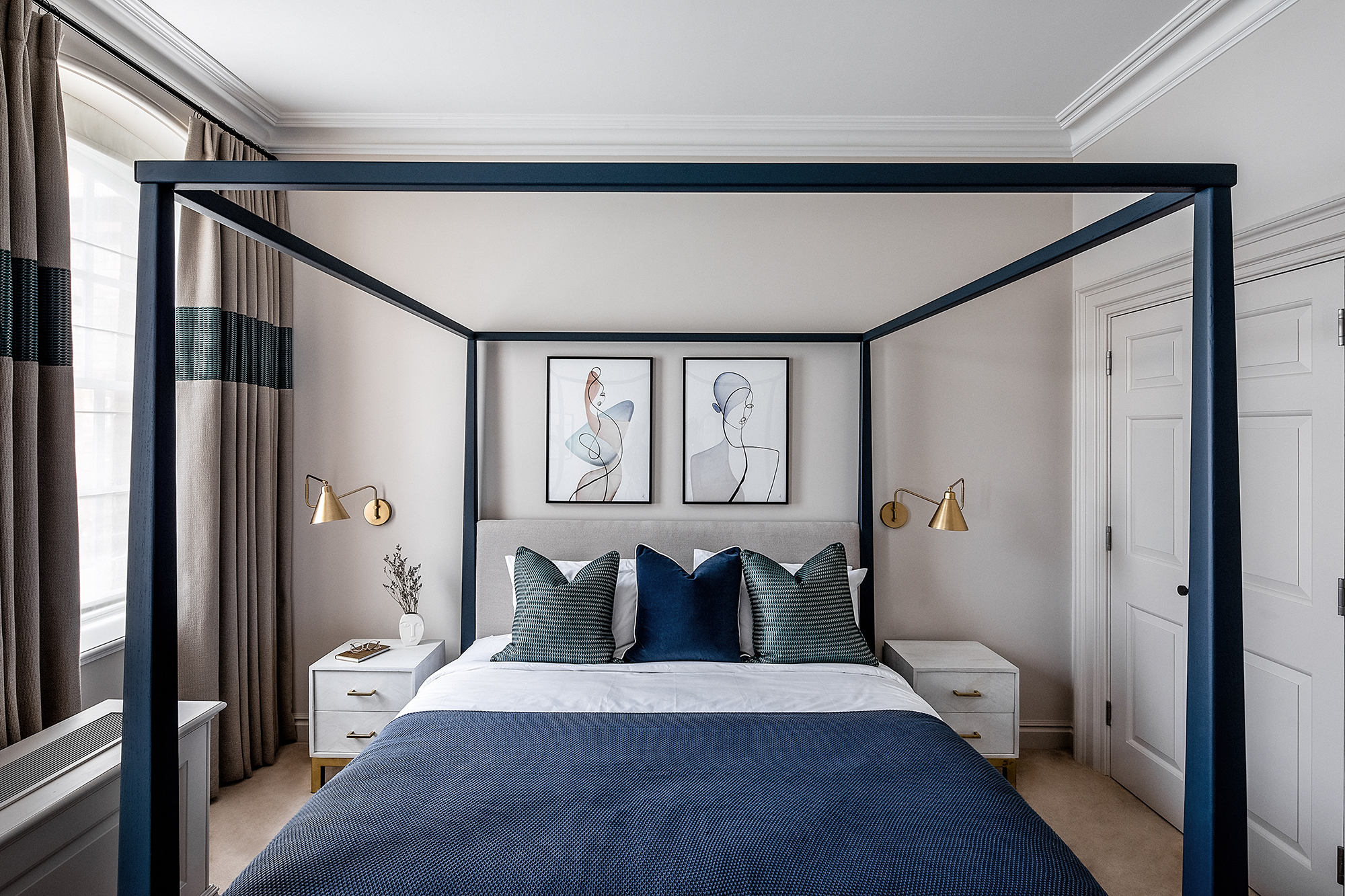
For example, in the space featured above, we started with a bright parrot fabric (as seen on the cushions), then selected the more muted colors from within that pattern to inform the rest of the design.
5. Balance is key
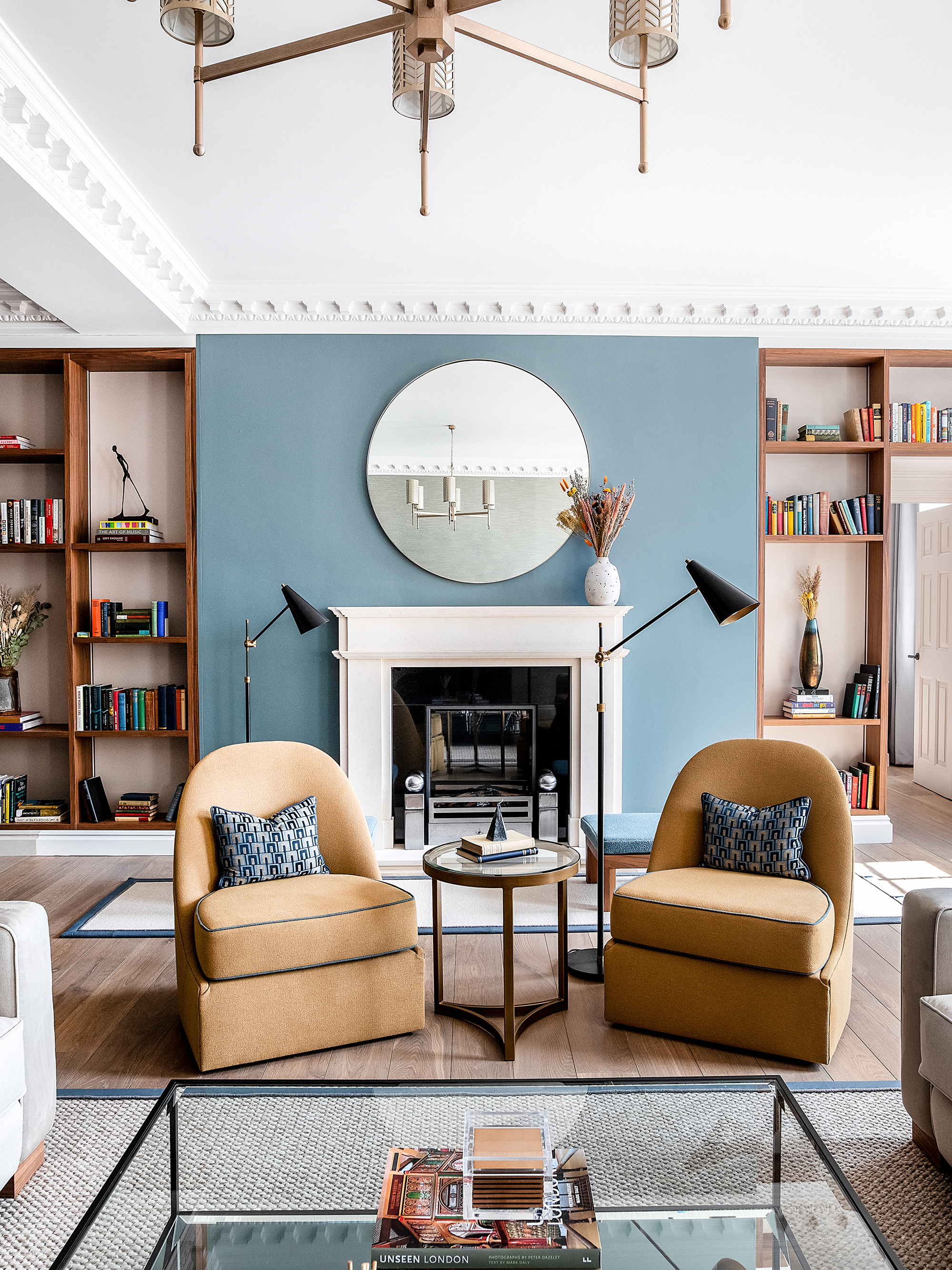
Ensuring balance in your interior design can be quite hard to achieve, especially if only one item has the accent color. However, this is easily fixed by layering. For example, if a bold shade is seen within a cushion or accent wall idea, then that tone should reappear in another format such as on an accent chair, lampshade, artwork, or rug trim. This will avoid your space from looking too ‘dotted’ and disorganized.

Having graduated with a first class degree in English Literature, Holly started her career as a features writer and sub-editor at Period Living magazine, Homes & Gardens' sister title. Working on Period Living brought with it insight into the complexities of owning and caring for period homes, from interior decorating through to choosing the right windows and the challenges of extending. This has led to a passion for traditional interiors, particularly the country-look. Writing for the Homes & Gardens website as a content editor, alongside regular features for Period Living and Country Homes & Interiors magazines, has enabled her to broaden her writing to incorporate her interests in gardening, wildlife and nature.