What are the most calming color combinations? Experts share 6 pairings for a tranquil scheme
Create a restful home with these endlessly calming color combinations

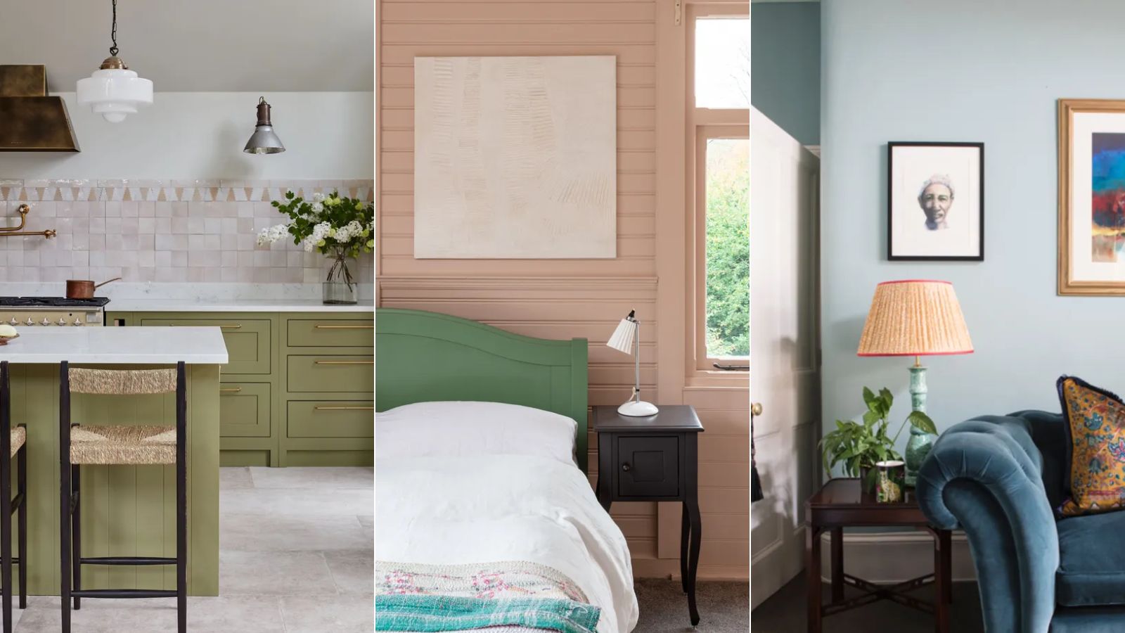
Creating a calm environment in our homes is something most of us strive for, and the use of color plays a key role in doing so.
The colors we decorate with – and how those colors work alongside each other – will set the mood of a room, so giving close thought to color combinations is an important step in the decorating process.
But what are the most calming color combinations for rooms? We enlisted the help of color experts from leading interior paint brands to uncover the most calming color combinations, which we've rounded up below.
6 calming color combinations
From pairing gentle neutral tones with nature-derived green to classic sea blue with crisp white, many carefully balanced color combinations will evoke a sense of rest throughout the home. If you're looking for color inspiration for your next home decor project that enhances relaxation, read on.
1. Green and soft neutrals
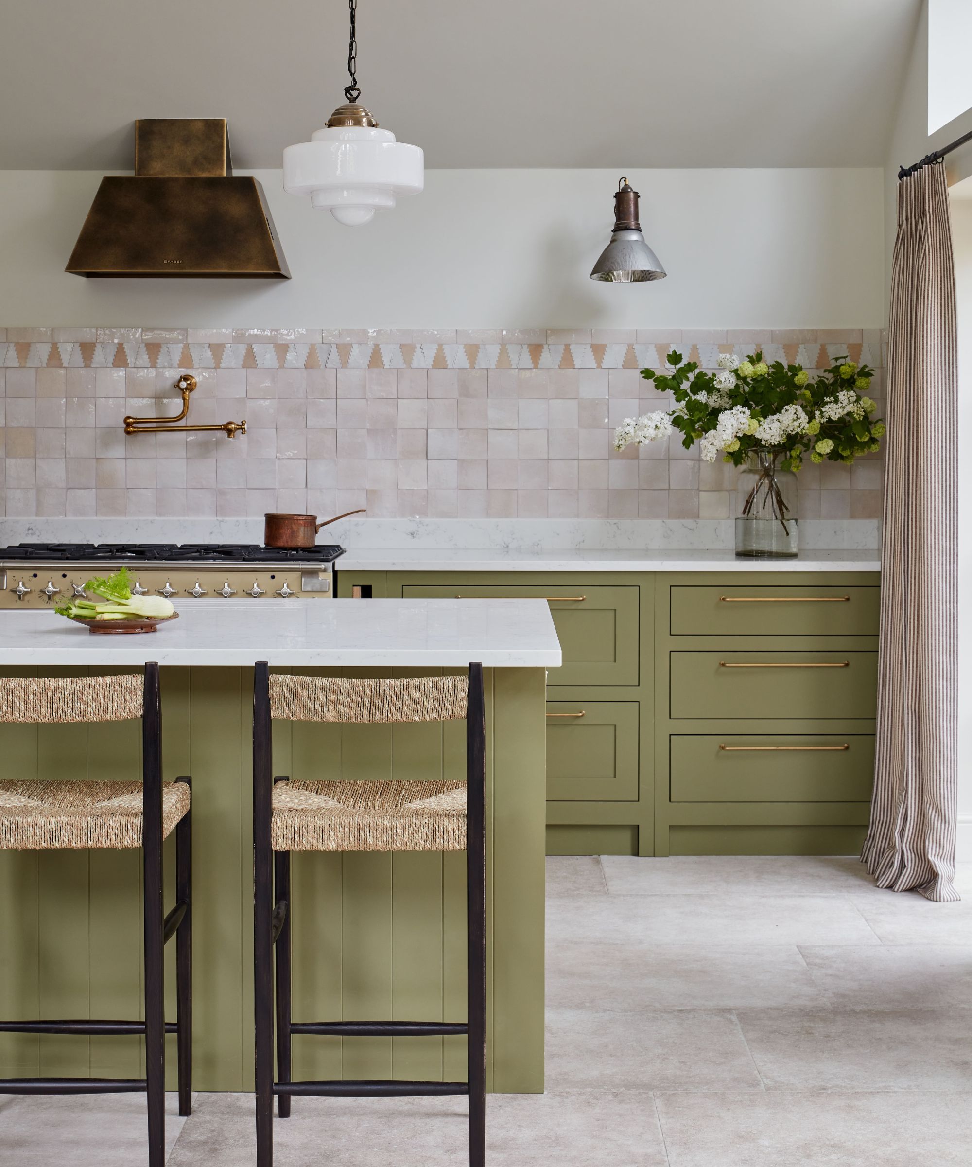
'For a soothing interior scheme, green is a great choice,' says Ruth Mottershead, Creative Director at Little Greene. 'As the true color of nature, green makes us feel comfortable within the home. It is a shade that we associate with the tranquillity of the outdoors.'
'From earthy, muted tones such as Sage Green, which is soft yet sophisticated to deeper shades such as Dark Brunswick Green or the lighter shade of gentle Book Room Green – green is a color that brings a sense of peace and soothes the soul.'
When decorating with green as the primary color, soft neutrals work best alongside it. Ruth warns that whites can create too much contrast when paired with green, interrupting its calming appeal.
Design expertise in your inbox – from inspiring decorating ideas and beautiful celebrity homes to practical gardening advice and shopping round-ups.
'Avoid combining green with harsh bright whites, which can feel cold and stark,' says Ruth. 'Opt instead for warmer neutrals or natural stone colors such as Portland Stone Light or Travertine which are perfect for creating restful and comforting interiors.'
2. Chocolate brown and clay tones
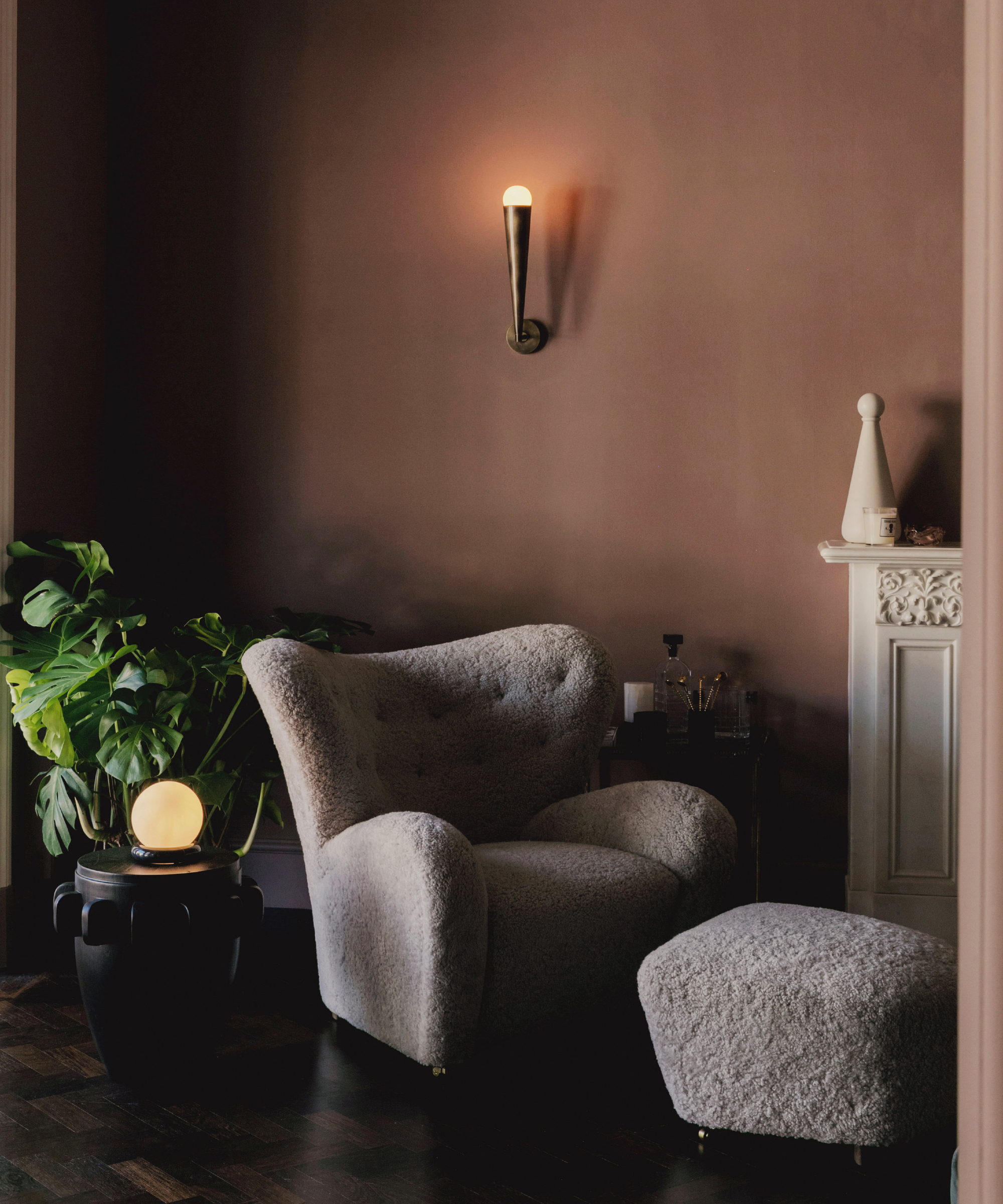
Ruth Mottershead also recommends decorating with brown for a darker color scheme that's equally calming. She says that chocolate browns make for a more restful choice than other harsher dark colors:
'Don’t be afraid to use darker shades, as rich, chocolate browns are also perfect for creating restful spaces that bring comfort to the home and envelop a space. They work wonderfully as an alternative where you might previously have considered black, charcoal, or a dark blue, bringing a restful and warm atmosphere to an interior.'
When choosing the best colors to pair with chocolate brown, Ruth recommends lighter clay tones to create a tonal scheme: 'Partnering beautifully with neutral hues and natural tones such as Clay and Lute, stronger browns add a tonal element that will add warmth to an otherwise cooler interior.'
3. Light blue and white
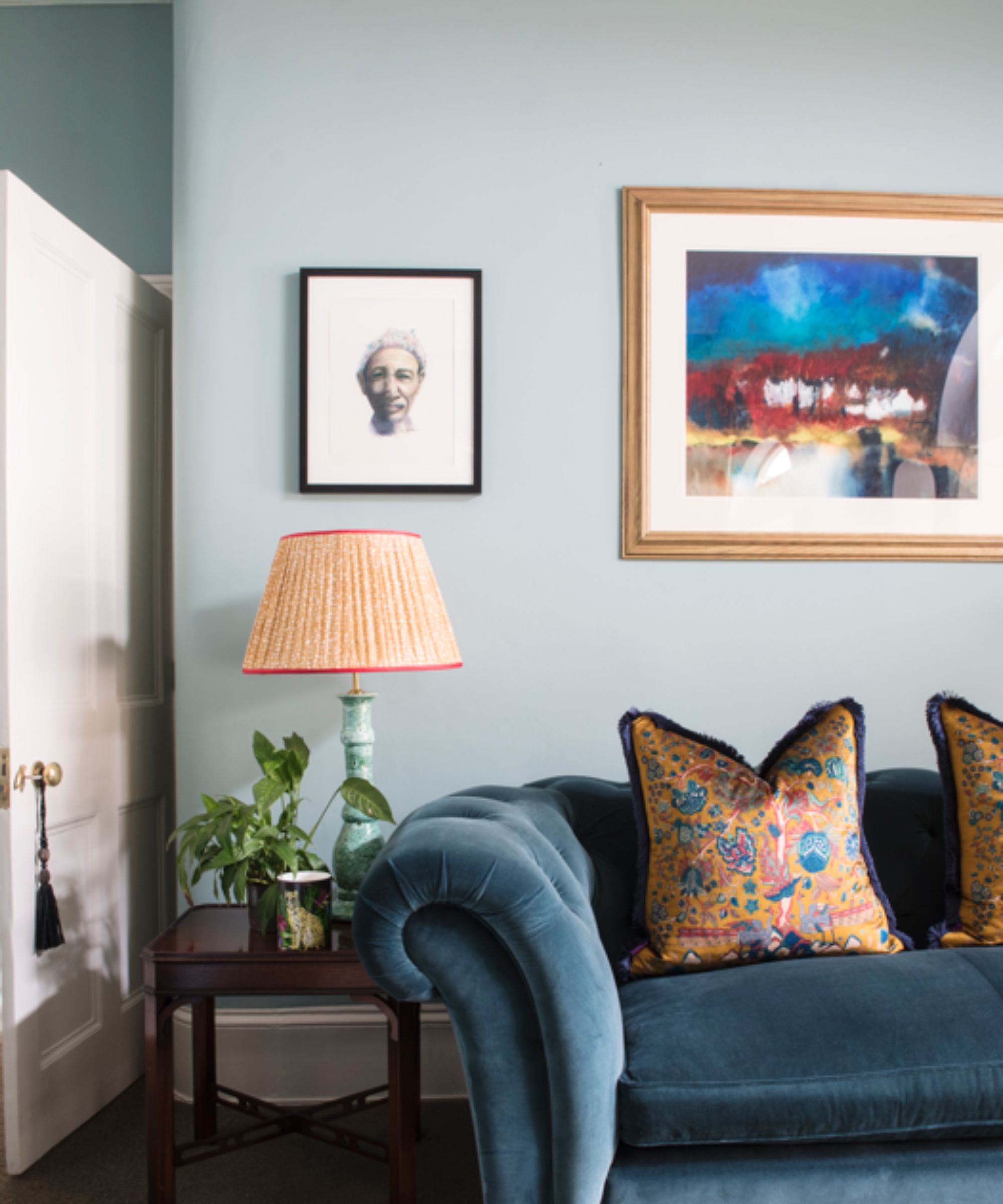
Decorating with blue and white is a classic calming color combination, evocative of coastal decor. Tash Bradley, Director of Interior Design at Lick explains below why blue works especially well in the bedroom for a relaxing feel.
'Blues work well in the bedroom because they provide a sense of serenity and clarity of thought – allowing you to calm your mind before bed. The lighter the blue, the more mentally soothing the room.'
Pairing this cool hue with white creates a fresh and timeless look; enhancing its restful appeal and playing to its cool tones. Weighing in on decorating with blue, Erika Woelfel, Vice President of Color at Behr explains that 'neutrals in the white color families compliment these nature-inspired hues.'
She adds that this classic color pairing can work equally well in a kitchen: 'Covering kitchen walls in Blank Canvas and using Offshore Mist on kitchen cabinets creates a serene environment.'
4. Pink and green
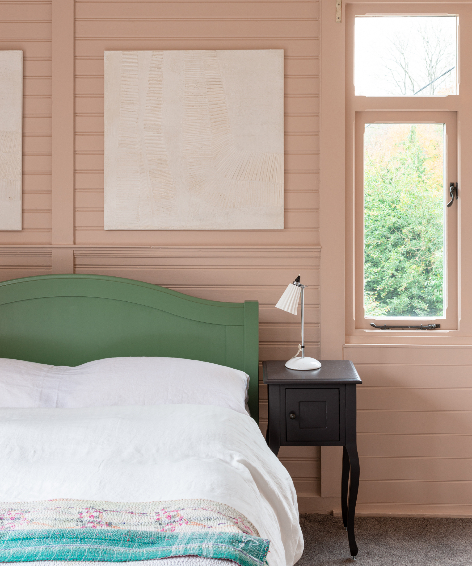
For a more vibrant calming color combination, consider pink and green. Helen Shaw, Director of Color Marketing at Benjamin Moore explains below that this color combination, especially pastel variants of these two shades, is a go-to pairing.
'Soft pastels will offer the perfect injection of color, and pinks and greens go hand in hand. Being complementary colors, they work to elevate each other yet are far less contrasting and harsh than green and red, for example. Their calming tones won’t be overly stimulating as they require our eyes to do little to no adjusting.'
The bedroom is one of the best rooms to channel this relaxing combination. Tash Bradley elaborates on the color psychology of pink, explaining: 'Pink is one of the best colors to use in a bedroom as it’s an incredibly nurturing, caring and warming color, which is exactly how a bedroom should feel. When you walk into a bedroom which is painted in soft pink, for example, Lick’s Pink 01 or Pink 02, your shoulders instantly relax, and you settle into a calm space.'
5. Burgundy and wood tones
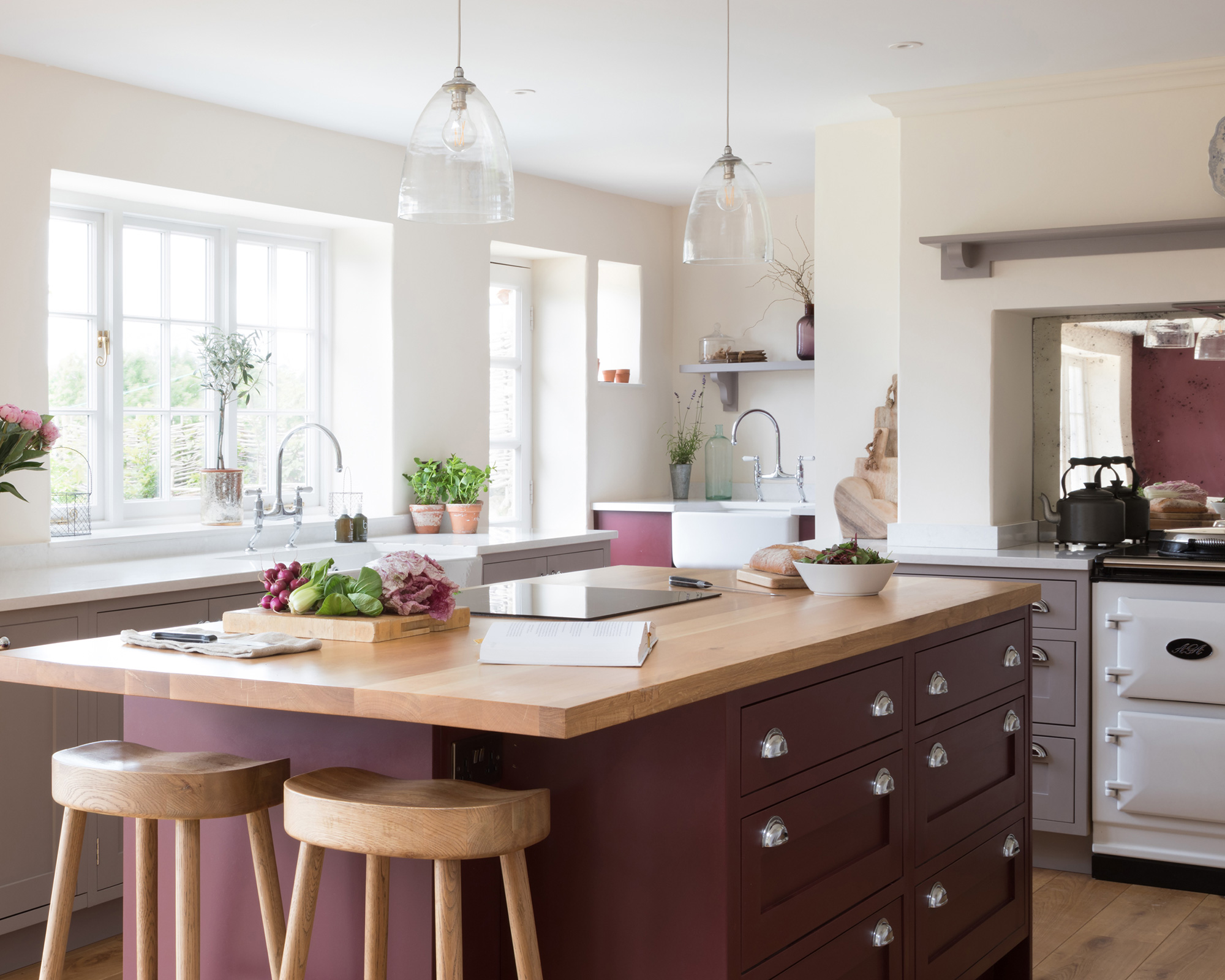
Earthy colors such as burgundy and natural wood tones make another calming combination. 'A rich burgundy paired with dark brown woods or accents will bring a rustic warmth to any room,' says Helen Shaw. 'Earthy colors reflect less light, making a room less active and therefore more restful.'
This pairing makes an obvious choice for a kitchen, by using burgundy on the walls or cabinets and incorporating wood tones through the kitchen countertops; but it also works in other rooms, so long as they have appropriate amounts of natural light, as Helen explains below.
'This works particularly well in large, well-lit spaces where there is plenty of natural light to avoid it becoming closeting and confined. Layer the look with natural materials such as ceramic clay vases and textured fabrics and finishes to soothe the senses and deliver softer surroundings.'
6. Beige and white
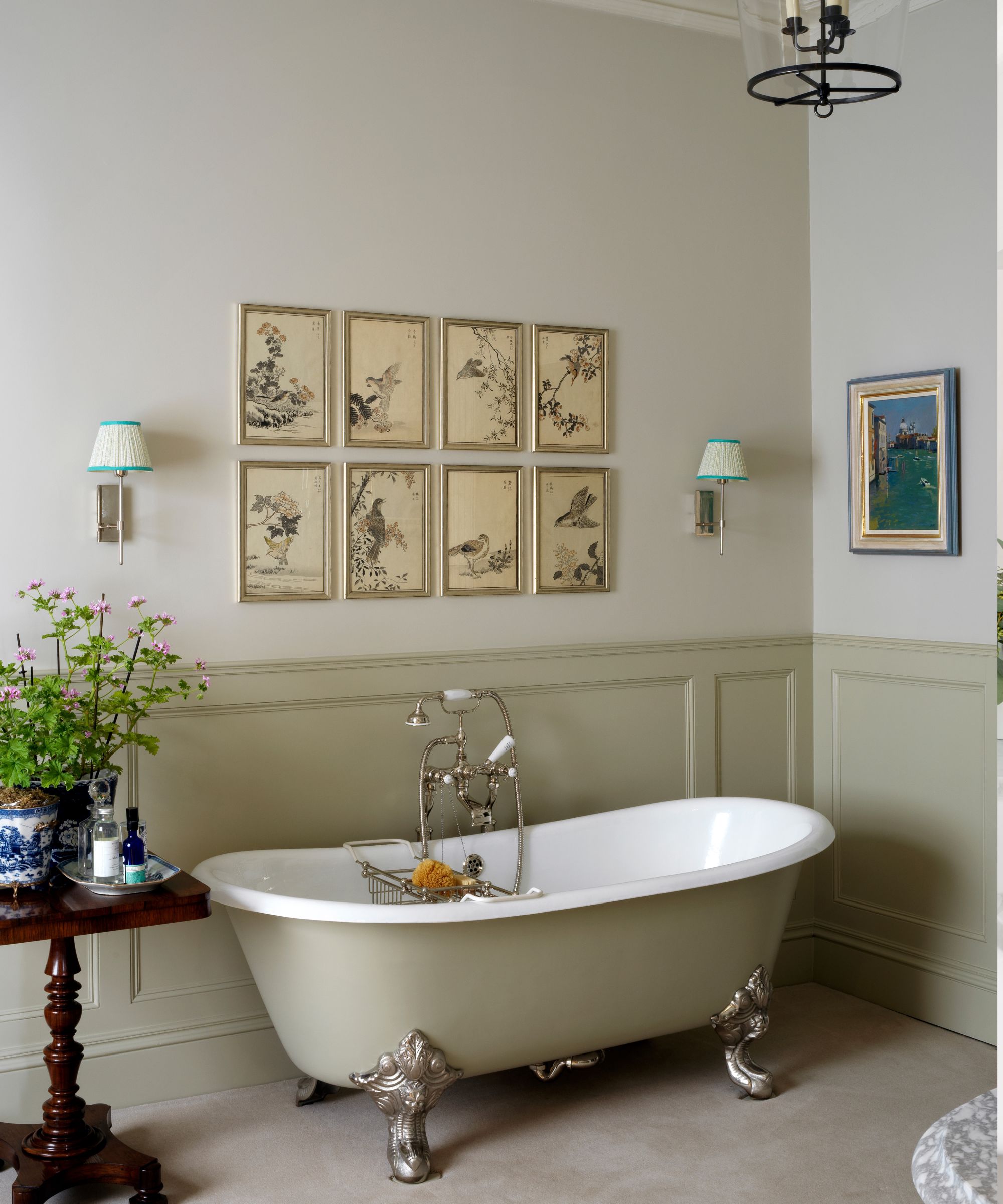
You can't go wrong with a fully neutral scheme to achieve a calming feel. Layering warm neutrals creates a pared-back and spacious look that's restful to the eyes.
'Pairing warm neutrals such as cream, beige, and white together will ooze comfort in a sophisticated and effortless way,' explains Helen Shaw. 'Elevate this timelessly stylish look with layers of texture such as dark woods, tactile bouclé textiles, and sleek stone surfaces such as marble and quartz.'
When choosing the best colors to layer into your neutral scheme, Tash Bradley recommends the following paint ideas, which would work well in a neutral bathroom: 'Colors like Lick’s Beige 03 and Beige 02 are grounding neutrals that make you feel very comforted and give you an almost spa-like feel.'
Whether you're drawn to light neutrals or prefer a richer color scheme, these pairings work in harmony together. From the bedroom to the kitchen, use these color combinations to ensure a feeling of relaxation runs throughout your home.

Emily is a freelance interior design writer based in Scotland. Prior to going freelance in the spring of 2025, Emily was Homes & Gardens’ Paint & Color Editor, covering all things color across interiors and home decor for the Homes & Gardens website. Having gained specific expertise in this area, Emily is well-versed in writing about the latest color trends and is passionate about helping homeowners understand the importance of color psychology in home design. Her own interior design style reflects the simplicity of mid-century design and she loves sourcing vintage furniture finds for her tenement flat.