What colors go with light pink? 10 pairings that design experts swear by
We source the colors that go with light pink, you'll be surprised at how many there are

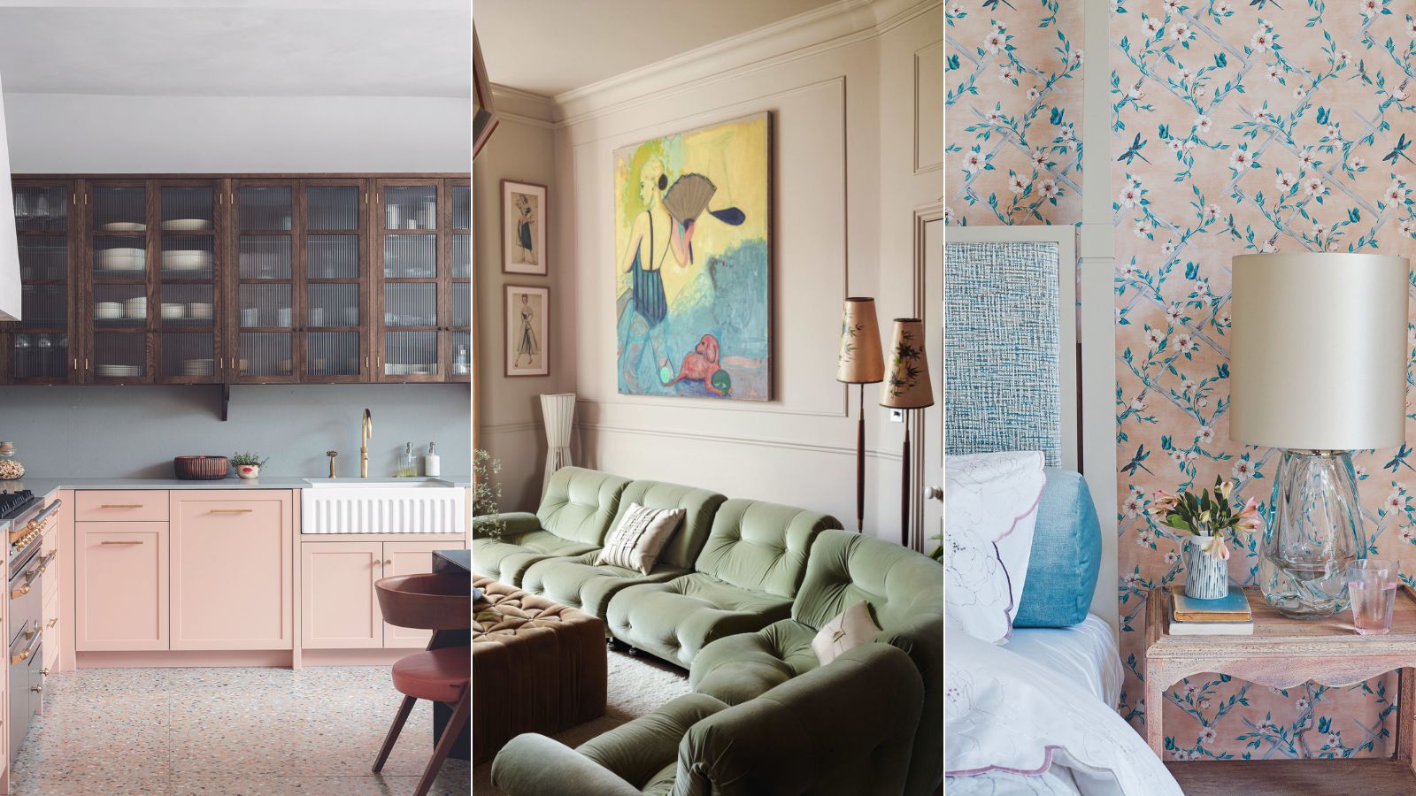
Design expertise in your inbox – from inspiring decorating ideas and beautiful celebrity homes to practical gardening advice and shopping round-ups.
You are now subscribed
Your newsletter sign-up was successful
Want to add more newsletters?
Easy on the eye and hard not to love, this pretty shade is a popular choice. The big question is what are the colors that go with light pink and how can I make them work?
'Pink is one of my favorite colors. It is a calming color associated with love, kindness, and femininity,' says Francesca Wezel, founder of Francesca's Paints. 'Adding a splash of pink to your home will bring a peaceful and serene environment. A very, versatile color, it looks good in drawing rooms, kitchens, bedrooms, bathrooms, and entrances.'
When decorating with pink there are various tones to choose from, and sometimes you might need to pick a color that matches tonally to it if it's slightly deeper. It's also a perfect color to use with other pale shades or use it as a secondary shade if you want to team it with a punchy accent like forest green or terracotta. Darker colors like indigo and charcoal work well too – you can't go wrong with light pink if you want to create a scheme that's gentle and warming.
10 colors to pair with pale pink
The color wheel is often the first port of call when it comes to learning about what shades go with others, it is a great tool, but if you love a color combination and it works for you then go with your instincts. Read our tips below from our favorite color experts and designers who give us their take on colors that go with light pink and why.
1. Light pink and pale grey
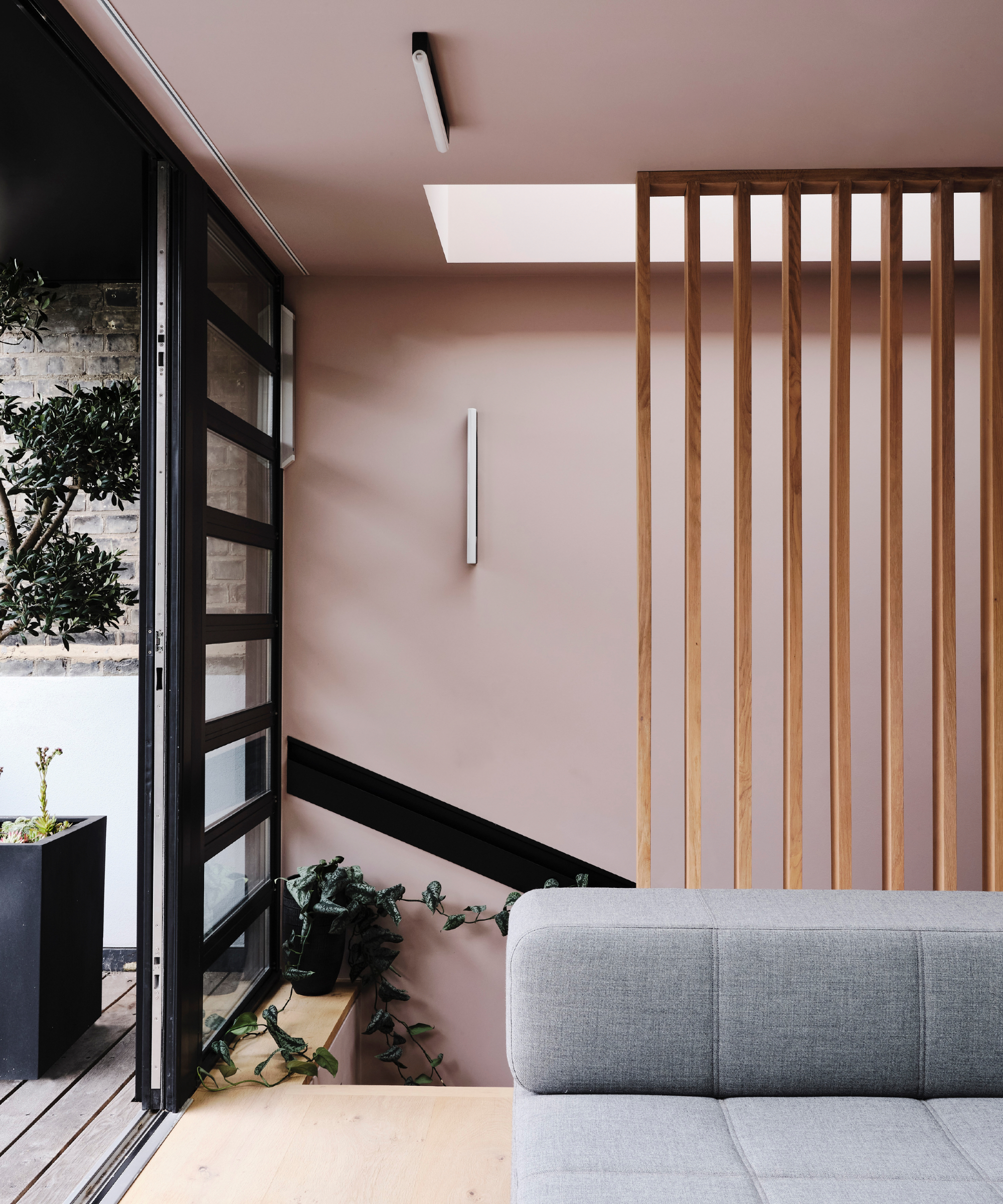
Pale grey is another extremely versatile shade, though it can be on the cool side so teaming it with a light pink will rectify that. Keep the pink as the main color and the light grey as an accent, here it's used minimally but really does add to the scheme.
'Pink is said to represent the color of hospitality, that was the reason why Jaipur was painted pink, to welcome the Prince of Wales during his tour of India in 1876,' adds Francesca.
'Pink rooms look great with green and set black or shades of grey off beautifully. There are so many shades of pink: from shocking pink to the softest tones. We have many shades of pink in our collections because it is a real favorite. Lately, I like to make my pinks with a touch of burnt umber, to make them look warmer and soft. The only shade I don't like so much is that bubble gum pink, I find it too cold and blue.'
Design expertise in your inbox – from inspiring decorating ideas and beautiful celebrity homes to practical gardening advice and shopping round-ups.
2. Light pink and dark violet
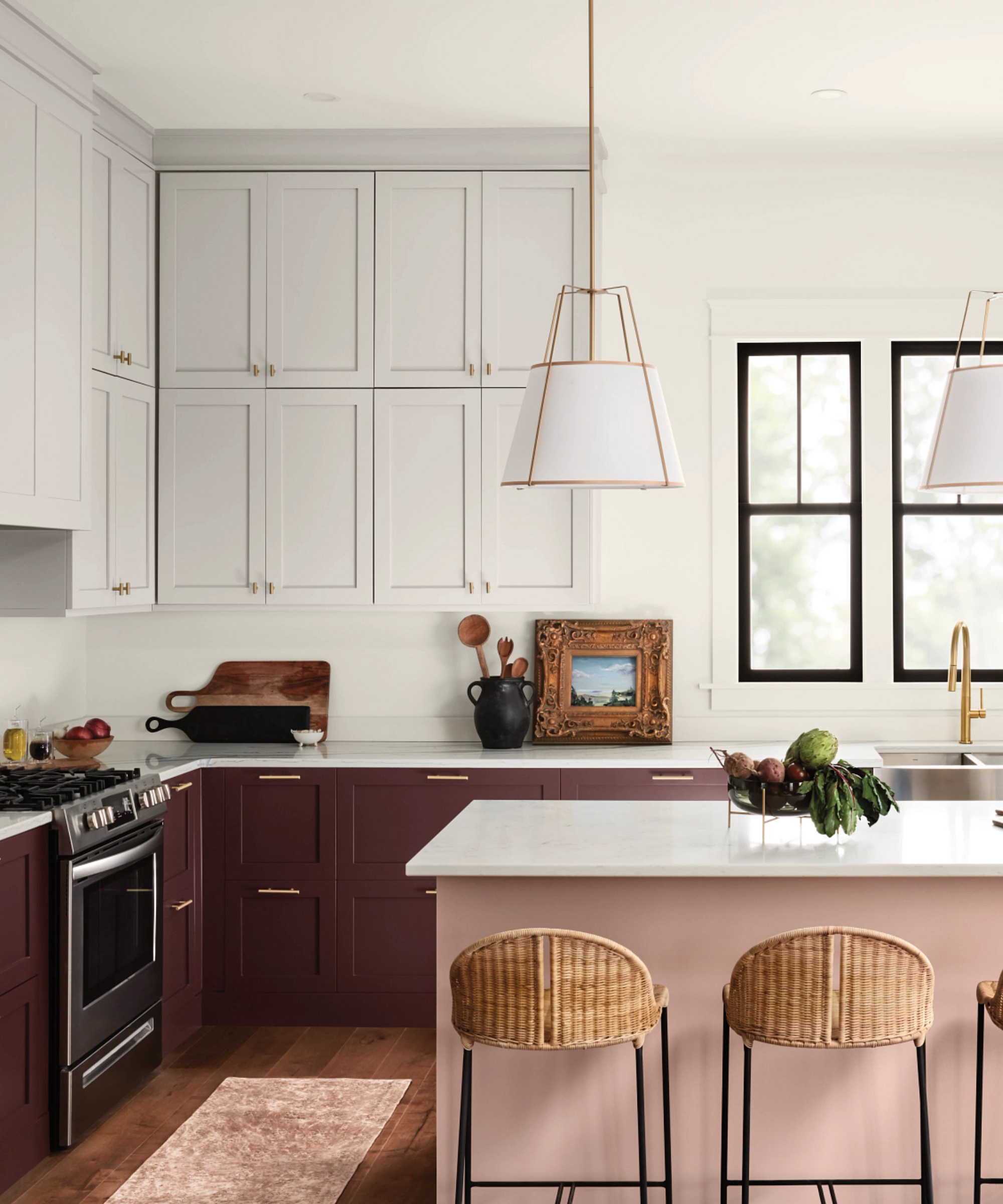
If you don't want an all-encompassing pink scheme then opt for using that as the accent and a darker shade as a grounding color. This scheme takes the on-trend two-tone kitchen approach. The base cabinetry is painted in deep violet with pinky undertones that add depth to the white walls and light pink island.
'Light pink goes great with a warm neutral white color since pairing those two hues together creates a very breezy and welcoming space filled with brightness and joy,' says Sue Walden, director of color marketing, at Sherwin-Williams.
'I recommend pairing a light pink, such as Pink Shadow SW 0070 with Dover White SW 6385. We also love it when teamed with a dark saturated violet like Carnelian SW 7580. A rich warming shade that contrasts perfectly against the pale pink.'
3. Light pink and yellow
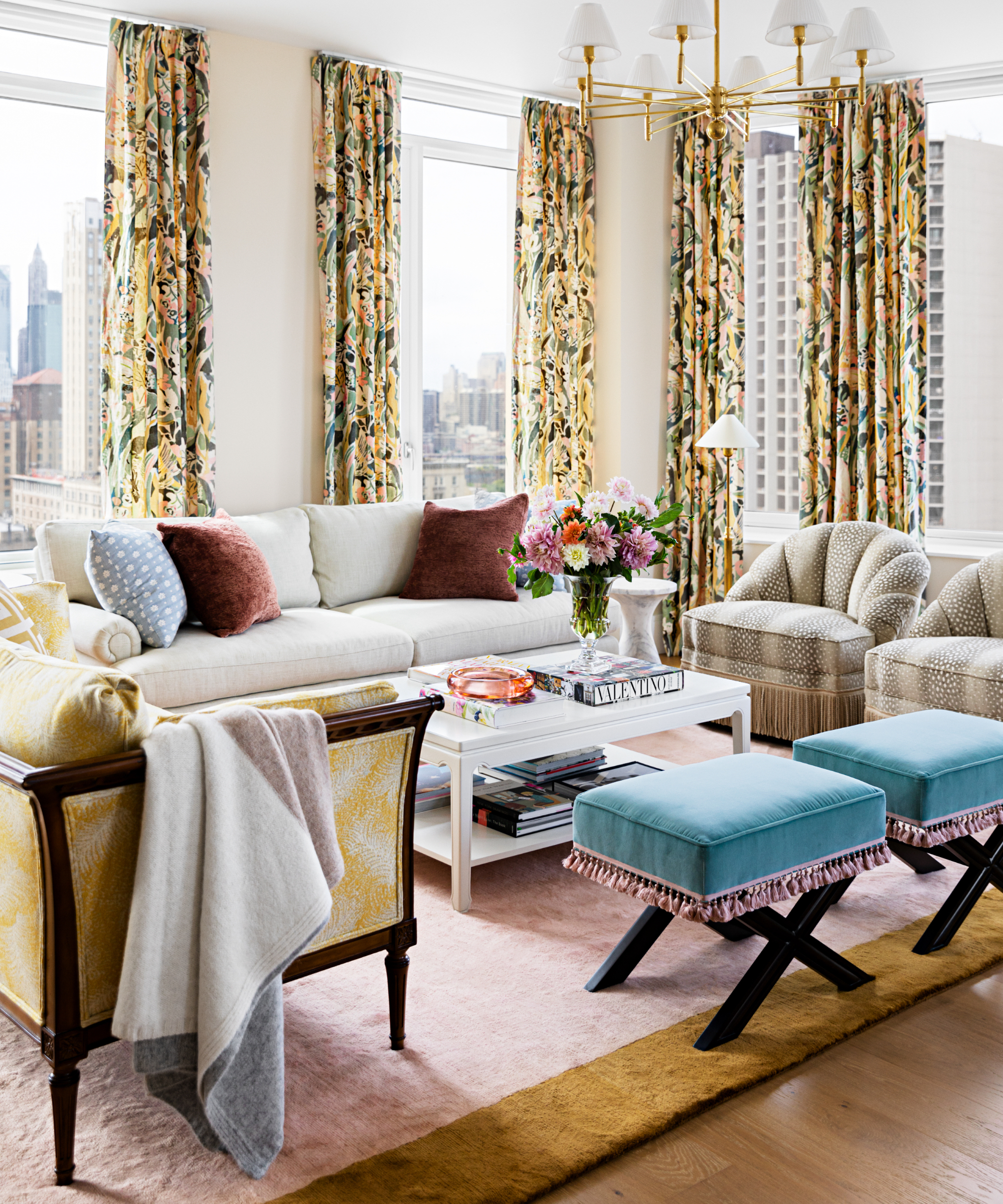
If you're decorating with yellow then pink should be the top of your list to pair up with. Uplifting and joyful, yellow is mood-enhancing and is ideal if you have a north-facing room that needs some warmth.
You can use pink with it minimally as above – the light pink rug grounds this apartment's living room whilst the dark yellow trim matches the floral yellow drapes perfectly. Lighter tones are seen in the antique couch and the light pink trim on the sky blue footstools brings the color up into the room.
Anelle Gandelman, founder of A-List Interiors explains her design process for this fabulously cheery space:
'We used a combination of light pinks and sunny yellows to create a warm yet whimsical living room color scheme. Selecting the right shades and tones of these colors was key to creating an elevated space and preventing the color duo from feeling juvenile.'
4. Light pink and indigo
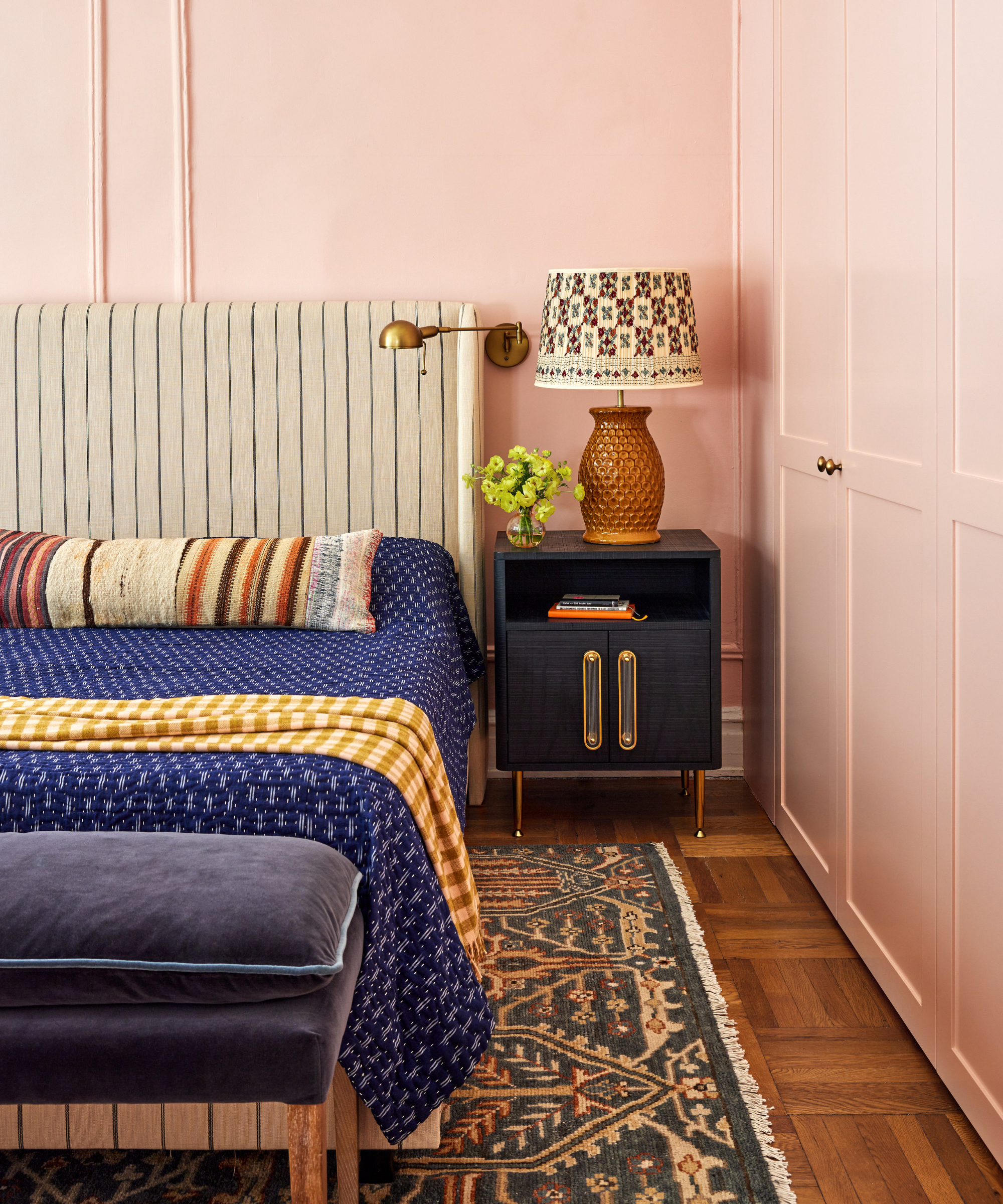
Perhaps a more off-the-wall pairing, light pink and indigo blue works because of the contrasting elements, it's a complementary color scheme. The inky tones of the woven bedspread are eye-catching and are softened in this eclectic bedroom by the earthy shades of the oatmeal headboard, striped cushion, and mustard-checked blanket.
The light pink unifies the bedroom and together with the ochre table lamp, rug and flooring adds a generous warmth to the scheme.
'Light pink can be used in surprising ways. It’s not just for a little girls' room or a powder room, it can be quite sophisticated,' says Rebecca Amir, founder, of Rebecca Amir Design LLC.
'It might feel more comfortable to stick within a pastel color palette, but pairing light pink with more saturated colors can create harmony in an unexpected way. For this light pink bedroom, I paired Sherwin Williams' Romance with deep indigo and pops of ochre. The rich, contrasting colors help keep the room from feeling too frilly and feminine. I think the unexpected pairing is what makes the room feel collected and interesting.'
5. Light pink and forest green
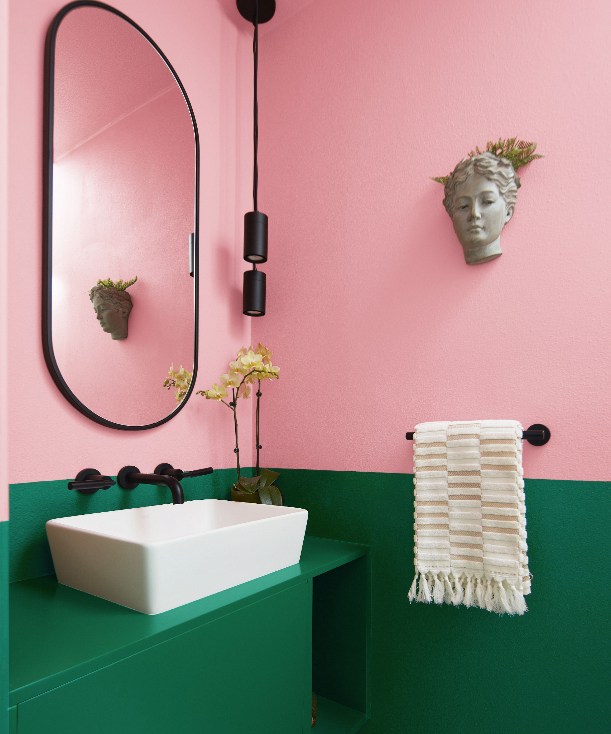
If you've opted for a brighter light pink over say a rose blush for example, then team it with a stronger shade. Take this powder room as an example – a paler pink would have been lost against this forest green, but a stronger, yet still light pink sets the scene.
'Pinks and greens produce a really pleasing aesthetic and there are many ways in which to create interplay between the shades. For a bold statement, combine ice cream shades of pink with a forest green – this feels soft yet fresh and optimistic,' advises Helen Shaw, director of international marketing, Benjamin Moore.
'There are many techniques you can use to combine the colors; from using one shade to pick out architectural details such as the woodwork, to creating a two-tone wall to instantly add depth and drama to your space.;'
'When creating a simple split wall effect the function and furniture of the room can help guide the height of the line, for example, in the bedroom, you can cleverly position the line to create a visual headboard or similarly give an illusion of a splashback in a bathroom,' she adds.
6. Light pink and charcoal
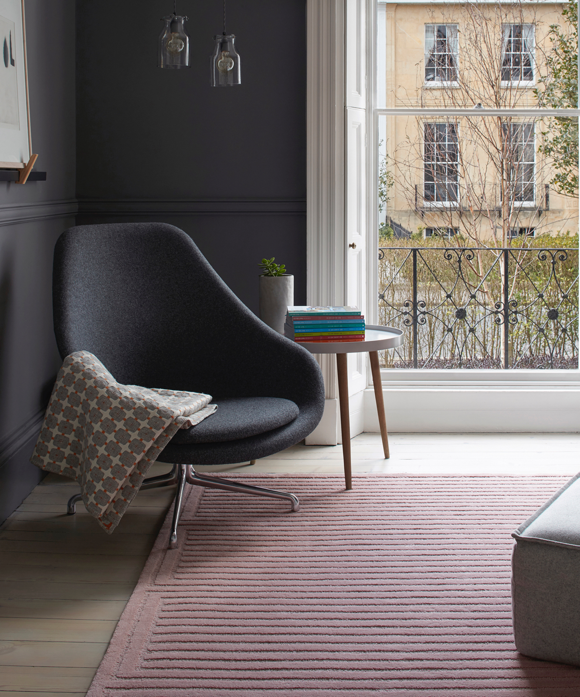
'For a calming and contemporary space, blush pink and charcoal grey make a stylish and chic color scheme,' says Andy Guard from Roger Oates Design.
Color can be added by accessories, so if you are in the process of updating an existing scheme you can have a play with shades you think might work. This light pink tufted rug is a great pairing with the charcoal walls and chair in this apartment.
'By using complementary colors, the addition of a tufted rug in a soft and linear pattern offers comfort, texture, and interest to an interior space,' adds Andy.
7. Light pink and terracotta
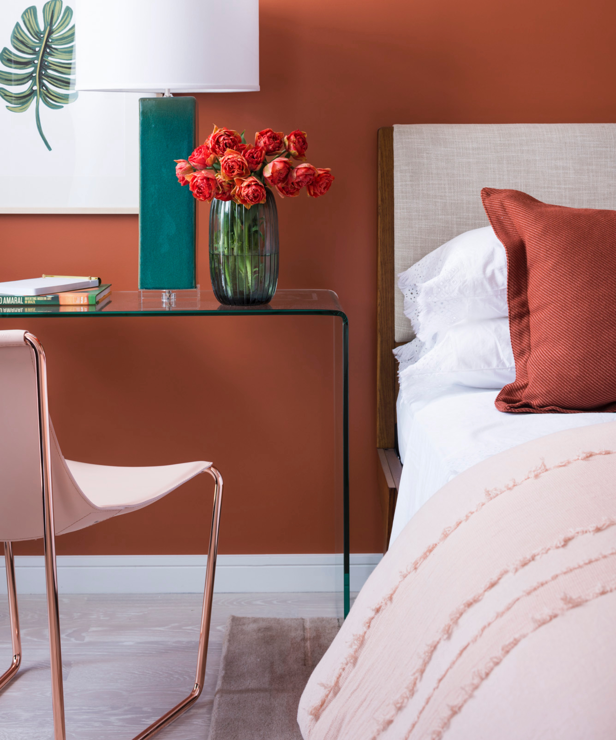
For a north-facing room, you may want to choose terracotta, it's a color that's gaining favor in color trends due to its earthy and grounding properties.
'We like this pairing for a bold, feminine touch, it makes the space feel warm, yet still soft. You can think of these shades as neutrals and pair them with your favorite woods and white with a natural rug underfoot,' advises Dan Mazzarini, creative director, ARCHIVE by Dan Mazzarini.
Pop in some white for balance, it will break up the scheme a little so it doesn't become too heavy visually, small additions will do like bedding and a white lampshade.
8. Light pink and stone
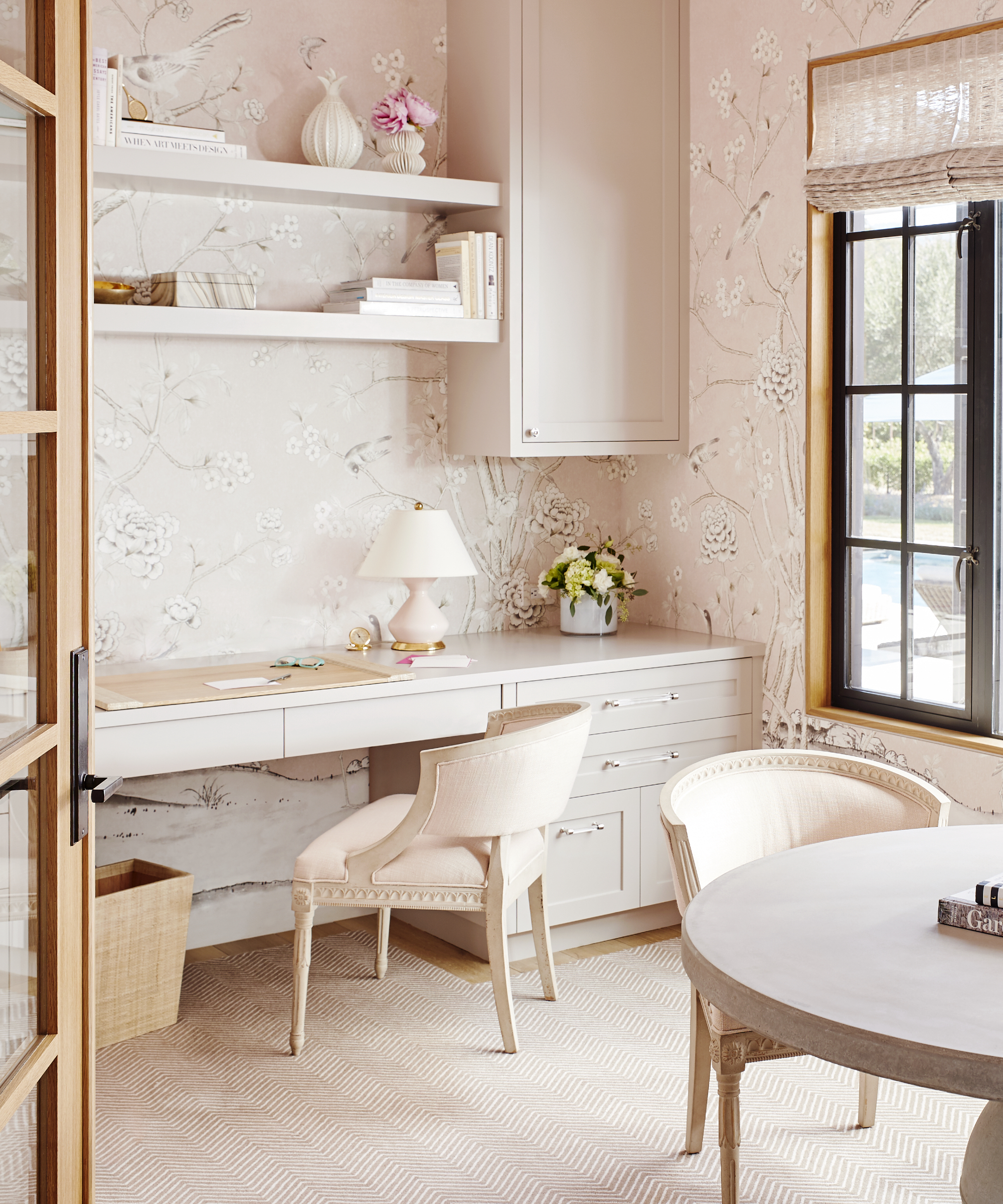
If you like decorating with neutrals, pair pink with an off-cream or pale taupe. Equally as beautifully, it's an elegant pairing when wallpaper is used.
'I love pairing soft pink with greys, creams, and taupes to create a tranquil and sophisticated palette. The greys and taupes elevate the pink and add a little more gravity and maturity to the soft blush tones making the overall feel more adult and serene,' says Katie McCaffrey, owner and principal, of McCaffrey Design Group.
For a modern edge to a serene scheme like this, paint your windows black, it will certainly give a touch of depth to the overall look.
9. Light pink and chartreuse
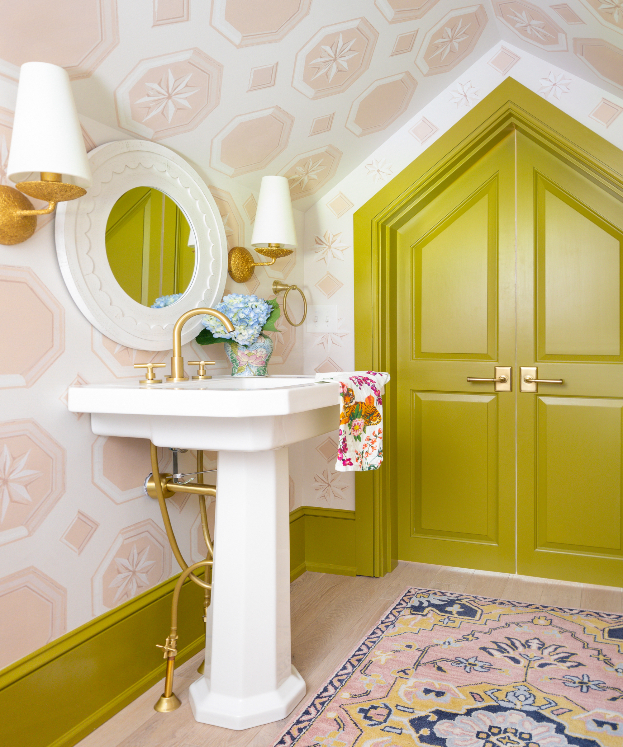
To create a statement, paint your woodwork and doors in a zesty shade, it allows the eye to flow around the room and aside from that, it's a fabulous color combination!
'I love pairing light pinks with richer, deeper colors. In this pink bathroom, I paired light pink paint with a vibrant chartreuse,' says Isabel Ladd, founder, of Isabel Ladd Interiors.
'I like pink and green together, but sometimes fear it can look too sweet or too preppy. This perfect shade of Chartreuse, however, feels like a "wild card" and keeps the light pink perfectly pleasant.'
10. Light pink and brown
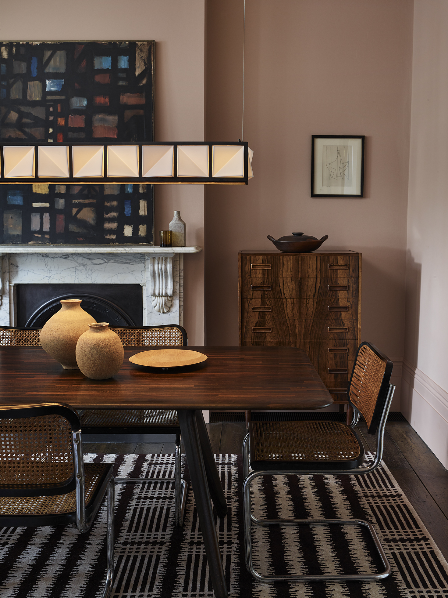
Light pink and brown, perhaps a combination you might not have considered, but bear with us. Brown doesn't need to mean brown walls, though it's a color that's increasing in popularity and we are seeing more and more of it in interior design trends.
Most furniture is 'brown' so essentially if yours matches in tone like this retro dining room then you're already halfway there and doesn't it look great with light pink? The paler shade lifts the heaviness of the wood and really lightens the whole space, add a rug on top of the hardwood floor too for a touch of texture.
FAQs
What colours go with blush pink?
For a fresh feel in a room that may have a lack of natural light, opt for white. It will lighten and brighten whilst the blush pink prevents the space from becoming too clinical.
Another great color to use is apple green, match the tone to the pink you've chosen and it will create a restful and serene combination that you'll wonder why you've never tried it before – we promise!
Is pink an on trend color?
Pink is always on trend in some form or another. It's a classic hue that as you can see goes with so many shades. It's also a really versatile shade, in its palest form it's almost like a neutral, and then you have super bold pinks if you want to make a statement, and deep raspberry pinks if you are after a more moody look.

Sophie has been an interior stylist and journalist for over 20 years and has worked for many of the main interior magazines during that time, both in-house and as a freelancer. On the side, as well as being the News Editor for indie magazine, 91, she trained to be a florist in 2019 and launched The Prettiest Posy where she curates beautiful flowers for modern weddings and events. For H&G, she writes features about interior design – and is known for having an eye for a beautiful room.