Paint experts at Benjamin Moore reveal their top 3 color pairings for 2024 – full of mood-boosting hues
Create an uplifting feel with these playful color pairings

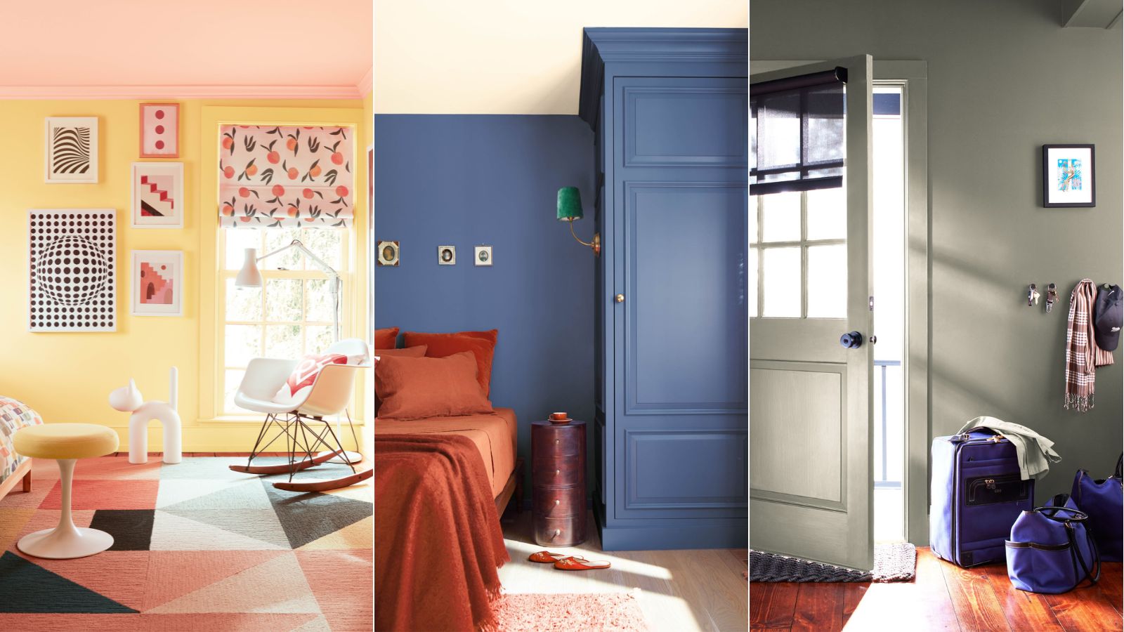
In 2024, one of the key trends we're noticing is a welcome of color. Gone are the days of purely minimalist interiors, homeowners and interior designers are gladly welcoming color to create spaces that feel vibrant and full of personality.
But if you're not used to decorating with color, it can be tricky to know where to start with choosing which colors to pair together. To give you some ideas, we're turning to leading paint company Benjamin Moore who has rounded up three color pairing ideas, reflecting on 2024's top color trends.
If you're looking to uplift your home with some vibrant colors this year, keep reading to learn about these expert-approved color combinations, guaranteed to energize your home decor ideas.
A post shared by Benjamin Moore (@benjaminmoore)
A photo posted by on
1. Teacup Rose and Honeybee
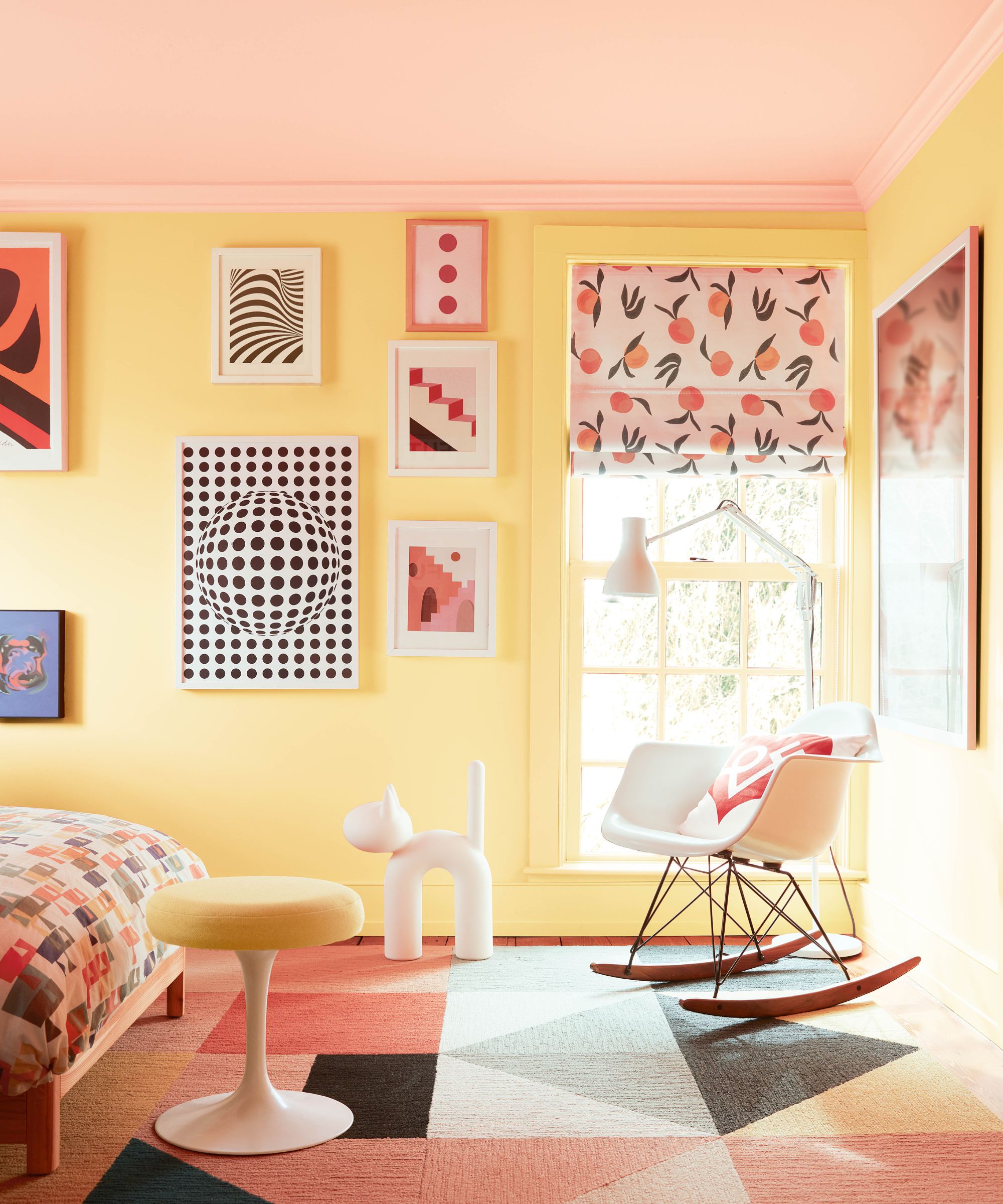
Beginning with a playful and summer-inspired color scheme, from Benjamin Moore's color expert and design specialist, Molly Hannelly, a standout color pairing is Teacup Rose and Honeybee – a combination of pink and yellow. 'I think they just play together so beautifully. They create this really vivacious space but the colors aren't really bold or dark. Honeybee is this soft, subtle yellow, and teacup rose is also a softer pink hue but when they’re combined, it’s such a bright and joyful experience.'
While these hues certainly make a statement, they're a great choice if you want to create a space that feels instantly mood-boosting and happy. Opt for this combination in smaller rooms in the home such as a home office or powder room, choosing one of the two shades as the main color and the other as an accent hue.
A color marketing and design specialist at Benjamin Moore, Molly Hannelly, has a penchant for all things centered around color, design and paint. Molly joined the fashion industry as a copywriter in 2017, and had the privilege of joining Benjamin Moore in December of 2020 as the copywriting coordinator.
2. Blue Nova and Topaz
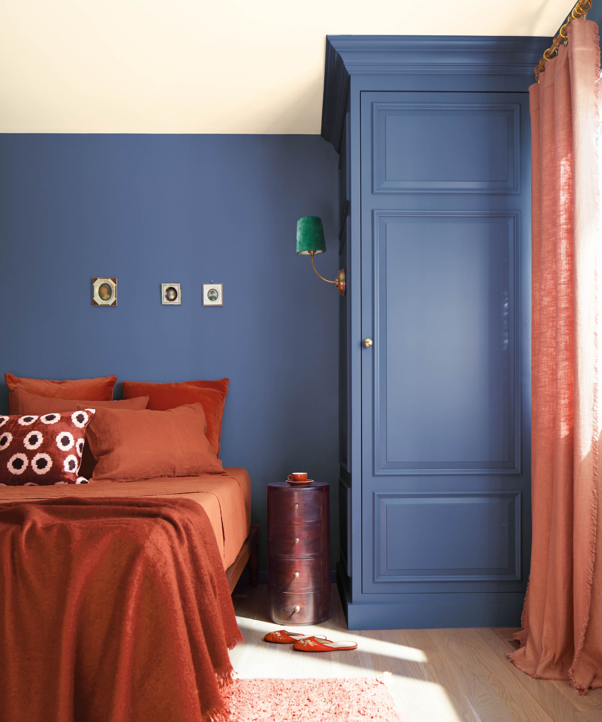
Since Benjamin Moore's Color of The Year for 2024 is Blue Nova, it's no surprise to see this included in this year's color pairings. A mid-blue with violet tones, Blue Nova is a unique shade that is said to evoke comfort in the home. Andrea Magno, Benjamin Moore's director of color marketing and development, recommends pairing this hue with Topaz, a deep shade of orange with brown tones.
'I think the push and pull and the energy that’s created between Blue Nova and Topaz is really exciting. You have this dynamism and this excitement that happens when you have these opposing colors.' While these are two fairly bold shades, Andrea continues to explain that the way these two hues work together is key, suggesting Blue Nova as the main color in a room and a more subtle incorporation of Topaz.
Design expertise in your inbox – from inspiring decorating ideas and beautiful celebrity homes to practical gardening advice and shopping round-ups.
Andrea Magno, Benjamin Moore’s director of color marketing and development, is an expert in anything to do with paint colors and paint. During her 18 years at Benjamin Moore, she has increased the number and variety of educational programs as well as research into paint trends.
3. Blue Nova and Antique Pewter
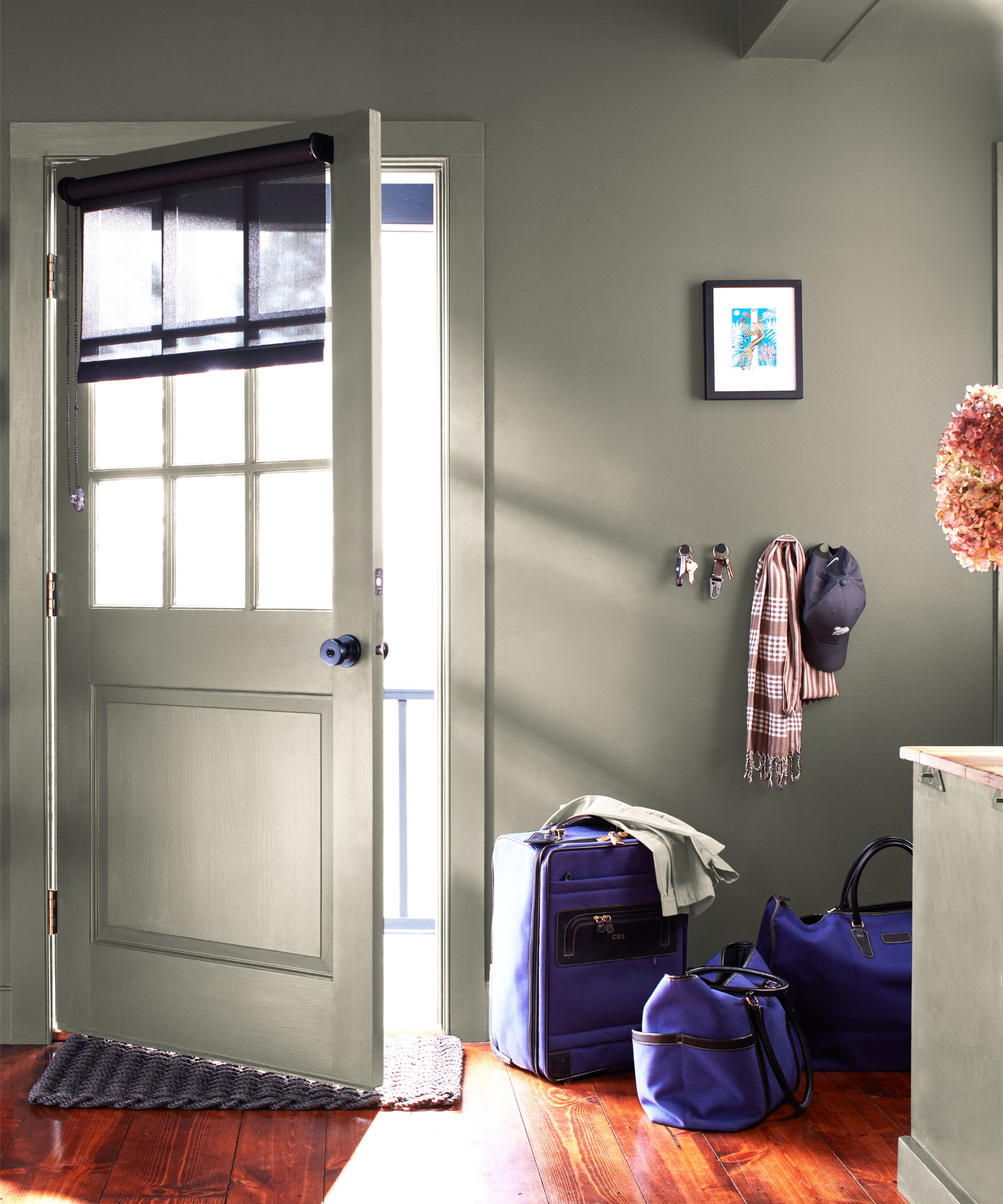
Continuing the theme of Blue Nova, color expert, Anastasia Davydenko, also recommends this as a color pairing, but this time with Antique Pewter, a gray-green hue: 'I personally love Blue Nova paired with Antique Pewter. I would love to see it in a striped pattern on a wall – I think that would be extremely beautiful and dynamic.'
While you can take inspiration from Anastasia and create a striped pattern with these two paint ideas, you can also use this color pairing more subtly. With Antique Pewter as a primary color in a room as pictured above and Blue Nova as an accent color, it brings interest to this otherwise fairly neutral hue. Opt for this combination in an entryway or kitchen for a timeless and natural look.
If you're feeling inspired to embrace these uplifting hues into your home, be aware of these color rules interior designers swear by, to ensure you create a balanced scheme.
Emily is a freelance interior design writer based in Scotland. Prior to going freelance in the spring of 2025, Emily was Homes & Gardens’ Paint & Color Editor, covering all things color across interiors and home decor for the Homes & Gardens website. Having gained specific expertise in this area, Emily is well-versed in writing about the latest color trends and is passionate about helping homeowners understand the importance of color psychology in home design. Her own interior design style reflects the simplicity of mid-century design and she loves sourcing vintage furniture finds for her tenement flat.


