The only 5 paint colors to decorate with in June 2024, according to color forecasters and designers
This June's paint color trends explore everything from gentle mauve, glistening turquoise to soft pinks and forest greens

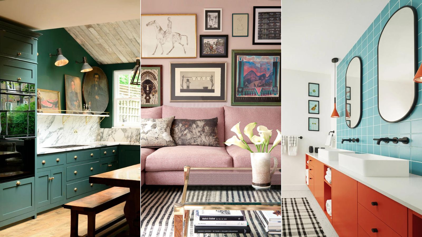
June marks the start of summer; a joyous month full of entertaining, laughter and hopefully, sunshine, so finding the perfect paint colors to decorate with in June should replicate the feeling of euphoria and happiness that often arrives in the summer.
Our summer decor ideas are full of soft yet playful colors that instantly put a smile on your face, so why not bring some of that into your home? Introducing all the best parts of summer into your home can allow you to brighten up your home and invite a touch of the outside, inside.
To make the paint-selection process easier, we spoke to color experts and interior designers to get their best room color ideas to approach choosing color and paint trends for June with confidence.
Article continues below5 paint colors to decorate with in June – that soothe with the summer sun
If you wish to decorate your home with the latest summer color trends with a hint of summer, you're in luck.
I've rounded up the most beautiful colors set to dominate color trends in June 2024, along with helpful guidance from the experts in the know on how to use them in your home.
1. Forest green
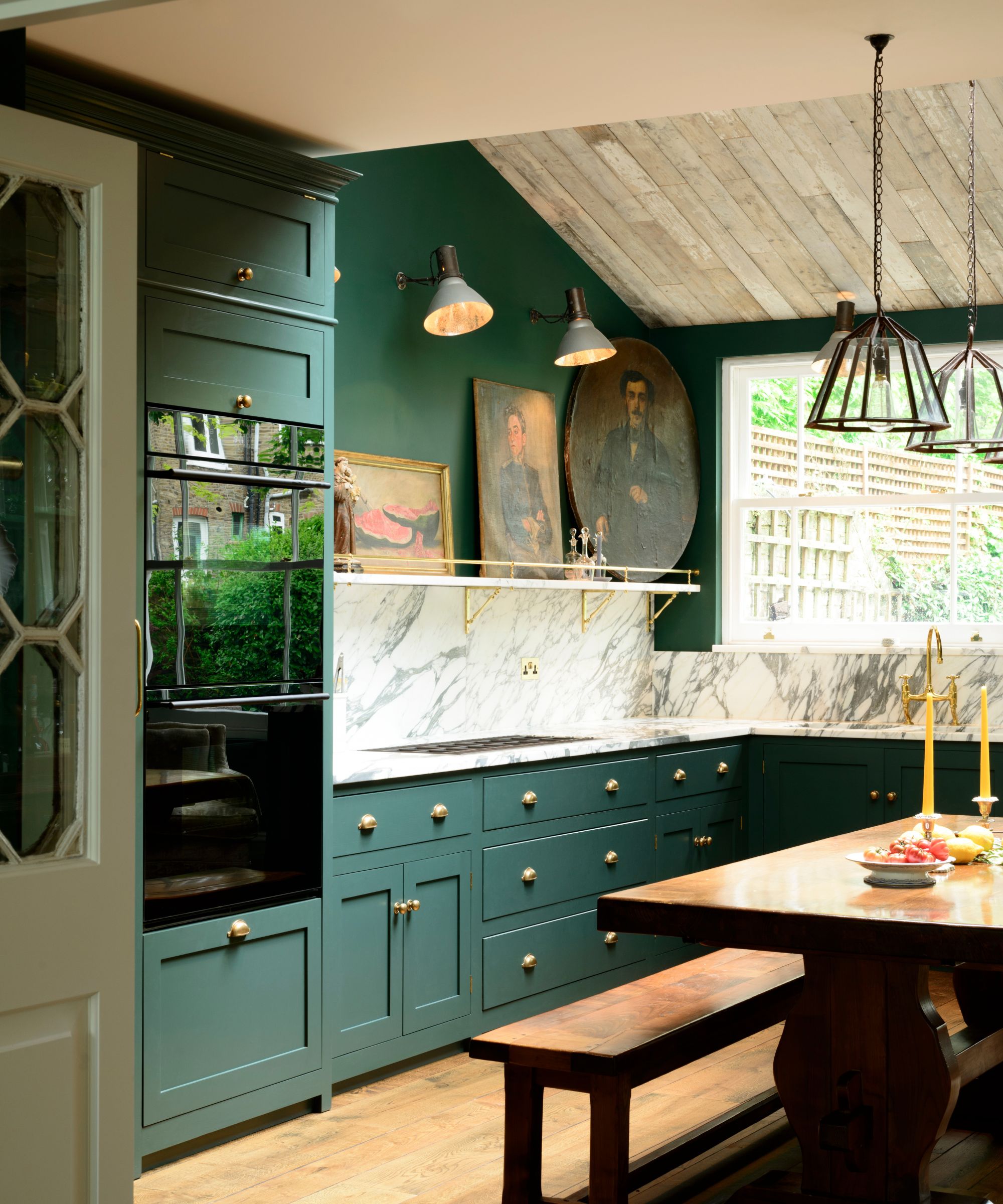
As a backdrop, the soothing quality of green is hard to beat. In June, the forest is abundant with rich, verdant foliage and our home should reflect the glorious bounty found in nature.
The majesty of ancient forests has long inspired interior design. Whether the grandeur of an oak tree or the enchanting shape of an acanthus leaf, rich, velvety greens offer homes a nurturing connection to nature.
Design expertise in your inbox – from inspiring decorating ideas and beautiful celebrity homes to practical gardening advice and shopping round-ups.
‘Green reassures us on a very primitive level. We know we can find food and water, which means green equals life. Using dark greens in our home, brings in these feelings of reassurance and rest,’ says Karen Haller, color and design psychology specialist and author of The Little Book of Color. ‘Surrounding ourselves with too much green or the wrong shade, however, can lead to feelings of stagnation and lethargy.’
Pay attention to the colors that make you feel good. If forest green isn't for you, you can be certain you'll find another green on the color spectrum.
2. Burnt orange
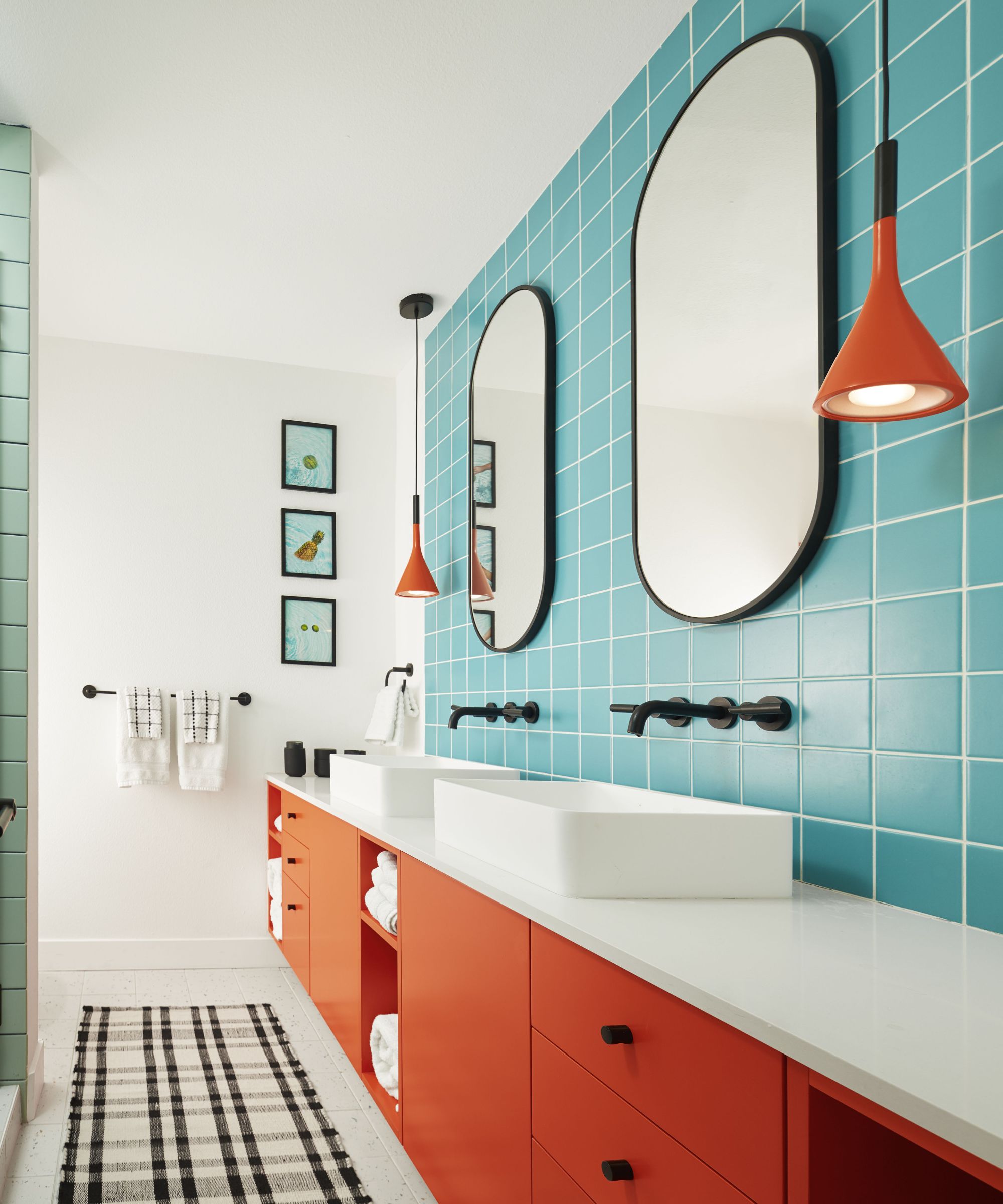
Unashamedly bold, burnt orange is a surprisingly sophisticated color choice for June. A bold, fiery color tinged with hints of red and brown, it is zestier than earth tones, yet offers a smokier, more relaxed aesthetic than brighter hues. Decorating with orange provides interior schemes with energy, while also imbuing a sense of warmth and calm.
‘Burnt orange is a wonderfully optimistic color but it is not one for the cautious,’ says Helen Sanderson, creative director of fabric company Ian Sanderson. ‘It is a serious, grown-up color that makes fabulous partnerships with teal and with surprise elements of subdued blush pinks.’
If you don't want to paint a room in orange, dropping burnt orange into an otherwise neutral scheme by way of soft furnishings or as an accent wall offers a more measured approach to its use than painting a whole room.
‘We’re currently using orange as an accent, pairing it with aquamarine or with teal, yellow and pink,' says Liv Waller and Cath Beckett, co-founders, of Yellow London. 'We prefer it as an accent rather than a full wall color – but never say never to a gloss orange downstairs toilet!’
3. Turquoise
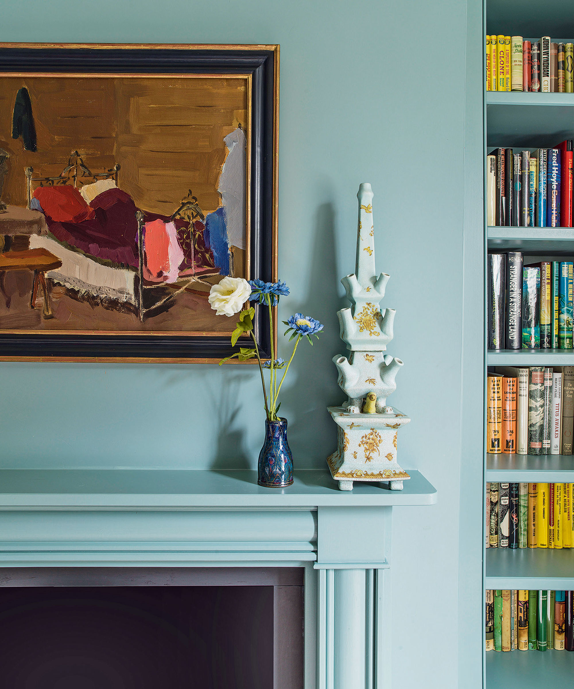
A beguiling hue that reminds us of warm and sunny climes, turquoise has the ability to be invigorating and calming.
Tricia Guild, founder and creative director, of Designers Guild enjoys decorating with turquoise: ‘Reminiscent of endless tropical skies and oceans, this color is full of vitality even on a grey day. Some consider blue to be cold (and it can be sometimes), but this powerful, punchy shade is anything but; rather it is enlivening in its strength. Use it with a white for crisp simplicity, make it dramatic with darker hues or take it to the Caribbean with pastel tones. It responds beautifully to sunlit rooms, but looks equally stunning with low lighting and candlelight.’
‘This is a guaranteed crowd-pleasing color with lots of positive associations for summer,' agrees Annie Sloan, color and paint expert. 'It embodies both the recessive quality of a blue and the calming quality of a green, making it very easy to work with. I’d be inclined to dress it with heavily textured accents to give a cozier finish, but a 1960s palette of turquoise and orange also works fabulously with mid-century modern silhouettes, glass decor and metallic fittings.’
Whether you choose a relaxed living scheme or opt for a more classical style, you can always rely on turquoise to offer you an uplifting connection to nature.
4. Mauve
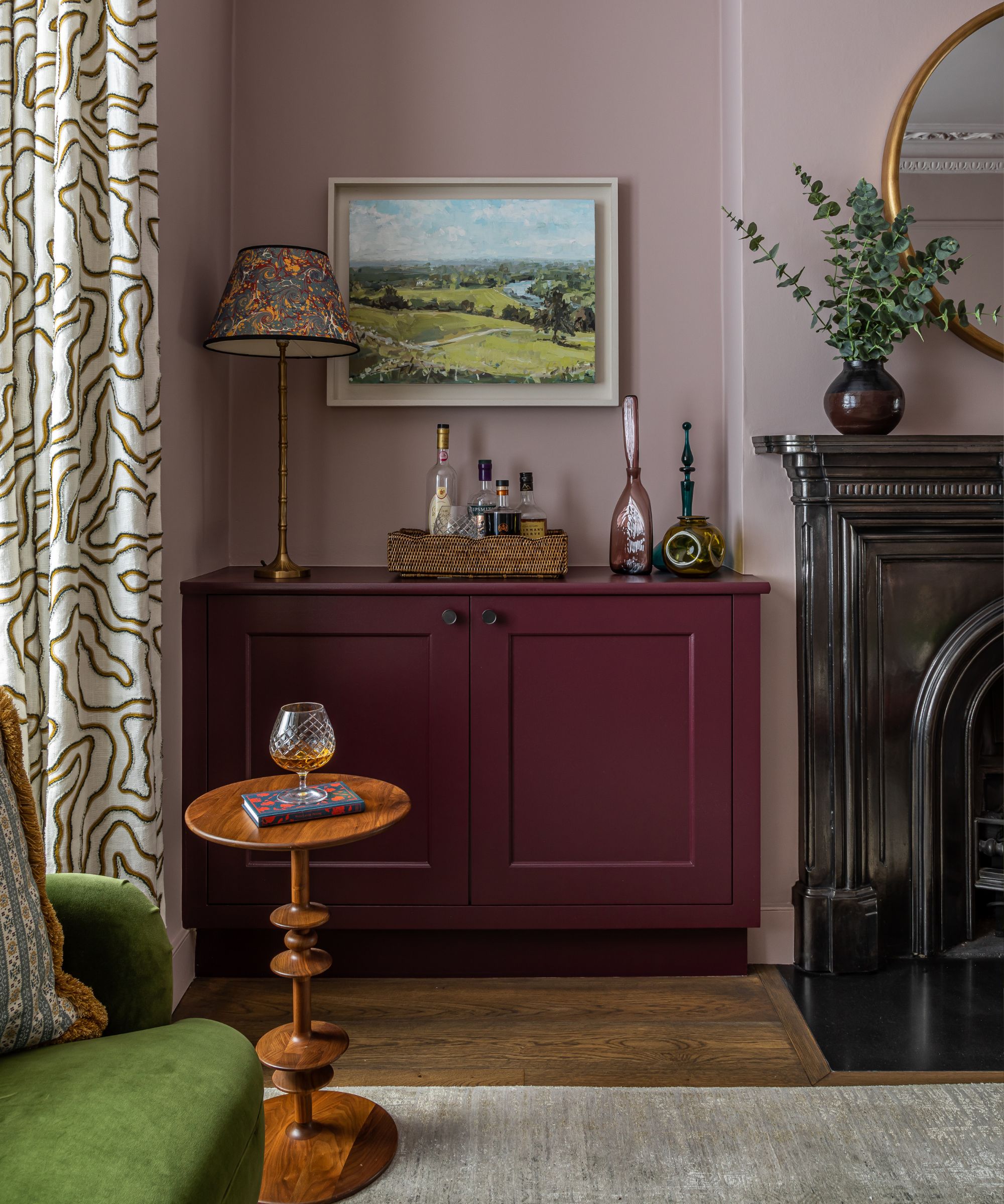
Purple is making a comeback and is perfect for bold and creative looks. Soft purples, such as mauve and lavender are surprisingly versatile. Lighter shades promote relaxation, while deeper tones add elegance. Combining it with white gives a balanced look, while gray adds modernity and depth.
‘Soft purples have an inviting, friendly energy and are great for creating a relaxed feel within a home,’ says Francesca Wezel, founder of Francesca’s Paints. ‘Associated with sociability and open-mindedness, it helps make people feel at ease – perfect for communal areas. Mauve also has a slight feminine edge, which reinforces the feeling of comfortability.’
When it comes to pairing this color, try a bold berry shade for a summer smoothie aesthetic that will see you through the entire year.
5. Soft pink

Gentle yet somehow also a statement shade, soft pink is an evocative hue that has a wonderful sophistication, allowing it to work for both modern and classic rooms. It is the perfect color for the start of summer.
'Soft pink is our absolute favorite color to work with,' says Caroline Stemp, co-founder of Sascal Studio. 'We often use it in living rooms and bedrooms. We don't tend to use pale pink in darker rooms with no windows or north-facing rooms as it can look too gray and dingy.'
Color conjures up different reactions in everyone, adds designer Sarah Fortescue. ‘Soft pink warms my heart, cushions my body and I feel its warmth and comfort. There is an infinite spectrum of pinks, however, depending on the room, the history of the house, its scale and function, pinks can vary hugely. Pinks with orange or ochre hues are wonderful.' She suggests pairing pink that has an undertone of orange and red with a bright red or using a white backdrop on a piece of furniture. ‘Azure blue, navy and Indian green also help create a harmonious but uplifting space,’ she adds.

Jennifer is the Digital Editor at Homes & Gardens, bringing years of interiors experience across the US and UK. She has worked with leading publications, blending expertise in PR, marketing, social media, commercial strategy, and e-commerce. Jennifer has covered every corner of the home – curating projects from top interior designers, sourcing celebrity properties, reviewing appliances, and delivering timely news. Now, she channels her digital skills into shaping the world’s leading interiors website.