The only 5 paint colors you should decorate with in May 2024, and color forecasters and designers agree
To give your home a refresh, try painting with the season’s most inspiring shades

Design expertise in your inbox – from inspiring decorating ideas and beautiful celebrity homes to practical gardening advice and shopping round-ups.
You are now subscribed
Your newsletter sign-up was successful
Want to add more newsletters?
May is a joyous month. Spring is now in full swing, and the colors of flora and fauna are alive and abundant, so finding the perfect paint colors to decorate with in May should replicate the beauty of nature.
We are nearly halfway through the year, and with summer on the horizon, May is a wonderful time to welcome in colors that reflect this period of transition. Unsurprisingly, this month is all about nature with hues of emerald green, zingy yellow, and sparkling teal.
To make the paint-selection process easier, we spoke to color experts and interior designers to get their best room color ideas to approach choosing color and paint trends for May with confidence.
Article continues below5 paint colors to decorate with in May – to reflect the bounty of nature
If you wish to decorate your home with the latest spring color ideas with a hint of summer, you're in luck.
I've rounded up the most beautiful colors set to dominate color trends in May 2024, along with helpful guidance from the experts in the know on how to use them in your home.
1. Pale blue
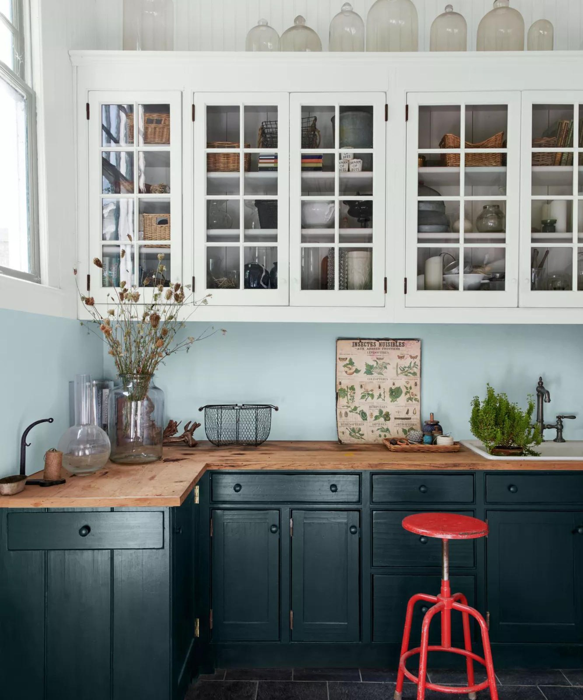
Conjuring endless skies and infinite seas, pale blue is the color of the moment. Embrace myriad shades to create uplifting and optimistic spaces that soothe the soul. Fresh, airy and imbued with the restorative power of nature, light sky blues have this year been tipped by interiors experts as the perfect backdrop to modern living this month.
‘Whether we are working or relaxing, creating or exercising, it is essential to have a space that reflects the optimism and desire for a fresh, new start that is top of the agenda for the year ahead,’ says Marianne Shillingford, creative director of Dulux.
Design expertise in your inbox – from inspiring decorating ideas and beautiful celebrity homes to practical gardening advice and shopping round-ups.
Naturally soothing, but equally energizing and hopeful, decorating with blue promises to bring the outside in to enhance well-being. Pair it with neutrals such as white and cream for classic calm or with stronger mustard, olive, sienna and navy tones for a unique, head-turning scheme.
2. Emerald green

Vibrant and impactful, emerald green is a joyous hue that can deliver different looks – think upbeat and modern and even classic and regal. Decorating with green will always be a popular choice, but this particular hue is also the birthstone for May, so it is known to bring luck and good fortune if this is your birth month.
Emerald green packs a full but at the same time an understated punch. It can transport you to the cool tiled floors of Marrakech or the traditional drawing room of a late 18th-century Georgian mansion in England, and it’s being used more and more in interiors today. This color works with anything and is bang up-to-date.
‘When decorating with this bright shade recently, I was after a very specific kind of green,' explains Luke Edward Hall, founder, of Luke Edward Hall. 'You know how in the early days of spring, after a long winter, fields of grass can look so vivid they appear almost artificial? That’s the shade I was after! It works well with a subdued brown or pale blue.’
‘I adore this vibrant green,' says Jasmine bible, founder, of Jasmine Bible Design. 'When using a color this bold, up the impact by painting the walls, doors and trim all the same hue to create an intense, enveloping feeling, as if you were inside a jeweled box.’
3. Lemon yellow

Embraced in a big way or used in small doses, this sunny shade is rich, and confident and exudes positivity and warmth. Be inspired to decorate with lemon yellow – the most cheerful color, guaranteed to inject warmth and creativity into any space. As one of the most uplifting colors it is not surprising that it is having a renaissance for the month of May.
The versatility of yellow makes it a favorite element in decorating schemes for interior designers. When it comes to deciding where and how much yellow to use, consider the light in the space. ‘As with any pigment, natural light will affect how your color choice looks in a room so I’d always recommend painting a sample onto the different walls in a room so you can see how it will look in different lights throughout the day,’ says Dominic Myland, owner of Myland Paints.
Yellow is a great accent color for those that are less bold – use it as piping, fringing on cushions and through your pictures. 'It always looks great with beige, browns and greys, giving them a real pop,' explains Emma Deterding, founder, of Kelling Designs. 'Put a yellow into a stack of anything from plates to cushions and it will give it all a lift. A dash of zingy lemon yellow will always cheer up any scheme.’
4. Dusky pink
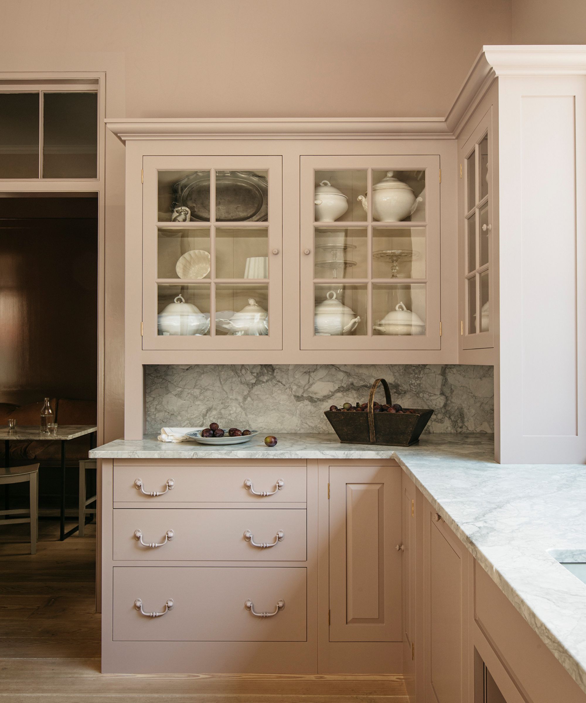
Warm. gentle and effortlessly elegant, this soft hue is a pretty alternative to the usual neutrals. A barely-there dusky pink, this irresistible shade is proof that our love for pale plaster hues endures. Such a delicate, unabashedly feminine hue will happily envelop most rooms, but would undoubtedly feel perfect in a bedroom or bathroom.
When planning the decoration of tiny rooms, the instinct is often to paint them white to give the impression of space, but there are other options. Perfectly suited to cramped spaces that don’t have natural light, the addition of plaster or dusky pink warms up an area and prevents stark shadows. Using the same color paint on walls and cupboards can also create the impression the room is larger than it is. It pairs beautifully with many shades, including ochre, blue, grey and green. Most importantly, it’s a color that makes a house feel like a home.
5. Teal
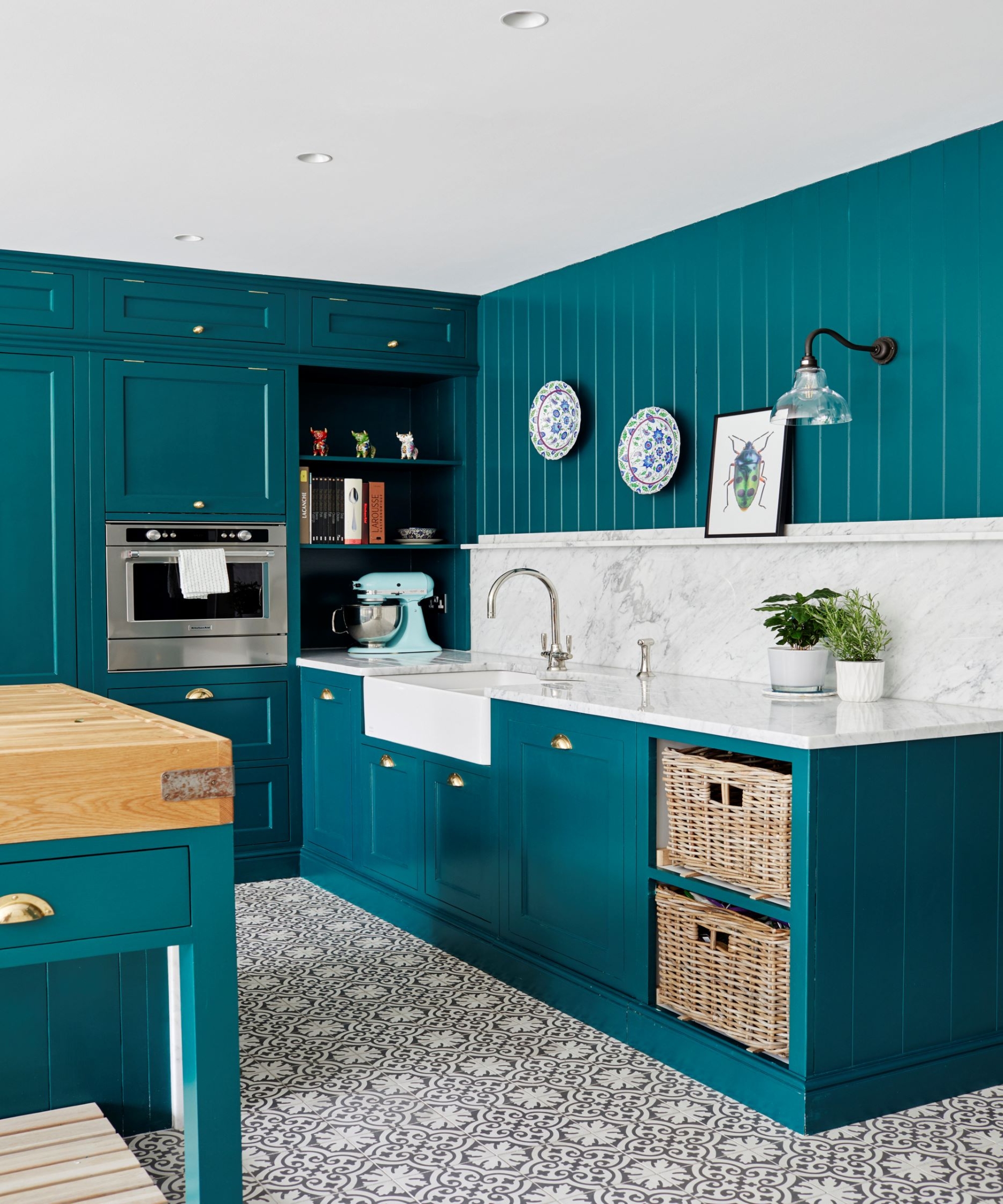
The uplifting yet serene teal is an interesting contradiction, blurring the boundaries between blue and green, and equally between fun and sophisticated when added to an interior scheme.
Teal appears on the color wheel between blue and green, so its boundaries are blurred, and numerous interpretations of it exist, from light to dark. ‘Teal is a member of the cyan, or green-blue group, and is widely associated with positivity, happiness, and stability,’ explains Helen Shaw, director of marketing at Benjamin Moore.
Decorating with teal is currently riding a renaissance, according to Charlotte Cosby, head of creative at Farrow & Ball. ‘Teal is a very balanced, versatile shade that can be used to create a subtle or dramatic space, as it shifts between blue and green in varying levels of light.
But why does teal uplift and calm in equal measure? Tobias Lewis, head of brand at Valspar, has a theory that links to the shades found in the natural world and the recent global pandemic. ‘Colors that have a biophilic nature, such as blue and green, evoke a stress-relieving and mood-boosting atmosphere. This makes teal – a deep, cyan-green shade – ideal for rooms to wind down in, including the bedroom and living room.

Jennifer is the Digital Editor at Homes & Gardens, bringing years of interiors experience across the US and UK. She has worked with leading publications, blending expertise in PR, marketing, social media, commercial strategy, and e-commerce. Jennifer has covered every corner of the home – curating projects from top interior designers, sourcing celebrity properties, reviewing appliances, and delivering timely news. Now, she channels her digital skills into shaping the world’s leading interiors website.