These are Farrow & Ball's current 'most loved' paints – and how to decorate with them throughout the home
From deep blue to earth-toned pink, these paints are universally loved

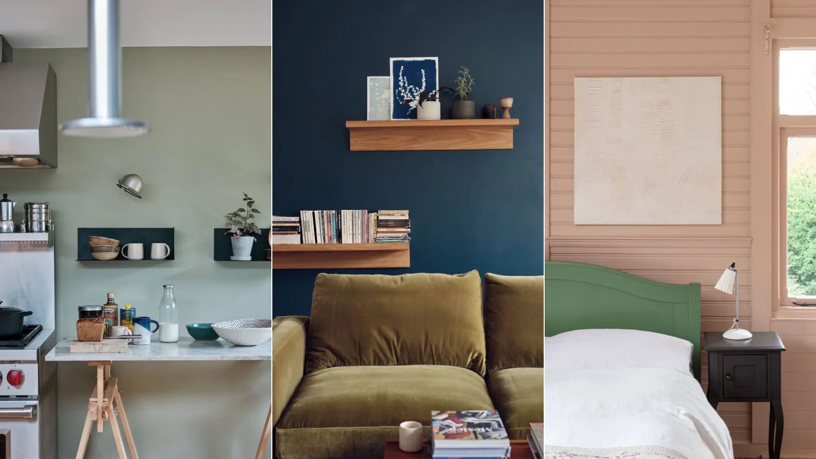
Design expertise in your inbox – from inspiring decorating ideas and beautiful celebrity homes to practical gardening advice and shopping round-ups.
You are now subscribed
Your newsletter sign-up was successful
Want to add more newsletters?
When it comes to decorating with Farrow & Ball paints, you're most likely familiar with some of their most popular shades. From rich blue to earth-toned pink, these paints are continually embraced by interior designers and homeowners alike.
But what are the best ways to decorate with these popular colors? To give us some guidance, Farrow & Ball's color specialist Patrick O'Donnell took to Instagram to share a video in which he talks through three of the brand's 'most-loved' colors.
Below, we've rounded up each paint idea, sharing Patrick's color expertise to give you some ideas for decorating with some of Farrow & Ball's best sellers. Whether you want to create a moody kitchen or a restful bedroom, these ideas are absolute classics that we're sure you'll love.
Article continues belowA post shared by Farrow & Ball (@farrowandball)
A photo posted by on
1. French Gray
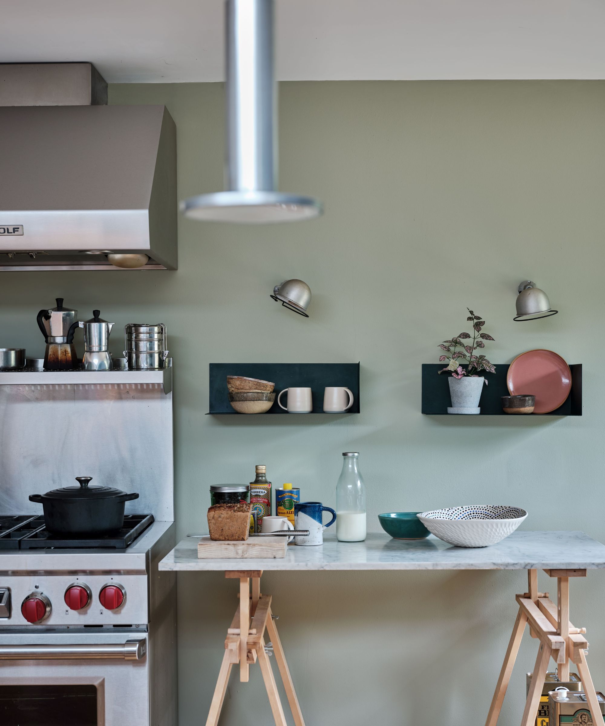
Farrow & Ball's French Gray is the first of the paint brand's most loved paint colors, and Patrick says it makes a great choice for a living room. This color leans a lot more green than it does gray and works well to create a calming scheme.
'Just team this very simply with your trim and ceiling color in Slipper Satin,' Patrick suggests. Referring to this warm white paint, Patrick explains: 'When you start playing with off-whites, they’re nicer than really sharp clean whites.'
To finish the scheme, Patrick advises incorporating a splash of red with Preference Red as an accent color. 'This could be just a fabric reference,' he says while adding that this bold hue could also be used to paint furniture. 'Those plummy reds work really well with the green,' he says.
2. Hague Blue
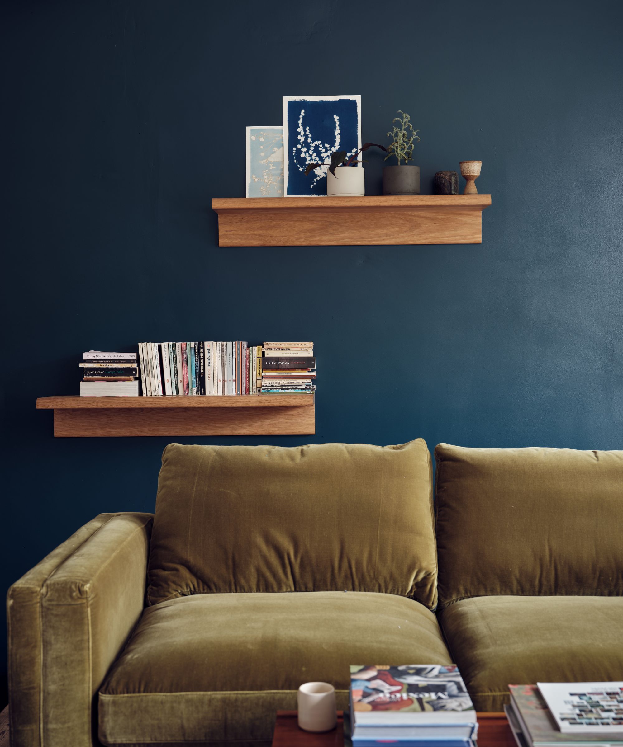
You've most likely heard of Farrow & Ball's Hague Blue before, a popular moody shade of blue. 'Everybody loves Hague Blue,' says Patrick. You can use this bold color in many rooms, but Patrick suggests using it on kitchen cabinets for a classic look.
Design expertise in your inbox – from inspiring decorating ideas and beautiful celebrity homes to practical gardening advice and shopping round-ups.
To uplift this deep shade, Patrick recommends decorating with Bancha, a mid-century-inspired olive green color, in smaller doses.
'And then just to lighten everything, give a bit of relief, paint all your walls and ceilings in the lovely Shaded White.'
3. Setting Plaster
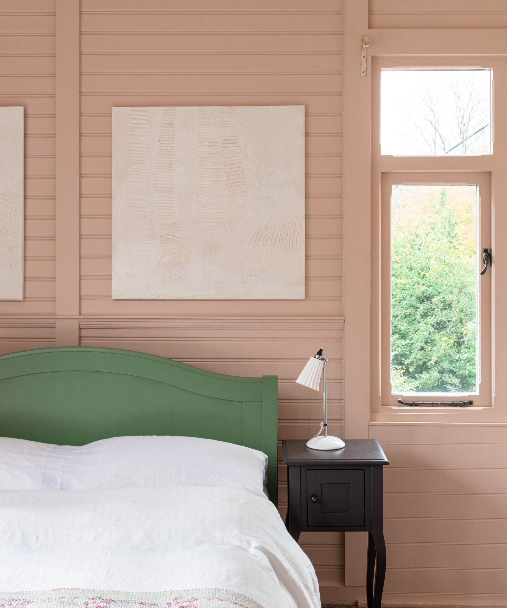
Farrow & Ball's Setting Plaster is another of the paint company's most loved colors, which Patrick describes as 'the most flattering of earth pinks.' Again, there are many ways to use Setting Plaster, but Patrick recommends using this soft hue in a bedroom.
As an accent color, Patrick recommends teaming Setting Plaster with Mouse's Back: 'They just play really nicely together, that pink and brown is such a beautiful combination.'
And for your trim and ceiling, the color expert recommends School House White to complete the relaxing bedroom scheme.

Patrick O’Donnell is Farrow & Ball's color consultant & brand ambassador and has been with the brand since 2012. Patrick works with designers in the UK and North America, helping to bring their projects alive with the iconic, F&B color palette.
Whether you're looking to create a calming bedroom or on-trend kitchen, these expert-suggested color schemes are a great place to start. Or, if you're looking to add some more color to your home for spring, these Farrow & Ball cheerful color schemes have you covered.
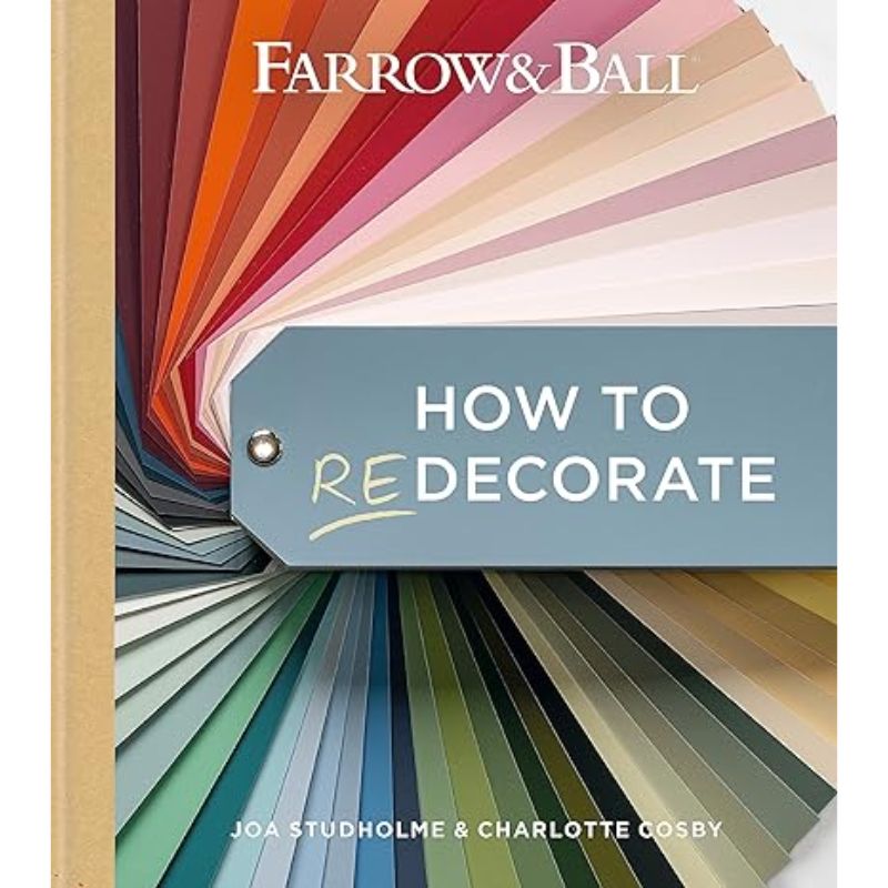
Looking for more help with your home decor color schemes? This Farrow & Ball book covers all things color when it comes to decorating a home.

Emily is a freelance interior design writer based in Scotland. Prior to going freelance in the spring of 2025, Emily was Homes & Gardens’ Paint & Color Editor, covering all things color across interiors and home decor for the Homes & Gardens website. Having gained specific expertise in this area, Emily is well-versed in writing about the latest color trends and is passionate about helping homeowners understand the importance of color psychology in home design. Her own interior design style reflects the simplicity of mid-century design and she loves sourcing vintage furniture finds for her tenement flat.