Sherwin-Williams' 'herbal apothecary' color scheme perfectly balances calm and cozy – here's how to embrace the trend
The paint brand's calm and considered herbal apothecary color palette provides endless design inspiration

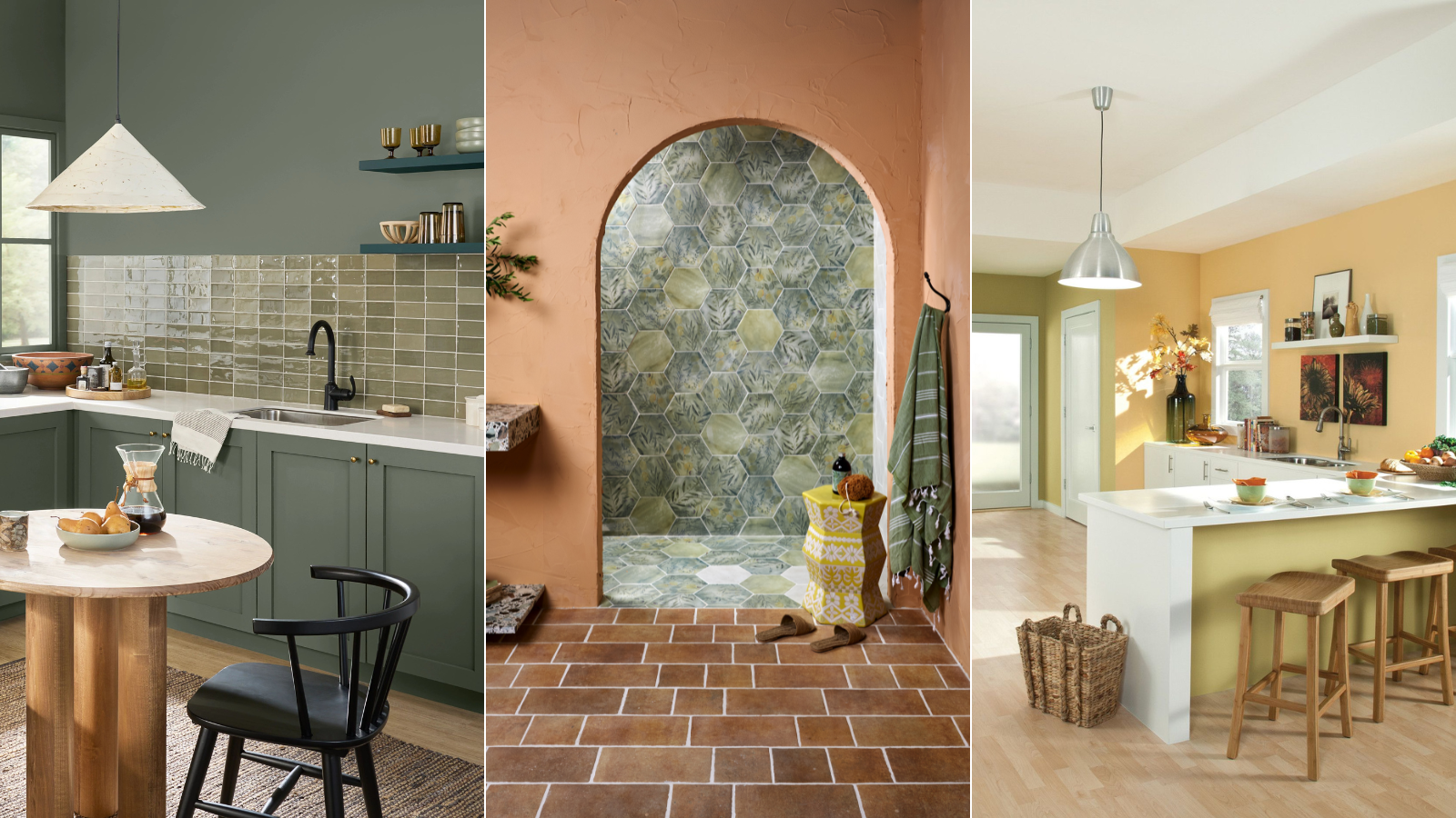
We can always count on Sherwin-Williams for gorgeous paint shades and endless design inspiration, and the brand's latest color pairing hasn't let us down.
Sherwin-Williams recently posted a selection of paint colors that create an 'herbal apothecary aesthetic,' a color trend that's fresh and organic – and perfect for a pre-spring refresh. Including neutrals and natural tones, the color combination is calming and considered.
'Create a natural state of balance in a bathroom or bedroom with this herbal apothecary-inspired palette,' says Sherwin-Williams in the post's caption.
To get expert tips and tricks for designing with the brand's selected shades, we spoke with Sherwin-Williams' director of color marketing, plus four interior designers. Here's what they had to say about decorating with earthy tones and creating a calming, yet cozy space.
A post shared by Sherwin-Williams (@sherwinwilliams)
A photo posted by on
What are Sherwin-Williams' herbal apothecary-inspired colors?
The herbal apothecary color scheme consists of five beautiful hues, from mainstay neutrals to more vibrant, earthy tones.
Sue Wadden, director of color marketing at Sherwin-Williams, says that the first shade, Whitetail SW 7103, is 'the ideal bright white to pair with colors like cool browns.' This is due to the color's yellow undertones, and she recommends using it to decorate shared spaces, like kitchens.
Moth Wing SW 9174 is another classic addition to the color palette, and brings a calming atmosphere to any space.
Design expertise in your inbox – from inspiring decorating ideas and beautiful celebrity homes to practical gardening advice and shopping round-ups.
'This warm medium beige with gray undertones is also a very inviting shade for spaces like kitchens, but would also look great in living rooms,' says Sue.
Gingery SW 6363 is 'the perfect mix between orange, brown and gold yellow, she says, adding that the hue would be a beautiful accent when paired with something more pared back. And Rosemary SW 6187 is another organic tone that Sue suggests for accents.
'This deep, organic green with cool gray undertone is a gorgeously fresh color for cabinets and pairs well with wooden furnishings. I specifically love using this green for home offices because it inspires sophisticated simplicity and creativity alike,' she says.
For a bit of extra energy, Bee’s Wax SW 7682 finishes out the apothecary-inspired color palette. Here's how Sue would use the hue.
'This buttery yellow is bright and cheerful. Decorating with yellow has always been associated with mood-boosting – when you want to add a pop of color to brighten a space this is an obvious choice to use for a nook or as a kitchen cabinet color,' she says.

With a strong background in design and color leadership, Sue Wadden was appointed director of color marketing at Sherwin-Williams in 2016, and has been with the paint brand since 1998.
How to decorate with the shades
The palette proves perfect for spaces you want to keep fresh and airy, and designers love using these hues for full walls and finishing details. Here's how four interior designers suggest decorating with the apothecary shades.
1. Brighten up your space

Lauren Levinson, senior project manager and interior designer at Rise Projects says these Sherwin-Williams shades are perfect for bringing warmth into any area of your home. Calming colors have grown in popularity in recent years, she says, and this palette contains several stunning examples.
'These shades are easy to mix and match with furnishings and trims. They can be used to brighten, harmonize, and enlarge a space and one doesn’t need a design degree to find ease in how to utilize them,' says Lauren.

Lauren Levinson is a Senior Project Manager and Interior Designer at Rise Projects, a full-service architecture and interior design firm based in New York City.
2. Pair with natural accents
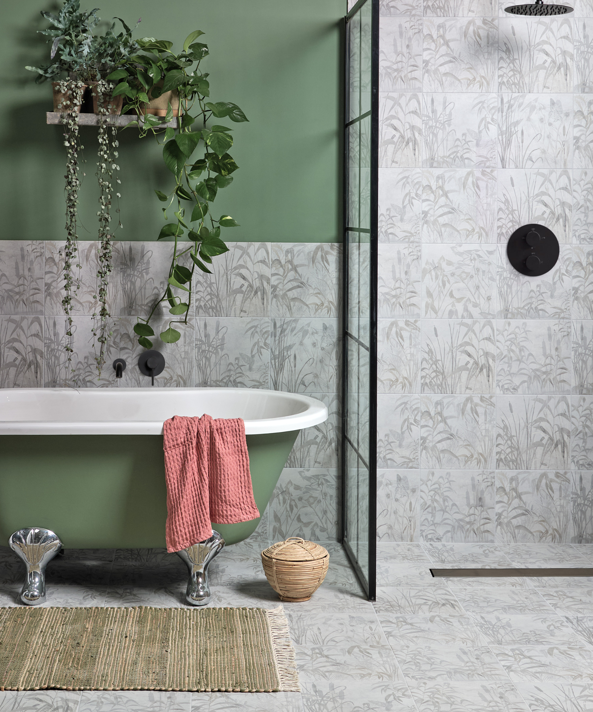
Because the color palette pulls from the great outdoors, pairing natural fabrics, materials and accents with these shades comes quite naturally.
Rushda Hakim, interior designer and founder of Rushda Hakim Design, says she loves the apothecary-inspired palette and suggests several smart ideas for decorating with the shades.
'Incorporating it into my designs, I would have fun with the herbal accents in wallpapers, throw pillows and upholstery,' she says.
Rushda says natural textures like jute or rattan pair beautifully with these Sherwin-Williams colors, and suggests picking out rugs or accessories in those textures to 'enhance the organic feel' of a space.
House plants, herb pots or 'botanical-themed kitchen accessories' will also 'reinforce the apothecary inspiration,' she says. And, when it comes to letting the color scheme flow beyond paint colors, Rushda suggests sticking with natural tones.
'Choose tableware and decor in complementary tones like greens and browns for a cohesive look. Incorporate dark wood furniture or accents to complement the warm, neutral tones,' she says.

Rushda is an award-winning interior designer with training in Mumbai and London. She now owns her own women-led firm in New York City.
3. Create a calming bathroom

As Sherwin-Williams suggests, the herbal apothecary's calming elements work beautifully in a bathroom, offering a tranquil atmosphere for all your bathing needs. Grazzie Wilson, head of creative at Ca'Pietra and Proper Good Paint, agrees, saying the hues make designing a bathroom quite simple.
'The herbal color palette from Sherwin-Williams lends itself to bathrooms, as the colors are rooted in nature hues which we know work well in this space. They are also muted and so evoke a sense of calm, which helps us to relax in a room that we often turn to, to do that,' says Grazzie.
Grazzie suggests picking out the shades you like best, whether that means you stick with one color, or add in three or four. It's always alright to focus on the paint alone, but she says 'picking tiles that have these shades running through them' is an easy way to build out a cohesive design scheme.
'Here, we’ve picked out Ca’ Pietra’s Capri tile which is rooted in the Mediterranean and has a leaf motif pattern that uses a darker green Rosemary shade. A curved arch separates the shower space from the rest of the bathroom and is painted in a contrasting but warming shade of orange, similar to Gingery,' she says.

Grazzie Wilson is head of creative at Ca'Pietra, a luxury stone and tile brand based in the UK.
4. Use the shades for wall details and ceilings
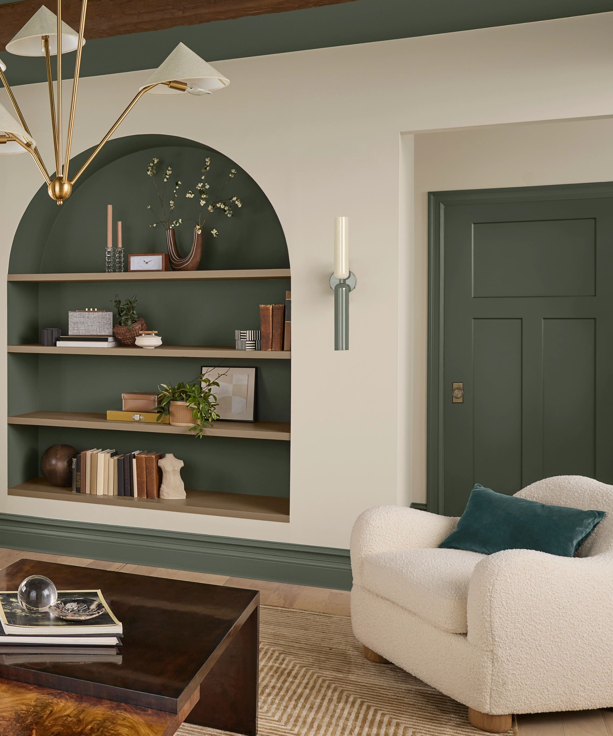
'To me, splashes of these colors, whether it be in art, on couch pillows, or even painting an old wood floor is a great way to mix and match the Goddess of Mother Earth,' says Kari Whitman, founder of Kari Whitman Interiors (KWI), of the herbal apothecary-inspired palette.
Kari suggests using these hues to create accent ceilings, pairing them with hanging light fixtures to bring out the full extent of their color. Alternatively, she says painting crown molding or baseboards in an accent hue, as pictured above, brings a space to a whole new level.
'Something that’s really fun is using wallpaper in the back of a bookcase and painting using one of Sherwin-Williams' colors for the shelves. Or be creative and use more than one color – stripes, or alternating colors for each shelf! I’m a big fan of Sherwin Williams as I think they are extremely designer-friendly,' says Kari.

Founded in 1994 by Kari Whitman, Kari Whitman Interiors (KWI) is a distinguished design-build firm specializing in luxury residential and commercial interior design.
The herbal apothecary aesthetic can be translated into any room, and blended with many styles. It's about creating rooms that feel warm and cozy and at the same time fresh and tranquil. This color palette proves these deeper more earthy tones can be just as calming as the classic blues and whites and though the style may have stemmed from a trend, the scheme is very much timeless.

Abby was the Interior Design News Editor at Homes & Gardens and is now studying for her Master's degree in Journalism at City University, London. Prior to joining our team, she worked with Better Homes & Gardens, where she wrote and edited content about home decor, gardening tips, food news, and more. She studied Journalism and English Literature at New York University and moved to London to pursue her love of writing in 2023.
