5 unexpected colors we loved this year that interior designers say will last into 2024
There are always those favorite color trends that you don't want to leave behind, we asked our experts which they loved the most

Design expertise in your inbox – from inspiring decorating ideas and beautiful celebrity homes to practical gardening advice and shopping round-ups.
You are now subscribed
Your newsletter sign-up was successful
Want to add more newsletters?
This year has been a colorful one, we have seen a resurgence in being bolder with schemes and the once-loved neutrals have taken a backseat. Dopamine decor has been a key design approach and decorating with colors you love rather than what's 'on trend' has meant a rise in shades such as warming pinks, sage greens, all kinds of blues, and even red has been gracing our homes in various shades.
The Colors of the Year and color trends have reflected this shift too, with many being bolder than we've seen in the past - most recently Pantone's Peach Fuzz, Benjamin Moore's vivid blue Nova, and Sherwin-Williams' bright sky shade Upward.
Warmer shades have definitely been at the forefront for 2024, with earthy tones and softer neutrals being far more popular than cooler tones, replacing the ever-popular gray.
Article continues belowBut what are the colors of 2023 that are going to stick? Often the hype around bolder shades fades fairly quickly, so we spoke with interior designers and color experts on the colors that we loved this year that are actually going stay around for 2024.
The colors from 2023 to take into 2024
There's a mix here, but one thing all these colors have in common is they are definitely on the warmer side of the spectrum. All year interior design trends have been about creating softer, warmer more welcoming spaces and the colors we have loved have reflected that.
1. Yellow
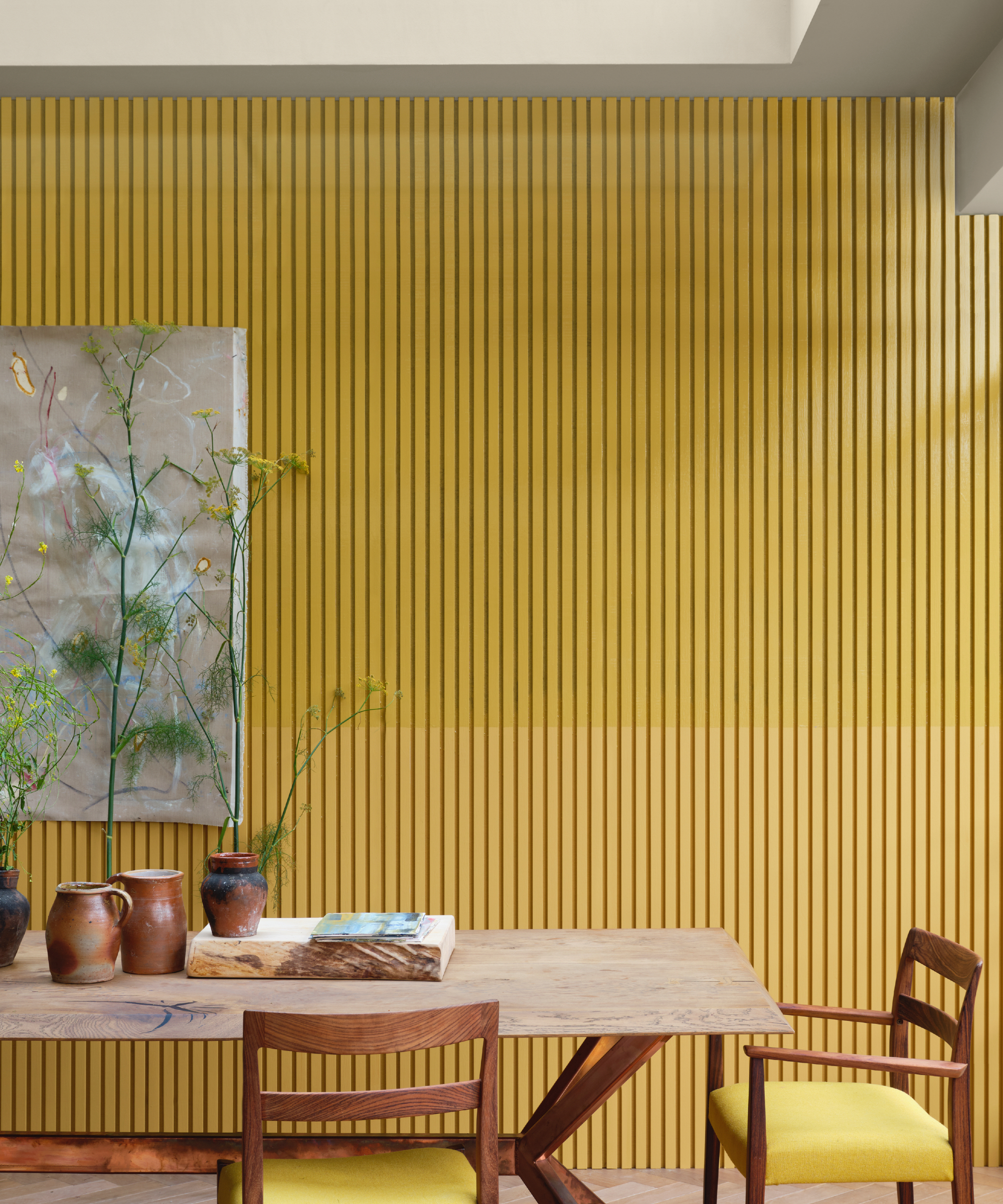
Yellow is a color we didn't see all that much of until 2023. Decorating with primary colors is often seen as tricky since they are so bold and vivid, however yellow, in its warmest, richest, and yet slightly muted form can be a really liveable shade, adding energy to any space.
Farrow & Ball's most popular yellow paint - India Yellow is the perfect balance between that zing you want from yellow and that softness and warmth you want from a color that won't overwhelm.
Design expertise in your inbox – from inspiring decorating ideas and beautiful celebrity homes to practical gardening advice and shopping round-ups.
In this dining room note how the vividness of the yellow is balanced by all those natural textures and neutral colors. And look even closer and you will see there's a mix of paint finishes here too with matte in the lower half of the wall and gloss on the upper, adding even more texture and interest.
Joa Studholme, color consultant at Farrow & Ball explains, 'Balancing ultra-matt Dead Flat with Full Gloss is a gorgeous, albeit unexpected, way to give spaces a modern, polished feel. India Yellow in Full Gloss on the upper of this paneled wall and in Dead Flat below, accentuates the architectural detail without it overwhelming the colour scheme. Using a combination of finishes like this bounces light around and makes spaces feel more interesting, transforming the ordinary into extraordinary.'
2. Peachy pinks
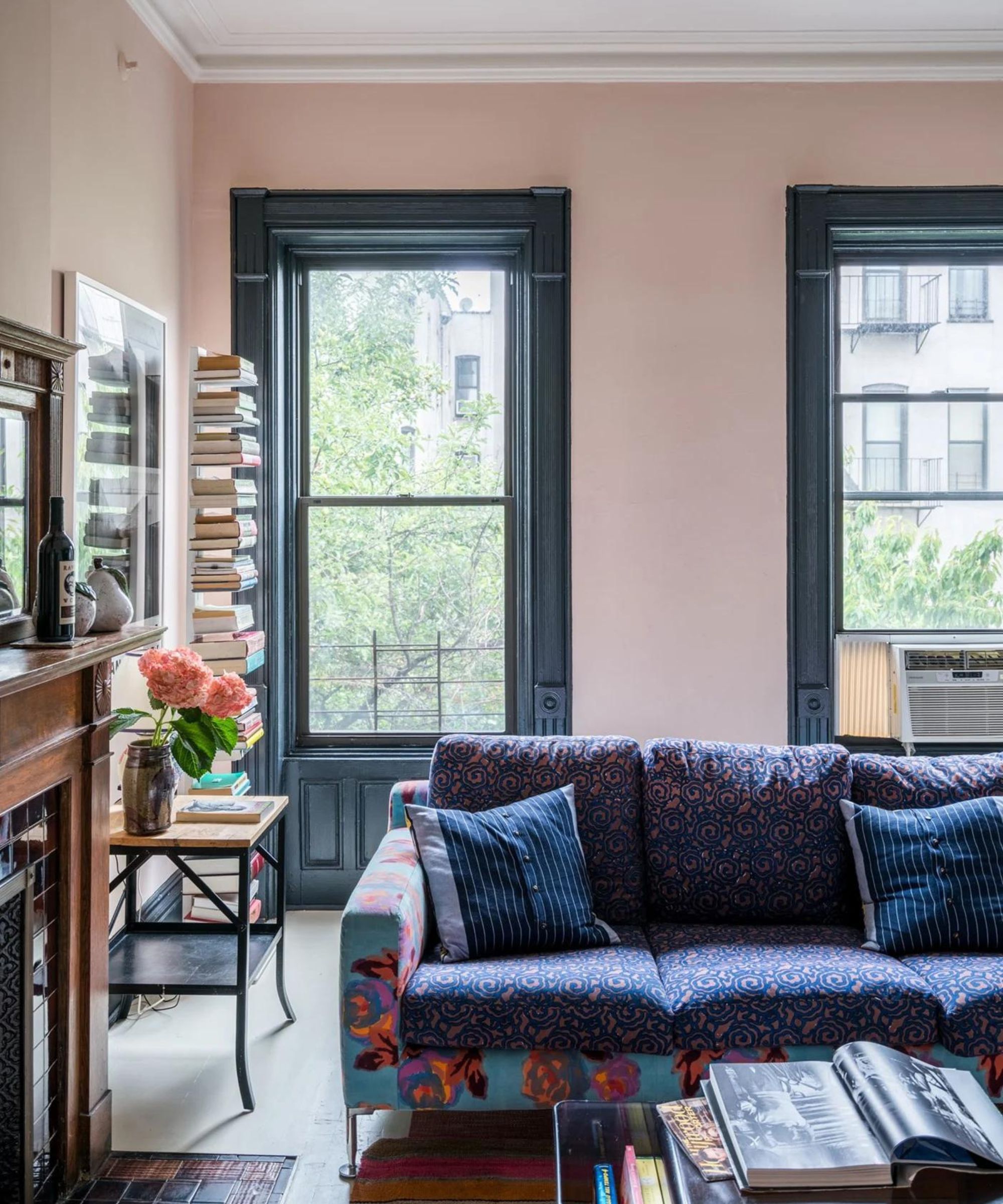
'Making way for more characterful tones, I imagine in 2024 we will see less neutrals such as white, beige, and gray being used which can sometimes feel flat and perhaps a little bland,' suggests interior designer, Matthew Williamson.
'The popularity of warm tones will continue growing – pink, tan, clay, terracotta and peach are just some of the shades that we’ll see more of. They instantly warm up and modernize a space, whether used individually or combined in one scheme. I am using a soft plaster pink paint on the walls at home at the moment as it feels like a new neutral - it’s warmer than gray and more interesting than beige.'
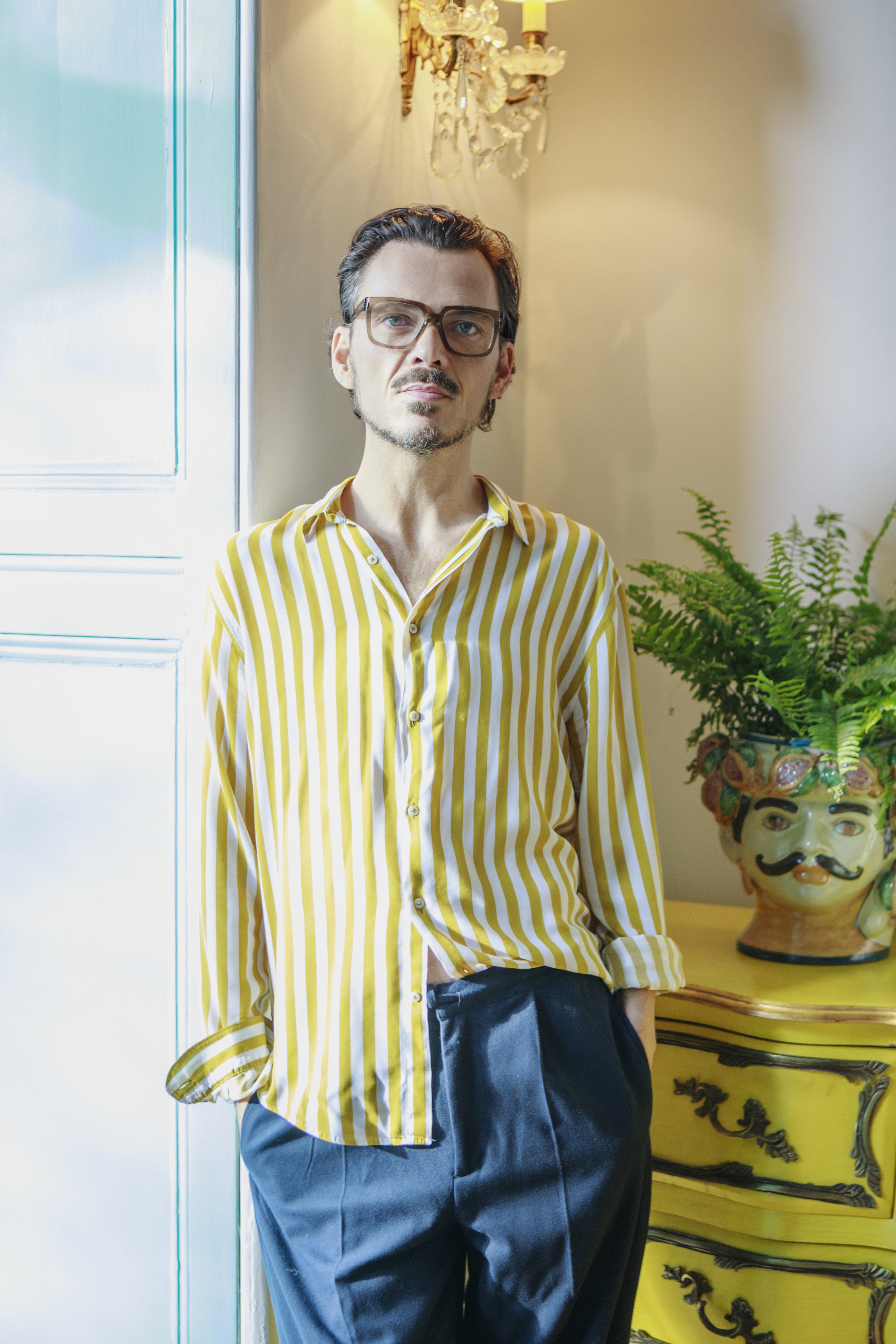
Matthew Williamson is an award-winning British interior designer, known predominantly for his unique and unrivalled use of pattern and colour. Having begun his illustrious career in fashion under his namesake brand over 20 years ago, Matthew has drawn on his decades of experience and pivoted seamlessly into the world of interior design. He now develops several homeware collections to sit his growing residential and commercial interior design portfolio. His latest achievements are the launch of his first interiors book, Living Bright, a personal guide to embracing colour, and the Design Kitchen, a newly designed space for the Design Museum in Kensington, London.
3. Orangey camel tones
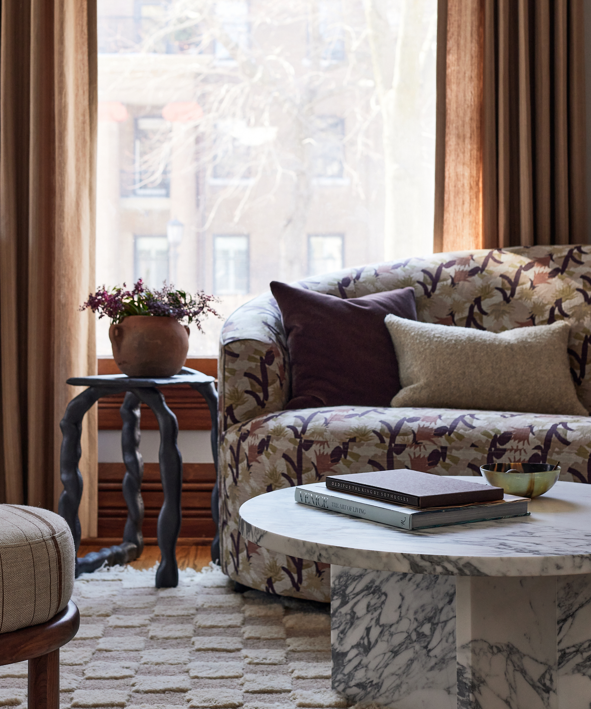
Earthy colors have been huge in 2023 and we don't see them going anywhere in 2024. Terracottas, browns and camel shades have taken over whites and grays as the neutral adding far more depth and interest than cooler shades.
'Rust, olive, camel, plum,' says Julia Miller, founder and creative director at Yond Interiors. 'These warm earthy tones are soothing and natural and can be chameleons in a space, pair them with light neutrals for sophisticated calm or wake them up with acidy brights.'
Stronger than a standard 'neutral' camel is lighter and brighter than terracotta which makes it ideal for warming up a North-facing room or for adding some coziness to a snug. Not quite brown and not quite beige the love for this versatile and yet unexpected shade is sure to continue way into 2024.
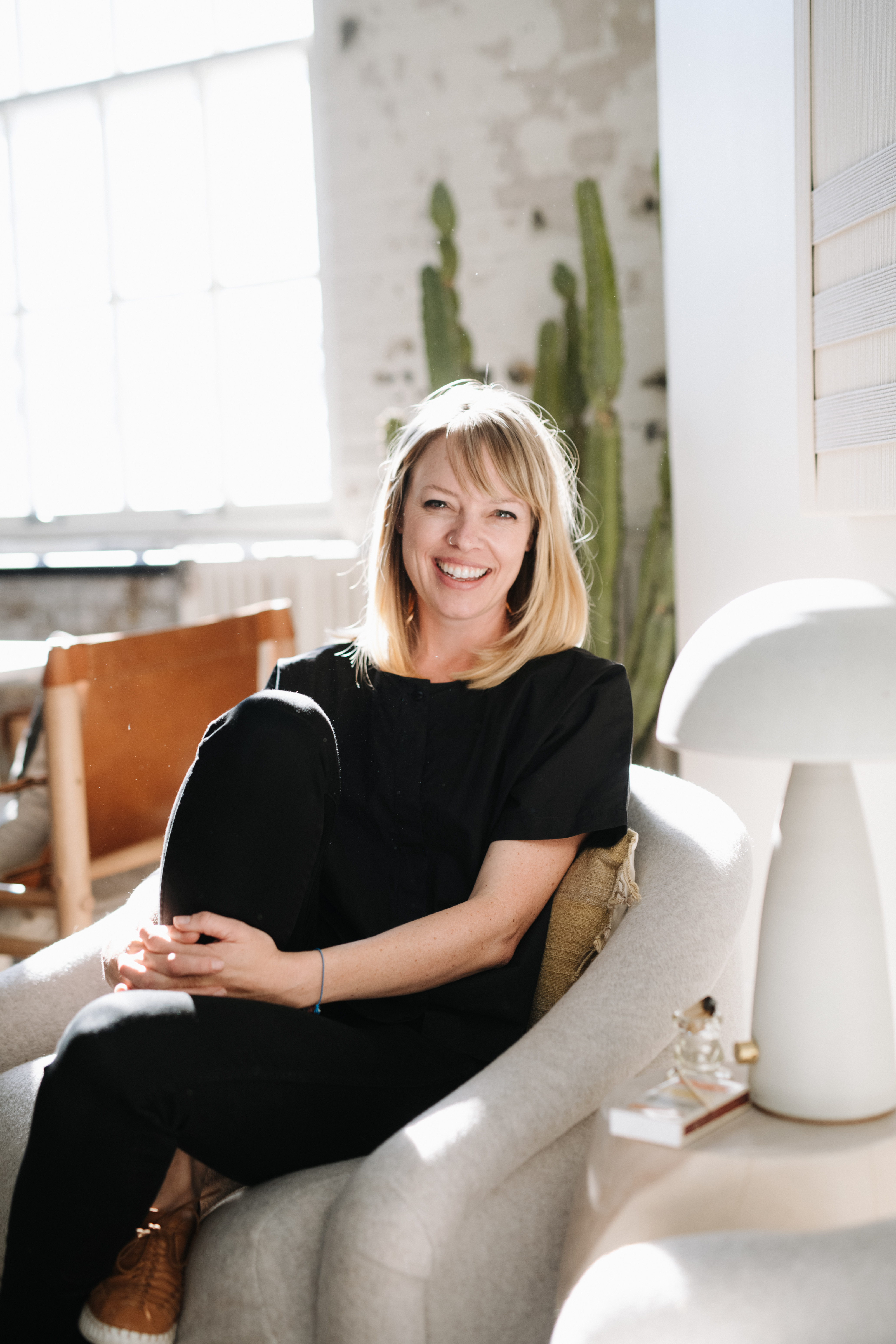
Yond Interiors founder Julia Miller is a designer whose work is anchored in the belief that interacting and engaging with intentional design enhances well-being. Her wide portfolio of residential projects, designed with her small team her Minneapolis-based studio, are underpinned by this foundational philosophy. Through consistent exploration of proportion, light, and balance they deliver honest and nurturing spaces built for daily life. Their values rest in respect for historical architecture and love for craftsmanship. Sourcing vintage and tailor-made pieces are the cornerstones of their work
4. Warm white
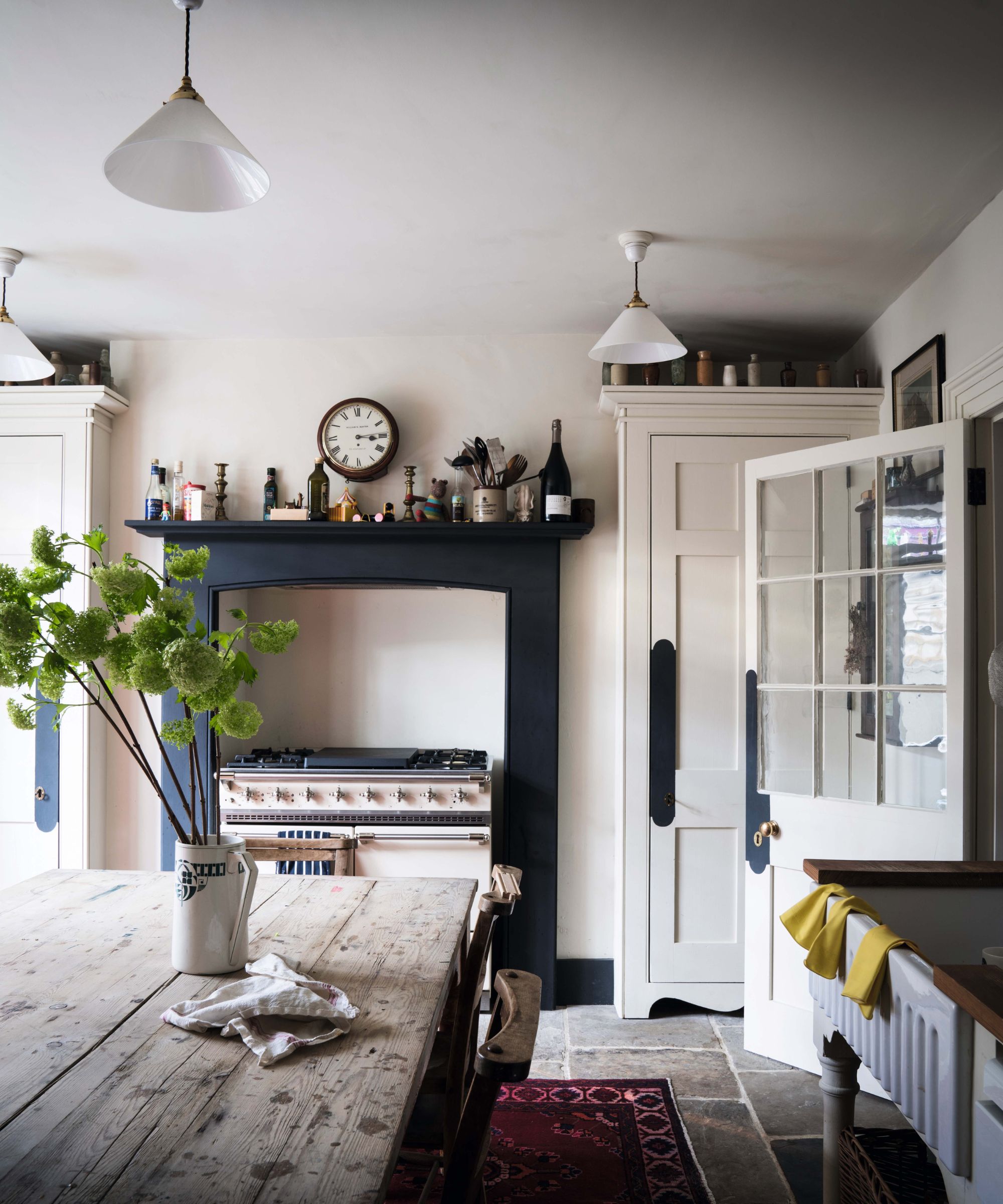
Warm white paints have been huge in 2023, they have become far more favorable than a pure brilliant white and it's easy to see why since these closer-to-cream shades add much more to a room.
This is such a useful color to have in your interior design repertoire, it's less clinical than white and yet just as versatile and can be paired with many other colors and works with any interior design style too.
In terms of specific paints, Farrow & Ball's best seller and much-loved by interior designers is Cornforth White, a gentle shade with a hint of greige that turns it into a versatile neutral.
'Cornforth White by Farrow & Ball is an unbeatable color,' says Tom Rutt, director, TR Studio.'It is so versatile and works across any style of interior, modern or traditional. Not too warm, not too cool, it’s just essentially an easy neutral that’s a failsafe to work with and will cope with any changing trends.'
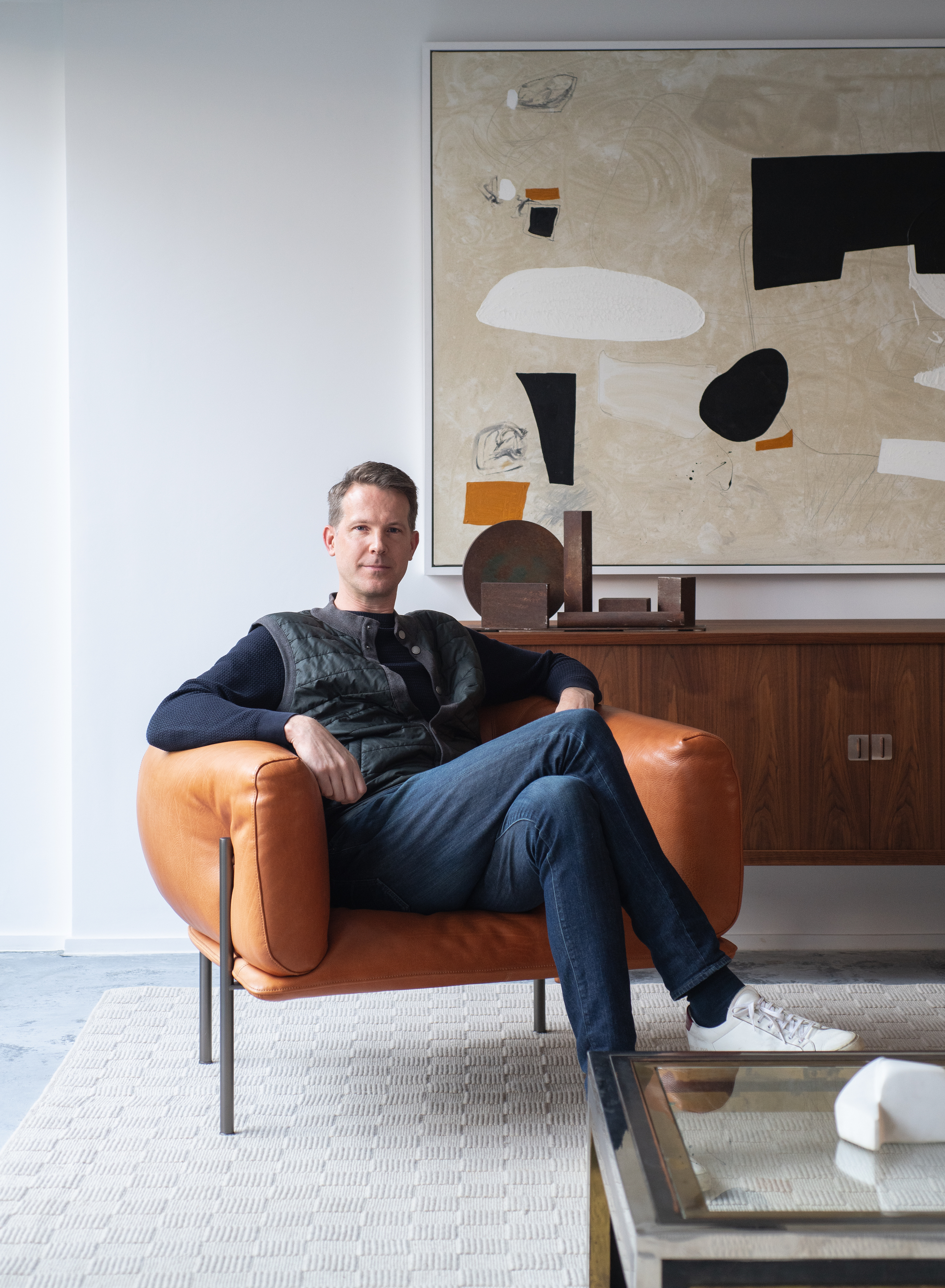
Tom Rutt is the founder of TR Studio, a luxury architectural and interior design practice based in the City of London. Influenced by the likes of David Chipperfield, Vincent Van Duysen and Pierre Yovanovitch, Rutt has a crafted yet modernist approach to design, always paired with something that lifts it from minimalism in its purist sense to create something playful and uplifting. Working on high-end bespoke residential and commercial projects in the UK and internationally, the practice encompasses architecture, interior design and project management.
5. Deep browns
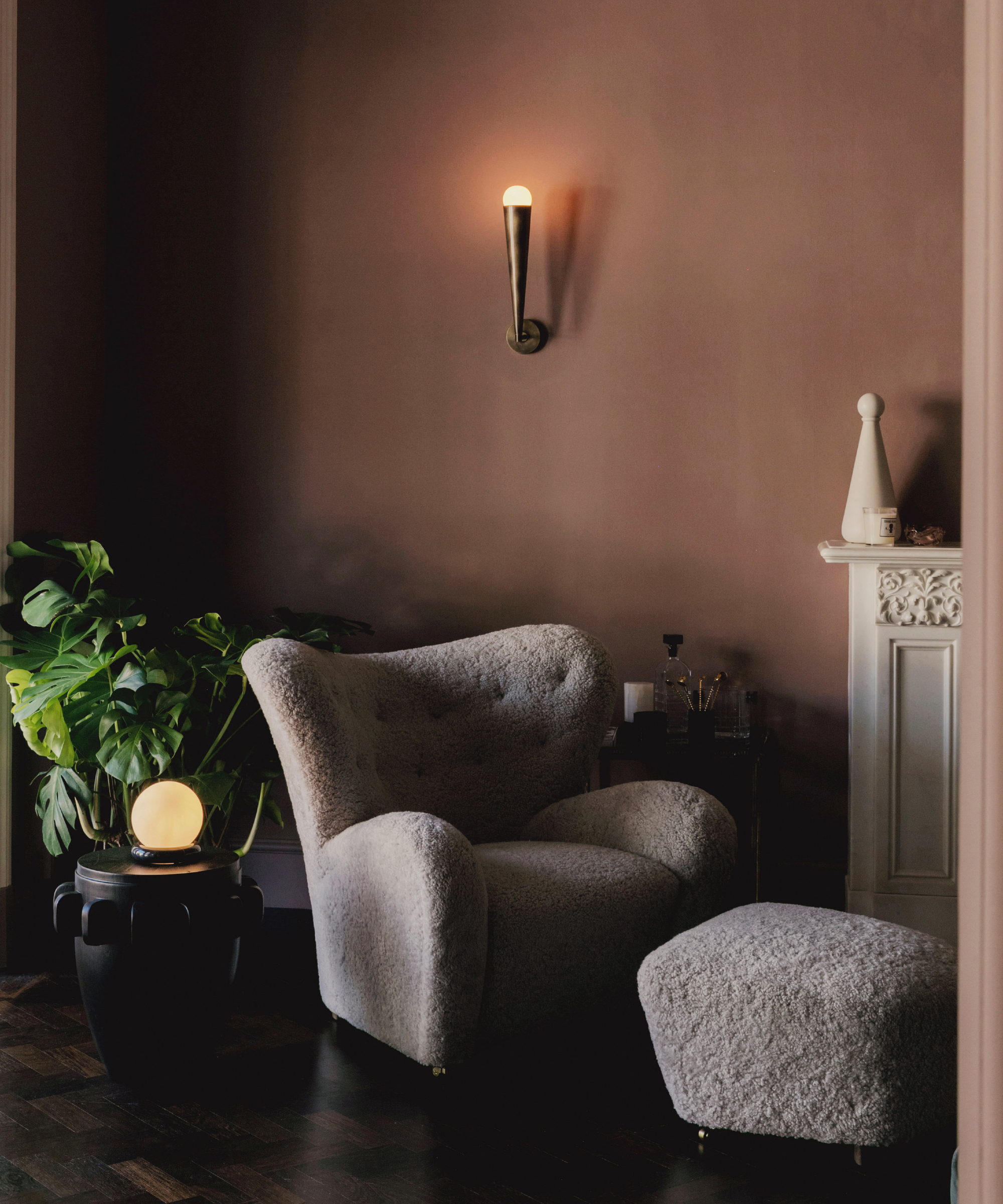
'Brown is still enjoying a resurgence which we hope to be able to take full advantage of into 2024. Personally, I like deep bitter chocolate tones, ideally in a lacquered finish – although I have chosen the paler Mummy by Edward Bulmer for our living room in the countryside which is such a lovely cocooning shade, and it works with everything. Blue and red will never get old… I also love buttery yellow with deep red too,' says Tiffany Duggan, founder of Studio Duggan.
Decorating with brown has definitely become more popular in this last year or so, but this slightly retro shade's resurgence seems to only just be beginning. Again, a warm shade that's cozy and cocooning and used in the right space can feel very modern and sophisticated. It's a great color for small rooms too.
There's a good mix of colors we feel sure will be seen in 2024. Some brighter shades being carried forward that will sit well with the spring-summer trends. Remember that if you love a color it's fine to keep using it over and over, but if it needs a little refresh then perk it up with an accent or two.
Sophie has been an interior stylist and journalist for over 20 years and has worked for many of the main interior magazines during that time, both in-house and as a freelancer. On the side, as well as being the News Editor for indie magazine, 91, she trained to be a florist in 2019 and launched The Prettiest Posy where she curates beautiful flowers for modern weddings and events. For H&G, she writes features about interior design – and is known for having an eye for a beautiful room.