Kitchen paint colors going out of style in 2024 – and the classic colors you should be using instead
Some kitchen paint colors, designers say, are feeling outdated. Here are the colors you could use instead

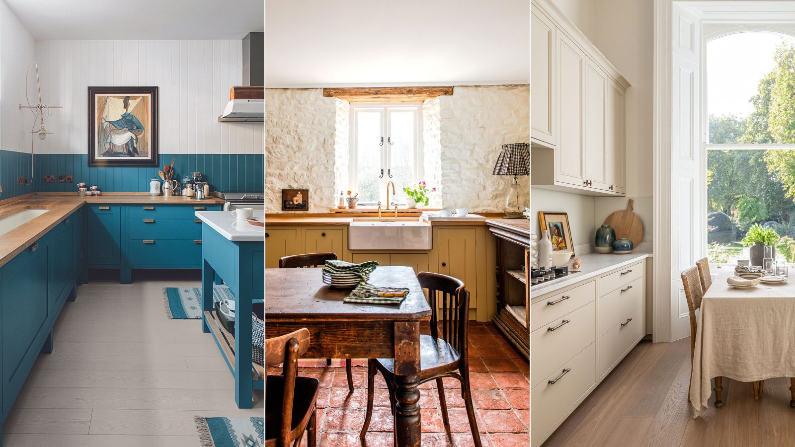
- 1. Cool neutrals – try experimenting with earthy tones
- 2. One tone schemes – incorporate pops of color
- 3. Super vivid reds – pick pinks or rusty tones instead
- 4. Grays – opt for warm beige shades
- 5. White – try using yellow as a neutral alternative
- 6. Navy blue – switch for softer aquamarine hues
- 7. Dark colors – instead lift the space with grown up pastels
Design expertise in your inbox – from inspiring decorating ideas and beautiful celebrity homes to practical gardening advice and shopping round-ups.
You are now subscribed
Your newsletter sign-up was successful
Want to add more newsletters?
The most popular kitchen paint colors come and go, some stick around for decades before being replaced and some are gone in less than a season. And while we always say to follow trends with caution, when it comes to your kitchen color you do want to pay some attention to what's in style to ensure your space doesn't look dated.
So what kitchen paint colors are on trend for 2024? And which kitchen colors are out of style this year? We asked the experts for the color trends to avoid in your kitchen this year and which shades you should be using instead.
Kitchen paint colors to leave behind in 2024
Color, especially kitchen color, is one of the most fundamental design decisions you can make in this functional space. Finding the right painted kitchen ideas can help you avoid making disastrous color mistakes.
Here decorators and designers reveal what kitchen paint colors are going out of style for 2024, and how to approach choosing paint ideas for kitchens using the color wheel, the latest kitchen trends, and paint trends.
The Perfect Kitchen, Barbara Sallick | From $21.87/£30.45 at Amazon
Learn more about the fundamentals of kitchen design in this bestselling book. Find practical advice as well as hundreds of images to inspire your own remodel
1. Cool neutrals – try experimenting with earthy tones
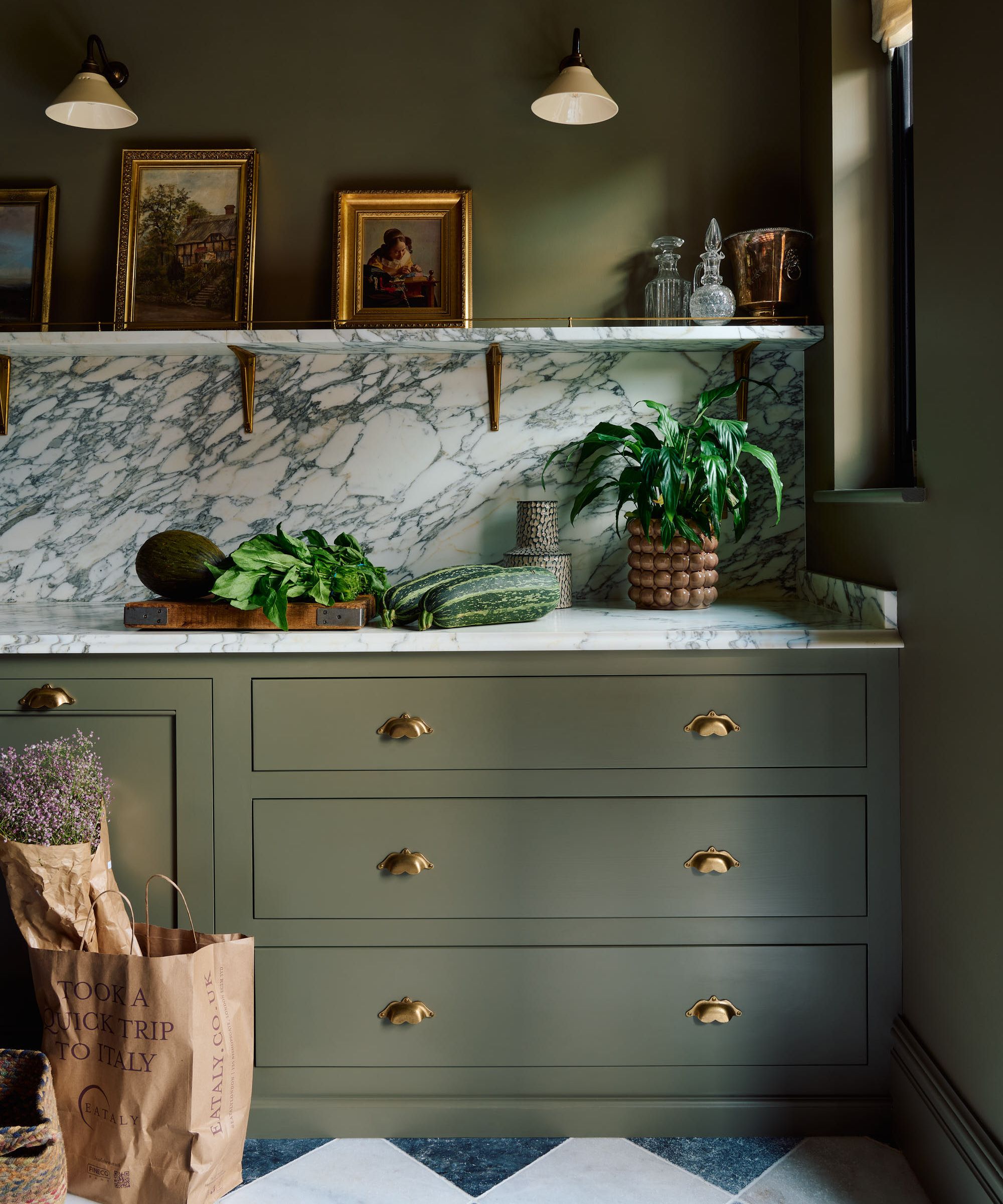
'In more recent years, neutrals with colder undertones have been replaced with warmer shades of the hue alongside altogether bolder color choices. Kitchens are the perfect place to introduce more saturated colors, particularly if the rest of your home’s palette leans more toward light neutrals,' explains Helen Shaw, Director of Marketing at Benjamin Moore.
'Opting for a bold color on walls or cabinetry is a great way to renew the whole room and make the space pop. Deep earthy tones like burgundy and terracotta shades enhance the rustic warmth of a wooden kitchen look, where deep greens and navy walls will perfectly contrast a cool marble surface.'

Helen Shaw is part of Benjamin Moore's UK division. Color expert and international marketing director, Helen and her husband Craig are founders of Shaw Paints, acquired by Benjamin Moore in 2020.
2. One tone schemes – incorporate pops of color
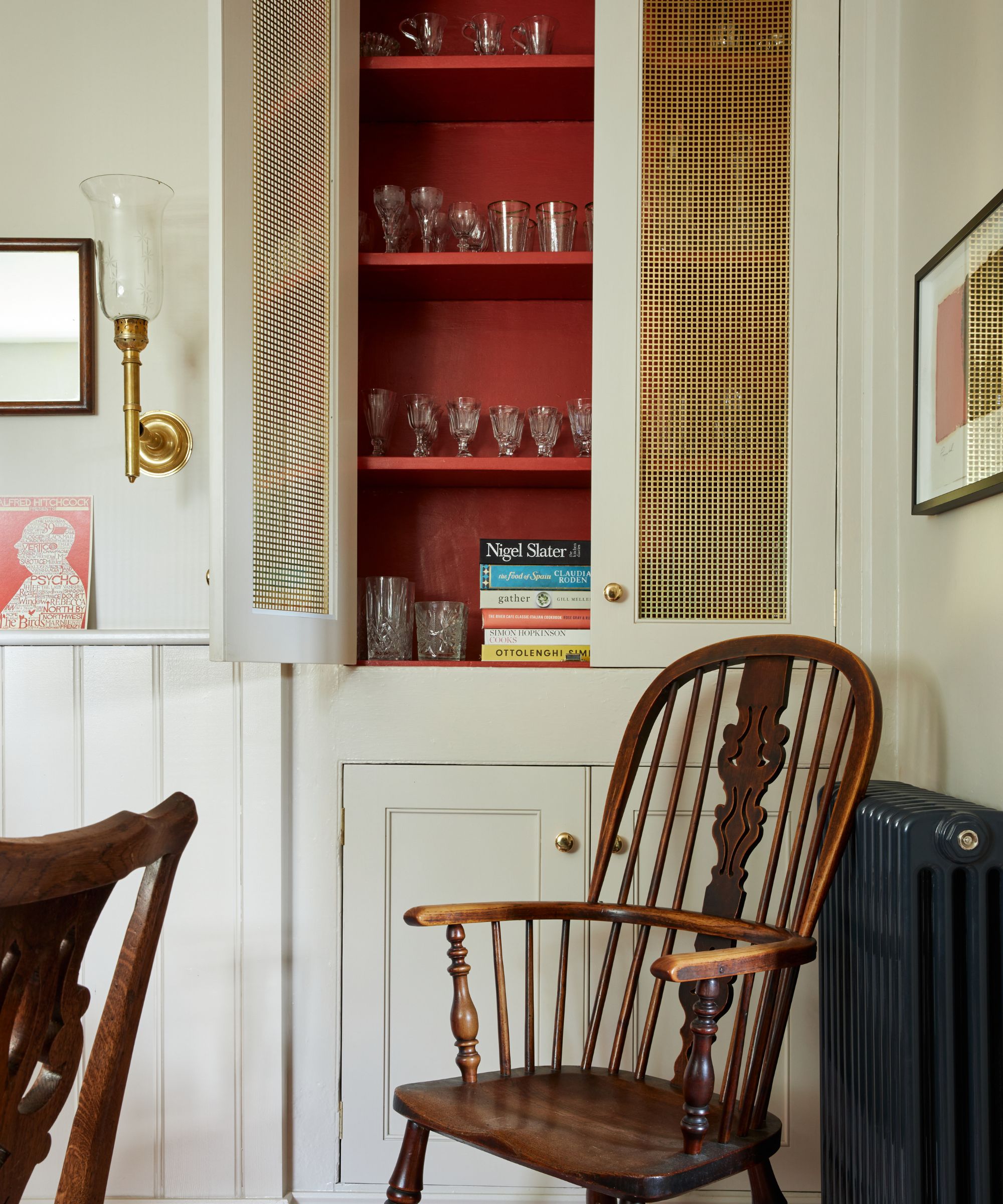
'Say goodbye to bland and tone-on-tone palettes in 2024,' says designer Julie Anne Burch.' Kitchens will embrace fresh, clean designs with pops of intriguing colors. Alternatively, bold and unique color palettes will take center stage, offering a departure from the ordinary. The key to kitchen design in 2024 lies in creating sharp contrasts – either embracing timeless traditional elements or venturing into uncharted territories with innovative ideas.'
Design expertise in your inbox – from inspiring decorating ideas and beautiful celebrity homes to practical gardening advice and shopping round-ups.
Bringing in accent colors into a kitchen color scheme does have a bit of a knack to it however, in order to nail this trend you don't want it to look overly considered. Avoid pops of color that perfectly match because it can look staged and flat, instead opt for a tonal approach adding in different shades of the same color throughout the room to ensure there's depth.
3. Super vivid reds – pick pinks or rusty tones instead
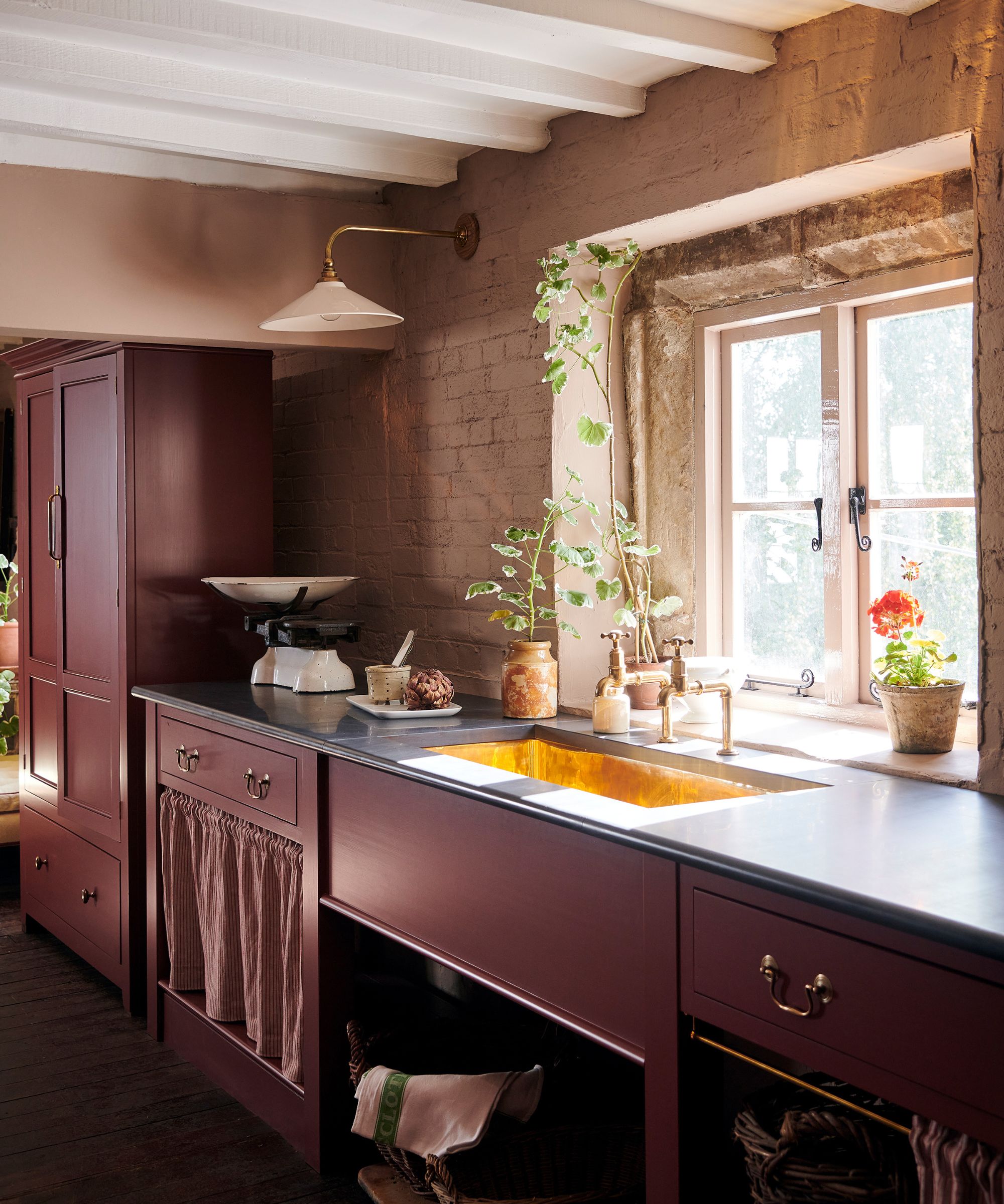
Red is a strong and bold color for the kitchen – the workhorse of the home – but lately we've been witnessing a color shift to a softer, subtle hue – enter pink.
Rich, elegant, and nuanced pink is undisputedly the color trend of the moment. A warm pink, like the one above, lends sophistication to a scheme. A versatile hue, it can veer into a playful pastel or brighten into deep coral.
‘This tone works perfectly in a small kitchen that is rather dark, or which suffers from a lack of natural light,' says Elizabeth Hay, founder, of Elizabeth Hay Design. 'Not only does it inject a space with brightness and cheer, but it will also bring out and highlight any accent colors in the room.’
With its clear ties to the natural world, warm pink is used for painting accent walls and brightening a kitchen or dining area with splashes of color that symbolize and promote health and vitality.
‘Due to its close relationship with pink and orange shades, the color is mood-boosting and energy-stimulating without becoming overwhelming like many red kitchen shades. On the other hand, with more muted and subtle tones, pastel pink can become a good choice to enhance quiet confidence and serenity,’ enthuses Sarah Lloyd, senior brand manager at Valspar.
4. Grays – opt for warm beige shades

Once a tried-and-trusted neutral, gray has since fallen out of favor when it comes to kitchen cabinet colors. Instead, more designers and decorators are reaching for beige – the new neutral in interior design.
The power of a beige kitchen color palette to add warmth and elegance to the heart of our home should not be underestimated. A soft scheme of harmonious neutrals creates a reflective backdrop to the ever-changing light of the seasons.
The broad spectrum of neutral, earthy shades they conjure up offers rich inspiration for creating a soothing scheme. From creamy limestone shades and the oaty tones of untreated linen to the grayish-browns of weathered oak and warm earthenware ochres, neutral shades can be as captivating as color.
Farrow and Ball: Recipes for Decorating | $43.16 at Amazon
Farrow & Ball is a leading producer of high-end paint and luxury wallpaper, and their design experts share their wisdom for creating harmonious interiors and beautify home décor in this inspirational book.
5. White – try using yellow as a neutral alternative
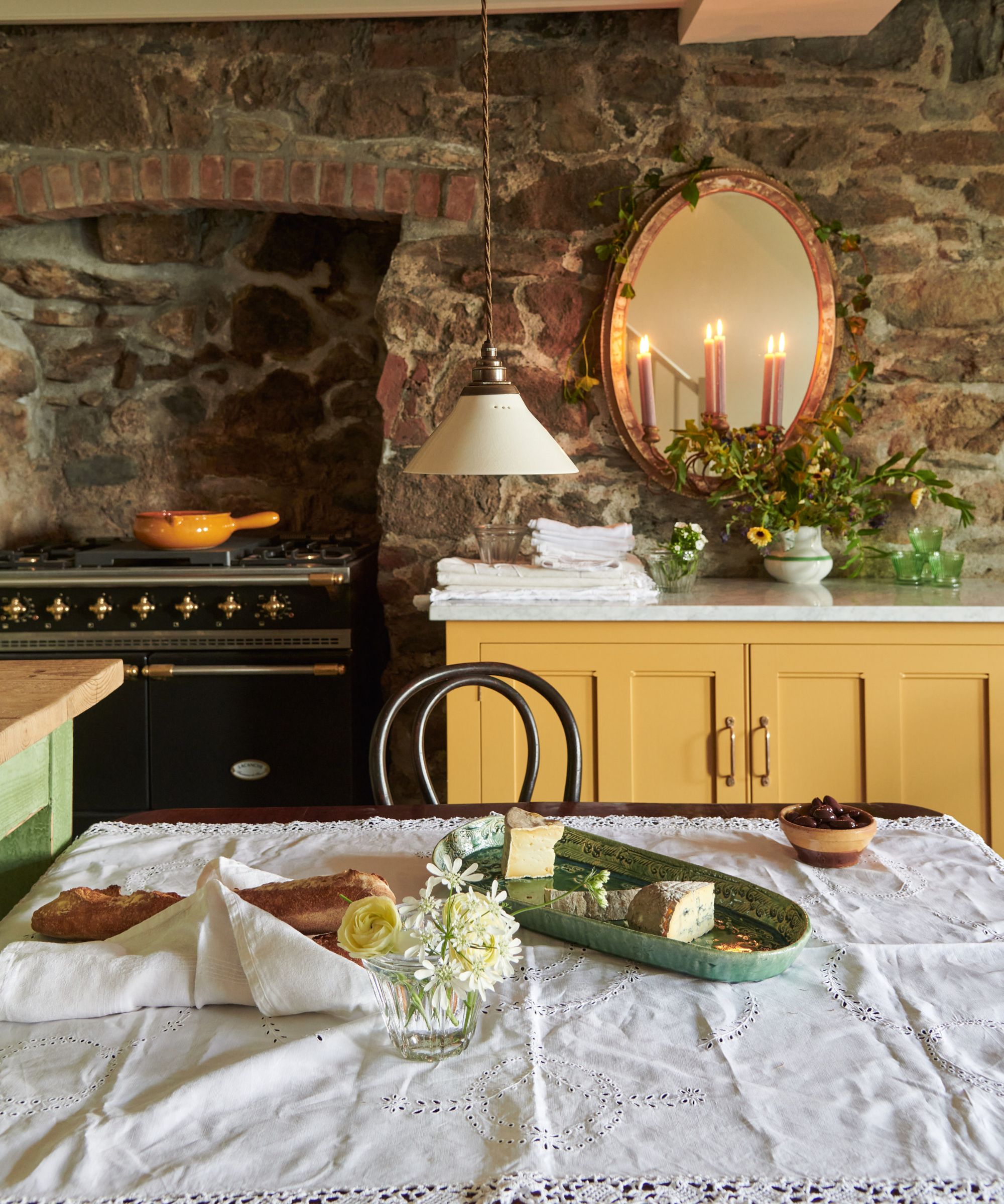
Another former favorite, white kitchens are no longer the desirable kitchen trend they once were. These days, designers and clients are reaching for mood-boosting hues to add a touch of joie de vivre to their kitchens.
'We are specifying and seeing fewer pure white and gray kitchens lately,' explains Jennifer Walter, founder of Folding Chair Design. 'The bright white and gray trend saw its day, and kitchen cabinetry is seeing a resurgence of light woods and deep colors. People aren’t as afraid to use color in their kitchens, and with the popularity of the English kitchen, deep blues, yellows, and even cranberry palettes are becoming wildly popular.'

In a Baltimore rowhouse in 2010, Jennifer Walter founded Folding Chair Design Co. with a baby on her hip and one on the way. Her mission from the start has been to enhance the lives of her clients by realizing the greatest potential in their homes.
6. Navy blue – switch for softer aquamarine hues
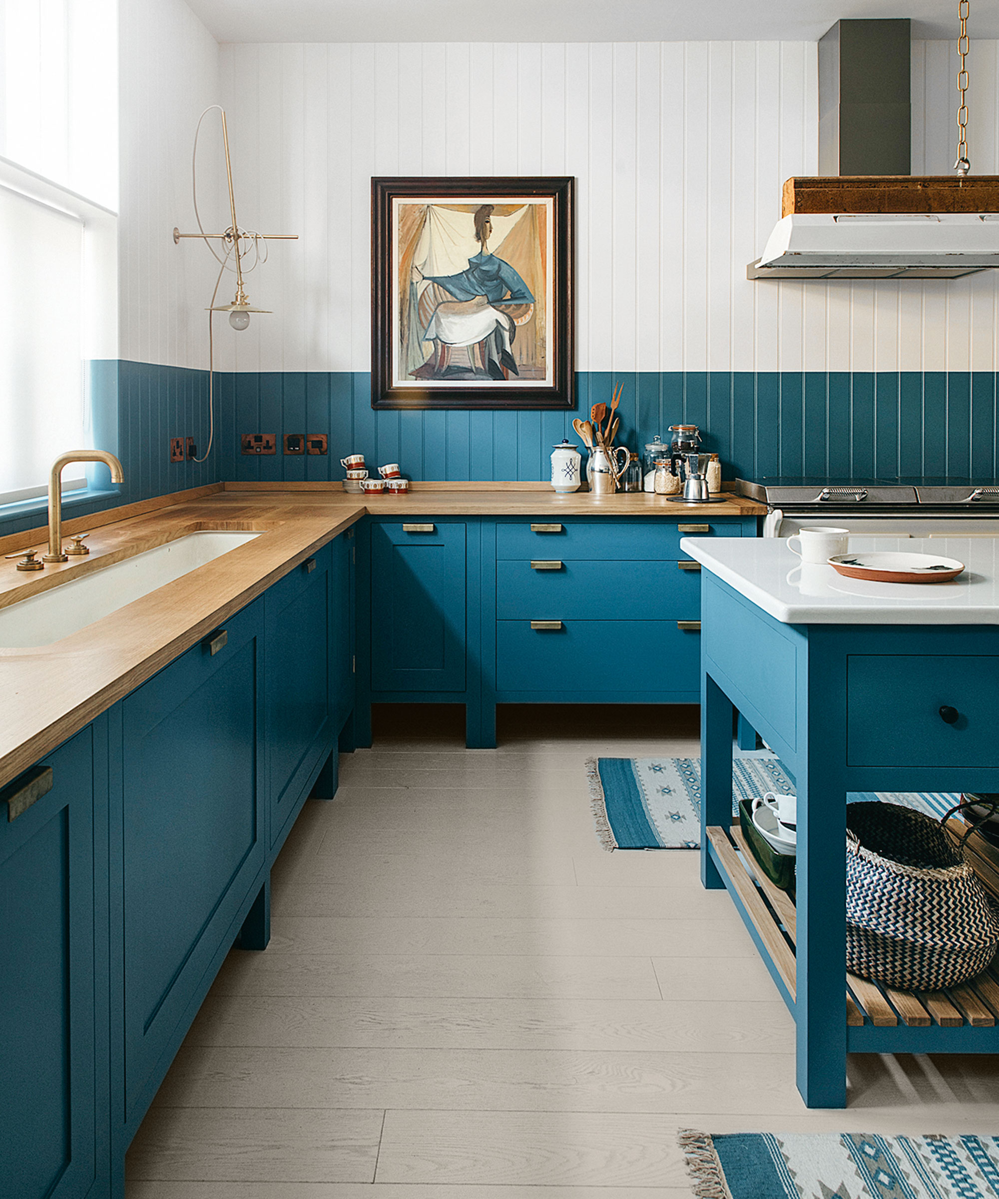
Navy blue will always be popular, but lately, designers have been considering softer, subtler, serene variations in the modern kitchen. A shade that's always been popular in the world of interiors, ocean blue is set to be 2024's kitchen paint color du jour.
From the alluring aquamarine hues of sandy Caribbean shores and the glistening teal tones of pebbled Mediterranean beaches to the inky blues and midnight notes of deep Atlantic waters, the colors of the ocean are as serene as they are striking and offer a versatile spectrum for decorating a contemporary and country kitchen alike.
‘Ocean blues, like lapis and cerulean, are the most wonderfully gender-neutral paint colors,' says Nicole Salvesen, co-founder, of Salvesen Graham. However, avoid using cold blues in north-facing rooms. Instead, find those that have some warm tones in them and they will be a brilliant backdrop for artwork, texture and timber.’
7. Dark colors – instead lift the space with grown up pastels
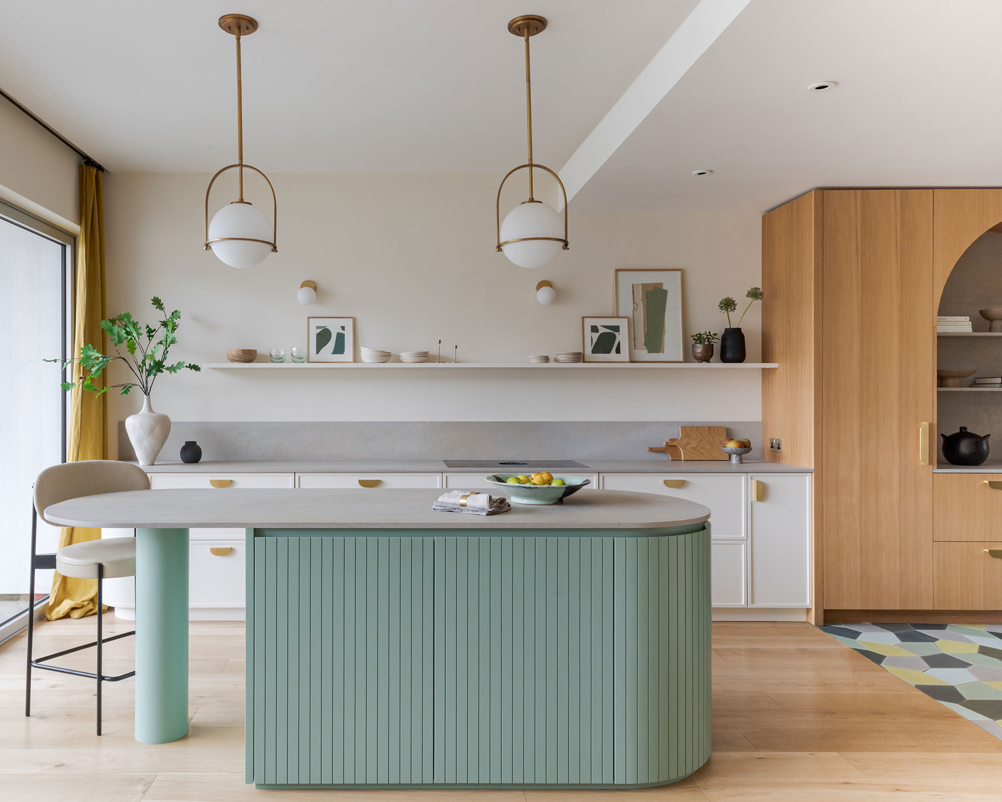
Dark kitchen cabinet colors were once considered the best paint palettes for kitchens. They were bold, strong and hid a multitude of decorating sins. However, we've gone full circle, like most trends, and are now welcoming back the pastel hues that previously graced 1950s kitchens up and down the country.
From peaceful pinks to blissful blues, pale sugary shades will give the illusion of space and create a restful atmosphere in the home.
'Pastel colors offer a charming alternative to neutrals or dark shades; they are calm but embracing, soothing but uplifting, and can give added life to a room without being overpowering', says Ruth Mottershead of Little Greene.
Ruth Mottershead is the creative director of the family-run paint and wallpaper businesses Little Greene and Paint & Paper Library, which specialize in creating luxurious paint and wallpaper that represent 300 years of decorative history.
What all of these shades indicate is that while 2023 was the year of bold and bright colors, 2024 is more about warmer, softer, more liveable colors. That's not to say these kitchen colors are bland, they are just easier on the eye – pinks and rust red instead of primary shades, grown-up pastel blues instead of the ever-popular navy, and warm beiges instead of cooler grays.

Jennifer is the Digital Editor at Homes & Gardens, bringing years of interiors experience across the US and UK. She has worked with leading publications, blending expertise in PR, marketing, social media, commercial strategy, and e-commerce. Jennifer has covered every corner of the home – curating projects from top interior designers, sourcing celebrity properties, reviewing appliances, and delivering timely news. Now, she channels her digital skills into shaping the world’s leading interiors website.
