Revealed: Dulux Color of the Year 2022 – the ultimate paint color for small spaces
The Creative Director of Dulux explains why Bright Skies is the perfect choice for small rooms and the best way to use it. Hint: it's not on the walls

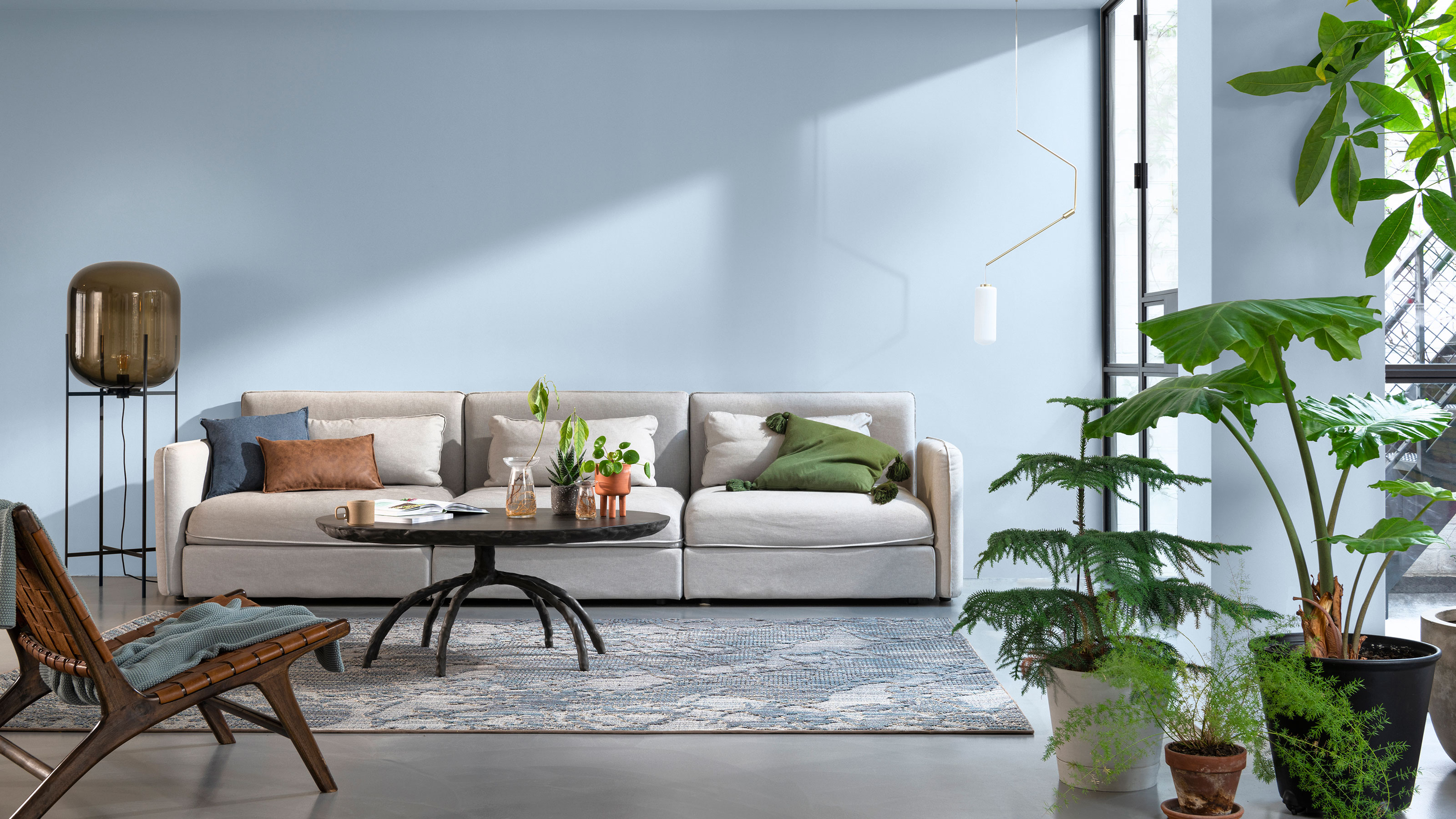
Dulux Color of the Year 2022 Bright Skies has become the next big color to know about.
The light and airy blue is a departure from the subtle green color trends that have dominated 2021. The paint shade has been designed as a breath of fresh air for your home, a shot of sky blue optimism.
However, it has another clever use according to Marianne Shillingford, Creative Director of Dulux – making a small bedroom look bigger.
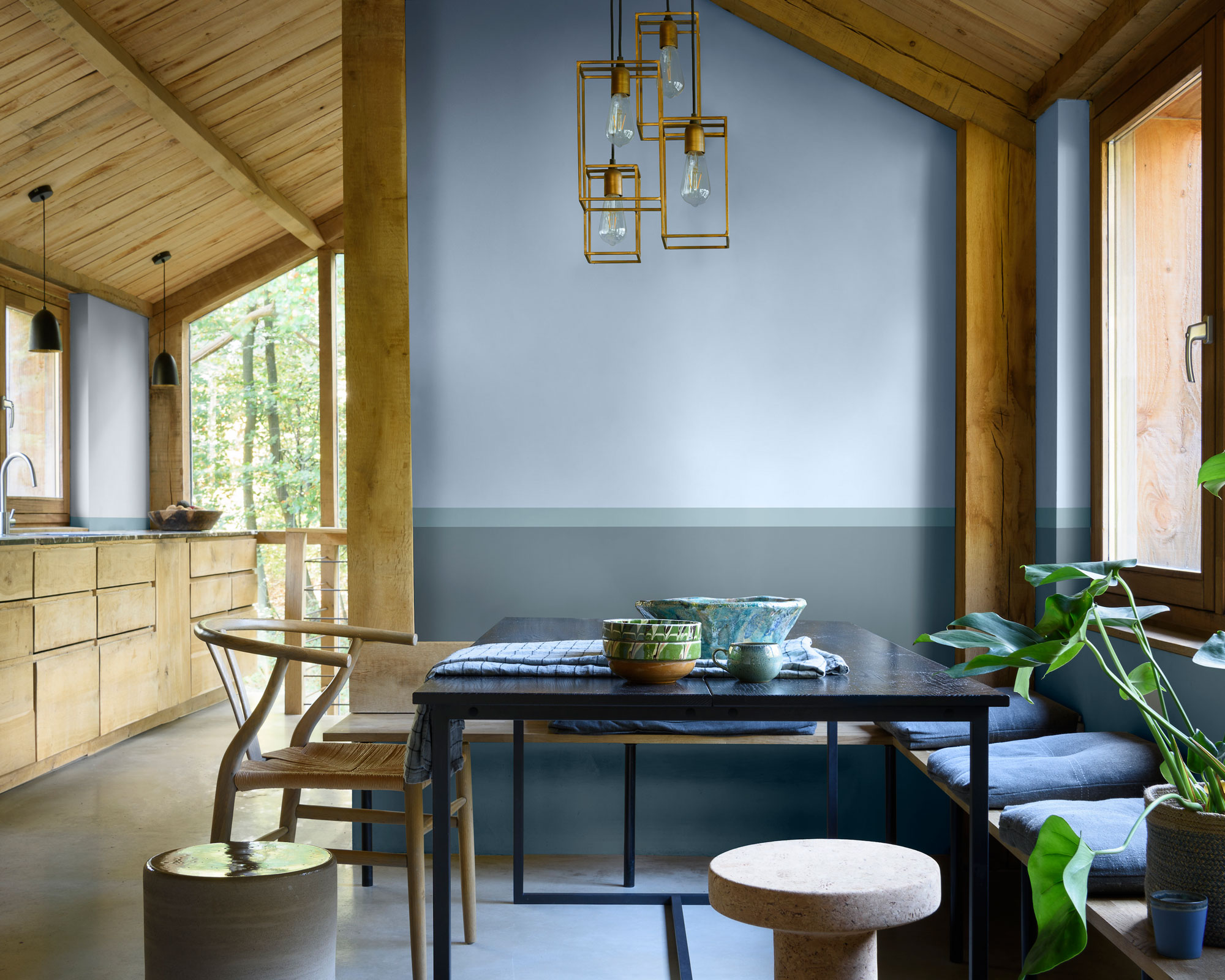
'It's a color that makes small spaces and spaces that are blocked in seem huge,' Marianne Shillingford tells Homes & Gardens. 'It is what we like to call a receding color.
'Each color has a specific wavelength, this is a color that has a short wavelength – so it looks further away from us. So it actually makes a small space seem bigger because we can't quite focus where the color is. It looks further away from us than warmer colors which have longer wavelengths.'
As with the past 19 Dulux Color of the year shades, Bright Skies was selected by a team made up of leaders in design, fashion, color, and the built environment. They considered the trends, innovations, and events of the last year that have impacted the way we all live and work before creating the new color.
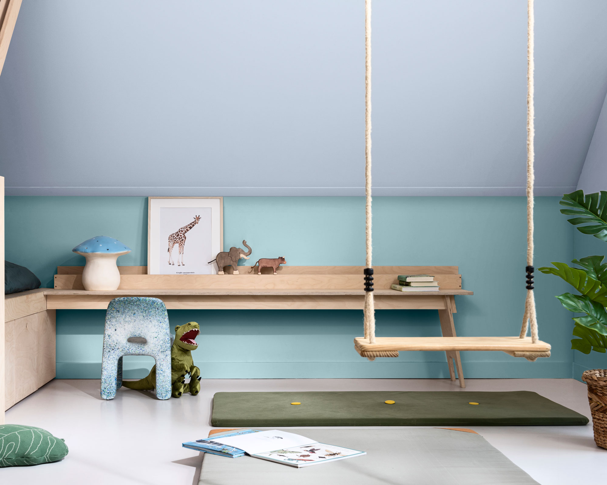
The blue shade has been created in response to almost two years of multiple lockdowns. It has been designed to represent a change of gear as we move into 2022 as we feel optimism and begin to embrace our freedom and blue room ideas again.
Design expertise in your inbox – from inspiring decorating ideas and beautiful celebrity homes to practical gardening advice and shopping round-ups.
'Right now, people want to feel revitalized and enjoy the freedoms that are returning to them, to look out and bring in new ideas. What better inspiration can we take than the endless skies around us?' explains Marianne.
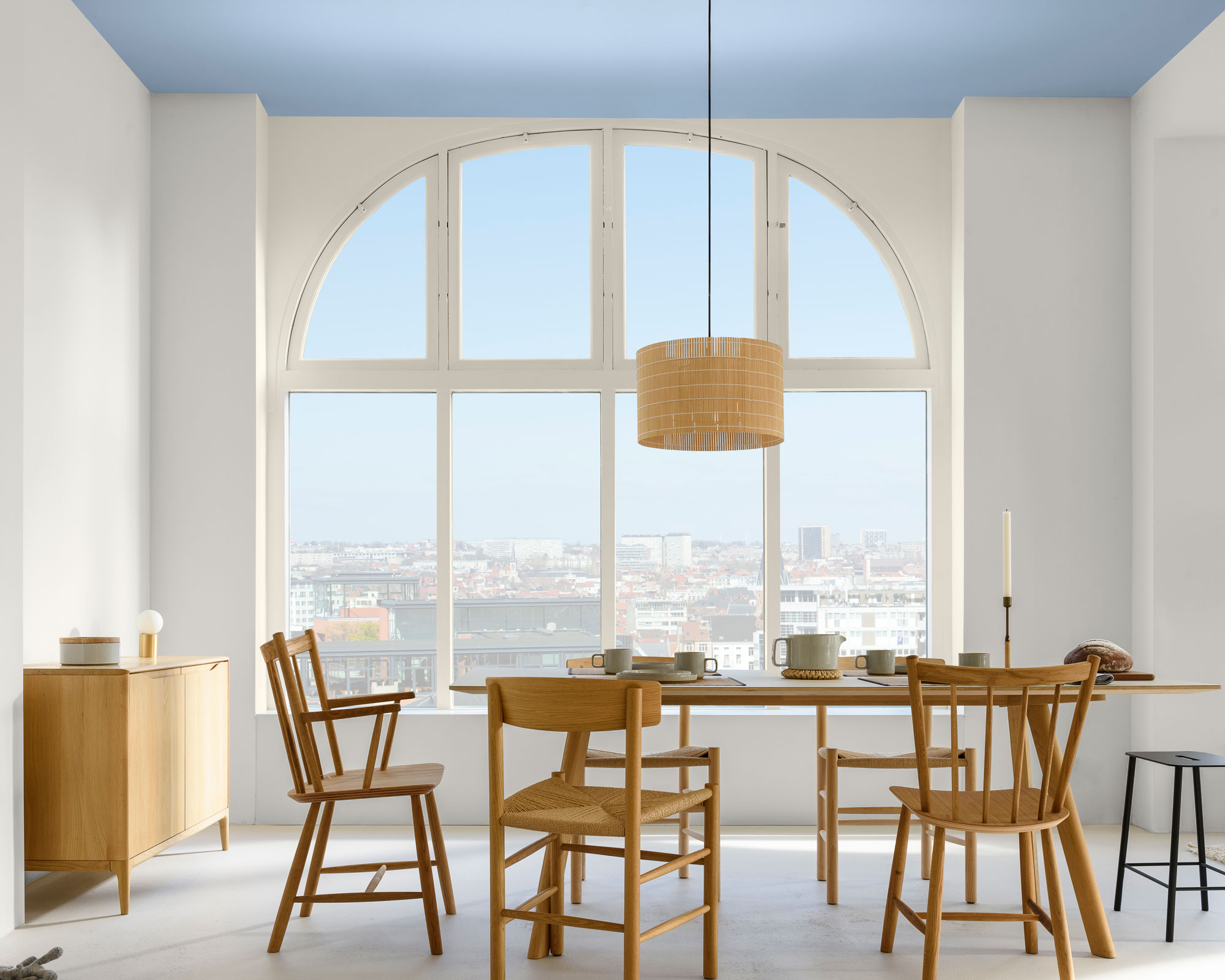
However, while this shade has been designed to look lovely on your walls, Marianne reveals that the best use for the color is to look toward the sky and cover your ceiling in it.
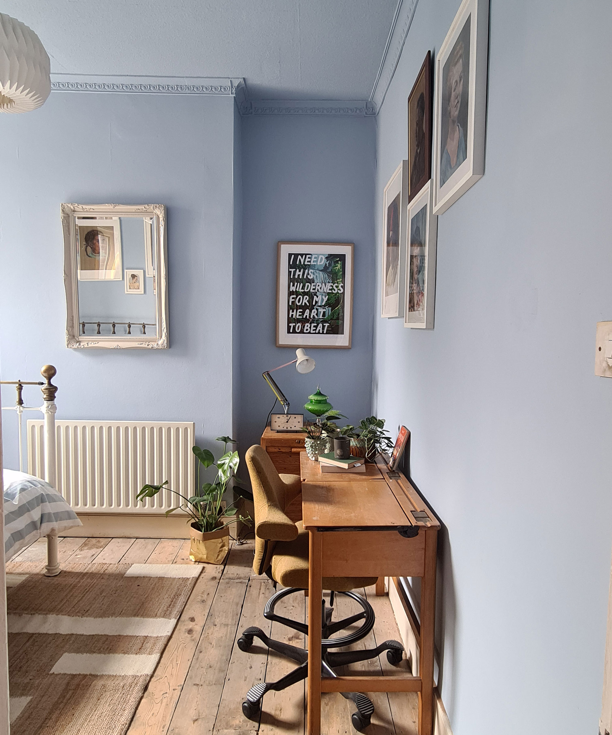
'If you use this color on the ceiling you don't have to commit to the walls, but it just makes that ceiling melt away,' says Marianne. 'It just fills a room with a breath of fresh air. The ceiling is a great way to use it, the most fantastic use.'
'I'm going to paint it on the ceiling of my bedroom. In fact, I'm going to immerse my bedroom in it,' she reveals.
'While we're used to bringing green into our homes in plants, we're not so used to bringing the sky into our home, other than through the window. I think this will be another revolution, especially painted on the ceiling.'
What colors go with Bright Skies?
The Dulux Color of the Year Bright Skies has been designed to go with 37 different colors. Each has been curated into four palettes, designed to react to different styles and what you want from your home.
The Greenhouse palette is perfect if you're looking to introduce Bright Skies into your green living room ideas. The palette is full of fresh greens and blues, and features former Dulux Colour of the Year Tranquil Dawn, a subdued green hue.
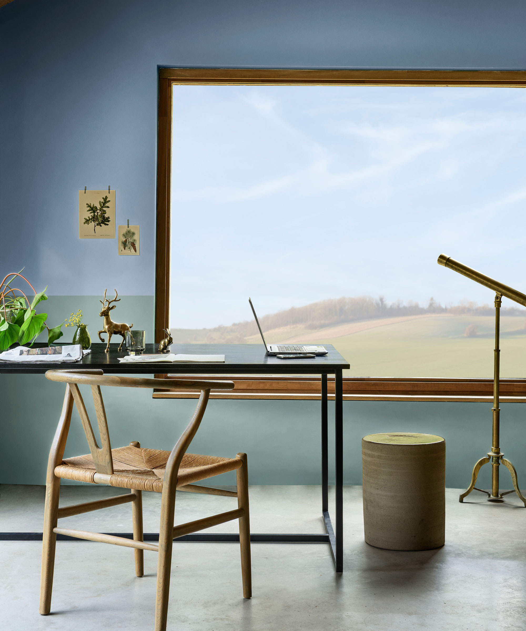
The Salon is a softer color palette, which demonstrates how beautifully Bright Skies can be used as an accent color against a fresh neutral backdrop. It embraces chocolatey browns and beautiful stone greys.
However, a surprising but stunning color pairing for Bright Skies is red and orange. In the Studio and Workshop palettes, the blue hue has been paired with a mix of soothing pinks, yellows, and even lilacs. Coral or blood orange accents add a shock of delicious color.
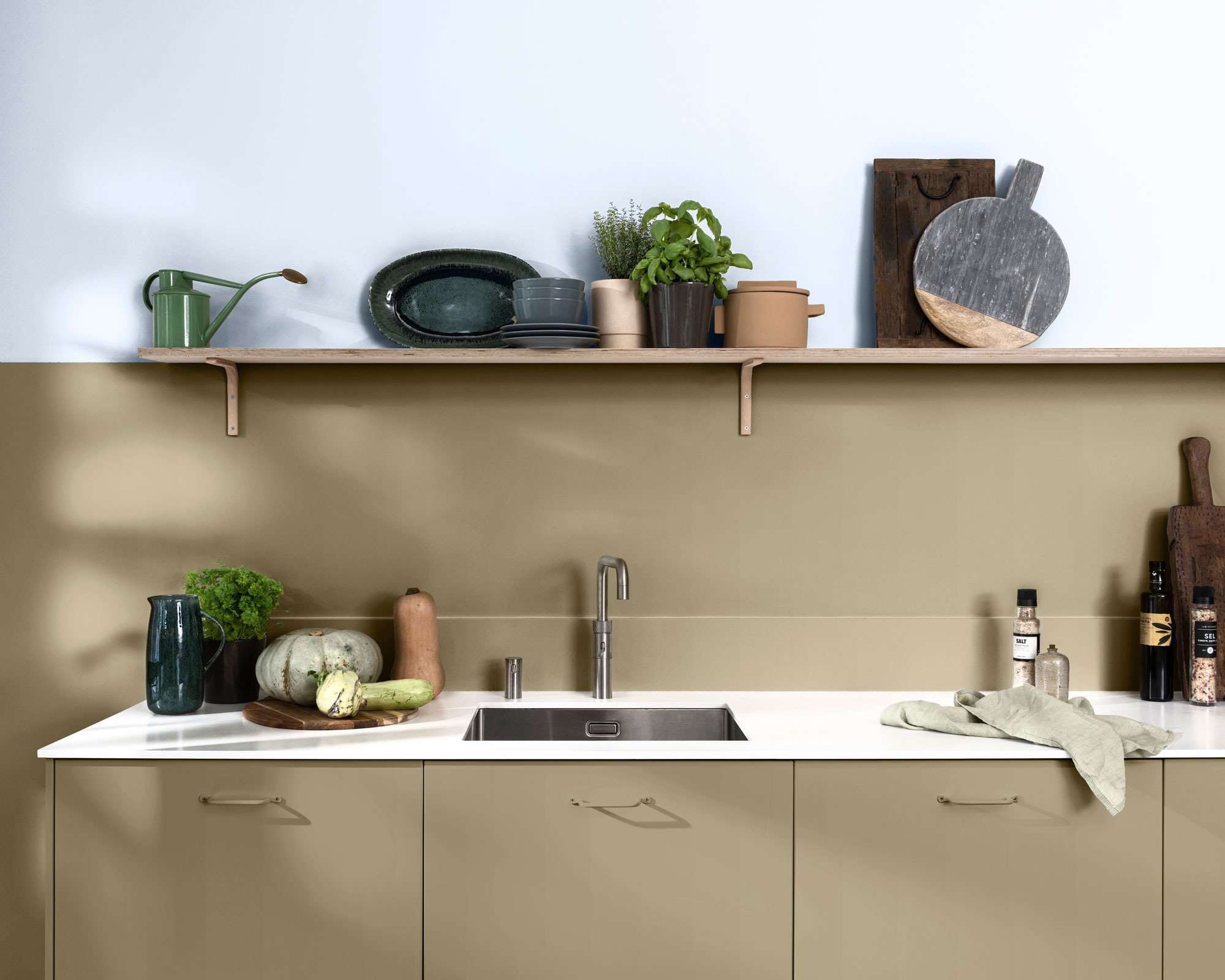
'It's like having chili in food, or salt or pepper – it's like putting a cushion on something,' explains Marianne about the surprise color combination. 'You don't need much of it, but it's like a lightbulb moment. It becomes like a seasoning of the palette. Everything starts to shine.'
Bright Skies might not have been the color we expected to be big news. However, now we've seen it we must admit we can't stop brainstorming blue bedroom ideas, or thinking about painting our ceiling.

Rebecca has been working as a homes and interiors journalist for over four years. She first discovered her love of interiors while interning at Harper's Bazaar and Town & Country during my Masters in Magazine Journalism at City, University of London. After graduating she started out as a feature writer for Women's Weekly magazines, before shifting over to online journalism and joining the Ideal Home digital team covering news and features. She is passionate about shopping for well-crafted home decor and sourcing second-hand antique furniture where possible.
