7 design tips to take from this California home and its elegant monochrome style
A classical home for a vivacious young couple, this design by Corine Maggio balances formality and fun

Design expertise in your inbox – from inspiring decorating ideas and beautiful celebrity homes to practical gardening advice and shopping round-ups.
You are now subscribed
Your newsletter sign-up was successful
Want to add more newsletters?
When Elaine and Jeff Burrell first contacted Corine Maggio on Instagram to say they wanted her to design a future home they hadn’t even found yet, the interior designer wasn’t entirely sure the project would ever come to fruition.
‘It was so sweet and, much to my surprise, a year later they did end up reaching out,’ Maggio said. The young couple had purchased a home in California’s Walnut Creek – a part of the country that is no stranger to the world’s best homes – and, as promised, called upon Maggio to help turn it into their dream house.
‘They fell in love with the house because of its potential,’ she said. ‘It has a beautiful backyard with a pool, and they had big plans to make much more of an indoor-outdoor living situation perfect for hosting, which they do often. They were not able to bite off everything at once, so we started with just the primary bedroom and family room. And then, about a year after that, we started the kitchen and entry.’
Article continues belowThe Burrells were keen on a classic, elegant aesthetic, with a monochrome palette at its heart. ‘The theme of their style-study imagery was "Classic European and Luxury California’,’ said Maggio. ‘It needed to be a ‘wow’.’ With Elaine’s background in luxury hospitality, they were also keen to include design touches akin to high-end hotels, as well as have a space that was comfortable enough to accommodate plentiful guests, as well as their baby son Bentley.
Maggio gave us a tour of the home, and shared with us her tips on creating a luxurious home fit for a sociable young family.
1. Make a statement in your entryway
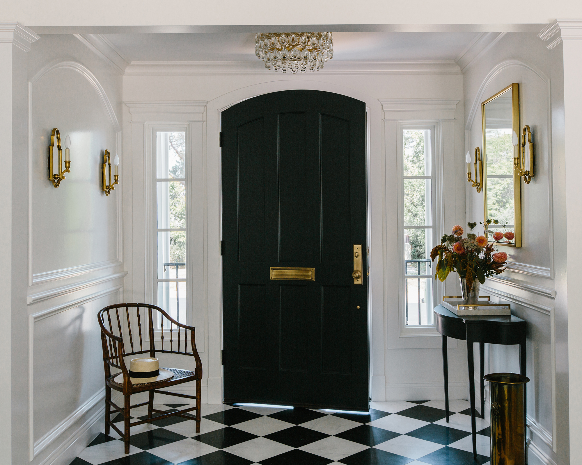
‘It was super important for them to have a strong sense of entry, which I couldn't agree more with,’ said Maggio. The entrance hall is the first chance in any home to show your guests your personality, meaning strong design statements are a must among entryway ideas. Jeff Burrell’s father worked as the architect on the project, and helped them extend this hallway area into a dedicated entrance space.
‘I love working with small spaces and so creating impact here was a blast,’ said Maggio. ‘The black and white floor tile was a no-brainer because it showed up over and over in their inspiration images. Then the addition of the full height dramatic paneling adds that more classic European feel we needed, along with the traditional sconces and crystal flush mount. They needed just a little table for a variety of practical reasons so that, in conjunction with the mirror, really brings the hospitality element.’
Design expertise in your inbox – from inspiring decorating ideas and beautiful celebrity homes to practical gardening advice and shopping round-ups.
2. Balance black and white in a monochrome scheme
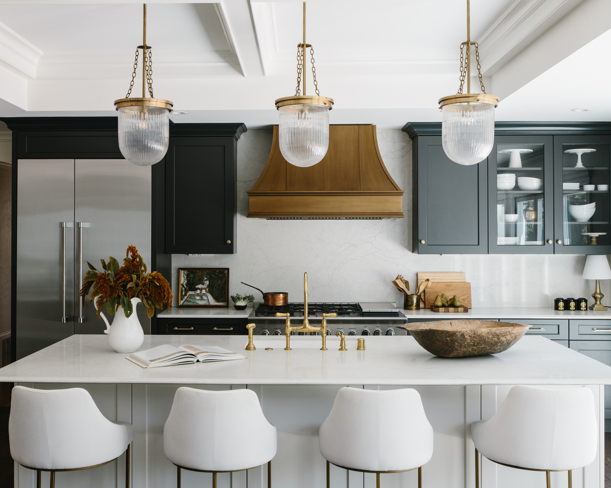
‘The Burrells made it clear there should be nothing boho, farmhouse or country about this redesign. It was to be classic, black and white and relatively formal,’ explained Maggio. The monochrome theme continues beyond the chequerboard-tiled entrance to the rest of the home, and really makes its presence felt keenly among the kitchen ideas.
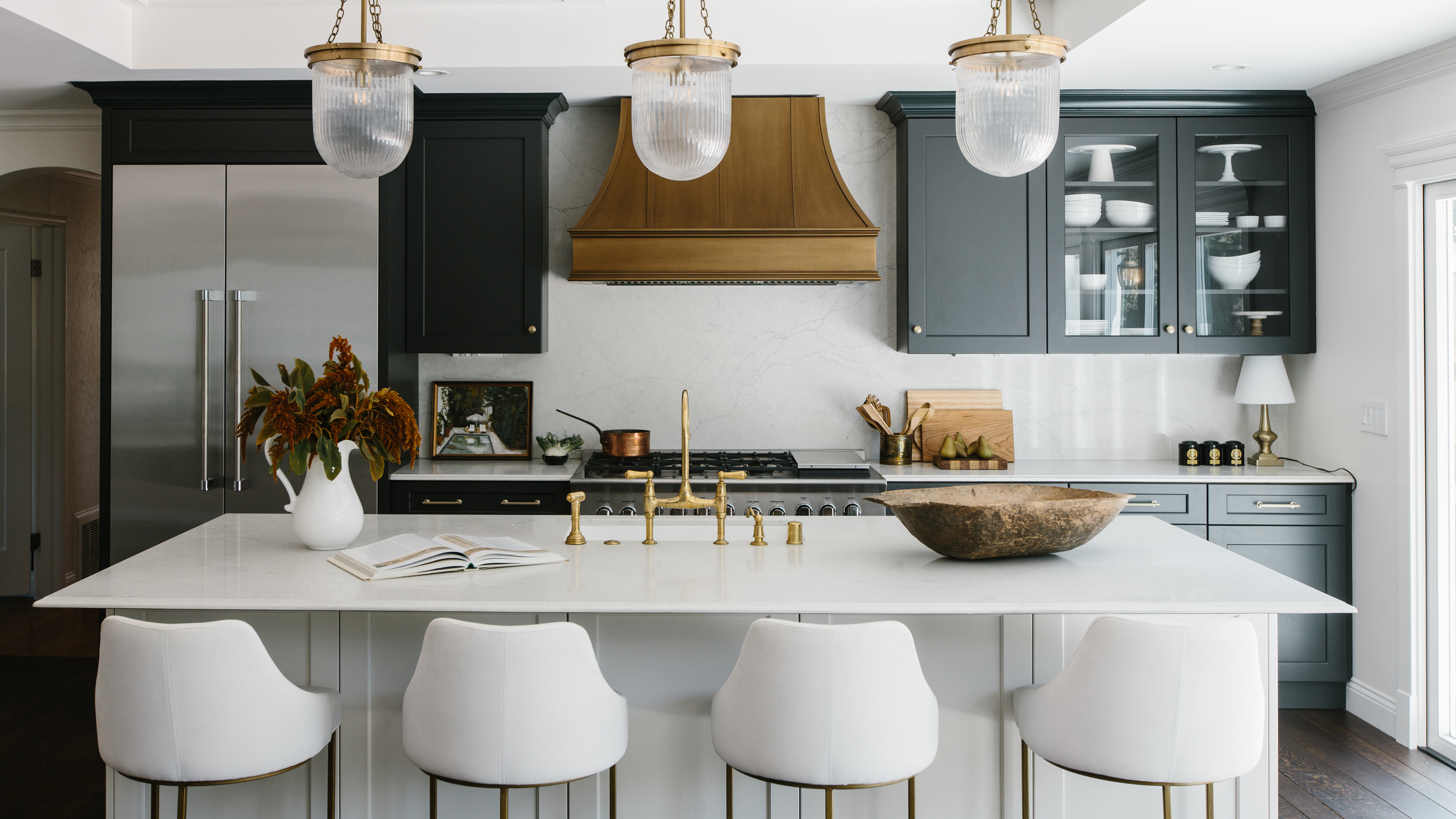
‘Their inspiration images for this space were a mix of white and dark kitchens,’ said Maggio, ‘but the space gets so much light and white kitchens are a dime a dozen. So going dark was always my first choice – but, given that the kitchen is not actually very big, adding the white to the island gives the space more of a dynamic feel.’
3. Use seating to break up a long living room
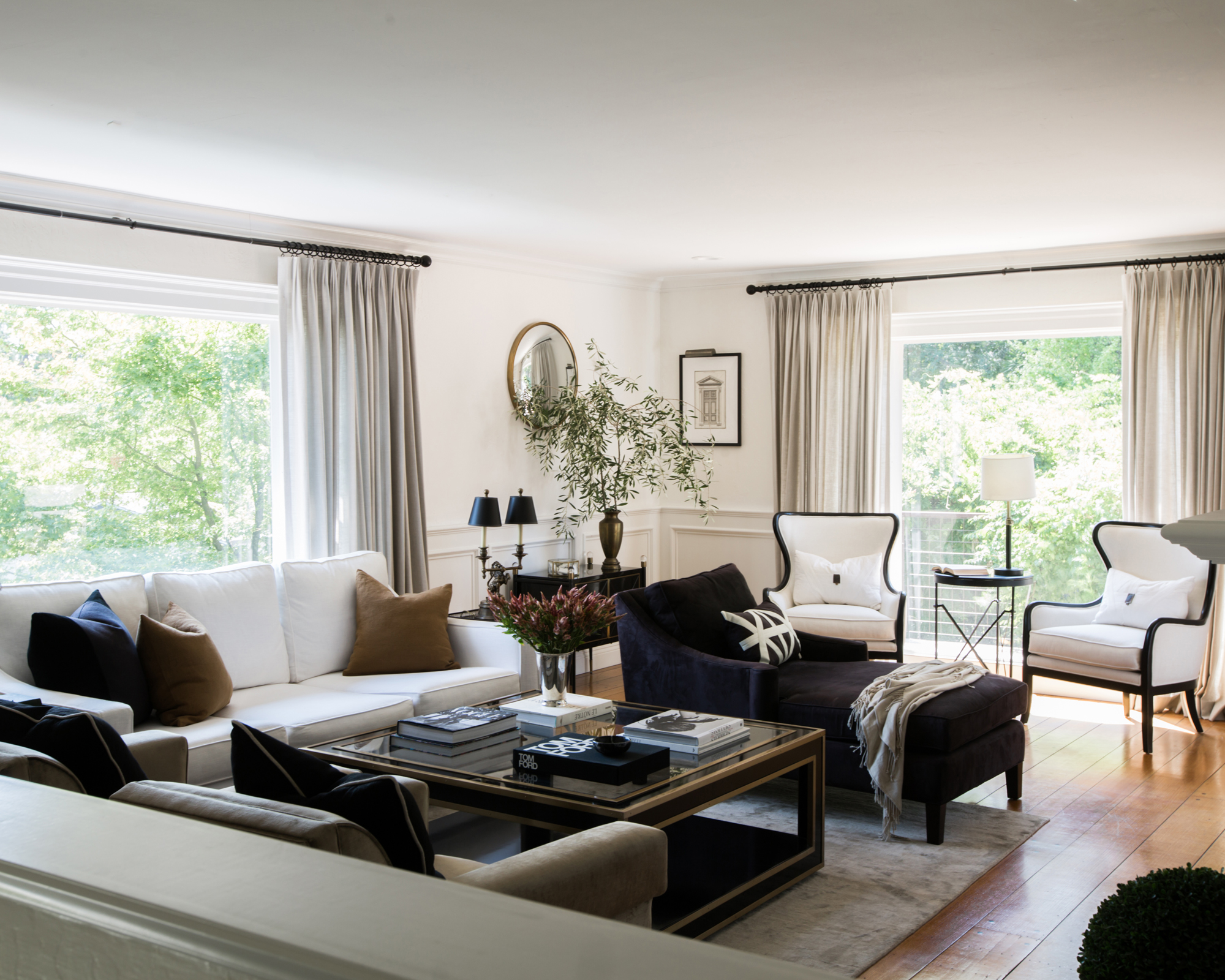
‘The family room is everything,’ said Maggio. ‘I love the balance of how formal it feels and yet how inviting it is. I don't often think of those two things working so seamlessly together.’
Getting the living room ideas to work this well, however, didn’t come without challenges. ‘The shape was long and narrow which was a challenge when space planning,’ Maggio explained. To make it feel convivial, seating has been carefully positioned to create intimate – but connected – seating zones. ‘The solution I came up with was to do a chaise in between the main sitting space and the two chairs by the window. That way, when entertaining, someone can sit there and converse with people in either direction.’
4. Make your bedroom feel like a hotel suite
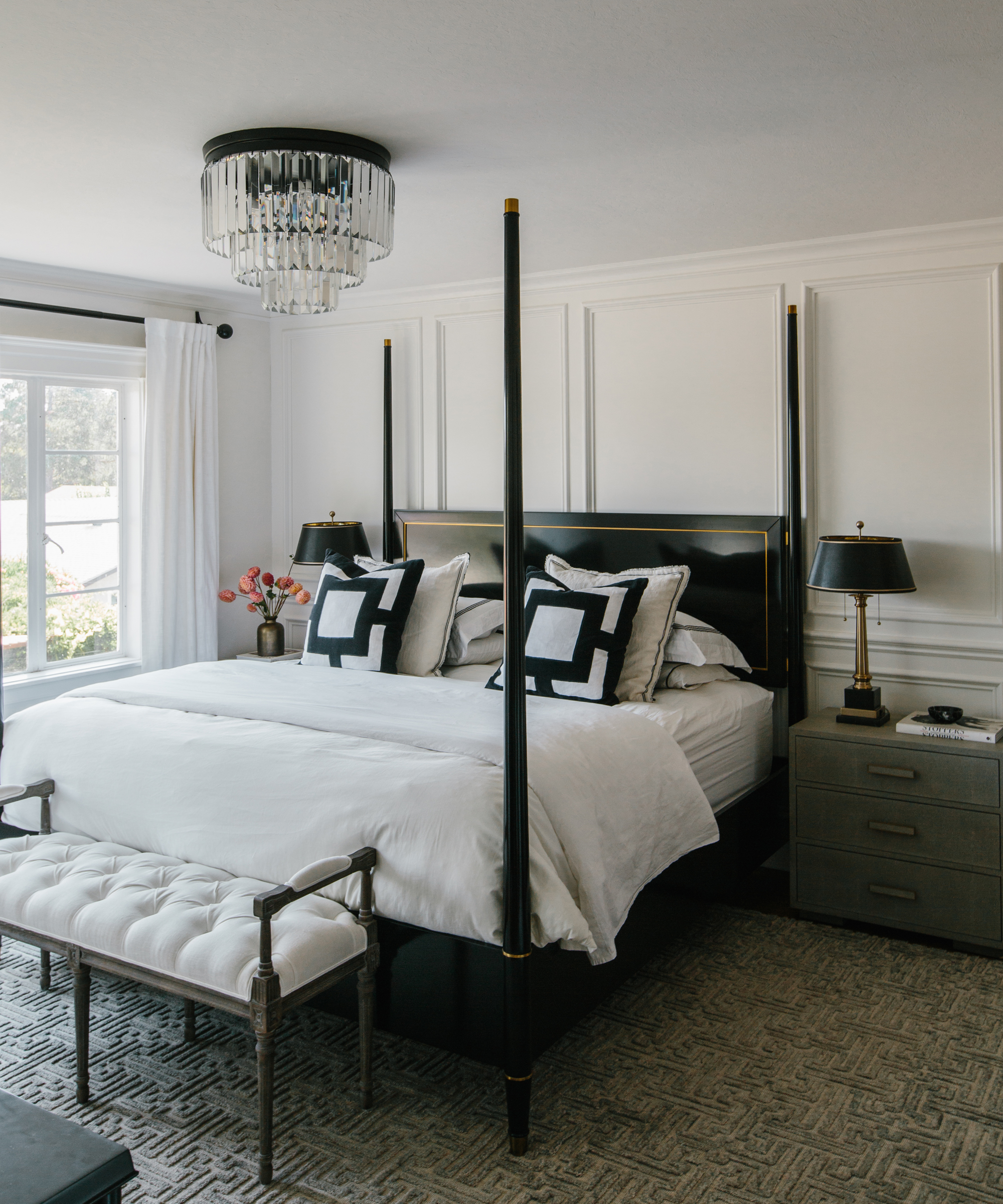
‘This space was meant to feel like walking into a hotel room and boy, does it ever,’ said Maggio. Channeling hotel chic is a growing trend among bedroom ideas in the home, particularly as home working means they are increasingly the only sanctuary of relaxation in the house, and deserve a touch of luxury.
‘The bedding, pillows and lighting were all hotel-inspired, and the bedside tables brought texture and softness,’ said Maggio. ‘The four-poster bed was a hot topic of discussion since the room isn't actually very large but I felt confident that it was needed for the drama and stateliness it brought. To stay on budget we only paneled one wall, which wasn't a big deal since the other walls have windows. The Greek key rug pattern and tufted bench connected the European feel from the other spaces.’
5. Add character to a kitchen with unique details
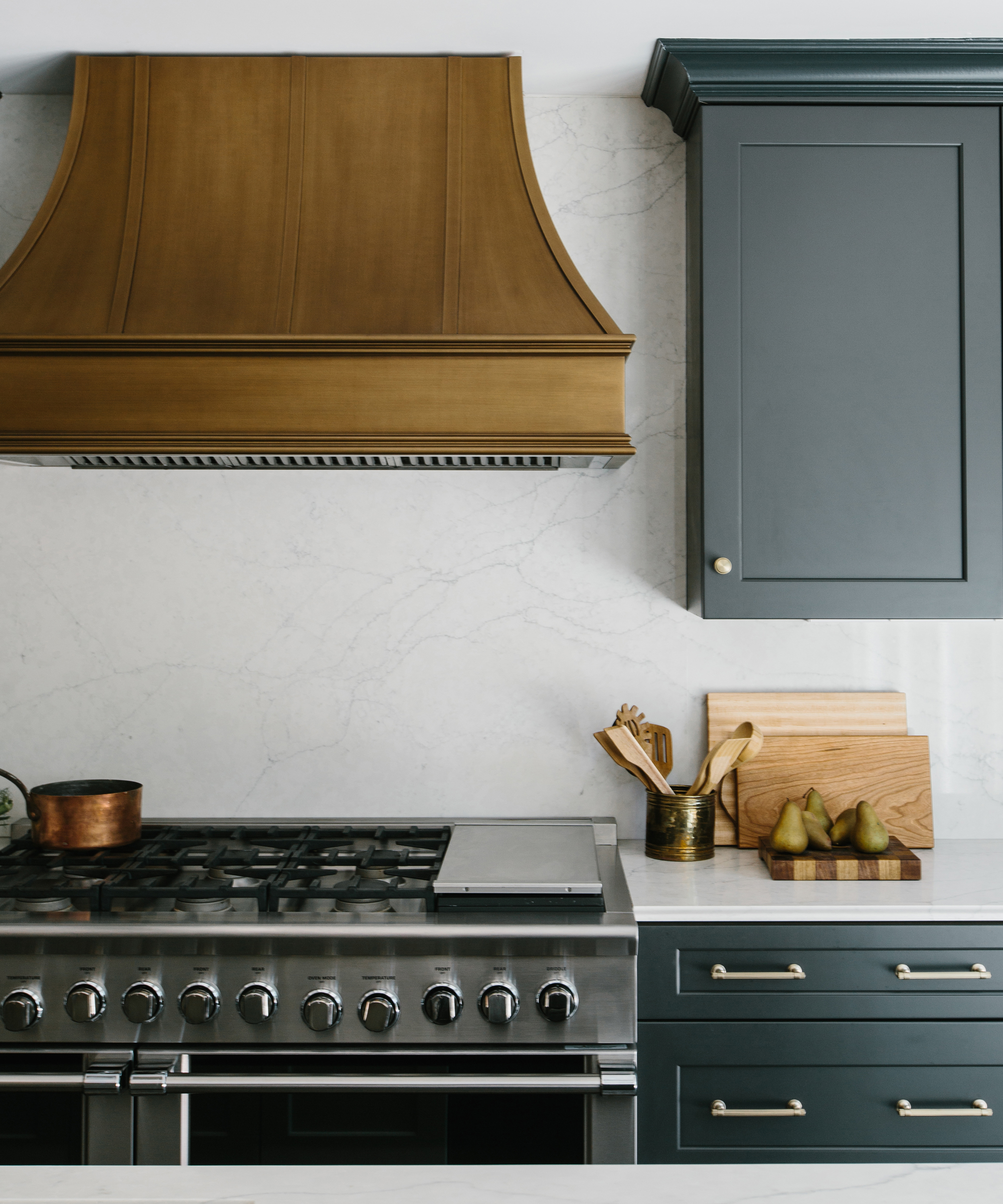
As Maggio was determined the kitchen wouldn’t be ‘a dime a dozen’ in its design, she chose a number of unique details and finishes to give the space character.
‘The hood is the showstopper of the space,’ said Maggio. ‘We custom designed that, and matched the finish to a table base sample we had from Restoration Hardware. It was the perfect mix of brass and bronze, and the crew who worked on it did a perfect job.’
The kitchen island ideas also got some special treatment too. ‘Before presenting the design to the clients, I kept all my fingers and toes crossed that they would approve the pendants over the island – and to my great joy, they did. I see the same pendant lights over and over, and these felt more special and a nice mix of modern and classically traditional.’
‘The unlacquered bridge faucet also helped bring in the traditional element along with the ogee edge counter detail. The coffered ceilings were the client and architect’s doing and I'm so glad they did. It brings the ceiling up and hits all of the marks.’
6. Soften a room from top to bottom with curtains
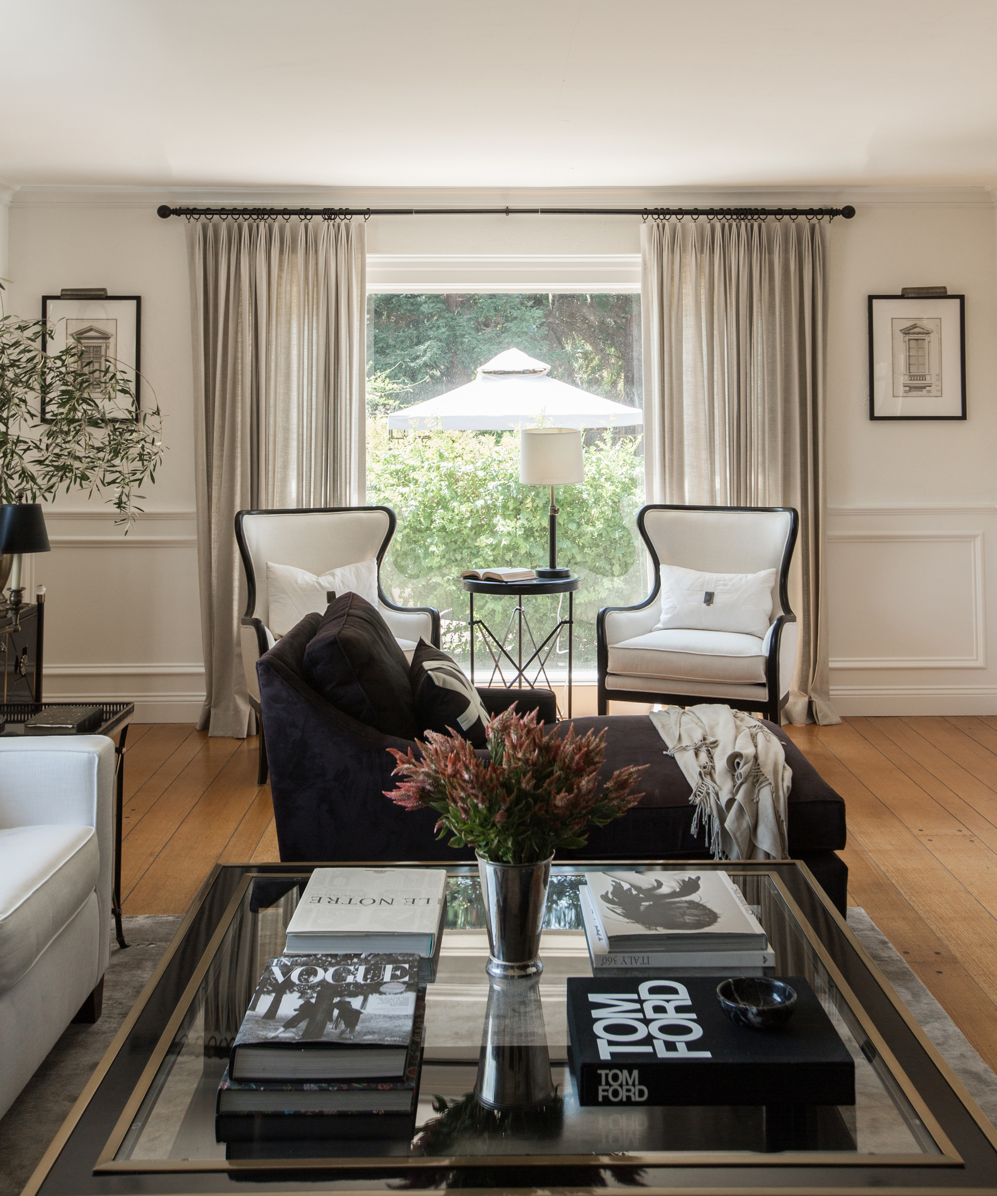
The owners wanted the home to feel formal, but a family living room always requires a softer touch. ‘The bronze velvet chairs were a little bit of a stretch when it came to the budget but their warmth was so necessary as a relief from all of the black and white,’ said Maggio.
Along with gentle variations on the monochrome theme, the off-white curtains also add a cosseting sensation to the space. ‘At first they didn't know if they wanted to splurge on the drapery, but afterwards they said it was the best decision they made,’ Maggio said. ‘Even though the drapes are never closed they soften the space and add height. The coffee table is the hearth and center of the room and really ties together a lot of elements.’
7. Turn hosting necessities into design features
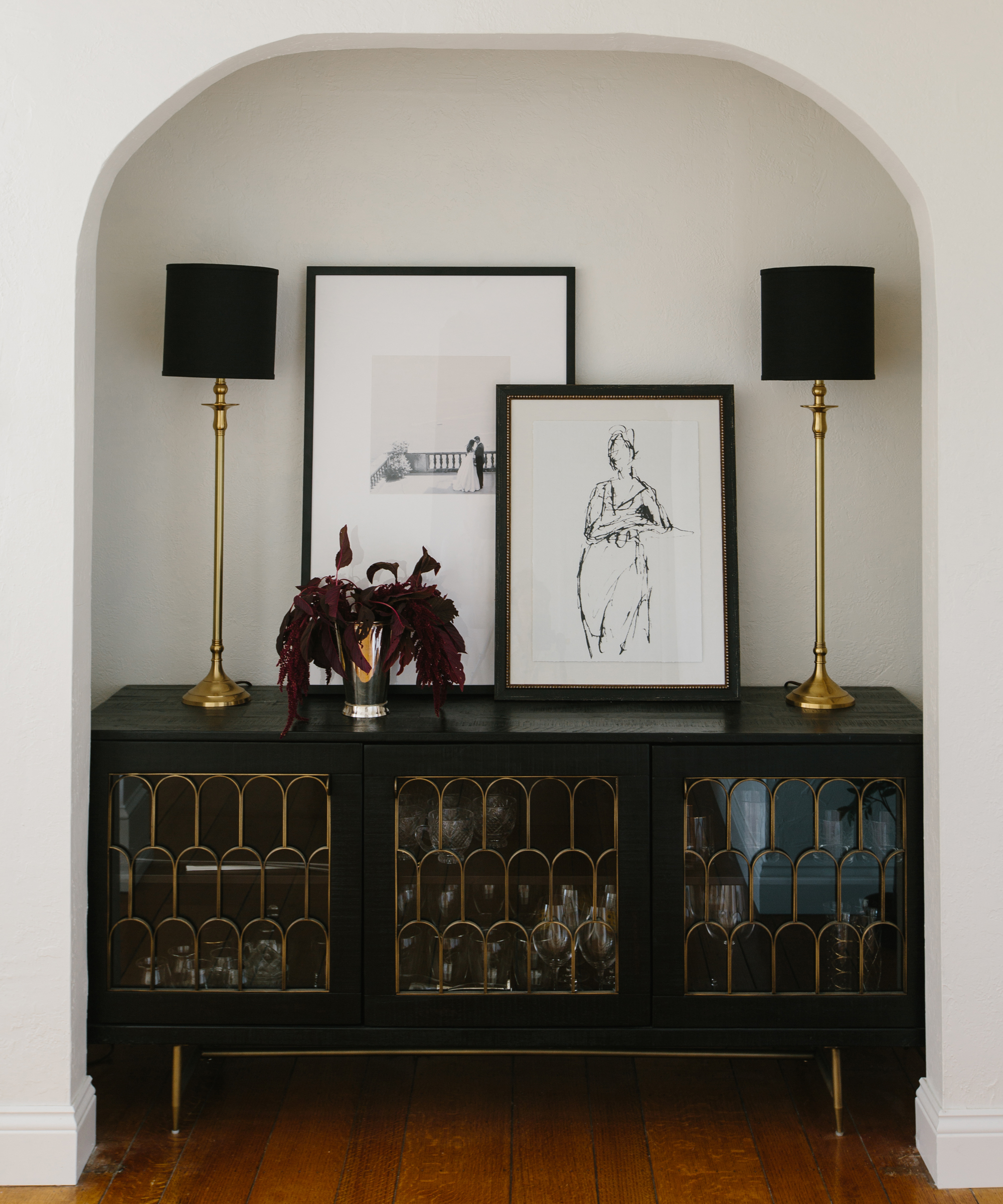
When making a home your own, it is often necessary to work with the quirks of its architecture, rather than against them. This recessed alcove is situated in the corridor leading towards the family room – Maggio turned it into a central feature of her hallway ideas that benefitted the client’s desire to have a home with guests at its heart.
‘Functionally, everyday living is great and all, but they wanted it to be a place to host,’ said Maggio. ‘Gatherings and parties were a primary focus on many of the functional decisions.’
Ensuring the color palette continues throughout the transitional spaces, the white-painted alcove is fitted with a black sideboard, which holds and displays glassware, signifying that the space is ready to party at all times. A vintage touch is added through Art Deco-style scalloped details in gold on the window, along with the color-matched lamps, while a contemporary feel is given by the artwork leaning on the wall.
Interior design / CM Natural Designs
Photography / Carley Summers

Ailis started out at British GQ, where a month of work experience turned into 18 months of working on all sorts of projects, writing about everything from motorsport to interiors, and helping to put together the GQ Food & Drink Awards. She then spent three years at the London Evening Standard, covering restaurants and bars. After a period of freelancing, writing about food, drink and homes for publications including Conde Nast Traveller, Luxury London and Departures, she started at Homes & Gardens as a Digital Writer, allowing her to fully indulge her love of good interior design. She is now a fully fledged food PR but still writes for Homes & Gardens as a contributing editor.