What are the best bathroom color combinations? 5 designer-approved pairings to try
From bold combos that take from both sides of the color wheel, to tonal schemes that are all about the layers...

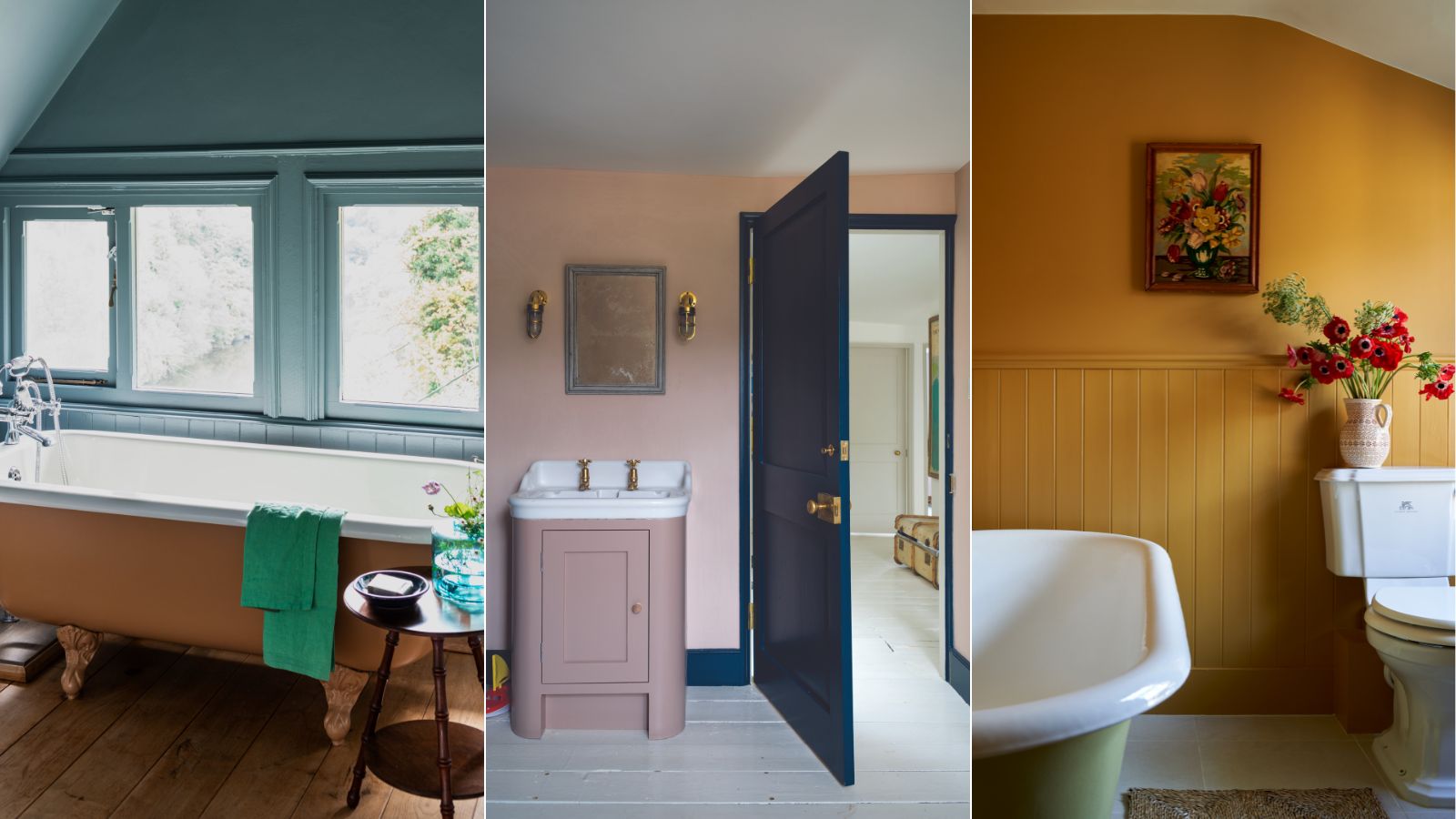
For what feels like an age, bathroom color schemes have been dominated by neutrals. And we get it, bathrooms are very lived-in spaces and we want them to be relaxing, calming spaces, and for many that means whites, creams, and greys. Plus, a lot of bathroom fixtures are some version of white and they are usually the jumping-off point for any design decisions. However, we are starting to see a resurgence of bold bathroom color ideas, even colored bathroom suites are making a slow and steady comeback.
And in a world where white and grey bathrooms have for so long reigned supreme, we are enjoying this new trend for injecting some color into a bathroom, and getting a bit more experimental with the palettes. So we asked designers what bathroom ideas and color combinations you should try if you want to be a bit bolder in your shade choices...
The best bathroom color combinations
As all these room color ideas are about to prove, a colorful bathroom can be a real joy, and going slightly bolder with the color palette doesn't mean the space can't still be calming and serene. It's about finding a balance in your color scheme, going for a vivid pink and toning it down with an olive green or choosing a warm and sunny yellow, and giving it a freshness with a crisp, bright white.
And consider who uses the space too, is it your main family bathroom? A guest bathroom? A powder room? This may dictate how bold you'd like to go with your color combinations. As designer Irene Gunter points out: 'The best color combination for a bathroom depends on the users and frequency of use. For instance, bolder color combinations are suitable for guest bathrooms or powder rooms that are used less regularly, allowing for more daring color choices. For instance, at home I decorated my guest's ensuite with upbeat red terrazzo tiles and slightly more subdued wood paneling painted in Beach Glass by Benjamin Moore, creating a small space that packs a colorful punch.'
'Similarly, bold color combinations can create a lively and playful atmosphere in children's bathrooms, making bath time more enjoyable for kids and lifting their mood, especially in the morning when they need extra motivation.'
'For main bathrooms, choose color combinations that encourage relaxation and unwinding after a long day. Rich, earthy shades of brown, green, or orange evoke a feeling of warmth and comfort. This makes them the perfect colors for a space where one does not wear many clothes,' she adds.
1. Blues, greens and whites
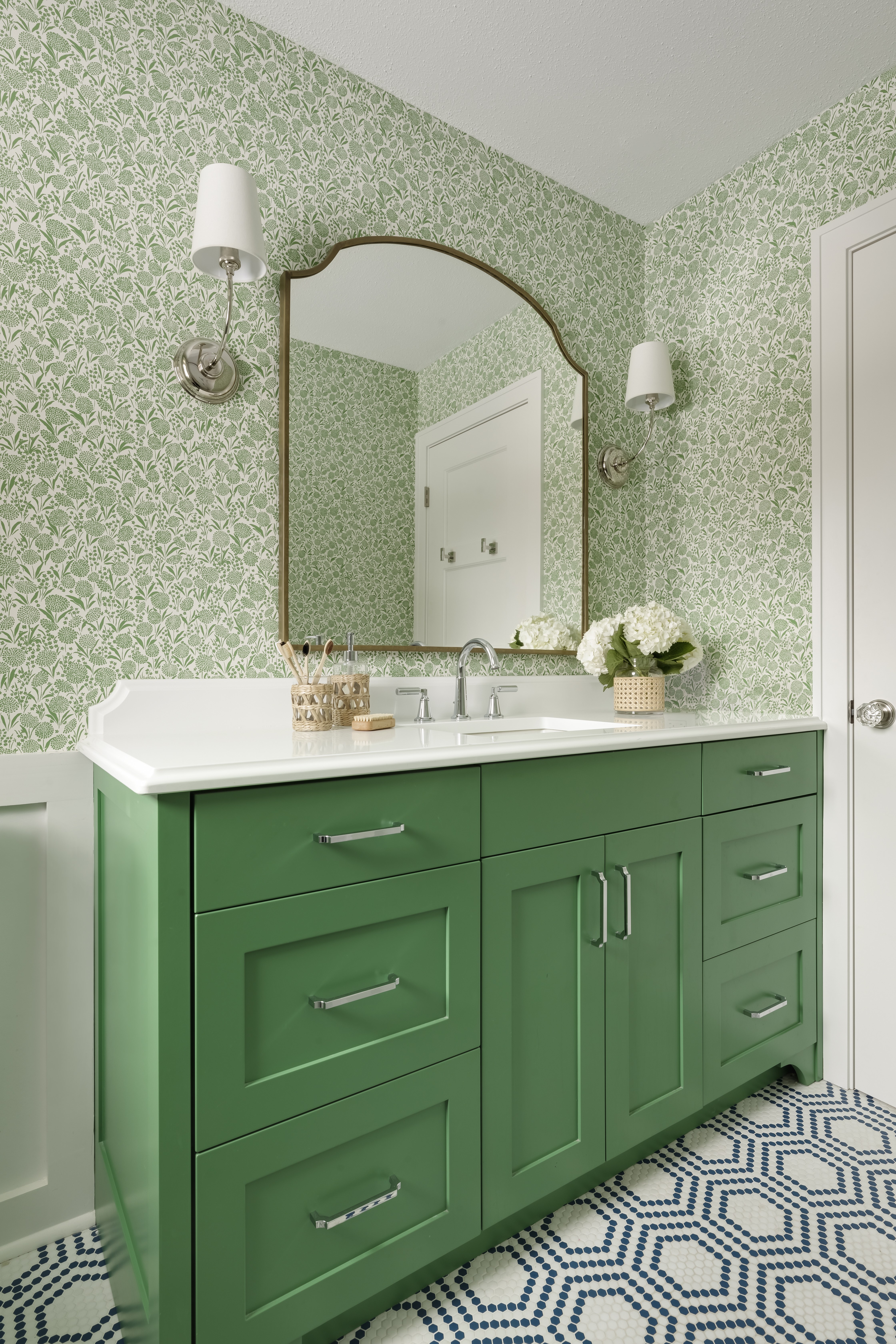
A blue and green bathroom may sound a bit too... under the sea themed, but as this bathroom designed by Davis Interiors proves, add in a heavy dose of white, and what you get is a fresh, chic, and cohesive bathroom color scheme.
Design expertise in your inbox – from inspiring decorating ideas and beautiful celebrity homes to practical gardening advice and shopping round-ups.
'Our go-to colors for bathrooms are always blues and greens. Soft blues and greens create a calming and relaxing atmosphere, while still feeling clean and fresh,' explains the studio's founder Jennifer Davis. 'On the other hand, the infusion of more vibrant blues and greens in the bathroom can evoke a refreshing and cheerful atmosphere. I adore the simplicity and classic vibe of blues paired with whites and the crisp, fresh feel of richer greens combined with whites. Yet, what truly captivates me is the delightful mix of greens, blues, and whites, creating a preppy, but classic charm!'
Designer Kathy Kuo agrees, 'I really love crisp, clean color combinations for bathrooms. You can never go wrong with any combination of blue and white – be it navy blue and bright white, or a muted French blue and a warmer off-white. Adding in hints of teal and green can also work nicely, and if you feel the need for a warmer color to serve as a contrast, do that with your towels since they're easy to mix and match throughout the year.'
Just look at the color wheel, this combination makes sense. It's what is known as an analogous color scheme – colors that sit close together on the color wheel and work beautifully together. And look at nature too, blue and green are everywhere in nature so, of course, they are going to look lovely when paired together in the home too. And you have options here, you can go bold with a primary blue and vivid green, or for a subtler take on the combo, dial it back with a soft sky blue and pale sage green.
2. Deep grey, warm whites and brass
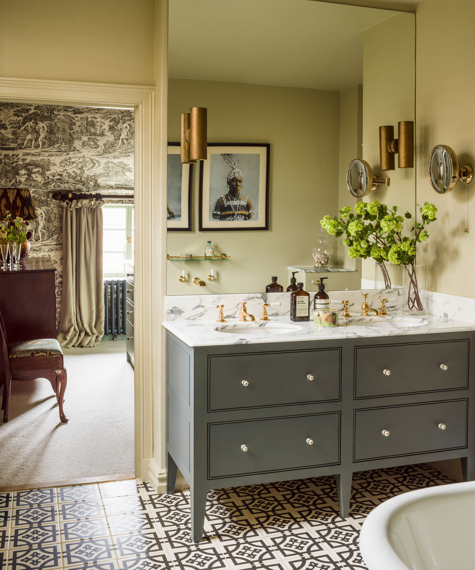
You know this bathroom color combination makes perfect sense. The drama of the deep grey, the contrast of the white and then the warmth of the brass. It's the perfect balance of cool with warm, dark with light and what you get is a bathroom that feels cool and sophisticated, but also cozy and inviting.
'Bathrooms are a great place to play with using color, especially guest bathrooms as they can really surprise and delight. Dark charcoal and white paired with brass are a great classic combination to add drama and sophistication especially if you utilize a bold dark-hued marble or terrazzo to ensure the palette feels luxurious.' explains Tom Rutt, founder of TR Studios.
And if you want an even warmer take on a dark bathroom, switch the grey for a deep, chestnut brown. 'Brown is not a color many would opt for, but it can look very elegant teamed with dark walnut vanity units and black or brass hardware. If you wanted to add a pop of color, terracotta works really well with this mix,' explains Tom, and we very much agree. Don't dismiss decorating with brown it's coming up slowly and steadily in the world of color trends.
3. Dark greens and subtle red accents
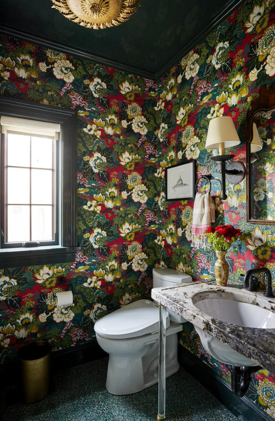
Bear with us on this one. We know the phrase red and green must never be seen comes to mind, but when used in the right space, in the right quantities it can be a really playful but sophisticated combination for a bathroom. We would say experiment with this pairing in a powder room, rather than your main family bathroom as a powder room presents the perfect opportunity to have some fun with color.
'If you are decorating a modern powder room, this is the place to get experimental with color and have a bit of fun. You don't spend loads of time in there and it's also usually the smallest room in the house so why not lean into that and go bold? It's such a look when you have a more neutral color palette throughout the rest of your home and then you open the door to a downstair powder room and it's a hit of color,' suggest Tash Bradley, color expert at Lick Home.
Designer Kati Curtis, who created this beautifully bold space, is all for using contrasting colors in your bathroom. She says, 'The best bathroom color combinations today are complimentary schemes that feature colors opposite each other on the color wheel. Complementary palettes are not only visually appealing but also create a harmonious balance. Bathrooms provide an excellent opportunity to take design risks without major consequences. For instance, consider the pairing of green and red tones or blue and orange tones for a striking complementary scheme, using wallpaper or patterned tile.'
4. Sky blue and muted mustard yellows
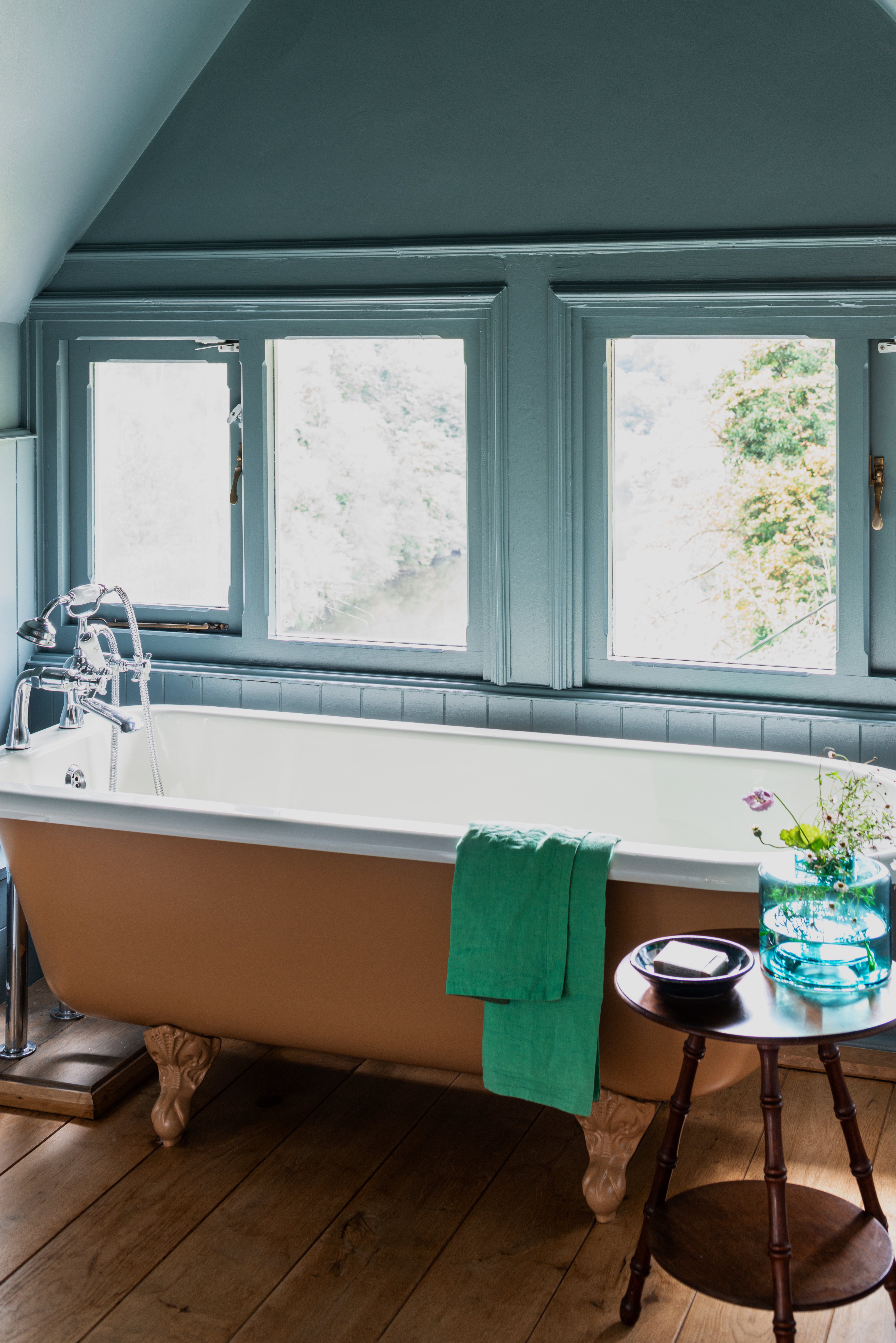
A bold combination yes, but you can go as hard or as soft as you like. Primary colors are so often ignored in the world of interiors, but they can be the perfect colors to bring into a playful family bathroom – a space that needs to work for everyone in the house. The key with primary colors like blue and yellow, especially when bringing them together, is to go for more muted versions. Soft blues and mustard-toned yellows are far more livable shades that can come together beautifully in a bathroom.
'For a family bathroom, I always recommend bringing in some joy and a combination I love is pale blue and yellow,' suggests Tash. 'Sounds bold, but go for pale blue as your starting color, take it onto your walls and your ceiling, and then bring in pops of yellow in your fixtures – like a yellow freestanding bath or add in some paneling for a color-blocking effect. If you are feeling brave, red also looks great with this pairing. But not an intense red, a soft, playful earthy red.'
Bring in plenty of white too, even if you want to color drench your bathroom in a primary shade, and make the other the accent colors, always add some white to lift this potentially quite intense combination. Even the inside of the bathtub as seen in this blue bathroom will do the job.
5. Beige, warm whites and plenty of textures
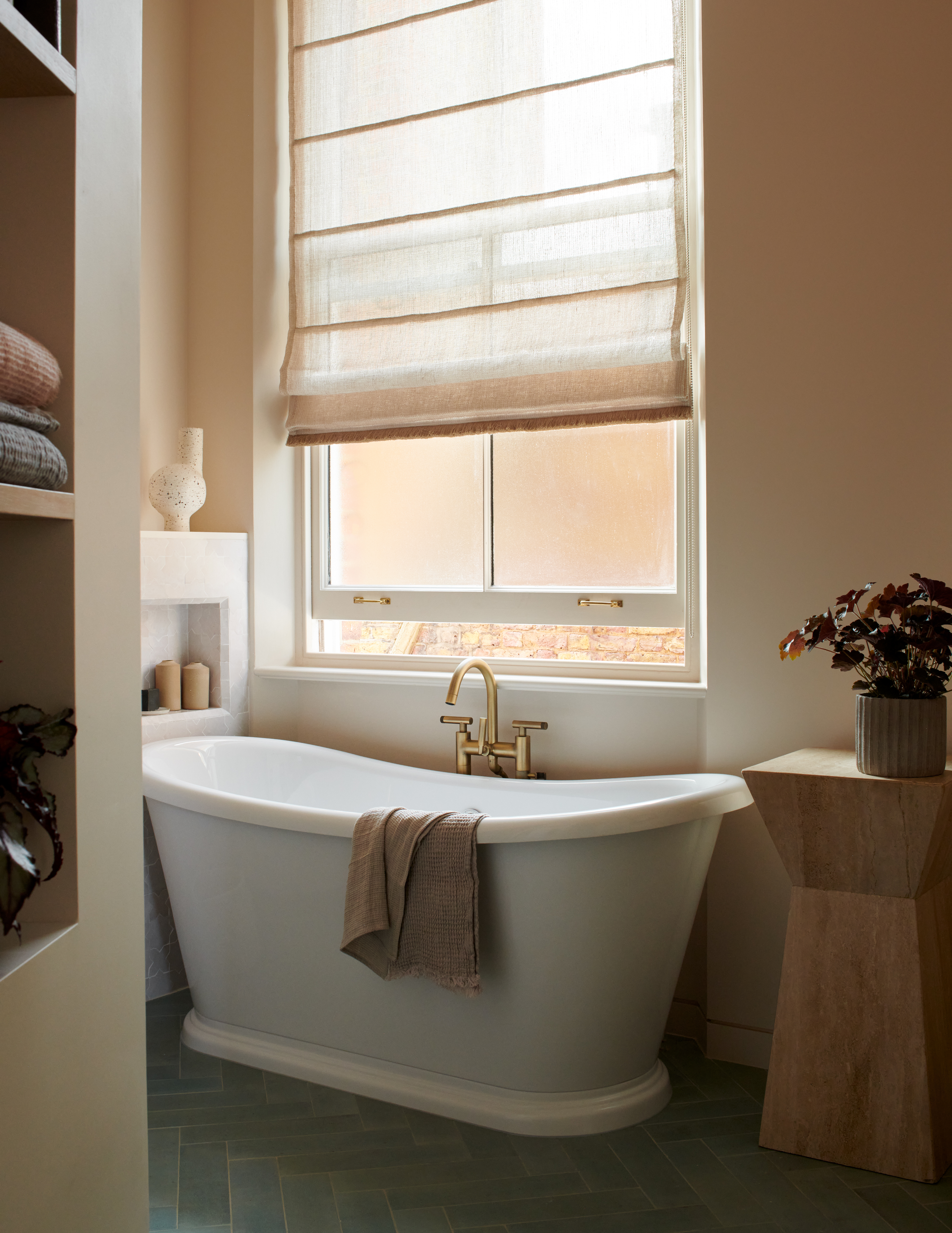
Characterful bathrooms don't all have to be about bold colors, you can create a bathroom filled with depth and interest using a neutral palette too. But the interest comes when you combine and layer different neutral tones – beiges, whites, creams greys. And different textures too, plaster finishes, different tile shapes, and natural materials are part of the 'color' palette also, and will all work with the neutral shades to create a bathroom that feels every bit as interesting as one filled with color. Case in point, this beige bathroom was designed by Tala Fustok.
'When it comes to a master bathroom, I think a more neutral palette stands the test of time,' says Tom Rutt. 'We have used Tadelakt waterproof plaster a number of times for bathroom designs. It adds so much more interest and texture to a space but in an elegant and understated, spa-like way. The grey and dark stone color options I think really work well paired with neutral glossy zellige tiles and matte black or brass hardware.'
Tash Bradley agrees that: 'For a much safer, more traditional bathroom color combination, you can go wrong with layers of warm soft neutrals (always warm over cool in a bathroom). It's a very comforting color, it makes you feel instantly very calm. If you want to create that more earthy, grounding spa-like feel invelope your whole room with a warm beige.'
'However, avoid adding in any harsh white. A brilliant white is the last thing you want in a bathroom, it just feels a bit clinical. And never leave the ceiling white, and that goes for any color combination, it will make the ceiling a focal point, which is not what you want in a bathroom,' adds Tash.

I am the Head of Interiors at Homes & Gardens. I started off in the world of journalism in fashion and luxury travel and then landed my first interiors role at Real Homes and have been in the world of interior design ever since. Prior to my role at H&G I was the digital editor at Livingetc, from which I took a sabbatical to travel in my self-converted van (not as glamorous as decorating a home, but very satisfying). A year later, and with lots of technical DIY lessons learned I am back to writing and editing, sometimes even from the comfort of my home on wheels.