This Washington home teaches us how to do minimalism in a way that still feels cozy and welcoming
How do you create a minimalist scheme that's still warm and comfortable? The designer of this Washington home explains

- 1. Soften the boundaries between inside and outside
- 2. Use the trees outside as a natural screen
- 3. Layer warm neutrals to bring balance and comfort
- 4. Create a standout feature to add character to a minimalist setting
- 5. Get the details right – they make all the difference
- 6. Max out on storage
- 7. Think about the scale and position of furniture
- 8. Have fun with displays on open shelves but keep them tidy
- 9. Experiment with dark colors, they can be cozy
- 10. Hide clutter with smart storage, but make it beautiful
- 11. Use luxurious upholstery and textiles to contrast with modern architecture
- 12. Understand the power of curves and textured finishes
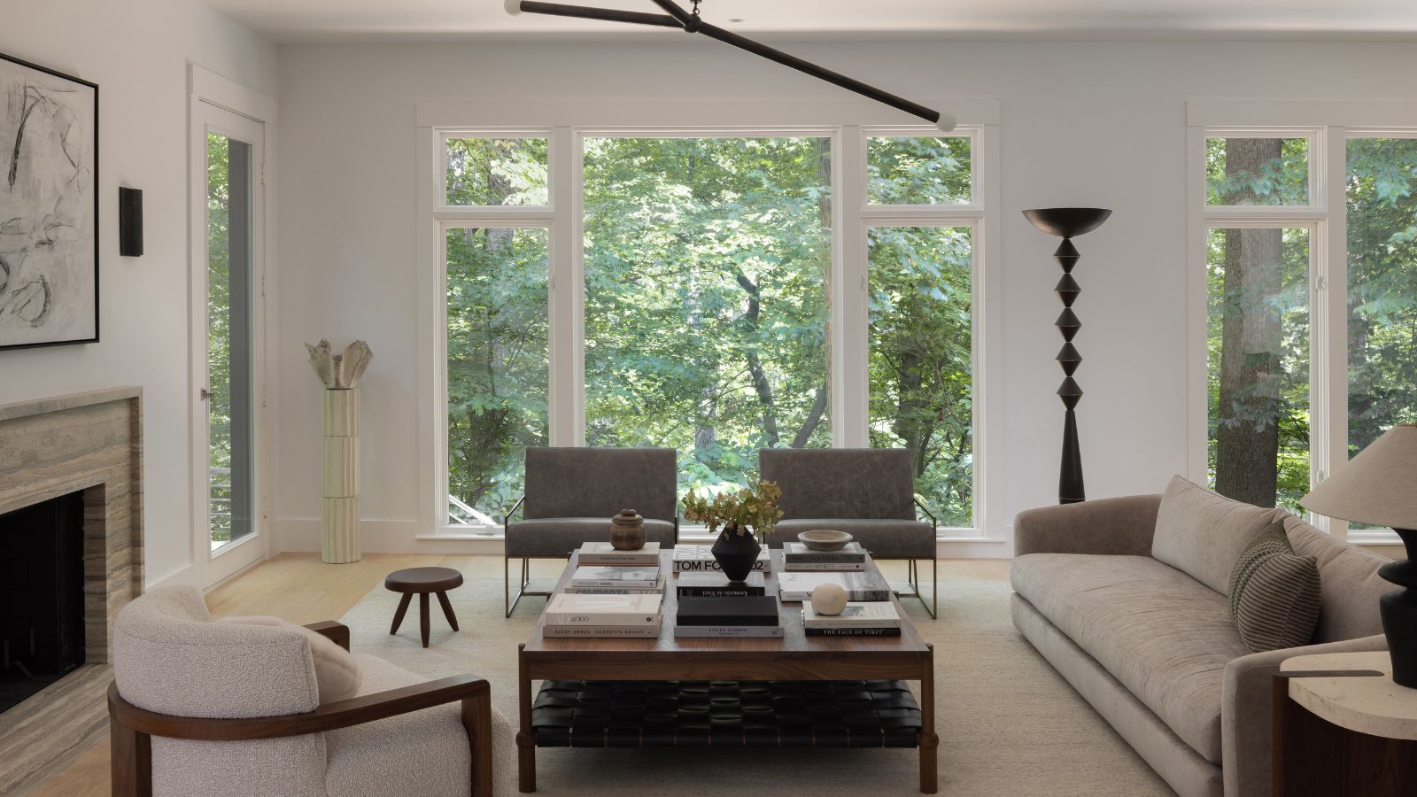
One of the best things about being inside this contemporary home in downtown Washington DC are the views you get of the world outside. As houses goes, it's as close to nature as you can get in the city, and the property's unobtrusive gray exterior appears to merge into – and absorb – the greenery of Rock Creek Park.
Until its recent remodel, however, the property's tired and dated house design simply didn't match up to its beautiful setting. So the new owner called on the experts at Lorla Studio to update the home throughout for him and his young family.
Laura Hur, the design studio's founder, explained the challenges of the brief and how she arrived at the best solutions for the homeowner. 'He wanted the home to feel minimal, modern, and peaceful,' says Laura. 'And we did that, but also added warmth and a reflection of nature outside.'
That balance was key because without including some natural, warm elements, minimalist interiors can seem stark and unwelcoming; definitely not what this family was looking for.
Laura shows us around the reworked spaces and shares her insights on how to turn up the heat and the comfort factor in cool, minimalist spaces.
1. Soften the boundaries between inside and outside
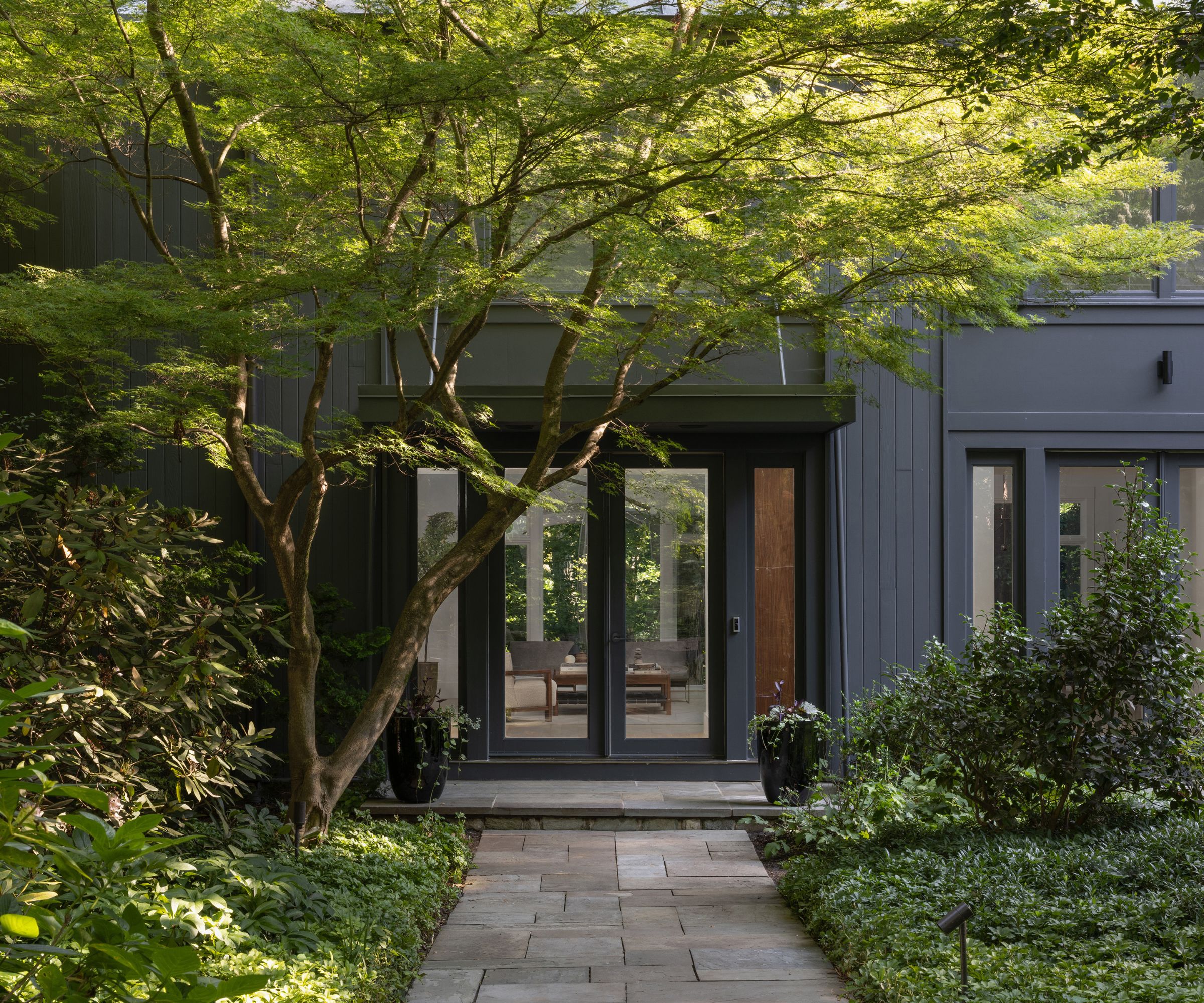
The leafy parkside setting was one of the major selling factors for this home, and the front yard landscaping ideas feature lush, dense planting around the home's approach and front door, thus blurring the boundaries not only between the property and the park, but also the garden and the house. The planting overlaps and softens the quiet dark gray exterior of the clean-lined property, which otherwise might have appeared stark in its setting.
'The outside spaces were very important to the interior design because of the large windows throughout the home. You can see the park, trees and deck from almost every room in the house. The colors, light, and natural elements influenced the design,' says designer Laura Hur.' We did not change the existing exterior architecture, which enables high ceilings and an abundance of large windows that look out onto the park below.'
Design expertise in your inbox – from inspiring decorating ideas and beautiful celebrity homes to practical gardening advice and shopping round-ups.
2. Use the trees outside as a natural screen
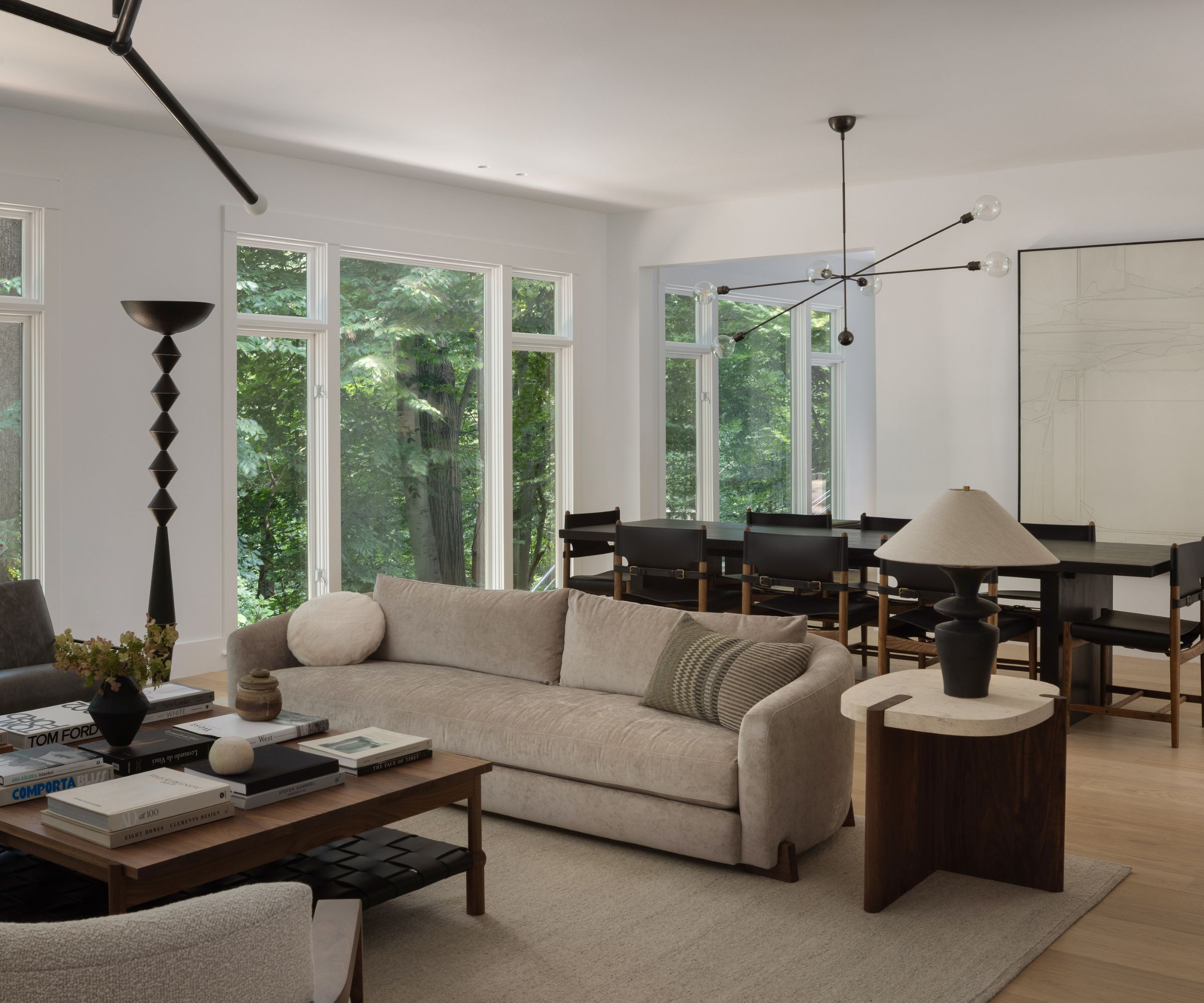
And on the subject of windows and window treatments, why add drapes when the landscape outside offers up a perfectly beautiful natural screen? In a minimalist scheme, it makes sense to avoid the additional clutter of curtains or blinds and leave the strong architectural windows to speak for themselves.
'The only rooms that have window treatments are the four bedrooms,' says designer Laura. 'We did not want to do anything on the interior to compete or take away from the gorgeous views of the park that are visible from almost every room in the house.'
3. Layer warm neutrals to bring balance and comfort
The living and dining room are open-plan in this house, so it was important to create harmony and balance between the two spaces. The two main takeaways from Lorla Studio on how to achieve this are: first, keeping to a limited and natural color palette; and second, ensuring that no single feature stands out above any other in the space.
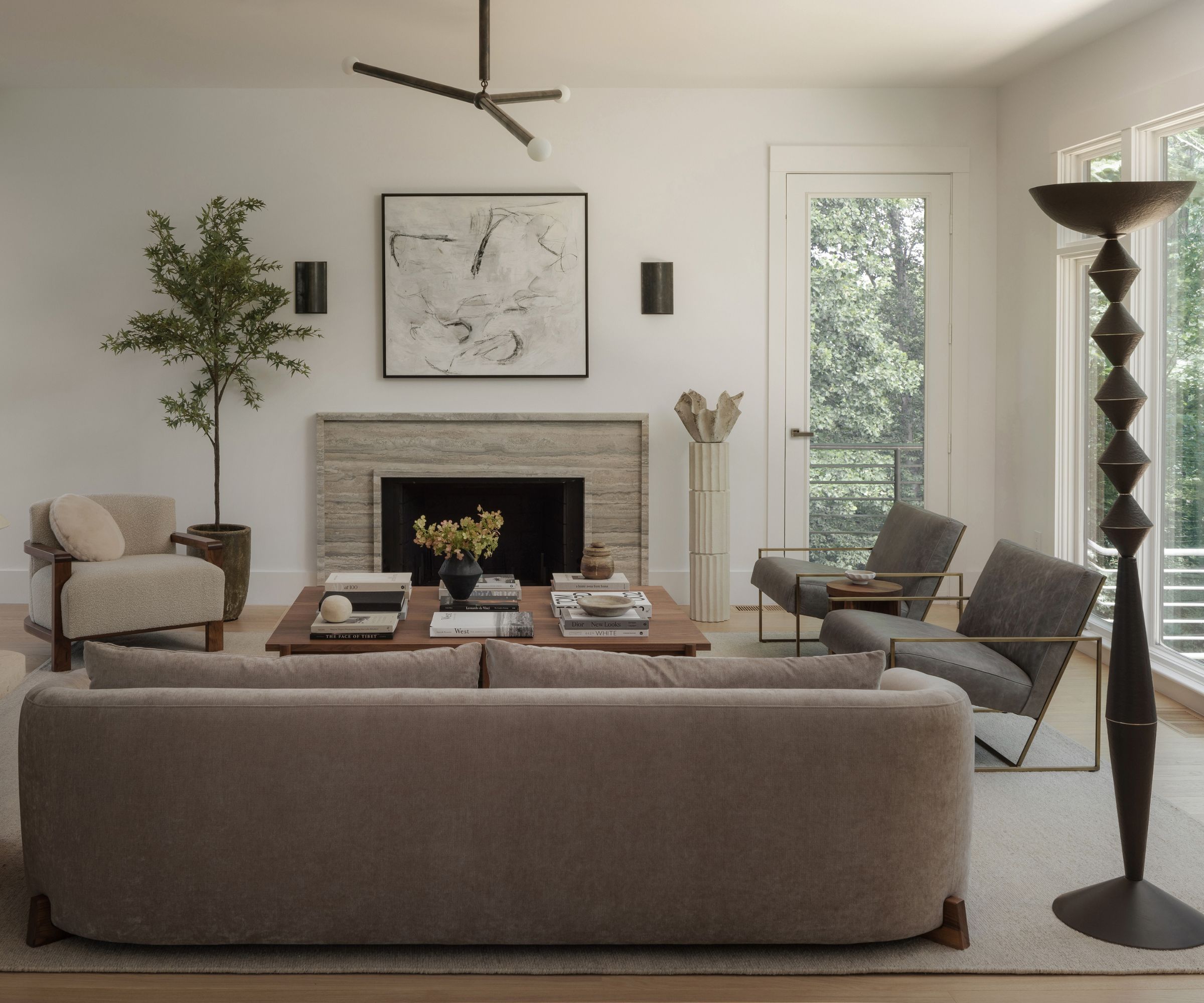
To bring balance to the living room ideas, designer Laura says: 'We designed a custom travertine fireplace surround, after deciding a bold veined marble would have overpowered the room, and we did not want any one element to grab too much attention. All of the design elements work together to create a feeling of restrained elegance, paying homage to the original architecture that placed nature at the forefront of the design.'
As far as the color scheme is concerned: 'To allow nature and the large windows to take center stage, we were also very intentional in the colors and furniture that we introduced,' explains Laura. 'The colors in the travertine are reflected in the colors of the park seen through the windows, and then echoed in the furniture: soft greys, browns, tans and creams.'
'Despite the openness of the living room, sitting there feels intimate thanks to the soft furnishings and relatively low seating heights,' continues Laura. 'We sought sculptural lines as seen on the sofa and decorative lighting, and soft, warm colors that do not compete for your attention, yet effectively keep the space from feeling cold.'
4. Create a standout feature to add character to a minimalist setting
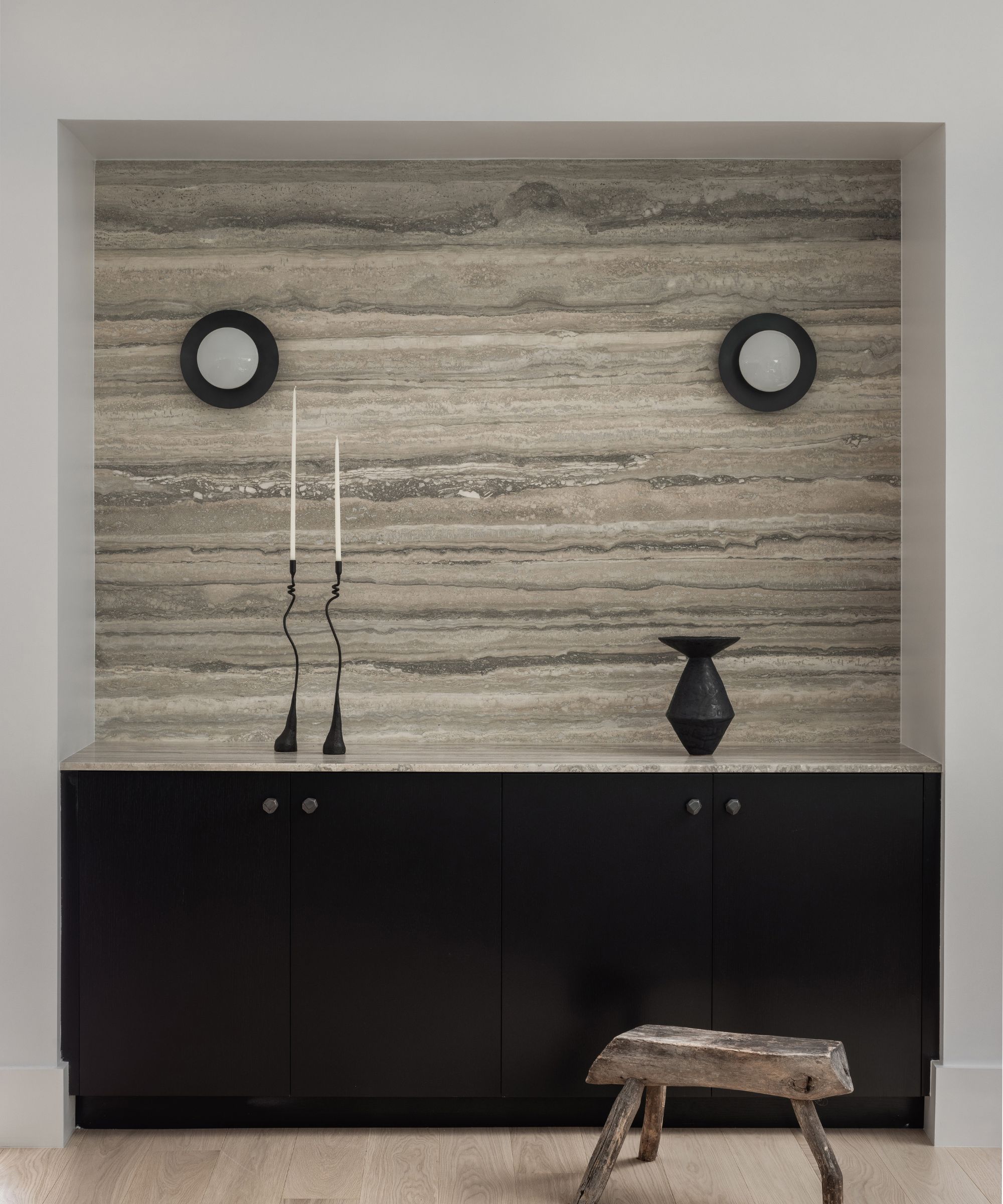
Having established that no single feature in a minimalist room scheme should grab the attention, how does Laura explain this showstopper of a credenza?! Positioned in an alcove between the living and dining room, the eye-catching custom piece is used as a home bar.
'It was a perfect moment to make a splash, and provide a highly functional storage credenza for entertaining,' says Laura, who adds that the dry bar is her favorite design element across the whole project. 'We designed it in black stained oak, which has a lot of depth and texture, as you can see the wood grain, and used a honed silver travertine as the countertop, running it up to the ceiling for a dramatic full height backsplash. The travertine brings a sense of movement to the space, but is elegant and subdued in its muted colors, which was exactly what we needed here.'
5. Get the details right – they make all the difference
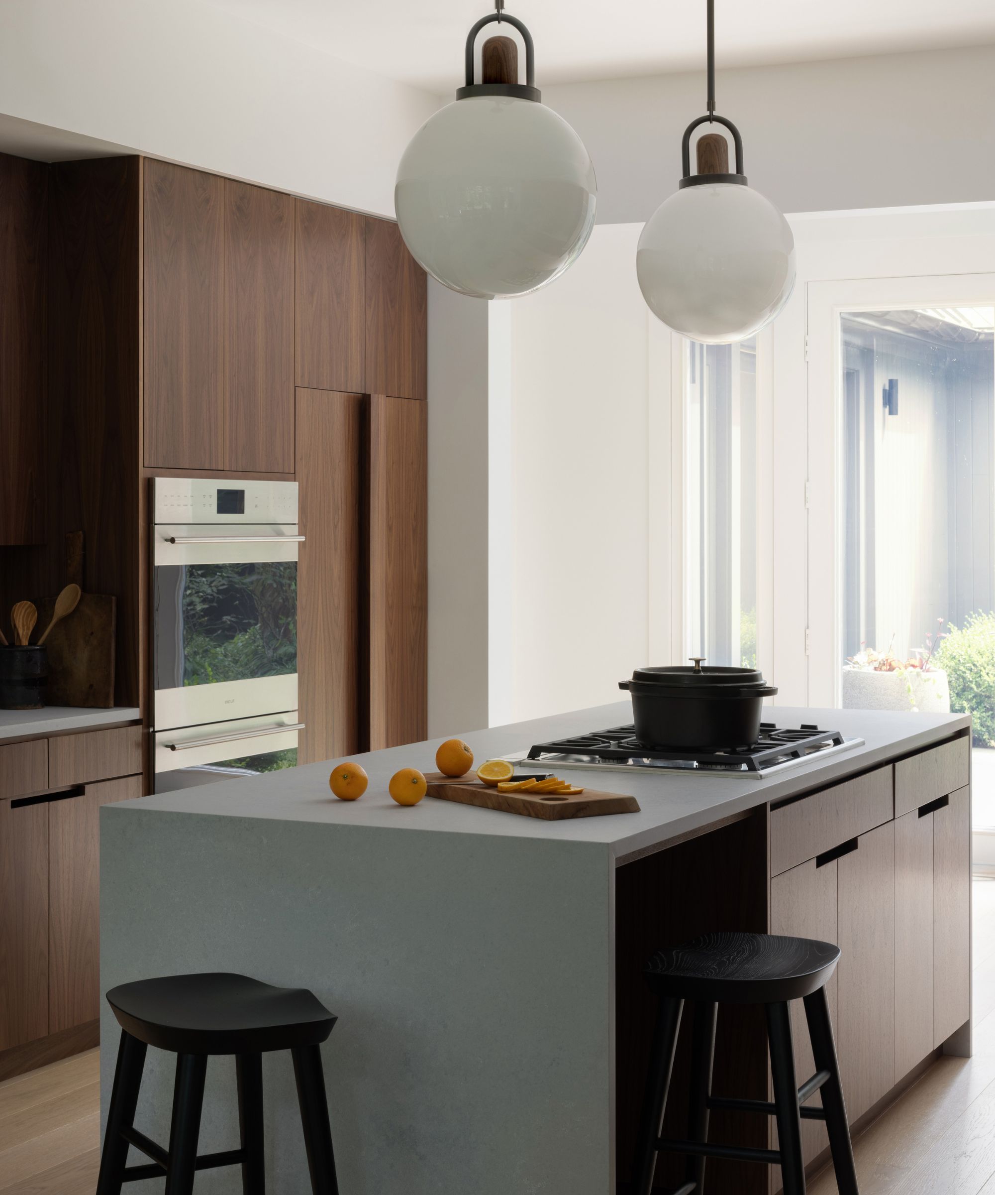
It's all in the detail, and in this redesign, explains Laura Hur, the inspiration for custom finishes and unusual styling came from nature, classic cars, vintage watches, and modern architecture, which were all keen interests of the client.
'This translated into small but impactful details in our kitchen ideas, such as the integrated pulls on the kitchen cabinets, but elsewhere in the home, too,' says Laura. 'It also informed the browns, blacks, and tans that you can see in our color palette throughout. The custom cabinet fronts that we designed for the kitchen and closet in the foyer are among my favorite details. We designed them in a warm walnut with integrated hardware/pulls and they create a very chic, warm and minimalist feel.
6. Max out on storage
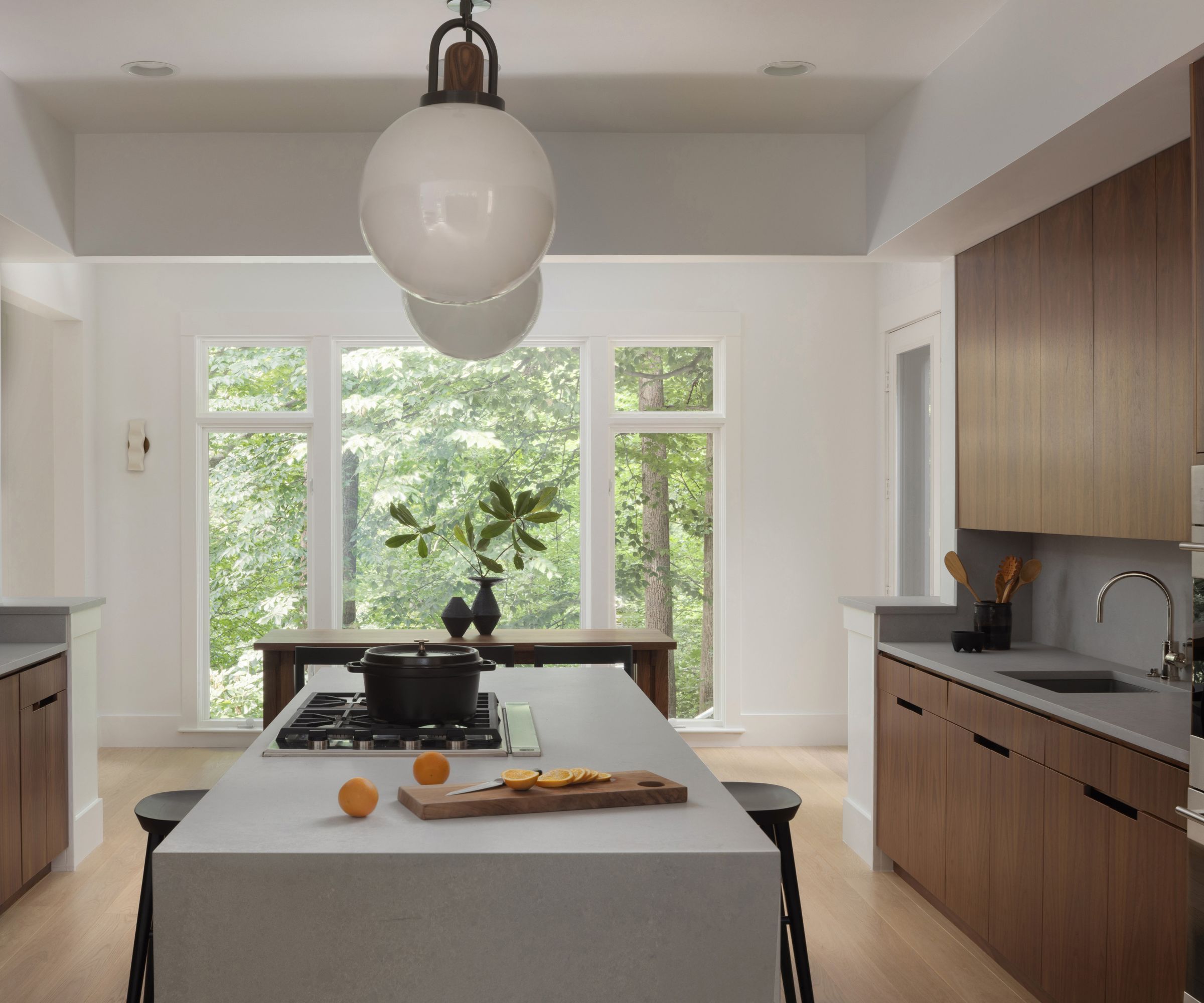
For our kitchen storage ideas, we established a language and style of walnut cabinet fronts with integrated hardware for a warm and minimalist feel. We paired the warm walnut cabinet fronts with cool grey Caesarstone countertops to bring in the contemporary vibe our client likes. The frosty white arc globe pendant lights from Allied Maker were the perfect jewelry for this minimal and somewhat utilitarian space.'
7. Think about the scale and position of furniture
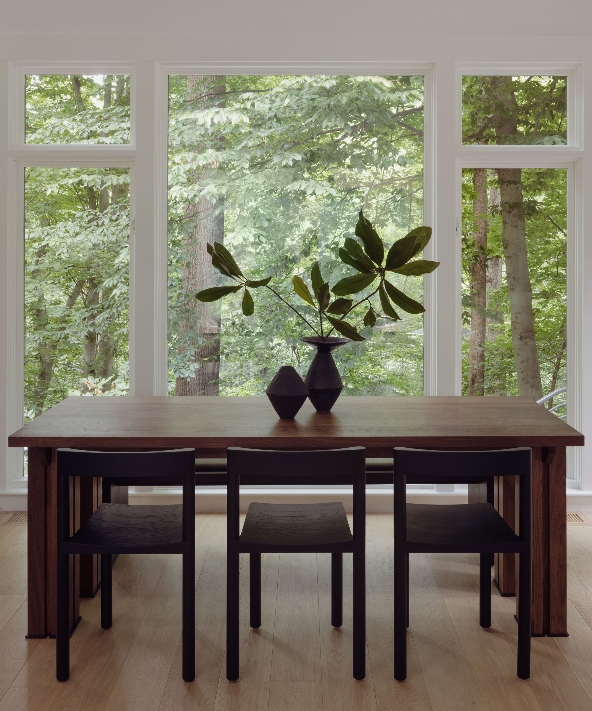
It's no good cramming a dining nook into a minimalist kitchen when there simply isn't enough space. However, there are ways to tackle the space issue in your eat-in kitchen ideas to add comfort to a minimalist scheme. Popular solutions include using a space-saving round table, or fitting fixed banquette seating.
In this kitchen, however, where the huge window is the focus, neither of those options would have worked. Instead, Lorla Studio commissioned a custom-sized dining table from Crump & Kwash. 'We used it at the end of the kitchen, in the area we called the breakfast nook,' says Laura. 'There had to be a table here, but it is a tight space, with lots of circulation surrounding it. So the custom size table, paired with a stunning bench from Fern in Hudson, NY, and sculptural chairs provided the right amount of circulation space, and interest, not too loud, but functional and stylish.'
8. Have fun with displays on open shelves but keep them tidy
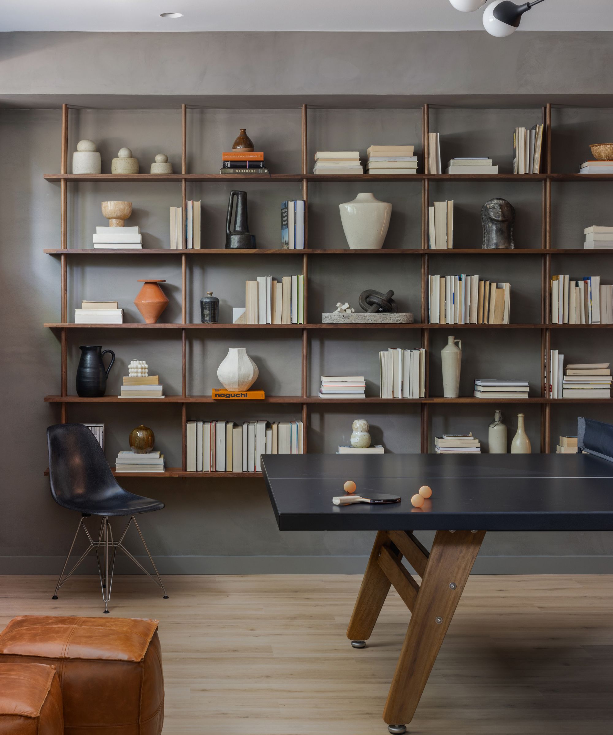
Who doesn't love decorating with shelves, creating a display shelf or several, full of objets, piled with special books, and overflowing with mementos? Well, it has to be said, it wouldn't be the storage solution of choice for most minimalists.
But take a closer look. This Horne shelving arrangement in the home's basement games room is symmetrical so is easy on the eye, holds beautiful vases and ceramics to soften the space, has a slim profile, and therefore has a minimal impact in the space, and most important of all, it's TIDY. So we reckon that's plenty of wins for the minimalist.
9. Experiment with dark colors, they can be cozy
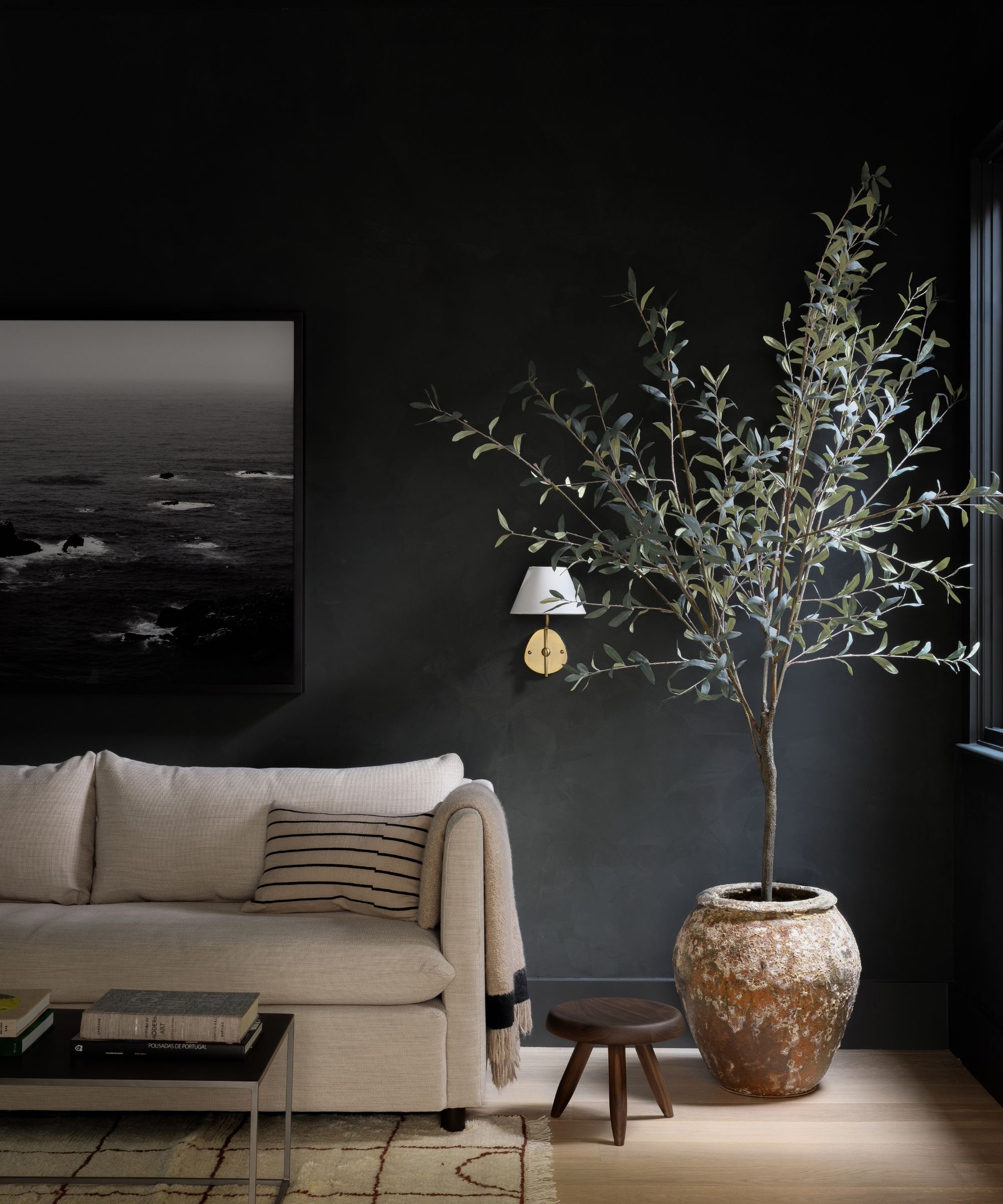
This inviting seating space is in the home office, where the textured dark green walls (Portola Paints Roman Clay in Lone Park) create a cozy, cocooning effect, all the while staying true to the home's minimalist spirit.
But how do you decorate with dark colors in a minimalist scheme? The secret is to keep furniture to the essentials, ensuring that it's classic and clean-lined, and sticking to the pared-back color palette of neutrals for soft furnishings. Meanwhile, the green plastered walls, the oversized plant, and the area rug soften the look and bring the room to life.
10. Hide clutter with smart storage, but make it beautiful
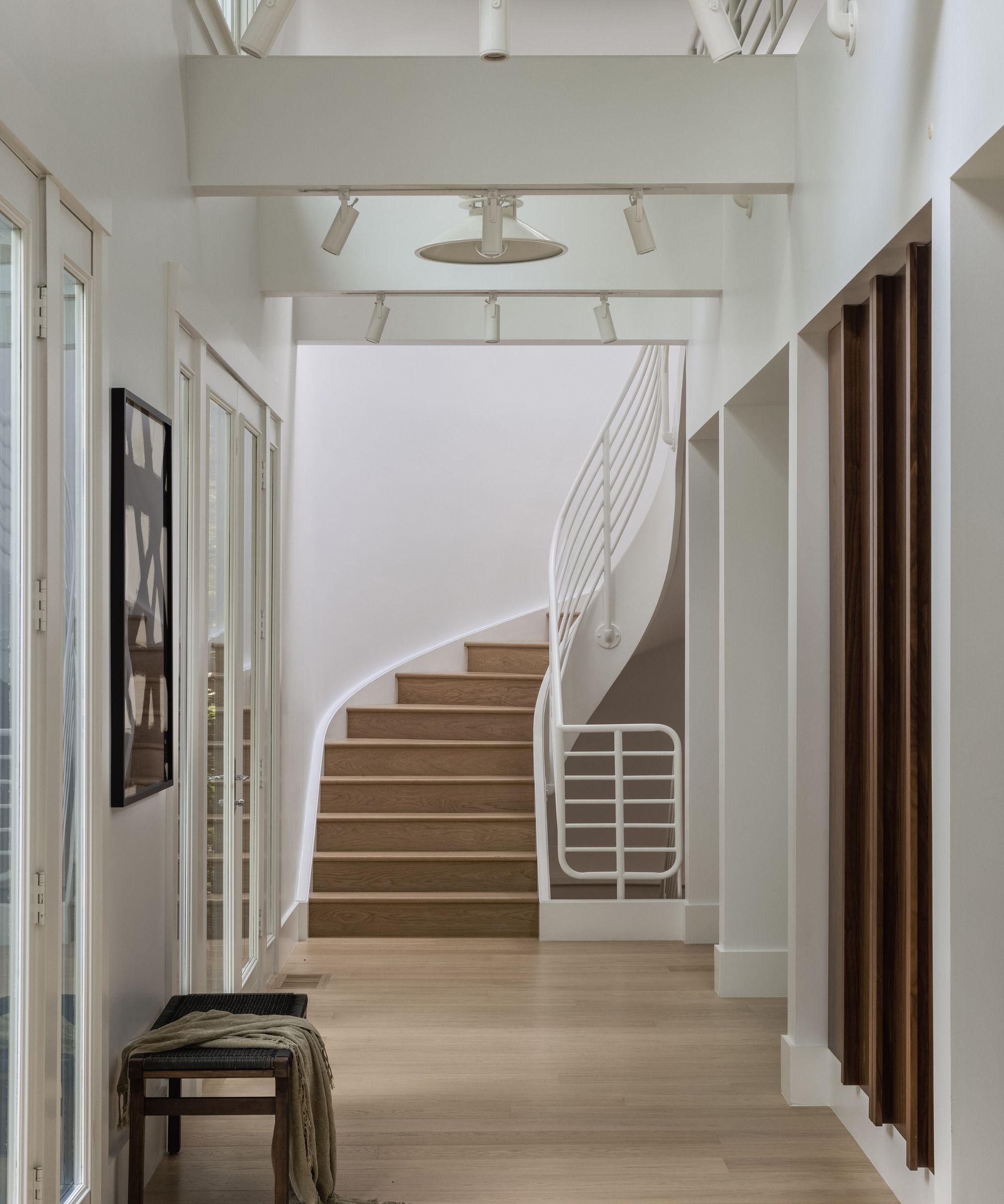
Designer Laura Hur explains how her quiet, unassuming hallway ideas fit in with her overall concept for the home. 'The client prioritized a minimal and clean home and hates clutter. The key to executing this aesthetic is ample storage space to keep rooms clutter-free,' she says. 'To achieve the warm and minimalist look and feel we designed lots of attractive and custom storage ideas and carried this language into the doors of the coat closet in the foyer, with integrated walnut handles. It is highly functional and very elegant.
'We all loved creating a moment in the hallway, in an area that could have easily been overlooked, by using the Soren Globe Light from Pinch paired with a rustic bench from Spartan Shop and a framed print from Block Shop Textiles. This simple moment is one of my favorites,' she adds.
11. Use luxurious upholstery and textiles to contrast with modern architecture
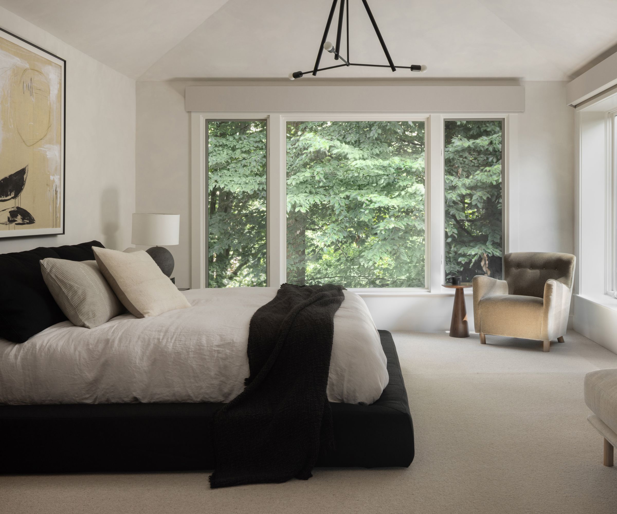
To soften some of the hard lines of the architecture all over the home the designer selected furniture with subtle curves and soft edges, such as the sofa and armchair in the living room.
For her bedroom ideas, with the same aim, Laura chose a fully upholstered bedframe. 'We selected textiles that are durable and will age beautifully. We used plenty of luxurious, soft textiles (velvets, boucle, linen, and more) and curves, which all play an important role in keeping the home from feeling too modern or cold.'
12. Understand the power of curves and textured finishes
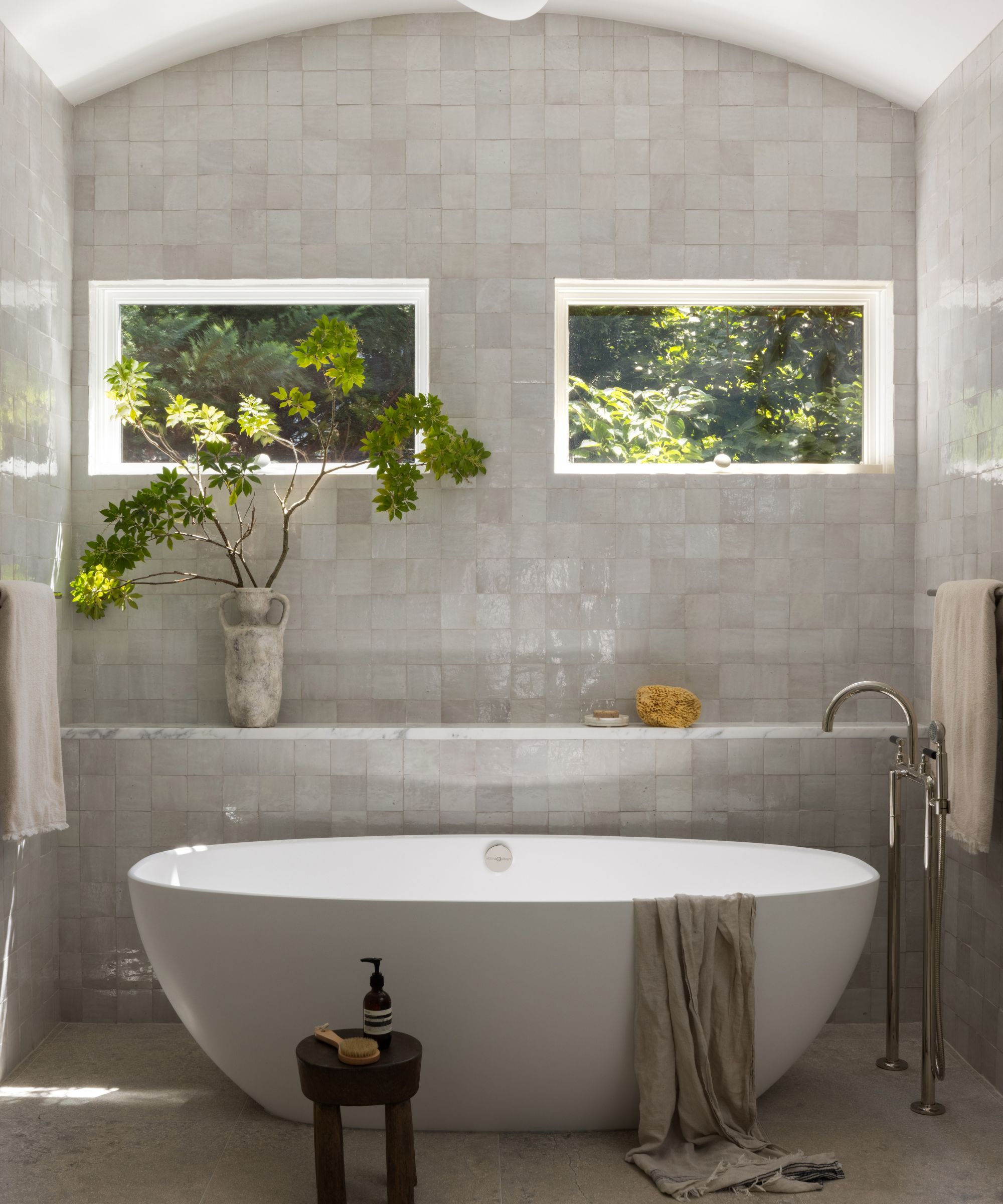
Continuing the curved theme into the bathroom ideas, see how the arched ceiling together with the curved tub from Victoria & Albert frame softens the space. There's another element at play here, however, and that's the careful selection of materials and finishes.
'Specifying handcrafted materials is another way we sought to counterbalance the modern elements of the home,' says designer Laura Hur. 'This can be seen in the zellige tiles and hand-applied clay lime finish on the walls here in the primary bathroom. Plastered walls are also used throughout the the home, and this subtle texture was a wonderful way to add a softness.'
Design: Laura Hur at Lorla Studio
Photography: Jenn Verrier
Styling: Courtney Favini
Karen sources beautiful homes to feature on the Homes & Gardens website. She loves visiting historic houses in particular and working with photographers to capture all shapes and sizes of properties. Karen began her career as a sub-editor at Hi-Fi News and Record Review magazine. Her move to women’s magazines came soon after, in the shape of Living magazine, which covered cookery, fashion, beauty, homes and gardening. From Living Karen moved to Ideal Home magazine, where as deputy chief sub, then chief sub, she started to really take an interest in properties, architecture, interior design and gardening.
