Designers say these are 5 of the most difficult paint colors to decorate with – here's how to make them work
Here's how to embrace typically daunting paint colors in a stylish way

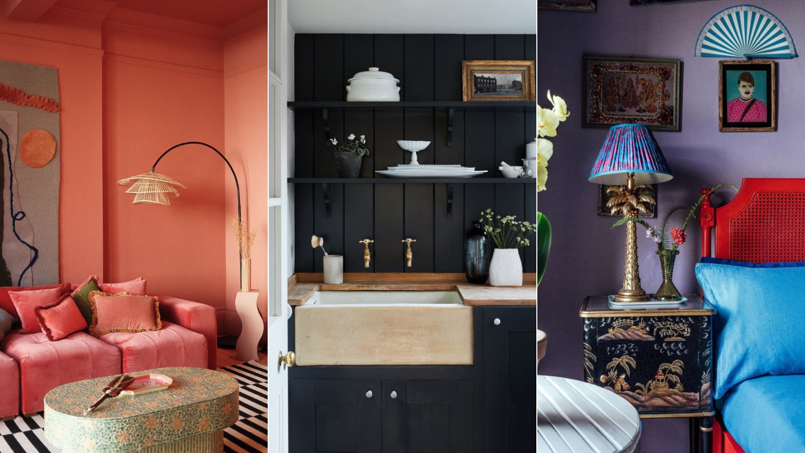
When it comes to choosing the right colors for your home, certain colors can feel more daunting than others. For some, it's saturated warm tones that often feel intense; for others, it's dark and moody hues that can risk overwhelming a space.
Generally speaking, designers agree that certain paint colors are, across the board, more difficult to decorate with than others and require a bit more consideration to ensure they work effectively throughout room color ideas.
To learn all about these typically difficult paint colors, we enlisted the expertise of color specialists and interior designers.
What are the most difficult paint colors to decorate with?
Below, we share five of the trickiest paint ideas and expert advice on how to make them work. By following these tips, these colors can actually be some of the most effective throughout the home, creating bold spaces that make a statement.
1. Black
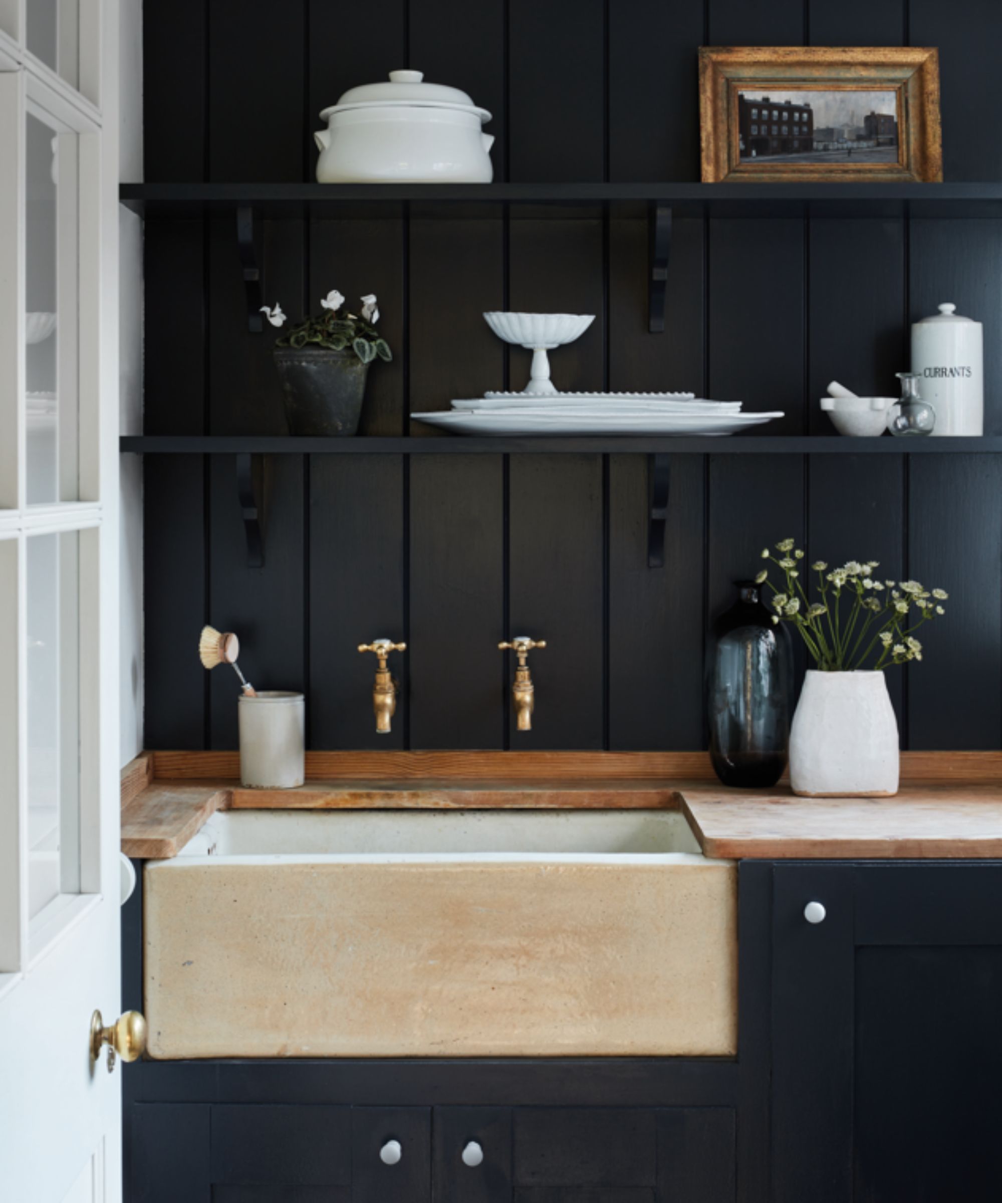
'For many of us, black can feel like an intimidating color to use in interior decoration, but by veering slightly away from pure black (still elegant) and using more nuanced blacks, you can create rooms of great beauty and drama,' explains Farrow & Ball brand ambassador Patrick O'Donnell.
One of Farrow & Ball's most popular paint colors, Patrick recommends using Railings in place of true black to create a softer look when decorating with black.
'Our perennial favorite, Railings, creates a great backdrop to many a living space. Your artwork will register with renewed clarity, you will feel cocooned when bathed in ambient lighting at night and colors will pop against it (think chartreuse yellow or bright emerald sofas in velvet or wool).
Design expertise in your inbox – from inspiring decorating ideas and beautiful celebrity homes to practical gardening advice and shopping round-ups.
'For woodwork, pull out the nuanced blue in Railings by teaming it with Borrowed Light.'
2. Purple
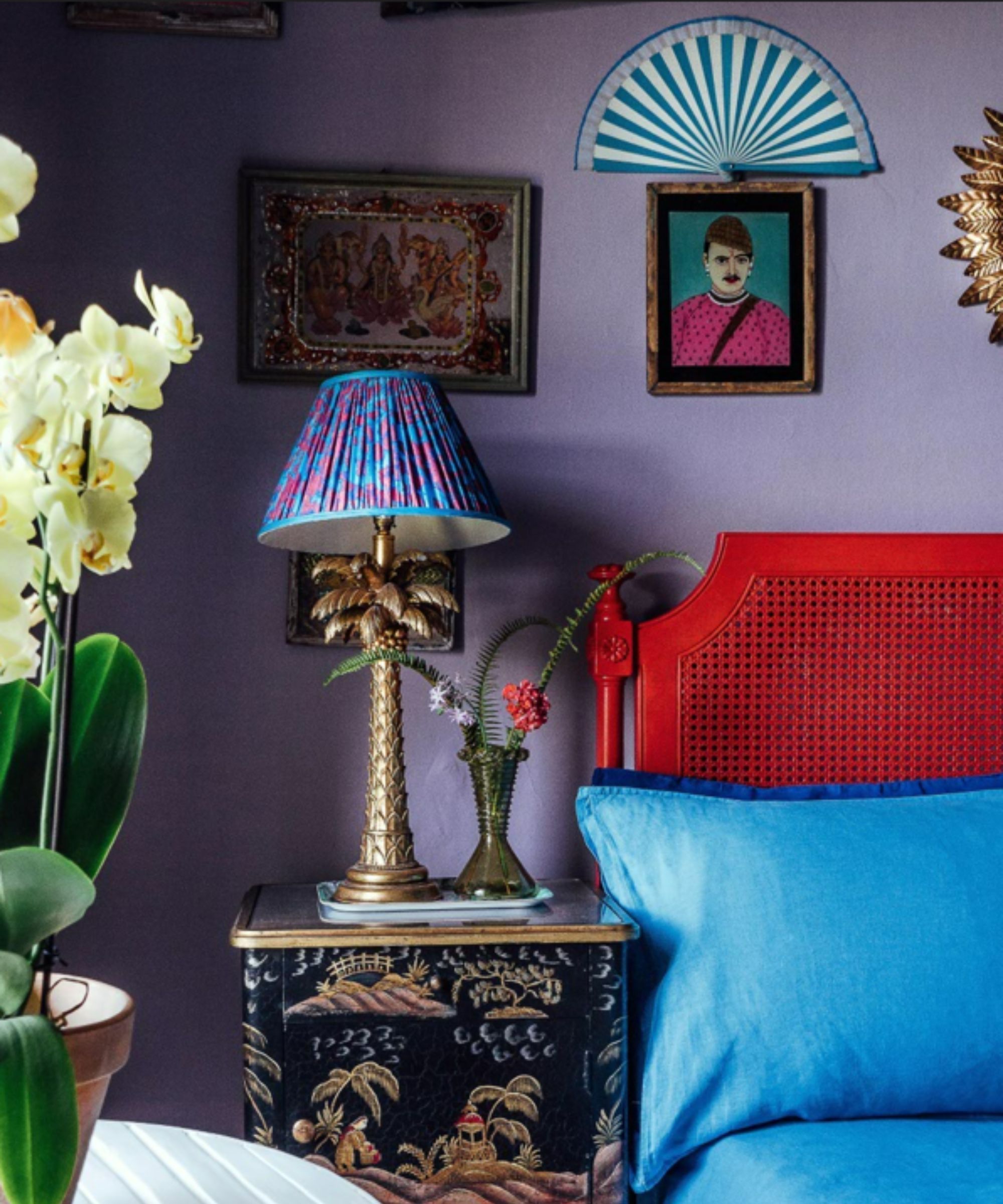
Interior designer Matthew Williamson suggests purple as one of the trickiest colors to incorporate into interior schemes since it can often be incredibly intense when used in large quantities.
'I’ve always found purple to be one of the most challenging colors to integrate into an interior scheme,' explains Matthew. 'Its deep, intense tone for some reason feels heavy with an almost somber quality, but I can still see its merits.'
When decorating with purple, the designer advises using it as an accent color in a room rather than a dominant color. 'Rich and evocative, it sets the mood for a dark and moody interior. My advice is to use purple sparingly – perhaps painting a standalone piece of furniture such as a chest of drawers.'
'That said, my old bedroom was painted in a soft shade of lavender paint – I wanted to see if it might have the allure that pink and green have for me. The color ended up working really well in the space and creating a more dramatic backdrop.'
3. Orange
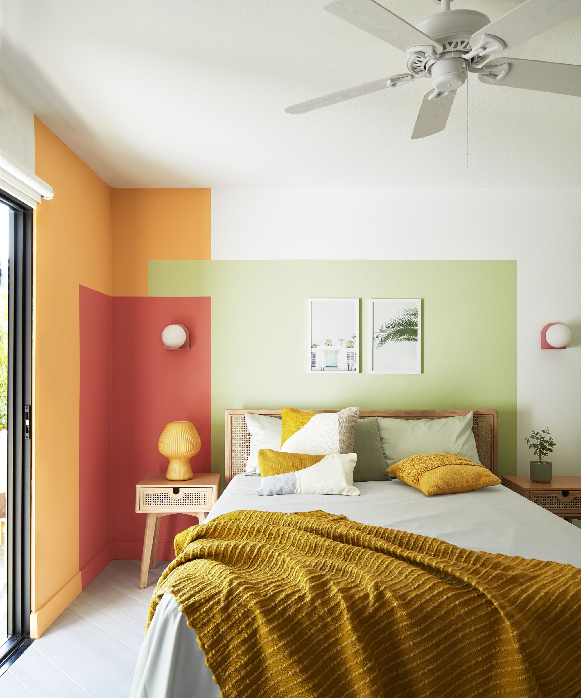
'Although initially daunting, decorating with orange offers a wonderful opportunity to bring a sense of warmth and comfort to a space, whilst naturally lifting the mood,' says Helen Shaw, Director of Color Marketing at Benjamin Moore.
'Depending on the shade used, it can completely transform the atmosphere. Opting for a deeper hue accentuates white woodwork creating a calming, sunset mood – ideal for spaces you go to relax such as a bedroom or living room.'
If you're drawn to brighter orange tones, doing so through smaller accents can ensure a liveable look whilst still having an energizing impact. 'Consider where you can add pops of this bright color to your scheme through furniture and accessories such as painting kitchen stools or dining chairs – these small bursts will exude both calming and energizing effects.'
4. Red
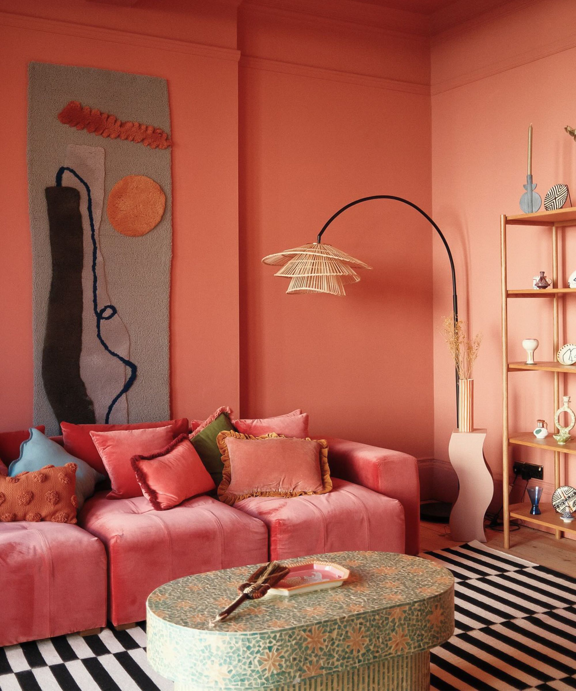
Decorating with red is one of the boldest colors, so it's not unusual to find it daunting to bring this saturated hue into interior schemes.
'People typically find bolder, warm colors quite daunting to use within their interiors,' says Tash Bradley, Director of Interior Design at Lick and Color Psychologist.
'A poppy red, such as Lick Red 02, although initially intimidating, can be beautifully effective when you consider the overall tone of your scheme and how you will dress the room with complementary textiles, decor, hardware, and tiles.'
Additionally, Tash recommends using red more sparingly by turning to color theory to ensure it doesn't overpower a room. 'Adhering to the 60-30-10 rule can simplify the process. In this method, 60% of the room should be in a dominant less saturated base color; 30% in a secondary, punchier color; and 10% in an accent color that adds excitement, contrast, and zing.'
5. Dark jewel tones
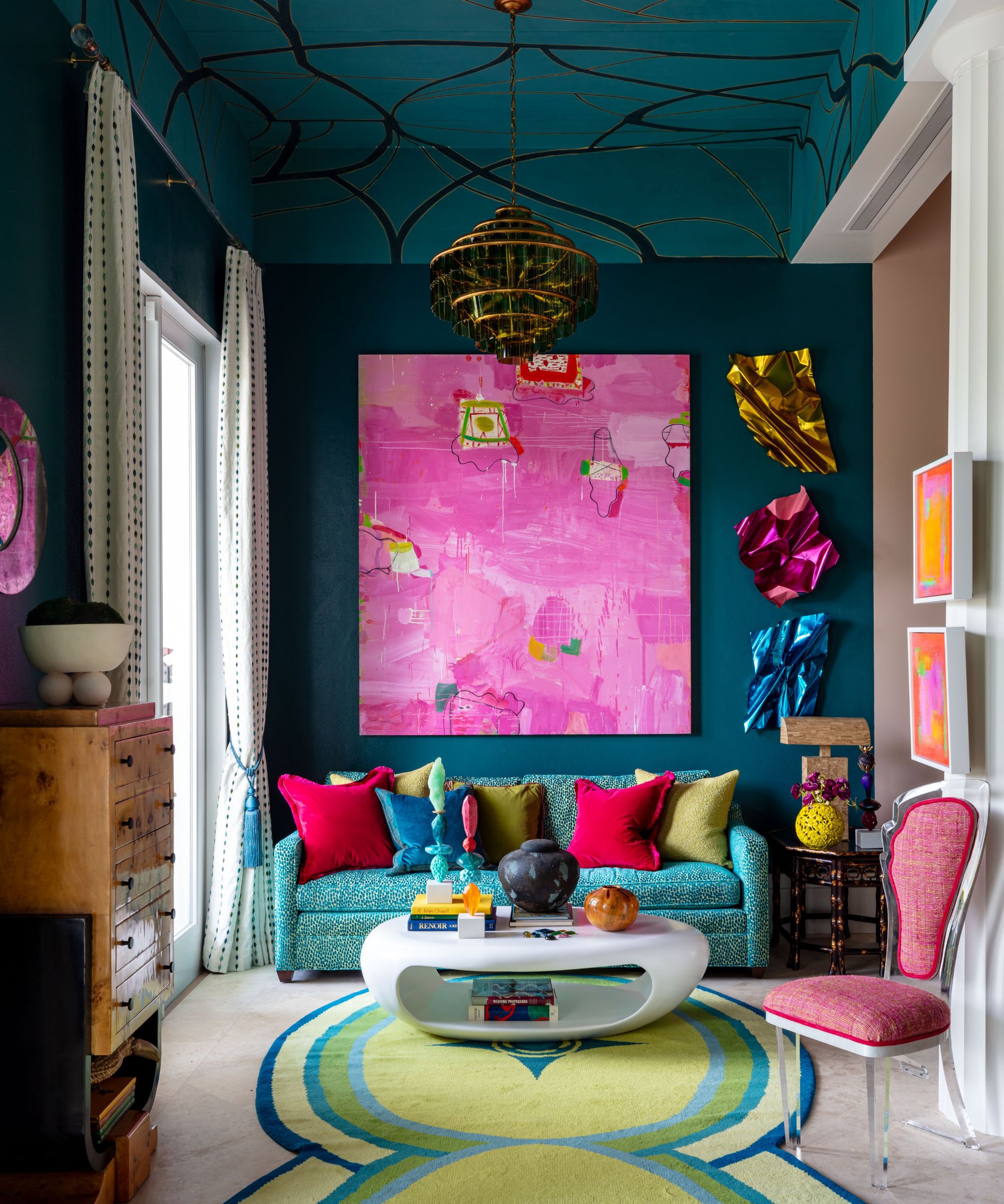
Decorating with jewel tones often seems like a bold move, but if sophisticated and dramatic is the goal, these dark tones are a winner.
Interior designer Kristina Khersonsky of STUDIO KEETA says that the best way to incorporate these colors is to fully commit, drenching a room in dark jewel tones.
'Sometimes the color choices that have the biggest impact on a space can take the most commitment and faith,' explains Kristina. 'One thing to consider with a deep, jewel tone is that you can’t go halfway. Single accent walls are long gone and create too much contrast next to a white wall, and more often than not, can even look unfinished.'
'If you’re going for a darker color – go all in with color drenching. Don’t forget the ceiling either, as this will make all the difference in letting the color show you its true potential.'
In this maximalist living space designed by Nadia Watts Interior Design, you can see just how effective dark jewel tones are when used in large quantities, creating an opulent and dramatic look.
Although initially daunting, these bold colors can add endless appeal to your home – whether you fully drench a room with dark hues or use saturated tones as smaller accents.

Emily is a freelance interior design writer based in Scotland. Prior to going freelance in the spring of 2025, Emily was Homes & Gardens’ Paint & Color Editor, covering all things color across interiors and home decor for the Homes & Gardens website. Having gained specific expertise in this area, Emily is well-versed in writing about the latest color trends and is passionate about helping homeowners understand the importance of color psychology in home design. Her own interior design style reflects the simplicity of mid-century design and she loves sourcing vintage furniture finds for her tenement flat.
