Bathroom color ideas – 17 shades to try to bring calm and character into your space
Bathroom color ideas are no longer all about the neutrals, 2025 is the year for being bolder in these spaces

Hebe Hatton
- 1. Embrace a dark and dramatic bathroom color scheme
- 2. Bring in color and texture with bathroom tiles
- 3. Choose a classic blue and white scheme
- 4. Mix blues and grees with warmer shades
- 5. Use the same color on walls and ceiling
- 6. Spark joy with a modern orange
- 7. Use colorful fabrics to soften the space
- 8. Drench on the color
- 9. Introduce a playful spirit
- 10. Use the color wheel to pick soothing bathroom colors
- 11. Future-proof with a tonal neutral scheme
- 12. Use the 7-2-1 ratio
- 13. Contrast dark colors with warm accents
- 14. Use two patterns in the same color
- 15. Introduce one strong shot of color
- 16. Pick a warm blue bathroom color
- 17. Don't forget you can add color with the floors
- What is the best color for a bathroom?
- What colors are best for a small bathroom?
- What is the most relaxing color for a bathroom?
- Which bathroom paint colors going out of style in 2025?
Design expertise in your inbox – from inspiring decorating ideas and beautiful celebrity homes to practical gardening advice and shopping round-ups.
You are now subscribed
Your newsletter sign-up was successful
Want to add more newsletters?
For a long time, bathroom color ideas have been dominated by neutrals. The fact that so many bathroom fixtures are white, or some variation on white, has meant that those colors have often been the go-to.
And while there is absolutely nothing wrong with an all-white bathroom, we are seeing a shift towards being more playful with color in these once very practical (often clinical) spaces.
A good bathroom color scheme is essential for creating the look, feel, and design you want in your bathroom or shower room. And you can use everything from tiles to sanitaryware to accessories to create a unique look.
Article continues belowAdding a bright and beautiful hue to your bathroom will really lift your whole home, bringing this functional space into line with the rest of your decor. The good news is that there are so many bathroom ideas and colors to choose from.
17 bathroom color ideas to inspire a change in scheme
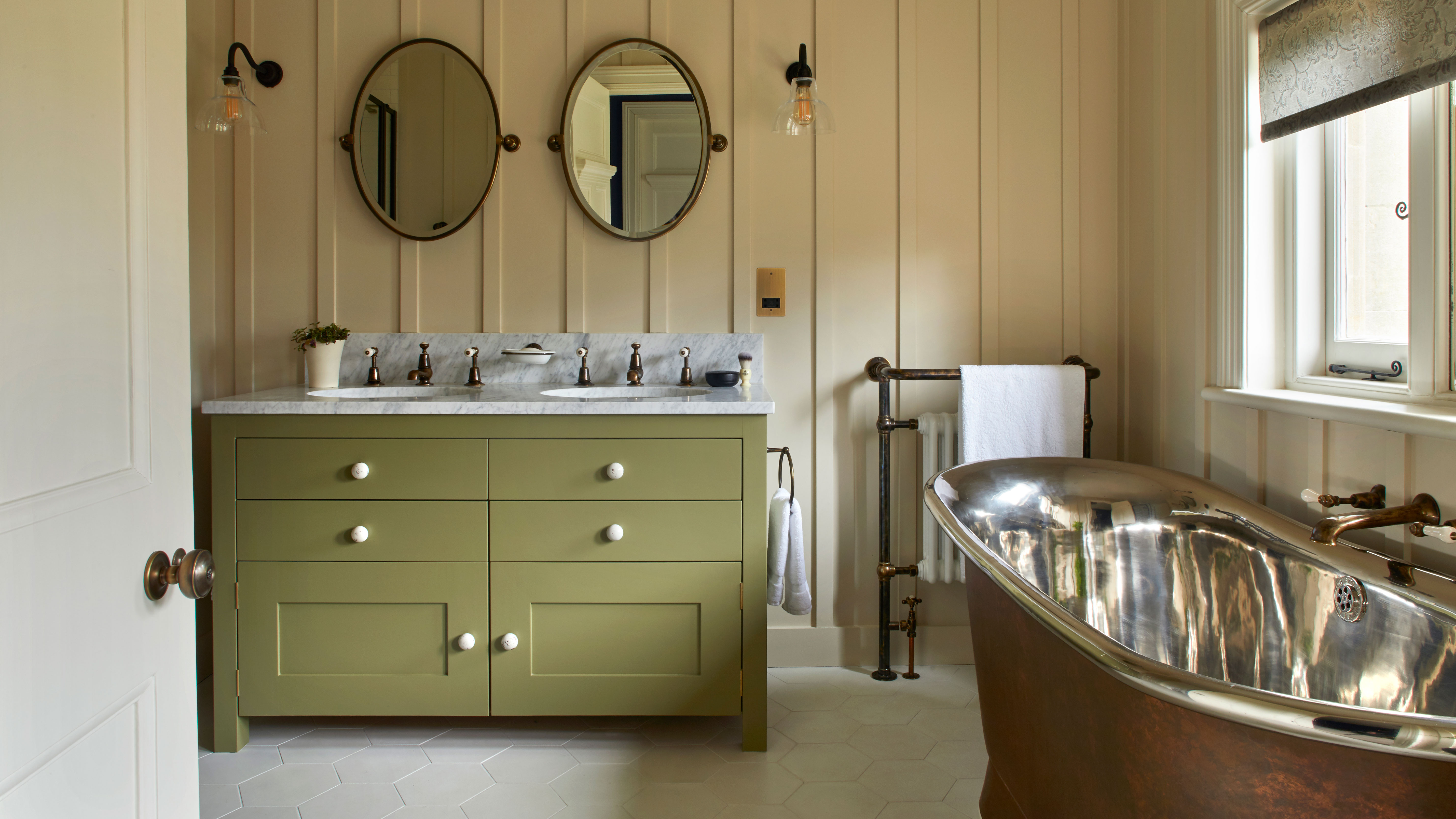
Don't ignore colorful bathroom ideas when you remodel – they can utterly transform a space. Using bold wall treatments, vibrant sanitaryware, bright flooring and brilliant accessories, we show you how to use room color ideas to refresh your bathroom.
1. Embrace a dark and dramatic bathroom color scheme
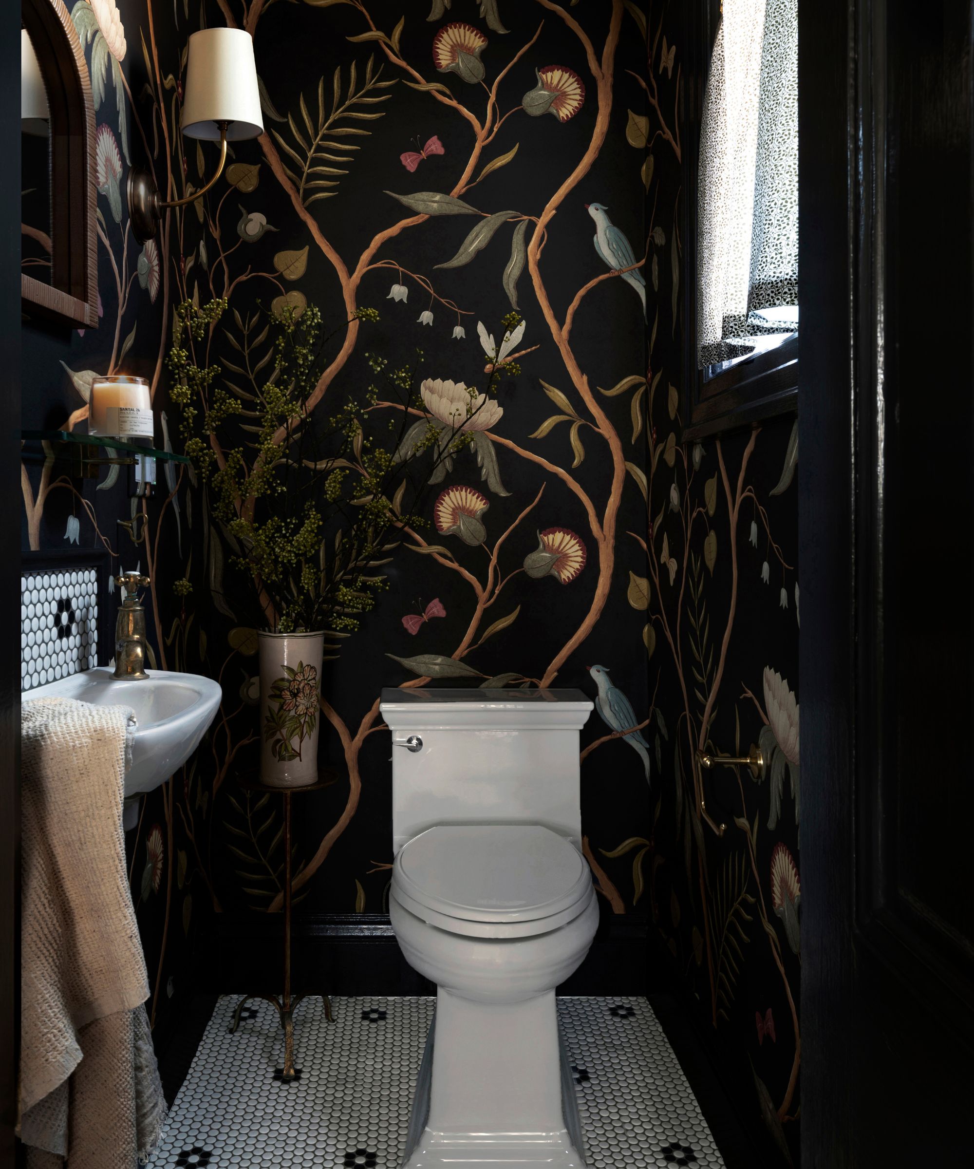
Bathrooms, although very high-traffic areas, they aren't necessarily very lived-in. By that we mean, unlike a living room or bedroom, you don't spend long periods of time in these spaces. That means you can be bolder with your color choices. Bathrooms are the perfect place to be more experimental.
In this small bathroom, going for a dark and dramatic color scheme really made sense. As McKenzy Golding, Principal Designer at Goldenbird Design explains, 'We always build our designs from an understanding of the natural environment. If your space is naturally small and dark, don't be afraid to lean into that. This powder bath really lacked natural light, and so we decided to build within that context. It also had high ceilings, so we specified a sweeping botanical paper that envelopes the space and paired it with a high gloss trim.'
Design expertise in your inbox – from inspiring decorating ideas and beautiful celebrity homes to practical gardening advice and shopping round-ups.
2. Bring in color and texture with bathroom tiles
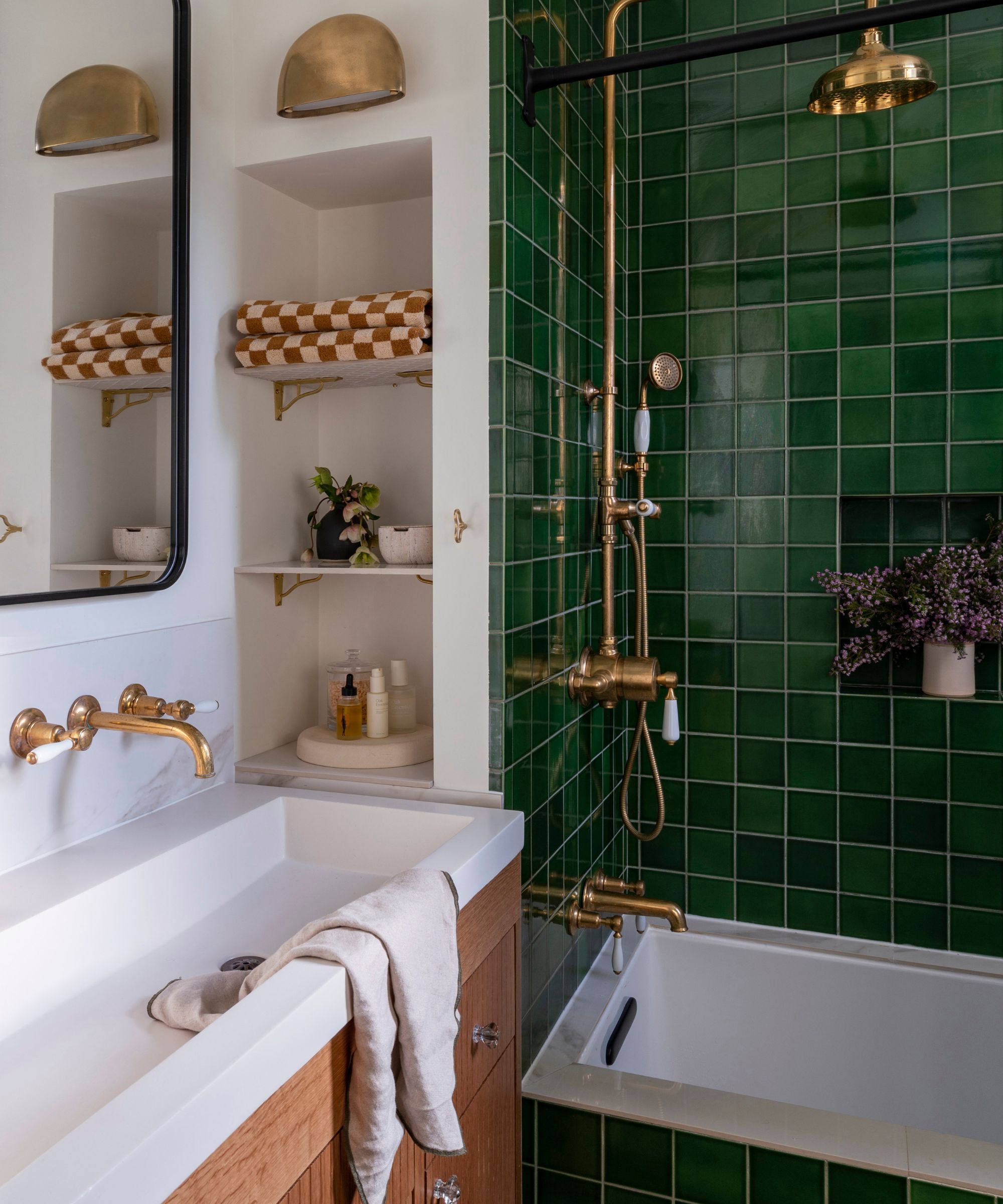
'Bright bathroom tiles with deep glazes – in various patterns and combinations – have such an impact on a space that feels highly elevated and highly personal,' says McKenzy. 'This Heath Ceramics jade glaze has such a depth to it that carries you throughout the day. It can feel vibrant and energizing in the morning sun, and dark and grounding into the evening.'
'We loved this glaze so much that we looked for ways to infuse the tile in more of the bathroom. We carried the tiles onto the tub apron and onto the back wall of the bathroom, creating an accent tile wall that reflected in the vanity mirror and that also infused a bit of a “wet room” vibe to the small space. It’s a surprising detail, and really creates such an enveloping feel.'
3. Choose a classic blue and white scheme
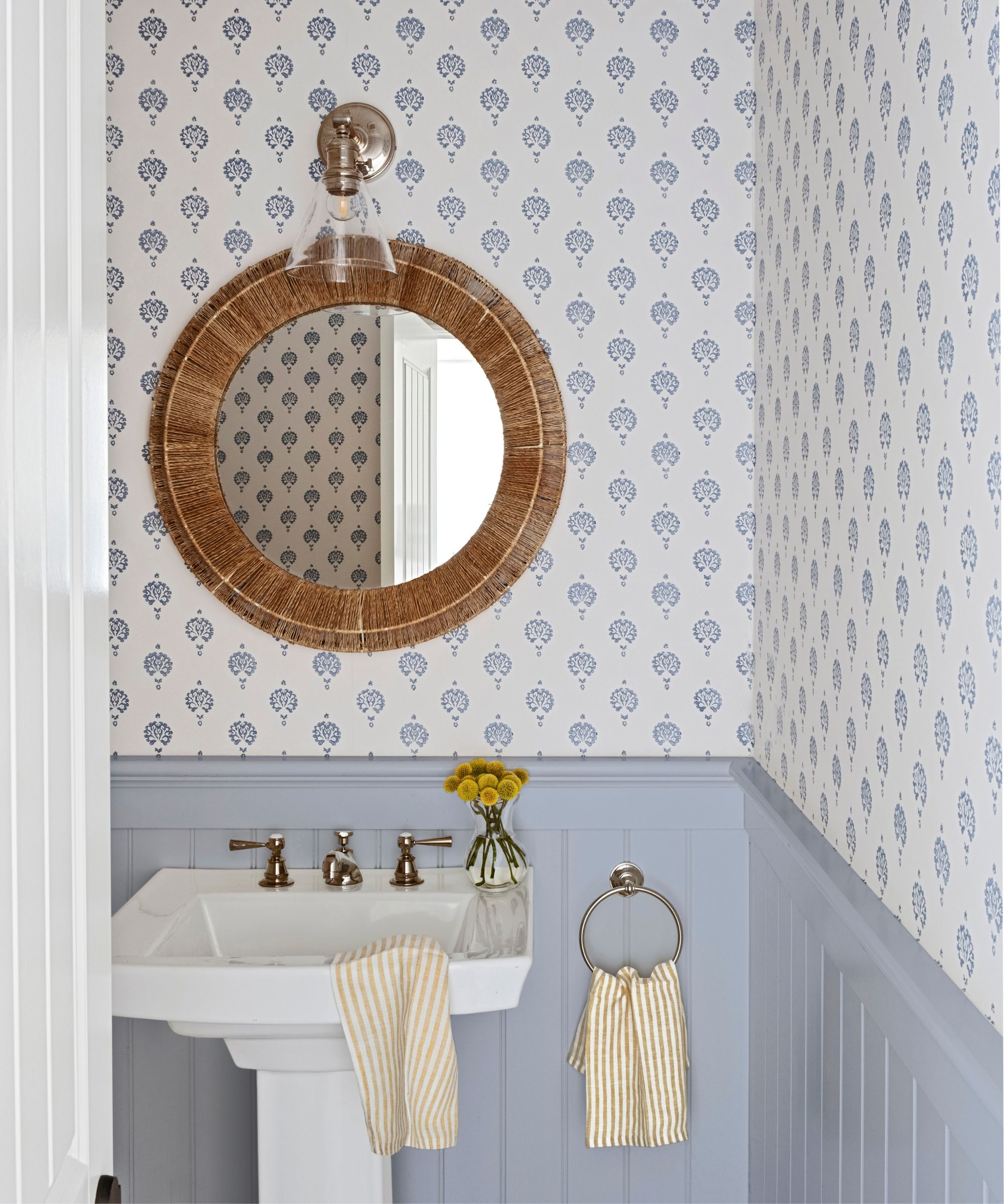
'I'm a big fan of keeping it classic when it comes to bathroom color schemes. You really can't go wrong with a warm white paired with a cool tone like navy blue, turquoise, Prussian blue, or sage. The cool colors, alongside a warmer neutral, pair nicely to create a serene and spa-like atmosphere,' explains designer Kathy Kuo.
It might sound like a cliché pairing in a bathroom, but as Kathy points out just changing that white so it's slightly warmer takes it from a cold combination to a really inviting one that can just subtly nod to a rustic coastal feel while still feeling chic and timeless.
4. Mix blues and grees with warmer shades
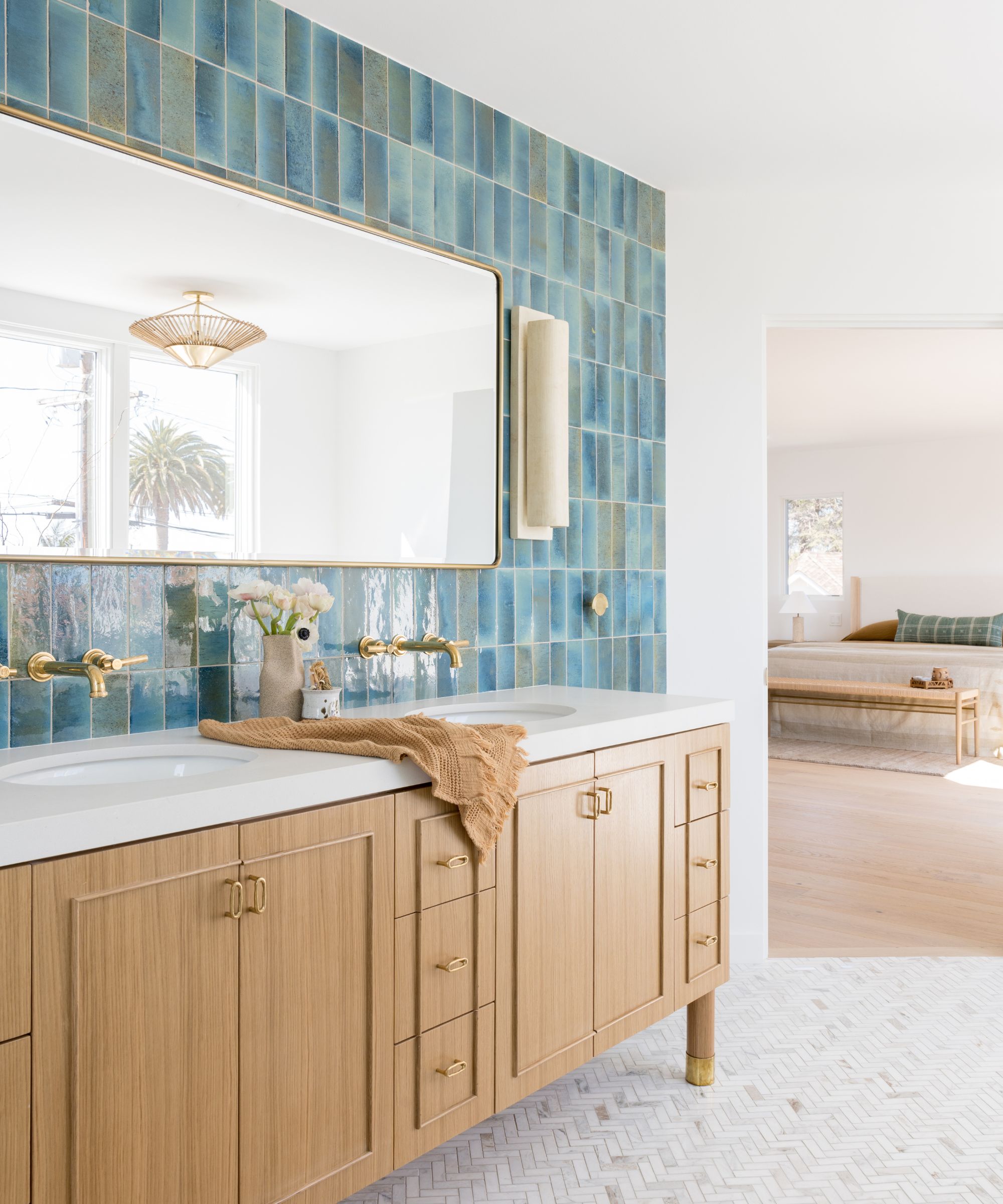
This bathroom color scheme by Lizzie Green proves that blues and greens needn't always feel like cooler colors. Picking tiles over, say, paint allows for texture, so rather than a flat shade, you can find designs that have different tones running through them which can really warm up the colors. See the tints of a more earthy brown shade within the blue tiles?
Pairing these colors with plenty of warm, wooden finishes helps to balance the coolers too, and ensures a blue bathroom color scheme always feels welcoming as well as calming.
5. Use the same color on walls and ceiling
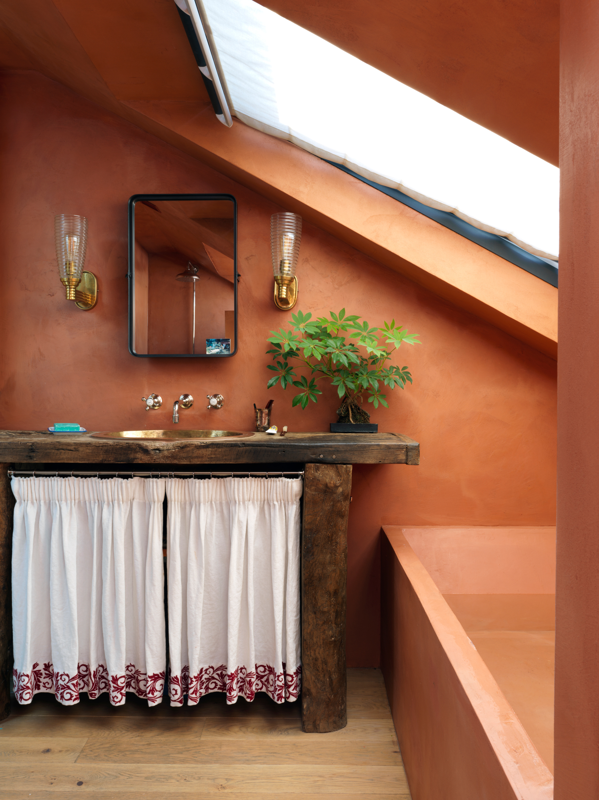
In this main ensuite by interior designer Beata Heuman, carrying the same color tones over the fifth wall and other surfaces helps to blur out awkward angles and sloped ceiling lines.
‘All the walls and the bath are clad in Béton Ciré, which is a micro concrete paste and totally waterproof,’ explains Beata. ‘The idea here was to make the space feel warm and earthy, unlike most bathrooms. The wooden floor continues in from the bedroom, which connects the suite of rooms and also makes it feel more spacious.’
6. Spark joy with a modern orange
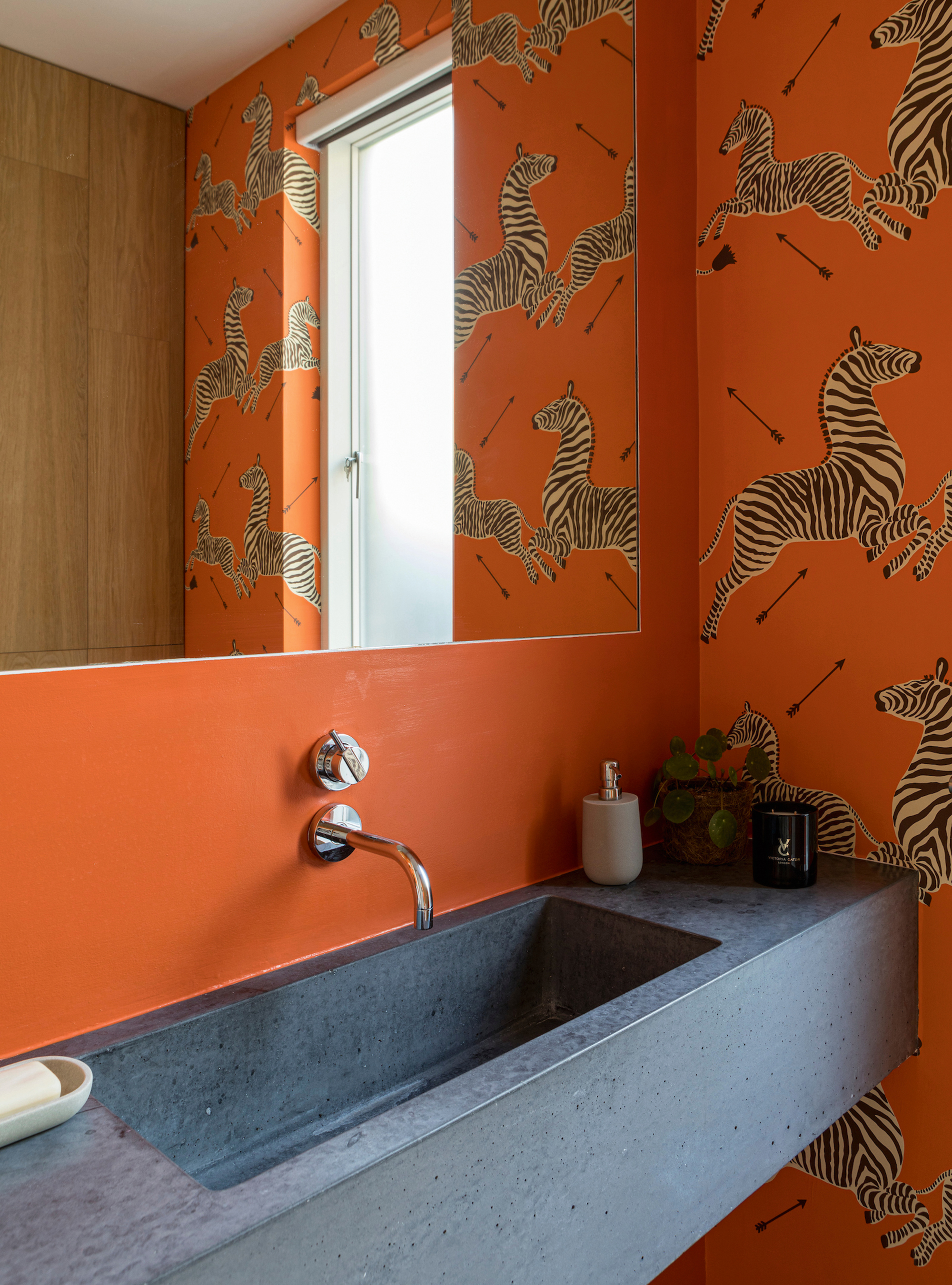
Decorating with orange is a joyful way to add vibrancy and optimism to a small bathroom or powder room. ‘It brings warmth and uplifting energy, whether you use it on a whole wall with paint or wallpaper, or bring in pops of orange throughout,' says Emma Deterding, founder and creative director, Kelling Designs. 'I often pair orange with teals and pinks as they work effortlessly together.’
‘Wallpapering is a great way to stop bathrooms from feeling too sterile and just perfect for creating truly happy spaces, which I believe every bathroom should be,’ adds Nicola Harding, owner of Nicola Harding & Co. ‘Installing half-height paneling helps protect wallpaper from the danger zone, where water is most likely to splash, while also providing another opportunity to add cheerful colors.’
7. Use colorful fabrics to soften the space
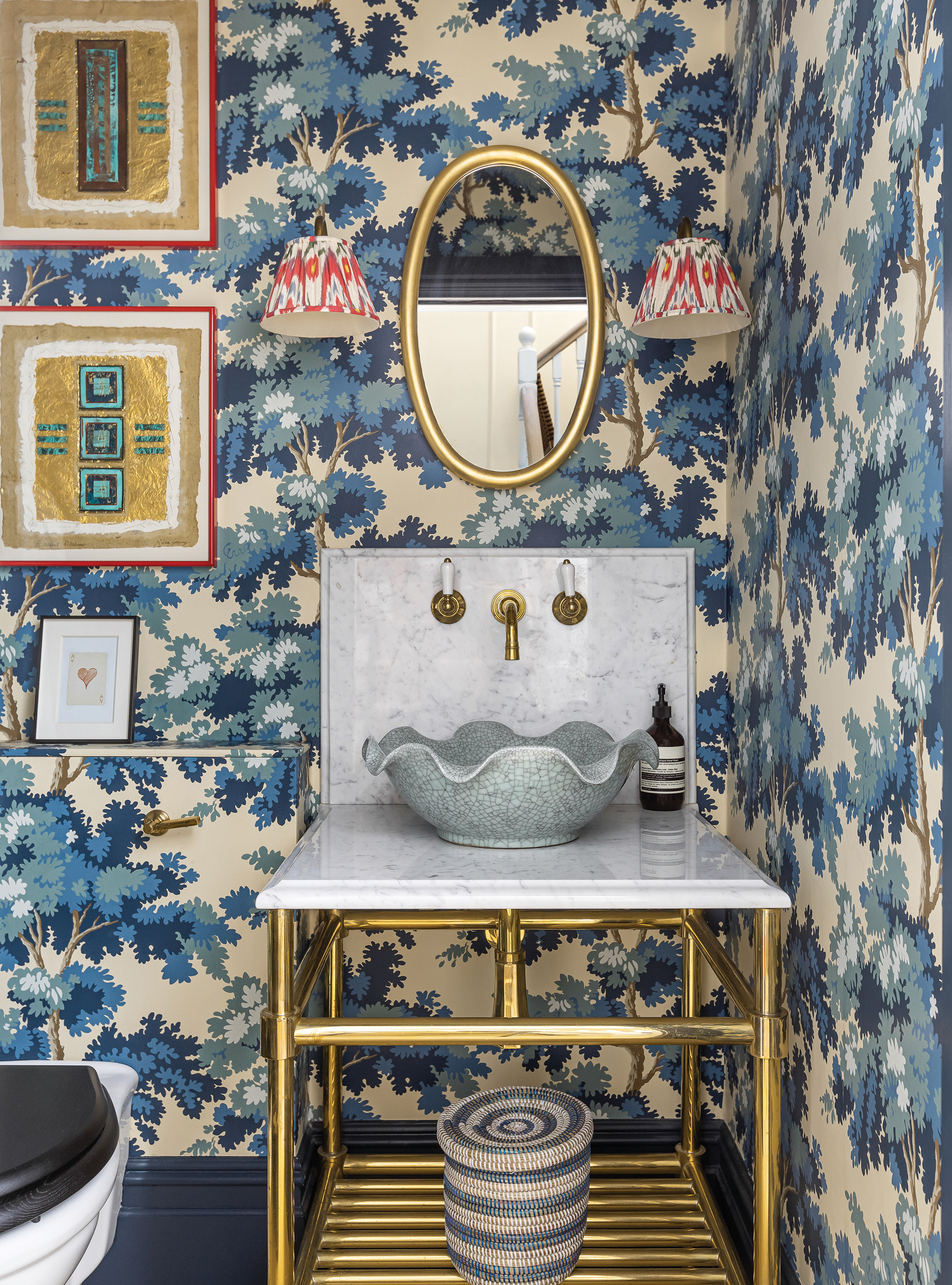
Some great fabric on a bathroom vanity or bathroom window treatment can also be used to stop a bathroom from feeling sterile. A skirt below a basin might seem granny-ish, but the right choice of fabric, such as a block print in a joyful color that contrasts with the wall tiles, can make it fun.
If it is a tiny bathroom with the potential for steam build-up, you might want to consider a washable or outdoor performance fabric. Most luxury brands make lovely papers in vinyl quality, which are ideal for bathrooms as they won’t peel. Another option is to paint clear varnish over the wallpaper to prevent peeling.
8. Drench on the color
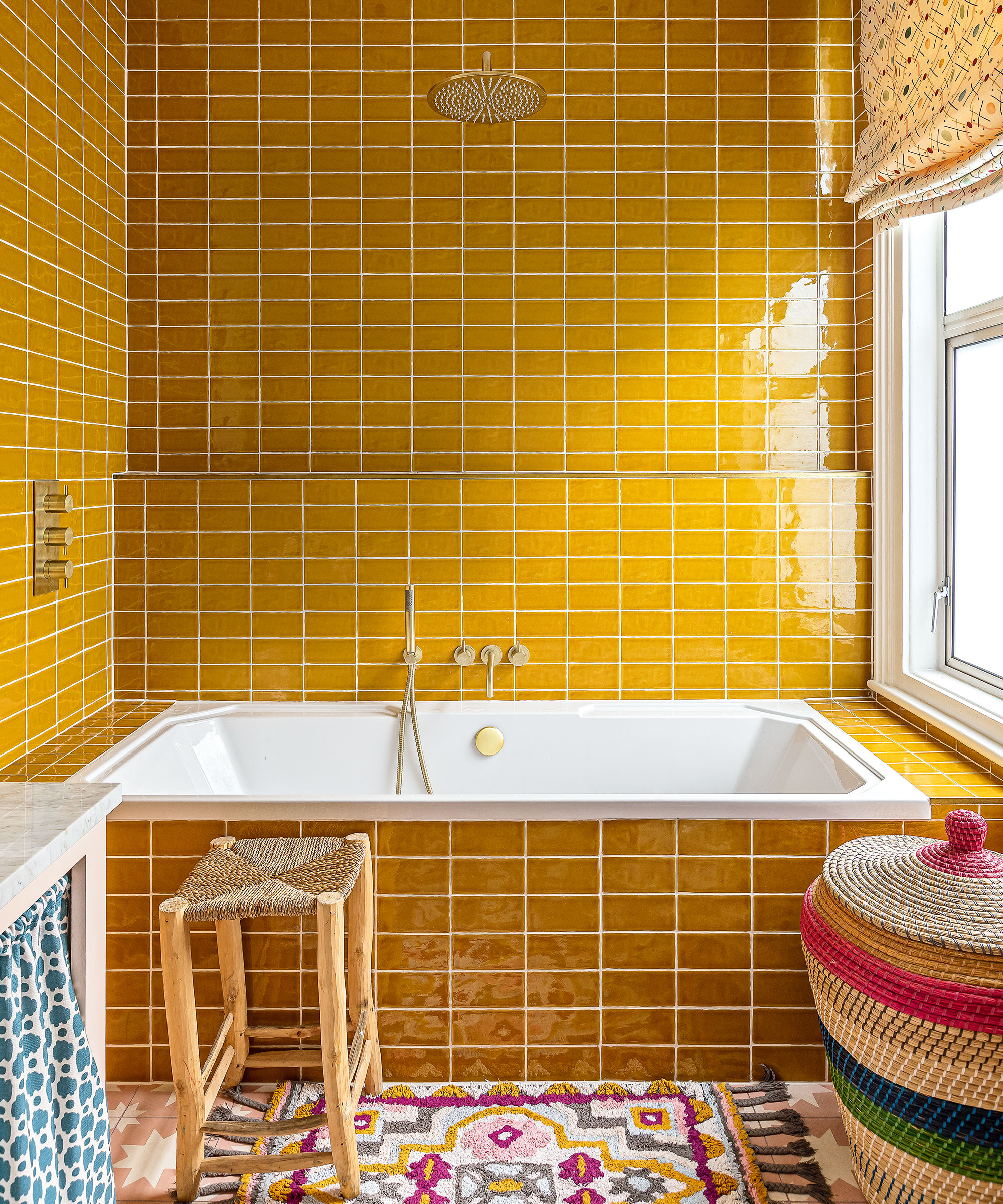
‘We always recommend being adventurous when it comes to color in bathrooms, as secondary spaces, they’re a great place to experiment,’ says Lucy Barlow, creative director, Barlow & Barlow.
‘The color drenching trend is a brilliantly bold technique that can really enhance a smaller room. We went for mustard and pink in this family bathroom because it’s appropriate for a child’s space without being too sickly for any adults who use it as well.’
9. Introduce a playful spirit
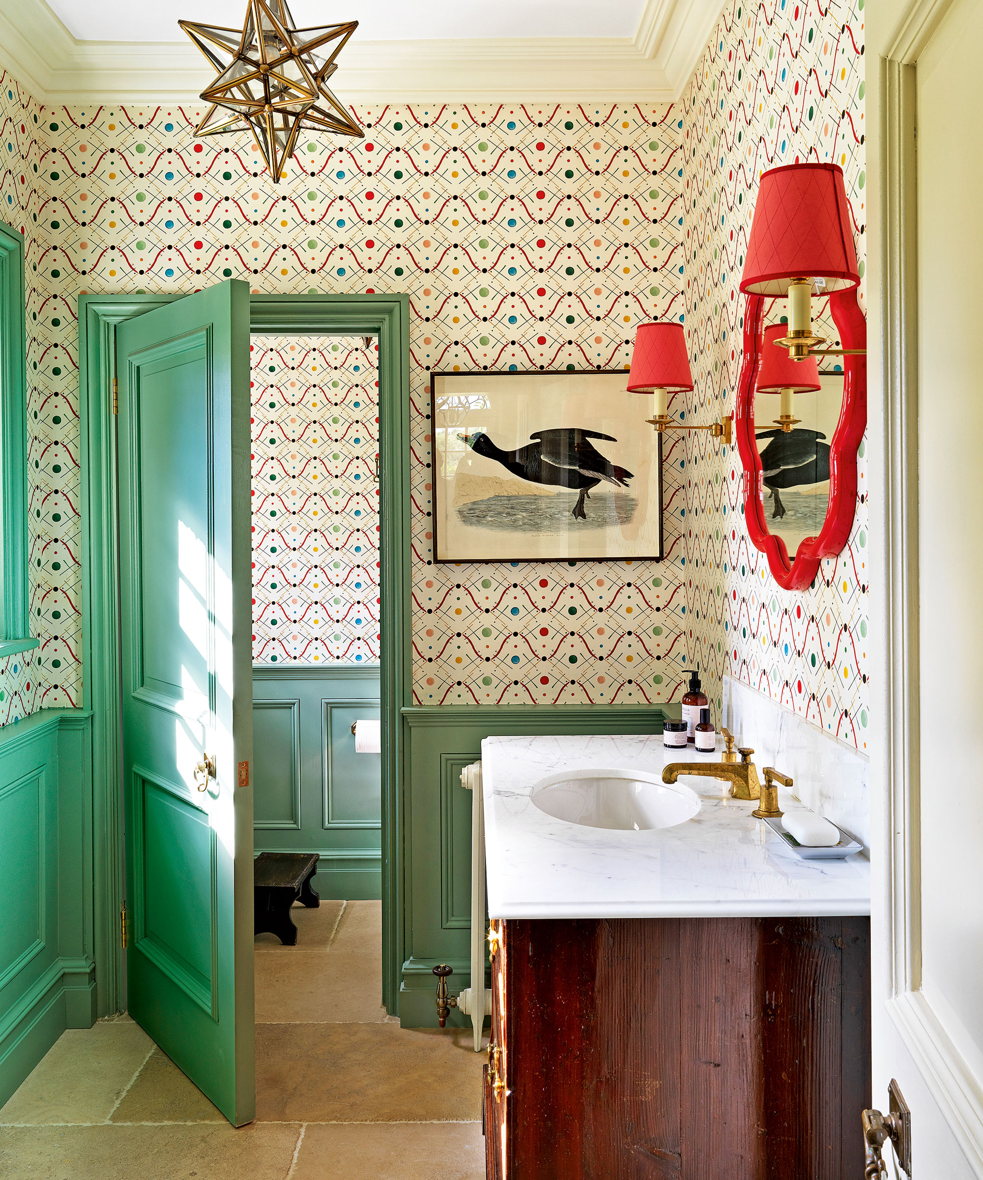
In this boldly colored bathroom in the home of Aurelia Skincare founder Claire Vero, Salvesen Graham has expertly worked color and pattern.
‘Picking up a color tone in the bathroom wallpaper on the paneling and woodwork is a lovely way to introduce a further element of decoration to a scheme,’ says co-founder Mary Graham. ‘For practical reasons, paneling can also provide additional resistance to everyday wear without diluting the bathroom wallpaper's power to impress.’
10. Use the color wheel to pick soothing bathroom colors
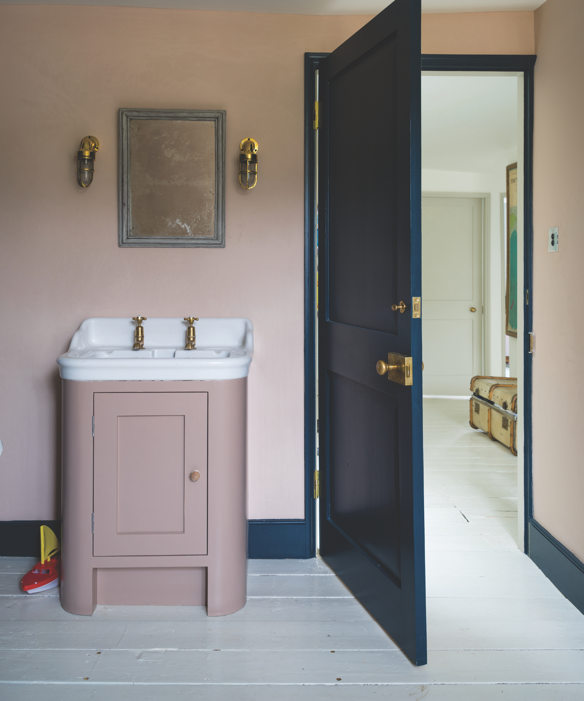
Pairing colors in bathrooms can be tricky because space is often limited, and so color clashes are highlighted. Take advantage of the color wheel to make things easier. The wheel lets you see at a glance how colors relate to each other visually and has been used in design for generations.
Opposite colors – say red and green – are complementary, whilst those next to each other – like green and blue – blend. Play around till you find your perfect combination.
11. Future-proof with a tonal neutral scheme
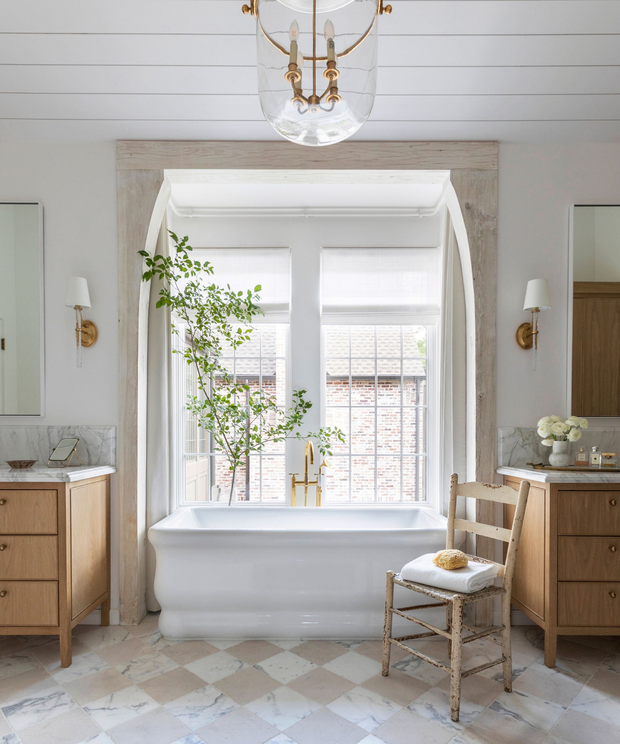
Decorating with neutrals in a bathroom is a classic for a reason. They allow colors to inspire feelings of calm and serenity. But they do need breaking up; you can do this by mixing two different neutrals together. Go one shade darker – gray and white, or beige and brown.
This is a great way to future-proof your bathroom too, as double-neutrals will never go out of style. For a balanced look, paint two-thirds of the room the lighter neutral shade and the remaining third the darker.
12. Use the 7-2-1 ratio
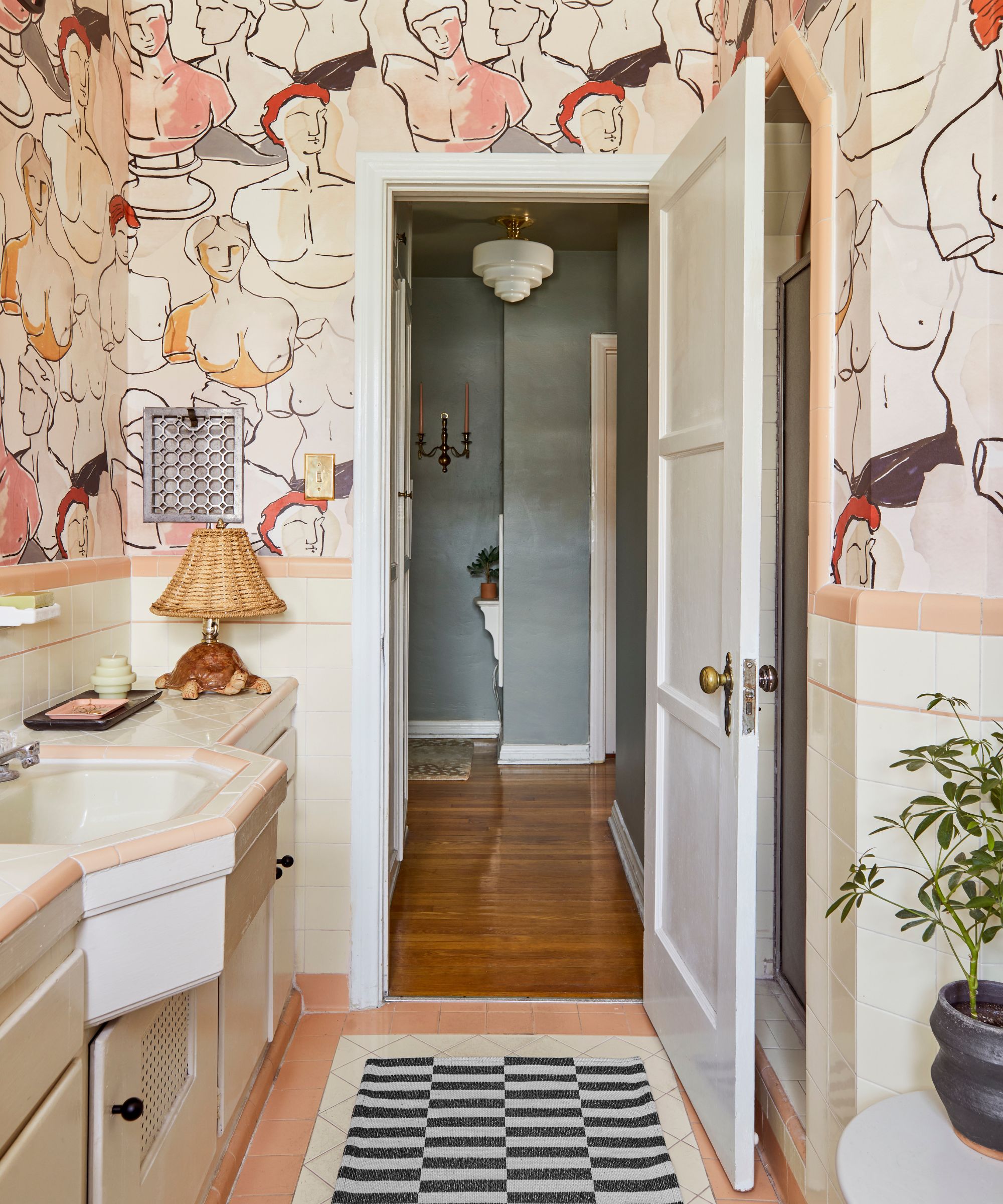
If you want to add a splash of color to your bathroom but you’re not sure how far to go, choose three shades – one neutral, one colorful but light, and one bold. Then, divide these across the space with a ratio of 7-2-1.
So seven-tenths of the room should be neutral, two-tenths lighter, and colorful - leaving the final tenth bold. This will add color to the space in a non-domineering and balanced way.
Find three colors that conventionally go together, like white, gray, and light green, and swap out one of the colors for a bolder version – lime green, to create a striking 7-2-1 bathroom color scheme.
13. Contrast dark colors with warm accents
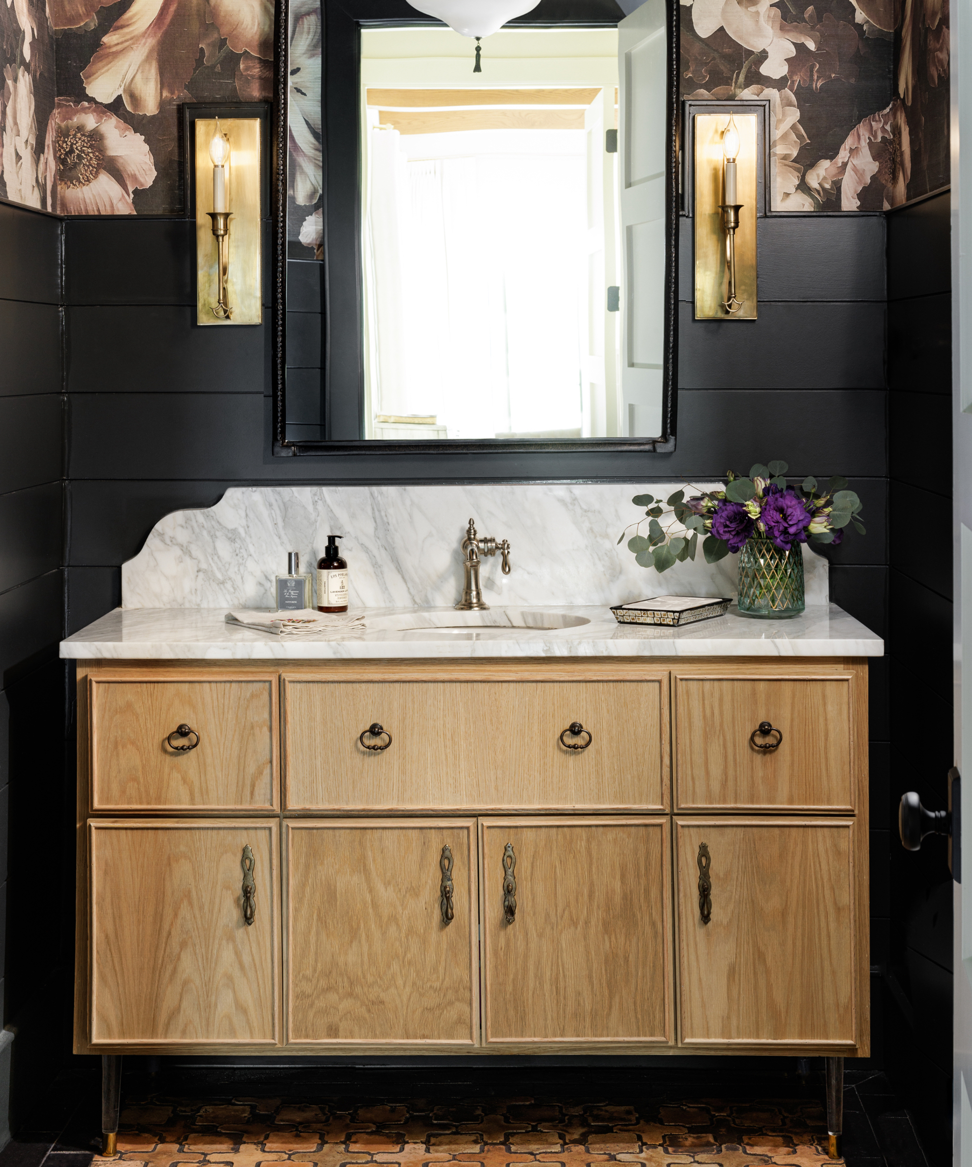
Bathrooms are traditionally seen as white, bright places, but don’t be afraid to go a little darker with bathroom color ideas. A dark color, such as charcoal or indigo, can really make a bathroom pop, especially when used in stark contrast with bright, light finishes. Matt black fittings are becoming more popular all the time, with many of us opting for black and anthracite showers, taps, and fittings these days.
Adding another hue to a dark bathroom color scheme – a bright green, for example – will create a modern, contemporary look.
14. Use two patterns in the same color
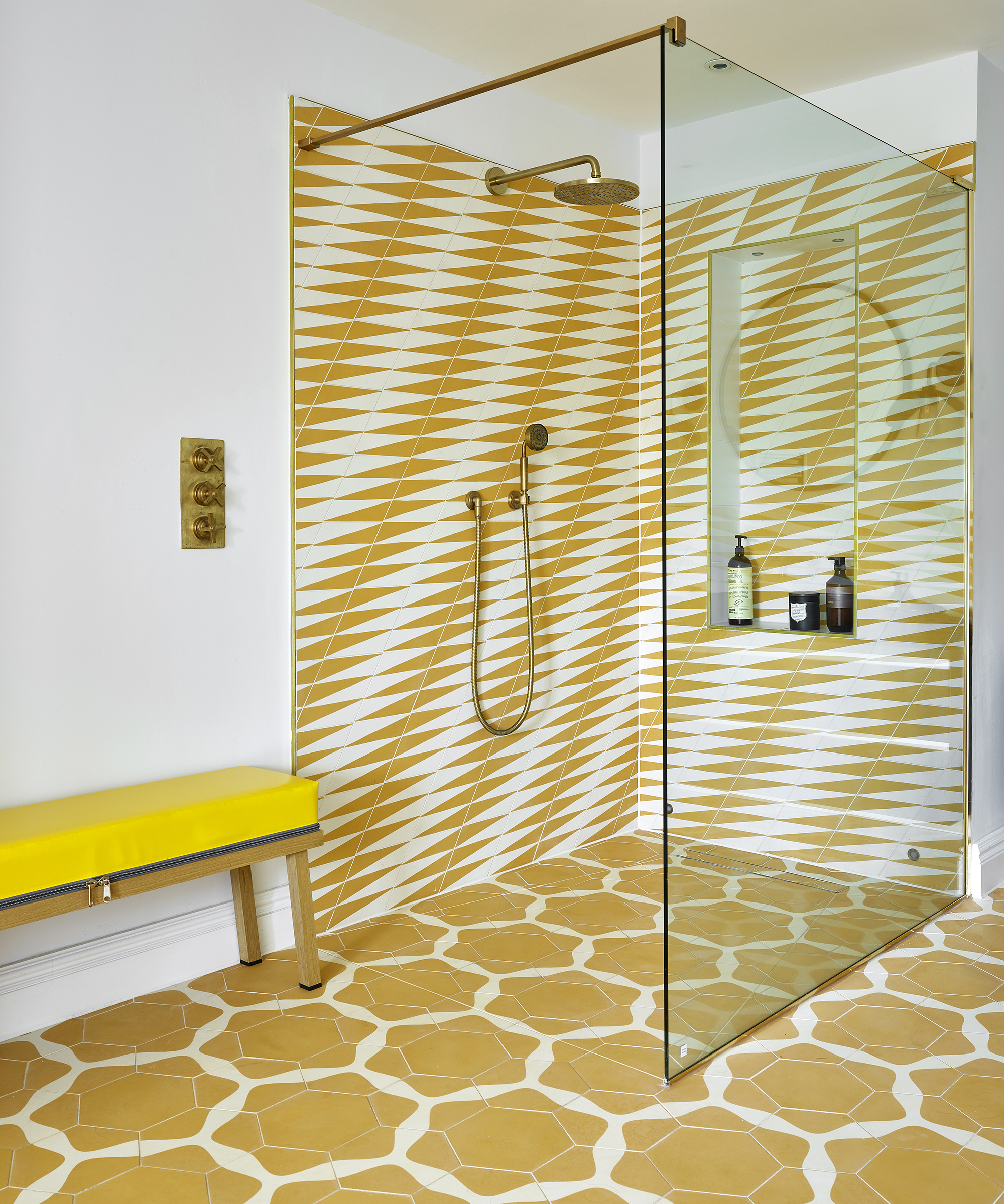
Embracing strong color, when designed as part of the flow of the rest of a home, can produce joyful results, as shown in this walk-in shower.
‘Boldly colored and patterned tiles can add such personality, dynamism and impact to bathrooms, really lifting the space,’ enthuses Caz Myers, director, Caz Myers Design.
‘While the tiles may be dramatic, the overall scheme can be timeless if you choose a color that truly resonates. Pattern-wise, go for tiles in two-tone repeats, like these modern geometrics, which, even when mixed, work effectively to create a unique and surprisingly restful space.’
15. Introduce one strong shot of color
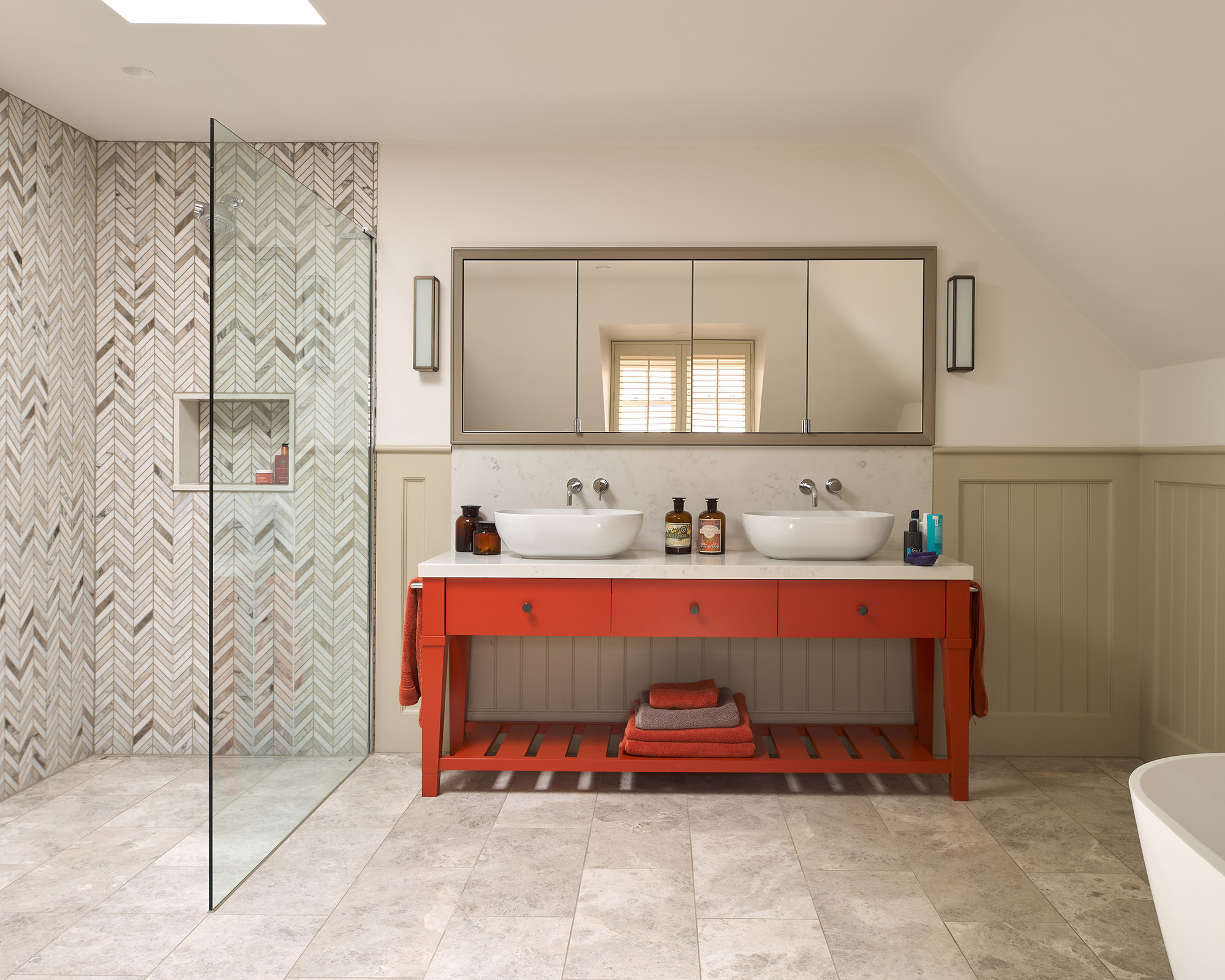
Color-blocking is a great technique for anyone keen to test strong paint colors without over-committing. An all-out approach, with multiple blocks of undiluted color, often clashing, is popular in modern homes.
But for a more classical look, go for one small, clearly defined block of dramatic color. Take inspiration from the Shaker-style bathroom vanity idea shown above. The orange-toned red – try Andrew Martin’s Tomato Frog No. 52 – provides a dynamic focal point against creamy natural stones.
Restricting the rest of the paintwork to muted tones makes the statement color feels more impactful. Best of all, small injections of saturated color are easy to update.
16. Pick a warm blue bathroom color
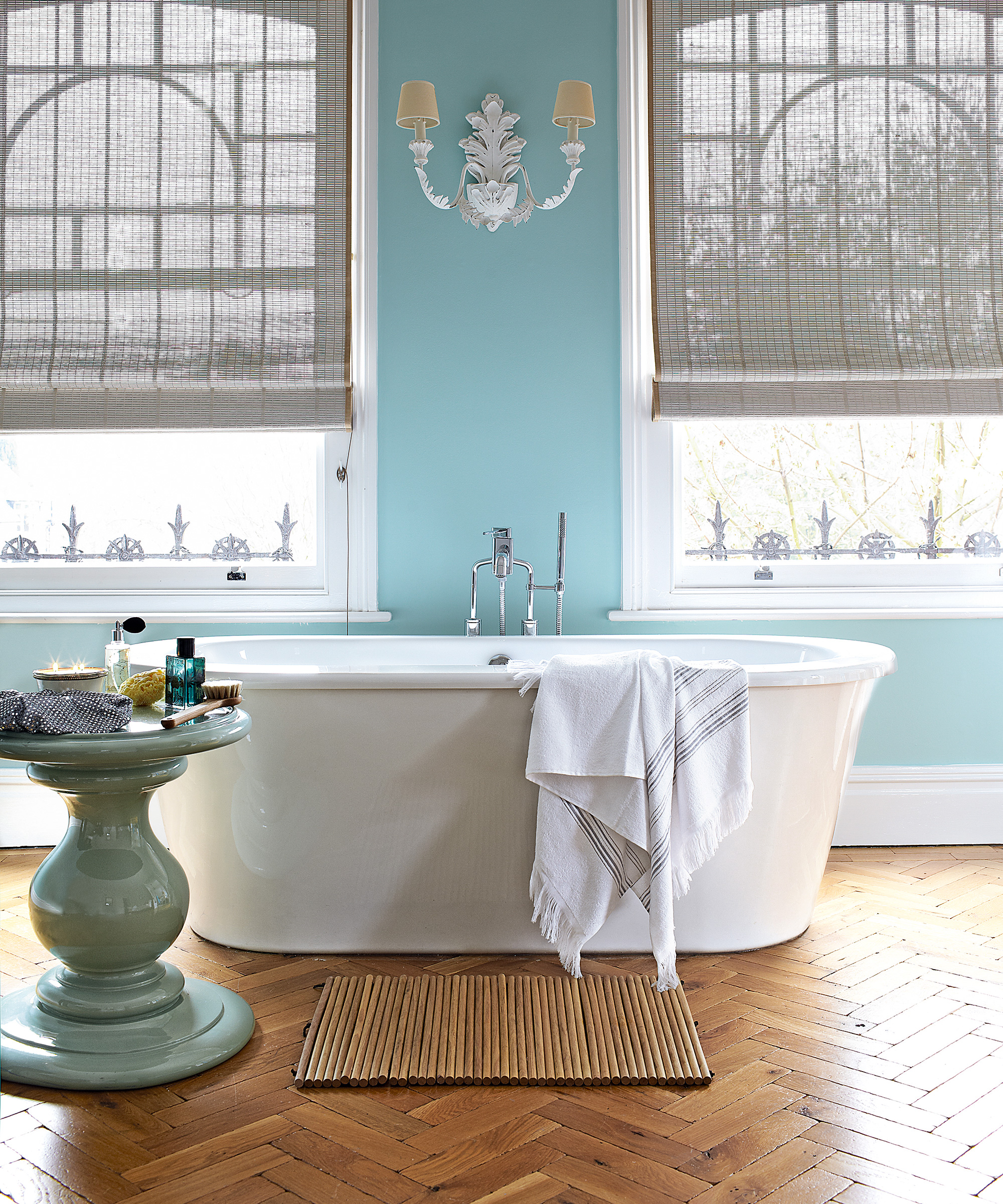
'Warm blue' sounds like a contradiction or oxymoron, but if you are searching for blue bathroom color ideas because you love the shade, bear in mind that those shades with a touch of yellow in them are likely to help the room feel warmer – a must in a room that you want to feel inviting.
Only go for a gray-blue in a bathroom that's flooded with sunlight when you're most likely to be using the room – or if you're remodeling a house in a warm climate. Otherwise, the space is going to feel cool and somewhat unwelcoming.
17. Don't forget you can add color with the floors
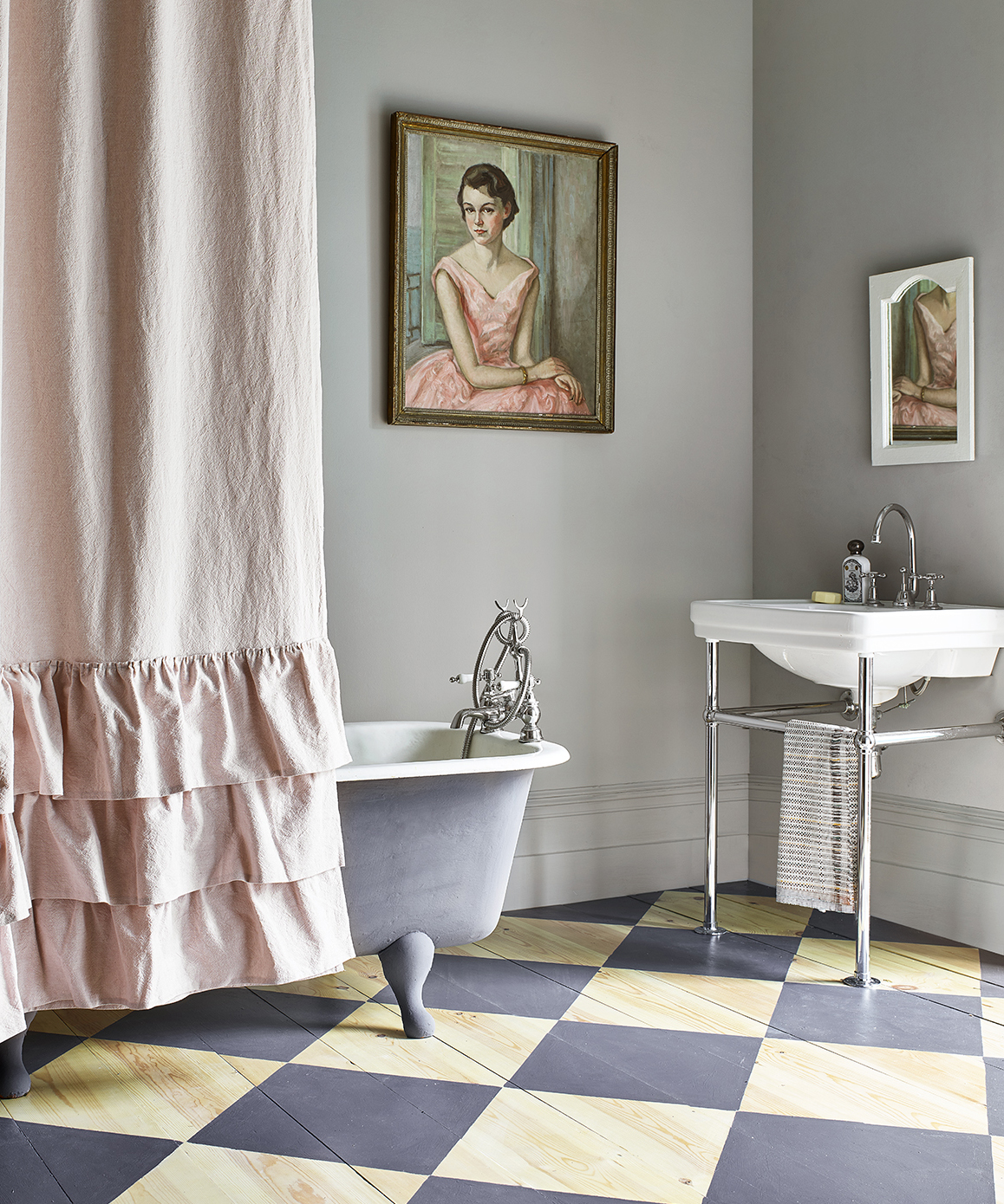
If you’ve got a wooden bathroom floor, you can really make the space pop by painting the floorboards. Make sure you prime the floor and sand it before adding two coats of paint to each board. This can give your bathroom a rustic, country-farm-inspired look too.
Contrasting color combinations across each board can create a strong monochrome effect. Combine this with a white bathroom, and it’s all the color you’ll need.
Bathroom color ideas FAQs
What is the best color for a bathroom?
Color is subjective, and the hues you choose will come down to your space and style. However, there are a few shades that are fail-safe picks that work well in most schemes.
Warm neutrals like beige, taupe, and even off-white are timeless and classic, perfect for neutral bathrooms. A lot of warmer neutrals are also favored in Japandi and Mediterranean-style spaces.
In north-facing bathrooms, look to colors with warmer undertones, whether it's a neutral or a bright color. Warm blues, greens, and even pinks are popular choices right now, as are materials like terracotta.
On the other hand, south-facing rooms can usually carry cooler tones, as the warmth of the light can make your bathroom colors look more orange-toned. Lighter, pastel colors can look really beautiful here, as can cooler-toned moody palettes if you prefer something bolder.
Bathrooms that face east or west need something in the middle. This will also be impacted by how much light your bathroom gets, so make sure you sample paint colors around the room and check how they read at different times of the day.
What colors are best for a small bathroom?
Choosing your bathroom color for a small space works very similarly to a larger bathroom. You'll need to consider the aesthetic you want for the space, as well as the direction the room faces.
Again, neutrals are often favored in a small bathroom to give the illusion of greater space, although we are seeing more people embracing darker hues – take the bold powder room trend, for example. Dark blues, deep blues, burgundy, and even black have become a hallmark of a moody-meets-elegant space.
If you're looking for small en-suite or cloakroom ideas, stick to the same wall treatment throughout. In a larger area, don't be afraid to ring the changes by using dark stone or tiles in a walk-in shower to add contrast and a really stylish impact.
What is the most relaxing color for a bathroom?
In terms of the most relaxing color for a bathroom, it really depends on personal preference. Color has a huge impact on mood, and bathrooms have a tendency to sidestep polarizing hues in favor of pale neutrals and whites, which are refreshing and easy to live with. At the opposite end of the spectrum, darker shades of gray including slate, are also popular for creating a cocooning spa-like effect.
Which bathroom paint colors going out of style in 2025?
Much like with any outdated decorating trend, one of the biggest mistakes is to eschew bathroom paint ideas and color altogether for fear that your space will age badly. And as 2025 continues to be the year of personalized spaces, there are a few bathroom paint colors experts say you should avoid and what to try instead.
White
Bathrooms are no longer the soulless, clinical, functional places they once were. These days, we are seeing designers and decorators experiment with more colorful bathroom ideas, and it makes a welcome change to the pure white bathrooms from yesteryear. However, one color we didn't expect to see make a comeback is pink – once a popular addition to the American bathroom during the 1950s.
Instead, designers are recommending soft, warm pinks, which were once popular for bathrooms in the 1950s. ‘Shades of pink are extremely versatile and have been a popular choice in interiors for centuries,' says interior designer Natalia Miyar.
'Pink is a truly wonderful shade to use as an accent color in a bathroom. There is such an incredible range of shades to choose from, and dark pink can add depth and personality to a design scheme. It’s bold and vibrant and works so well when used with white sanitaryware.'
Gray
A former modern favorite, gray has surely had its time in the sun. This cool, often cold, color scheme is making way for the return of decorating with beige and taupe, which still offers a neutral palette, but feels decidedly warmer.
‘For me, neutrals such as taupe are grounding wall colors,' says Henriette Von Stockhausen. 'It’s important to remember that sometimes a classic interior is just the ticket: calm colors, gentle schemes, traditional fixtures and fittings – no pattern clashes, no huge color pops, just comfort and a quiet space to relax in.'
Sky blue
Sky blue is still a popular color, but we are noticing fewer designers decorating with this pale shade in favor of darker, bolder variations from the same color palette. It is safe to say that decorating with blue will always be admired in a bathroom, but perhaps it is time that we turn our attention toward the dark side.
Choose a cool, deep blue in a bathroom for guaranteed spa-like relaxation. To add depth to a watery scheme, take inspiration from ripples and reflections and layer up different textures, including glass and stone with marbled effects and lustrous sheens.
Yellow
Where once yellow was seen as a fun way to add color to a bathroom. After all, it is a heritage hue, known for injecting cheerful warmth and sunshine to every surface it touches. But has yellow had its time in the spotlight?
This season, we are seeing more designers opting to decorate with red and brown instead. Earthy red and brown shades can transform interiors, adding a sophisticated to the playful aesthetic.
Interior designer Georgie Wykeham loves using muted reds in the bathroom: ‘Rhubarb is my go-to color; added to a neutral scheme, it creates warmth, depth and a touch of the unexpected. Used on its own, it is a very easy color to live with and yet it also works beautifully with blues, greens, pinks and reds.’
You really can have fun with your bathroom color ideas, whether you love a pared-back, tranquil space or a bold and beautiful design. If you prefer light, color-free spaces, there are plenty of neutral paint colors for bathrooms that aren't stark white.
Just avoid the bathroom paint colors going out of style if you want a scheme that feels timeless, and consider taking designers' advice on board when it comes to the colors you should never paint a bathroom. And if you're really stuck on what hue to use in your design, why not find inspiration from this year's bathroom color trends?

Jennifer is the Digital Editor at Homes & Gardens, bringing years of interiors experience across the US and UK. She has worked with leading publications, blending expertise in PR, marketing, social media, commercial strategy, and e-commerce. Jennifer has covered every corner of the home – curating projects from top interior designers, sourcing celebrity properties, reviewing appliances, and delivering timely news. Now, she channels her digital skills into shaping the world’s leading interiors website.
- Hebe HattonHead of Interiors