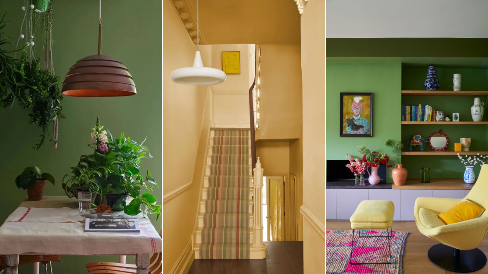
Bright colors are back for spring 2024 – the experts at Farrow & Ball say these two shades are the easiest to use
Create a vibrant look with these Farrow & Ball paints


Design expertise in your inbox – from inspiring decorating ideas and beautiful celebrity homes to practical gardening advice and shopping round-ups.
You are now subscribed
Your newsletter sign-up was successful
Want to add more newsletters?
There's no season I anticipate more eagerly than spring. After a long winter with short days, spring feels like an instant boost to the mood with the promise of warmer weather and new beginnings.
If you're anything like me, the very first signs of spring instantly make you want to replicate the feeling in your home as much as possible. Whether that's by adding fresh daffodils to the kitchen counters or swapping out decor for lighter fabrics, refreshing the home is a great way to mark the changing seasons.
But beyond these simple decor changes, adding a fresh paint color can be one of the best ways to uplift your home with a spring-inspired palette. Farrow & Ball color specialist Patrick O'Donnell agrees, taking to Instagram to share with us two bright paint ideas to use in your spring decor, both of which are optimistic and fresh.
Article continues belowA post shared by Farrow & Ball (@farrowandball)
A photo posted by on
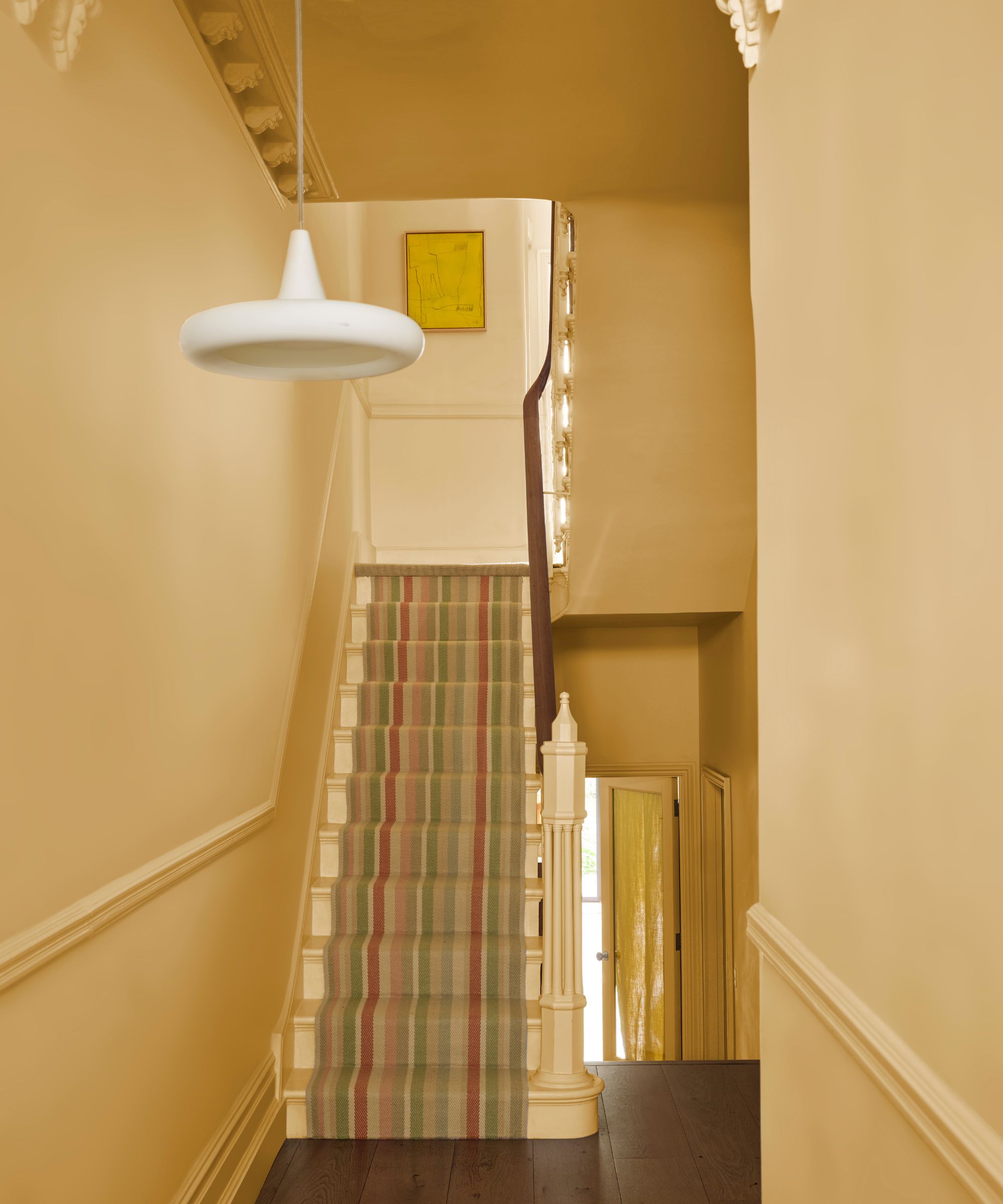
Playful 'Sudbury Yellow'

The first Farrow & Ball paint that Patrick recommends as the perfect spring color is Sudbury Yellow. 'This is such a good yellow,' says Patrick. 'It’s really elegant, there’s nothing too shouty but it’s got so much depth to it.'
There are many ways to decorate with yellow. Use it in an entryway for an instantly welcoming feel, or as Patrick recommends in the video, use it across kitchen cabinets.
When it comes to choosing other paints to pair with this playful hue, Patrick advises: 'Treat everything else, walls and woodwork, in the lovely Off-White which has a tiny little bit of yellow through it.'
As a third color to introduce to this interior scheme, Patrick points to Studio Green to provide some contrast, especially for flooring ideas: 'If you have the luxury of a wooden floor that needs a little lick of paint, something like Studio Green underneath is just beautiful – it gives it good weight.'
Design expertise in your inbox – from inspiring decorating ideas and beautiful celebrity homes to practical gardening advice and shopping round-ups.
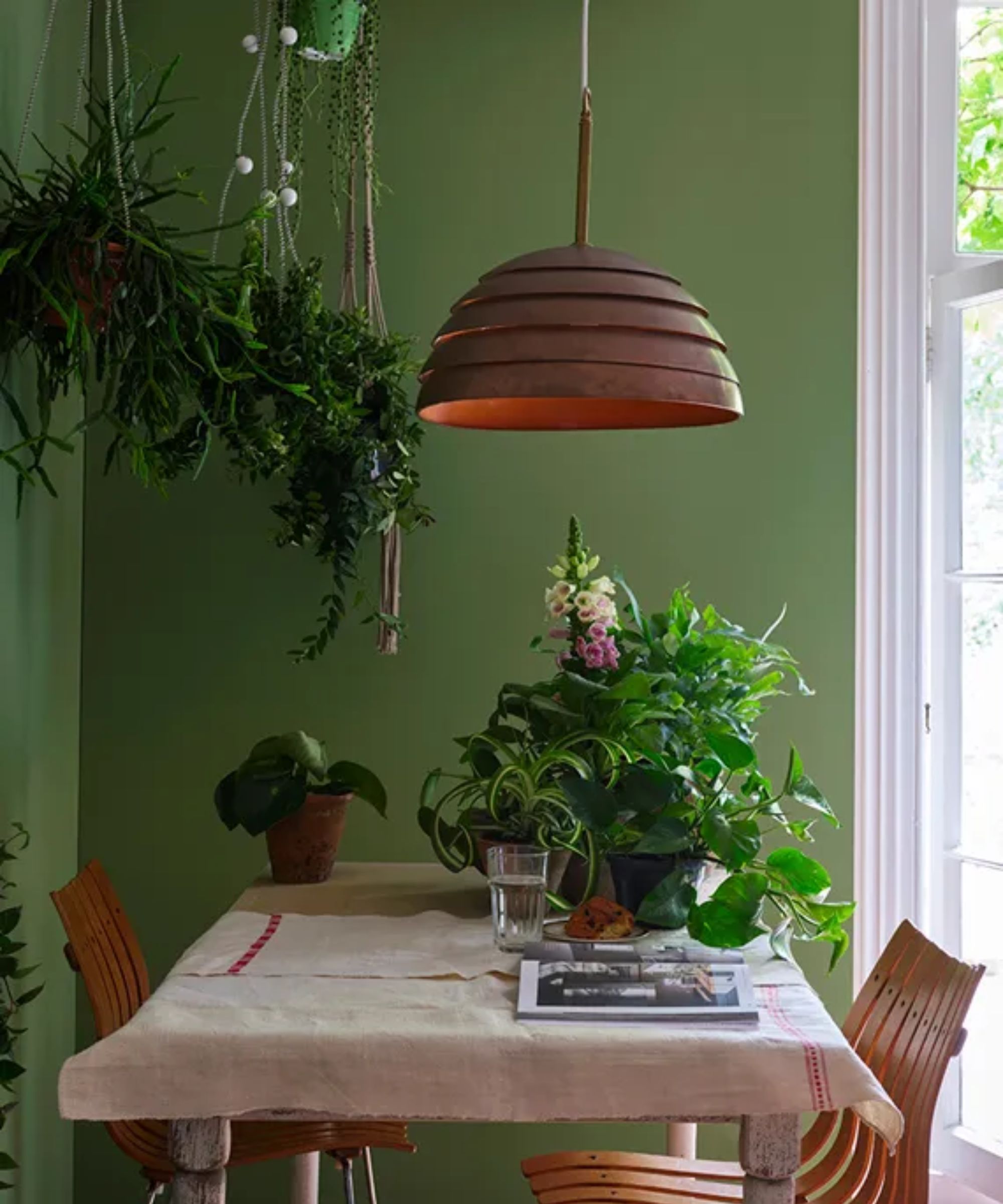
Optimistic 'Yeabridge Green'

If decorating with green is more your style, Patrick recommends using Farrow & Ball's Yeabridge Green which he describes as 'verdant and optimistic.'
Again, this uplifting and nature-inspired hue can be used in many ways. Patrick says that it's a 'great front door color if you’ve got white render and white stucco,' as an exterior paint idea.
But if you want to bring this color inside the home, Patrick adds that it also makes a great choice for a hallway or entryway. Yeabridge Green 'looks beautiful with traditional wooden stairs.'
To complete the look, the color expert recommends using Farrow & Ball's James White for the ceiling and across any trim detailing, to allow the green to remain the standout: 'This is strong enough, you don’t need another color.'

Patrick O’Donnell is Farrow & Ball's color consultant & brand ambassador and has been with the brand since 2012. Patrick works with designers in the UK and North America, helping to bring their projects alive with the iconic, F&B color palette.
These bright colors will no doubt uplift your home decor ideas in time for spring with a vibrant look. If you're wondering how else you can nod to the changing seasons in your home, we've rounded up our favorite spring kitchen decor ideas to give you some more inspiration.

Emily is a freelance interior design writer based in Scotland. Prior to going freelance in the spring of 2025, Emily was Homes & Gardens’ Paint & Color Editor, covering all things color across interiors and home decor for the Homes & Gardens website. Having gained specific expertise in this area, Emily is well-versed in writing about the latest color trends and is passionate about helping homeowners understand the importance of color psychology in home design. Her own interior design style reflects the simplicity of mid-century design and she loves sourcing vintage furniture finds for her tenement flat.