Color therapy: the room colors therapists swear will boost your mood – and those you'll find draining
Suffering the January blues? Color therapy can help! These expertly chosen colors could help brighten your mood

Design expertise in your inbox – from inspiring decorating ideas and beautiful celebrity homes to practical gardening advice and shopping round-ups.
You are now subscribed
Your newsletter sign-up was successful
Want to add more newsletters?
Color therapy (also known as chromotherapy) asserts that some colors can help improve your mental health. And while it's unproven, there's no doubt that, as individuals, we usually pick colors for our homes that make us feel good.
Whatever our unconscious choices, color psychology hints that some colors are better than others at boosting mood, however. ‘Colors can generate physiological changes such as increasing our heart rate and impacting our hormone levels,’ explains color therapist, Lee Chambers, ‘and colors can make a difference in how relaxed and at ease we feel.’
So which should you choose if you want happy room ideas? And which to avoid, according to color therapy? Here, we have spoken to leading color experts and well-being consultants to determine the best choices, and ask why and how color therapy works.
What is color therapy?
Color therapy focuses on using colors specifically to help improve well-being. The practice studies the light wavelength of a color to judge the energy of a color and assess its impact on mental and physical health. Blue, for instance, is perceived as a calming, restorative color – hence its use in spas and medical centers; red increases heart-rate and is said to invigorate, hence why you often see it used in TV studios of breakfast shows. Color therapy is not new; it has been practised since ancient times.
Which mood-boosting colors do color therapists use?
‘Our homes are critically important to our sense of well-being. The act of decorating those spaces is the catalyst that sparks our creativity, providing that special environment that helps us thrive,’ says international color specialist and director of the Eisman Center for Color Information, Letrice Eiseman. ‘It is important for our homes to be filled with the colors that help us to express the particular moods that will be most comforting and uplifting.’
This is what to choose.
1. Warm-toned yellows and oranges
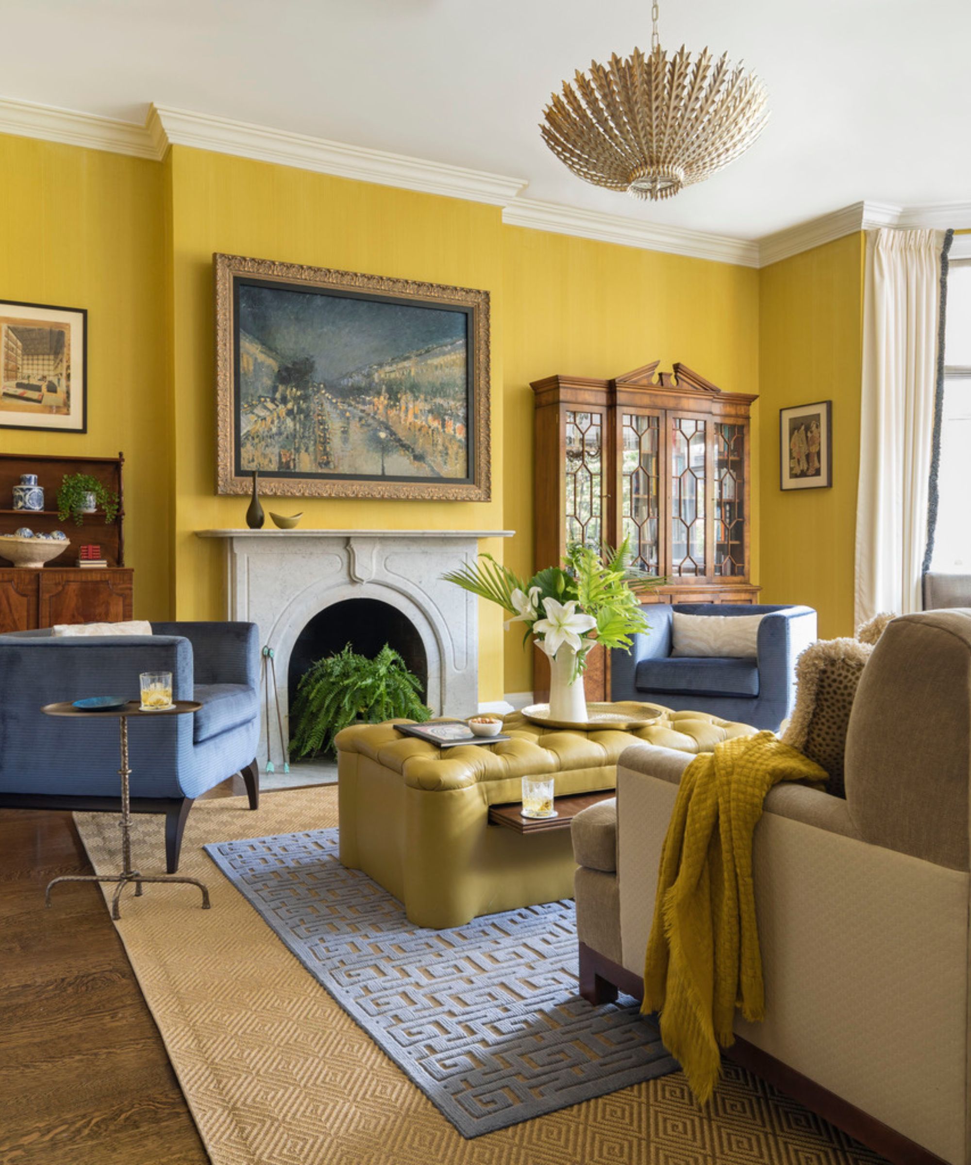
Reminiscent of summer days, it is perhaps unsurprising that decorating with yellow and decorating with orange can help to make us feel uplifted at home.
Design expertise in your inbox – from inspiring decorating ideas and beautiful celebrity homes to practical gardening advice and shopping round-ups.
‘In these darker, cooler months, warmer colors can often give us that cheerful boost or pop of energy that makes us feel like we can go through the season with positivity,’ Lee Chambers suggests.
‘Yellows are great for creating some joy and boosting how we are feeling, while decorating with purple can give us a bolt of energy and send our imagination racing. Greens bring a real freshness and feelings of growth and harmony, while oranges are welcoming and warming while giving us the enthusiasm to keep moving forward.’
‘A large part of our associational reaction to color is related to natural phenomena. For example, yellow is the color family most often attached to the warmth and joyfulness of the sun and blue to the constant presence of the sky and the dawning of a new day,’ continues Laurie Pressman, Vice President of the Pantone Color Institute.
‘Sunny yellows which infuse optimism and joy such as Pantone 13-0754 Sunstruck can do the trick here, gregarious bright oranges that are friendly and sociable such as Pantone 16-1364 Vibrant Orange and dynamic and animated bold reds including Pantone 18-1750 Viva Magenta.’
2. Energetic reds and pinks
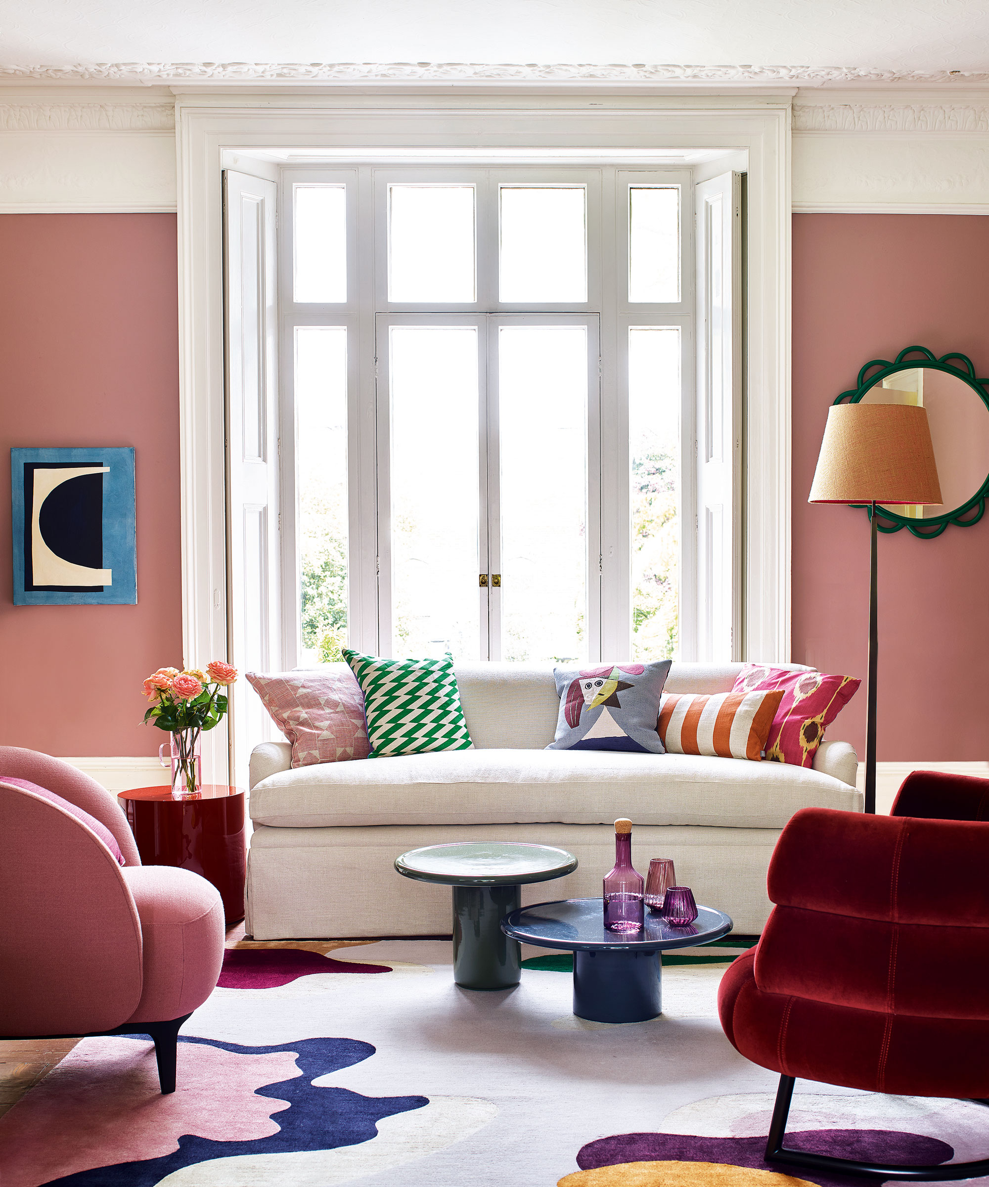
‘As a general rule, the brighter, more vivid shades are mood lifters, especially in the warm side of the color wheel,’ suggests Letrice Eiseman, a color expert. ‘They are warm reds, hotter pinks, yellows, oranges, and red-purples. They are energetic and dynamic.’
Red rooms can sometimes be overwhelming and anxiety-inducing, however, so decorating with red in more conservative ways such as through decorative pieces and accents, or opting for a muted shade can help to make this energizing tone more palatable. Choosing pink hues, named some of the most beautiful colors for a room by experts, is a good way to do this.
3. Relaxing blues and greens
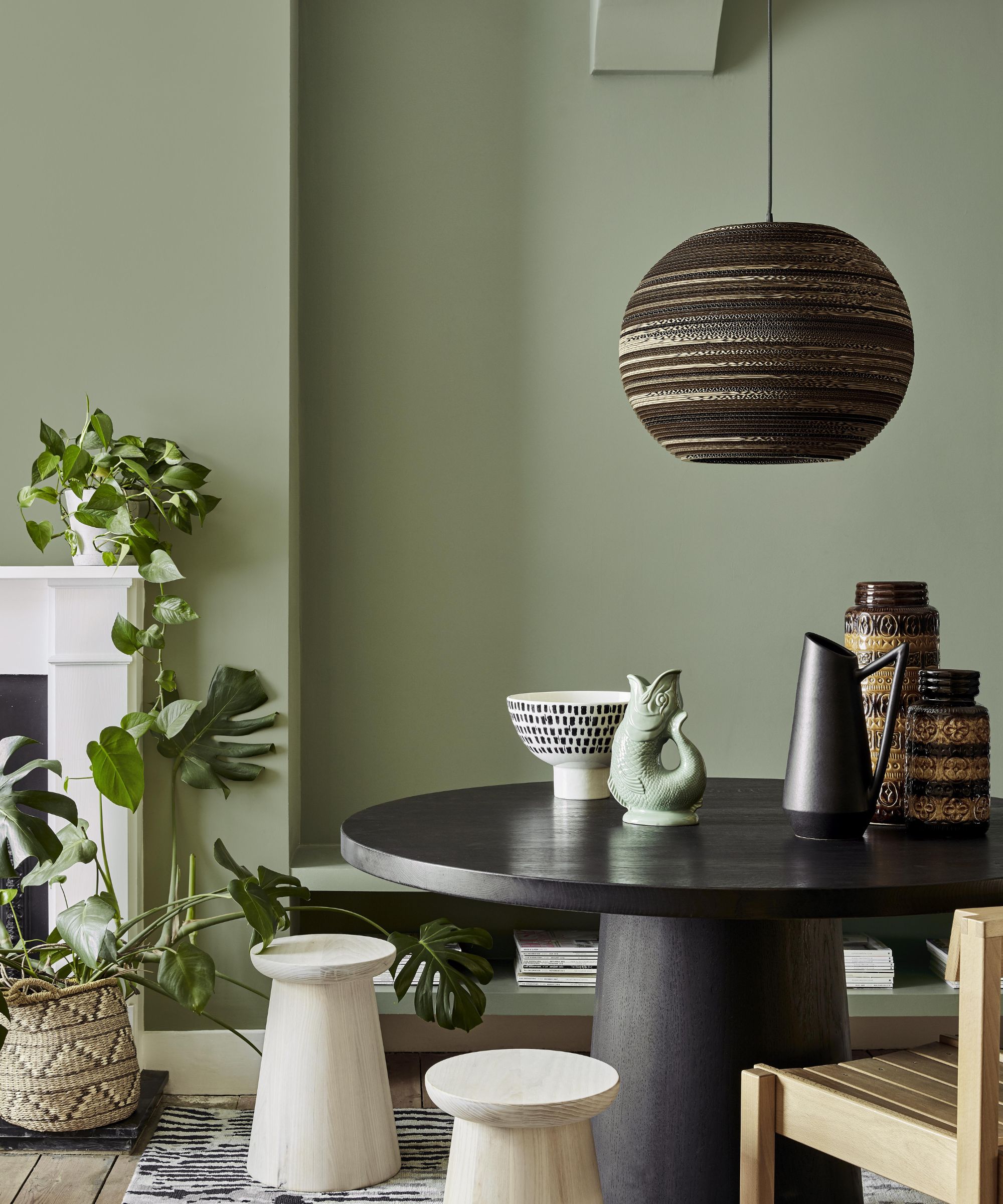
‘Cheerful color is a great way to boost mood and lift the gloomy grays of January. With spring just around the corner, it is great to focus on new beginnings and opportunities to refresh our homes with new hues,’ says Sherwin-Williams' director of color marketing, Sue Wadden.
Blues and greens are reminiscent of the natural world and have been named some of the most relaxing colors for a home, and the best colors for reducing stress. Even in darker or earthier hues, these colors can be reminiscent of the earth's natural beauty.
‘The cooler side of the color wheel renders the more contemplative, calming shades, especially in the light to mid-range. However, the brighter variations of electric blues, bluish greens, and bluish purples, can also boost moods,’ Letrice Eiseman adds.
Which colors will drain you of energy?
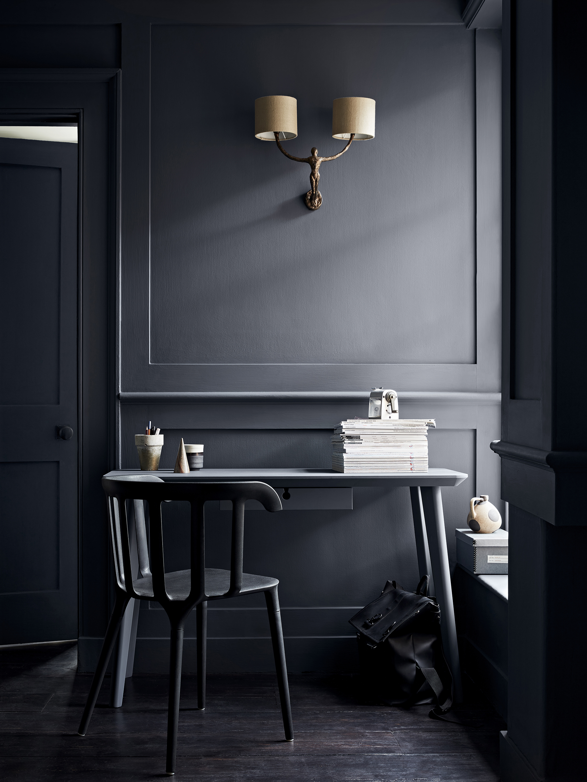
There is no consensus on the colors that you should stay away from to boost mood like there are for positive mood-enhancing shades, according to experts. Rather, it is about avoiding tones that you personally find draining.
‘Darker, more somber colors are generally not mood boosters, however, it is important not to generalize as for some people deeper shades such as teals and navy blue, especially in dark bedrooms, can be very restful,’ says color expert Letrice Eiseman. ‘It can all depend on how the individual reacts to the colors mentioned. It is always best to use some color favorites, rather than abiding by strict rules.’
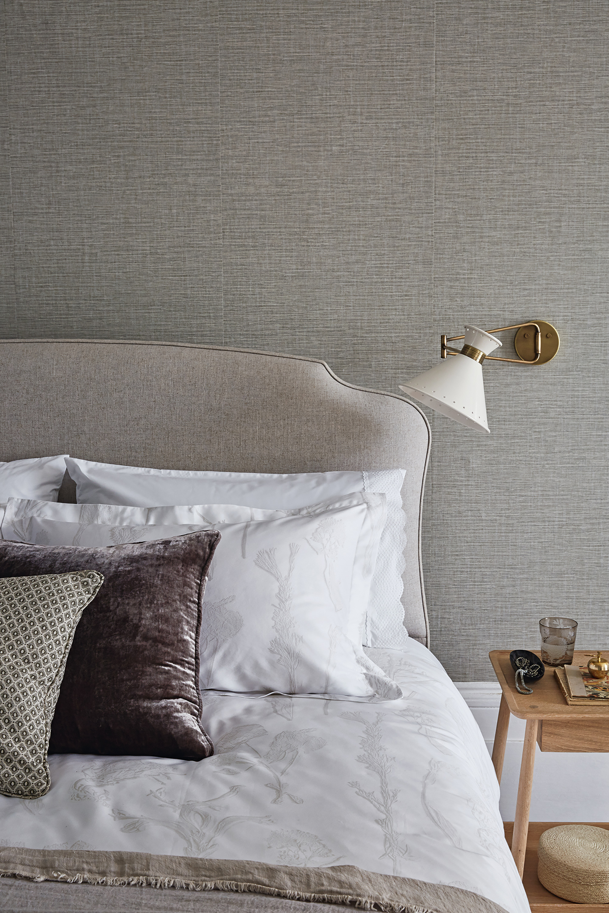
‘It is important to remember that color is quite a personal preference and that what unsettles us isn't always what unsettles others,’ Lee Chambers, color therapist concurs. ‘It is worth considering that black and gray can make a room feel unwelcoming and cold when not used mindfully, and white can feel quite empty and clinical.'
Red is also known to be the most stressful color.
'The intensity of red gives some of us a real energy boost, but for others, it can increase feelings of irritation and instability. And in a similar way, darker blues can provide calming confidence and safety for some, but draining pessimism for others.’
Why is color therapy important in a home?
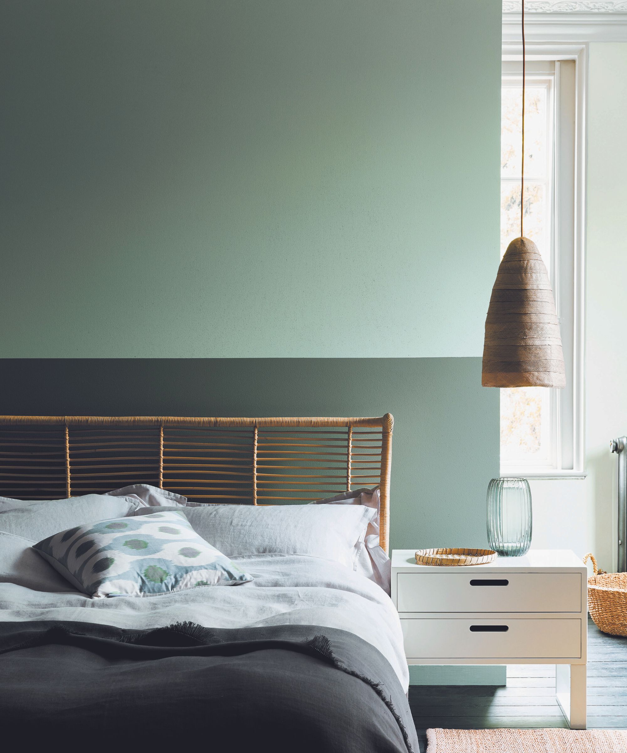
‘If we think about the physiological aspects of color – we know that the pituitary gland is affected when we are exposed to red, increasing adrenaline flow,’ begins Laurie Pressman, vice president of the Pantone Color Institute.
‘At the same time, we know when surrounded by green our heart rate slows down as it affects our nervous system, causing us to breathe slowly and deeply, helping the heart to relax by slowing the production of stress hormones.’
‘We spend a significant amount of time in our domestic environments, and we use the space in a variety of ways. One thing we have a level of autonomy over is the colors we choose to place in our domestic environments, and by curating the palette of our property, we are able to influence how we feel in a positive and proactive way,’ explains color therapist, Lee Chambers. ’It is also a great way to express ourselves and our identity in a space that is often safe and where we feel like we belong.’
What colors reduce anxiety?
It is thought that blues, greens, and light purples are all good colors to help reduce anxiety. These soothing, peaceful colors either remind us of nature or have a generally pleasing light wavelength making them easy on the eyes and mind so are unlikely to overwhelm the senses causing heightened panic or anxiety.
Chiana is Homes & Gardens’ kitchen appliances editor. With a lifelong passion for cooking and baking, she grew up experimenting in the kitchen every weekend with her baking-extraordinaire Mom, has spent time cooking with Le Creuset's expert chefs, and has developed a great understanding of how tools and appliances can make or break your ideal relaxing kitchen routine.