8 popular kitchen hues and the surprising psychology behind each one – and the color you should always use with caution
Find out if you're perceived as smart, funny, kind, or creative all because of your kitchen color choice

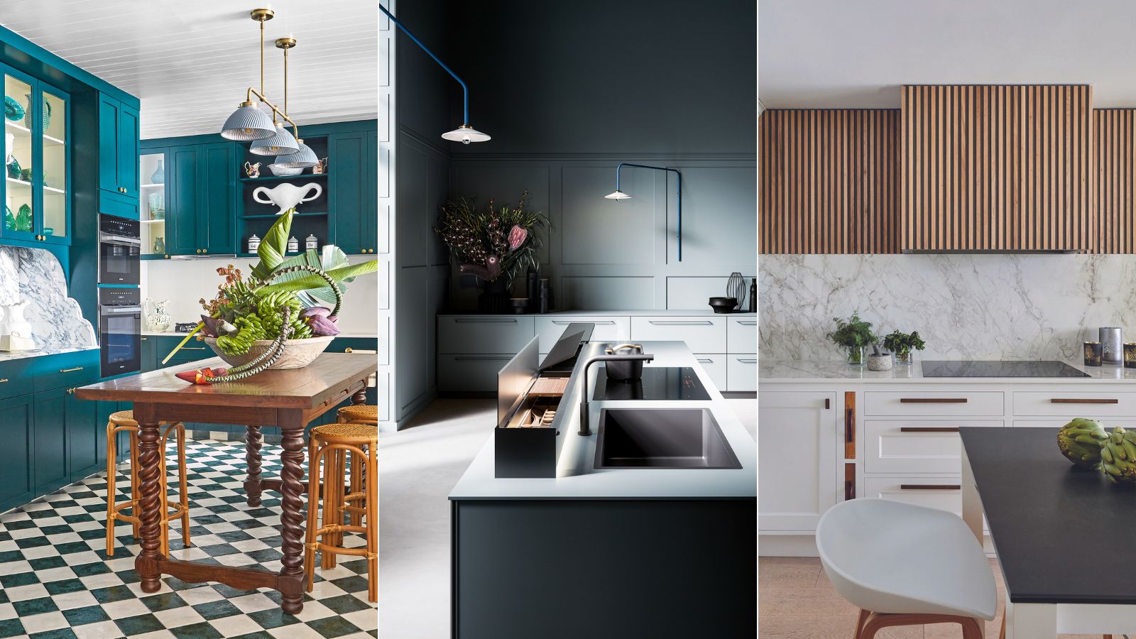
Design expertise in your inbox – from inspiring decorating ideas and beautiful celebrity homes to practical gardening advice and shopping round-ups.
You are now subscribed
Your newsletter sign-up was successful
Want to add more newsletters?
Your kitchen is one of the most seen parts of your home’s interior and makes an important impression on friends and family as this is usually the place where we congregate. Therefore, choosing the right color for your kitchen is vital.
But if you're wondering if kitchen colors mean anything, you are not alone. Naturally, you'll want to ensure your kitchen sets the right tone for the rest of your home. Whatever your style or budget, there are many kitchen color ideas – with different meanings – to make a difference in your own space.
Here, we’ve asked color psychologists, decorators, and interior designers for their take on kitchen color meanings, and to share their advice on this fascinating and rarely explored subject.
What does your choice of kitchen color say about you?
Finding the optimum color for your kitchen that you will love for years has never been more critical, with the kitchen now a multi-purpose room designed as much for living and entertaining as it is for cooking.
'It’s amazing how a change of paint color can give a colorful kitchen or painted kitchen a completely fresh look, picking up on different accents within the home,' adds Rob Whitaker, creative director at Fired Earth.
But what exactly do these colors mean? While this may not be a deciding factor in your final color choice, it is an intriguing topic, and we wanted to dig a little deeper into the psychology behind the meaning of certain colors, especially when used in the kitchen.
1. Paint with yellow to boost creativity and joy
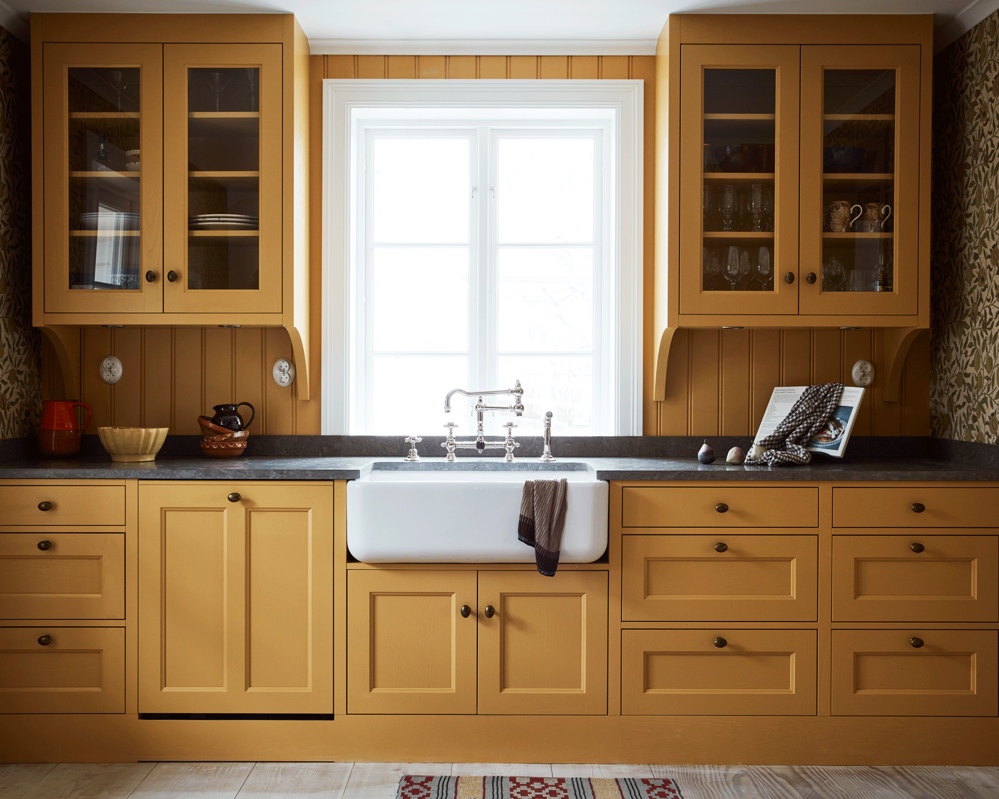
Embraced in a big way or used in small doses, this sunny shade is rich, versatile, and exudes positivity and warmth, but what is the color psychology behind using yellow in your kitchen? Yellow is, in fact, one of the oldest known colors in history.
Design expertise in your inbox – from inspiring decorating ideas and beautiful celebrity homes to practical gardening advice and shopping round-ups.
‘Yellow can create a mellow and uplifting interior all at the same time,' says Martin Waller of global design brand Andrew Martin. 'It transports us back to long lazy sun-drenched days in the Mediterranean and it can brighten us up on gloomy days. It works brilliantly with blues, teals, greens, and reds, and for real crisp freshness use with white.'
Karen Haller, color psychology and best-selling author of The Little Book of Color shares a similar opinion on this uplifting hue: 'At the lighter, bolder end of the spectrum, yellow is a color of optimism,' she says. 'From mellow honey tones to vibrant citrus hues, decorating with yellow is a brilliant way of bringing cheer and energy to everyday spaces like kitchens, and can be used to create a myriad of bold looks.'
What do the editors of H&G think of yellow kitchens? Our deputy editor Jo Bailey has particular a penchant for yellow. 'Mood-lifting and warm, yellow brings energy, confidence, and optimism to a space,' she says. 'It can be used anywhere in the home but is most effective in busy spaces, or north-facing rooms that lack light.'
2. Soothe and calm with a blue kitchen
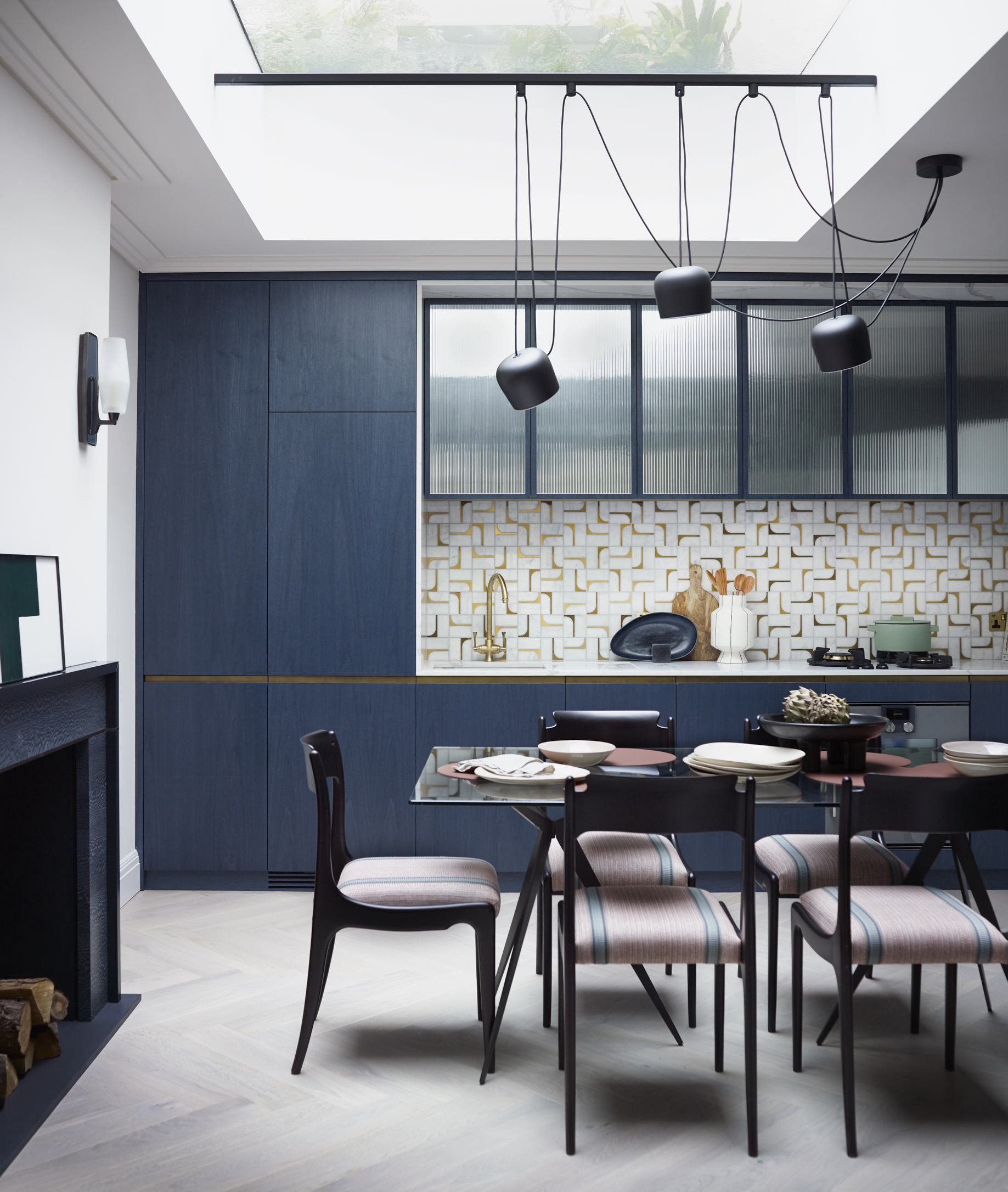
With a new year comes the opportunity to look to a bright future, and where better to start than by injecting your home with mood-enhancing color? 'Fresh, airy, and imbued with the restorative power of nature, blue kitchens have this year been tipped by interior experts as the perfect backdrop to modern living,' says color psychologist Karen Haller.
‘Whether we are working or relaxing, creating or entertaining, it is essential to have a space that reflects the optimism and desire for a fresh, new start that is top of the agenda for the year ahead,’ says Marianne Shillingford, creative director of Dulux, '‘Bright Skies’ was our Color of the Year for 2022, but we expect it to endure well beyond the present year and onto the next.
Naturally soothing, but equally energizing and hopeful, the shade promises to bring the outside in to enhance well-being. In the kitchen, pair it with neutrals such as white and cream for classic calm, or with stronger tones of mustard, olive, sienna, and navy for a unique, head-turning scheme.'
3. Energize with a red kitchen – but use with caution
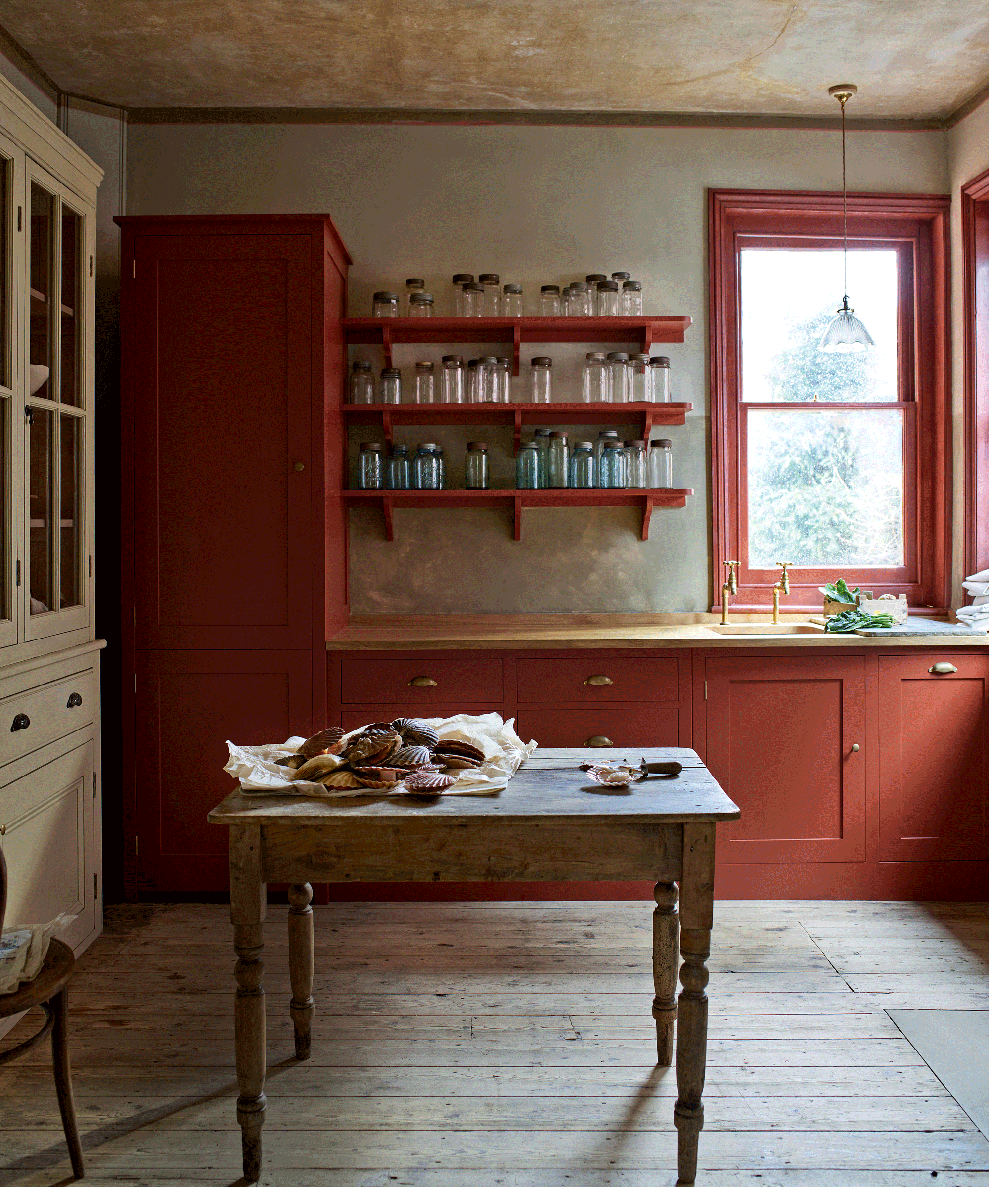
You may be surprised to hear that red, despite being one of the most stressful colors, is also a passionate and life-enhancing hue to use in a lively space, such as the kitchen. After all, red offers a luxurious bank of positive energy. However, as this color is strong, and often used for warning signs, it is best used with caution and consideration.
Historically, red has associations with wealth and status. In the 17th century, flashes of red dye were used on the soles of shoes worn by aristocratic courtiers to Louis XIV, while the use of a VIP red carpet goes back to Ancient Greece. Perhaps a present-day example of this might be the eye-catching interior design trend to use red in high gloss or lacquered finishes on woodwork.
‘We have been using red to decorate the walls of our homes from the beginning of human existence,’ explains Marianne Shillingford, creative director of Dulux. ‘We find red on the walls of the earliest cave dwellers and red pigment was used in Neanderthal burials as a symbol of life. It has the longest visual wavelength of any color, which makes it the most impactful, and it is famous for stimulating the appetite, good conversation, and love, making it an enduring favorite in the dining room, kitchen, and even bedroom,’ she continues.
So whether you highlight a red kitchen scheme with touches of carefully chosen accessories, or paint walls floor to ceiling in a deep shade of this versatile color, it can transform interiors and create different moods, from refined to playful, depending on its application.
4. Pay homage to the hue that has the ability to soothe, inspire and excite
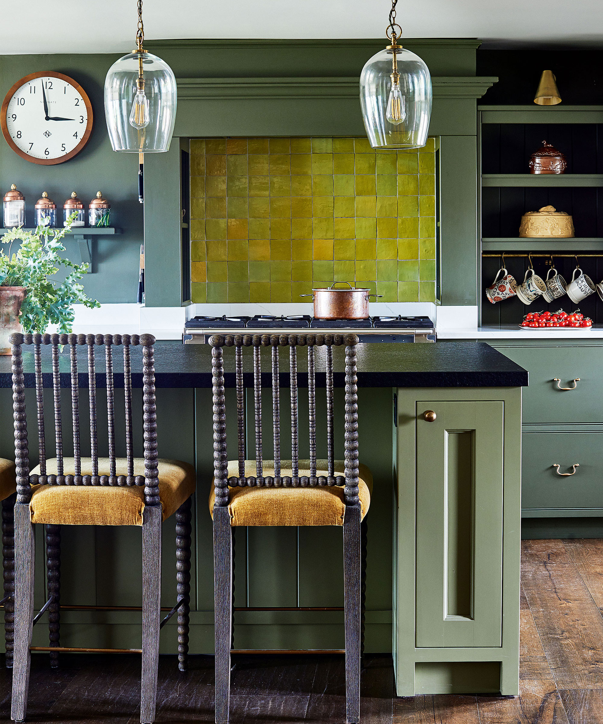
Calming, creative, and with strong links to nature, green is a versatile color that can work in many kitchen styles. The majesty of ancient forests has long inspired interior design. Whether the grandeur of an oak tree or the enchanting shape of an acanthus leaf, rich, velvety greens offer homes a nurturing connection to nature.
‘Green reassures us on a very primitive level. We know we can find food and water, which means green equals life. Using dark greens in our kitchen, brings in these feelings of reassurance and rest,’ says Karen Haller, color and design psychology specialist, and author. ‘Surrounding ourselves with too much green or the wrong shade, however, can lead to feelings of stagnation and lethargy.’
A green kitchen really comes to life with plenty of natural light, so it suits south-facing rooms best. It can, however, work in a dark, narrow kitchen space too, when paired with terracotta shades and mid-tone wood to bring in warmth.
5. Welcome innocence and clarity with white
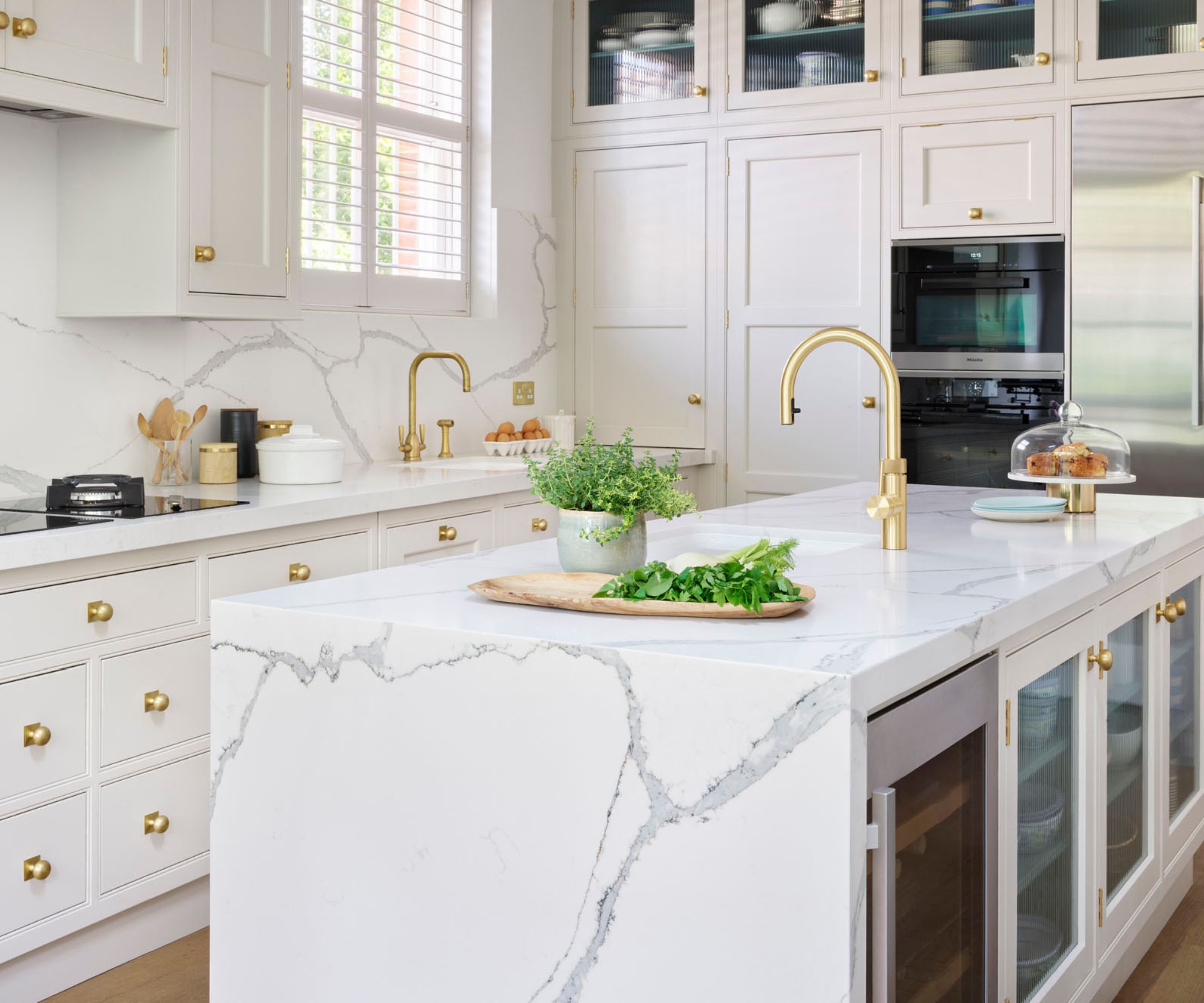
Choose the most popular kitchen cabinet color for its enduring style, versatility, and the color’s timeless appeal. White kitchens are the most requested kitchen color bar none. If your goal is to create a 'wow' kitchen, but you want to maintain a classic and timeless style in your home, then white kitchen cabinets are an extremely tranquil and liveable option.
Put simply, a white color scheme will tell your visitors that you are a clean, tidy, and organized person. A traditionalist at heart, the owner of a white kitchen exudes confidence and sophistication. Many homeowners choose white for its timeless appeal, after all.
In the practice of kitchen Feng Shui, white also represents precision, happiness, and communication. White is a wonderfully versatile and tranquil color making it a beautiful choice for the 'heart' of your home.
6. Instil power and subtle sophistication with a black kitchen
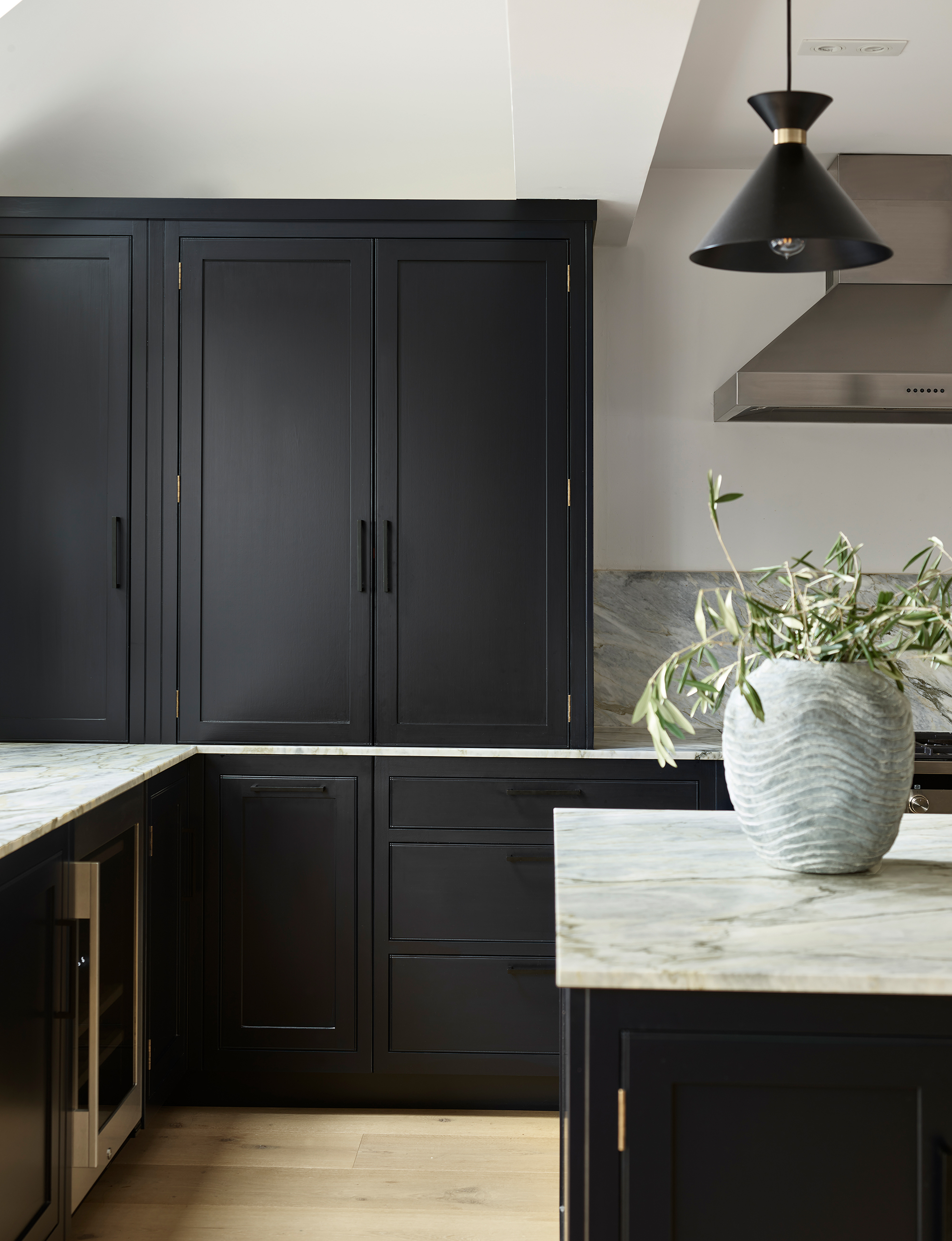
Black is a daring yet confident color, so understandably we are seeing it appear more and more in kitchens. For classic good looks, black is a winning choice for kitchen cabinets and walls. Black, especially when paired with white, is also said to add value to your home, so it is a great color combination if you are planning to sell.
But that is not the only benefit of decorating with black. Those with black kitchens are thought to hold positions of power and authority. This person is also believed to be serious, sophisticated, and strong.
‘A deep black kitchen will always be in style,’ says certified color expert and interior decorator Pattie Kelly of Inspired Home Interiors. ‘Like the enduring ‘little black dress’, a black kitchen is a classic which will stand the test of time.'
7. Decorate with grey to improve confidence
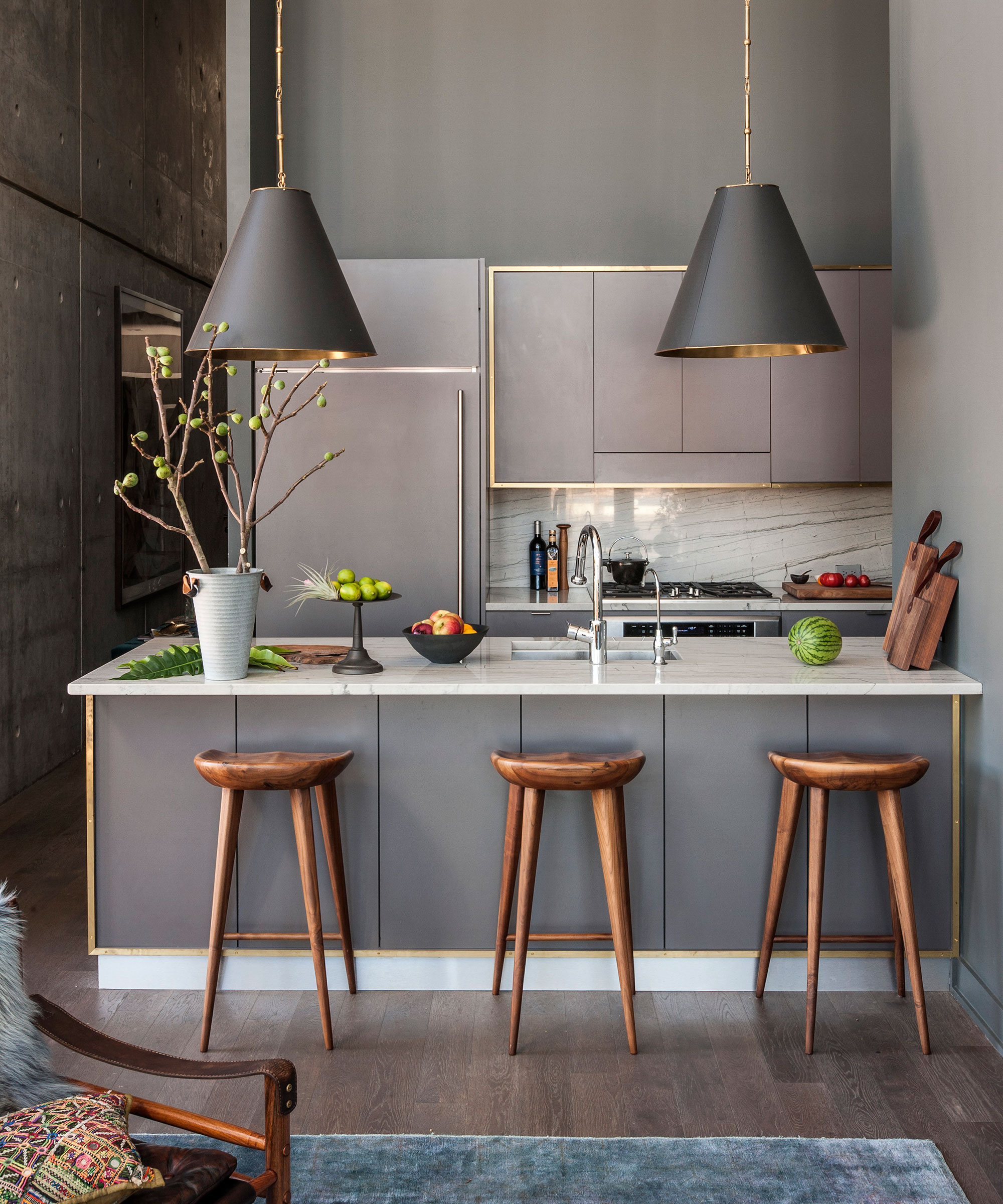
Grey kitchens have had a bad reputation recently due to their perceived gloomy nature, but this once-popular color is on the uplift. This confident and sultry shade goes with every color and can be used to add depth and sophistication to any room, but none more so than the kitchen.
Grey is a color that has its own weather system of light levels and hues. From the gentle grey morning rain of a bright wide sky to the breathtaking drama of dark storm clouds, the scope for creating beautiful kitchen interiors is endless.
‘Greys are hugely versatile, from cool off-white shades, through warmer neutral mid-tones to the very deep and mysterious,’ says Justyna Korczynska, senior designer at Crown Paints. ‘They have more color and texture within them than straight black.'
Historically, grey has had many incarnations in the home, but was particularly significant in the 18th century. The light-reflecting qualities of pale grey, especially when paired with gold leaf and mirrors, became a fashionable color choice for bringing elegance and light to the Royal Gustavian Palaces of Sweden (1772 to 1809).
Surprisingly, grey is enormously versatile; grey often makes a calm elegant backdrop, which can give an air of sophistication for spaces such as kitchens and dining spaces.’ Mood is one consideration, but it is also helpful to consider how grey might affect the size of a room. ‘The paler the tone, the more it will reflect the available light. The darker the tone, the more light it will absorb,’ says Justyna. So do factor this in if grey is a color that makes you feel sad or anxious.
8. Create a space that evokes kindness and purity
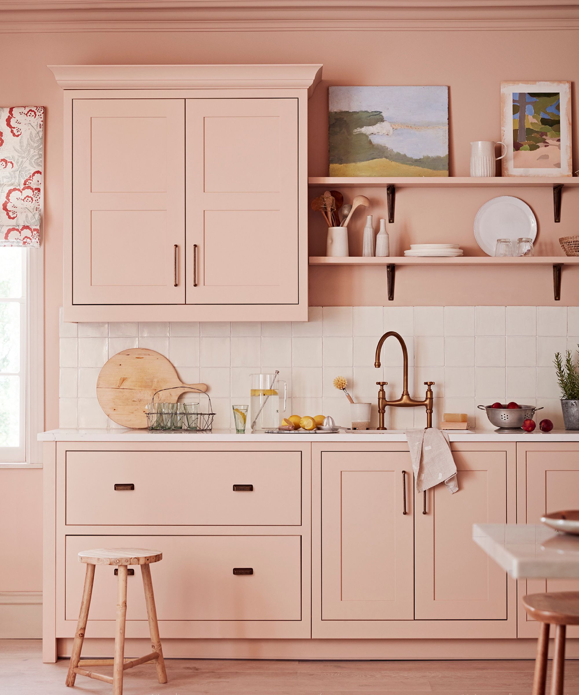
Cocooning and pretty, the pink palette ranges from a confetti of palest blossom through plaster and peach to the cooler tones of vintage rose petals, and even the latest trend for Barbiecore, if you are brave. With its connotations of grace, purity, and elegance, the color also has significant historical provenance.
Pink goes way beyond the current connotations of being overtly feminine or girly. Sweetly nurturing in nature, blush pink has a deceptively quiet strength and transcends both room and gender preconceptions.
'Pinks have been used throughout history and ranged from the plaster pinks, based on red ochre, to the blossom pinks from crimson lakes,’ says Edward Bulmer, an architectural historian, interior designer and founder of Edward Bulmer Natural Paint. ‘The latter were expensive and much loved as a tinting color on ornamental plasterwork from the 18th century onwards. They are a perennial favorite as they flatter both building and occupant.’
While so often thought of as a color for bedrooms and relaxing spaces, don’t overlook the potential of pink in more practical rooms such as the kitchens, where it can lend a calming air. In particular, the atmosphere of a kitchen can be greatly influenced by the color you choose.
‘There’s so much to consider when designing your kitchen, and color is one of the most effective tools you have when it comes to creating atmosphere and character,’ says Neptune’s Fulham branch kitchen designer Stephanie Nix.
‘Pinks are an incredibly popular color at the moment; they work beautifully with the undertones of Carrara marble and mix with pale or darker greys to create a calming cooking space. You could also introduce black accessories through lighting or black-bronze handles to keep the look chic and sophisticated.’

Jennifer is the Digital Editor at Homes & Gardens, bringing years of interiors experience across the US and UK. She has worked with leading publications, blending expertise in PR, marketing, social media, commercial strategy, and e-commerce. Jennifer has covered every corner of the home – curating projects from top interior designers, sourcing celebrity properties, reviewing appliances, and delivering timely news. Now, she channels her digital skills into shaping the world’s leading interiors website.