The 5 outdated paint trends that no longer excite us – and what's proving popular, instead
Experts reveal what to leave behind

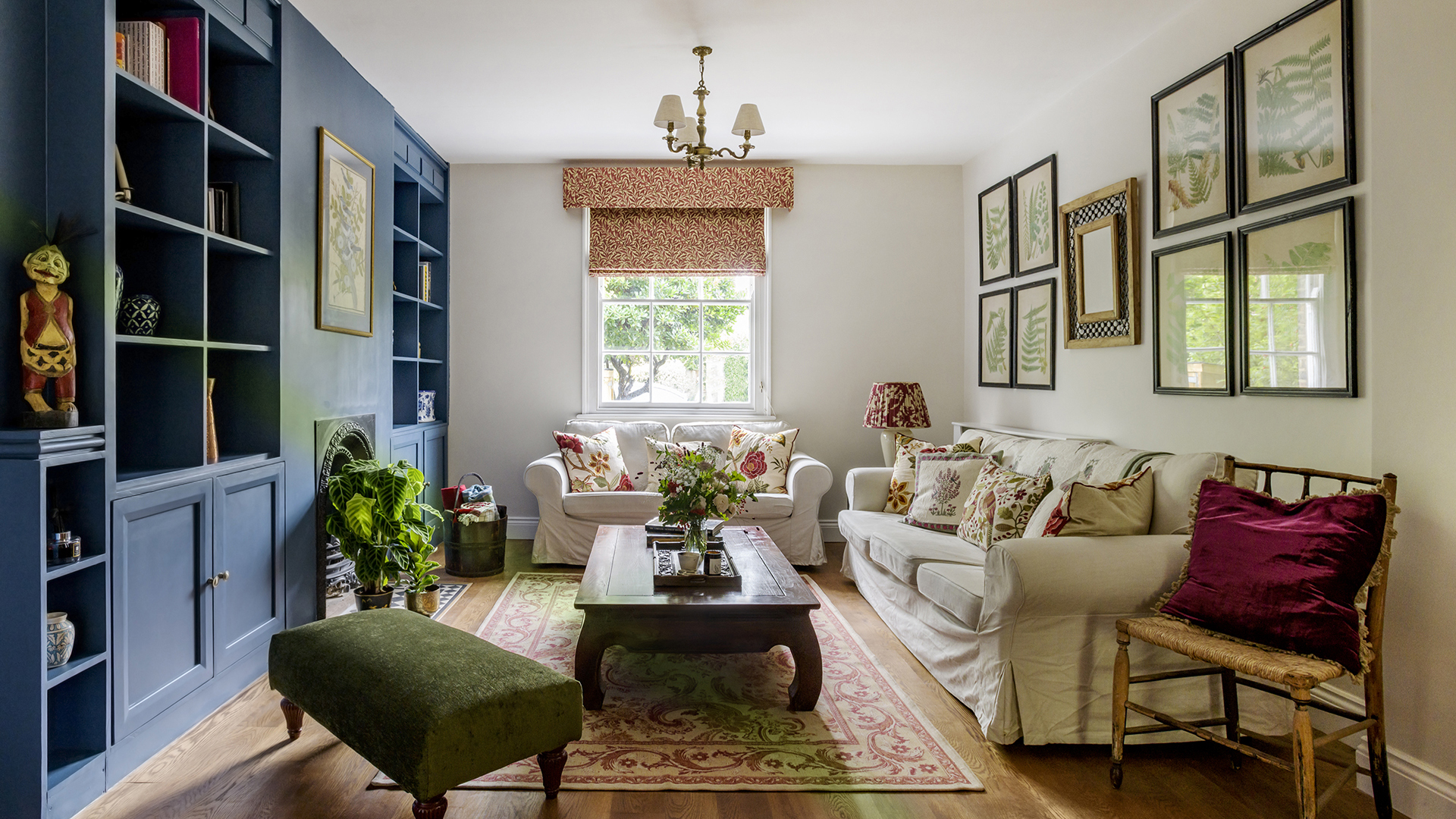
If you love reading about trends, you'll probably love catching up on outdated ones even more.
And while we openly admit that paint trends, like all fashions, come and go like the tide, and that we all have different tastes and paint ideas we want to try out, it's always good to know what's hot and what's not when you're redecorating a room.
So, whether you're about to plan a whole new design scheme, or feel certain areas of your home are in need of a refresh, look no further for what not to do. We asked a collection of interior designers and paint experts to share their outdated paint trends – and the looks replacing them.
5 outdated paint trends (you may want to avoid)
From neutrals that are making our homes feel cold and uninviting, to breaking away from all white spaces, explore the 5 outdated paint trends that designers are no longer loving.
1. Goodbye gray
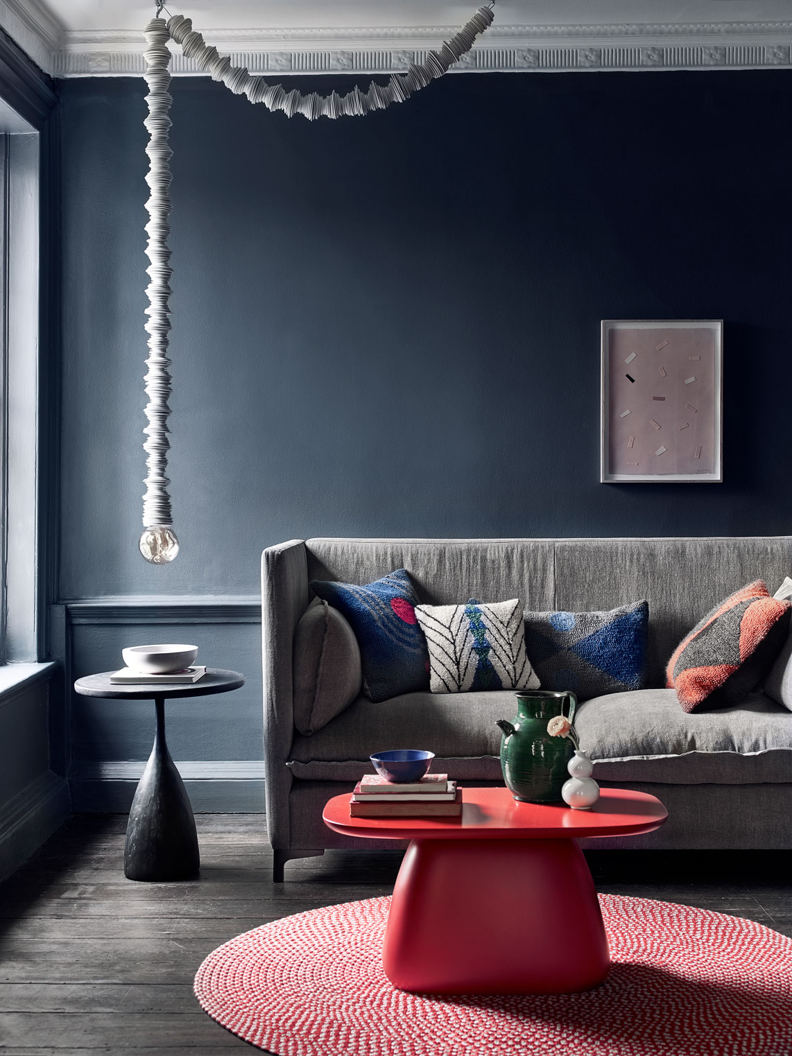
Can it really be goodbye gray?
Decorating with gray will always prove to be a timeless and versatile shade for neutral room ideas, but many of us are moving away from stark, cool gray spaces to grays with more warmth and with more colorful undertones.
From gray-green, to making a cool gray room look warmer with impactful accent shades and clever color combinations, adapting our gray spaces to feel more inviting and cozy is key for 2023 color trends.
Design expertise in your inbox – from inspiring decorating ideas and beautiful celebrity homes to practical gardening advice and shopping round-ups.
As Devin Shaffer, interior designer at Decorilla says, 'gray is a great neutral color that can have a calming effect when used in the right way. Softer shades of gray, such as dove gray or light gray, can be very relaxing and it also can be used as a calming accent color in a room with brighter or bolder shades.'
We explore this topic further in our dedicated feature, what color is replacing gray? You'll be surprised by the answer.

San-Francisco based interior designer Devin Shaffer has a Bachelor of Arts in Interior Design and is a lead designer at Decorilla Interior Design.
2. Au revoir uninviting neutral finishes
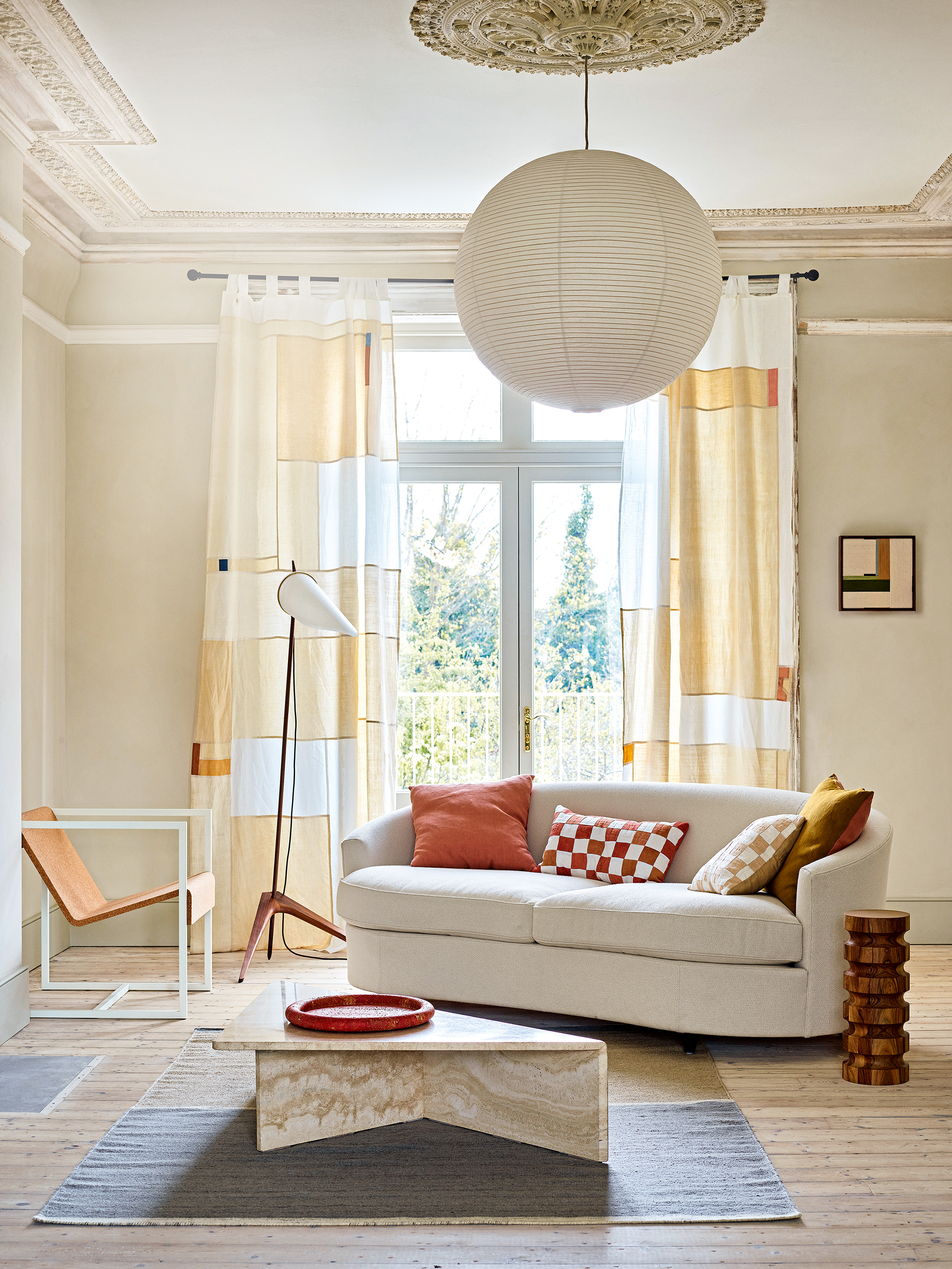
In a similar fashion to moving away from cooler shades such as gray, many of us are discovering new neutrals to decorate with in the home – white and gray are no longer the only options for those wanting to decorate with neutrals.
This year has seen a new era of neutral shades, with many inspired by the relaxing colors of nature.
Patrick O’Donnell, color consultant and brand ambassador at Farrow & Ball says, 'The love of warm, earthy neutrals continues, and that once derided shade beige is very much a color of consideration. Jitney with its discreet yellow/gray undertones gives it huge flexibility to layer with other shades too.'
Justyna Korczynska, color consultant at Crown Paints also supports this and says, 'Colors of nature, such as earthly beige and warm clay and all shades of green have been a firm favorite for the last few seasons, as over the past few years, nature has become even more important. The outdoors has been an escape, somewhere to go to recharge our batteries or even just take a break. We want to channel that feeling in the home with warm, cozy shades inspired by the natural world.'

Patrick O’Donnell is Farrow & Ball's color consultant & brand ambassador and has been with the brand since 2012. Patrick works with designers in the UK and North America, helping to bring their projects alive with the iconic, F&B color palette.
3. Ciao white trims and ceilings
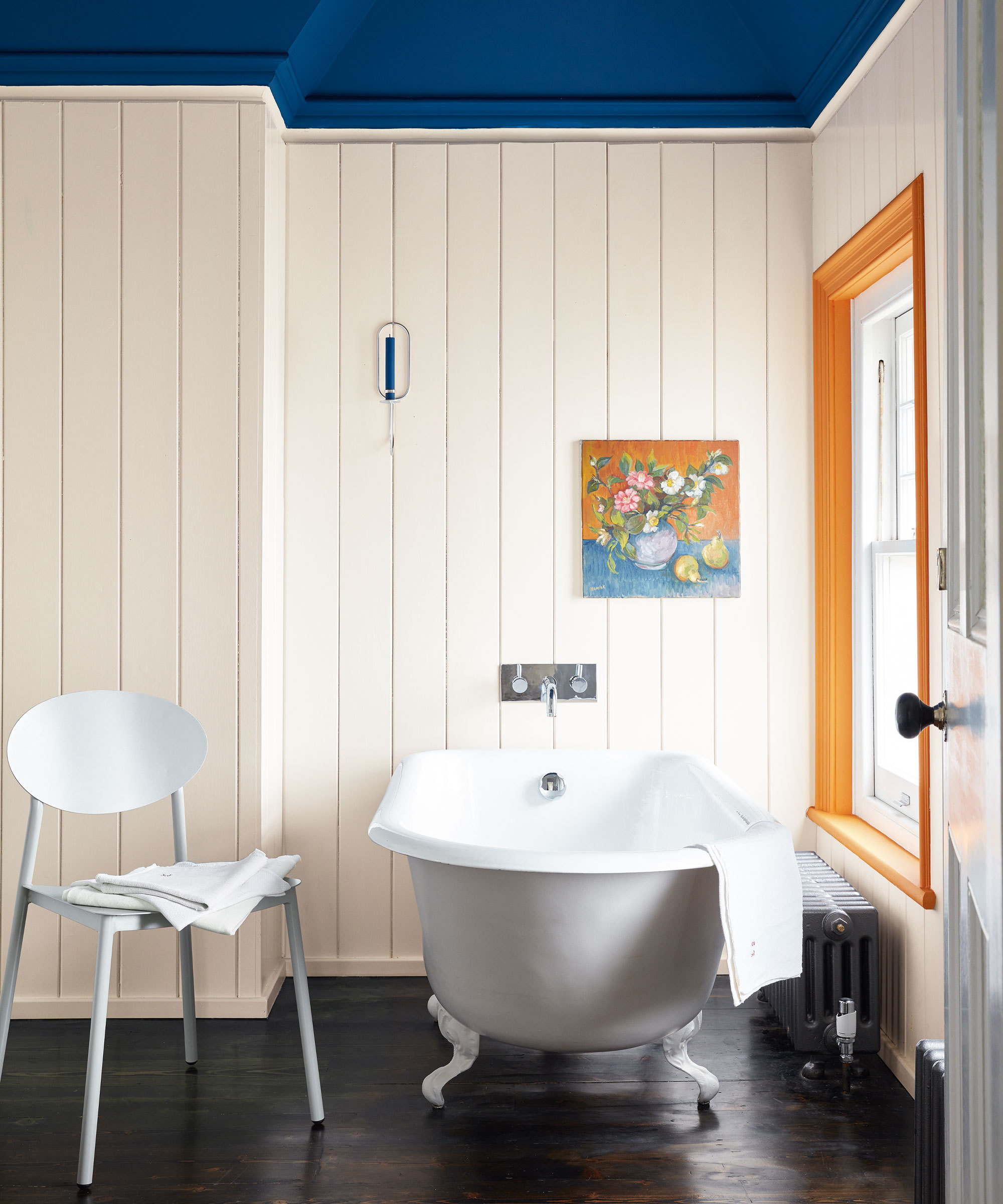
'Architectural features are a fantastic host for making a statement with color, be that baseboards, paneling and doors, or trim and ceiling. Yet these elements are so often – by default – painted white, without consideration for how that affects the space,' says Andy Greenall, head of design at Paint & Paper Library.
When planning the room color ideas in your home, rather than leaving these details white, embrace ceiling paint ideas and colorful ceiling trim ideas; making for a more luxurious and well-thought through look.
Ruth Mottershead, creative director at Little Greene adds, 'when painting a room, consider the ceiling within your color scheme. The ceiling is often painted white out of habit, but this has a big impact on the way that the room will feel. There is a host of options that move away from traditional whites, bringing ceilings into the design scheme, or using them to create a design focus.'
Whether you go all-out with an impactful, color-drenched look from floor to ceiling, or enhance an accent color by painting your trims in a matching shade, think about how every surface and architectural detail can work in harmony with your scheme.
Ruth Mottershead is the creative director of the family-run paint and wallpaper businesses Little Greene and Paint & Paper Library, which specialize in creating luxurious paint and wallpaper that represent 300 years of decorative history.
4. Adiós dark colors in small spaces
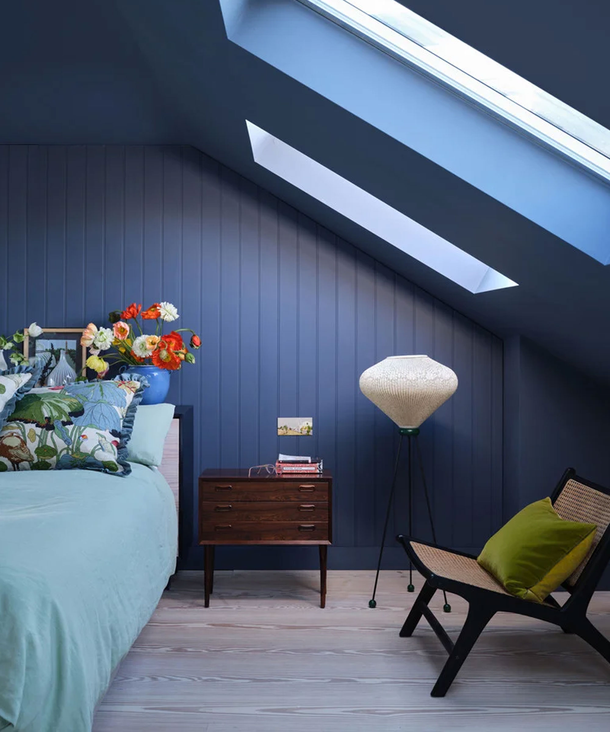
For so long, we have been advised to avoid dark colors in smaller rooms in fear they will make the space feel closed in and uninviting. Whilst lighter colors can work well at helping a small room look bigger and brighter, darker colors should not always be avoided.
'If your room is dark, white is not your friend here – so play with darker colors. While this may feel counter intuitive, some dark colors will recess, and you will create a cozy and comforting place to dwell,' advises Patrick O’Donnell from Farrow & Ball.
Embracing dark colors or an impactful use of pattern and texture in a small space can create a unique, immersive design that helps to distract the eye away from the size of the space.
Justyna Korczynska from Crown Paints adds, 'working with bold, dark colors should be all about balance. Always make sure you incorporate neutral and pale features into the room, whether that’s through furniture, accessories or other paint colors, as this will light up the space.'
5. Sayōnara accent walls
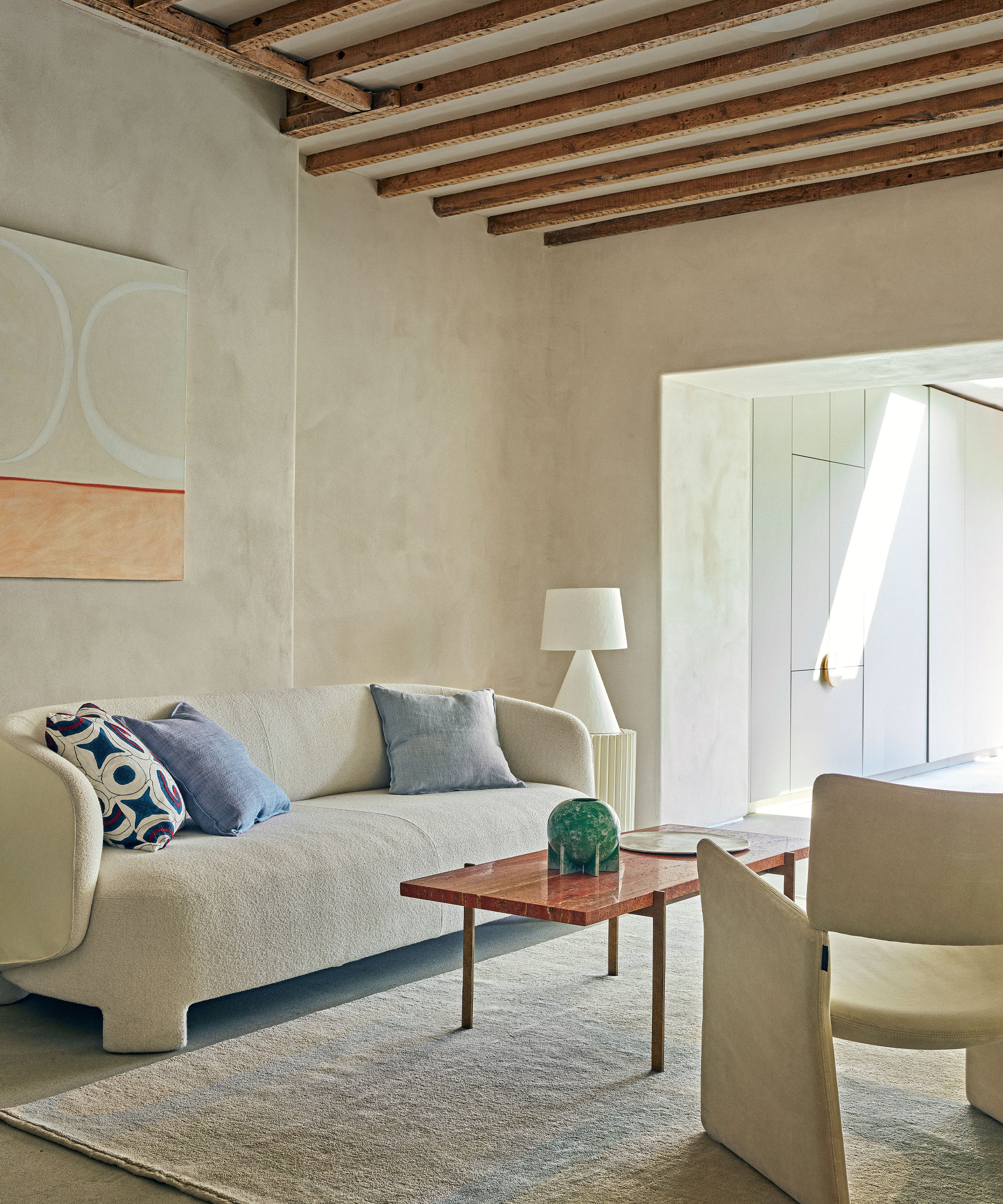
Victoria Yardley, founder of eco-paint brand Victory Colours says, 'accent walls, which used to add a pop of color and add interest to a space are now becoming more outdated. Instead, people are choosing more cohesive color schemes, throughout rooms and spaces, or using patterns and textures to add interest to walls.'
If you want to introduce a bold element of color to a room, really commit to a shade and use it throughout the space, or opt for a more muted color on the walls and bring in colorful accents through accessories such as decorating with art, a beautiful rug or cushions.
FAQs
What are the outdated paint colors for 2023?
As we have explored in this piece, there are a selection of paint colors that have fallen out of favor for recent interior design trends.
From white and gray being replaced with warmer neutrals inspired by nature's palette, to being more adventurous with color on features such as ceilings and trims, the overall feel is that cooler paint colors are being replaced by warmer and more uplifting color schemes that help our homes feel more cozy and characterful.
When exploring outdated paint trends, it is important to note that trends quickly come and go, what was once the height of fashion one year may be totally reinvented the next; only you will truly know what will work in your space.
Of course, trend analysis can be wonderfully helpful and inspiring when exploring home decor ideas, but the key is to always choose colors and paint ideas that reflect your personal style, and that bring joy every time you step foot into your home.

Zara joined Homes & Gardens in February 2022 as a Content Editor. After studying English Literature at University, she worked as an Ecommerce Website Editor, Content Writer and Buying Intern at multiple independent businesses within the luxury retail and lifestyle sectors. Her role at Homes & Gardens unites her love, experience and passion for the world of design and desire to create inspiring written content. She enjoys nothing more than discovering new trends, brands and products, whether that be in fashion, interior design or lifestyle.