The colors to avoid painting your home after big life changes – and what to use instead
The colors in our home really do impact our mood – here’s what you need to avoid after a turbulent life event

- 1. Avoid red when you’re experiencing heartbreak or grief
- 2. Stay away from neutrals when the children have left home
- 3. Find alternatives to gray when you’ve started a new job
- 4. Keep it neutral when you’ve just moved house
- 5. Be wary of red if you’ve just got married
- Why color makes such a difference after a big life change
- FAQs
Design expertise in your inbox – from inspiring decorating ideas and beautiful celebrity homes to practical gardening advice and shopping round-ups.
You are now subscribed
Your newsletter sign-up was successful
Want to add more newsletters?
After a dramatic life event – be it your children flying the nest, a breakup, or a new job – our homes become the best place to seek refuge, rest, and recuperate to avoid stress. But how we decorate our spaces can have a huge impact on how well this works for us – and there are some vital colors to avoid painting your home after big life changes, experts warn.
Between avoiding the most stressful colors, and picking the most relaxing colors for rest, color therapy can drastically alter how we process changes in our everyday lives and could make the difference between sailing through your troubles and being bogged down in anxiety.
Here, top paint experts have shared the five colors to avoid painting your home after big life changes if you want your home to be a sanctuary.
Article continues belowColors to avoid after big life changes
Working out your new decorating ideas when you are weighed down with stress can lead to rash decisions and unhelpful thinking patterns. Luckily, there are several mood-boosting hues that color therapists urge you to use after a big life change instead. Here’s what to avoid, and what to use in its place.
1. Avoid red when you’re experiencing heartbreak or grief

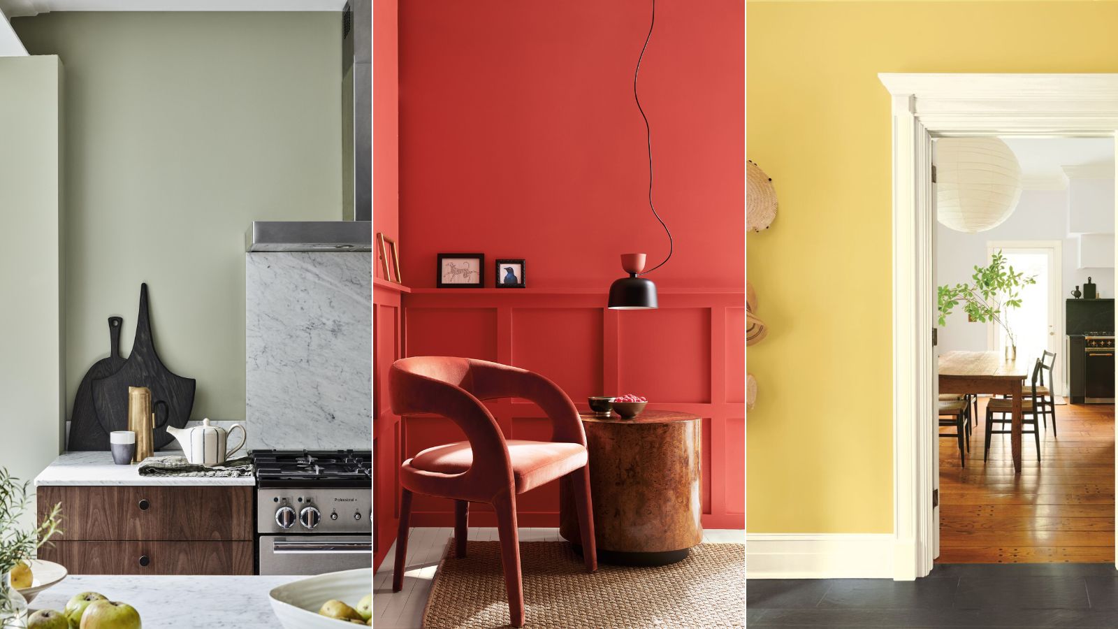
When struggling with heartbreak and grief, it is often recommended that you spend time with yourself to rest, recuperate and slow down – and our homes are the perfect place to do this. When focusing on self-care, however, it is best to avoid overstimulating, stressful colors, such as decorating with red, or decorating with yellow to avoid ‘overwhelming a fragile heart,’ says Marianne Shillingford, color expert and creative director at Dulux – ‘unless you want to distract yourself or party through the pain,’ she adds.
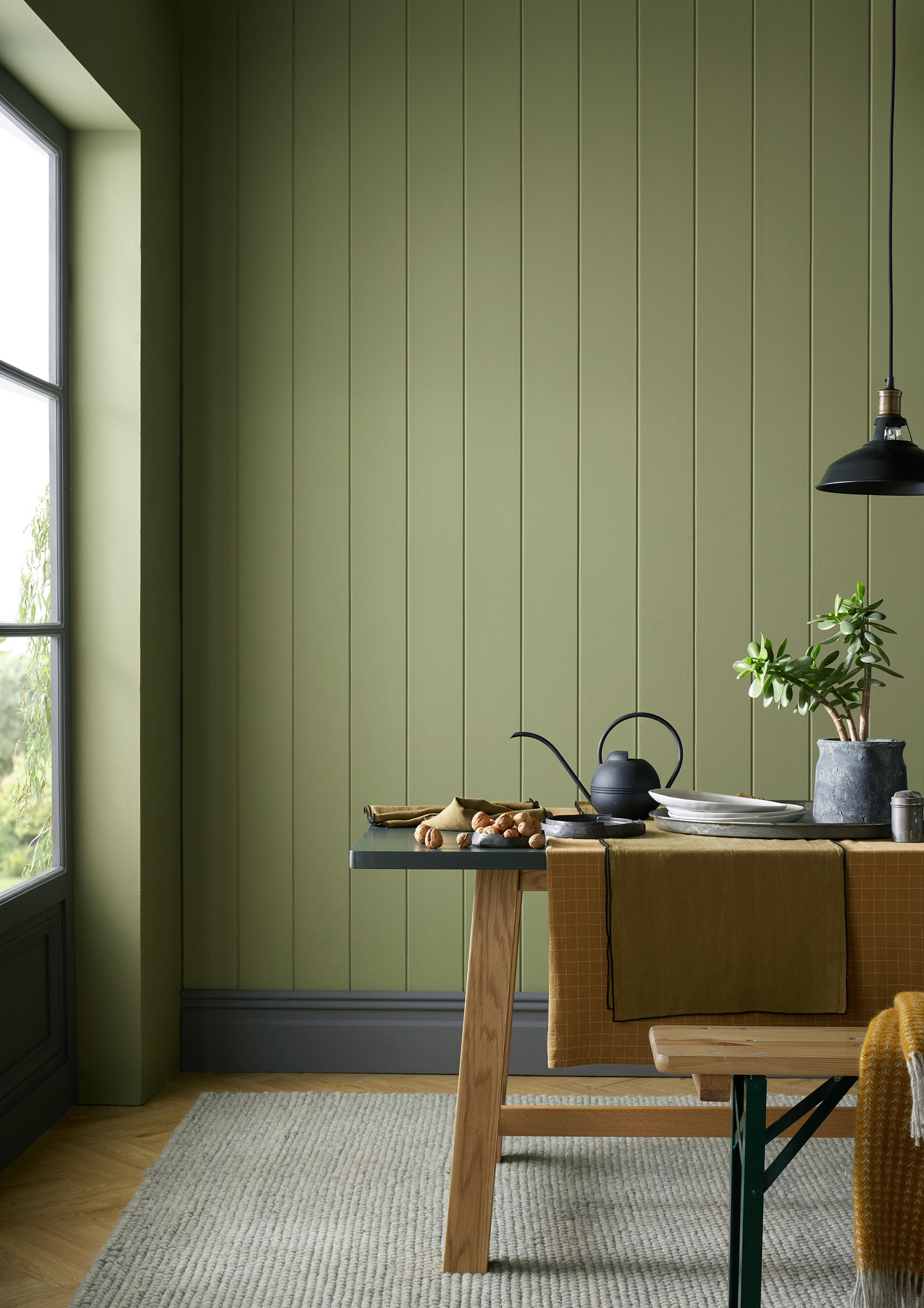
Instead, it is a good idea to add some stability to your home, giving yourself some space to breathe with tranquil colors such as green, suggests Patrick O’Donnell, color expert and international brand ambassador for Farrow & Ball.
‘You won’t put a foot wrong if you want to create a restful environment by finding a perfect mid-green, not too clean but not too drab either. You can team it with a gentle gray, such as Farrow & Ball’s French Gray which will work beautifully in any room, or pair it with the softest Wimborne White as a perfect trim and/or ceiling color for a soft space.’
Design expertise in your inbox – from inspiring decorating ideas and beautiful celebrity homes to practical gardening advice and shopping round-ups.

Patrick O’Donnell is Farrow & Ball's color consultant & brand ambassador and has been with the brand since 2012. Patrick works with designers in the UK and North America, helping to bring their projects alive with the iconic, F&B color palette.
2. Stay away from neutrals when the children have left home
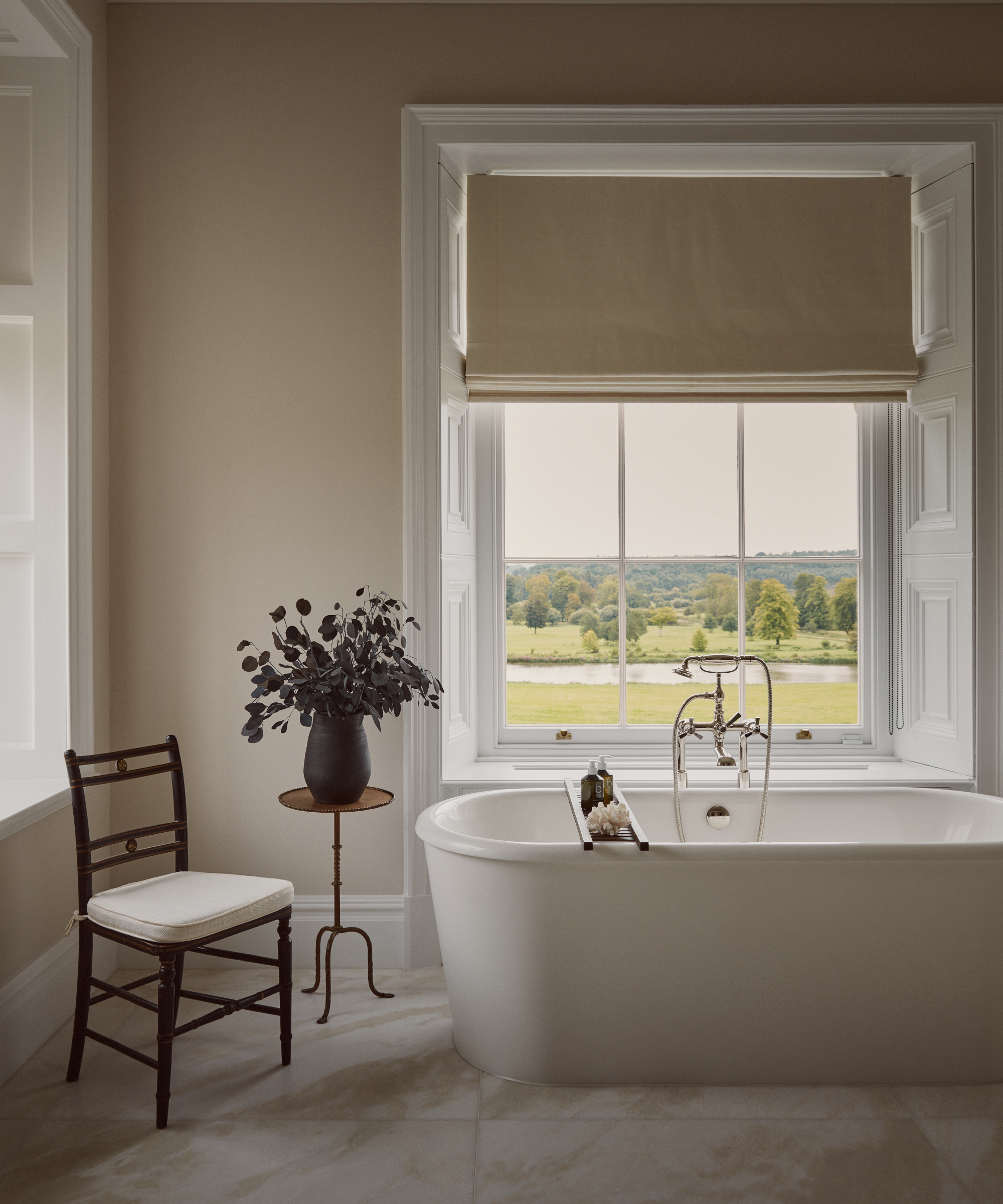
Children leaving home can drastically change the dynamics of a household. If you are looking to transform your old teenager's bedrooms into more usable spaces, then it can help to avoid picking stark white or neutral colors to prevent removing all personality from the room, or making them feel like a hotel room, Marianne Shillingford, color expert says.
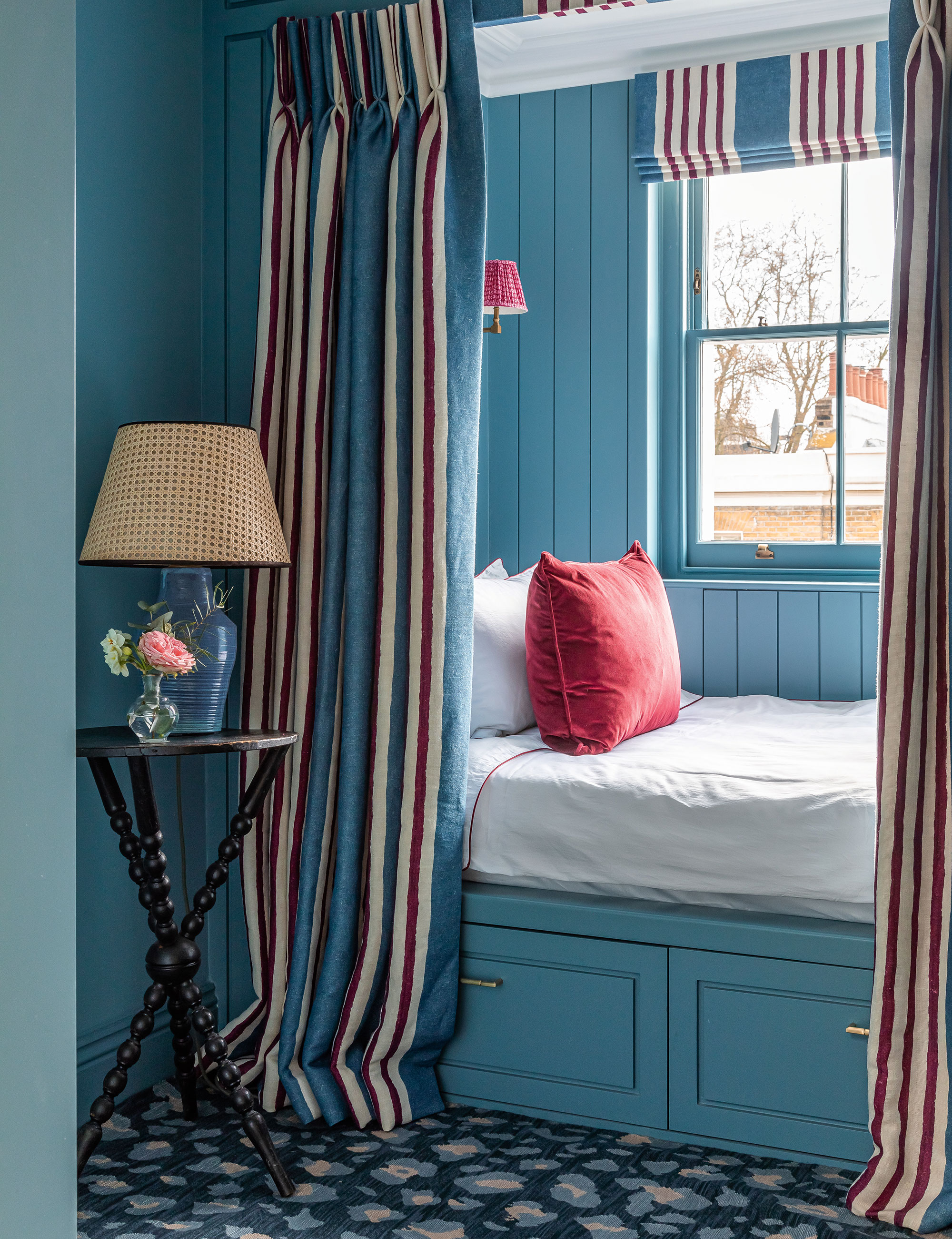
Rather, you should seize this challenge and take the opportunity to show your kids just how daring you still are,’ Marianne recommends. ‘For sure, it can be a sad time, but when you are ready for a fresh start to the next exciting chapter in your life, you can try decorating with blue. The perfect colors to refill your nest with are rich ocean shades of teal, navy, and sky blues – these shades are both bold but calming, perfect for a time of transition.’
3. Find alternatives to gray when you’ve started a new job
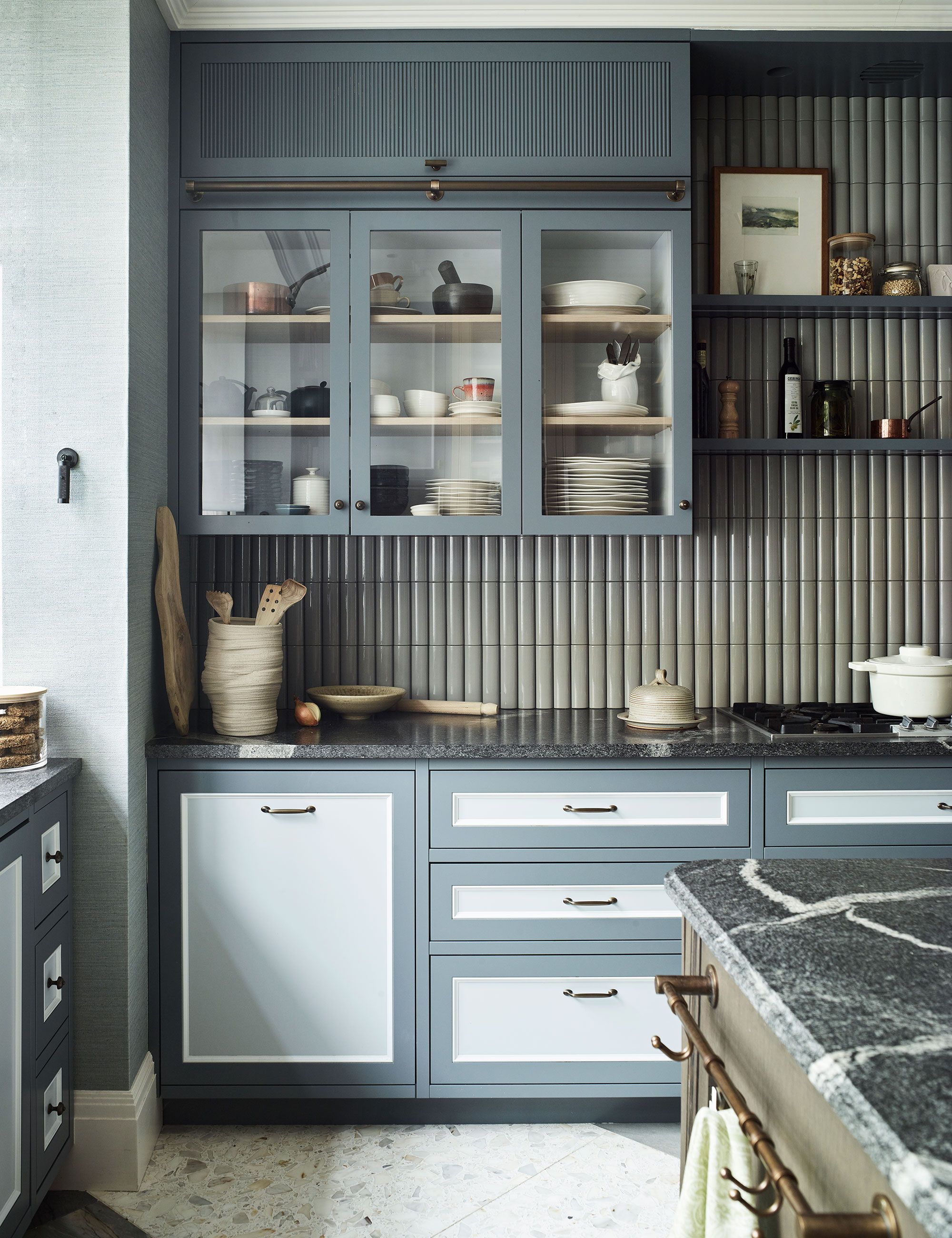
When starting a new job, whether you have moved house or are shaking up your routine after feeling stuck, it is important to use some of the most motivating colors – especially in home offices, and avoid subdued tones like grays and cool neutrals ‘which are not so great for boosting mood and self-confidence when you need it most,’ Marianne Shillingford, color expert says.
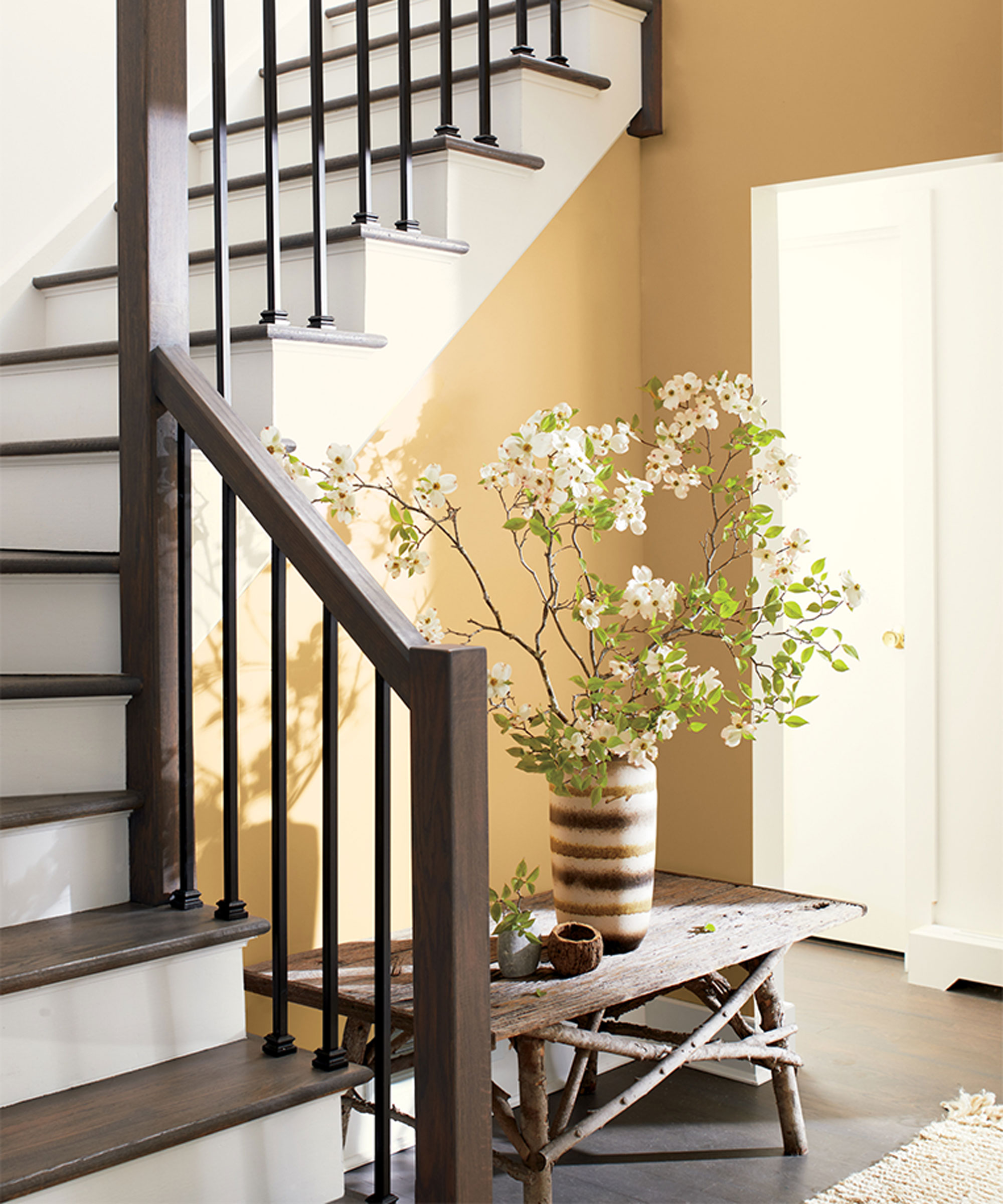
Patrick O’Donnell, color expert instead recommends using bright, bold tones and playing with yellow room ideas, for example.
‘Bright shades like yellow help to recharge the batteries,’ he says. ‘Nothing says sunshine more than a cheering yellow, and whilst painting a whole room can feel like too much commitment, consider flipping the convention and use it on your woodwork for a nod to optimistic cheer!’
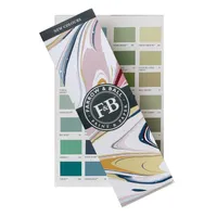
Farrow & Ball Color Card | Free from Farrow & Ball
Picking up a free color card can help you pick the perfect color for your space without committing to painting a swatch on your walls.
4. Keep it neutral when you’ve just moved house
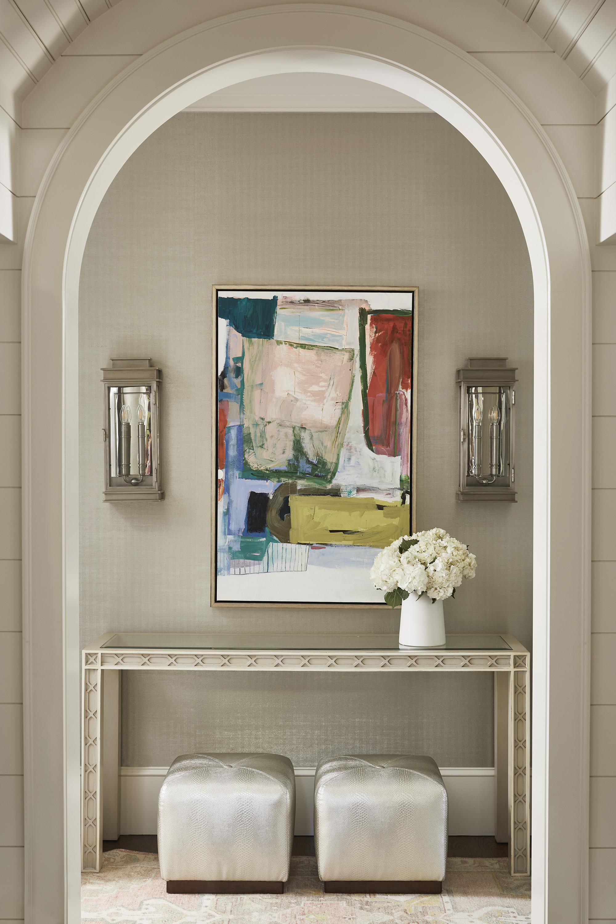
Moving house has been declared one of the most stressful life experiences we all live through, so it can again help to avoid decorating your new space with bright, eccentric colors right off the bat.
Instead, it can be a good idea to opt for decorating with neutrals, such as a warm-toned cream or white, to help you settle into the new house to avoid making big design decisions under pressure, suggests Erika Woelfel, Behr’s VP of color and creative services.
‘When it comes to big life changes, Blank Canvas, a soothing warm white, is the perfect fit – it is a color of renewal and fresh starts,’ she says. ‘Blank canvas is the ultimate solution for someone looking for a color with the transformative power that will leave a clean and optimistic background for limitless possibilities.
‘Swiss Coffee, Spanish Sand, or Perfect Taupefrom Behr are also wonderfully relaxed neutral shades that give a warm, relatable feeling amid life changes. They also offer flexibility for you to play with and ultimately transform a space from a place of rest to creativity.’
5. Be wary of red if you’ve just got married
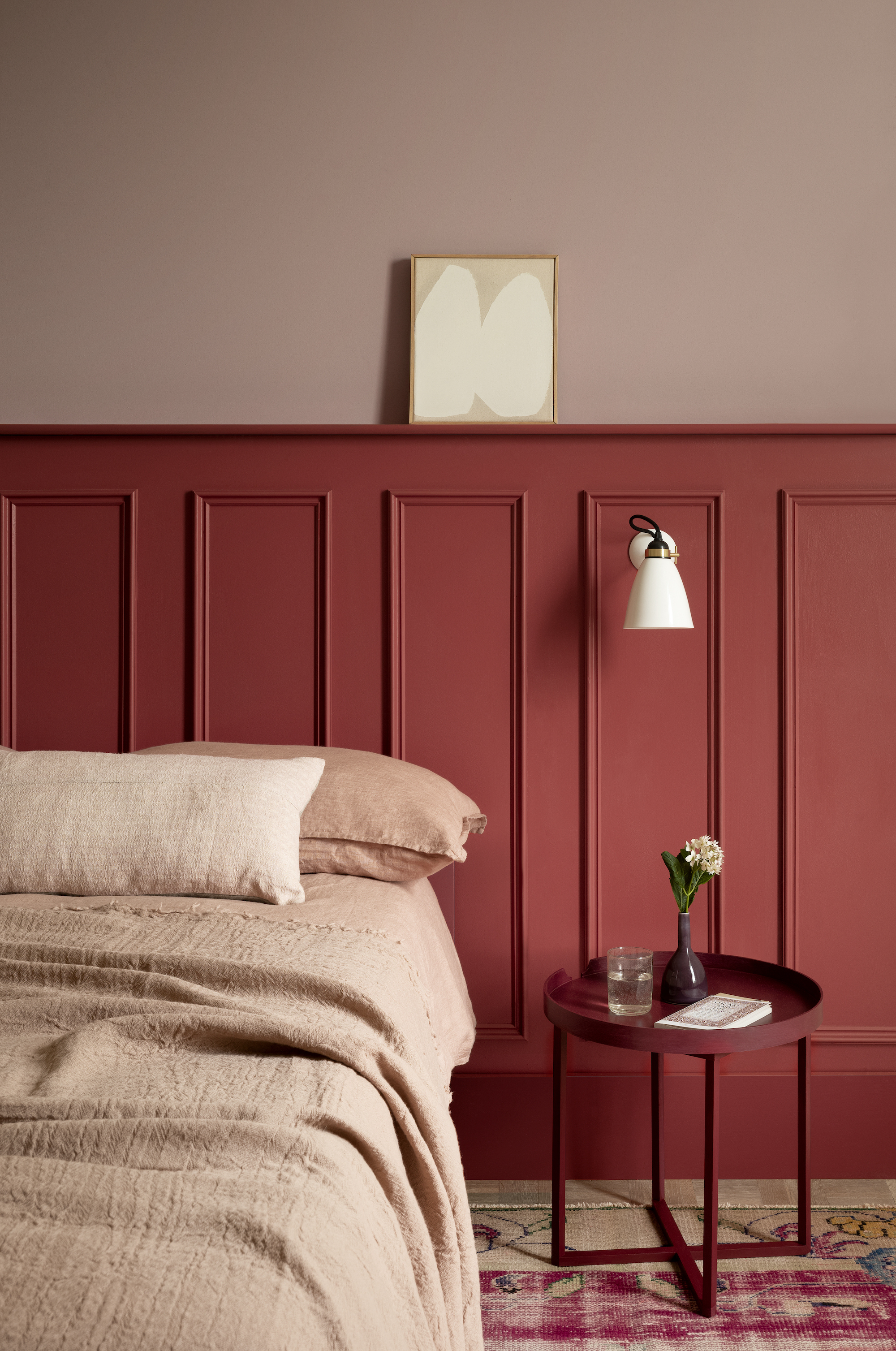
The chances are that you have already been living with your partner for a while before getting married, but your wedding can be a massive life change in and of itself that can spark a desire to redecorate your home. When working on bedroom ideas for couples, Marianne Shillingford, a color expert suggests avoiding red. Although touted as the color of passion, there can easily be too much of a good thing, she warns:
‘Red is the most stimulating color, and you have to use it carefully. Too much of a good thing sometimes isn’t so good, and passion can flare both ways when you’re going through big life changes. While you may well have more fun in a red bedroom, red in a living room or kitchen may be too overpowering, so I recommend that newlyweds stick to cooler tones in their living spaces to retain that post-marital bliss.’
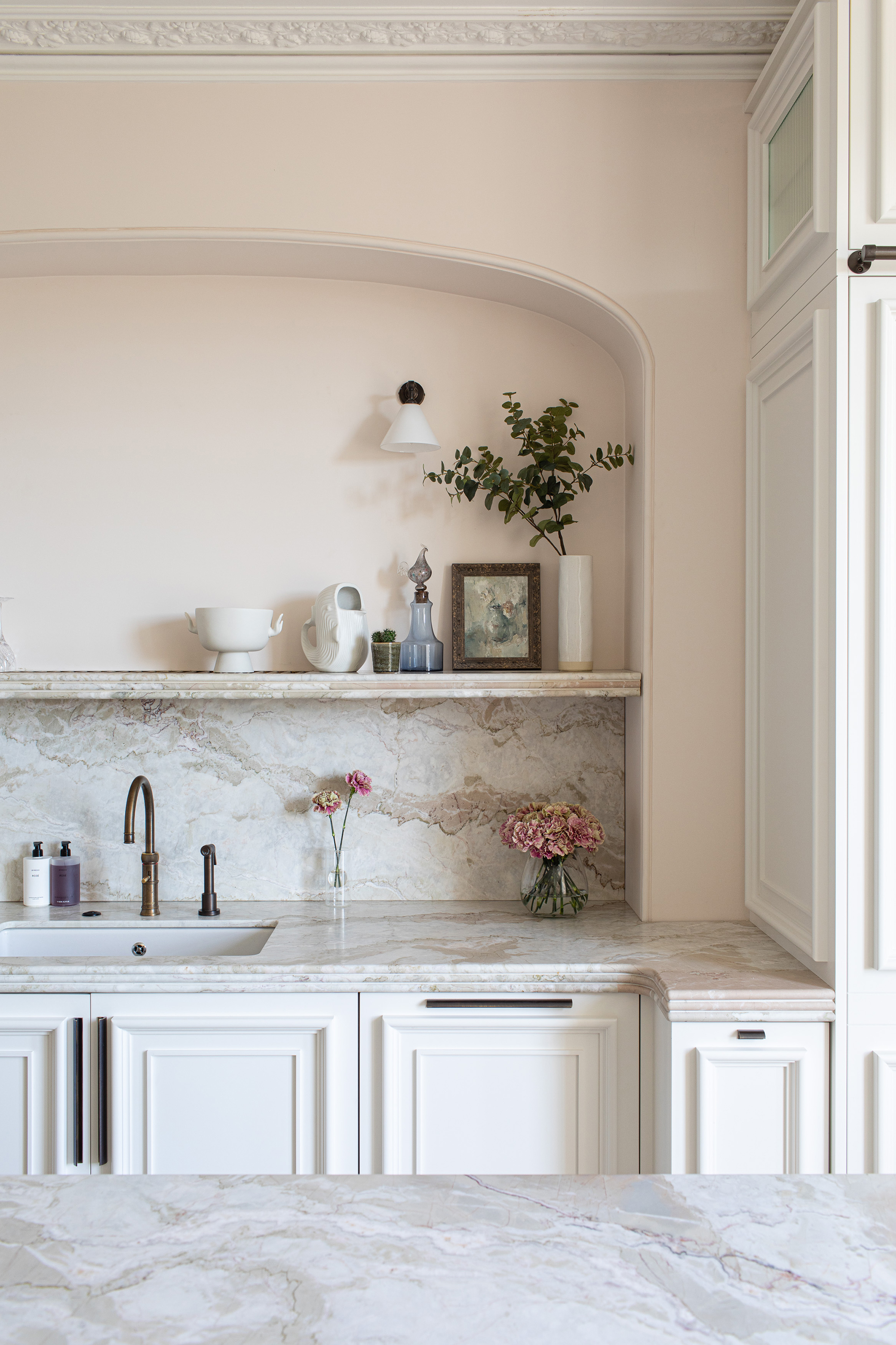
Named the most beautiful color for a room, toning down red hues and using pink or pastel shades is a more suitable alternative Helen Shaw of Benjamin Moore continues.
‘Color drenching and blocking is a perfect method to bring these shades to life. For instance, soft pastel hues such as sage greens and romantic blush pinks or lilacs pair beautifully and are a perfect entry point for adding a subtle layer of calmness into the home whilst looking fresh and optimistic.’
Benjamin Moore Paint Sample | $5.99 at Benjamin Moore
These small 8oz sample pots are ideal for testing your new collars out before committing to your new look.

Helen Shaw is part of Benjamin Moore's UK division. Color expert and international marketing director, Helen and her husband Craig are founders of Shaw Paints, acquired by Benjamin Moore in 2020.
Why color makes such a difference after a big life change
We may not immediately think of repainting our homes when our life seems to be up in the air, so to speak, but how we use color and paint have drastic impacts on our mood and redecorating can be a great form of alternative therapy, suggests Laurie Pressman, VP at Pantone Color Institute.
‘Color influences us both psychologically as well as physiologically,’ they begin. ‘As a part of our psychic development, color is tied to our emotion as well as our intellect, this means that every color holds meaning, whether we consciously think about it or not. Some of these associations and feelings we may inherently sense, while others can be learned by association and/or conditioning – such as red being danger and green being nature. This then enables us to recognize the messages and meanings delivered which has an effect, ultimately, on how we feel.’
As a result, switching up your paint ideas can be a wonderful way to heal.
FAQs
What colors are best for our mental health?
Studies have proven that colors inspired by nature, such as blues and greens, can help to improve mental health – and this is the main reason why hospitals and care settings use these soothing shades. When incorporating these colors to improve your mood, consider adding them not only through your wall paint but your decor too, as well as adding in real plants and maybe a small water feature of some kind to appeal to all your senses and create a wellness space.
What is color therapy?
Color therapy is a form of professional therapy that uses color light and images to help combat a series of mental health disorders. While this is usually done by a trained professional to help with diagnosed disorders such as depression or anxiety, we can use the basics of the practice in our homes, picking colors based on years of research to help influence our moods from day to day.
Painting intuitively and working with colors that you know help to relax you and cheer you up is the best way to work when decorating after a big life change. Always use colors that don't hold any negative connotations in your life, using paint trends and the expert's knowledge as guidance, but never law, when creating a relaxing space for you.

Chiana is Homes & Gardens’ kitchen appliances editor. With a lifelong passion for cooking and baking, she grew up experimenting in the kitchen every weekend with her baking-extraordinaire Mom, has spent time cooking with Le Creuset's expert chefs, and has developed a great understanding of how tools and appliances can make or break your ideal relaxing kitchen routine.
