The 80-20 color rule is the interior designers' secret for a perfect scheme – this is why it works
The 80-20 color rule is a classic design trick that ensures your interior schemes are perfectly balanced with a professional edge


The 80-20 color rule is one of the easiest design rules to implement and, when done correctly, it can have transformative effects on the way you dress your home.
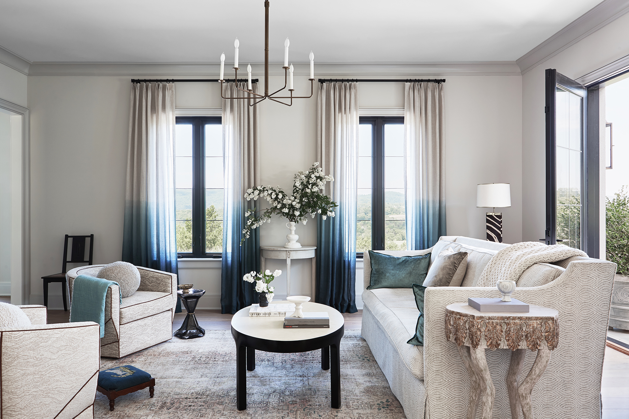
Following the 80-20 color rule is really simple. It states that the majority of your room – 80% – should be decorated in neutral colors, such as whites, creams, beige or pale pastel hues. The remaining 20% is where you can let your creativity shine, opting for statement colors and patterns. If you use this rule in your interior design, you can't go far wrong.
'The 80-20 color rule is a great concept for room color ideas because it provides a balance between neutral and accent colors, creating a harmonious and visually appealing space. The neutral colors serve as a foundation for the room, while the accent colors add interest and depth,' says Artem Kropovinsky, interior designer and founder of Arsight.
What is the 80-20 color rule and how do you use it?
The 80-20 design rule is a key interior designer tip and states that the majority (80%) of your room's color scheme should be neutral.
However, when decorating with neutrals, too many injections of color can feel overwhelming if not carefully thought through. Thankfully, the 80-20 color rule promises that by limiting the bold shades to only 20% of the room, you will achieve the perfect balance of hues. It's also a great way of introducing some of the latest color trends to a space without going over the top.

Based in New York, Artem Kropovinsky, founder of Arsight, has a decade of extensive and considerable global design experience. Prioritizing minimalism, sustainability, and authenticity, Artem, alongside his team of professionals, works on projects in the US and worldwide. Here, he explains how the 80-20 design rule might be applied to different rooms in your home.
- Living room: 80% neutral walls with 20% accent pillows and throws in a bold color.
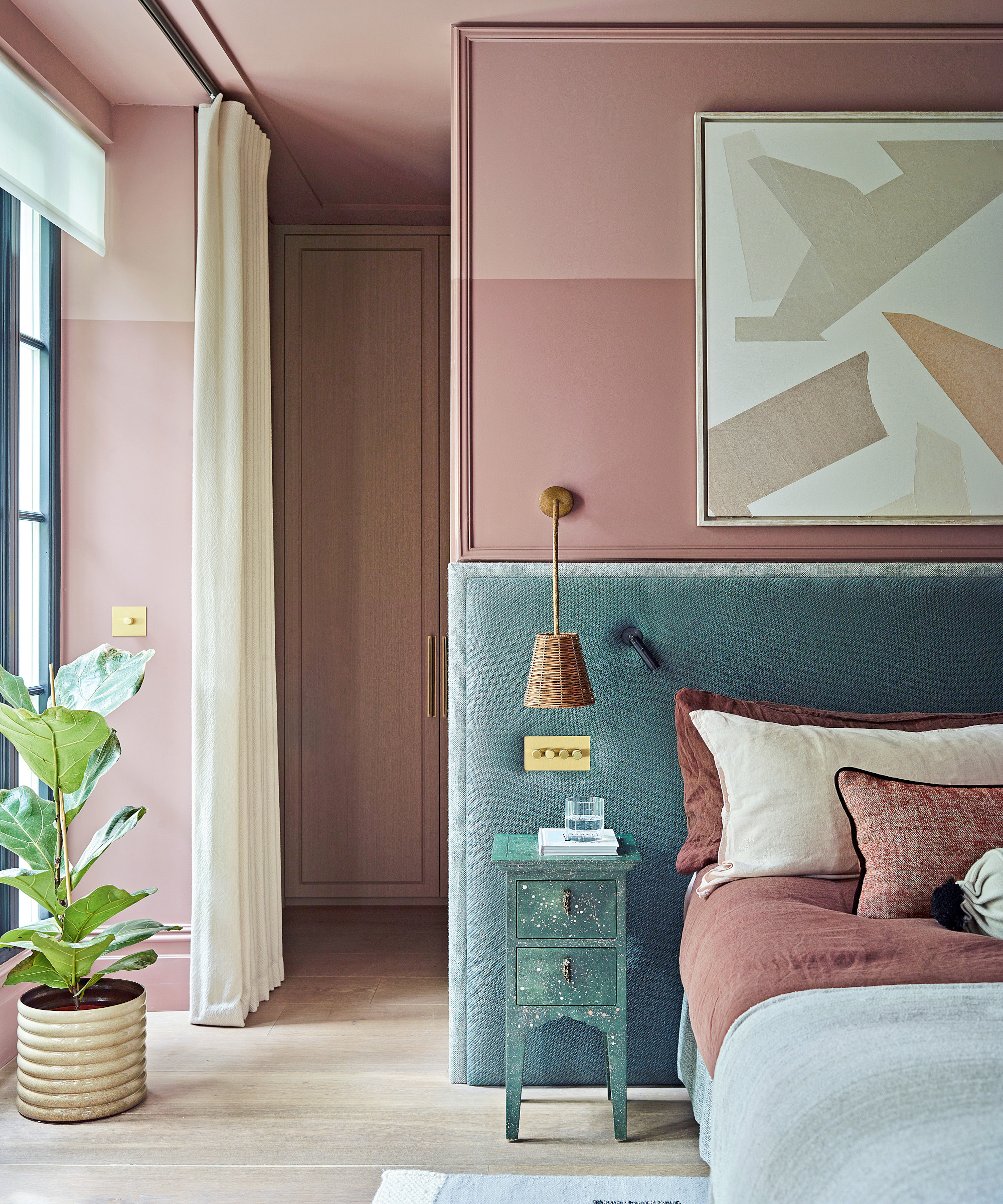
- Bedroom: 80% neutral bedding with 20% bedroom accent wall in a calming color.
- Kitchen: 80% neutral cabinets with 20% accent kitchen backsplash or countertop in a bold color.
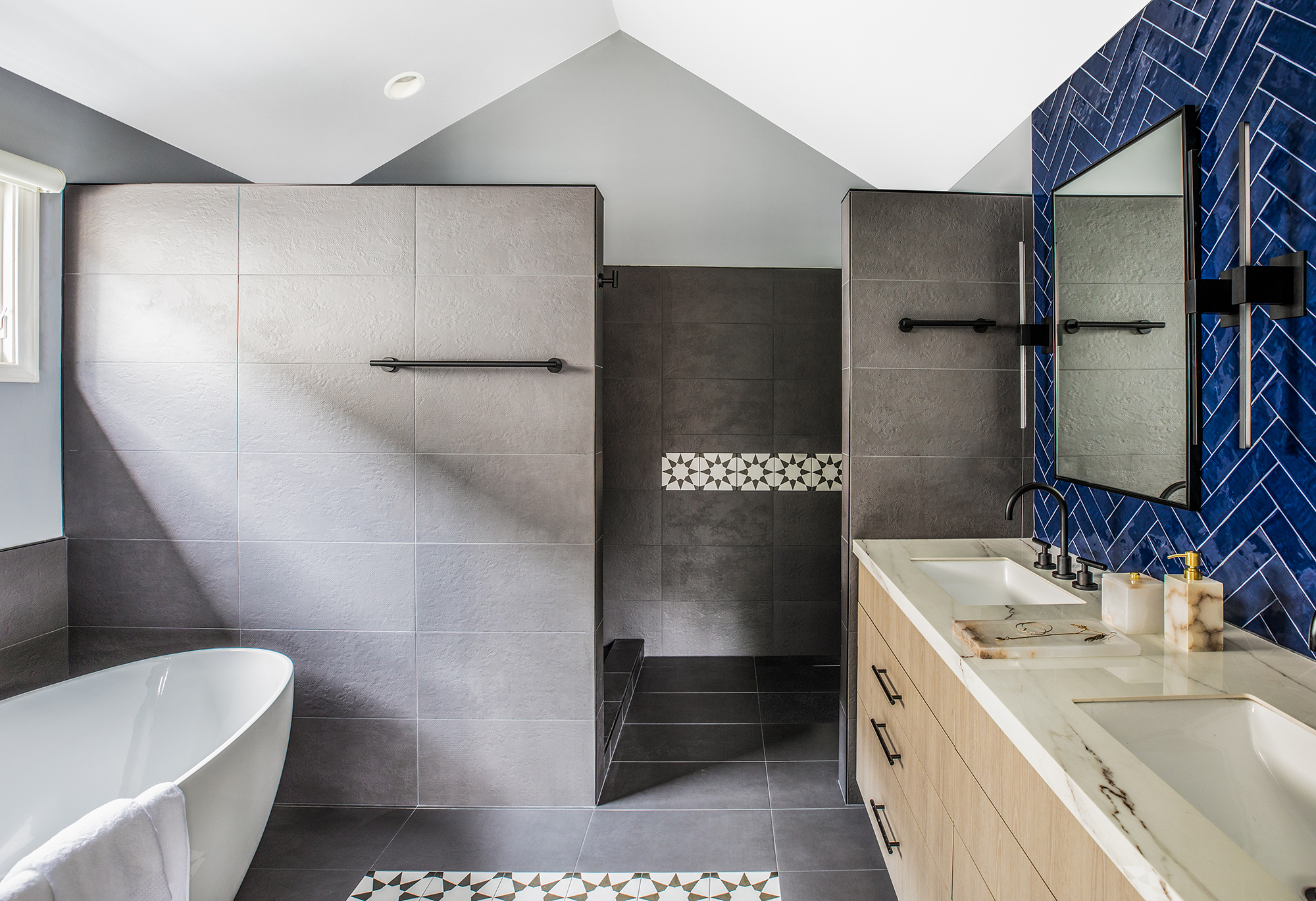
- Bathroom: 80% neutral tiles with 20% accent shower curtain or towels in a contrasting color.
'For me, the 80% often comprises the larger investment pieces, such as sofas or a large rug, the paint or wallcoverings,' adds Ariella Duker, founder of Ariella Duker Interiors. 'The 20% brings the drama, the contrast, and/or the visual interest, so window treatments, pillows, accessories, an accent piece of furniture, or through decorating with art.
Why is the 80-20 color rule so effective?

Former fashion stylist and Sotheby's-trained art historian, Ariella Duker has brought her experience to the world of interior design. Her art history background has resulted in a comprehensive understanding of classic design principles and she brings a timelessness to modern spaces. Many of her projects feature a tonal, neutral palette, with beautiful, well-chosen accents introducing personality to the space. Recipient of an IFDA Rising Star award, she was also recognized as a New York Cottages & Gardens Rising Star, and was featured on Luxe Magazine’s Gold List.
The 80-20 color rule is a good idea as it helps to create a balanced scheme, plus it can give you confidence to experiment with accent colors in a neutral room.
Design expertise in your inbox – from inspiring decorating ideas and beautiful celebrity homes to practical gardening advice and shopping round-ups.
Similar to the 60-30-10 rule, it provides you with a framework that will prevent you from overwhelming the space and produce a professional look for your home.
'While some may argue that you can't have "too much of a good thing", I personally, suggest practicing (some level of) restraint in residential spaces,' explains Ariella Duker, founder of Ariella Duker Interiors. 'Color inevitably affects mood. In moderation, you can get the benefits of color without a visual onslaught. Bedrooms, for example, are often intended to be a calming retreat, so a chaotic or strong color scheme lends itself to a chaotic mind, which is not very restful.
Does the 80-20 color rule mean you can only decorate with two colors?
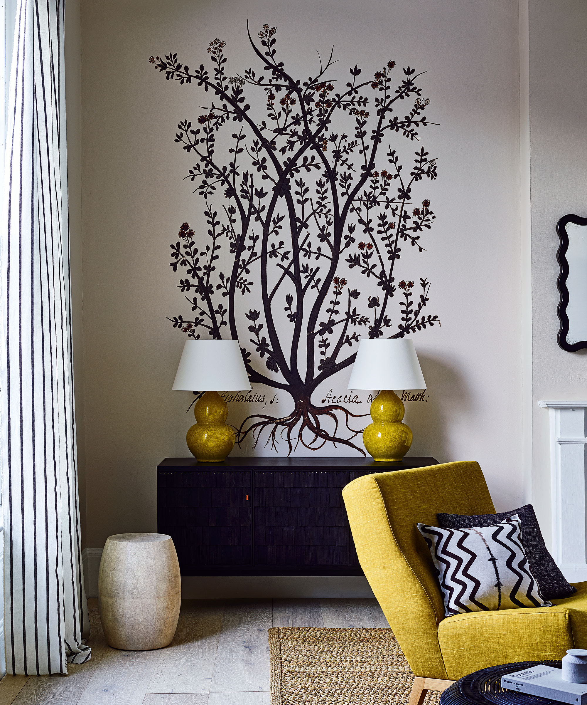
No, following this color rule doesn't mean you're limited to only using two colors. 'You can choose any neutral colors to make up the 80%, and any accent color as the 20%. The key is to choose colors that complement each other and work well together,' explains interior designer Artem Kropovinsky.
For example, beige, cream and gray can all make up the 80% and then accent colors can make up the remaining 20%. Whether you go with a couple of accent colors for beige or prefer to decorate with primary colors, there are plenty of options to choose from.
How do you know which colors go together?
The easiest way to know what colors go together is to consult the color wheel. You can also gain inspiration from interior designers, and learn which color combinations for rooms they recommend to see which colors the professionals commonly pair together.
However, it is still a creative process. 'Knowing which colors go together is based on a blend of client taste, science, emotions, and culture. Some designers lean into the technical color wheel, while others are influenced by how colors feel, or what we see in nature – more organic with less highly pigmented hues,' explains Smita Sahoo, owner, founder, and creative director of āśaya design.
'Personally, I like to learn a lot about what my clients will respond well to by talking to them about the places they've traveled to and about their cultural backgrounds. A collection of artifacts from a person's travels, or a bright indigo wall feature can each comprise the 20% of boldness in a design to deliver a more personal and interesting statement.'
Can you have an accent wall with the 80-20 color rule?
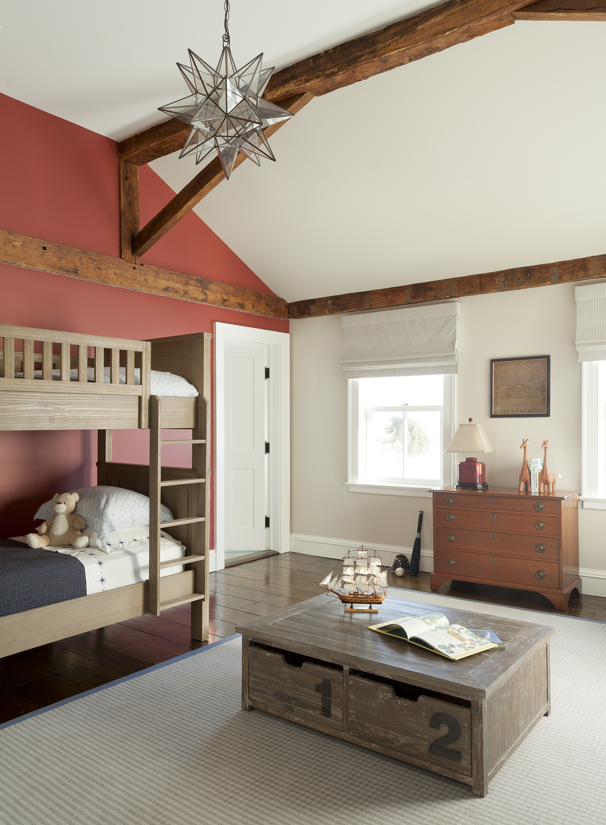
Yes, you absolutely can have an accent wall as part of the 80-20 color rule.
'An accent or feature wall is a great way to incorporate the 80-20 color rule. Choose a neutral color for the majority of the room and a bold accent color for the feature wall to create a focal point and add visual interest,' explains Artem Kropovinsky, interior designer and founder of Arsight.
Accent walls aren't just about solid colors either – try experimenting with wall mural ideas or even a shiplap wall to add texture and depth to your scheme.
Do I have to follow the 80-20 color rule?
There are lots of design rules – including the golden ratio – that can guide you in your interior design, helping you to achieve a harmonious and professional look.
Some people are naturally mathematically minded, while others find it harder to apply logic to creativity. While design rules can be useful, don't get hung up on the numbers. Interior design is all about self-expression and filling your space with things you love.

Having graduated with a first class degree in English Literature, Holly started her career as a features writer and sub-editor at Period Living magazine, Homes & Gardens' sister title. Working on Period Living brought with it insight into the complexities of owning and caring for period homes, from interior decorating through to choosing the right windows and the challenges of extending. This has led to a passion for traditional interiors, particularly the country-look. Writing for the Homes & Gardens website as a content editor, alongside regular features for Period Living and Country Homes & Interiors magazines, has enabled her to broaden her writing to incorporate her interests in gardening, wildlife and nature.